
Statistics
We looked inside some of the posts by 2022-504-mathewhocking and here's what we found interesting.
Average Info
Notes Per Post
0
Likes Per Post
0
Reblog Per Post
0
Reply Per Post
0
Time Between Posts
2 days
Number of Posts By Type
Text
17
Last Seen Tumblr Blogs


Fun Fact
Total funding amounts to $125.3M.

Text
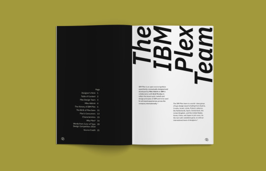
ISSUU publication.

The final cover design for my publication. I decided to change the top text to Plex Mono as I thought it looked better in this font.

I utilised the parent pages to include a top section which displays a line across each page between the borders and here you can see what font is on the page as well as the point size. I used a lighter shade from my base colour as I didn’t want it to be a main focus. I also removed the glyphs because I thought it looked too overwhelming for the style I wanted to create. Finally, any text that I have sourced features a superscript number at the end to make it easier for the reader when addressing the reference page.

I decided to take the advice from Karol and explore this large title idea again for this page. This time I changed the colour of the text box fill to match which actually prompted me to only use this one colour throughout my publication (except for the assets on my parent page). I think it just looks clean, bold and keeps my publication feeling more minimal.

I reverted to using my main colour for the background on this page as I felt the lighter blue I had previously used did not allow the thin and light fonts to really showcase themselves. I do however like the contrast between the light and dark colours you see at the top of each page.

The only adjustment I made to this spread was ensuring the text boxes were centred after applying the parent page assets as originally they were sized to the borders and this meant text was too close.

This is a new spread which I sort of just created on the fly after revisiting some of the research and inspiration I found earlier. This page does include the parent page assets as the concept speaks for itself, exploring a regular weight from IBM Plex Sans, which prompted me to want to make a page exploring thin or bold as well. I like how this page has a kind of pattern to it and is just really playful in its design.

Māori and English text pages. I decided to use Māori text which speaks to the opposite of what IBM is about so this page is really exploring contrast and difference. Taiao translates to earth or nature, wairua translates to spirit or soul, atua translates to ancestor or god, whenua translates to land, huarere translates to weather and aroha translates to love. So, compared to machine, technology, etc, the Māori words have more of an organic and spiritual meaning which is why I used Plex Sans which has a smoother and more breathable style, and Mono for the text about the typeface which feels more digital and sharp.

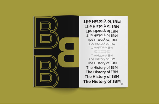
I decided to use some more text from my research on IBM Plex as I thought there wasn’t enough in my original or formative publication design. Again, there is a superscript number following the text for reference. The left page features more structured text as it gives a thorough insight on the origins of IBM Plex so I wanted it to be clean and legible. The quote on the right page is informed by what it is saying, so the larger text is set to a bigger point size and the smaller text has been reduced significantly.

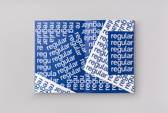
This is another page which does not feature the parent page assets due to the overall concept and was informed by the ‘regular’ spread. To create this page I converted the original text box, which has a fill colour, to a png and then placed it into the document in a way that creates this kind of pattern. I experimented a lot with placement and how each would inform that.

For my final pages I decided to feature letters from the end of the alphabet, signifying a kind of close, and these are set in Plex Condensed Italic. I originally did not set them in italic but thought that it created a nice contrast against the reference page to the right. The reference page includes bold and regular Plex Sans to help differentiate the title and web address.

The final page. Very simple, minimal and I think works best for my style of design.
0 notes
Text
DEVELOPMENT - P6 + P7 + P8 + P9

I didn’t develop this page much further as I felt it stood quite strong from the beginning. The only major alteration I made was changing the background colour to one of my chosen shades. All text is set in Plex Sans with weights set accordingly.

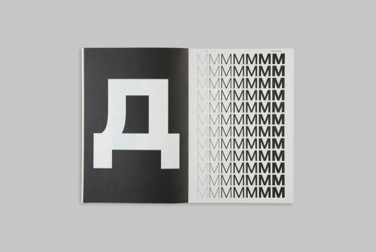
These spreads have also not been altered much except for colour. The left page is set in Plex Condensed and the right page is set in Plex Mono. This spread explores various glyphs available in the IBM Plex typeface. I like the contrast between background and text here.
0 notes
Text
DEVELOPMENT - P4 + P5

Initial sketches. Based on the advice I got from my formative I didn’t want to change much from my original design. I knew I wanted to experiment more with the title, only including a first name in large text, and then also playing around with colour.

Here I enlarged ‘MIKE’ to extend across the entire spread which is in Plex Mono Medium. I think this is visually effective but felt too overwhelming for the rest of the page contents. The body copy is in Plex Condensed Regular and has been aligned accordingly to the guides I created. The right page is also set in Condensed Regular.

Here I decreased ‘MIKE’ in size to only operate in one page and I think this works better with the body copy. I also changed the second page to work vertically and it is centre aligned which I altered the leading on to be evenly distributed rather than appear too tight.
P3 + P4 design

My final design for pages 3 and 4. I changed the colour as I think the darker shade from my colour palette works best for this kind of layout otherwise it is too washed out. All text is set in Plex Condensed apart from ‘MIKE’ which is set in Plex Mono. I like the asymmetry on this page and the balance between bold and regular styles.
0 notes
Text
DEVELOPMENT - P2 + P3

Sketches for pages 3 and 4. Here I started to think about grids and how they might inform the layout. I already have the text I want to use and so visual development is what I need to focus on based off the feedback I got during my formative. I decided not to include the glyphs I used for my formative submission as I want to keep the overall design very minimal but strong.

I used grids when experimenting with these pages. Here I looked at how the text would look if it were positioned in the middle of the page and centre aligned. I also altered the background colour to a shade of my base colour. As an introductory page I wanted to use what could be considered the ‘default’ of this typeface so I knew I wanted to keep all text in IBM Plex Sans with a regular and bold font.

For this experiment I decided to use page numbers (which should actually be 2 and 3) but I think they are too overwhelming and intrusive. I also tried rotating the text on each page to give this spread a new layout. I changed the quote to uppercase and I think this is very effective.
P2 + P3 design

My final design for pages 2 and 3. I reintroduced 2x glyphs but went with a more simple and geometric shape which acts as a border in this instance. I decided to keep the quote in uppercase as I think it creates a nice balance between the pages. I also did not veer away from my base colour as I would like to introduce shades further into the publication.
0 notes
Text
REFLECTION 5.0
This week was all about the refinement and reworking of our material. The presentation was short but covered existing examples of type specimen work, the importance of using grids and hierarchy, and how to correctly print and package our work for the summative deliverables. We also created an account with Issuu, which is where we will upload our single pages as a PDF when finished. The print and packaging system was a little bit confusing but I made some of my own notes during the class demonstration which I’m hoping will be point me in the right direction when the time comes. I think that doing this a few times will certainly make the process easier as I know this part of the project is just as important as designing especially when in the industry.
I’ve continued working on my type specimen book, trying to strengthen my designs. I think during this process I would like to do some more research on potential layouts which could inspire my own, extract typographic quotes I could include from the past weeks presentations and potentially do some print outs on a chosen paper stock to see how it might physically look as a final publication.
My goal before next weeks class is to have a finished publication ready for editing and critiques.
0 notes
Text
DEVELOPMENT - COVER

Sketches for the cover design. Here I considered how I could communicate what type the specimen book is about and what kind of type treatments would work best. In the bottom right sketch I thought about a concept which could unite the front and back covers in an effective way using the beginning and ending letters of the alphabet.

I know I want something simple for the cover design. These two use Plex Sans, Condensed and Mono but I think that the ‘IBM PLEX’ is too heavy against the smaller ‘Type Specimen Book’ text.

Keeping the type simple and consistent seems to be a better option and I think it would make more sense to have the cover (and back) in colour like the design on the right.
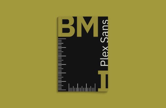
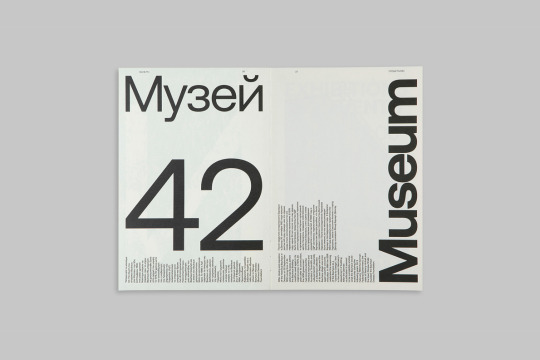
Cover design

My final cover design uses IBM Plex Sans (regluar and light) and features the name of the typeface and what kind of publication it is. I added a small line to the top right text as I think it gives that particular area more structure and also aligned it right to mirror the title.
0 notes
Text
FINAL SWATCHES

After having some issues with printing for the formative (due to not fully understanding the way colours/colour codes work) I took some time to revisit the presentations where these topics were covered and find a better colour palette which I know will print the way it is intended.
I decided to move towards grey tones instead of blue as I like the variation in shades and it doesn’t steer too far away from the nature of IBM being a very technological, machine based brand (think hardware, wires, chrome, etc).
0 notes
Text
REFLECTION 4.0
This week was the formative feedback session. I wasn’t very happy with the material I brought in but Karol gave me some great advice on how I could strengthen my designs in preparation for the summative in a couple of weeks.

For the cover, I wanted to create something very simple with an emphasis on the colour I will be using and the type that will be explored throughout the book. The asterix is in IBM Plex Sans Bold and the title is in Sans Light. Karol advised that I consider the alignment of both the asterix and text and also to remember the importance of consistency. I will definitely experiment more with the cover to see how I can elevate the current design.

The first page in my book is a quote which I sourced from the IBM website and the second page is a brief summary about the IBM Plex typeface. The entire spread is in Sans Regular as I felt it made sense to set everything in a ‘default’ for the introduction. I included an arrow glyph on each page to give the composition some movement and interest. The notes I was given about this spread was to adjust the text on the right to align left (for consistency and effective reading), general alignment between text and glyphs, and the relationship between the two glyphs. I will admit I did this spread quite quickly so I can see how there seems to be a disconnect between the two and this will need to be fixed.

This spread is about the type designer and the type forms available. I decided to use a variation of type styles including Plex Mono, Condensed and Sans because I think these 3 could be considered staples in the typeface and they surprisingly work well together. The layout and style on the right page was influenced by some of the research I’ve done. I wasn’t sure of the exact number of glyphs available so ‘500′ is just a placeholder until I can find the correct number. Instead of it being so static, Karol suggested I enlarge the name to fit across both pages which I absolutely agree with and had thought about doing, and this will then allow the body text and type form section to be positioned around this.

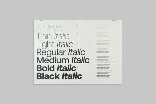
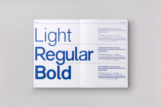
I would consider this spread a proper introduction to what the typeface is able to do so I’ve presented the available weights in each font using Plex Sans. This was inspired by some of the research I’ve done and I think it’s just a very effective way to not only advertise the various type weights but also create an interesting visual. I also decided to include the lowercase, uppercase and number forms in each weight which is positioned to the right. All text on the left has been sized to fit across both pages and I’ve included the font and font size at the top of each page to help the reader understand what IBM Plex looks like various sizes. Karol suggested I consider alignment with this element so that the font/size description properly lines up with its related text.

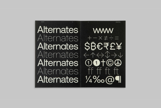
This spread is all about the availability and versatility of glyph forms and I decided to invert the colours on the right page to create more interest. The glyph forms on the left are in Condensed and somewhat randomised, with consideration for placement and balance, while the glyph forms on the right are in Mono and follow the traditional vowel arrangement of ‘a, e, i, o, u”. I think I would like to revisit this spread to see if I can include more glyphs or just experiment with positioning.

English and Māori text in Plex Serif. The arrows are meant to represent a sort of “this > is that” so it acts as an educational source for the reader. I really like Karol’s suggestion to make the downward arrow bold so the same as the text it is assigned to. Something I want to experiment with is the inclusion of more text and I think this will then prompt a smaller point size.

The back cover of my book which is directly related to the cover through the use of asterix glyphs. This page was also produced quite quickly and I can definitely agree with Karol about considering placement and proximity of the asterix however I’m not sure if I will use this design for my summative so I will conduct more research to find inspiration.
Overall I don’t feel very confident with what I submitted for the formative so between now and then I will really focus on playing and experimenting to create a denser collection of work. I will begin this process by actually sketching out some ideas before I bring any new concepts into a digital space. One of the challenges I faced was with colour, as you can see the difference between the digital content and these scans of my printouts, so I will need to familiarise myself with why that happened (definitely has to do with the RGB and CMYK colour codes, check document set-up).
0 notes
Text
FORMATIVE SPREADS
Due to having covid and not being in the best condition both physically and mentally, I haven’t made as much progress as I would have liked, however I did manage to produce 12 pages for the formative feedback class today. I have not yet uploaded these to Canvas as it completely slipped my mind so my submission is late which I'm not very happy about. I will make my submission before the end of today.
The colour I decided to use is this hyperlink blue which is the same colour that is featured on the IBM website. I think it’s not only an impactful colour but it has a technological aspect to it which I think will help enhance the identity of my typeface.


0 notes
Text
NZBC TASK
I began this task by sketching some potential layouts which include a range of fonts, weights and visuals. Because of the nature of this document I knew I wanted to create something minimal and legible.

My first concept uses IBM Plex Sans in regular, medium, bold and italic. I used a thin line to divide each section and hierarchy to strengthen the visuals. Using a sans serif definitely ensures legibility when working with such small text.

An alternate version which uses similar weights but instead features IBM Plex Mono. I like the overall style of this version as it reminds me of something a typewriter might produce, however I do think the first design would be more successful in this day and age.

0 notes
Text
TYPE SPECIMEN BOOK RESEARCH
IBM Plex Sans Typeface Specimen
I was happy to find a book specific to the typeface I'm using. It focuses on IBM Plex Sans and has some really great layouts and colour.
The cover of this book uses an interesting layout. I like how the letters in ‘IBM’ have been asymmetrically placed and the ‘Plex Sans’ fits nicely in-between.
There is a lot of Swiss elements throughout this book which I think works great with this typeface as it’s a sans serif. The text at the top of the right page has a nice angle and balances out the body text nicely as a spread.
The left page here features only 3 letters but is still impactful with the experimentation of colour and line. The right page has a nice waterfall effect and I really like how the top half has been rotated to create a mirrored style.
Although seperate pages, the text from the left page looks to be entering the right page at the bottom. This shortens the right page and almost acts like a border. I think the way in which it has created a new form is really clever.
Aeonik Pro
The cover of this book is super playful, featuring letters, numbers and glyphs and even has a smaller version (black and white) which focuses on the glyphs and “sculptural expression within the typeface across Latin, Greek and Cyrillic alphabets”. I like how the type moves down the spine when stacked like this.

This spread has a really nice balance between colour and point size. As an intoduction/beginning page I think using the ‘a’ is a nice way to signal that.
The way this design has utilised both regular and italic fonts in individual lines is really clever and the reader is able to further understand how each one operates through a small paragraph aligned to each. I definitely want to try create something similar to this in my book.
A nice break from the black text on a white page and an interesting way of representing glyphs. It’s very tidy and I think something I will consider when exploring the IBM Plex glyphs is the placement and how each one works with each other to create an interesting visual.
This is probably my favourite spread in this book. The balance between the large text and body text is sharp and clean. By rotating text 90 degrees it creates a second layout and the variation in styles is another great element to this spread.
This spread is another big inspiration for the direction I want to go in. I like how there is a colour inversion between the pages and the gradient style on the right page sits nicely against the bold glyph on the left.
RM Pro Font
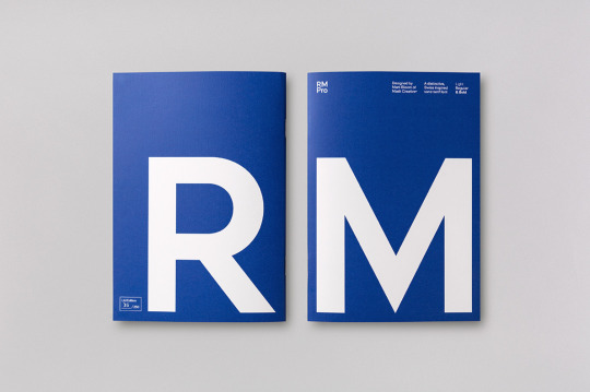
Because the name of this typeface is simply ‘RM’ I think it was a good choice to present the front and back covers of the book in this way. I will also be using blue and white for my typeface specimen book so it’s really nice to see these colours presented in a similar format.
This spread is very similar to a lot of other work I’ve seen but that’s probably because it’s just a really effective way of presenting the different weights in a typeface. I like how this one in particular uses both the alphabet and glyph forms as body text instead of just a paragraph or excerpt from something.
A really nice layout to display a single font. The placement of colour is well and angles is well thought out and I think overall this spread has a nice rhythm to it.
Type presented in a park subway system signage which immediately made me think of the work of Massimo Vignelli. This is something I haven’t seen a lot of in my type specimen research and I think it’s a great way of emphasising a typeface’s features and legibility.

Another great way of displaying the alphabet and glyph forms in a this typeface. There is almost a flush-left, ragged-right style due to the top and bottom lines falling short however it still has a nice balance. Again, the placement of each glyph is well thought out so that each one works in harmony to create an effective visual layout.
0 notes
Text
TYPEFACE RESEARCH
All content sourced from the IBM website.
IBM Plex
When we set out to create a typeface that was unmistakably IBM, our own history was our greatest source of inspiration. IBM has always served as a medium between mankind and machine. Between the natural and the engineered. The emotional and rational. The classic and the cutting-edge. Our most important job is to help humanity and technology move forward together. IBM Plex® brings these relationships to life through letterforms.
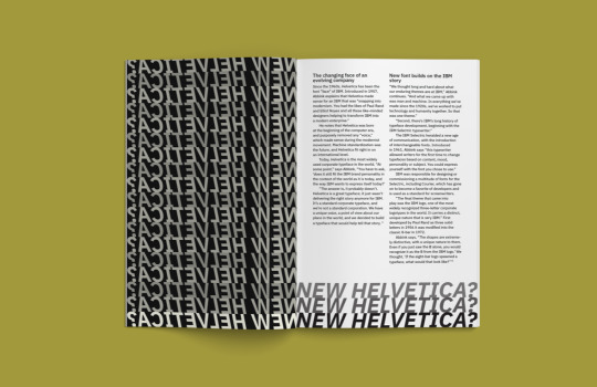
We needed Plex to be a distinctive, yet timeless workhorse—an alternative to Helvetica Neue for this new era. The Grotesque style was the perfect fit. Not only do these typefaces balance human and rational elements, the Grotesque style also came about during the Industrial Age (when IBM was born).

Plex and Helvetica: It’s easy to see the rationalized, horizontal terminals of Helvetica compared to the Grotesque-inspired, angled terminals of Plex.
As the new typeface for our diverse and global brand, Plex® is just as important as our name or our logo. It fine-tunes the tone of our words. It represents who we are and what we believe—as a company and as designers. Every decision was made with purpose; every detail has a reason for being. We created Plex as part of a system, and as part of our identity. Just like the other elements of our brand; just like mankind and machine; Plex and IBM are better together.

Each glyph in the entire Plex family has been TrueType hinted (i.e. optimized for on-screen legibility in small sizes).
Living up to our name—International Business Machines—meant thinking globally right from the start. Plex spans over one hundred languages from Arabic to Zulu with more still to come. IBM Plex non-Latin Scripts: Cyrillic, Greek, Arabic, Hebrew, Devanagari, Japanese, Korean (Hangul), Thai (Loopless) and Thai Looped.


With four subfamilies, eight weights, two styles (roman & italic), and 100 Languages, IBM Plex® can do just about anything you need it to. Just download, add to your font manager, activate and enjoy.

0 notes
Text
REFLECTION 3.0
This week we worked with InDesign and focused on paragraph styles and swatches to create more assets for our type specimen books. Carol also made some page plans available which indicate possible layouts for either a 16 or 24 page book. Because IBM Plex has such a large range of styles I will definitely aim for 24 pages. We also looked at some existing type specimen books and the elements in them which result in good design. A few things I learnt in class include how to use and edit tables in InDesign, what proof marks are, what a ‘slug’ is (extra space at the bottom of a document for a client to sign), and the difference between coated and uncoated Pantone colours.
Our last SDL task for this project is to reproduce the NZ Birth Certificate using our assigned typeface and the techniques we’ve learnt in class. I didn’t realise that the graphics/background used on these type of documents is to ensure they can’t be illegally photocopied. In preparation for our formative feedback session next week I will create and print 12 draft pages (6 sheets) for my type specimen book.
SDL 3.0 - Aotearoa NZBC task - Type specimen book research - 12 draft pages
0 notes
Text
PARAGRAPH STYLES EXERCISE
The second task in class was to edit an existing document using the paragraph styles feature specifically using rules above and below a paragraph or text. We also created a colour swatch with alternate tints. Both of these features are really helpful with creating consistency and hierarchy in a document. For this exercise I used IBM Plex Condensed in various sizes and weights.
I will definitely take advantage of the paragraph styles and swatches feature when creating my type specimen book. Something I would like to work on as a designer is my time management and work flow as I tend to produce things in a meticulous way so I think getting familiar with these tools will improve my speed of production.


0 notes
Text
GLYPH TABLE EXERCISE
The first task in class today was to create a table of glyphs specific to our assigned typeface using the tables feature. I used uppercase and lowercase letters, numbers, punctuation and various other forms. The second page features a single glyph which is the new sheqel sign or the currency sign of Israel. I like the concept of this design but if I do include it in my type specimen book I would add more type to strengthen the concept. This task was really helpful in understanding some of tools available in InDesign and I will continue using the software for this project.

0 notes
Text
MATARIKI EXERCISE
Sketches
After viewing the PDF file in the task folder, I sketched some ideas of how I might digitally work with the assets given. I knew I wanted to have a bold heading with Swiss Style body text and the crossword graphic would need to be incorporated somewhere.

English (UK) poster
I used IBM Plex Sans in regular, medium, bold and italic for this poster. I wanted a clean Swiss Style and so working with this specific font felt like the best choice within the IBM Plex typeface. I decided to use white and red in both posters as it creates consistency and references the tino rangatiratanga flag colours (sans black). It took some time to align everything and figure out which type treatments best suit which text but overall I’m happy with this design. If I had more time to complete this task I would look at experimenting with font, scale and rotation.

Māori Poster
I used IBM Plex Condensed in regular, medium, bold and italic for this poster. I decided to integrate more of an asymmetrical layout in this design and I think having the heading on a 90 degree angle creates more visual interest. Because I was working with a condensed style font I definitely had to consider the kerning and leading in the body text more so than in the previous design. If I had more time I would like to experiment with the crossword section in this poster.

0 notes