
Don't wanna be here? Send us removal request.
Statistics
We looked inside some of the posts by 2022-504-ollie and here's what we found interesting.
Average Info
Notes Per Post
0
Likes Per Post
0
Reblog Per Post
0
Reply Per Post
0
Time Between Posts
1 day
Number of Posts By Type
Text
17
Last Seen Tumblr Blogs


Fun Fact
Tumblr was named as a finalist in Lead411’s New York City Hot 125 in Aug 2010.
Text
Rational
I always saw Prompt as quite a fun and bubbly typeface in the heavier weights. I wanted that to be apparent in my animations, which is why one of my submissions shows a sort of narrative conversation between two people that develops over time. In contrast I also saw the typeface as professional, almost corporate level in the thinner weights which is why I used sudden changes to background footage inspired by clear cuts commonly seen in corporate videos or advertisements. I kept my blue despite my initial apprehensiveness starting project 2 as I didn’t want to loose roots with where my work has started (type specimen book). I always saw the blue as hopeful and positive, challenging the stigma blue faces in colour theory, which is similar to what Cadson Demak had set out to do when creating Prompt; to create a loopless typeface in the wake of many looped typeface’s success, and acceptance in Thai culture only for it to become identified as cool, trendy and modern. I developed my work to include the direct opposite colour to my blue, being a light orange, which I felt to be warm and also positive, keeping a sense of continuity despite such a drastic change of colour in my work. I always loved watching animations of objects getting larger in a linear fashion, I presented my interest with this style by quickly presenting the 18 different weights the typeface provides. I used peer feedback in my development of my Thailand asset to include the Thai flag to really nail the location to people that couldn’t make out the shape of the country.
I learnt how to tween content to create seemless movement between frames. And in one of my initial starting GIFs that I now abandoned, I had tested manual tweening to compare to the automatic one. I learnt how to use blending effects to make type blend into walls for extra realism. I learnt how to make individual objects rotate and move which I used frequently as a means of eye-candy in my work. I learnt the power of hierarchy in my body text, making certain aspects larger or more bold to make them pop or be the main aspect of that sequence. I learnt that using other languages in the work can make the piece feel more accepting by demonstrating words and sentances in Thai and in alot of cases, making Thai words the primary piece to pay respects to the designers.
0 notes
Text
Gif 2 resolution
The resolution of my second gif is more subtle in comparison to the other developments of my gif/videos. I increased the time the presentation of the weights are on screen, making them more legible and can be comprehended. The orange background used in my developments so far was added to this gif, presenting as soon as the weights presentation appears and sticking through till the end, where I used the outro sequence of my previous gif to give a sense of a design system within my gif work.

0 notes
Text
Gif 1 resolution
My resolution of gif 1 shows the word "COOL" enlarging, putting emphasis onto the word. I also included my newly found colour of light orange under my outro sequence, along with a small custom transition back to the start.

0 notes
Text
Another development of video 1
It was made apparent in my newly made video that my Thailand asset was easily misunderstood for the French flag since the type covered the asset, I therefore made the asset smaller allowing the type to be better legible, while the asset can be easier understood. I also took to opportunity to move it away from the edges to consider my margins.

0 notes
Text
Resolution video 2
My resolved video 2, contains the previous iteration of containing the orange colour to create a contrast about half way through the video, the orange background persists until the end of the video.
0 notes
Text
Development video 2
Feedback received in my week 11 class suggested that my frame in this section was quite close to the margins, looking somewhat unprofessional or even rushed. I returned to the scene to crunch it down slightly.

The new version feels less random and more intentional of where I want my work to sit.

In my last development of this scene, I took my orange colour (which was found from inverting the light blue, complimenting the blue) and used it overlayed via layer effects ontop of one of my downloaded Thailand aerial videos. Creating a warm looking effect when I present the moving text.

0 notes
Text
Developed video 1
My developed video includes my new colour which is the opposite of light blue (light orange) to contrast and compliment the blue that has been shown throughout my content to date. There is new content within the video, such as and introduction after prompt comes up, with the word "Ready?" in both Thai and English, with Thai being the word in bold and larger to represent the origins of the typeface and pay respects to the nationalities of the designers (Thai). Sharply moving into the next series of copywriting representing the simplicity of the typeface and then clearing the frame equally as simply before the fading in copywriting motivating the observer which the typeface itself accomplishes. The next series of events present my newly created Thailand asset by itself, as it represents itself with the copywriting stating it was made there shortly after. Other new content includes a small presentation of several Thai glyphs fading in around the static copywriting in the middle, eventually surrounding it before moving out of frame and the central copywriting fading into the background. The next frame further motivates the observer before falling in on itself into the frame in a circular motion before the final "goodbye" frame is presented, with the same theory of mannerisms and design layout as the introduction, giving a sense of a design system being used to a degree. The entire scene fades to black, allowing a seamless loop back to the starting dark frame of the blue clouds back at the beginning.
I liked the development of this video as it feels dedicated to motivation and positivity rather than blatantly presenting information, it feels fun and engaging while presenting said information and therefore feels better to represent my typeface compared to the concept.
0 notes
Text
Development of video 1
In my feedback session last week, it was suggested I play with different colours, in my context, I took my light blue and inversed it, the resulting colour was the opposite colour on the colour wheel, orange.
I also replaced some repeated content with new copywriting to better differentiate between my videos, this helps remove some stagnancy that was developing through some content.

0 notes
Text
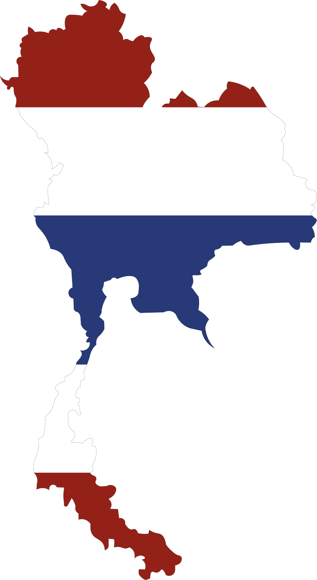
Developed Thailand asset
I took my original 1080x1080 Thailand lined asset and decided to add the flag to fill the inside of the asset. This is to further portray the country easier rather than a simple lined asset. Furthermore the asset is able to tell its own story of what it is without needing a description. Which could come very handy when developing my videos/gifs.
0 notes
Text
Formative gifs & videos

The attached gif is my first submission for the formative assessment. I used a panning left to right before bouncing tweening motion before being concealed. Then followed by a jumping text and diagonally moving left to right. The word loop-less increases in size before decreasing and revealing my name. The word cool then comes together from different angles and then a small sentence "trendy, bubbly & bold" are revealed slowly by a moving shape. The outro I kept simple until I reached the words "Thai type foundry" which uses a layer mask to present the country and give context to the words. The photo moves int he background keeping attention of the reader.

The attached gif is my second submission for the formative assessment. I wanted to present something that can be related to by everyone and therefore I chose to uses text messages as a way of exposition. The type is revealed before moving upwards, clearing space for the "reply". The word Prompt falls into place and my gif transitions into portraying the different weights of the typeface, increasingly getting faster and more extreme as time progresses. Ending with a simple, clear cut "by Cadson Demak".
The attached video is my third submission for the formative assessment. My video starts fading from black into a stock video that presents my typeface from left to right and then fading to transparency. Then suddenly changes into an ABC rapidly changing from tiny to massive over a very short period of time clearing the frame of any matter setting the scene for my next set of matter. The words "bold & bubbly" fall onto the screen with the word bubbly with a stroke layer to feel more bubbly then just a singular word. Then moving into a revealing text saying "Thai type foundry" with changing background footage of Thailand to go along with it. Finally, presenting the designers Cadson Demak before fading to black.
OD
0 notes
Text
B-roll footage
I elected to obtain some royalty-free background footage which can be used in my video timeline animations to add some depth too it.
All content is provided and endorsed by www.pexels.com with their legality disclaimer linked here; https://www.pexels.com/license/
Downloaded videos include;
Multi-Colored Vapor by Engin Akyurt
Thailand's Beauty Of Nature And Travel Destinations by RICHARD ELLIS
Thailand's Beautiful Nature by RICHARD ELLIS
Drone Footage of Maya Bay in Thailand by Sutee Panyarat
0 notes
Text
My third gif
My third gif employs a range of different technical skills I have developed over time, which includes tweening however also the mechanical handmade style of animation for certain parts of the animation. I wanted to present the gif in a style that seems most fitting for it; a lighthearted conversation.
I had to use different timings on different parts such as when the final message becomes clear in the text bubbles so it is legible before moving to the next frame. Also when I present the different weights I wanted to show build up overtime where the frames become quicker and more erratic as the time progresses, showing a sense of fun and chaos which I believe this font is really well at doing.
Before concluding on a simplistic, minimal ending noting the creators. I thoroughly enjoyed creating this gif and fully intend to use it in my formative assessment creeping up in the coming week (11).
OD.

0 notes
Text
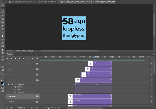
A snapshot of work being created
This image was taken during the halfway point of my second video animation being created. I had just finished a small section presenting the 58 Thai glyphs.
0 notes
Text
Week 10 lab:
The following video is my combined work from the week 10 lab work. I used a series of different transitions such as fading and reveals through the use of keyframes and masks. I enjoyed using videos to fill my text and the use of the videos as b-roll footage added a layer of complexity to my work I'd like to use in the future.
OD.
0 notes
Text
Week 10 class notes:
In class today we will be looking at different kinds of transitions and introducing imagery into our content.
Context: Surrounding, setting, background, frames of references, relationship.
Designers need to consider the screen real estate when planning transitions. The text will cycle through one, two, three or more transformations and come to a rest.

Designers will primarily use animation in three ways;
To indicate a state change
To add emphasis
To reveal extra information
A state change shows that an object has changed state into another form/colour/object
Emphasis animations are used ti draw attention to specific information or an action.
Reveal are used to hide/reveal extra information, being hidden to the side, a drop down, wide or popover.
0 notes
Text
Week 9; Gifs over the break
I wanted to experiment and develop my understanding of motion graphics by comparing the tweening of frames automatically vs hand done. I am keeping the consistency of my colour theory going as to follow my design system, however I would be open to experimenting with slightly different gradients in the future to better represent my typeface.

My first gif is more infographic, presenting the weights Prompt provides, the creator and the country the creator is from (Thailand). The opening type shows the name of the typeface fading in, which was achieved through multiple layers and the opacity settings. I have since learnt with the tweening tool this can be automated however as I will mention in my next section, this was kept as apart of my experimentation. The movement of all type in this gif is handmade which is why I can see some irregularities with the positioning of movement in frames, however, that very error is why I think it looks quite playful on a thicker weight, almost looking bubbly. Attached at the end are several keywords I could use to describe Prompt.

My second gif is more abstract. Much of the tweening is automatic and feels more professional, almost corporate. The sizing movements of "prompt", "loopless" and"Ollie" was done by hand however as I couldn't get the tweening to work correctly. The individual movement of the letters to form the word "cool" was done over 23 frames for a total of 120 frames. This section was done to experiment with multiple moving parts to form one cohesive unit. It was also done in preparation for a third gif which relies on my ability on individual moving parts. Overall my ability to use the tweening tool/skill both reliant on automation and manually has advanced dramatically compared to my first round of creating gifs. I have discovered that there is a time and place for both dependant on the parameters on what the designer is trying to achieve, for example; trying to create a bubbly, fun, nonchalant kinetic type? handmade would be a great way to present that type as the slight errors done in movement add to that unrefined final movement once saved. While trying to create a rigid path the type can move on feels more corporate, professional.
OD.
0 notes