Don't wanna be here? Send us removal request.
Text
Final Compositions
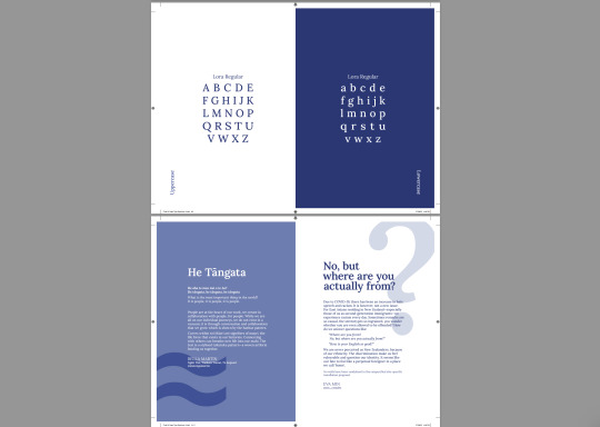
My final compositions consisted of 28 pages that I believe visualised the Lora typeface and its relevant information well. I wanted to include an article on type as well as information on the designers and the typefaces origin. I researched into Cyrillic script languages to demonstrate these. I believe the colours were well contrasted and relevant to the typeface. I displayed all of the type distortions and styles/ weights and uses through the 28 pages.




0 notes
Text
Week 5 Iteration

Here is my first iteration of my designs. I began to refine and remove pages I felt did not suit and experimented with new layouts and ways of showing type. I attempted to add contrast by using some pages with lots of small text and some pages with a little amount of larger text, as well as exploring the use of white space to keep the reader engaged. I used contrast in the form of colours as well, with some pages having white text on a blue background and vice versa. I also tried to start incorporating more tints of my colour and utilising tools such as transparency and repetition to create more interesting designs. From here I needed to continue drawing sketches and digitising them as well as refining the smaller details of my publication. I also needed to do some research into language and the Cyrillic script.
0 notes
Text
Spreads Iteration

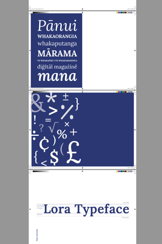

Here are my initial spreads from my formative assessment. I think the most prominent learning I have understood are about how a typeface works and the anatomy of type. Also how important hierarchy is and the use of aspects such as kerning, leading, line spacing, etc. To make one typeface look interesting and aesthetically pleasing without using a secondary one. With my type specimen booklet, I would like to incorporate the use of grids more and utilise the different font weights and colour transparency more. I also need to add text to unfinished pages 2 and 22-23.
I would also like to change the Maori text page to a differing page with more text, as I would like to include more paragraphs in the Lora typeface. The page with the ‘j’ and ‘s’ also needs to b e changed to highlight details or to include these details in the type analysis pages. I also would like to alter the font weight pages to include more information or combine them into one. The blue background on the alphabet page needs to be extended to match the left page. My type anatomy page needs to include more details of type and I would like to highlight the interesting serifs on the Lora typeface. My feedback from my formative has also said to make the line weights smaller so I have done this for my next iteration. I do like my covers and introduction page (but need to add my quote) and they just need some tweaking to refine the spacing.
0 notes
Text
Initial Sketches
Here are my initial publication planning sketches. I found that sketching out my ideas quickly was beneficial in the production of my digital designs. It made the process faster and more clear and I was able to remember all my different ideas to combine, rearrange and refine into final compositions. I explored several different options which I tried in InDesign and if they did not work I would draw more sketches to try.


0 notes
Text
Typography Quotes & Body Text
“When typography is on point, words become images.” ― Shawn Lukas
https://www.goodreads.com/quotes/tag/typography#:~:text=%E2%80%9CTypography%20is%20the%20craft%20of,with%20a%20durable%20visual%20form.%E2%80%9D&text=%E2%80%9CIn%20a%20badly%20designed%20book,and%20mutton%20on%20the%20page.
“Form and function together create typographic excellence.”
― R. Roger Remington.
https://kidadl.com/quotes/typography-quotes-all-graphic-designers-need-to-read
https://www.frontify.com/en/blog/7-designers-share-their-favorite-fonts/
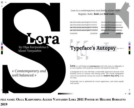
Alexei Vanyashin (*1982) is a Russian graphic and typeface designer, and educator. He researches and writes on the history of Cyrillic. Collaborates and consults for foundries on Cyrillic.
https://www.behance.net/110design
Designer of the Latin/Cyrillic very humanist Private Sans (2010, +Bold) while she was a student at the British Higher School of Art and Design in Moscow. In 2011, she published the free contemporary serif face Lora and Vidaloka (a didone done with Alexei Vanyashin) with Cyreal.
http://luc.devroye.org/fonts-54845.html
Glyph definition: https://www.merriam-webster.com/dictionary/glyph
Lora font (potential introduction): https://hipfonts.com/lora-font/
https://www.fontsquirrel.com/fonts/lora
Olga Karpushina info: http://www.identifont.com/show?2VTL
https://www.behance.net/olyakukhto
0 notes
Text
Updated Colour Palette
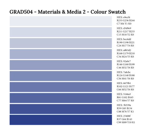
Here is my updated colour palette. Similar to my initial one, however, I wanted to add in more of a purple tint to speak on the hint of femininity that the Lora typeface encompasses. I created tints of this colour 10-90%.
0 notes
Text
Typeface Specimen Inspiration
The following publications are excellent examples of compositions that have striking and powerful elements. They keep the reader engaged by providing balance between information and white space. They use strong colours and interesting type distortions, as well as, contrast for visual interest. I would like to focus on these elements of contrast and balance, as well as, exploring how I can use some of the elements in the following pages to inform my own designs.

The f


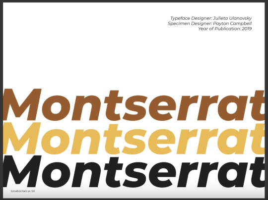
Montserrat Typeface Specimen - Payton Campbell
https://issuu.com/pkcampbell/docs/vis_317_typeface_specimen_pages


Mrs Eaves Type Specimen Book, dmarianovsky
https://issuu.com/dmarianovsky/docs/mrs_april_1__2017

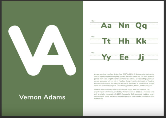


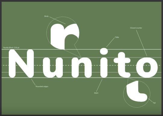
504 - Type Specimen Sample, Alyssa Goh
https://issuu.com/kwilczyn/docs/alyssagohnunitotypespecimen_readersingles


Alexis Reid | Type Specimen Book, Alexis Reid
https://issuu.com/alexisreid2/docs/alexis_reid___type_specimen_book


Playfair Display Type Specimen, lauracangle
https://issuu.com/lauracangle/docs/speciman_pages
0 notes
Text
Colour Swatch

I ended up choosing a blue colour palette as Lora is a modern, contemporary, futuristic typeface and blue is representative of the future.
0 notes
Text
27th Letter

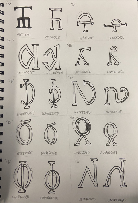
27th letter ‘kr’ sound
After exploring different ways that shapes such as circles, triangles and rectangles can be put together to create a new letter, here are the forms I created. Adding a serif to the ends to match with the Lora typeface also. I ended up choosing the third design to develop.
0 notes
Text
Lora Typeface Initial Research
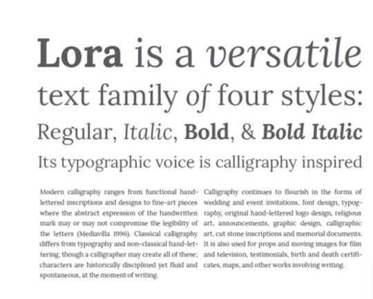
Lora is a well-balanced contemporary serif with roots in calligraphy. It is a text typeface with moderate contrast well suited for body text. A paragraph set in Lora will make a memorable appearance because of its brushed curves in contrast with driving serifs. The overall typographic voice of Lora perfectly conveys the mood of a modern-day story, or an art essay. Technically Lora is optimised for screen appearance, and works equally well in print.
Source:https://www.fontsquirrel.com/fonts/lora#:~:text=Font%20Information,in%20contrast%20with%20driving%20serifs.
Designed by Olga Karpushina and Alexei Vanyashing, this font was a part of the fonts released through Cyreal fonts, a collaboration between the two designers that has produced many good fonts.
Source: https://www.designyourway.net/blog/typography/lora-font-pairing/
0 notes
Photo


Week 3 Class Task
This task explored paragraph styles in more depth. I learnt about how to add rules which I did not know before. I would like to continue altering these layouts to add into my final publication. I began to introduce my colour palette in here. I notice a big difference between the styled paragraphs and plain paragraphs in reading ease and visual interest.
0 notes
Photo

NZ Birth Certificate Task Week 3
I found this task challenging as it was difficult to fit all of the text onto one small page, however, it taught me how I can position text in unique ways such as next to each other horizontally, and use different character formatting techniques such as size, kerning, etc to make much more text fit onto a page neatly than I thought would.
0 notes
Text
In Class Grid Task Week 3
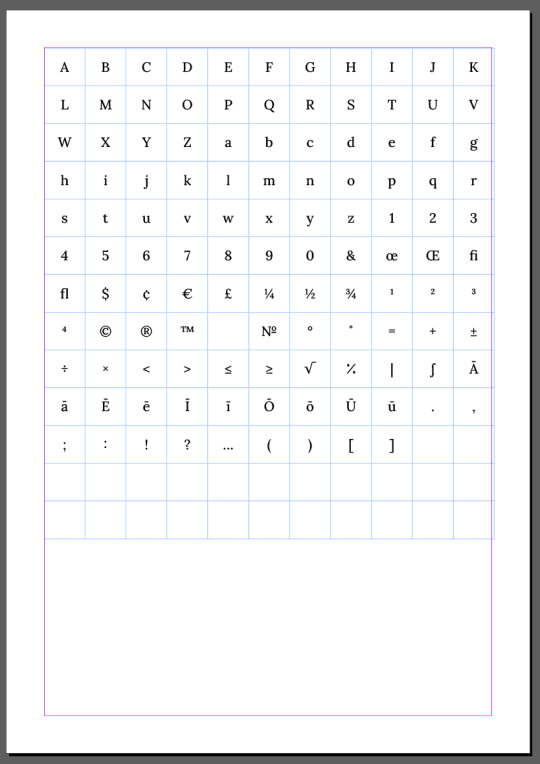
I found this grids in-class task very beneficial and I would like to use this tool in my final design. I did not know how to create a grid with even spacing, as previously I would use a text box and position separate text boxes or use ‘spaces’ in between giving an uneven and messy finish. I would like to further explore how grids can be used in different ways.
0 notes
Text
SDL Spreads Week 2


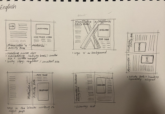
In this task I found that pre-planning and sketching out my work was very beneficial in creating a better final layout. I took 2 of the 10 sketches and turned them into final digital designs. I like the look of the contrasting, strong colours. This further developed my skills in using character and paragraph styles, such as different weights and leading.
0 notes
Text
Lora Monograms Week 1 Task

Initial explorations of my typeface and what it looks like in each weight and style. I also created 4 monograms to see what the text would look like as distorted and manipulated type for future spreads.
0 notes
Text
Kia Ora Week 1 Task

I really enjoyed this task and I would like to explore using it more in the future. Using the shapes to create words was very interesting to me and is a technique I haven’t used before, as well as, learning how to cut the circle to give 4 different shapes.
0 notes
Text
He Muka Task

In this task I have better learnt to use the character and paragraph style tools and options to create a contrasting layout that is easier to read.
0 notes