
Don't wanna be here? Send us removal request.
Statistics
We looked inside some of the posts by 2022504sem2ahnesshim and here's what we found interesting.
Average Info
Notes Per Post
4
Likes Per Post
0
Reblog Per Post
4
Reply Per Post
0
Time Between Posts
3 days
Number of Posts By Type
Text
17
Last Seen Tumblr Blogs


Fun Fact
Tumblr has a 66 index score for customer satisfaction in the US.
Text
Gif animation #5

*Tumblr upload different to actual gif*
When I upload it to Tumblr a few frames from the number section repeats itself, however when I view it on the web after exporting as a gif.
This is the digitalised version of my draft sketch of gif animation #5 that I previously uploaded on Tumblr (can be viewed in post). In my draft you can see that I originally thought to create little boxes for the close up of the serif’s of the typeface, however, as I was digitalising the gif, I wanted to keep everything quite simple, therefore, I changed it slightly.
0 notes
Text
Gif animation #4

This is the digitalised version of the storyboard I drew up as a draft - a guide that was helpful in creating my gif animation
0 notes
Text
Gif animation: more drafting


I sketched up some mor drafts of storyboards in how my gif animation would and could look like ( may slightly alter it as I digitally make the gif). Reflecting upon the previous gif animations I made, there were a few parts I wanted to improve and make further changes as well as to add more elements in which I thought was needed.
0 notes
Text
WK9: Video animation
I found the tutorials on canvas very useful. It was quite clear on how to animate using the video animation. Although it was quite difficult to create a video animation, compared to the way I was used to - the frame by frame animation, the tutorials were able to help me and the YouTube videos that was linked on the course resources.
0 notes
Text
WK8: Gif Animation version 2/draft 2

Although, there were sketched drafts, some I followed, but as I was making the gif I made some more changes and added some as well. Although it is not perfect animatic gif, this is a rough idea of how I want my gif animation to look like. There are some frames or “tweens” that could be improved but I can further finalise and improve it in my final one.
0 notes
Text
WK8: Animation Version 1/Draft 1

Although it is not a perfect gif, I wanted to explore the range of techniques that we learnt from in our lectures. I do like the more slow paced, as I thought that it suited more well to my typeface than the frame rate being too fast.
0 notes


Text
Lecture: 19/09/22
Scale

Opacity

Appear/fall in

Numbers

This lesson was really helpful, as I learnt lot’s of tricks and tips as well as shortcuts and easier ways in making these gifs, such as “tweeting”. These techniques will be very well used in my gif making.
1 note
·
View note
Text
Holiday Work:504 2D Typeface Animate

Version 2: Frame rate is slightly differently on the last few frames

2 notes
·
View notes
Text
WK 7: In class Animatic Gif Exercise
Lecture:
We learnt about the frame rates and how important it is in delivering the “subject”. For example you may have a very elegant typeface, you would not want the animatic to be jagged or laggy but rather deliver it smooth.
I saw the difference the frame rates per second made - the more frames the more smooth but the less frames the more jagged and lagged the animatic becomes.

This was the first animatic gif that we were taught how to make in class. This gif required more listening and more instructions, however the tutorial was quite fast so there were many things I was not able to catch, but I got there at the end :)

This animatic gif was much easier to make than the first one, but to make this you have to make sure that with every letter there is a duplicated background and have to merge the layers “COMMAND E”, for this gif to work.
1 note
·
View note
Text
Languages Page
First Iteration

I thought the lines between the texts were too thick, and this especially was exphasized because all my other pages were of 0.5 (the lines)
Second Iteration
I designed this across the two pages as one spread, however, I received feedback that this page did not really fit in with all other pages, therefore, I did not use this design.
Third Iteration


These two pages, I designed so that the Maori pages fit with the other Maori page, however, design -wise I thought these two pages did not suit eachother very well as one page seemed very minimal and the other quite bold.
Final

This is my final design. I thought it would be good to show the contrat of english and both Maori as these languages are the two important languages spoken in NZ. The design also remains quite constant and therefore, correlates with one another.
0 notes
Text
Other Pages (did not use in typebook)
First Iteration

Second Iteration

Third Iteration

Fourth Iteration

Fifth Iteration
These pages were apart of my typebook, however, I thought this was not effectie at all ad rather looked like another quotes pages. Therefore, I did not put this page in my type booklet.
0 notes
Text
Reference Page:
First Iteration

This Thai Glyph is the same or similar as the Cadson Demak logo that they have, therefore I chose to use this Thai Glyph in my reference page.
Final
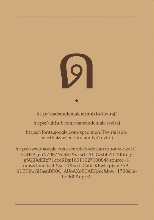
I decided that it need some division, therefore instead of the line I used the diamond symbol again, to create a sort of division.
0 notes
Text
Back cover
First iteration

I wanted my back cover to carry on the same features from the front cover, therefore you can see the resemblance of the frontcover on the backcover design.
Second Iteration

I thought it would be a good idea to add in the typeface designers name on the backcover, Therefore I placed it on the bottom of the page rather than the center or the top as the heirachy would be quite wrong and would look strange, as you are coming tot he end of the booklet
Final

I also added in the diamond symbol I used in a few pages of my type specimen book.
0 notes
Text
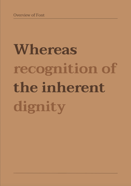
Initial Form
First Iteration

If you look carefully, the very top bar was not in line with the “T” and I thought the text could also be placed better
Final
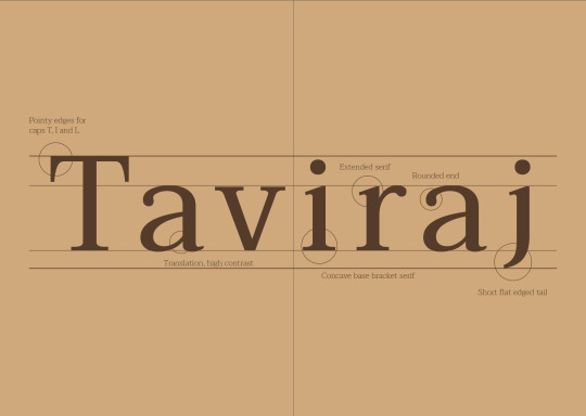
Although there was not much change from the first iteration apart from all the very small details, I still think it made a chnage as it looks more neat.
The reason why I chose to design it like this, across the two spreads was because when I researched about this typeface, they said they took special care into creating this typeface tso that the curves of the thai glyphs would be effective but still holding that elegance to the typeface design. Therefore I thought it was important to show the key features of this typeface, which is why I created this across the two spreads with the circles that highlight the curves, the serif and etc., of the typeface
0 notes
Text
Typebook Specimen: Languages Pages
First Iteration

I wanted to incoporate the two different tones, just to see how it would possibly look like.
Second Iteration

Just for pattern-wise, I thought it would be best if i did dark brown then a lighter brown and so on, which is why I changed the colours for this one.
Third Iteration

I thought having the two Thai text on it was quite unnecessary and served no purpose, but it was just distracting and disruptive, which is why I removed one of the thai texts.
Fourth Iteration

I thought it would be a good idea if I included the basics of the thai language such as basic characters, numbers and vowel marks
First iteration of second page

I quite liked the lighter tone of the brown as the text colour against the even lighter tone/shade of brown
Final
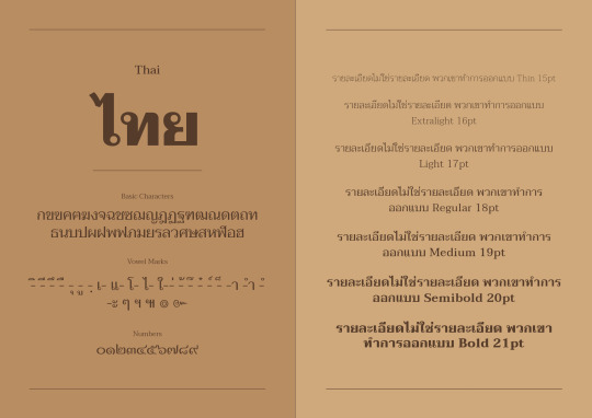
For the final, I thought it would be a good idea o actually place the text saying “basic characters, vowel marks and numbers” so that readers know what it is.
For the seond page I also positioned the text to be centered to the page, to continue to the flow within the spread.
0 notes
Text
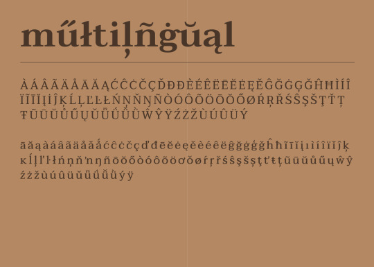
Typebook Specimen: Type Specimen
Analogue


Digital Draft
First iteration
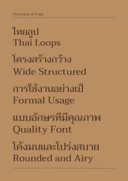
I wanted to display both thai and english as this typeface was inspired by thai latin serif type and specifically designed for the curvatures of thai glyphs.
Second Iteration
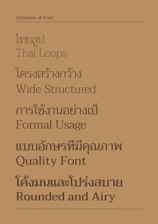
I displayed them from thin to thicker weights, instead of the same weight all the way through, to show the different qualities this typeface has.
Final

When I looked at my other pages of the typebook, I thought it would be best if this page was proportioned in the centre of the page instead of from the left.
0 notes