
Don't wanna be here? Send us removal request.
Statistics
We looked inside some of the posts by 2023-512hyunseo and here's what we found interesting.
Average Info
Notes Per Post
8
Likes Per Post
8
Reblog Per Post
0
Reply Per Post
0
Time Between Posts
7 days
Number of Posts By Type
Text
13
Last Seen Tumblr Blogs


Fun Fact
China blocked Tumblr because of pornography and censorship problems in 2013.
Text
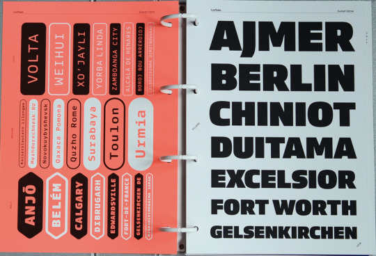
Redsign the type speciment booklet
The picture on the left (the first picture) is the design before modification and the picture on the right (the last picture) is the final design.

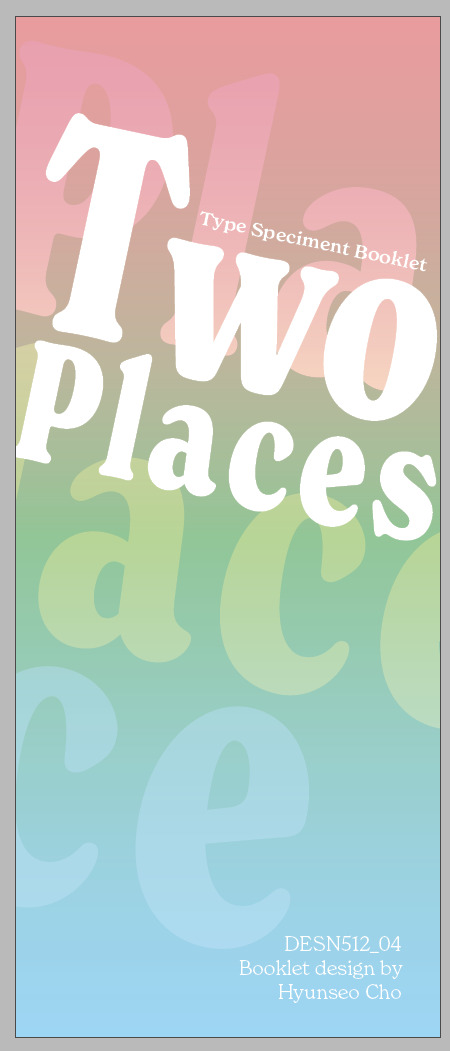
I gave it the name. The biggest feature of my Type Specimen booklet is that it shows two countries, cultures, and languages through pepeha, so I wanted to emphasise it, so I named it Two Places. I also moved the name I wrote on the back cover to the front cover.


The plain back cover was also changed to a gradient colour to match the front cover. The name of the booklet was placed up and down, and the bottom text was turned upside down to give it a look that looked like a reflection.


I wrote a whole page on the left about fonts and font designers, but I deleted them all and changed them to rationale. I wrote more about why I chose this font and what the connection is between the font and Pepeha. I also added more Korean text so that you can see and feel it yourself.


When I first designed it, I tried to create a beautiful design using various colours while showing the diversity of fonts. However, after I finished the design, I realised that the use of various colours, various fonts, and irregular arrangements made it less readable, and everything was bad.
To fix this problem, I thought I should add more brevity, so I used one font style and highlighted only the parts I wanted to emphasise with bold. I liked the box used in the previous design, so I brought it back.


I used words related to me that are not related to pepeha, so I changed them to words related to pepeha.


I tried using a grid to create a page that showed uppercase and lowercase letters, but the gap between the alphabets was too wide and the size of the letters was too small.
To fix this, I redesigned the grid and increased the size of the letters. The white background seems to interfere with the perfection, so I deleted it and added NZ and KO to the background instead. In the previous design, I used blue and green as the point colours, so I tried to give a point with blue and green lines, but it seemed more clear to use only pink and white, so I changed it to white. The unbalanced layout seems to reduce readability, so I switched to central alignment.


I like the design, but I wanted to change it because it looks ugly somewhere.
What I wanted to show on this page is the weight and type of font (nomal and condensed). Using this font, I wanted to show how the feeling was different when using short words and long words, but the space between the letters was narrow and there were too many words, so the screen became full and the design became frustrating.
I focused on showing one word, changed the background to monochromatic to make the contrast more clear, and added a line to add a design feel.


This is an attempt at a different design. I liked the modified design as shown in the picture above, but I tried a new design because it seemed a bit lacking.
This design emphasises the weight and condensed font, showing various weights on the left page and various weights in the condensed font on the right page.
This design was chosen as the final design because it better shows the fonts.


It is a page that shows how to feel when using fonts as body text.
The first design I made was one I made when I had no idea how to design it. It is not a pretty design for anyone to see, so I thought that I should revise it later while making it.
All previous texts have been erased and rewritten in relation to Pepeha. I used four types of weights while explaining the four places. In the lower left corner, I wrote down the source of the used article.


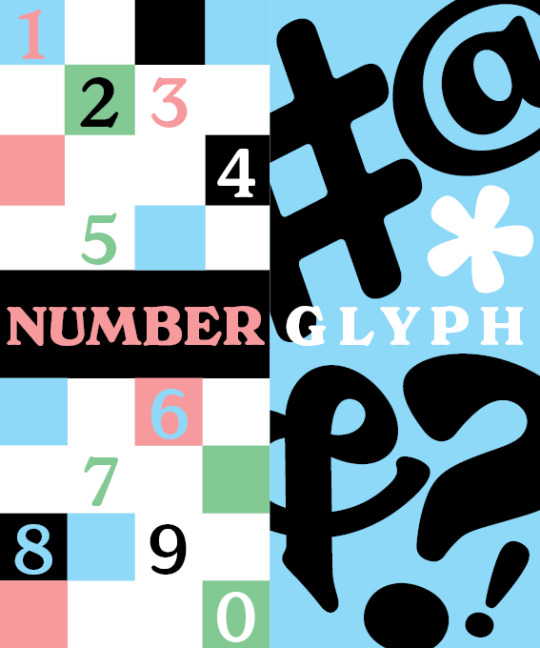
It is a page that shows numbers and glyphs.
I wanted to show numbers and glyphs in a design rather than simply listing them, as when showing the alphabet. Each page was made of numbers and glyphs, both of which seemed too complicated to look at because they were both highly designed, so I handed them two pages each.
On the number page, I used three colours I had set and black, but it seemed like too much colour, so I removed the black and used only the three colours I had chosen. The left page showed numbers from 0 to 9, and on the right page, two beautiful numbers were enlarged to emphasise the charm of the font.
The glyph page already shows well-designed glyphs and does not have to show all the glyphs, so I just added more margins to the left.
1 note
·
View note
Text
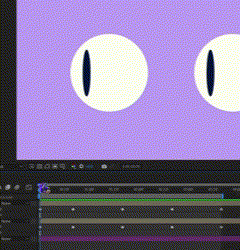
Kinetic Typo prosece 2


This scene is a close-up of the petal movement scene and zooming out, showing the tower and the lake. To make this a more dynamic scene, I used the 3D Layer feature in After Effects to give the camera movement.
However, the skill I used to create this scene was a skill I did not know well, so it was a simple scene, but I had a lot of trial and error in making it.


That's the video I planned for the storyboard. At the end, I added a scene showing the name of the video and my name for a short second. I can finish here, but I added some modifications and scenes.


I added a short animation and changed the direction of o to the right.


I increased the size of w and s to make it look like a capital letter.


After the scene introducing the lake, I added a line introducing my name. In this scene, I used the assets of the pepeha place that I showed earlier to mean that they constitute me.

As the name was reduced to the bottom left, I put a transition that naturally goes to the scene showing the credit at the end.
1 note
·
View note
Text
Kinetic Typo prosece 1


I got feedback to start with pepeha without 'Kinetic Typography'. but I like this animation work, so maybe I can use this animation with other text.


I realized that if the background was blre, it would overlap with the color of the next scene, so I ichanged the color to pink.


This is the first animation I completed, but I felt it was not enough to feel like floating in the water, so I added wave and position animation.


1 note
·
View note
Text
WK9 Premiere Pro prectise
This week we learned briefly how to use Premier Pro.
Premiere Pro is a video editing program like After Effects, but the use of both is slightly different.
In the case of after effects, it is used to effect the video itself or to create an animation, and In the case of Premiere Pro, it is used to edit multiple video files.
It is possible to edit the Premiere Pro and After Effect files directly by linking them together. For example, if I want to put a glitch effect on an A-cut video in Premiere Pro, select A-cut and click 'Replace With After Effects Composition' to open the after effect and edit the video. The edited video can be found directly on the Premier Pro. Video files edited in linking with After Effects can be recognized by turning red.

1 note
·
View note
Text
WK8 After Effect practise
This week's lecture learned the basics of making animations using After Effects.
The way to make animation in AE is to use keyframes. If entering a specific value (position, size, rotation, etc.) in the desired frame, the value between the two key frames is automatically set and animation is created.
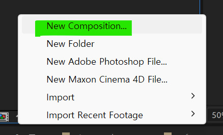
Compositions are good for creating assets. When createing an animation, the screen becomes more busy as the layers increase. If createing a new composition and create an animation in to that composition, I can clean up the layers and bring same animation images.
1 note
·
View note
Text
WK7 kinetic type storyboard


format: MP4, 1920*1080px, 10~30sec
It is a kinetic type video storyboard based on pepeha. I thought of a kinetic video that also features a picture that matches the text, but I don't feel like emphasizing text motion, so I'm wondering if I should make a new content.
The reason for these results seems to have been influenced by the memory of watching videos that made song lyrics into kinetic typo videos in the past.
Starcover-Event Horizon
Patexum-Boong-Boong
leekum-Dinosaur
So I looked up kinetic typography videos that didn't show the lyrics of the song.
CV VIDÉO - VICTOR VICHERY
Flowup Brand Identity Release: Rebranding 2018
Typography Intro - Modern Urban Opener for After Effects 2021
What I felt while watching these videos is that it is possible to express the feeling of the image only with text, and the effect of music is also great. Directing is important, but the sense of rhythm is also important.
With this in mind, it would be good to make a new content or modify the current content to make a video that fits the kineti type more.
1 note
·
View note
Text
WK 5, 6 make and print booklet


These are my digitally completed booklet pages.
First of all, I set 3 colors that will be the base color, and then I made a cover that determines and shows what design and atmosphere my bookmarklet will have.
Based on the sketch, the text was placed first without color. After that, the size and spacing between the texts were adjusted. Adding colors was done at the very last stage because it looks too complicated and won't focus on the font if I make it while thinking about decorating from the beginning.
After all the text was properly arranged, I fill the background color. If the background is unified into one color, the page is not distinguished, and it is not good to separate or emphasize the page, so I changed the background colors do not overlap.
For words written in text, I tried to use words that were related to the thema as much as possible.
On the page showing the alphabet, upper case letters are colored in 'Korea' and lower case letters are colored in 'New Zealnd'.
-----
When printed for hand-in, the size of the page is A4, but it was printed on A3 paper. I didn't understand why I should do that, but in the process of binding, it was for to uniformly size both sides, top, and bottom of all the pages.
Another PDF file with guidelines was created, which was needed to check whether the pages printed on both sides were in contact with each other or whether one side was pushed aside. Based on the circular mark, it was possible to check how much error there was and whether the corners were in contact with each other.
1 note
·
View note
Text
WK4 booklet plan

This is my type specimen booklet sketches. I'm planning making 16 page. Some pages may change the order.
What I thought while sketching is what concept I'm going to show the font. I wanted to make a booklet that shows a lot of fonts without much decorative elements. I sketched with the idea of showing the font in as many ways as possible.
How to express my big theme(pepega) is important, but I wanted to design and express it to match the name New Spirit.
0 notes
Text
WK3 type specimen showcase layout reserch
I didn't know what layout to make the type specification book, so I looked into other people's works. The images I've just researched focused on how to layout the showcase rather than the layout of the entire book. Instead of a showcase that ends by showing the shape of a font, I looked for a way to layout/design with information so that I can know the characteristics or use of the font just by looking.
https://vllg.com/products/type-specimen-folio


2. https://teachingresource.aiga.org/project/type-specimen-book-2/


3. https://www.behance.net/gallery/60082075/Dalloway-Type-Specimen?tracking_source=search_projects%7Ctype+specimen+book


0 notes


Text
WK1 Moodboard

I put images of mountains, rivers, lakes, seas, and flags on my moodboard. A large image represents a place, and a small circular picture tried to include a texture image. The symbolic objects of each place were added to the edges.
0 notes
Text
WK1 Typeface
Arbotek

2. P22 Mackinac

3. New Spirit

When I found the first font, I liked the various thicknesses and block-like shapes, but I found a new font because I felt that it didn't match when I put text on the moodboard. I liked the second font, but it didn't fit because I felt a strong serif feeling. The third font is a suitable font with a moderate block feeling and a serif feeling, so I decided to use it.
0 notes
Text
WK1 Pepeha
Hi, I'm Hyunseo. I was born in Auckland, New Zealand but I moved Korea when I was at 3 and I feel Korea is more my home so I write my place in korea.
I was born in New Zealand but I want to say I'm from Korea. The mountain is Namhan. The river is Hangang/Han river. The lake is Seokchon. the sea is West sea.

1 note
·
View note