
Statistics
We looked inside some of the posts by 2023-512rubymatthews and here's what we found interesting.
Average Info
Notes Per Post
2
Likes Per Post
2
Reblog Per Post
0
Reply Per Post
0
Time Between Posts
21 hours
Number of Posts By Type
Text
17
Last Seen Tumblr Blogs


Fun Fact
Users from the US are the majority of Tumblr visitors.
Text
Final type specimen book


On the right are the front page and back page together as one spread for the purpose of this post, to show all my pages.
I noticed when I exported my pages into jpegs for this post, that the images came out slightly blueish, like when I exported them into a pdf for my formative submission also but they became brown-tinged. I researched and found it might have been an issue with my RGB color swatches. I followed this article tutorial and it seemed to fix it, my images on pages 10 and 11 are the right tone of B/W as in InDesign.
edit with latest version
0 notes
Text
Sound
I would have loved to use organic sound recorded from my house of the birds and rustling trees in the wind but I couldn't get a sound I was satisfied with as there were always abrupt wind noises on the mic. So, I downloaded a sound from epidemic sound.com called wind leaves sound 1 with a peaceful rustling of wind sound and made it for the length of my 30-second video but fading in and out and the start and end. Although I wasn't happy with the original sound of the recorded videos, I included some bird noises too, so at least a little is authentic to the natural sounds of my whenua.
I'm debating whether I add more bird noises.
0 notes
Text
Final kinetic type animation
In the end, I ended up going with the green background as I thought it made the word Howick pop the most at the beginning instead of black, even though I did like how the black looked against the green video showing through in frames two and three. But, the green was a new and fresher look that I aesthetically liked better.
(add onto this)
1 note
·
View note
Text
Rendering issue

My video should render with this color as the solid background and after following these instructions it's still not correcting itself, I'm unsure how to fix it and If I should just leave the final black.
If I'm not able to have the green, ill adjust the brightness/contrast effect of the text in my saved after-effects file so it shows up nicely against the black, as I've had to do with the green background.
Some websites state there's a processing error with apps such as QuickTime player, and not the video itself.
0 notes
Text
Week 12
This week we used our class time to focus on completing our kinetic type, editing type specimen booklets and updating tumblr blogs. I mainly used this time to work on my animation and ask for some help from david on some key after effects tools like
I considered the idea for my second and third frames, turangawaewae and the Maori proverb, the words being scattered/blown away by the 'wind' to add to the atmosphere and sound I've created for my animatic. the only research I can find surrounding this are tutorials for effects like sand dispersing which is not the effect I was going for, neither is it my priority to apply this effect so I think its best I focus on my animation as a whole without this first considering how soon the deadline is/priorities. if i. decide afterward it is something id still like to include I can always revisit it.
I asked David for help with the opening frame of my kinetic type as I couldn't find out how to begin with, that letter w with no other letters showing and zoom out with adjusted kerning to display the word Howick layered over my video. he walked me through the transform tools of position and tracking to achieve the outcome I wanted as well as a helpful effect called 'easy ease' which is basically an option to help smoothen the transition and movement of the word when zoomed out. for my turangawaewae frame and Maori proverb frame, I was also stuck with getting the word 'stand' to stay on screen after the rest had faded and was told I need to add another layer with just that word, position it on top of the same word in the text and fade that layer out separately. I also want to struggle with fading in and out different text boxes at different times as well as their transparency which is achieved basically the same way but with opacity levels. I was able to adjust these and am happy with the result.
My current kinetic type altogether and an outline of the key things that need to be fixed before submission:
I'm currently having an issue with the background color, as it's light green in aftereffects but when I import to the media encoder to render video it's black. I will research how to fix this.
shorten the 'turangawaewae' frame, too long.
potentially add an ending credits frame.
fix the horizontal blur issue on the 'H' of Howick.
Substitute current sound with a less disrupted track (copyright-free sound).
0 notes
Text
Type specimen booklet - summative
This past week I've been editing the layout and content of my type booklet in order to help it connect better with my kinetic type animation while also reviewing the feedback from my formative and in general the things I've learned post submitting it in week 6.
Some key changes I made were turning off hyphenation for all my body texts/paragraphs so that it's more pleasant to read and aesthetically/functionally more professional to the eye. I've also downsized a lot of the words and texts to go for an even more minimal and sleek look with that extra bit of negative space created.
This page I felt was quite crowded with text and I knew I wanted to change the 'Howick' to look less like a logo. below shoes a side to side comparison between the changed spread, smaller body text, less crammed words, kerning adjustment for 'howick', and I've changed the maori proverb to one that connects better to my overal theme and kinetic type.
For this spread, I've done away with the two column grid style, as it was advised to me its easier for the eye to read along a longer text line that way, swell as no hyphenation anymore. I've made the text smaller which I think gives it more sleek minimalistic look. (11pt)
For all pages, I've also made the page title and drop folio at the bottom smaller (12pt to 11pt) and the line underneath thinner (1pt to 0.5pt)
I'm noticing there is a slight discoloration between my exported pdf from the formative and the InDesign document, I'll see if this is an issue from incorrect color swatches - as it also happened with my photographs.
I changed the layout for my turangawaewae page to reflect the meaning of turangawaewae more effectively and strengthen the visual connection to my kinetic type.
in the next few blogs posts I'll display my final type book
0 notes
Text
Refreshed reminder of the visual and transitional frames of my type animation (developed).
Building on week 7 SDL
Key frames:
Fade into a frame with 'W' letter
Zoom out to word 'HOWICK'/'Howick'
Sentence above appears to introduce Howick's relevance to me (E noho ana ahau I)
Fades away, next frame with different video (new angle)
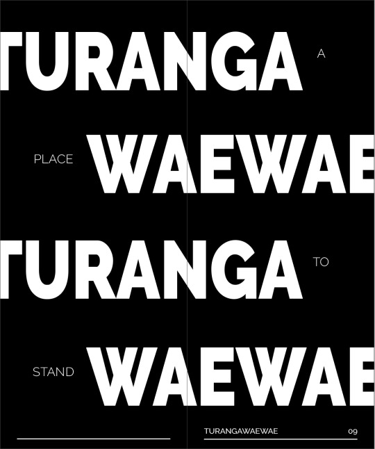
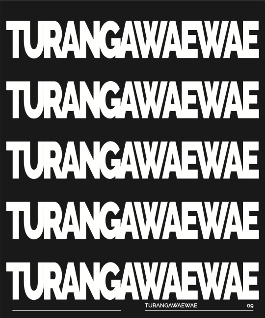
Tūrangawaewae/whenua fades in
What it represents + a place to 'stand'
Words fade away with the word 'stand' fading last
Maori proverb and my rendition
End credits
Remember to include different angles in frames, 3 video frames not longer than 9 seconds each.
Alternative: One tree hill and take video of the trees/trunks there + roots, broaden place to Tamaki Makaurau.
Focus on nature, trees, roots, where I grew up, how has my whenua/place/environment shaped my identity?
Storyboard visual:

0 notes
Text
Text in animation
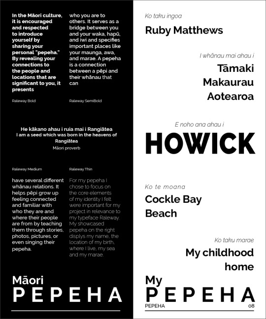
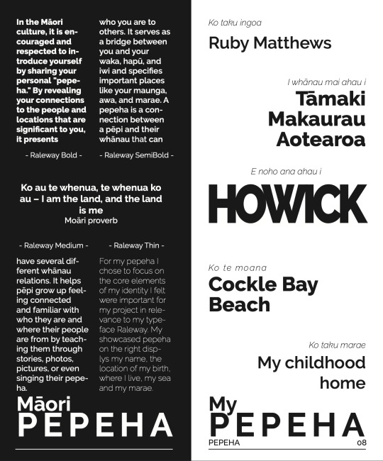
Turangawaewae - 'A place to stand', often our marae. A place where we feel "empowered and connected. they are our foundation, our place in the world, our home".
Maori proverb - He kākano ahau i ruia mai i Rangiātea


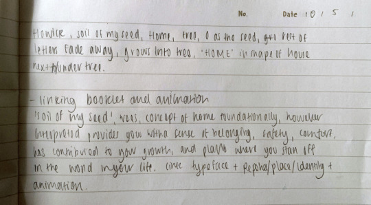
I really resonate with where it says 'today we move around so easily, living throughout Aotearoa and the world consequently, and because we've spread, it is encouraged to reconnect with your home environment and place in hope of developing and recharging a sense of 'unity and belonging', deepening and embracing your connection to your family and the comfort a special whenua provides' is how I interpreted that explanation. I think the proverb is really beautiful in meaning and relates well to my theme of the importance and influence of whenua, reiterated in 'the proverb tells the story of taking root, developing, growing, and blossoming in the place you belong/come from'.
'The legacy of tupuna' refers to the mark and stories left by our ancestors and their ties to the land, which I unfortunatly can't relate to seeing that my heritage in made of many backgrounds. Although, this does help me feel more individually connected in a way to Tamaki Makaurau Aotearoa as it is a place I am familiar with/know.
I'm torn between using 'Howick' or 'Tamaki makaurau' in the beginning and focus of my type animation as I'd like to do Auckland as a whole but I'd like to feature the letter 'W' as it was quite the centre piece of my type booklet and I know that would support the connection between the two, and therefore the end result/hand in overall.
0 notes
Text
Colour/s
Introducing colour/tint as a single tone (neutral dark brown)
I am considering having my animation in brown tints instead of black and white, in fear that the grey shades will give it a more dated or historic feel than what I'm going for. Brown will also go nicely with my written and visual emphasis on earthy and organic elements and pepeha connotations, as the Maori culture cherishes the land/ earth of Aotearoa greatly. And the video through the transparent text tinted a lighter shade of brown too to create a subtle balance but still have separation of the text and background. I also thought about having the video tinted green, with the brown solid background but I'm not sure if that would look too disconnected or not boldify the text enough.
(I will try this out and update/post experiments here)

Testing/animation experiments:
Overlay of transparent text with video and Gaussian blur effect:
I am happy with this snippet except for the fact that I wish there was more wind and more movement in the leaves. I might rerecord this on a windier day so the type can appear more animated.
0 notes
Text
Brief specifications reflections
It was stressed to our class that It was important for our formative and now our summative, that the brief and its guidance and instructions are there for a reason and should always be revisited to make sure you and your work are aligning/supporting the communicated end goal and purpose. Even if I've already begun working towards a finished product it is good to reflect on the key things needed for this summative so I checked out the brief again and reminded myself of the aims:
Must communicate your story/message using appropriate typography creations using your own content and adapted type forms
Consider when your typeface was created and what contemporary interpretations could be introduced following your own interpretation.

Ways I intend to communicate my message is through visuals, text and style (including but not limited to colours (B/W), format etc). these being nature (video of tree in my backyard and other meaningful spots in Howick) and text (sentences and words from my pepeha and type booklet) E noho ana ahau I Howick (I live in Howick or (No ahau - I'm from)), Tamaki Mankaurau, tūrangawaewae and its meaning (a place to stand), Maori proverb potentially describing the personal growth in relation to place, and end credits.
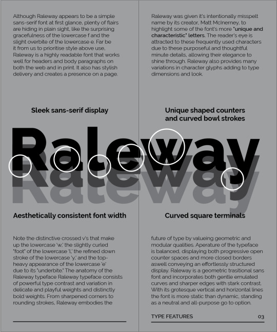
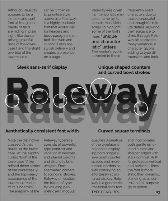
Second prompt - The Raleway typeface was created in 2010 by Matt and later expanded by the League of Moveable Type, branching its appeal and diverse versatility even further. Progression in type design as time moves forward is almost like a tree, like living nature, it evolves, grows and reaches a more developed state. 'metaphorical timeline'. I am struggling to understand the second point of interpretations but I analysed it as critically and simply as I could.
0 notes
Text
Klim Type Foundry
The klim type foundry and website is one that was shared with me through a friend and thankfully so because I found this gem below! It has greatly influenced my animation and helped me understand the idea and similar visual I'd love to achieve. I scrolled through and really took a liking to a few animations especially this collection - Manuka, I have screen recorded below which uses a coloured video of a lit up New Zealand native bush at night in the background, filling out the transparent text that boldly stands out with the word 'Manuka' spelt out in three frames. In my opinion it is such a powerful yet serene kinetic type to market the typeface Manuka released in 2021 by Kris Sowersby. I am drawn to and inspired by the appearance and impact of the type, text and video that's been displayed in such a cool typographic way on the screen. This method of kinetic type is one I have also chosen to largely base my animation around as the visual supports my rationale and the link I made between my typeface and my pepeha (place/nature and the structure/features of the typeface characters). It includes elements that I am using for my video as well such as te reo Maori, solid black background, the botanical aspect and the effects of letters/words fading in and out.
0 notes
Text
Sound Research
I've started thinking about what sound I would like to have playing during my type animation and whether I'd like to record it myself or insert copyright free sounds I am able to download from the web (that is relevant to my video footage and words of my pepeha/whenua in the animation).
I'd say the mood of my animation is quite peaceful and relaxed, so to go along with that atmosphere and my visuals I think dynamic sounds of nature like wind, rustling leaves/branches, birds, even rain will align well and support my animation. If I am unable to record sounds myself that I'm happy with then I know I have the option of using already generated sound.
If I were to add downloaded sound I think I'd add it after I completed everything else as I think it'd be easier that way? I'll ask for another opinion in class next week and report here.
(edit 25th May) I'd like to have a continuous play of the same sound file playing throughout the video as I think it would create a nice peaceful flow between frames. this will either be from the internet or recorded by me (someone quiet with trees, wind, and birds and maybe the bustle of people too).
(firsthand creations, attribute sound, royalty free music)
Movement
Emil suggested because I'm intending to overlay my chosen text and sentences over video footage, it would be helpful to use a tripod when recording my video unless I'm able to hold a very still grip on my camera (iPhone) to prevent interruptive shaking and ineffective capture of the subject matter (trees/roots, rustling leaves, swaying branches). Emil also encouraged me to record in early hours when daylight is the clearest and taking advantage of the disruptive weather of Auckland, using the wind movement and it's amplified sounds. The wind will also help to avoid the overlay appearing as a near still image, wind helps motion therefore emotion.
0 notes
Text
Week 11 Class
Today David talked about the importance and thoughtful detail of including end credits that contributes to the finished product of our kinetic type animations and the sophistication of the end result. The main things that we would need to have in the ending credits of our videos would be the following:
title of our piece - My Whenua
by 'name' - Ruby Matthews
paper code and group prefix - so for me that would be DEDSN512 CD 01
other, crews/special acknowledgment or thanks, or music referencing.
^^Raleway by Mac McInerney, thanks to my family and AUT (resources) and sound if not handmade, recorded by me.
As well as the designer (me) and crediting the typeface used's designer (Raleway by Matt Mcinerey and the League of Movable Type).
The suggested size for our end credits is 23pt.
Idea for sound: can have the music fade out and leave the screen blank to create a peaceful/gentle sort of pull away from the animation. in my opinion this depends on the style and visual mood and emotion of the animation and the entrance/exit the designer is intending to create.
After going through the presentation slides for today and the demo we had about 2 free hours until the end of class to continue with our animations/blogs/book etc with the opportunity to ask questions and ask for help/feedback/guidance from our tutors.
Class tutor one-on-ones:
Today I talked to Emil about the progress of my animation, how my blog is doing and how I'm feeling about this module so far. We also looked through my type specimen booklet pdf as a refresh of my design style and aesthetic, colour palette, layouts and how that could tie into the ideas I have for my kinetic type animation. advice that Emil gave me in terms of my animation is to focus on tying elements of my animation to my booklet and specifically the connection I made between that and my pepeha/whenua/identity in my written rationale. We also discussed the idea of still continuing with B/W but adding a tint relative to my elements - nature - leaves - trees - roots (greenery/botanical) which could be a dark emerald or brown (earthy tones to support my themes).
I asked David for his advice on something I touched on with Emil regarding a certain layout featured in a few spreads in my type booklet (2 column grid per page - such as my pages on raleway's type features) and what he called a 'typographic crime' haha, and explained how when text is morphed to be touching in a way where its almost illegible it takes the form of almost a logo instead of a legitimate word that can be read. He suggested for my summative it would be good to correct this by not adjusting the kerning to be so small and instead comfortably spaced. What was interesting is that Emil also mentioned how it came across as a logo but that it could be helpful or used in a way where it works by advertising Howick. I'm not sure at the moment what I'll end up doing as I'm torn between it standing out awkwardly without relevant connections and tying into the tourism text segments about Howick in my book. for the two column grid he communicated that It was hard to read given it only gave the reader a couple words per line, plus the double hyphenation cutting it up further, making it hard and unpleasant to read and change lines.
The hyphenation is awkwardly seperating words halfway or in 3/4 and it doesn't look right or support the feel of professionalism on a page or in a type specimen book. This is an easy turn off in indesign and I will definitely be implementing this when I edit my book.
Key words from my notes today:
Growth, shaping, whenua, dynamic, diversity, duality, roots, 'object of nature' representative to my pepeha/whenua.
0 notes
Text
Week 10 Class
Making Kinetic Typography - working with sequencing files
Because I was absent from our week 9 class, I've had a look on Canvas at the class activities we did and the SDL (To continue working on our type animation), and also the presentation slides uploaded to teams.
Stop Motion
This week focused on moving image sequences for stop-frame animation and time-lapse photography. 'In computing and non-computing contexts, a file sequence is a well-ordered, (infinite) collection of files, usually related to each other in some way'.
Three outcomes for this week:
Form a basic understanding of File Sequencing
Continue to develop individual kinetic-type projects
Keep process work up to date on blogs
since my kinetic-type animation won't be using the method of stop motion, I will spend less time on this blog and more on completing my animation. But, it is still important for me to understand this process for the future, so I've done some external research plus taken notes from the presentation slides which I will paste here.
Basics of stop motion animation
Stop-motion animation is a simple way of making animated films. By gradually moving objects against a backdrop, and taking photos at each stage, you can create the illusion of continuous motion.
Finalise the script and/or storyboard. Get together all the necessary props, backdrops and equipment (camera, tripod, lights). Darken the room so you’re completely independent of natural light. Ensure you can transfer the pictures of your camera to your editing software. Pick a quiet space – a room, a car, or anywhere else that isn’t exposed to noise – where you can record any sounds and voice-overs you might need.
The two main styles of stop-motion animation: 2D cut-out style and 3D style. The 2D cut-out style involves using paper and includes steps such as writing the storyboard, drawing and cutting out the backdrop and figures, and taking photos. On the other hand, the 3D style requires creating figures, props, and the film set using materials like modelling clay. It mentions that shooting a 3D stop-motion film is generally more time-consuming compared to a cut-out animation.
Anima Vision - vision school online (basics of stop motion animation)
File Sequencing and its Importance:
Taking a photograph every 10 seconds over a period of 2 hours will give you a playback clip of 30 seconds at 24fps and comprise 240 photographs. (canvas link to timelapse calculator https://www.photopills.com/calculators/timelapseLinks to an external site.)
* Tip: Take your photographs as jpg’s (not RAW files).
Taking photographs for stop motion:
The number of photos needed for a successful stop-frame animation or time-lapse moving image will vary. A smoother final product will be produced if more photos are taken in a shorter amount of time. Keep in mind that a tripod is a necessity for your camera, and it must always be kept still. Use the cable release function when shooting a stop-frame animation sequence to prevent touching the camera and creating a camera shake. The camera needs to support an automated time-lapse function if you're taking time-lapse pictures. These can be set to take pictures automatically at a specific time.
After a new after-affects file has been set up:
in order for the sequence to work all photographs must be saved into one folder
in after effects choose 'file-import-file'
Select the first file from the list. Do not select any other files, just the first file.
Make sure that Import JPG Sequence is selected and click open.
Into your composition, drag the sequence file. You might need to resize your photo to fit the format, depending on the size of the original file.
Re-sized to fit composition window 1920 x 1080p

1 note
·
View note
Text
Week 9 Class
Adobe Premiere Pro and After effects
To start off the lesson we were introduced to adobe premiere pro and its features, later on discussing using after affects and premiere pro simultaneously as they both contain different tools that were necessary for the demonstration. I have never used premiere pro in the past so it was cool to explore editing motion video alongside overlaying text using aftereffects, focussing on timeline composition and how the dynamic link works between the two.
The main thing we learnt from the difference between the two was after effects have a harder time processing memory faster and it is more equipped for specialised effects such as basic 2d, and 3d animation and kinetic typography. For thorough editing, colour grading, sound and basic text premiere is the go as well as working in favour of faster memory speed (less 'memory hungry') so is much quicker for longer pieces like over the couple minutes mark and more competent with editing, colour grading. It is definitely possible to edit and colour grade in after effects but will not work to your advantage as well as premiere pro will. I know in my case my laptop will not be able to handle premiere pro and after effects open at the same time, at least well at all, so will be taking full advantage of access to the uni Macs for this assignment as much as possible.
This was the video we made, using the demo files, in Aftereffects and premier pro. Towards the end of the class after experimenting with different opacity levels I realised the timing of the words appearing had jumped forward instead of gradually fading into sight like it had before. I am unsure of how this happened and will ask my tutors when showing them my blog perhaps in the next class how to revert it to the result the instructions achieved and jot down in my editing notes.
I found this part of the demo also really educational and interesting to watch and follow along with on my screen, playing with overlaying text on a video and experimenting with fading and motion of both the cloud/woods video and the text itself. Understanding the features of the timeline such as opacity and stopwatch and keyframes is only a snippet of what the app includes, so I am excited to learn more about how I can potentially use the tools it provides for this module.


(presentation slide example of app layout)
Following post/s - research what kind of animation I'll be making, what it will look like (visual/visual language), method of animation, key frames, elements and phrases and what I'm intending/planning to convey aesthetically and symbolically. Discuss and display all my draft ideas and how I'm developing my final idea.
0 notes
Text
AFTER EFFECTS VERSION 2
BUILDING ON FROM WEEK 8
Animation and After Effects
Working with compositions, layers and effects.
Key things I learnt/reflections:
We continued the kinetic type module this week and went over some of the fundamentals of animation as well as the many various types for us to research and choose from. Additionally, we practised and were introduced to a few Photoshop and Adobe After Effects techniques for moving images.
It will be necessary to develop an idea of the type of animation style you want to use for the Kinetic Type project because each student has a wide range of options for the animation technique they can use.
(outline different types and what I'm drawn to)

I wasn't happy with the transitioning of the frames with my storyboard prototype so I used drawn frames from the week/s Microsoft Teams files during the demo to make a quick animatic in Photoshop of the storyboard and an introduction to After Effects.
If I were to remake this I would make the rate per frame slower so it would appear better to the eye and viewer, where each frame illustration can be seen properly without the flow being too choppy.
Ideas/notes for animation ^^
This Week's Learning Outcomes
Understand the requirements of the brief and start to plan for preparing professional and creative practical skills.
Navigate the next steps in the brief provided to continue learning the Adobe Creative Cloud software.
Learning the storyboard process to generate considered design systems for moving type samples.
Develop a basic understanding of After Effects workspace, composition, keyframes, and saving + exporting
(Include ideas I'm thinking about for my animation and previous ideas, then add current ideas to my week 9/10 blog, with screenshots of draft animation).
This week we received written feedback for our formative submissions (type specimen booklet, rationale, presentation)
•Develop your type specimen ASAP after receiving feedback while it is fresh, even briefly (especially proofreading, errors)
•Prioritise work on Assignment 2, but remember both Assignment 1 + 2 are resubmitted together at the end of the semester (summative assessment)
•Both these assignments are considered together, so look to develop conceptual and aesthetic links between them as you work on Assignment 2
Rationales should link connect chosen font and place and should be driven by a clear concept
•Less time spent discussing the process and not enough concept, context and research
•Directly address the brief and balance the potentially challenging task of a hybrid document (type specimen and typographic response to your pepeha/place in one document)
Some key things I need to work on for my summative submission:
Booklet: The page four layout was good, the 2-column paragraph layout was difficult to read as the lines were too short. solution: convert to 1 column or shrink the size of the text.
Export file in spread layout (easy fix in InDesign export settings)a lot of spreads have too many details, so focus on negative space/minimalistic approach more, which will work nicely with B/W.
Blog: make sure I have a blog update for each week as I haven't covered as much as I need to at this point. This will contribute to my final grade and so extra work and time will need to be put into documenting all in-class activities, SDL, assignments and research!
Presentation: needed more examples which are something a populated blog will support and help me with the development of my ideas for the summative.
Blogs and presentations demonstrate the process, research, time investment, development, and reflection. - investment in development -
(What is needed to submit for summative and what do I need to do to work on those things)
Digital and the physical printed version of the type booklet
(Referring to constructive feedback continue editing and enhancing its presentation and text format to an improved standard)
Kinetic moving-type animation
(Using after effects, continue animation while building my understanding of the software and its tools)
Next post - research what animation I'll be doing, what it will look like (visual/visual language), method of animation, key frames, elements and phrases and what I'm intending/planning to convey aesthetically and symbolically. Discuss and display all my draft ideas and how I'm developing my final idea.
Animation types:
0 notes
Text
What is Kinetic Type - History
Kinetic typography refers to the creation of moving type. It is an animation technique that is used to make lettering expand, shrink, fly, move in slow motion, grow and change in numerous ways for the user. The effect can be simple and short with only small changes or quite elaborate and lengthy.
Kinetic typography use has almost exploded recently because of more use of the technique in web design. Once something that was only used in video and television, kinetic typography is gaining popularity as a background effect on websites and in web-based videos. (All of this is possible thanks to higher and more common broadband and increased internet and web surfing speeds.)
The technique used for a number of reasons but can add emphasis to certain content. It can help convey tone and emotion. It can help create a unique visual where none exists. It can be an affordable option for those with limited budgets. It can add interest when your design is in need of a boost.
Kinetic Typography: An Introductory Guide - DESIGN SHACK
^^
History - Kinetic typography has made its mark in todays tech and design as an emerging sensation for graphic or type designers, but it does have a story to where it came from. Kinetic type was first present on the big screen, here is a brief overview of key moments of type history. Researchers at the Human Computer Interaction Institute and School of Design at Carnegie Mellon University have traced the first use of kinetic typography to the 1959 Alfred Hitchcock’s 1959 film “North by Northwest.” In the opening credits, type is used in a movable format. A year later, the effect was used again in “Psycho.” “This work stemmed in part from a desire to have the opening credits set the stage for the film by establishing a mood, rather than simply conveying the information of the credits,” researchers wrote.
From this point, kinetic typography became more commonplace in film and later in television. It’s been used in credits, during shows and for advertisements.
More recently, it has become a widely-used technique in website design (and for some mobile apps as well) and is quite common in online videos. It is used for everything from advertising and promotion to art to music videos to a storytelling tool for journalists.
0 notes