
Don't wanna be here? Send us removal request.
Statistics
We looked inside some of the posts by 2023-512samdoanpham and here's what we found interesting.
Average Info
Notes Per Post
1
Likes Per Post
1
Reblog Per Post
0
Reply Per Post
0
Time Between Posts
2 days
Number of Posts By Type
Text
12
Last Seen Tumblr Blogs


Fun Fact
Tumblr Inc. is using 66 technologies for its website.
Text
HAND IN
Communication design is a program focused on information developing and visual communication which shows how media design can communicate with people ideas and messages. In the Communication Design program I can explore new skills I have not learned at high school before. This can help you improve your skills with digital design and try more stuff such as Advertising , Animation , Web design , Publishing and more about design . For me I found this course interesting when I was in high school and don;t know what to do next step for new life chapter , during the time when i was in highschool i had design class I looked at the bottle packaging in my desk try to make a new look for that for that moment I found out design quite interesting and apply for that course because I want to be a graphic designer. Until now i still felt bit worry with my digital design skill but over 6 week study Communication Design course I felt exciting cause every lesson i know more thing i haven't know before like example with Adobe Indesign , Illustrator … the difference between typography it not just about the text because the text design sometime can bring your the feel , the message behind . For me, communication design can also help bring everyone together , sometimes it is not just about the aesthetic look of yours , it also can be the aesthetic look and bring your message, your voice wants to tell people through your design that is why I found Communication Design is interesting.
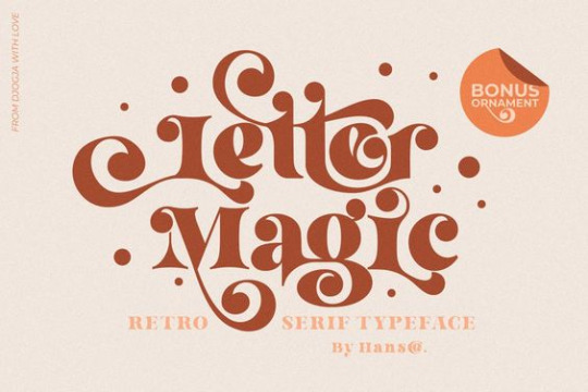
I chose the concept of blue and the font I chose for my book type is “Magic Retro” because with me the ocean and magic is something that is really meaningful for me . I choose blue not other colour because , for me part of my theme is Ocean so that colour is represent for the ocean colour , blue also sky colour when u think about sky and ocean that bring for your the feel of freedom this is the message i want to telling to viewer through my typography . Magic Retro is the name i choose for my typography book first because it Magical is the theme i want to bring to viewer be freedom and dream , do what you want to do no matter what happen will coming to once you dared to dream and go for it the magic will come and helping you when you trust yourself . The colour and the font is suitable with my pepeha because when ever I feel negative dont know to do for the next step i will thinking about the Ocean because i want to be freedom like a ocean no matter surrounded by natural influences , it is always be gentle and accepting all even it a good or bad . Part of the thing want to sharing to view is always be yourself , be confident , be creative and be positive ,
I really like that font because at first look I feel like that font brings for me the feel of dream and magic so that is why I choose Magic Retro and mix that with blue to fit with my theme pepeha . With Magic Retro font i think it will going well by help me bring the message want to tell to people like how it bring for me the feel of dreaming and gentle , like the message I want to tell at the beginning , I want to telling to the view the message of my pepeha like I Am the blue Ocean but also it have to have something soft but dream in that to fit with the feel i want to bring is gentle like an Ocean .
My message I want to bring to that is be yourself ,I was scared to do something because I could not be confident all the time. If something bad happens, I will cry about it . At this time I found out why don't we just open ourselves like an Ocean , just be gentle and accept all the things that happen in your life. Sometimes you should be happy accepting that . Sometimes, stay positive to accept that will help you to grow stronger and be the best version of yourself . That helped me a lot to build up my mindset now to be confident and trusting myself. I realise crying is not the way you deal with the problem , staying positive and trusting yourself is the key to help you deal with all the bad things coming to my life . The term “Ocean and Magic” is the concept I used for this work to communicate with view . This course makes me understand more about what Communication design is and how I used that for my work to communicate with view by visual art , all the colour and font using having a story behind .
Magic Retro I choose for this concept because go back with the message I want to telling is about being yourself and be freedom like and ocean , the curl detail in this font remind me about the curl of the wave , I really interesting with that font because it bring for me the feel of a dreaming the curls and the way word character connecting to each other look really interesting for me . Reason why I chose the name for this media making is “Magic Retro” matching with the font name because same thing with the font. I want that art can also bring for viewers the same feel of dream and softer .
For The animatic it just basic base on my booklet , I still choosing the same colours as the book to make them relate and second i kinda like the colour pallet because making the feel refreshing and catching eyes . By doing the animatic i feel like this thing is quite hard for me because this stuff i havent done at high school before so during the time making the animatic i had watch tutorial on youtube and asking teacher , friends if i had any question .
0 notes
Text
Week 12
in Week 12 is a final week of class to do the work , by this semeter we have learn lots stuff in After Effect and In design
I got some stuggle when I do the after effect with the key frame that why i cant play the video . I asked the teacher and got help the work much easy . The main colour is still blue and i think that will suit the theme well , I think it will be look good with the text motivation behind cause it will make look fun .
this is some video i had look on youtube to support me during made the animatic
youtube
0 notes
Text
week 11
back to class week 11 , in this class lesson we learn about what we gonna do when we handing in the work , the work due on week 13 wednesday which mean we only have 1 and half week left to finshing the animatic .
in this class lesson we learn how to save our file end credit and upload in on canvas to making sure we got all the equiment and still working on our project for the assignment due soon .
0 notes
Text
week 9 + 10
week 9 and 10 is about how we working on After Effect to creating an animatic video with the stuff we had done and the story board we plan to do . When i made a plan i realise that is make the work is more easy cause by that i able to know what i working on and what i need to continue with . I thinking the blue would be good idea for this project but i feel like if i keep stay with the same thing like the last project that will make the viewer feel bored so i try to mix it will other colour and i feel like Pink mix with Blue would be an good idea cause they still in the same pastel pallet

i feell this too colour go together make it feel like summer vibes , refreshing. i don't like the colour go darker because this kinda feel sadness and not matching with the front.

because i still haqve to learn more about affter effect so by the time i also looking at some video i found on youtube show me tutorial to trying on my work , those video kinda helpful because by that i can easy to learn with After Effect .
youtube
youtube
in the class at week 10 , we had learn about how to how to save and up load a video working we will do in canvas when we handing it in , this is a good activity because for the last assignment i have a little problem when i handing in the working the file is too big to hand in in canvas so by this one it will be less risk when we handing in the working in the last minute .
0 notes
Text
week 8
in week 8 we try to introducing with the new abode app After Effect . I never use that app before to this is bit confusing to me , the nexst project we doing next is making a effect video animatic . like the practising we did lat week is making a story board plan what we gonna do i decied the colour i gonna use and the front will use . I kinda like the front Magic Retro at the first project so in the next project i think I will keep that .
because After Effect is the next app i haven't been using before so i try to look at some video on youtube introducing about this app so i able to use that , for me this app still is hard thing for me becasue the stuff is different that other adobe stuff i had done before
youtube
0 notes
Text
week 7
back to uni after 2 weeks break , i made my booklet . this outcome kinda last minute cause some stuff i dont having it at home so i fix it up a little before i have to hand it in week 7 .Also the video i make can not submit on canva , i had ask the teacher to give me some help and they show me how to fix the problem .
this is my booklet outcome , i decide to print it in the shiny paper but in the last minute the shiny paper to thick to tape it together , also the printing is wrong not like what i want to make so i just keeping it simple with the normal paper cause i have to handing it soon

0 notes
Text
week 6
before start the uni break in this week is the last week we have with the booklet design . I have finish my book with the book name is magic retro - this also the same name with the type i use in the book , i name it " magic retro" also because this name is kinda the theme i want to bring into the book i made i want this bring to the viewer the vibe dreaming , fairy so the colour and the name will be match each other so well .
cause we also need to make the actual book soon during on our break time so after showing in class i also looking on youtube and pinterest to get some idea what my outcome gonna look like becasue i want the piut come will be a good quality .

that example is showing me how they making a book , in this mock up i realise the important when they puting image on that is making the book more interesting , and the colour is also important cause if u get the colour out of the colour palette matching it will make it look confusing also too much colour or image make the viewer not forcusing on the message you want to say cause other stuff will take them more attention then the type u saying . By this example i try to change my book to cut off some image not relate .
here also some more book example i found .

in the assignment it also asking for the video represent the book you making , this mean by looking at the booklet outcome i also have to make video introduct my book as well . this video is about maxium 4 minute , i think making a little intro so the represent video would be a good idea so i decied to record a little intro showing people like typography is everywhere us this really important that way relate to what i will say in the represent video also can make a little interesting cause i dont want the video just about boring talk straight 4 minute.
0 notes
Text
week 5
week 5 , i stared working on the booklet after the lesson . by what we have learn , i got the book layout already and start puting colour on that , i decied to put some picture on that to explain the theme better , i keep using with the blue palette for the booklet .
By the time i start doing the book i think some picture on that will make it look nice so i have put some picture on that to explain the them more .
This is what i start so far


0 notes
Text
week 4
last week 3 we got a tutorial in class to showing us how to making a booklet layout but after class i still had look some video on Youtube to get some more exprience cause for me i still have to learn more stuff cause be honest I'm not strong with Adobe stuff . There is some video i had look after class to get some practise .
youtube
youtube
i found the front name "Magic Retro" on the video i watched , this front look quite nice for me , in my point of view this front more like a dreaming type that kinda match with the colour i had choose blue . To get know more about the front i gonna use .

0 notes
Text
week 3
week 3 , which what we learn in week 1-2 in week 3 we still continue whiich the lesson we look at , trying more with Indesign and Illutrator about the typography i have a looking in online about what fornt i gonna use for the book and have to be link with my pepeha
i did a little brain storm what i gonna do with my book , i plan to choice blue is the main colour i gonna use cause i want the book look refresing , something look kinda freedom so i think this colour platte should be good . the website i use to fine the colour palette call coolors , that website helping me finding the colour .

to looking for the front to matching with the theme i want to bring into my booklet , i had look at some video on tiktok , freefront,.. to find some new front matching with me , i found this video recommand some new front people most using really interesting .
0 notes
Text
week 2
this week 2 lesson is learining more about the concept we gonna do for the next assignment . in this lesson they sowing more about Indesign stuff and typography . By rhis lesson i learn type is really important because by using different fornt and size this is can bnring for the viewer the feel and easy to understanding what you trying to say in the work to paying attention at that .
here is some type fornt i have look online :


0 notes
Text
week 1
in week one activy first start with the course , we got introducing about the course and adobe , in this thurdays lesson we have small activity talking with your mate sit next about their pepeha and after that is the SDL finishing your own pepeha by fill the pepeha sheet at class . Pepeha is basicly the way how you introducing yourself to other people in Maori , i thing that is really good activy for the first lesson to sharing and connection with other the place and people important to you.
I have try to finishing this at home and this is my pepeha :
Kia Ora Tatou
Ko Fansipan Te Maunga
Ko Tam Bac Te Awa
Ko Viet Nam Ahau
Ko Doan Pham
Toku Whanau
Ko Sam Toku Ingoa
1 note
·
View note