
Don't wanna be here? Send us removal request.
Statistics
We looked inside some of the posts by 2024ardn632isobelchilberto and here's what we found interesting.
Average Info
Notes Per Post
1
Likes Per Post
1
Reblog Per Post
0
Reply Per Post
0
Time Between Posts
18 hours
Number of Posts By Type
Text
17
Last Seen Tumblr Blogs


Fun Fact
The KCSC sent more than 20K requests to delete posts related to prostitution and porn to Tumblr from January to June 2017.
Text
Week 11 - Short Reflection
Overall, I am very happy with the narrative I portrayed in my image series. I like how they work together but also separately, and each image can stand alone without taking away from their value. I enjoyed the process of explaining the contextual ideas that back the project. I hope these ideas are conveyed and that it could start a conversation on the portrayal of women in media. I also hope that it is seen as a bit of fun and mildly horrifying in a way!
I especially liked the process of taking the images. Though it was hard to take the photos on my own, style myself and be the subject, it was a rewarding process. In the future, I want to work more on preproduction, as it's cool to control the narrative every step of the way. In post-processing, I still need some refinement of my skill as it wasn't as polished as I wanted. That being said, I was able to put the knowledge I had previously and predict something I am proud of to the best of my ability.
0 notes
Text
Week 11 - Final PDF
To present our ideas, we were tasked to create a PDF including all images and our positioning statement. I laid it out in a way that moved through the story. I felt putting any image other than the first image would ruin the linear nature of the five compositions. So I placed all together at the end to show how they worked with each other. I then formatted my positioning statement to be easy to read but matched the vibe of the other images.


0 notes
Text
Week 11 - Presentation
As I had an extension, I made a video presentation instead of presenting to the class. I talked through my compositions, context research and reflections.
0 notes
Text
Week 11 - Positioning Statement
To really honour the research and final compositions, I wanted to write a piece of text that explained it fully. This was a challenge with the word limit, and I had to cut down my writing a lot. There was a lot more I wanted to say, but by cutting it down, it was able to help hopefully be more digestible and straight to the point.


0 notes
Text
Week 11- Final Compositions Overview
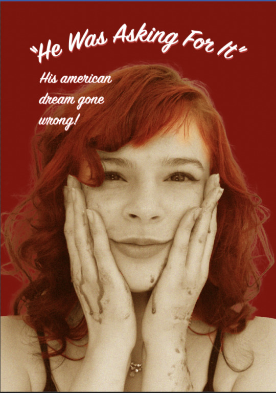
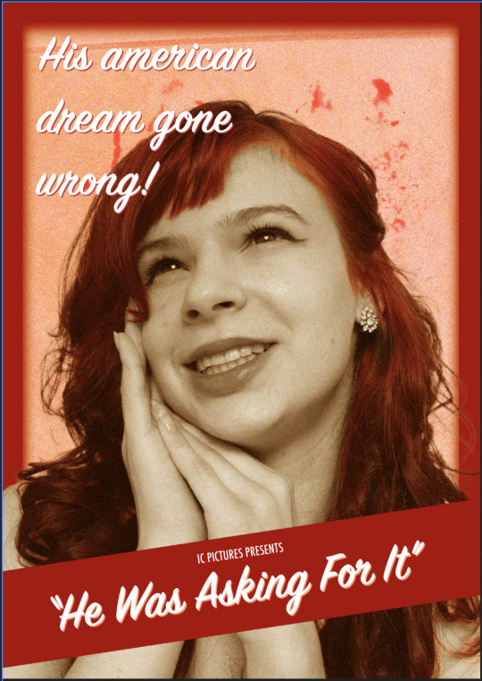
Creating my final images included a lot of work with masking. Using the soft brush, I blended the coloured layered image with the black and white image to bring the red hair through. I had to change the opacity depending on the thickness of the hair and how close it was to the hairline. This, as you can imagine, took a long time. I'm unsure if there was an easier way to do this, and I hope there is in the future! It also isn't as perfect as I wanted, so if I could work further on this, I would. I used colour grading to have my images in black and white but with red and black tones peeking through. I changed the dynamic range across all compositions so they were at an equal brightness and contrast. I removed the backgrounds and made sure the hair didn't reveal the past backdrop too much. I also added grain to give an old-timey feel to the images as well.
For the text of my posters, I added the credits at the bottom of each poster to tie them together. I thought it would be fun to have different catchphrases across all images. Each text placement reflected how the type was laid out in 50s film posters, too. I used black text under white text to contrast the image and make it feel separate so it stood out better for reliability. The backdrops use red, relating to horror and violence, and then pink, relating to femininity and colour trends of the 50s. With the dissolve blend effect, I could give the backdrops an organic feel, frame my subject, and allude to blood or a demonic nature. Finally, I edited the blood in a pinky-redy tone to relate to the two colours and the violence alluded to.
Composition One: The first image talks about the American dream, a seductive reality for her husband. An idealised reality that she isn't too happy about you will later find out. The posing is inspired by 50s ads portraying women in this perfect, doe-eyed look.

Composition Two: The second image is her becoming the femme fatale, killing her husband's dream and him. Her expression is one of freedom from her reality and a sinister one as well. I used advertising language to draw the viewer to watch the "film".

Composition Three: The third composition shows the aftermath of the killing. Her shhhing motion and hiding of the axe allude to her getting away with it. Though you can't see the husband, the text and blood on her face are representative of this.

Composition Four: The fourth is a scream of victory and anger towards her husband. As it states, she never asked about the situation in which she was put. The blood in her mouth alludes to cannibalism and her malicious nature.

Composition Five: The final image is her face of satisfaction with her new reality free of him. The blood on her hands contrasted with her happy facial expression. The text explains what has happened as well as making her facial expression even more horrifying!

0 notes
Text
Week 11 - Vivian Vixen & Movie Credits

To add the realism of my posters, I was suggested to create movie credits alongside my title. To create this, I took a look at the posters I'd looked at before, both horror and 1950s. From there, I chat GPT-ed movie credits with 1950s names below my actors. For the actors/stage names, I went with the most generic white male name I could think of. And then, for my main character, I went with Vivian Vixen. The term vixen has been used to refer to women either in a sexually attractive context or in a way to refer to them as angry or unpleasant (Britannica, 2024). Which encompasses the character I am portraying. I also chose a typeface that matched the 1950s, making sure it was thinner but not too thin so it was still readable.
Text Source:

Thicker vs Thinner. Thicker looked better and was more readable:


Britannica. (2024). Vixen Definition & Meaning | Britannica Dictionary. @Britannica. https://www.britannica.com/dictionary/vixen
0 notes
Text
Week 11 - Emil Feedback
In class, I was able to receive some feedback from Emil. This was really helpful as I wanted to figure out how to elevate what I had and also to see what was working. My idea of the series representing inner turmoil didn't seem to work, but I was fine with the narrative being more malicious. For the colours of the composition background, I was suggested to have them in an alternating order. I also needed to play around with the order of the images. This was particularly important as the second image in my competition didn't work as well as I wanted. After my feedback, I feel it will work better fourth. In a way, it tells the story of her after she kills him; maybe she eats him!!? The shh image is also working as the middle image as well as the first and last images.
Another point raised was creating movie credits to add to the realism as well as the names of those who were starring in the film. With this, it was suggested that black and white be introduced for the text. The text also needs to be used to aid the story the images are telling. I need to play around placement and shifting them around the page.
Red and pink work are my colour palettes in terms of representing horror and femininity. Emil suggested pink for the blood, as the blood in my images also needs to be brought out. I thought this could look cool, but I might tone it back to a red-y pink. The fringing also works, but I wasn't sure if it was. It was suggested that more be added, dispersed, more organic, etc. I will play around with this more for my final submission.
0 notes
Text
Week 11 - Peer Blog Feedback
In class, we worked in pairs to give feedback on each other's blogs. I was partnered with Serena, who gave me really sweet feedback. From this, I know I am going in the right direction in terms of the way I present the work of the project. I also know that certain ideas I was portraying are being interpreted the way I want them to.

0 notes
Text
Week 11 - Class Notes
Course content, academic readings, book of veles
link different ideas together, non generic statements
What are the photographers there work etc, expand
women, red hair, women in horror women in the 50s
1 idea per paragraph and sentence
pre-post etc
what they need to know, not me!
Even colour distribution
0 notes
Text
Week 11 - Statement example
In class, we were tasked to look at a past student's work to get an idea of what we needed to do. Alongside this, I also analysed what was working on another person's work. I found this helpful to get an idea of what is missing from my work. But also analyse how it feels to read another person's work to get an idea of what works and what doesn't.

Title and name at beginning
Notes
Starts with positioning statement
How she did it
Outlines theme
Talks about inspiration and how she applied it
I don't feel there are clear sections like in the positioning statement guide.
More reflection on her would be good as to what she would do differently in the future.
Lack of references in text (APA)
Citing sources of information, not common knowledge, artworks
What does the reader need within our writing
Her statement shows how well she thought out her ideas. She talked about how she applied these alongside her research to create her compositions. She talks in-depth about what she did to manipulate the images and her process during the project. Her theme is well outlined; therefore, I am able to look at her work and understand what's going on better. Artist models are talked about, but also how she applied the inspiration she got from them to her work. I don't feel there are clear sections like the positioning statement guide. She tends to expand her ideas across the entire statement, but it would be good to see those introduced earlier and linked back to when necessary. For example, in the introduction, talk about the themes and ideas further to flush them out more. In the end, it would be great to see more self-reflection on what she did that didn't work and also what she would do in the future. There is also a lack of APA references in the text, which would be helpful to link back to in terms of the works she referenced.
0 notes
Text
Week 11 - Inclass Group Critique
In class, we did a brief critique of our current WIPs. I believe that my compositions are working well as a group, and the colour treatment is strong as well. The typefaces also work in terms of the time period, and the name is strong as well. To improve, bringing out the blood would elevate it. The backdrops also need to be improved. Using paper texture either online or done manually. This would be a form of manual manipulation, which would add to my exploration of a range of manipulations. Also, they said that my face looks manipulated, which is kind of fun, as this is not the case.
0 notes
Text
Week 10 - Composition Draft

This week, I was able to finalise my final idea by selecting five images for my final five film posters. I created a linear story of the process of her killing her husband. The first image is inspired by the 50s perception of a female housewife. This perception is then changed when it portrays her being, what I perceived, being attacked by her husband. This is subverted by her being the one to attack her husband in the next image. The following image is her shh the viewer with blood on her face. Telling no one to tell and portraying the aftermath of the murder. The final image is one of satisfaction with her smiling with the blood literally on her hands. Throughout all these images, she still looks put together with her curled hair and jewellery showing the time period she is in. I laid them out as a series, which is working. Using the pink background and then red shows her switching from housewife to husband killer.
Looking forward, I must ensure the lighting is the same across all compositions. This will allow cohesion and also allow a mockup of them for the final feels unified and well polished. I need to edit the blood to be darkened on the posters as this will already tie into the image with edited blood. The readability of the text is also an issue that I will need to improve on next week. I like what it's saying, but this must be readable to pack the punch I want. I also am unsure if the outline is working as well as I want, so I want some feedback next week to figure out what's missing from it.


Exploration that didn't make the cut!:
I spent a lot of time experimenting with colour and type to get the 1950s movie poster effect I wanted. I also played around with what the backdrops would look like as it was hard to create the organic look that 50s film posters had digitally. The layout and overlying of assets was also an area I explored. Including text on objects or a band of colour. I even tried playing around with the bloody floor as a backdrop, but it didn't fit the look I was going for.


0 notes
Text
Week 10 - Symbolism of Red Hair
My character's red hair ties perfectly into the story, relating to the symbolism of red hair in art history. I found this article on the topic of Artsy, which was particularly interesting. When I dyed my hair red, I didn't think of any connotations with it. I just thought it was a cool colour, but after reading this article, I realised how ingrained misogyny is into anything women do/are. Red hair is just a hair colour. It doesn't equal women being promiscuous, sensual or devious, as this article mentions in relation to red-haired women in art (Dotson, 2019). I have heard this consensus in the past as well amongst my peers. This ties into my project, though, as the character does have an inherent sexuality and a devious nature in that she kills her husband. It's interesting to think about that. In a way, I am playing into this connotation, and I don't know if that is harmful. But I guess it could be a talking point. By editing my hair to show the red, it manipulates the viewer's perception of the character.
Dotson, S. (2019, May 24). Untangling the Symbolism of Art History’s Most Famous Redheads. Artsy. https://www.artsy.net/article/artsy-editorial-untangling-symbolism-art-historys-famous-redheads
1 note
·
View note
Text
Visual Treatment
After my research, it was time to come up with how I would apply this to my movie posters. Therefore, I made a list of the post-processing steps I needed to take. This would help me know what I needed to do and also show how I applied my research to my compositions.
Grain and black and white for the time period, but with red tone to tie into the techni-colouring of the time period.
Pastel pink for the time period and inherent femininity association (stereotypical cogitation) and red for horror.
Organic outline both an ode to horror and 50s posters
Red hair and blood coloured over in the style of 50s and also visual intensity to these elements
Movie credits, movie name, catchy catchphrases, integration of text with images with 50s typefaces.
0 notes
Text
Week 10 - 50s Type
To add to the 50s film poster concept of my posters, I had a look at popular typefaces used in the 1950s. This would aid the imagery both in terms of the time period and also give further meaning to the imagery. I found that movie posters in the 50s had a lot of catchphrases that aided the imagery in selling the film to the viewer. I found the wording was very dramatic but left you wanting more. A hook to draw the viewer in.
Posters used a mix of serifs and sans-serif, which created a mitch-matched collage feel. I found a lot of posters used more than 3 typefaces in one. The spacing and angles often used what would be deemed typographic sins now. The type was made more readable with the layering of the same phrase but in different colours also with boxes and shapes.
Notable examples:


Source Image 1: https://www.limitedruns.com/blog/movie/the-top-50-greatest-1950s-sci-fi-movie-posters-of-all-time/
Source Image 2: https://www.indiewire.com/gallery/best-1950s-movie-posters/
To find the type for my posters, I looked on Fonts In Use, a place to look at typefaces used in certain formats or themes, etc. I found a section on the 1950s where I looked at the ones I had access to through Adobe. I played around with a few but I ended up with Futura, Gill Sans and a brush script similar to one I'd found on the website.


Source: https://fontsinuse.com/tags/272/1950s
Final Choices:

Text 1: Futura Condensed Medium Text 2: Gill Sans Nova ExtraCondensed Bold Text 3: SignPainter HouseScript Semibold
0 notes
Text
Week 10 - 1950s Film Posters
To find reference points for the visual treatment of my posters, I looked at a range of 1950s posters on Pinterest and on the net. I looked at three key points of interest. (There is a 4th but it is in the above post) These points of interest were colour treatment, visual treatment and written word. I collected my favourite posters for each section and broke them down below:
Colour Treatment:
Primarily primary colour, due to the technicolour visual treatment of the time.
Bright, vibrant and contrasting. They pack a visual punch and would draw your eye when walking past them.
In some posters, the images have been painted over to be in colour.

Visual Treatment:
Bright contrasting colours.
Bright or neutral background depending on the visual effect they want.
Painted outlines behind to bring intensity to the subject/s or images.
Images are cut out without backgrounds, making them pop out.
Raw edges of backdrops, for example, paint stroke effect.
Organic or sharp borders to bring compositions together.
Relationship with type is important. Type doesn't feel like an afterthought. The colours often contrast or complement the images. They also interact with each other around or on top of each other.

Written Word:
Feels like catchphrases that could be easily referenced in relation to the movie.
Dramatic tone of voice, adds intensity to images.
Titles of movies can have quotation marks which is something I associate with 50s movie posters already.
The way the layout type shows the importance of what's being said or makes it more interesting e.g. laid out across the page feels dramatic and punchy.

0 notes
Text
Week 10 - Scrapping Ideas for New Ones
This week, I initially went into it with the idea of doing one movie poster and then compositions that looked like film scenes. The idea, from Emil, was to create a fake Letterboxd profile for a fictitious film. It would be an excellent way to show manipulated images in practice, as it would add to the realism of the project.


When I looked over the images I had, this idea didn't seem feasible as the images I had were all close-ups that felt they belonged on a poster. There wasn't enough variety to support this idea. Therefore, I decided to go for five movie posters as I found five images that felt they tied into the story well. I felt I could still tell my story well and I had an idea to add to the realism by making a mockup of 5 posters to show them in the real world.
Experimentation for first idea:
I like the overall look of these ideas, but they feel too modern. However, it would be an avenue I would explore in future projects. The layered effect is an interesting way to convey two contrasting ideas.


0 notes