
Statistics
We looked inside some of the posts by 22022-504-pimlapattsuriyasenee and here's what we found interesting.
Average Info
Notes Per Post
0
Likes Per Post
0
Reblog Per Post
0
Reply Per Post
0
Time Between Posts
2 hours
Number of Posts By Type
Text
17
Last Seen Tumblr Blogs


Fun Fact
Total funding amounts to $125.3M.
Text
Reflection
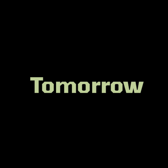
The typeface I work with for this project is 'Tomorrow'. At first, I struggled with the colour swatch for this project. I end up using the same colour swatch as my first project. I also added black. I very much like the contrast of green with black. At first, the content of my first gif is to show the upper case and lower case of my typeface. The feedback on my first draft of this gif is I repeat the word 'Tomorrow' too many. So, I have added more content showing the weight of my typeface as it was the main key point of my typeface. Also, I have added a sentence that says, "It's a superfamily with 18 styles.". The first part of my gif has inspired by my specimen book. For the second gif, I took a photo of my hand and applied it to my gif. As the first part of the gif, I have the words 'Tomorrow' that each letter is falling to each other. So, I need something to be an object that pushes the letter to make the animation make sense. One thing that pops up in my mind is the hand. I try it out. It worked well in the end. So, I keep it on my second gif. The content of this is about designers and the release date of my typeface. I have struggled with doing video timelines the most. For my first mp4, I took a photo of the crumpled paper and applied it to the video timeline. The feedback for this mp4 is the technique I used for the mp4. I used frame by frame technique. So, I lose the chance to use the video timeline function. At first, I do not understand the function of the video timeline, how it works and doing it improperly. So, I try to watch all the videos about the basic skills of video timelines on YouTube or Aut canvas. The content of this mp4 is to show the glyphs and number of my typeface. For the second mp4, I watched the tutorial on canvas on week 10. I used masking, Clipping mask and wipes techniques for this mp4. The content of this mp4 is about the keyword of the typeface and Anatomy. For anatomy, I have an idea from my specimen book. I also used the same background colour as the one on the anatomy page of my specimen book. I am happy with the outcome of all final four Type animations as my first time creating them. I am very proud of myself.
0 notes
Text
Rationale
For the second project, we have to create four different designs of Type animation. We used the same typeface that we used for the first project. Creating an animation is a new thing for me. I have no skill with it. At first, I find it very hard to create an animation as I do not have any basic skills. For the first two weeks after the holiday, I have the fun of learning frame animation. I learned a lot of new things during the class. On weeks nine and ten, we learn about the video timeline. It is where I started to get lost and stressed out. I think the video timeline is very confusing for me a lot at first. So, I spent time watching all the video tutorials that the lecture uploaded on canvas. It is a helpful tutorial. I get to know a lot of new techniques. For the first mp4, I have a lot of layers of paper image because I do the moving the paper is folding. The onion skin setting helps me to place elements of each one in the right place. This setting allows us to see the frame before and after. Mask the layer, holds the option key and click on the layer. I have used this thecnique for my second mp4. Command+E is to merge the layer, and to duplicate the layer is Command+J. All of this is saving me a lot of time. For the second gif, I learned how to paint inside the text. We have to hold the command and click on the text layer. Then we paint it. Another technique that I have learned from canvas is 'wipes'. This technique is an interesting idea to use when our work has a lot of words. I have applied this technique for the second mp4. Once I get to know all of the techniques of the animation process slowly. It is pretty simple. Also, I enjoy creating my animation. This project is very challenging for me. I have learned a lot of new skills during the whole process of creating Type animation. I will keep exploring the animation technique and improve my skills for my future project.
0 notes
Text
Final #2 MP4
The content of the mp4 is about the key point and anatomy of this typeface
0 notes
Text
Final #1 MP4
The content of this mp4 is to show glyphs and number of the typeface
0 notes
Text
Final GIFs/MP4s
#1 GIF

The content of this gif is to show the upper case lower case and the weight of the typeface.
#2 GIF

The content of this gif is about designers and the released date of the typeface
0 notes
Text
Final colour swatch
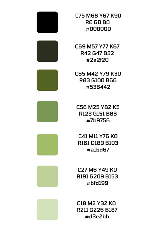
I end up used the green shade colour same as my specimen book but add black. I like the contrast of the black with a green. It is interesting when it together.
0 notes
Text
Idea (MP4s #2)

the content that I will do for the second mp4 is to show the key point and anatomy. So, I use this idea from my specimen book design for the second mp4.
0 notes
Text
Video tutorial in Canvas W10 (wipes)

I used this technique for my second mp4. I think this technique is very interesting when you play with the word. My content of the second mp4 is about the key point of my typeface I think this technique is a nice idea to work with.
0 notes
Text
Video tutorial in Canvas W10 (Masking/Clipping mask)
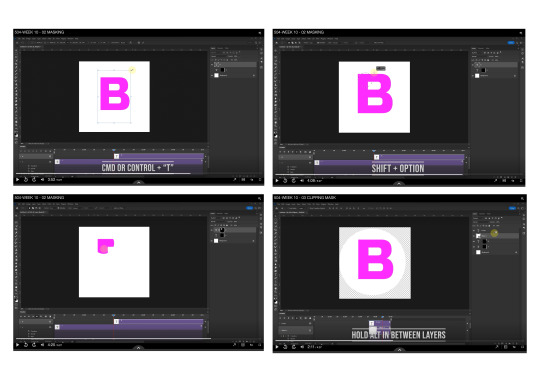
I used this technique for my second MP4.
0 notes
Text
Video tutorial in Canvas W9 (Painting)

I have use this technique of this tutorial for my first mp4 to paint the glyphs.
0 notes
Text
Idea (MP4s #1)

I have add this idea on my first MP4 as the content is the show glyphs and number of my typeface. I think this layout in this page of my specimen book will be a great idea to apply for my MP4.
0 notes
Text
Onion Skin Setting (Video tutorial in canvas W9)

I have watch the video on the AUT canvas. It help me a lot to create my video timeline. As I never done the video timeline before. The video tutorials is very easy to understand and it have all the basic skill that we need to know. I have use the onion skin setting for my first MP4. It is very helpful.
0 notes
Text
Idea (GIFs #2)

I have use this idea of my specimen book for my second gif on first part that the hand was push the word ‘Tomorrow’.
0 notes
Text
GIFs #2
In the second gif, I have get some feedback from the lecture to fixed the hand that I put it in my second gif.
#old version

#Fixed hand (NEW)
As the old one, the hand is just disappear and it does not look make sense. I have add the movement of the hand going backward to make it more clear and smoother.
0 notes
Text
#1 GIF (Change)
As a feedback from the lecture, I repeat too much of tomorrow word. So, I have fixed some design and adding more idea into it.
#old version of GIF

# New

Some of the design in the gif is inspire by my specimen book design. I have adding more content to make it look more interesting. Some of the design from the old version of first gif I still keep it in the new one.
#Idea

I think this idea of the layout in this page of my specimen book would be nice to have for my first gifs. as a content of my first gifs is to show the size, weight, upper case and lower case of my typeface ‘Tomorrow’.
0 notes
Text
Sketch planing
I have added more idea on my sketch plan workbook


0 notes