
Don't wanna be here? Send us removal request.
Statistics
We looked inside some of the posts by 24339695-blog and here's what we found interesting.
Average Info
Notes Per Post
2
Likes Per Post
2
Reblog Per Post
0
Reply Per Post
0
Time Between Posts
1 day
Number of Posts By Type
Text
8
Last Seen Tumblr Blogs


Fun Fact
The “We are the 99%” Tumblr blog became the slogan for the Occupy Wall Street movement.
Text
MED 1444 Animation 360 Degree Turn “Room of Monsters”
Intro
In this project I’ll be attempting to create a short animation of a 360-rotation using the Post to Post technique and around 48 frames of animation. I am also planning on using the things I’ve learned throughout the week in my animation including; colour, space and composition and line and tones.

Photo of Panels and Oil Pastels
Planning and Preparation
It took me a while to try and figure out what I was going to draw. I decided early on that I wanted to do an animation of a 360-degree rotation of my surroundings, instead of focusing on one object like I did with hand sanitizer animation. I felt like this would give me more opportunity to take advantages of a variety of different subjects instead of just the one.
I stated shooting some footage in different locations around Wales but had not much luck with something I felt happy to animate. They were either; too complicated, too dark, unfocused or the footage sometimes just couldn’t play at all. I was in my room in the hostel wondering what I could do when I realized that it was the perfect place to set it. The space is visually interesting, it has plenty of things to use in the footage and I knew it wouldn’t be too difficult to stylize for animation.

Paused Film of Hostel Room
Drawing and Colouring
When I started out drawing out the first panel I realized early on that I was already putting in way too much detail into the bed frame, this meant that it made it unnecessarily difficult to redraw in each frame at different angles and it also meant that I spent too much time drawing it. So, I decided to rub out the detail and use a straight line instead. (Which actually worked very effectively especially after the other parts of the bed and room where added.)
After a while of drawing I then realized that all the lines where hard to keep track of and work out which was which, so I had the idea to start colouring it in to make it clearer to myself what I was drawing. This worked very well and made it way easier to work out while I was drawing each frame.
When I got to the point in the clip where there was a clear person in frame I had the idea of using the figure but changing it into my own character to add intrigue. Their hair was already over their face, so I had the idea of turning them into a green hairy monster in my animation, as it used the figures main outline and made it much simpler to draw out each time. I then did the same to my coat hanging up on one of the pegs and my own reflection in the mirror.

One of the Panels from Room of Monsters

Paused Film of Hostel Room
Evaluation
As it’s own enterty I feel happy with the way the finnished product turned out, it is viberant, characterful and the frames run into each other smoothly. Although when compared to the breif and the targets I set for myself it doesn’t deliver the way I wanted it to, I’ll go in more detail later.
As I said before visually speaking I am very happy with the way my animation turned out. I decided for the colour scheme I wanted to use bright simple colours that would stand out as it was moving but also work well together to create a pleasing image to look at. To do that I decided to use the oil pastel colours as they where without blending them too much so I could get the raw colours. I’ve noticed through practice that once you start blending too many of the colours together it dullens the brightness of the shades.
I then decided to use complimentary colours for the first few frames to give it a visually appealing start. Through the rest of the animation I looked at the thing that where directly next to each other and took time working out which colours look nice close together and which colours stand out more against one another when I needed parts to stick out. For example, I use the complimentary colours red and green for the shot of the monster filming it. Because I knew he wouldn’t be i shot for long I wanted him to stand out against the background, so he’ll be easily spottable as soon as he goes into frame.
I also feel like the animation itself is very smooth and flows from each frame to the next seamlessly. I took extra care when drawing each frame to keep looking back at the one before it to make sure it fitted in and moved naturally to each shot. I realized as I was drawing the key frames that because it was 360 rotation as things went around they gradually go in and out of a tilt from different perspectives. I felt at this point it was a good job I was using Post to Post animation over Straight Ahead Animation as it gave me more opportunity to figure this out and made it easier for me to understand how the pictures would rotate while remaining the same dimensions.
I’m also very happy with the style of the animation, not so much the individual frames but more so how it all looks together. I’m happy with the character that I put into everything even including the inanimate objects, they have a slight wackiness about them compared to their real life equivalent and their simple designs make them have a childish appeal to them.
Besides this I still think I made quite a lot of big mistakes for example I misjudged the time I had to complete it, so not only did I not give myself I enough time I also gave myself to much of an ambitious task to get it done before the deadline and there for missed it completely. I didn’t realise it when I started but there were a lot of components to the animation even with its simplified design and using colour (although it’s helps in distinguishing the lines) also added on time that I didn’t have. It’s absolutely crucial when working on any kind of project that you understand your limitations and work and plan alongside them and I think that time was one of the main ones and I ended up overlooking it and there for missing it completely.
I also messed up with the sixes of the boxes, although this seems like a small detail it ended up having a big effect on the overall film. As I went along tracing over the box in each frame I didn’t realize and ended up making them get bigger and bigger with each frame, meaning that when it came to me taking the pictures on Dragon Frame of each individual panel the ones with bigger frames ended up having a lot taken out of them to fit the size that was determined by the first frame. I then had the opposite problem with some of the last few frames by making them to small. This ended up being worse than the ones that were too big as it meant that the boarder ended up showing in the shot and made it look less professional. In future I will take better care with the size of each frame and making sure they all stay the same. Although if this ever happens again I think I will adjust the focus of the camera to the smallest frame instead of the first so at least I won’t have the problem of the drawing being too small for the shot.
0 notes
Text
MED 1444 Animation 360 Degree Turn Reference Sheet
Every Child is An Artist (2014). Teachers Pay Teachers. [online]. Available at: https://www.teacherspayteachers.com/Product/Color-Wheel-1287529 [Accessed October 06, 2019]
Jessica Stewart (2018). Learn How Color Theory Can Push Your Creativity to the Next Level. [online]. (Last updated: October 5, 2018). Available at: https://mymodernmet.com/basic-color-theory/ [Accessed October 06, 2019]
0 notes
Text
Space and Composition
Space when referred to in art is the area around or between objects, taking form in either positive or negative. With out space images can be cluttered and difficult to look at, it can be hard to know where to focus on and can leave the viewer with a headache. So there for artist must create the illusion of space in their work to create calm and focus.
Composition there for goes hand in hand with space as it’s all about where things are positioned. As an artist it is vital to create some sort of balance in your art with your composition. You need to think about what your trying to capture and what emotion you want to put forward. This is also an asentail part of animation, as you are trying to create a narrative with your pictures and is essential to be able to use space and composition to get the viewer to look a certain way or get a certain emotion.
In this picture I’m trying to present a figure in a natural environment while keeping them as the main focus. As I was looking up at the bridge I liked the way the trees and branches framed the figure so I spent some time trying to find the right angle and started planning it out. As Istarted placing the colour down I decided that the houses behind the figure where too busy, so I decided to tone it down. Over all I like the effect it gave and think it does a good job at keeping the figure as the main focus.

Figure on a Bridge And There’s a Tree

People Sitting Outside
Unlike the “Figure on a Bridge And There’s a Tree” these sketches where done in a limited amount of time as the people depicted where constantly moving. n the first picture you can see that I was struggling a lot because of this. Instead of thinking about the overall positioning I was too busy trying to get the people down before they moved again, there for the picture as hole is a cluttered mess. There is a lot of confusion with depth and proportion as the figures where haphazardly placed in with out much thought.
Compare this to my later sketch “Sitting on a Wall” where I felt more confidant with the speed and you can see how there’s no where for your eyes to latch onto. Everything is jumping out for attention and you don’t know what to look at first. While in “Sitting on a Wall” there’s a clear flow from the right side of the page to the left. the peoples proportions make more sense in coloration to their position and there’s more of a balance where the people are placed.
Another thing I just noticed now is that in “People in Front of a Tree” all the characters are all looking in different directions. This actually corresponds with a performance technique where when your on stage people tend to automatically look where your looking. So if you want the audiences attention on a spot on stage or on a character you get the actors to look that way. So by having each character look in opposite directions I ended up loosing any direction or focus. As for “Sitting on a Wall” there’s a couple both looking right which starts you on your journey then there’s the figure in the middle looking right, then another couple looking in the same direction and finally the person at the end looking back and putting a cap to the story.

People In Front of a Tree

Drawing People Drawing

Sitting on a Wall
0 notes
Text
Line and Tone- Straight Ahead and Pose to Pose Animation
Line and Tone
Line art is a great way to capture a scene quickly and clearly. It creates clear boarders and when done well can capture an image, mood and tone in very few movements. You can see line work a lot in 2D animation as it’s clear way to show the viewer what your trying to depict without any hassle of having to add extra detail witch may obscure what your trying to show.
Part A: Exploring Line
In this triad of images I try to depict the same image with fewer lines in each one to show you can still capture the essence of a picture even with out the details.
I like how in the first image I use a darker line to depict the parts that are in the foreground. I think this makes a stylish way of adding depth.
Although I’m not a big fan of the squiggly lines in background. I wanted to create the affect of the different kinds of leaves with out too much going on, but even so I think I still made it overly fussy. I also think I went too simplified for the last two images as well as rushing it a bit too much, losing it's aesthetic quality because of it.

Park Drawing with Infinite Lines

Park Drawing with Ten Lines

Park Drawing with Five Lines
Part B: Adding Tone
In these pictures I experimented with adding different tones and colours. I feel pretty happy with how they turned out and I think they make a strong impact. By adding tone the drawings feel a lot weightier then the line drawings I did above. They have more of a presence. The best example is “Mug and Kettle- One Tone”. Even though I’m just adding darker line to represent shadow it instantly makes it stand out more. The stark difference between the black and white creates character and expression, when I look at it I feel a sense of arrogant contemplation as if the mug is casually thinking about how great it is. While the coloured version of the picture above it lacks that kind of personality.
I feel proud of the realism in “Boot tonal Drawing- Black to White”. The varying shades of black to gray gave me a lot to work with in crating the details in the creases and the lining. The only problem with it is I missed out on the bold shadows and there for doesn’t have as much of an affect as the overly confidant mug.

Mug and Kettle Bold Colourful

Mug and Kettle- One Tone

Figure Drawing- Three Tones

Boot tonal Drawing- Black to White
Part C: Animating Line and Tone
In this animation I am depicting a bottle of hand sanitizer turning around in a 90 degree angle. Although I haven’t seen it animated yet I can tell by flicking through it that its going to be relatively smooth. Like the street sign the few fresh colours help give it a sense of cleanliness which is what I was hopping to present as it is hand sanitizer.
Although like the sign the lack of background makes it too safe and plain. I think it could do with one or two other things in shot, I also think a shadow moving around it would look effective and help create depth. I also had trouble with keeping the shape of the bottle consistent, this was due to not using my reference more and using too much guess work.

0 notes
Text
Colour and Strait Ahead Animation
Colour
Colour is in everything you can see, It’s the reason you can tell visually everything apart. But colour itself is just the product of light emitting from a source which then reflects some colours and absorbs the others. Light waves are what reflects colour creating everything you can see around you, while black doesn’t reflect any colour it absorbs instead. (Which is the reason why on a hot day you’ll absorb the heat faster by wearing black rather then white.) This is only surface level knowledge though as the theory of colour and it’s affect is one of the most complex to control elements.
There are two kinds of colour; colour pigment and light. In colour pigment it is belevied that there a three primary colours; red, yellow and blue (RYB). They are known as this as they apparently can not be made from any other colours and are there for part of the frame work of colour. Although colour through light works differently and is theories that there for it’s primary colours are; red, green and blue (RGB). Although there are some people who believe that this is incoorect as some of these colours can be made using other colours there for going against the definition of primary colours. It’s said that the real primary colours are actually; magenta, yellow and cyan (MYC). That being said there seems to be no definite answers as yet and there is still a lot of debate over which is the most actuate.

Colour Wheal- Teachers Pay Teachers
On a less scientific note colour and colour theory also plays a big part in reflecting and stimulating emotions through it’s use of hues, tones and placement. Using a combination of colours close to each other on the colour scale can evoke a more calm relaxed feeling while using colours oppestet of each other on the colour scale (Conplentary Colours) can evoke stronger emotions. With the correct knowledge of colour theory you can create pieces that are both visually pleasing as well as evoking certain emotions.

Primary Colours- Learn How Color Theory Can Push Your Creativity to the Next Level
Straight Ahead Action and Pose to Pose
Straight Ahead Action and Pose to Pose are the two different ways of creating your frames. In Straight Ahead you start from either your first or last frame and create each frame one along from each other, while in Pose to Pose you use future frames to plan ahead and then fill the in-between frames afterwards.
The pros of Pose to Pose is that you are able to have more control over where the movement is going to go. For example: if you are having a character jump over a big hole in the ground you can have the first frame of them about to do the run up; a second frame of them squatting to jump; then you can have a few in the air over the hole and then another one landing on the other side. if you don’t do this you can be in danger of your character not jumping high enough or landing too soon.
Although Straight Ahead action can come in handy when wanting to animate something more natural and unpredictable like fire or water. This helps give the animation spontaneity and liveliness and as I said they are more unpredictable so working out where a flame will be in ten frames would be near to impossible with out losing it’s natural movement.
Part One: Exploring Colour
Sadly I didn’t read the brief very thoroughly when doing this, so it doesn’t quite fit the description.
I decided to draw a picture of a train station because I felt like there was a lot of possibilities with the bold blocky shapes of the station itself and the rounded lines of the pavement in front of it. I like the positioning of the colours in my adaptation especially of the green fence, green car and yellow sign. As they are the more radiant colours in the piece they stand out much more then the others do. They are also in a triangle position that gives the picture a sense of depth and perspective as well as helping to lead the eye around the picture.
If I could change it however I’d definitely do more planning for the angle of the piece as not everything is pointing at the same angle and the inaccuracy of the layout of the pavement is distracting from the rest of the picture. I’d also try and make the edges a lot cleaner as with the bold minimalist style of the piece the attention is drawn more to clarity of the shapes.

Train Station in Llandudno

Drwaing of the Train Station in Llandudno
Part Two: Straight Ahead Animation
For my Straight Ahead Animation I decided to focus in on the yellow sign as it was my favorite part of the picture. It was also the most simple yet recognizable part of the picture and I felt that it would work the best for animation.
Over all it turned out to be a smooth piece of animation and effectively presented a sign. I feel happy with the cleanness of the colours and shapes, I defently think it’s a step up from the original picture I drew before. I also like the colour combination of the bright yellow and blue with the crisp white of the top the sign and the background. I feel like it gives it a refreshing quality about it like toothpaste and hospitals.
There where a few things that could have bean improved on, for example there where a few inconsistencies with the arrow getting smaller as the animation went on, although this wasn’t too noticeable and was mainly a bi-product of using Straight Ahead Animation. If I do it again I’ll pay more attention between frames and find other ways to plan out the size difference. I also think it could have done with a little extra something in the background. As much as I love the simplistically I feel like it’s a little bit too barren.
1 note
·
View note
Text
MED 1444 Animation “A Bad Habit”
Intro
In this project I’ll be working in a group to create a piece of pixilation animation, under the theme of “A Bad Habit”. My aim is to develop my pace, timing and control through animation by creating a short narrative in keeping with the theme. I will also be demonstrating my knowledge of The Twelve Principles of Animation by employing an examining at leas three of The Principles.
Planning/ Story Boarding
After we got into our group, we decided to talk about what we wanted the piece to be like and lay some ground rules for the animation. We all agreed that we should keep it simple e.g. story, set and characters. This was because we realised, we had a limited time scheduled where we could all meet to shoot the animation. We also agreed that we should choose one bad habit and make the story based on that alone. This was again to make sure it wouldn’t get to complicated. It also means the story and themes will be easy to follow in the twenty too thirty seconds we have to present them. We then went onto making a mind map to explore different bad habits that we could potentially use in our animation. Once we had a few ideas written down we started coming up with story board ideas. At first this was a challenge as there where so many potential ideas it was overwhelming, so it was hard to get the ball rolling. Until Judy came up with the idea of drawing a table onto the wipe board and drawing a stick figure into the centre of the first box, she then asked what should the stick figure do? This then helped take the pressure away and I came up with the first idea of a guy leaning on his chair, until he starts falling. But the twist is he doesn’t stop falling until he lands back on his chair again. At the time I didn’t realise it but there was a miss communication and Judy thought I meant the chair with the person on it will rotate then go back down. When I really meant the person would fall into a different dimension then fall onto the chair.

Falling of Chair Story Board
This was mainly a joke idea but we all agreed that T-Posing was a especially bad habit so Judy made a story board of someone T-Posing away, then no one has to deal with it anymore.
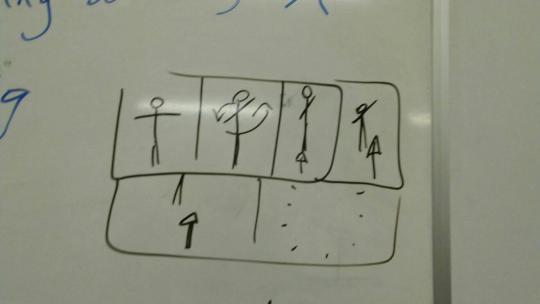
T-Pose Away Story Board
I then came up with the idea of interrupting speech bubbles, this came from reading and writing comics and noticing that in comics when someone’s interrupting, their speech bubble overlaps the others in the conversation as a physical representation, so it’s clearer to the audience whats going on. I thought this visual gag would also work well with pixilation because it’s hard to add dialogue normally. We also agreed that this would work well with staging (one of the principles of animation), as we could experiment with people crossing over each other and use layers to creating an interesting visual effect. Although we realised that this could be difficult to pull of as we needed more people, props and space to pull of well.

Interrupting Speech Bubble Story Board
Sophia then came up with the idea of the human pencil sharpener. In this a guy puts a pencil in their mouth then it comes out sharper, they then put it back in and they choke and die. Judy then had an idea for an alternative ending where instead of dying they spit out the now tiny pencil and it’s very sharp. As both of these sounded funny on their own I realised they where even better together. So we agreed the person will choke die and then spit out a tiny pencil covered in blood but still pointy. We all agreed this was the best idea to go with because it had a simple but entertaining narrative that fitted the theme well as it’s a bad habit to chew your pencil, it also uses the pixilation technique well as the pencil goes further down the persons thought we will use one of the techniques we’ve learned about and use replacement pencils. Over all it had a strong enough premise to make a short narrative but wasn’t too complicated that we wouldn’t be able to pull it of in the short time making it and the short time limit for the animation its self. Another bonus was that because it’s all about the person and the pencil set didn’t matter so we could do it any where. Which saved us having to book a room or sectioning an area of outside to shoot. We agreed the easiest place to it was in my halls kitchen as it was a simple clear environment that wouldn’t distract from whats going on in the shot.

The Human Pencil Sharper
Here’s a more detailed story board of my chair idea to put emphasis of what I was originally thinking. I like the imagination and ambitiousness of this idea but in the end I don’t think it would have fitted with in the time limit and would have been a lot more complicated to pull of properly. It would have also needed a lot more preparation and we just didn’t have the time where all three of could do all that.


Falling of Chair Two Story Board
Shooting Day
Overall the day of shooting went pretty smoothly, we got the set up almost instantly and we all roughly knew what we where doing as it was a simple concept. Before the others got there I had already come up with the idea for the set up, so when we started with the camera there where only a few adjustments that needed to be made. As the corner of the room was more in the shot then I originally thought it was, but it didn’t take too long to clear out and roll the blinds down. We then later ran into some trouble with the camera its self as it wasn’t focusing properly when we needed it to and the batteries weren't charged. Although this was frustrating at first we worked together to come with solutions for both of them. So a spare battery and a constant adjustments of the camera lens later we where on our way to making our pixilation. To do all the close ups I had to move the tripod physically closer then move it back into the right place by comparing it to the earlier footage, there was probably a better way of doing this but it worked at the time and we where in a bit of a rush. Sadly we didn’t have anything to use as blood for the end but I don’t think that mattered really.
Editing
Unlike the shooting of the animation actually editing it all together was an uphill battle. Neither one of us knew how to use the editing software so it was a challenge to get started. Judy did the main bulk of editing on the project and as she had the most experience with editing and cameras in general. As Judy was doing this Sophia started looking for sound effects for the pencil sharpener. It was a challenge to work with the unfamiliar software but once Judy Knew what she was doing things started to look up. We didn’t have time do finish it all in lesson so we met up after and did the final touch ups like editing the lengths of frames and adding more sound effects.
Evaluation
Over all I think this project went smoothly. The finished project was nothing substantial but that’s not what we were setting out to do. The Human Pencil Sharpener is a well-paced and controlled animation with a recognisable narrative and great comic timing for its length. We managed to incorporate effective staging by shooting at an appealing angle and keeping the background simple. We were also able to play anticipation with Judy’s body language building up each time, she put the pencil in her mouth.
If we did it again there are a few things I would have done differently though. One of them being in the planning and story boarding stage I think I could have been a lot clearer when explaining my ideas to save the moments of miscommunication, I also think we could have made more frames in the story board so we would have a better idea of what each of the animations would have been like. We should have also spent more time preparing before going into taking the pictures for example; putting marks on the ground where the tripod was, taking through the movements more before taking the pictures and sourcing the fake blood and long pencil sharpening. These little details would have made the piece more professional looking and would have made the shooting a lot smoother.
But putting all that aside, we created a visually pleasing and comedic animation that followed the guidelines set for us and does its job at presenting “A Bad Habit”
0 notes
Text
MED 1444 Animation Research into Pixilation Reference Sheet
Johnny Chew (2019). All About Pixilation/Lifewire. [online]. (Last updated: August 26, 2019). Available at: https://www.lifewire.com/what-is-pixilation-140460 [Accessed 24 September 2019]
Diemmeti (2011). Norman McLaren – Neighbours/YouTube. [online]. (Last updated: Nov 5, 2011). Available at: https://www.youtube.com/watch?v=4YAYGi8rQag [Accessed 24 September 2019]
Public Health England (2013). Change4Life: Smart Restart TV ad/YouTube. [online]. (Last updated: Aug 19, 2013). Available at: https://www.youtube.com/watch?v=FDUqsQ7FQyM [Accessed 24 September 2019]
PES (2013). Fresh Guacamole by PES | Oscar Nominated Short/YouTube. [online]. (Last updated: Mar 7, 2013). Available at: https://www.youtube.com/watch?v=dNJdJIwCF_Y [Accessed 26 September 2019]
PES (2014). Submarine Sandwich by PES/YouTube. [online]. (Last updated: Dec 10, 2014). Available at: https://www.youtube.com/watch?v=EWEl8-PHhMI [Accessed 26 September 2019]
0 notes
Text
MED 1444 Animation Research into Pixilation

PES’s YouTube Channel
Intro
Pixilation is a form of animation using humans. It works in the same vain as stop motion except you use real people as the puppets. It is often used alongside traditional stop motion to create scenarios and affects that couldn’t be done through live action without special effects. Some Pixilation films combi+ne the animation with live action while others are made entirely out of individual shots. In this assignment we will be creating a pixilation short film using techniques such as; timing, pace and control and utilising at least two to three of the Twelve Principles of Animation. We will also portray a narrative to do with ‘A Bad Habit’.
Pixilation Techniques
Because Pixilation is a branch of stop motion, they share a lot of methods, although there are some techniques that are used a lot within Pixilation, these include: Flying, which is done by getting your actor to jump around in slightly different places and taking pictures of them while in the air; Sliding on any surface by taking shots of the actor in the same position but moved along slightly each time; Taking photos of the actor in one place then taking pictures without them before taking more with them some place ells in the same shot can make them appear to teleport and making duplicates of parts of your actor to use when you can’t fit the entire actor in a small place but want to get the illusion that you can. Or when you only need a part of them to be seen somewhere but can’t get the entire person there just for the shot. These are just examples of what you can do with pixilation, like stop motion if you can imagine it there’s always a creative solution to give the illusion of it happening.

Animation basics: Homemade special effects - TED-Ed
Pros and Cons
One thing I find fascinating about pixilation is the affect you can get with the uncanny valley. Using real life people and getting them to move in strange unnatural ways can be disconcerting. For example, in the beginning of The Secret Adventures of Tom Thumb when the wife is in labour the expecting parents have shaky jolty movements from the pictures being put together. Some of their actions can also seem unexpectedly sharp and fast. This gives the viewer a feeling of discomfort even when nothing strange is directly happening in the scene. This affect when intentional or not can give a film a surreal atmosphere that would leave an impression on the audience. Another pro for pixilation is it’s use in live action and how it can be an easy and officiant way to add affects. Because it’s all done through practical affects you won’t need to do much editing after footage, depending on the film you mostly only need to edit together the pictures. Something I noticed works well in pixilation is how it can be used with traditional stop motion to create a divide between words and characters. A good example of this can be found in the advert “Change 4 Life”. In the advert they use a combination of pixilation, clay stop motion and 2D animation to create a divide between the mum’s word and her children’s. It also means they can use a human actor to remain relatable to the viewer while at the same time using more exaggerated movement and a stylistic approach to make it more interesting for the viewer there for making it a more memorable advert.
Change4Life: Smart Restart TV ad
There are some draw backs to pixilation however, for example it’s a lot more limited then other forms of animations. This is because you are working from the human frame instead of from scratch meaning you won’t have as many creative liberties as if you where doing a more traditional form of stop motion. You are also restricted to working on a larger scale, (unless you are planning on using green screen). Meaning you’ll have to source props and backgrounds in full scale, there for taking up more space and material. Not only this but because your using a real living person they can be more difficult to work with, rather than an inanimate puppet. This is because it’s much harder for them to have to stay in the same position for as long as you need them to be and can be lot more unpredictable.
Exploring
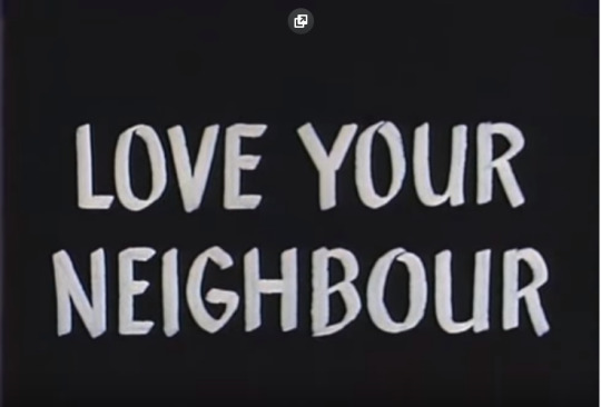
For as long as there have been films people have used pixilation to add in affects. You may have noticed it in a lot of early films before digital affects became fully developed. It’s still used a lot this day, but despite its frequent use it only really made a name for itself in the 1950s with the help of the director Norman McLaren. One of his shorts made in 1952 titled Neighbours was a satirical short about two neighbours fighting over a flower outside their house. They use pixilation techniques to create varying levels of tension cutting frames to make the movement faster and more violent compared to the more peaceful scenes in the beginning. They also use goofy sound effects and music that was used a lot in cartoon shorts at the time to give it a silly light-hearted tone that then clashed with the darker themes as the animation that made the message of “love your neighbour” at the end more powerful because the conflict of tone was so memorable.

Norman McLaren - Neighbours
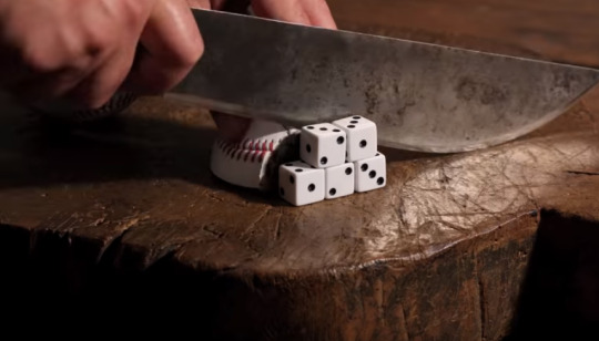
PES is an animation studio that uses pixalation to create creative and comedic sketches and posts them online. My favourite videos by them are the cooking videos where they’ll use all kinds of inedible objects to re-create recipes. Although both PES’s and Norman McLaren’s use the same method of animation their videos both capture drastically different styles. For example the comedy in Neighbours comes from the surreal goofiness of the characters and their surrounding with it’s use of exaggerated movements and it’s use of cartoonish sound affects. While PES use a more visual language-based humour, a great example being when they dice up the rounders ball and with each cut it turns into actual dice. Neighbours has a very fast paste in your face style, with fast paste frames and exaggerated comedy while Fresh Guacamole keeps a slower calmer pace keeping its humour contained into visual gags and the surrealness of everyday objects corresponding with the sounds of cooking. But in my opinion the main difference between the two of them is the way they present themselves. The animation Neighbours gives out the feeling that it knows it’s strange and follows through with that until the end, whilst Fresh Guacamole with it’s simple concept and realistic sound affects has the sense of bizarre normality. It gives of the impression that nothings abnormal at all and this is just how your supposed to cook.
Fresh Guacamole by PES | Oscar Nominated Short
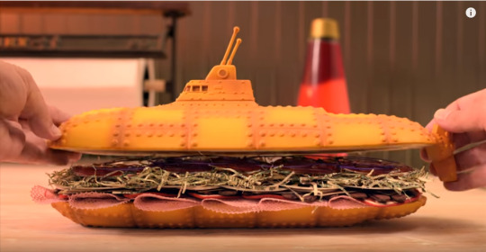
Submarine Sandwich by PES
1 note
·
View note