
Don't wanna be here? Send us removal request.
Statistics
We looked inside some of the posts by 2dplatformerng and here's what we found interesting.
Average Info
Notes Per Post
0
Likes Per Post
0
Reblog Per Post
0
Reply Per Post
0
Time Between Posts
3 days
Number of Posts By Type
Text
17
Last Seen Tumblr Blogs


Fun Fact
In Q3 of 2020, 31% of US users access the Tumblr app daily.
Text
HUD Research
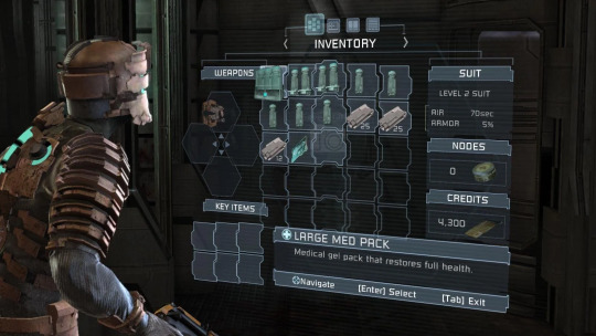
Dead Space's HUD is one of the best and most innovative uses of a ui I've seen. Dead space made its HUD a real tangible feature in the game. This alone adds to the immersion of the game seeing the character themselves scan the menu as you navigate through. For what the game is, its very effective as the game is a heavily sci-fi themed game so seeing a real life hud menu fits the world the developers built.
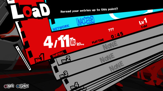
Persona 5 makes use of a very artistic approach for their HUD and menus opting for a more angular and almost put together look which fits the vibe of the game being a very eclectic game. The jumble text and angled menus are also very technically impressive because creating angles like this would require the menu to be in separate pieces.
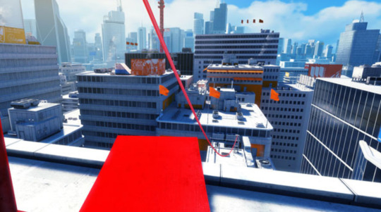
Mirrors edge opts for having no ui or a very minimal ui this allows the player to focus on the gameplay and environment more rather than having to constantly pay attention to 5 different things on different sides of the screen. I personally am not a fan of this as I think having a ui is helpful in most cases although I do understand why they chose not to include one.

Cris tales has all the basic elements of a turn based rpg. Although cris tales has a unique mechanic being the use of different parts of time which is incorporated into the ui by having folds in reality to show this and the world is different in each fold.

Dead cells has a relatively standard ui with abilities and their buttons shown at the bottom left and other menus circling the screen. I like seeing this style of ui in games I play as it’s often easy to read and kept together although it’s the least appealing to look at however it still works with the style and vibe of the game.
0 notes
Text
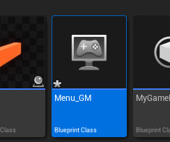
Adding New Screens
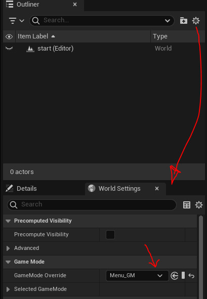
We are now starting to add start screens to the game however the UI still shows up in the new world we'll use for the start screen so we need to add a new game mode to fix this.
We need to remove the player from this game mode so the UI wont appear. You do this by selecting the default pawn class and clearing it.

To set this world to the new game mode you open settings and then choose world settings then in the new section
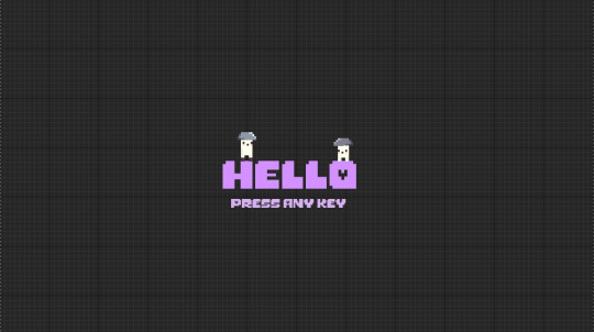
I Added my 2 characters on top of the title screen to add something interesting rather than just text.
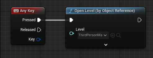
To open the first level we needed to add the small bit of code underneath.
I also made a lose screen that'll appear once you lose all your health.
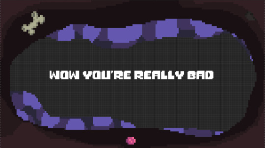
I tried to make the lose screen look like the character had been dumped in a hole by adding layers of dirt surrounding the text and adding some of the items I had in my dirt variations as well as a bone in the same colours as the skull I used. I also made it appear that it was from the characters pov slightly by adding a small view of the canopy hanging over the pit. The reason I made this the lose screen was because my characters death animation looks like he is decomposing so to match this I made it look like his remains had been returned to the soil much like real life composting.
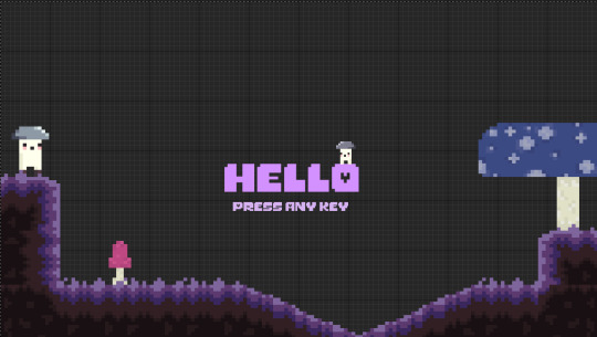
I added some landscaping around the start screen to add some more character and life to it. I moved my player into the foreground but kept the other character in the background to add a feeling of depth to the start screen.
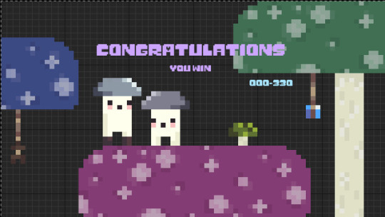
For my win screen I brought the 2 characters to symbolise the goal of the game and act as an opposite to the start screen. Th small bit of blue text acts as a score check and will tell you how many of the 33o points you got upon finishing the level.
0 notes
Text
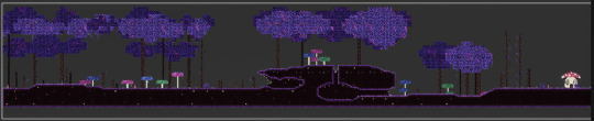
Level 2 Tile Map
This is my tile map for the second level. Level 2 is much more linear and is more in line with a traditional platformer. I wanted to have the levels feel different from each other and different reasons for being hard as typically in most platformers this would happen between 'worlds' or 'chapters' however because we aren't making 6 world games i decided to make the levels feel different instead. Level 2 relies more on the level being physically difficult to traverse rather than mentally being difficult to beat. The level utilises spikes more throughout as well as the risk of falling which takes of 1hp each time ,giving you only 3 tries to beat this level, and resets you to the start of this level no matter what part you fall.
0 notes
Text
Creating an End Point
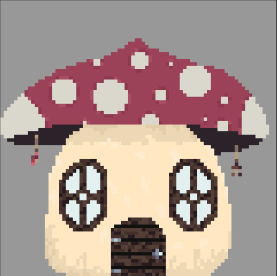
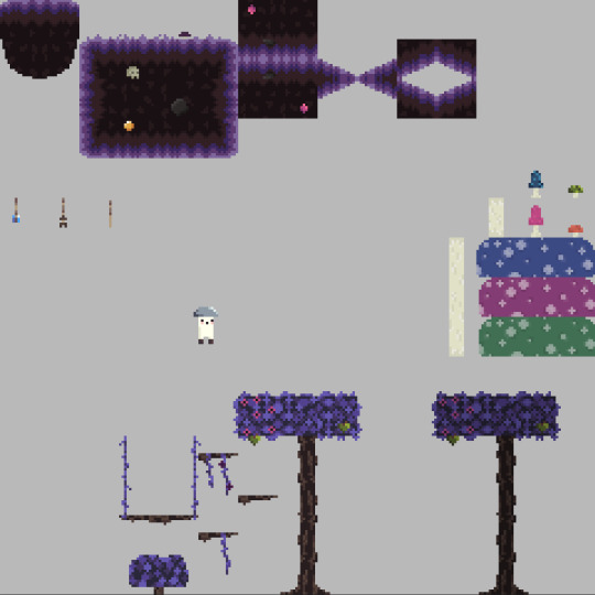
I felt like my levels needed a solid end point rather than just the small character at the end so I made a little mushroom hut for the character to be placed out the front of. I tried to link it to the rest of the level by adding some hanging ornaments to the top of the house similar to the ones I used on the mushroom platforms. I also tried to use a similar pattern on the wooden door and window frames to add a level of consistency
0 notes
Text
Adding Widgets
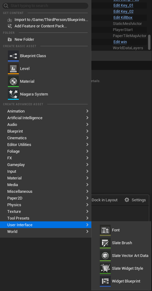
To add widgets to the game you need to first make a widget blueprint in the content drawer.
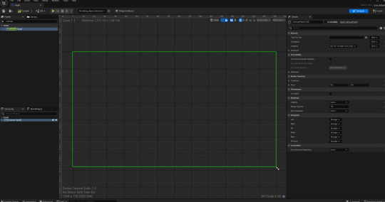
Next you need to open up the blueprint and before you can add and edit anything you need to add a canvas panel to your widget.
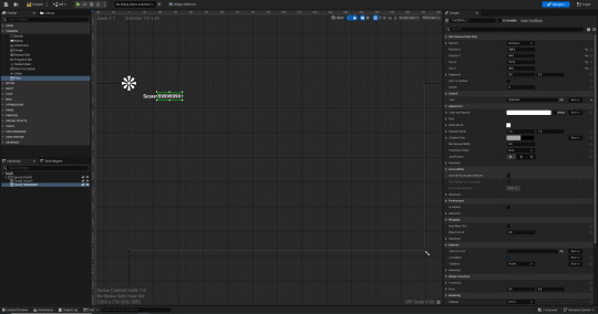
The next step when making the widgets was to add some text blocks. Whatever is currently written on them will change eventually however for the time being I've used the word score and a few 9s as place holders just so I know what it'll look like.
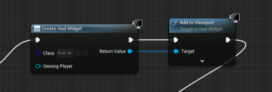
We now had to add the widgets to our games so to do this we opened up our character blueprints and coming off of the link starting with on event begin play we added create widget and chose the Hud we just made and the coming off of this we added add to viewport so it would actually show up in game.
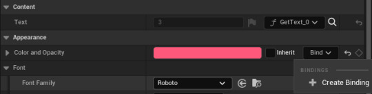
At the moment the widget was just displaying the placeholder text so the next step was to made it show the actual health and score that the player currently had. To do this we had to create a bind to our text so it displays the info in our game instance.
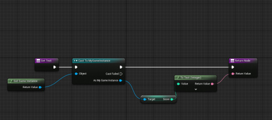
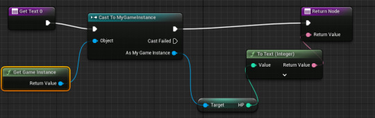
The score and Hp use essentially the same nodes apart from one gets Hp and the other gets score.
After doing this the score and Hp are linked to our game instance and update accordingly.

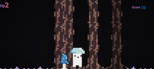
The Hud didn't really fit the rest of the games style as it was all regular smooth text layered on an entirely pixel art background so to fix we this we experimented with adding fonts and icons to the Hud the reason I chose the font that I ended up using was for 2 reasons. First I thought the style of letters and numbers fit the style of my game very well. Second I liked the fact that the p had a heart in it as I knew id haver the word Hp on screen I used this one so the word had a bit more character and it also represented what the word meant.
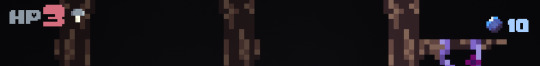
I also reused my gem sprite next to the score in place of the word to not only simplify the Hud but make it more visually appealing. I also added a small mushroom with the same colours as my character to the right of my Hp to add some visual flair.
0 notes
Text
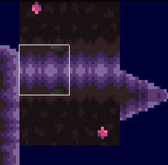
Creating a Wall
I wanted to have a key system with doors in my game to make it feel a little more like a puzzle platformer so now that I have the key working I started to create a sprite for the wall I'm going to use.
The log itself is just my thicker log tiles repurposed into an even wider one. It's 24 tiles high and it needed to be extremely tall as I have a section of my level that sits in the tress canopy so I didn't want people to be able to jump from there over the wall essentially skipping one of the key components of my game. I also decided to make it 32 pixels wide instead of my normal 16 to emphasise that this isn't just another log in my forest.
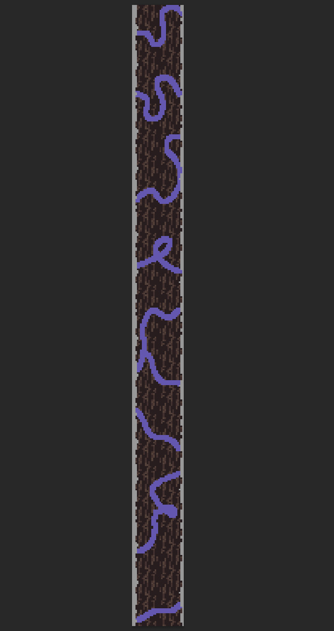
I then decided to cover the tree in purple vines to tie it into the rest of the environment more and also make it stick out more among the rest of the mostly baron trees. Later I plan on adding shading to these vines as well as some glowing fruit to make the tree seem more magical than the rest.
After shading the vines it looks a lot better and fits in more with the rest of the vines that'll be around it. On 2 parts the vines loop around each other so although its subtly I added a line all the way across where they overlap and shaded it slightly darker than the rest to emphasise the fact that the vines overlap here.

I made the glowing parts of the tree a yellow colour as I feel it compliments purple well and I don't have a lot of yellow in my game at the moment. I also made them glow at different points because I didn't want it to feel automated and mechanical so a more unpredictable glowing pattern made more sense.
I made some tweaks to the key as well because I felt like the idea of having a golden key destroy a big log seemed a bit far fetched. Despite the fact its till a bit odd I wrapped the key in a few vines to link it to the tree aa bit more.
0 notes
Text
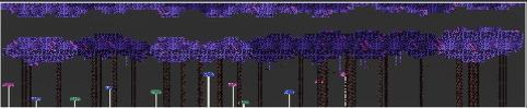
Tile Map Progress

So far I've just placed down the main ground and some basic background elements as I want to get the main flow and feel of the level before adding in different details. I set up a bit further back to because I wanted to put my key back there so it was a little hidden and out of the way.
This is the tile map currently. so far I've just made the basic blocking of the first section of the level. I made a section of leaves in the foreground as i want the leaves in this section to be their own part of the level and to reach this part you'll bounce up on a mushroom so to add a level of depth and immersion, it'll seem like you pass through the leaves.
I finally got around to adding the key to my game so from this point on I'll make sure i'm segmenting the game to utilise these better and help it feel like there are multiple sections.
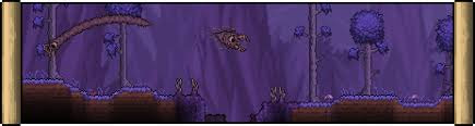
This is levels one finished tile map. Its cut into 3 sections, the first being a tree top section where the player bounces up into the tree line to receive the first key and unlock section 2. I decide to make section one a tree top sections as i knew I wanted to have variety in height within my level and i thought it would be slightly unique to make it a tree top section. Section 2 is the shortest of the 3, being a section with some simple platforming to reach a cave entrance thats collapsed and the player has to teleport inside to reach key 2 and then teleport up to the above platform to continue into the 3rd section. I had set out from the start to have a teleport mechanic in my game so this section was made to utilise that feature. Section 3 drops the character back down into another cave the leads outside to a section with 2 trees where the player has to traverse up jumping from left to right. In this section the player has to find the key as it in a section that appears to not be traversable but there is actually a hidden platform behind the tree line with a key and further along a bonus collectible. I made this section because i felt my game was slightly too linear so i made this section slightly harder to tell where you were meant to go.
0 notes
Text
Issue when making my tile map
I forgot to separate my half blocks so I've ended up with them as one block so i need to reopen my photoshop ,file and separate them and then re import everything again
0 notes
Text
Importing Tile Map
First I imported the png of my tile map into unreal as I have before and applied paper2d texture settings.
I then created a tile set and ended up with this.
0 notes
Text
World Design Research
youtube
Terraria used to be quite a simple game in design however over the years especially in is more recent updates its had a massive increase in quality and its art style. Terraria is a very colouful game and utilises desaturated an highly saturated versions of colours to expand the look of the game. The colours used across biomes help with the fell of the area you're in like the corruption uses desaturated purples and uses a lot of graytones too as it's meant to be a spookier biome as it houses onepf the earlier bosses in game. The music and sound effects in the game add to the setting as each biome has different soundtracks some change with time as well.
youtube
Dave the Diver's art style is a confusing one as all characters and most sprites are pixel art. Dave the Diver utilises vibrant colours as well as darker desaturated colours to show the different levels of the ocean Dave is diving at.
youtube
The eternal castle makes use of a limited colour palette composed of blue purple black and white.
0 notes
Text
Continuing with Tile Maps
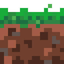
I've made quite a lot of progress so far with my tile map. I've really committed to making my foliage the same set of purples because I wanted my game to feature a lot of colours and I tried to cover the whole of my colour palettes and all that was left was purple which worked out well because I had set out from the beginning to have purple grass and plants. When starting to make my tile map I researched 16bit grass tiles and found one I used as reference for the ground coverage. Seen below.
I tried to make the grass and dirt a gradient and fade from lighter colours to darker similar to games like terraria like how the deeper dirt has a vignette over top however I wasn't sure how to do that so I compromised. I actually looked at Terraria's corruption as a source of inspiration for the grass and trees, it gave me the idea to desaturate the wood's brown.
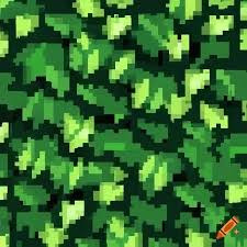
Like what I did with the grass when it came to the leaves I just researched 16bit leaf tiles. I used the one below specifically as inspiration for the layered look, going from dark to light purples
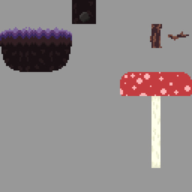
When coming up with dirt and grass variations I started out relatively simple just putting in a rock and a skull but to help tie things together for the dirt block that goes under my half block I made a small gem using the same colours as my crystal spike.


Also for consistency in one of my hanging decorations there is a smaller version of my collectable gem to help link parts of my art/world together.


0 notes
Text
Adding Animations
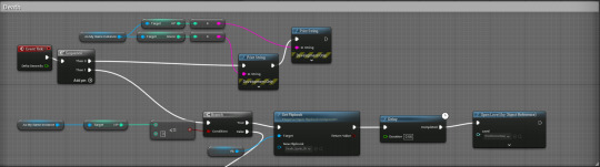
To add the death animation to my game I had to remake the health system coming off a different node instead of casting to game instance.
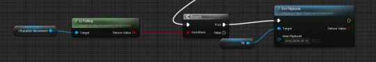
This checks if the player is in the air and if true plays my jump.

This set of nodes checks if my velocity is NOT equal to 0 and if so it plays my walk animation.
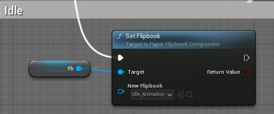
This makes sure that if none of the above are in place then my idle animation plays.
0 notes
Text
Pixel Art Research
Waneella:

Waneella on tumblr is a pixel art artist and she has great art to look at to help research colours, contrast and vibrancy.
Paul Robertson:
Paul's art is very stylised with harsh highlights and shadows on all his art he also uses great colour palettes often opting for bright vivid colours.
Pedro Medeiros:
Pedro's art makes use of great control over smooth line work and gradients when it comes to shadows and highlights on his drawings. Like the other 2 artist above Pedro makes use of very complimentary colour palettes.
Ivan Dixon:
Ivan focuses on making his characters seem very animated and alive in the gifs he creates making parts of the drawing flow naturally behind the character like hair or cloth.
0 notes
Text
Game Mode Research
A game mode is a specific set of rules and settings that alters how a game is played like survival or creative in sandbox games or multiplayer and story in a fps. You would use a game mode if you wanted there to be multiple ways to play your game allowing people to replay the game and it not feel stale. If i had a gamemode it would just be classic as my game doesn't require any others.
0 notes
Text
Design Research
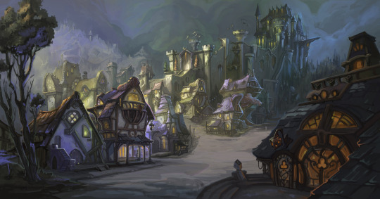
The art above and below from ArtStation will be helpful when designing my environments as it has a slight mystical feel which is what I want from my games environment. The bottom one fits even better being an abandoned monument or building in the forest as I want my mushroom forest to feel quite desolate.
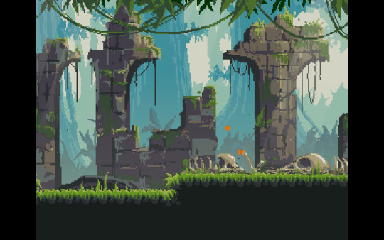
The art below also from ArtStation is essentially what I want for the colour and theme of my level environment so I'll use this as inspiration when it comes to tile mapping and creating the physical level.
0 notes