
Statistics
We looked inside some of the posts by 2dplatformerterm1-fe and here's what we found interesting.
Average Info
Notes Per Post
0
Likes Per Post
0
Reblog Per Post
0
Reply Per Post
0
Time Between Posts
3 days
Number of Posts By Type
Text
17
Last Seen Tumblr Blogs


Fun Fact
Tumblr has 411 employees.
Text
What makes my game unique?
A big part of what makes my game unique is probably my main character; a dog. It's design is literally just based off of my own dog, and I followed saint11's tutorial on how to animate a quadrupedal animal for the walk. The other animations I honestly just searched up YouTube videos of animals jumping, tail wagging, laying down and tried to emulate to the best of my ability.
Another thing that probably sets my game apart is my art style. I am unfortunately not very talented at art, so I wanted to keep my game more simple looking. I justified my own art style in my head by saying that my game was in the perspective of a dog, so nothing really needed to be over detailed. I didn't want to over complicate my work too much because I thought if I did so then my game would look worse.
Going into making my game, I wasn't that interested in my own idea, which was probably my downfall from the beginning. My sister wanted a game with a dog protagonist, and we bounced so many cool ideas off of each other that I immediately just went with it as my first thought. I did enjoy developing my game, and I did grow attached to my concept and wanted to make it work. But I'm not sure if it would have been better- if I could have showcased more and expressed myself more creatively if I had done something else entirely.
0 notes
Text
THE ANIMATION PROCESS
To start off, create a new file on photoshop. Adjust it to the correct size that you will need. Usually, you should animate your work in the same amount of pixels each time. For example, if you had been working in 32x32, then you should more then likely all be animating your character in the same regard.
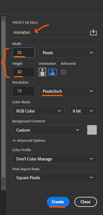
I had been working in 32x32, but since my character is a dog I had to increase the length of my new file. So I've been working in 32x64.
Using the window tab, if you go down you will find an option called 'timeline'. Once clicked on, you should have a timeline now on your screen. This basically acts as what you will make your frame by frame animation with. Each frame should ideally be only slightly adjusted from the previous one, creating small, gradual movements that will form something more cohesive and fluent when put together.
It's also recommended to find some sort of tutorial or reference to use when trying to animate your character.
Admittedly, I did not do so with my character. I used one of 'saint11's tutorials to make the walk cycle for my dog, however, the rest of my animations were completely just freely done by me. So I'm sure that the movements are not realistic, but I think that I did a pretty good job for each animation. I particularly like my idle, its very simple and cute. I feel like the tail wag adds personality to my character.
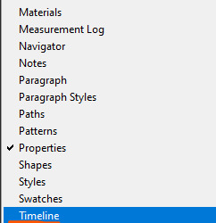
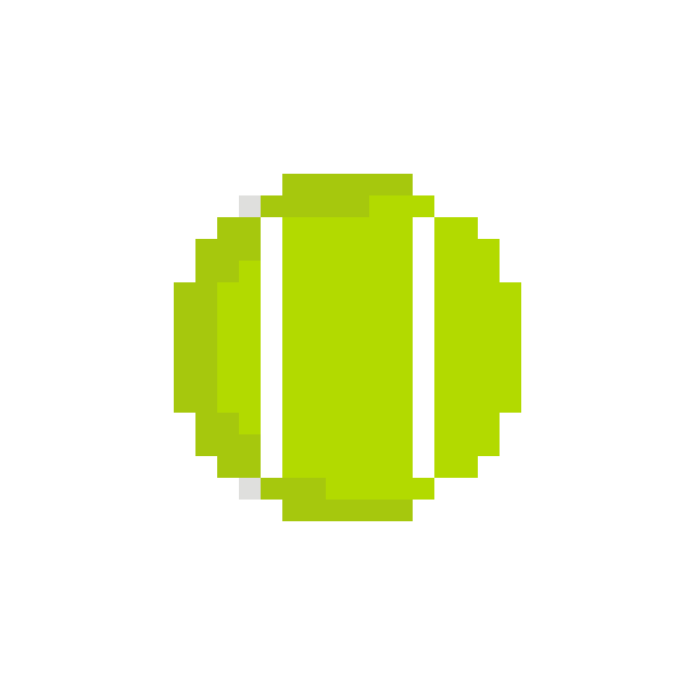
For my pick ups, It was definitely way easier then animating a full bodied creature. I like the way my health items spin, and the tennis ball I made. They're simple animations, but they work for the situation.
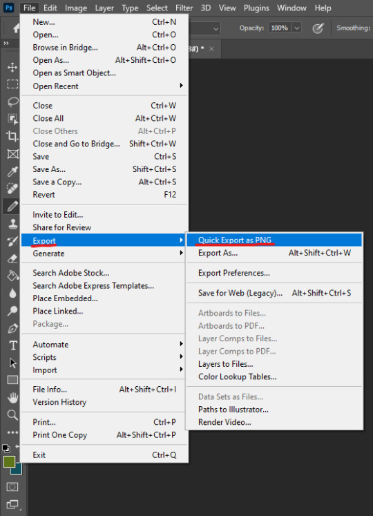
To make a GIF, you should first save your work. Then, access your 'save' tab, and locate 'export'. Click on 'save for web legacy', which will take you to this screen.
Adjust the image to the correct size. This may take some adjusting until you get the correct size. Also worth noting that the background to your animation should be turned off, so its not visible in. the background and is transparent.
Then, you save it to wherever you think is best suited. I chose my downloads.
0 notes
Text
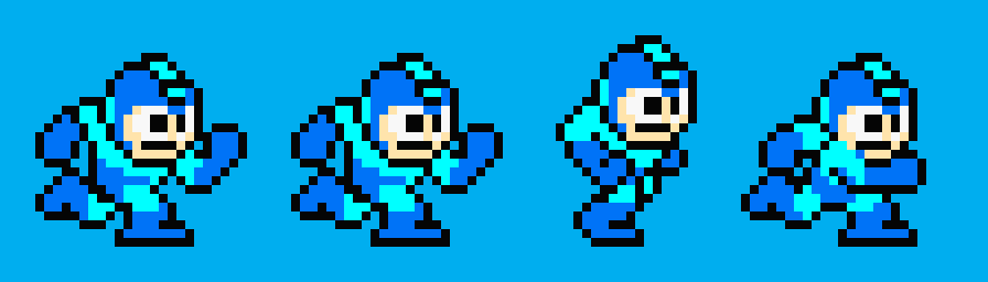
MEGAMAN WALK CYCLES
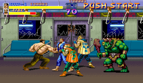
Personally, I prefer the mega man 8 walk cycle. Its way more fluid with its movements, and it feels like it has more personality than the original one. However, I will say that I do also enjoy the mega man 1 walk cycle too. It's definitely more jagged, but I like the simplicity of it at the same time. It does its job, and it does it well.
0 notes
Text
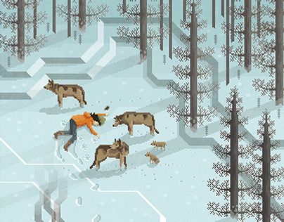
ARTSTATION


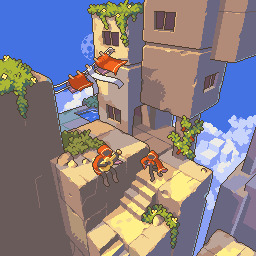
I like these dogs! I feel like they have a lot of personality, and it’s expressed well through the art pieces. I want my players to connect with my own dog character, so I think these artworks are good sources of inspiration to come back to.
And these artworks are what I wish I could have done for a a background for my game. Or something of the like- since these are relatively complex for the game that I wanted to create. I really like all the settings, and I think they would have made for excellent designs to take inspiration for my levels.


0 notes
Text
research - character animations
CRASH BANDICOOT - DEATH AMIMATIONS
youtube
MULTIPLE FRANCHISES - IDLE ANIMATIONS
youtube
SONIC- JUMP ANIMATIONS
youtube
0 notes
Text
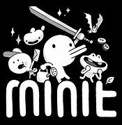
CHARACTER RESEARCH
SUPER MEAT BOY
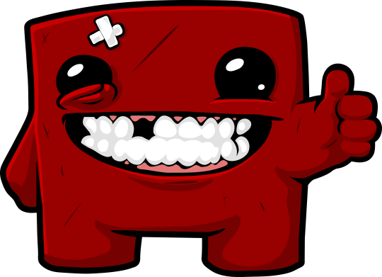
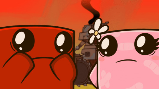
Well, he's made of meat.
CASTLE CRASHERS
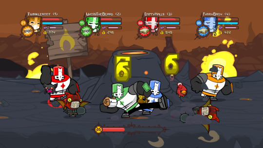
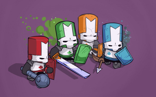
MINIT
0 notes
Text
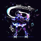
ARTIST RESEARCH
MICHEAL MYERS

His website contains most of his work on it, with lots of different projects for people to look at and take inspiration from.
I feel like for most of is art, he does abide to a more colourful colour palette. But it also seems to depend on what he is creating, judging by most of his projects- specifically his 'puffin pixels'.
LOSPEC
This website has a variety of different helpful things for pixel artist. On LOSPEC, people can show off their art and their colour palettes. There is also competitions that are held, where artists can show off their work and demonstrate their art styles.
There's definitely a lot of variety with every artist and their colour palette. No which one is exactly the same, some with more vibrant and others more dull.
PIXEL JOINT
This website is basically just for creators to show off their pixel art, in competitions or just uploading their art to be viewed by others.
Again, there isn't exactly a fixed colour palette. Plenty of people have very different colours that they used.
0 notes
Text
making enemies
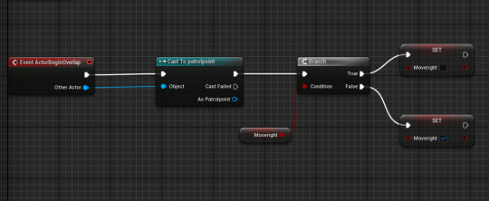
Firstly, we started off by adding a new blueprint ands setting its class yo character. I then called this blueprint 'enemy'. I also added another blueprint in the actor class called 'patrol point. These would act as stoppers to stop the enemy from walking all over the place, instead being set to a set spot.
Then, because we haven't made enemy sprites in photoshop very, we added in a cube to be the placeholder for our character for now. I made my cube blue to show that its very dangerous.
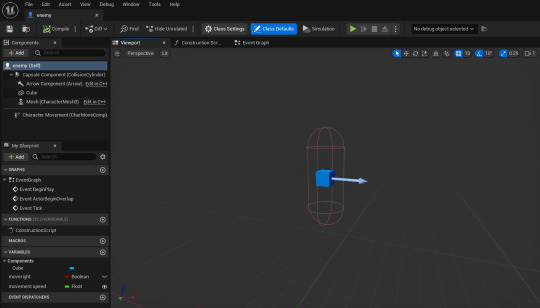
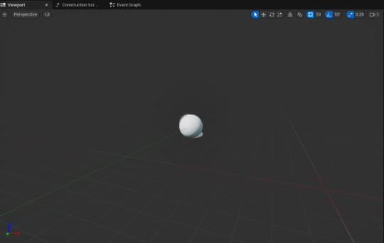
I then needed to add some code to my enemy so it would move around in a set position. To do this, I first of all had to go back to my blueprints for my 'patrol point'. I had to do this so that my enemies would be locked into a fixed area. I made my actor a sphere, which would act as my patrol points. That was all i really needed to do at that point, so i went back to my 'enemy' blueprint.
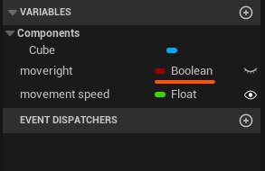
Now that we had made our actors for the 'patrol point', the next step was to add a component variable. I did this by pressing the little plus button, naming my new variable 'moveright'. I then made this new variable a 'Boolean'
We then had to make it so when the patrol point is collided with, the enemy will change direction, whilst staying in the restricted zone. We did this by casting (sending information) to the previously made patrol point, which then leads to a branch. The branch contains two nodes which state either true or false. If it is true that the enemy is moving right, then the patrol point will not turn it away. If it it false, however, then the code will activate and make the character turn right.
Next was adding the movement speed and
0 notes
Text
GAME RESEARCH
When researching the following games, I will be answering the following questions:
Is the setting detailed or simplistic?
Is there a limited colour palette?
Do the colours used create a particular atmosphere or feeling?
How do different levels / zones look - what ideas can you take away to help you make your level 2 /3 /4 ?
SWORD AND SWORCERY
youtube
-The setting is pretty detailed, with lots of shading and details within the environment.
-I think that the color palette is quite limited, using very dark and neutral tones throughout the game.
-The darker, more eerie colors do set a rather ominous tone to the game. It sets the player a little on edge throughout the experience, letting them know that they should probably be weary.
-Each part of every zone in swords and sworcery is carefully crafted to catch the players eye. I think i would want to try and create a more detailed background for my own game.
TERRARIA - USE OF BIOMES
youtube
-The setting for terraria is pretty detailed in the foreground, and the backgrounds are usually also fairly intricately detailed.
-I think that the color palette can vary a lot depending on the biome the player enters, such as the dungeons, or the hallows. This is a really cool concept that i might take inspiration from for my own game.
-The colors used in Terraria makes a good atmosphere
-Every biome in Terraria is vastly different from each other- with their own unique color palettes. I like the bright colors in some of the biomes, and I think that a color palette consisting of similar shades and colors would fit well in my game.
DAVE THE DIVER - UNDERWATER EXPLORATION
youtube
- I think that the setting for ‘Dave the Diver’ is fairly detailed, especially with the mini games and when you can actually go into an underwater setting as Dave and explore.
- I think that the colour palette is very consistent throughout the whole game, but i wouldn’t describe it as limited. There’s a lot of different colors, with plenty of shades which ranged from light to dark.
- I’d say that this game has a pretty fun and light atmosphere, which is reflected well in the colors that are used throughout the game.
- The different levels and zones are all pretty unique in their own way. I like the mini game aspects to ‘Dave the Diver’, and I think it would be interesting to add something similar to my game.
ETERNAL CASTLE - LIMITED COLORS AND THE USE OF PHOTOGRAPHS
youtube
-I think that this game is really detailed, especially so in the setting design. The characters are pretty simple looking, but the backgrounds and the game design make up for the lack of design in my opinion.
-Eternal castle has the most limited color palette out of all the games discussed so far, using mainly pink, white, blue and black for the settings. These four colors make up the vast majority of what is seen in the game, but there are occasionally other colors too..
-I feel like the color palette definitely alludes to a post-apocalyptic feeling throughout the game. It almost has a dream like atmosphere.
-I like how each new zone/ level is walked into fluidly. Its not abrupt, but is instead led into very naturally. I think that something similar in my game would be very cool.
0 notes
Text
Adding a HUD
A HUD is a heads-up display.
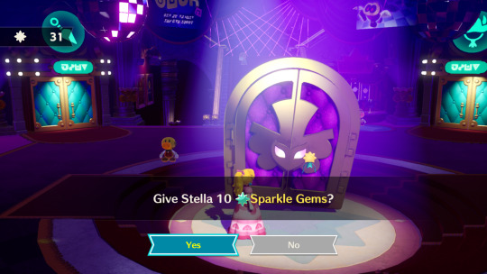
In 'Princess Peach: Showtime!', the HUD is in the top left corner. This shows the amount of 'sparkle gems' that the player has acquired over the course of their gameplay.
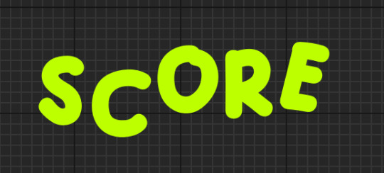
In my own game, my HUD would be the score and health system. And maybe a stamina bar too.
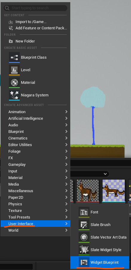
To add a HUD, I first started by opening my content drawer and right clicking in the blank space. I then selected the 'user interface- widget blueprints'. I then named my new blueprints 'HUD' and opened them up.
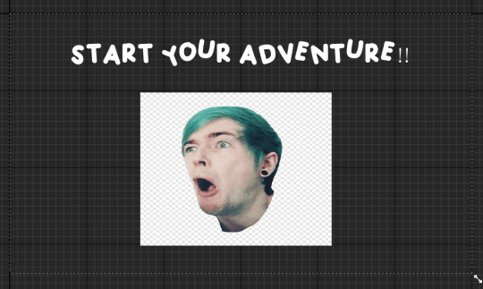
After opening my blueprints, I used my palette to get a canvas panel and added that to my blueprints. I then added some text to my new canvas panel, and altered it so that it simply said 'score'. Then, using PNG's I found on google, I added some funny pictures to my canvas panel too. I imported the images and applied paper 2D settings to them before adding them to my canvas.
I was left with this:
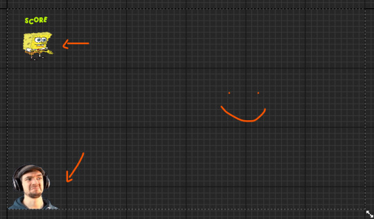
They wont be permanent parts of my game, but it was fun to add them.
Then, we learned how to change the font we wanted to use. To do this we first searched up a website called 'DeFont'. DeFont is a platform where people make and add their fonts for others to download or to buy and use in their projects. We changed the font because we needed to find one that would better sit our individual games.
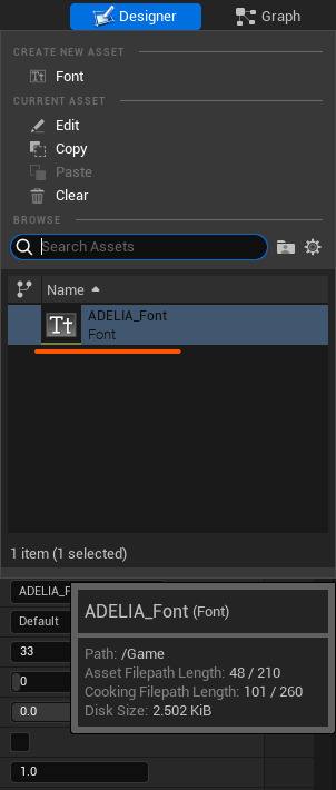
I chose a font called 'Adelia'. The cartoonish, childlike style of this font appealed to me, and I thought it would work well in my game.

To add this to my game, I started off by downloading the font into my folders. I then went back into unreal and imported my new font. I needed to go into my new font file and unzip it before i could add it into my contents drawer.
We then made a death and start screen for our games. We did this by making entirely new levels, which we left blank for the most part. We made different HUD's for each screen. These are temporary for now, and I will change them, when I come up with a more well thought out design.
0 notes
Text
RESEARCH
ARMY OF TROLLS
Games / Kynseed – Army of trolls
OCTAVI NAVARRO


DEREK YU
JOHAN VINET
tumblr
0 notes
Text
Adding tile maps to game
To start with, I quick exported my previously made tile maps as a PNG and saved it to somewhere I could easily access it. This Is the same process as when I made PNG's for my character sprite sheets.
I then opened up my unreal engine, accessing my content drawer and importing my PNG into my 'content' folder. I also changed my settings to 'Paper 2D', so that my artwork looked more crisp and not blurred. This will ideally create a more visually appealing game.
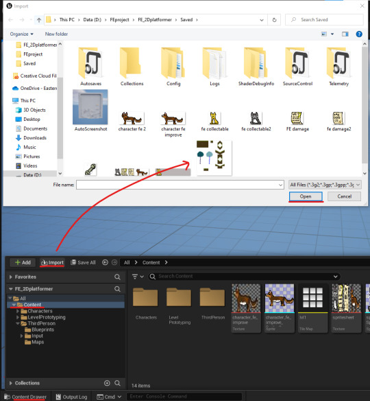
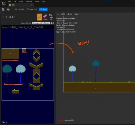
I then opened my new tile sets folder, which displayed all my tiles to me so I could add what was necessary to each one.
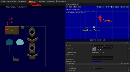
I needed to begin by adding collision boxes to the tiles that would be walked on my the player, so that when they entered the world they wouldn't fall through the platformer and die instantly. I did this by selecting the blocks I wanted and adding a collision box to them.
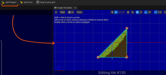
For boxes with odd shapes, I had to adjust the collision boxes by selecting the polygon tool and drawing out the correct shape.
After adding collision boxes to the correct drawing, I saved it and then made a 'tile map' and titled it 'lvl1'. This meant that i could actually begin to make my level by using my tiles to paint out a basic layout for what I want my level to be.
Then, to add this into my game, I simply just dragged it out into the world. At first, I set the co-ordinates to (0,0,0), but it collided with my original 2D level, so would not work as intended. I fixed this by changing the position of my new level so that it was further away from the previous level.
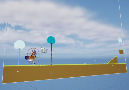
I need to shrink my character down quite a bit so that it doesn't look huge when playing the game.
0 notes
Text
UNREAL ENGINE - FEATURES
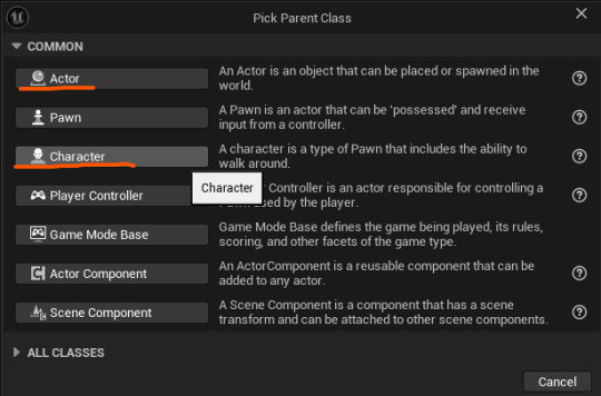
WHAT IS A BLUEPRINT?
A blueprints is a reusable object that performs a specific piece of code. In Unreal Engine, the blueprints are visual rather then just pieces of code to write out. An example of one of my blueprints is my bounce pad, which can be used repeatedly throughout my level.
These blueprints are important because it means you have an unlimited resource/amount of something, without having to re-do all the work just to make a copy.
WHAT IS CASTING?
Casting is when an object is taken and and converted into another class type. Its used to directly communicate with different objects. An example of casting that is 'Cast to BP_ThirdPersonCharacter', which I use to control how the player interacts with the world around them. Like obtaining scores, taking damage, moving around, ect.
WHAT IS A VARIABLE?
A variable is something that holds a value or a reference to an object or actor in the world.
WHAT IS A PNG?
A PNG is short for 'Portable Network Graphic'. It is a type of raster image file, which often has transparent backgrounds. This is because its the only type of file that can actually handle the graphics of a transparent or semi-transparent background.
WHAT IS A GAME MODE?
The game mode is basically an underlying set of rules that the game follows. These specific rules that the game has to follow make up what is the game mode. Some basic rules are as follows:
Number of players in a game
Spawn locations
Pausing the game- when/where/is it allowed?
whether the game has started or not
You would use a game mode when designing these specific requirements, as it helps the game to function properly and provide the best playing experience possible.
WHAT IS A SPRITE?
A sprite is a two-dimensional bitmap, often added and used in 2D games.
WHAT IS A GIF?
GIF stands for 'Graphics Interchange Format'. It is a series of images that replay on a loop repeatedly, usually to animate a characters movements.
0 notes
Text
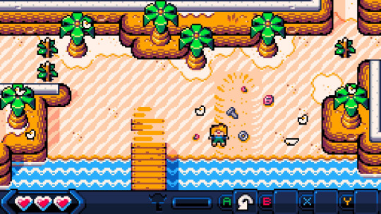
LEVEL DESIGN: Making my own tile maps
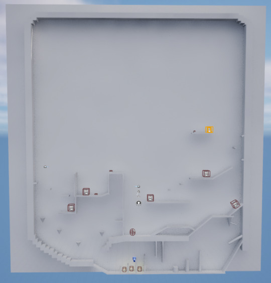
To begin with, I opened up my game and took a screenshot of my level from afar.
I then added some vague sketches/ideas of what I wanted the levels to look like.

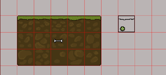
before: I don't like the little patterns in them, I think that they are ugly.
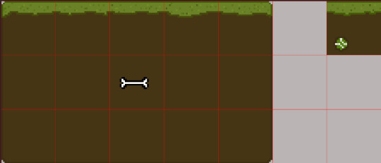
after: This is the final result of what my grass will be. I like the mono-colored dirt because it adds a sense of simplicity to the game which I enjoy, because that's the type of vibe I wanted for my game. It also makes my life a lot easier when connecting the tiles together in my games
When making trees, I couldn't really decide on a color pallet to use. I thought it would be fun to make the trees more vibrant, so that the level looked less boring. And then I also thought that it would be cool to make it so that the trees were how a dog would see them. However, dogs can only really see three colors- that being blue, yellow and gray. I didn't like the idea of making a solely using those three colors though, because I thought it wouldn't make my game look interesting enough.
At first, I made a regular looking tree.
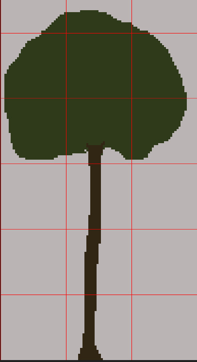
I didn't like it, I felt like it didn't match the vibe for what I wanted my game to feel like- a fun adventure game about a dog. And, I was worried my character would blend in too much with the bark of the tree.
So i decided to revisit my previous idea of using dogs colorblindness to make a color scheme.
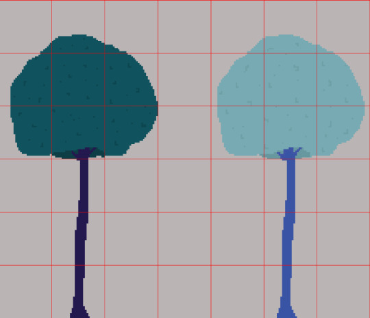
I like these much better!
At first, I made 2 just to compare and see which ones I liked better. But I honestly really like them both. I think I'll use the darker one on the left to be a background tree, and then the lighter tree on the left will be used more so in the foreground, so that it gives an illusion of depth to my game.
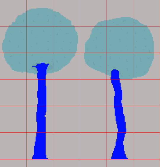
I made some different variations of the tree, just to make my game more visually interesting.
I was advised to try and add some depth to my trees, because apparently the colours I chose for the trees make it feel like its leaning away from the screen. I chose not to change my trees in the end for two main reasons:
I didn't like the way they looked. I prefer the solid colours, I feel like they fit the vibe that I'm trying to create with my game.
My game is supposed to be pretty simple looking. In my eyes, it's from the perspective of a dog. A dog wouldn't really take in enough detail from the world around it.
I will say, finding a balance of what is too complex and what is too simple has been probably one of the hardest parts about designing my level. I don't want to go crazy with detail, because then I wouldn't be sticking to what I think is right for my game and what my creative processes are. But at the same time, I don't want my game to be too simple, and therefore visually unappealing.
I hope I'm able to find a balance. It has been interesting trying to get into the mind of a dog, and trying to see things from a whole other perspective entirely.
0 notes
Text
TILE MAPS: Designing my own level.
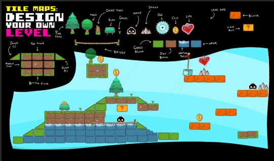
I made my own level using pre-made tile maps.
Using these tile maps made me realise that I'm honestly very lacking in environment building skills. It was pretty challenging to create even this fairly simple level from scratch.
0 notes