
Don't wanna be here? Send us removal request.
Statistics
We looked inside some of the posts by 603ollie and here's what we found interesting.
Average Info
Notes Per Post
1
Likes Per Post
1
Reblog Per Post
0
Reply Per Post
0
Time Between Posts
1 day
Number of Posts By Type
Text
17
Last Seen Tumblr Blogs


Fun Fact
12.7% of mobile users access Tumblr.
Text
Rationale
In closing of this project I understood the value of using multiple different programs to accomplish a resolved project/design. I used Photoshop to edit my photos and posters. Illustrator was used to illustrate scenes from photos (un-used) and inDesign for page layout. I think changing from Illustration to photo-based work early on was a smart choice since my Illustrations could certainly use more practice before I'm using them to hero an event such as Typografika. None the less I am still happy I experimented by creating an Illustration I could've used as a background as I could have easily switched back to it if my photo-based backgrounds weren't working. If I was to redo the project, I would likely take the illustration route but really embrace the illustration by creating vector art for each of the speakers/ having illustrations of relevant icons/symbols in the background.
In relation to the work I have created and submitted; I am happy with the work produced, the colours match my colour scheme I used and the careful consideration of where I place colours make them pop that much more. If I had extra time I would've liked to potentially experiment with backgrounds for the speakers, rather than the dull ones presented now.
I think the modern aesthetic I have attempted to communicate directly relates to my target audience (young adults) who in the beginning of my research felt uninvited to such events. The entire process of making this work was to make those young adults feel more included, as to why I chose neon lights and bright warm colours to attract them to my work.
Typographically, I think my typeface choice was successful (Helvetica Neue) I used a multitude of different weights within the font family to make particular areas stand out better than others. Such as how I used a thicker weight on the speakers first sentence as a means to draw people into the content/description they have. If I were to make a change I would have liked to use the angles my poster side uses more frequently throughout the work. It seems almost like a click-bait the way my poster shows these crazy angles and colours, to then be shown a very grid-oriented layout, I would've liked to embrace the potential chaos.
I used a particularly heavy amount of contrast throughout the work. This was used to make pieces easier to read however also create a differentiation between the speakers and the workshop. While the contrast is modern and clean, I pondered how this could've been iterated to better legibility without needing to rely on contrast. Could I have used another colour from my colour palette, or made type larger which therefore wouldn't need a background, could I have added a "speakers" and "workshop" background as a ring (like the "2024" I use on my front/back cover).
In conclusion of this project. I am extremely happy with the overall result. My colour selection was chosen in relation to my target audience. I believe I was able to make this project directed to them and I believe my typography was chosen well to communicate the modernness of the work. With several different experimentations that could've been taken had I not been set on the modern, photo-based work, I could have easily oriented myself into another direction based on the research conducted and different styles of creating work.
Ollie Duncan, 2023.


0 notes
Text
6.1 Activity
During the 6.1 class we performed an exercise pertaining to the combination of images, text and tables. While I already had experience experimenting with the aforementioned elements it was nice to reconsolidate my abilities in a controlled and supportive environment.
We played with paragraph styles and adjusting swatch colours to create time that contrasted against the background and used the element of repetition to create a visually appealing "conference programme".

0 notes
Text
Poster side mockup
Since I've settled on my poster side I decided to test it in the "real world" by placing it in the world via Adobe Dimensions. The mockup acts to represent how the lightning affects my poster and I'm very happy with how it looks. Its legible and colourful, just the kind of poster to attract my target audience.
The background image was taken from a fire drill that was done last week. I thought it was perfect due to the flat terrain I could place the poster sign on and the people outside looking like they are all queuing up to enter the Typografika '24 event. Coincidentally the arrows on my poster pointing to the direction they should be going.

0 notes
Text
Front cover iteration
George's feedback provided the insight I needed in regards to my front cover. I was told my old front cover should reflect my poster and layout style of my brochure.
And so I took my poster idea and turned it into front cover. I had mirrored the poster and removed several pieces of information before scaling the "Typografika '24" up to be the primary focus.

I realised that at a smaller scale the white rectangle would made the text difficult to view and so I decided to change the rectangle to black. The black now also creates a point of difference between the poster and the front cover all while retaining my neon light theme through the poster side and the brochure side from the get go.

My last iteration included the perspective my poster side had and cleaning up some small graphical errors that my last poster had.

0 notes
Text
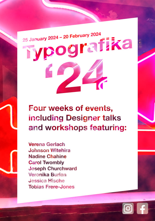
Poster side concepts and iteration
After receiving feedback from George pertaining to the poster side of my brochure it was made clear that I couldn't just slap the type of the speakers in a black colour on this.
To keep in line with the rest of the neon-theme/modern aesthetic that the rest of my poster (and layout by extension) contains. My first concept of the poster was putting the Typografika '24 name over a white rectangle that uses a shallow knockout effect to reveal the neon light background I had captured here in Auckland City. The "24" is large to communicate the year the event takes place but also to signify the importance of the year. The date above the Typografika name shares the same perspective angle with the title however is smaller and less imposing. The neon lights behind provide a natural colouring and shading on the knocked out text.
I used a clouds filter on top of the neon lights background and applied a linear dodge (add) effect to the clouds, making them blend easily into the work. I then colourised them and changed their hue to make with the rest of my colour palette before masking them in my poster. Creating a subtle modern feeling when looking at the poster.
The black text feels out of place and without purpose, with that I knew I had to iterate it.
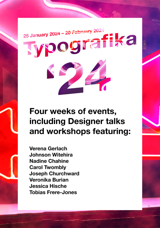
In this iteration I decided to use my knock-out effect on the remaining black text, this creates consistency throughout the poster while also remaining legible as the background used on this smaller type was darkened. It still has the hints of the neon lights that I've commit to but is dark enough to be read easily.
As per feedback with George, I used the angle of the perspective used on the type to cut away the bottom and top of the white rectangle containing the type. This was done to give the poster a more modern and futuristic feel. I feel that the work looks more attention-grabbing now as the geometric form isn't something commonly used.
Furthermore George suggested I could reduce the kerning between the "Typografika" and the "24" since the distance make the text look awkward and out of place. As a result I reduced the kerning and the header now flows much better.
I also noticed that the inner neon lights on my Typografika header revealed sharp edges from when I was scaling the inner images to create a nice effect on the work and so I used the content-aware tool combined with a freehand lasso tool to fix several errors. Which is when I realised I could take this into it's third iteration.
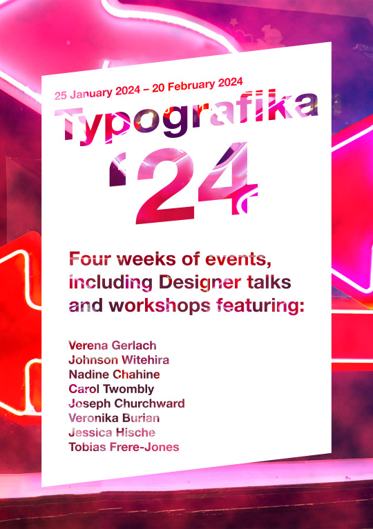
The third and most resolved poster (to date) uses the context aware tool to fill all of the inner text on the header. I felt that having some parts reveals while others not didn't create the consistency I was trying to communicate and therefore is why I decided to go down this route. I do like the contrast between the bright header and the slightly darkened information dump in the lower half of the work.
I also added a Facebook and Instagram icon as per the requirements of the brief. I took the icons and brought them into photoshop before desaturating them both. I desaturated them so that they don't break my colour palette. They we both edited on a 500x500px canvas as so their resolution remains the same. I put them under my colourised smoke layer so that they gain a little bit of colour and also gain some perspective.
Overall I think this poster communicates my intentions and themes well, a modern, neon light themed poster with reds, whites and blacks making up my colour palette.
1 note
·
View note
Text
My printed brochure
After making a few changes to my brochure, I decided to print out my brochure as a test to see how the colours came out and I was more than happy. The type is legible and the contrasting pages work incredibly well to portray information.
I did accidentally flip the front cover page and so when folded is back to front. I fixed a few grammatical errors in the type. Most notably, I moved a few pages around to make the layout flow better and as a result my pages are now flowing to the levels I expected.
I changed my front cover since I believe that the image I used on the front cover would be too difficult to read as the printer will only be able to capture so much quality. The bright background with the dark lines should allow the type to be far easier to read and the front cover now shows all 3 main colours used in my brochure before even going through it.

In this iteration of my brochure I fixed the front cover orientation and then flipped the pages 13/14 so that they are upright. I applied my grammatical changes.

0 notes
Text
Iterated map
I decided to revisit my map and iterate the colours slightly further. I didn't feel it was necessary to change a lot however I made the shadowed "walls" underneath my coloured "roofs" match the rest of my colour palette. This makes my map look more in line with the rest of my theme (neon lights) and thus I (subjectively) call this my refined map to be used in my submission.

0 notes
Text
Initial layout concept
Based off the neon light layout I had discovered several weeks ago, I created my first concept of how my layout will look. All the necessary content is present which allows me to experiment with adding personal features I think may add to the value of my project before the deadline.
I wanted the black and white colours to be present the most since they interact very well with the limited amount of colour I use per page. I discovered through my research that less-is-more when it comes to colour and I kept that in mind when designing this concept.
I wanted to communicate a modern feeling considering the context of the event containing such prevalent type/graphic designers. Furthermore my neon light theme I've set myself to feels in-line with this layout.
I chose verticality when I deemed it was necessary (in the case of my workshop timetable) however when I used it to announce the speakers or workshops it was more of a playful experiment that I decided I liked. It feels modern and right within the context and also uses the left column when places in the context of the rule-of-thirds.
At the current moment I'm not completely set on the images used for the speakers. I feel they break the immersion of the colour-palette I've used and therefore I will request feedback from peers and lecturers to see whether it's worth colour-grading them or outright removing them.
I wanted to make sure there was a distinction between the keynote speakers and workshop speakers since their colour grading was the same. I overcame this hurdle by exploiting the backgrounds of each. Keynote speakers represented by my black (#0D0D0D) while the workshop speakers represented by my white (#FFFFFF).
The timetables were interesting to create. I didn't just want to slap a table onto the board and call it a day, I wanted to develop it into something more bespoke and modern to fit in theme with the rest of the brochure. So I experimented with the stroke lines of the table and removed what I deemed to be excessive and causing an eye-sore and then decided to contrast half of the table to create an interesting effect. I chose the black on the side with the "Place" section since the AUT building colour I used (#FF0072) contrasts best against the black (as per my research from Adobe Color). My "Workshop" timetable is located vertically. This was intentionally done to allow the table to be legible since when printed and folded the size of the table will already be small however as per my research, gaining the interest through interactivity of the reader is important. Making the reader reposition the page in their hand forces their unconscious thinking to consider whether it is worth the movement. If someone is committed to the event then they will reposition the brochure in their hand, if not then they will skip it. This psychological design choice weeds out people that aren't committed from signing up and potentially not showing up to the event (as per sign ups are "limited").


0 notes
Text
Drafting my table
Before I inserted the tables I decided to draw them out in a rough sketch until I came up with two (for each) which present the information best.
Another factor in drawing out my tables first was due to how I wanted to pull all the table information together, rather than on each speakers page. This was for ease of the reader since then all the information for either a keynote or a workshop was presented to them in a chronological order, rather than having to go back and forth between pages to figure out which speaker speaks when.
Due to this design choice, the text on each speakers page can be bigger, along with the supporting image that represents the creation each speaker made.
The two tables are identical, the only difference being that a table was made for the keynotes while another was made for the workshops. I wanted to include a double page spread for the keynote speaker section as then there is ample room for the reader to see the information without strain since the size of the page once printed/folded will already be small enough. The workshop table will have to be experimented with. I could potentially rotate the table to be read at a vertical point-of-view (rather than horizontal).
Notes I wrote on my keynote page draft include:
Double page spead
Alternating background colours
A shortened date
Proper time etiquette
Include name of speaker between the keynote & date column.
The workshop page would also have these notes applied only difference being that a double page spread would not be required & the name of the speakers is in the right place (as a guide to visualise what my note looks like for myself and you).


0 notes
Text
Reworking my map
Just like my images of the speakers, I returned and recoloured my AUT map to match my colour palette. The colours use #FF0027 (my pinkest red) as to not be so overwhelming to the viewer.
The map still remains simple, elegant and modern, staying true to the original design however the pink areas highlight which building to find a particular speaker.
I felt it wasn't necessary to include roads since anyone that would be attending can use their phones to locate AUT, this map acts as a less detailed yet more informational version of their Google Map, illustrating what building is where.
I have been toying with the idea of using a key on my design, to describe the building however depending on how much space is left in my map page will determine whether it is implemented or not.

0 notes
Text
Reworking speaker images
Previously, I had uploaded my images with a neutral colour, waiting for this post.
After creating my colour palette I was able to revisit my initial images (which had their lights altered so each of them match). I then took one of my colours from the colour palette (#FF0833) and used an overlay blending mode set at 50% opacity to create the red effect on the speakers. I always intended to use the colour grading at 50% opacity so the colour does not over-saturate the speakers, in which case I decided not to use the red closer to the pink side as I believed it wouldn't be strong enough. Not to mention adobe suggested that the colour used on the speakers had enough contrast to be used for graphical components.
Now the speakers match the rest of my colour palette.


0 notes
Text
Playing with automation
Attempting to recreate the design of a poster using line distortion I took it upon myself to attempt to learn to how to create such an eye-catching effect.
I found mixed results however still created 3 front covers in the style using a script to develop the lines for me after I told it I wanted it in a particular style. (I should comment that the process used to create these was not chatgpt).
I followed this video: https://www.youtube.com/watch?v=dBDQ4CpfM8A
I found my first front cover to be too small to be legible, peer feedback also reinforced this idea to me when I questioned people on it.
My second front cover I found to be my best one. It is easily legible (in relation to the other two). It's simplicity is met with complexity and also has the modern aesthetic I am attempting to convey through my project.
My last front cover was done as an experiment to play with one of the colours from my current colour palette. While it is colourful and vibrant. It is too difficult to read however. I think that if I decreased the distance between the lines it may be easy to read however due my attraction to the second one and it's limited colours (which I have discussed previously I preferred), I will choose to run with this front cover.


0 notes
Text
Testing my colour palette
Adobe Colour has an excellent resource that allows you to test RGB colours for legibility in the context of contrast, showing you values for legibility in small sized type, large and graphic components.
They provide a contrast ratio which is accompanied by a description box reading:
"WCAG defines the minimum colour contrast ratios for legible text. Check if your colour choices meet several levels of the guidelines"
The fact that they provide this resource for free is incredible and something I will use for all projects that give me the freedom to choose colours.
I have attached my chosen colour palette using the contrast checker tool to check the legibility of my colour choices. It is clear that my choices overall meet the specifications Adobe suggests. Against a white background (which I intend to employ on some pages) small text may be affected by the contrast if I used my warm colours, therefore using a black (which meets the guidelines for all 3 tests) would likely be the best choice of action.
Against a black background (which will be prominent throughout my brochure) the colours meet every specification for all colours (except for the identical colour of course). This gives me a lot of freedom to experiment with shades of my colours to emphasise them better.
The contrast checker is useful in a quick moment, however, nothing can beat human eyes as in practice this brochure will be viewed on paper with human eyes. I believe experimenting with the colour on small text would be the best way to verify if the contrast checker is accurate.


0 notes
Text
Colour theory and selection
I've begun my colour theory and selection, I wanted a rather warm colour palette since I believed it would respond best to readers and retain their attention.
I divvied up my colour palette choices by introducing some colder colours in, just as an visual experiment for myself to garner how my project may look in a particular colour palette.
Red (by ColorMatters.com) defines the following facts about red (my likely choice of colours moving forward)
Red is one of the top two favorite colors of all people
Red is the most popular color used on flags in the world. Approximately 77% of all flags include red.
The history of languages reveals that red is the first color after black and white. (All languages have words for black and white. If a third hue exists, it is red.)
Designing with Red:
"All reds are not created equal. Aside from light and dark shades of red, there are two kinds of red:
Yellow-based reds: Are “tomato” reds.
Blue-based reds: Are “berry reds.” Some say that males are more attracted to the tomato reds: females to the berry reds.
Context is everything when using red. For example, when red is place on a black background, it glows with an otherworldly fire; on a white background, red appears somewhat duller; in contrast with orange, red appears lifeless."
ColorMatters talks about context within the colour spectrum of reds, which I find interesting considering the simplicity of just a colour shade of red. It makes me reconsider past projects and my potential miscalculated choice for a shade of a particular colour. I think for this project I will stick with one kind of shade of red, see whether it is effective (just planting seeds, seeing what will grow; as Paul says).
How red affects vision:
"Red captures attention. It is one of the most visible colors, second only to yellow - which explains why it is used on fire engines and stop signs to trigger alertness.
Red focuses behind the retina which forces the lens grows more convex to pull it forward. Therefore, we perceive that red areas are moving forward. This may explain why red captures attention.
Note: Eight percent of the male population has a red-green color vision deficiency and cannot see red at all."
I think that the stigma that red faces as a symbolic colour for negative and caution is warranted to a degree however I will gladly challenge the stigma face on to make a project that can appeal to the eyes without succumbing to the idea that the red is untouchable because "it's a sign of anger or hate" as people ofter refer to it as.
I think that the idea that the colour red has been reinforced as a trigger to alertness works in my favour to create a brochure that captures the readers attention and retains it if applied correctly. I must hone the ability to use the colour in moderation as to not oversaturate the work and make the colour loose its meaning.
Overall as a result of learning this information and my own reflection I will be choosing a colour palette that is warm, playful and something I can use in moderation without loosing its symbolic meaning. At this moment in time, I intend to choose my first colour palette. Its colours have small variations in the shade which will work best for continuity but also give me a little bit of wiggle room to play with the colours for times such as illustrations when I may need to shade a colour red with a darker version.


0 notes
Text
Inspiration for my colour palette
Living in Auckland City, I am exposed to many colours. Comparatively, living on Hibiscus coast neon lights aren't presented much, it's a fascinating distinction between the two and I wanted to explore them more, another component (as-well as my own attraction to neon lights).
Red has been prominent in Auckland recently and I wanted to symbolise the modernness of my designs with the modernness of our city (compared to what little neon lights would've existed around the city 50 years ago).


0 notes
Text
Illustration
In class today (M+M 4.1) we were shown an introduction to the pen tool in Illustrator. As seen from my Illustration of AUT done in the last previous days, I do already have an understanding of how to use the pen tool and an intermediate understanding of the Illustrator software as a whole.
Nonetheless I still did the expertise to demonstrate and further practice mastering the pen tool.
0 notes
Text
How to tile print
In class today (M+M 4.1) we learnt how to print in tiles which allows our work to be printed and viewed at an 100% scale (rather than a quarter of what it could look like.
0 notes