
Don't wanna be here? Send us removal request.
Statistics
We looked inside some of the posts by a7cad3-project and here's what we found interesting.
Average Info
Notes Per Post
0
Likes Per Post
0
Reblog Per Post
0
Reply Per Post
0
Time Between Posts
12 hours
Number of Posts By Type
Text
17
Last Seen Tumblr Blogs


Fun Fact
Tumblr Inc. is funded by 13 investors.
Text
My Outcomes
Must
For this project, I aimed to produce a game that has;
Enough playtime for the player, 1-3 minutes.
The Game needs to be under a PEGI 12
I must have a link to the UN goal that I had set for my self
And all of the main mechanics should be designed, making the game a playable state.
All of these here were the must for the game, like what I needed to get done before the project ended. I am sure that I hit all of these targets that I set for myself. The game has come further than I thought it would so I am glad that I hit all of these.
Should Have
Now for the extra parts for my game, this is the stuff that I wanted to get done and what I aim to do during my time;
A working UI with a timer and an bar representing how long left they can stay in the dark.
Working 'lights', aka the safe spots of the map, well.
Those lights flickering, around the map.
A death screen and a main menu screen.
Audio, music, for the game it's self.
Firstly, the UI was definitely was one of the harder things that I wanted on this list just because I was to incisive about the health bar and not wanting it in the UI and in the level instead, it was worth it though. I did also make the death scree and the main menu screen.
However, compared to the UI, the lights went really well and was done way fast than I thought they would be. The flickering worked as it was a material and the health system worked with collision boxes. The only problem I had was figuring out how to make the looping of the health.
Lastly, while making my project when it came to audio I realised that there wasn't many sounds that I could add that would fit the game. After experimenting, it was kind of better if there was not sound in the actually game, with there only being sound in the main menus and loading screens. With the exception of the enemy.
Could Have
Now these are the last three things what I wanted to have in the game, but wasn't necessary to have;
Enemies that spawn in if the player has been alive for too long, making it more difficult.
Multiple maps for the player to use.
A detailed UI's and menus.
Firstly, the enemies. They were definitely need in this game, mainly for making it more difficult overtime. Through game testing and allowing others to game test. The game was very luck baste, with where the lights spawn and adding the enemies supplied enough of a difficulty spike for the players, it even made one of my testers scared.
Now, the last thing I wanted to talk about, was that I "Could have added multiple maps" It's is really unfortunate that I couldn't add multiple maps, I just did not have enough time to develop them which is a shame. To be honest, I don't think the maps would have been to different compared to this one.
Sorry for the 0 images here
0 notes
Text
State of the Game - Lights Out - Version 0.5.1
Sound
Changed the fall of distance for the enemies buzzing sound.
UI
Making it more clear that the player has to stay in the light.
Added a Highest timer that shows at the end of the level.
Saving
Made it so that the Highest timer stays after the game is quit.
Enemies
Made it so more Enemies spawn after 30 seconds have past, making the game more difficult the longer the player is alive.
Bugs
Fixed a bug that made the game glitch out when the enemy killed the player while in light
For some reason on older GPU's, the game does heal you slower under the light. I made the delay 0.004 seconds longer, to see if it helps.
0 notes
Text
The Last Day - 4th Week - Monday
I didn't really plan for this day but because I had the time I decided to change a few things and add a couple of extra things that I thought was necessary.
Sound
The first thing I thought to change was the enemies sound as I thought that it didn't have enough fall off distance, so all I needed to was change a few values for this.
UI
One thing that I thought I needed to tell the player was that they had to stay in the light as it kind of would seem unfair to them.
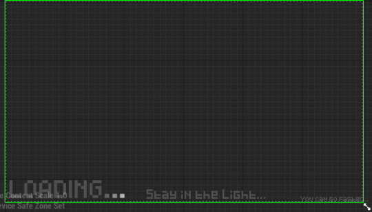
What I did was add it in with the loading screen telling the player to "stay in the light" the same way that I tell them about the ability. It is obviously more out of the way but I wanted it to be like that, just to be a little unfair.
High Score Timer.
I feel like that the game need to be able to record the players time/highest time they have, what I need was something that checks the timer when ever the player dies and then changes the highest time if its higher. I tried a lot of ways to get this to work, the first problem was that I thought (For some reason) that a "string" variable stored data. I felt like an idiot after I realised.
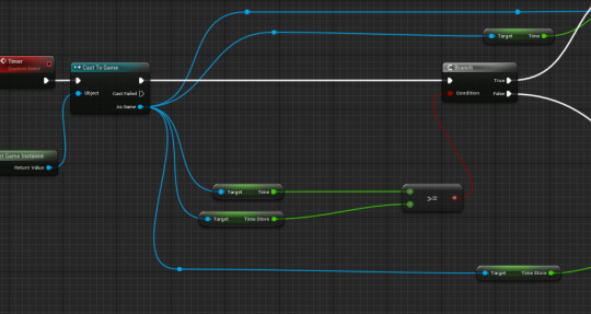
Firstly, this here either changes the time store variable to the player new highest time or just display's the games current highest time. This will be save able between opening and closing the game.
Death Bug.
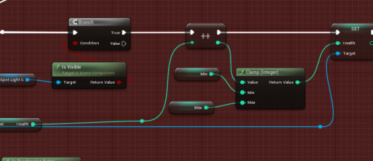
One bug I have found before was where when the player dies by the enemy while in the light, the player would have lost a large amount of HP however when lights clamp minimum collided with this, it changed the value back to 0. It now works how it is meant to.
Adding a Save Slot.
I did this the exact same what as I have described before, made a saving state, that stores the high score variable in to a slot. Then after when the character spawns, the high score is set back to what it was.
Adding More Enemies Overtime
I decided very quickly that it was kind of a bit repetitive when it came to staying in the lights with only two enemies roaming around, so I add the quick addition to make it so more enemies spawn every 30 seconds.

It just makes that small difference, at can be way more difficult after it stacks up. 10 enemies at 150 seconds makes the game way harder.
Adding an Automatic Quit Button
This was something that was required to have as if the college ever put things on display, even mine, it need to be able to quit if the player hasn't touched the game in over 30 seconds.
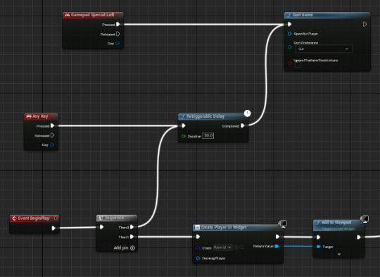
This here makes it shot at a delay at the start of the game that quits the game after 30 seconds, however the delay resets if the player has pressed a key.
0 notes
Text
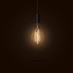
Making an Icon for the Game
As you can read from the title, I have make an icon for the game similar to what I did in the first project.
I pretty much took the light bulb from the marquee and used that here. While looking at games most icons were to do with there main characters, the games title or one of there main mechanics so I decided on this design.
0 notes
Text
State of the Game - Version 0.5
Sound
Added a few sounds to the game, that being light sounds for the main menu, adding those same sound to the credits and game over screen and when the player quits the game.
Added a sound so that the player knows when the enemy is near them. It's like a buzzing noise.
Added a sound for the timer when the player dies. While its flashing.
UI Changes
Adding a credits menu.
Changed the loading screen to tell the player that they can go faster.
Making it so that the player can see what text is selected at that current time, in most UI's. Making it Highlighted.
Moving the bar out of the main player UI leaving the Timer by it's self. Moving it to the level it's self.
Controller Support
Adding controller Support.
Binding the ability to the 'X' button.
Enemies
Added Enemies, that roam around the map very slowly. This stops the player from staying in the same light for too long.
Balance changes
Stopping the player from being in the light for too long, by adding two enemies that roam as stated.
0 notes
Text
Making a Slight Change To the Marquee.
I decided to pout my signature in the bottom right corner instead of having my full name in the games font.

I did this as I feel like having my full name in the bottom right just doesn't look good for the Marquee it's self, and I also just didn't like adding my full name on to it.
0 notes
Text
Wednesday - Last Day - 2/2
UI Changes
When testing my game through, I slowly started that the loading screen text was way to big and didn't work with the with the font. So I shrunk it.

It made it less bold and streamlined it. With it like this now, it looks more appealing to he player and it gave me the opportunity to put a little hint in the corner to tell the player that they can more faster, however not telling them the button. If I had more time I would have made it randomise between telling the player that they can be killed by something in the dark.
Sound
Added a beeping sound to the timer, once player is dead. The whole point of this was so that it felt like there was more in the game over screen.
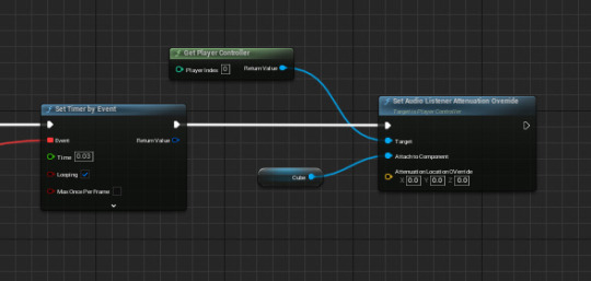
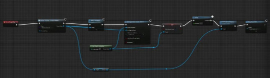
What you can see above is what lets me make it so that the player can here sound inside of the level, so that I can add the sound for when the enemy is near by. As stated before I feel like I need this so that the player doesn't randomly die, and thinking it's a bug.
I did also try add some noise to the lights however due to the lack of time I have left, I got it to work but all the time, not just when the lights are on. So in the end I just took it out of the game.
0 notes
Text
Third Wednesday - The Last Day - 1/2
Highlighting Text
Something that I needed for the player is making it so that the text highlights when it is selected to that they know what they are pressing.

I made this by using a loop that continuously checks if any of the buttons are select with an array, the branch checks if it is selected or not, if it is the text will change colour, in my case a lighter colour. If not it will go to a darker colour that I have chosen.
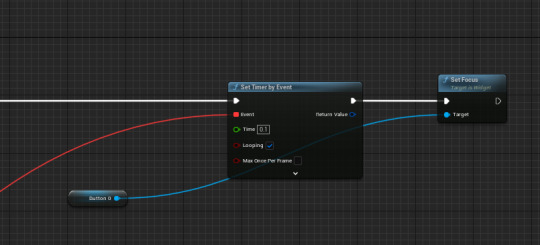
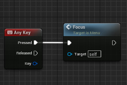
This above, makes it so the focusing goes on a button of my choice, if not it wouldn't work. The set timer by event checks to see if the text is still being hovered to make it change back to it's default colour otherwise it can sometimes stay that colour.
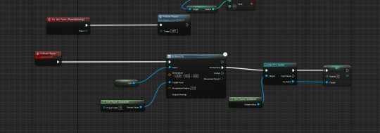
Adding Controller Support - The Ability.
I mean it is a given that I need controller support for the game, it's meant to be a an arcade game and I need a way to test if it works, so the easiest way to it by suing a controller.
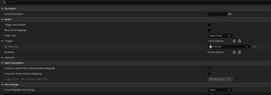
To do this, I made a input action (Called it "Ability") and gave it the trigger "Pressed", this is so that it activates when one of the inputs are pressed down.

To put inputs in here, I need to attach it to a input mapping index, thankfully for me, the is already one in the game by default, that has Jumping, Moving and looking already inside of it. To add another mapping, I clicked on the plus icon next to mapping, which allowed me to put the ability input in.
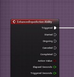
As I said before I needed to put the controls here, with the keyboard being "Left Shift" and the controller being "X". I have no reason for making it these buttons other than personal preference. As you can see the last thing I did was change the main note connecting the ability to this input action instead of just "Left Shift"
0 notes
Text
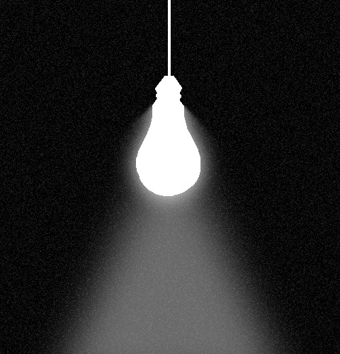
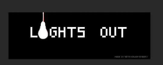
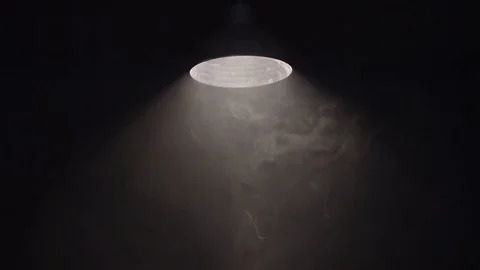
Marque Design
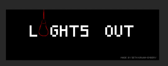
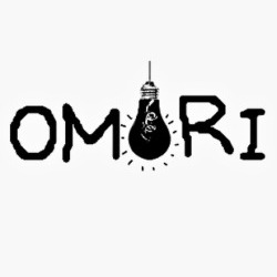
This was the first draft for the marquee, I wanted to use the font that I used all around this game, and as I said before I wanted a light (No way) to shine down. I decided to make it one of the letters of the game title similar to how omori's title looks like. I like how it comes across, as it represents a light and then on the other side I plan to make it a darker compared to the left side.
The first thing I did was do an early design of how I want the light to look, thanks to a friend, they gave me an idea on what the light, they think, should look like and this is there drawing of it. It is good however in the final drawing I think I will make it more round.
The next step I think is to change the font just a small bit, as I feel like it's to pixelated for a banner and after testing with it for a bit,

I landed on this. This just works way better, I made it look less pixelated and added curves because it made the letters stick out that little bit more. Next was trying to add a light beam from the bulb.
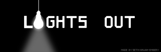
Firstly, I wanted to bulb to be somewhat glowing as it wouldn't make any sense if there was light but nothing around the bulb, and this is what I decided on. This design is smooth, is slowly goes back into darkness, its all I wanted from it and I feel like that it does hit the mark by showing the player that the light is on the one side but on the left side where it says "out" it goes to darkness.
Now I felt like that this was missing something, the back ground is just missing something. And as I thought to my self what would be better here than adding some "noise" to the image.

And this is the finished product. I am very happy with it, I mean gets the meaning across that the game is about lights, but it tells the player that it is dark, gloomy and even obscured showing that something is there.
0 notes
Text
Marquee.
So for this project, one of the requirement is to have a marquee to represent the games icon, similar to having a logo of some kind.
Inspiration/Moodboard.


As you can see from above, I wanted the marquee to represent one hanging light, just one, as I feel like that it wouldn't hit the mark if there was more than one, if it had more than one it would make it seem brighter logically and in there minds. If there is one, the darkness can overlap with the light to make it more mysterious.
0 notes
Text
Tuesday - Week 3
Sound
As I have said, I am going be adding way more sounds to my game, starting with the menu. As I said yesterday I had the idea on adding sounds to the buttons. The idea was to make it so there was a light switch turning off when the player pressed on one of the buttons, then when for example on the credits menu, you can hear the lights flip back on.
This definitely fits the games atmosphere so well, and I will not b e changing this in the slightest. If you hadn't noticed I also added noise to the loading screen, I wanted it to come across as eerie just because it blends with the games in environment.
I am really struggling to find music for when you are actually playing the game, however I have found something for the ability, I will have to record the sounds my self but it is from terraria's calamity mod. And this is something I will have to get at home.
I was testing a buzzing noise for when the ability is actually up, unfortunately this did not fit in and just didn't feel good.
As you can probably guess, you can tell that this doesn't work so I will not be using it.
Tonight And Tomorrow
Adding Sound to the main area.
Making it so the players controller highlights the text when selected.
Adding the ability sound.
Making people test the game.
0 notes
Text
Monday - Week 3 - 2/2
Enemies
This was not in the plan today but I want something in the game that makes it so the player can not stay in one light for too long, and what else to do it then adding an enemy.
The aim for this is to make it very slow, and so that you don't know it's there other than hearing it through sound.
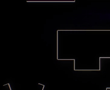
This is all I actually need for the AI to move towards the player, it uses a pawn sensing component to see where there player is and with a nevmesh on the map, it can move in that area.
I did also make so the player dies when it touches them and the enemy dies when the player dies.
(This video is in the light so you can see the enemy)
Funny enough, while recording this I did actually find a bug, I was just trying to show you how the enemy worked. This bug made the players code not know if it was above or on 0 health when the enemy touch it, to fix this I just made it so the enemies make the players health go to -1000 instead of 0, it was an easy fix but it was funny to see.
I made the enemies really dark, so the player doesn't know that they are there, this solves the issue with the player staying in the light for too long, you can also run into it, by accident, but it adds to the fun. There will be two of them.
I do plan to make it so the game over screen tells you that you have died to an enemy and if not, it won't say anything.
Tomorrow - Plan
To add more sounds and music. - This has priority
Testing my game a bit to see if its more fair.
0 notes
Text
Monday - Week 3 - 1/2
The Bar.
Firstly, I need to get that bar done, and in the end I decided to make it 3D so the health bar is actually in the world. The first thing that I need to do was make a cube through the modeling mode, just so then I can change the objects pivot. (I also promoted it to a actor after as I need it to be one)

Next, pretty much moved the code from the original bar to here. The difference being that it scales with the actors scale. Also if you probably didn't notice, is that there is a clamp is so that it stops it going in the negatives and expanding.

And this is the out come. Compared to the original, I think that this is way better, if I were to change anything it would probably be to make the colors of it change when it got smaller, like the previous one. I also made it blink at the start like the other bar.
Sounds
Well today was going to be all about adding sounds however I had to wait till the afternoon. And in end I was only able to think of one sound and that being the flights flickering.
With this I wanted to add ambience with it, the player might not here it a lot however it is there. And as for the main part the flickering of the light. I think this is all that is needed for the menu, on second thought I might add a button click sound on to the buttons.
0 notes
Text
Connecting credits.
This won't be a bit post but I decided to attach a credits menu to the main menu, just for when I add music and sounds to the game.
It didn't need to be complex so I just made it really similar to the main menu screen, with the flashing and I will make the actual credits do the same.
Also when looking at the menu I also decided to make it come down at the center instead of the side. Just because I thought it looked better overall.
0 notes
Text
State of the Game - Version - 0.2
Made the game harder by changing some of the lights values, to be quicker.
Made a nice looking loading screen.

Added a particles for when the player dies.
Added an ability for the player, which allows them to get faster on use.
Made it so the player knows when the ability is on cooldown.
Added a timer so that the player knows how long they have been in the game for.
Finished the main menu screen.
Added a game over screen.
Overall, I think that I have made decent progress this week. The only thing that I have missed this week was working on the health bar, I have an idea thankfully but I now need to apply the idea.
0 notes
Text
Different UI.
The whole point for me, by looking at different UIs, is to try get a an idea for how UIs can look like, depending on the games themes and what I can add to my own including, losing screens, menu screens and even get the regular UI that shows the players health.
Vestibular
Endoparasitic
Rabbit And Steel
Rabbit And Steel - Main Menu.
Firstly, I am going to start talking about Rabbit And Steel for literally only one reason and that been the main menu, solely the layout of it.

For me, when I think of layouts for main menus or title screens I expect them to have quite a basic design with them having a start, quit and options button. With some games having a credits option aswell.
When I looked at Rabbits and Steels menu, I thought to myself "This is something that I want mine to look like". And it was the first image I had for my menu and how I want it to look.
I mainly like the design due to the fact that there aren't many options at the front and most of it being tucked away well compared to Elden ring anyway. With that one of the only other things on the menu is the name of the game and some of there characters. It is very compact which is what I am after.
For my project however, I would like it to have less images making it more plain.
Endoparasitic - The Font And Colours
Next, I would like to talk about Endoparasitic for it's colour choices and it's font choice.
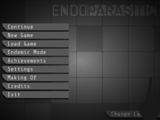
The main menu for Endoparasitic is very straight forward, very neat and sorted out all thought the menu with the font and the art style matching each other quite well. This is personally something that I want for my project as I mentioned before.
I want the main menu for my project to have the same effect as this menu, the font working with colours and it fit with the art style. I also like the fact on how they make the borders around the layout (Where the text is) look 3D in a sense, making it work with the hand in the menu.
For my project I would like to try make the game as black and white as possible. However, I might not try use borders like they have here in the menu as I don't think that it will fit the style of my game. That of the game trying to look somewhat older than most.
Other than that I do love the design of this menu.
Vestibular - Game Over UI.
Lastly, I thought that it would make sense for me to talk about Vestibular when it comes to UI because the game is trying to represent an arcade game as that was the goal of it.

This game over UI flashes on the screen after the player dies, showing quickly that the player has been killed if they had been left with any confusion. This is somewhat what I want in my project but for me, I would rather have it so it doesn't always appear and reappear, and maybe does it once or twice.
0 notes