Statistics
We looked inside some of the posts by aandreajasmine and here's what we found interesting.
Average Info
Notes Per Post
23
Likes Per Post
18
Reblog Per Post
0
Reply Per Post
4
Time Between Posts
7 days
Number of Posts By Type
Text
17
Last Seen Tumblr Blogs


Fun Fact
1,644 Tumblr posts in 1 second.

Text
Icons Workshop - Encounter
Tuesday 10th March 2020
Fot this wokrshop we started by playing a simple card game that consists of different famous artists that we had to choose from. In the end, I had chosen Pablo Picasso. To start this I had printed out a picture of said artist and began to get to work. My first process was using a new technieque and art tool - carbon paper. This process was to sandwich the carbon paper between a plain sheet of paper under (this would be where the final prouct would occur) and placing the original picture on top using this as a stencil and using an pencil or somehting with a point that could make a mark to go over the orignal picture to print it on the blank paper underneath. Here is the finished product consisting of all overlays and all the different editing techinques I had used.

While working on this, during the editing process I decided to look into and reasearch Picasso
0 notes
Text
Final Major Project !! - Encounter
Sunday 8th March 2020
This past week, we began our new and final brief!! :D The theme of it is ‘Encounter’ its not just us who were given the theme of encounter for our last project of our year; it was the whole department (I believe.)
During the breifing and introduction to the FMP, we were told that it is all our own work and little external help would be provided unless we ask for extra asisstance. At the beginning of the project, me and 3 other friends had made an original deal of having a joint 4 piece project that we all focus specifically on our certain charcter and the design we chose and the plan was to be at the end our charcetrs would have collaborated in one singluar project where we all wouldve worked in the same way an animation stuido would work, where we would all assign ourselves to aniamte our characters and then equally share the other parts with each other to present at the end and have an outcoume we could be happy with. Unfortunatly in the end, we decided agasnt it due to some complications and this helped me look into finding something that could inspire me more and something that could help me work on my own independent skills in my animation, illustrations, research and develeopment skills.
While thinking about what to put forward as a basis of my FMP I had a talk with my mum about her inpsrations and her likes and dislikes, we ended up talking about her interst in nature and religion and that helped spike my insparation with having a mother nature like character accompanied with religious aspects while possibly dealing with characters of colour and display the possible senarios and situations that POC go through.
0 notes
Text
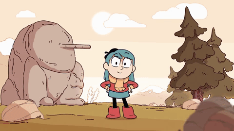
Photo Shoot !! - Monday 10th February 2020
It’s the last week of this ‘Primitive Worlds’ brief and i have finally finishing and photographed my finished diorama!!
Here u can see snippets of me creating and setting up my diorama. At first I had decided to use a green screen on top but at i used it I had noticed that it kinda washed away the monochromatic scheme i had going on so i decried to switch to purple which was a lot calmer on my diorama and didn’t wash away as many details like the green.


I had many many difficulties during the photo shoot since it was my first time using a camera to take a professional photo, when originally taking the photo it came out extremely blurry and in focused at the start but as i continued i was able to get a clearer shot after using it and focusing the lens more. since i don’t have a photo from the camera yet here’s a photo i took using my phone still keeping the light and the setting i had in the camera shot.


in the end i am very happy with my diorama since it looks a lot like how i had planned while still adapting to it by adding my characters and having them interact with the setting somehow.


The story i have in mind for the diorama i have created is that the more circular character is taking a stroll through the forest near the mountains and the character in the back is the guardian of said forest near mountains and keeping an eye on the character. for my final piece of writing i was thinking that i would be writing it in the perspective of the guardian as they watch the little character go by. the reason i had chosen to go with a monochrome background of a vibrant teal was because this whole thing in the perspective of the guardian who’s eyes only see things that do not belong in the forest yin full colour,, so the audience is experiencing the same things the guardian where their eyes are drawn to the small character in front that breaks the monochrome with a bright white accompanied with yellow and pink shades evidently meaning; they don’t belong.
0 notes
Text
Artist Research - Zim and Zou
Today I decided to look into the two artists that Heather had mentioned to the class to us on Wednesday: Zim and Zou.
5 notes
·
View notes


Text
Wednesday 22nd January 2020 - British Museum trip
Today we had gone on a trip to London!! Woo!! sadly not to sight see things like the London Eye, Big Ben or anywhere else. But to sight see in a place where only historical events thrive and prosper: The British Museum.


0 notes
Text
artist research!! - antony gormley


On *insert day here* we had went down to firstsite to look at the work they had on display that was created by Antony Gormley. It was called the ‘Field of British Isles.’ It features 40,000 statues created by people of all ages: children, teens and adults alike. Its made of clay to make them more connected to the earth and the ground and sculpted to to look like figures that somewhat resemble human like figures in a way. By doing this, it helps the audience/ viewer connect with the piece more. By looking at this piece alone it helps me understand why we’re looking at him and his work and how it connects to our brief as the whole artwork is made of clay (a source commonly used during primitive times, such as neolithic, the time we’re looking at right now) and it’s creating human/ golem like figures. Just like how we are doing in class and how we’re adapting to it aswell
Gormely is a british sculptor most recognised for with his work and sculptures that would take the shape of the human body.
0 notes
Text
Week Two (13th Jan - 16th Jan 2020)
Monday 13th January 2020 - Landscaping in Wood and Ceramic Workshops

Wednesday 15th January 2020 - Planning/ Initialising our characters/ backgrounds
Like the title of the day suggests, we spent this day just trying to create or have an finer version of our ideas. We started the day with going to the sensory garden and collecting all types of stuff like twigs, leaves and rocks and just other organic material. We then took them further and then used them to create types of textures using the raw materials themselves to add a special characteristic touch to the texture itself. After this we took time to step back and create our own little landscape for us to then draw from life but using only the textures in the landscape and not to add a solid outline. We went down to woodworks to create articulated characters tat we could place in our possible dioramas. As shown above there’s an initial design of one of my characters for my diorama. I have no idea what i’m going to do with it but it was a vert interesting process to create and make with. During this i had a long think about where i would like to have my diorama set in. i originally wanted to have a mountainous look since when you normally think of primitive things u picture cave men and primitive characters in stony and sharp areas but i adapted it to be a forest and mountainous landscape where you can see the mountains in the distance and forest in the foreground.
0 notes
Text
New Brief ! : Primitive Worlds - Week One (6th Jan - 9th Jan 2020)
- reatction to the brief (kewords and possible ideas and artist reserch ect...)
monday: mud/ clay sclupting
wednesdy: out of rocks and earth workhsop and looking and comaring artist works
Happy New Year!! To begin the year fresh, we started a new brief and we are beginning to focus more on illsutrations more than animation based topics. This brief is called ‘Primitve Worlds’ where we looked at how we could turn our 2-D projects into 3-D projects and create animation/illustrations from them using shape and from to successfully achieve the outcomes we had envisioned at the start. To be completely honest with you, when I was first told this brief I completely hated it (and I still do) so I don’t really have much inspiration for this brief but hopefully that won’t stop me from creating something that will help me achieve what I would like to in this brief. some key artists we are looking at are: Anthony Gormley, Henry Moore and Shaun Tan. What we aim to achieve in this new brief is to symbolise the meaning of neolithic (new stone) art with dioramas and also to experiment with stop motion and rigged animation and use our creations and find connections with our current ‘mordern’ art and primitive art.  As I stated before I had no initial idea that came to mind once told about this project so im going as I please wiht no motive at the moment but as this brief continues i hope to find one and go from there soon.
some key terms of this brief would include:
- primitive : ‘early stages in evolutionary/ historical development’
- neolithic : straight transaltion ‘new stone’ but its also ‘the final division of the stone age when polished/ ground stone weapons occurred’
- animation : ‘a series of linked images placed together in a sequence to create the illuision of life’
- stop motion : ‘a type of animation traditionally made with inanimte objects (such as puppets wiht armetures, models made with clay or even just random objects) by taking pictures of them and moving them every time mid pictures to create a finished project of the object creating the illusion thats its moved from its original position.
- diorama : ‘a set piece that tells a story/ narrative - normally a stil image’
- inanimte : ‘objects that dont have a life or any sence of life in them. not alive’
Monday 6th January 2020 - Golem Workshop (Working with clay)
Today we
0 notes
Text
Final Outcome - Miku + Hajime ( +500 word evaluation)

Miku (top) started off as my main character and she was a lot younger too, bu after some developing I decided to make split her into twins of different personalities. Hajime is my next main protagonist who was the second ‘personality’ of Miku, but she was more of a ‘feral’ sort of charcater. I decided to give her more of a tribal outward appearance and blend her character with a very scary character - originally a prirana, but then changed to a shark instead. I orginally chose a prirana due to their already commonly but falsely known fact that piranas are ‘hungry merciless man eaters’ chose this to make her appearence look unapprochable but personality sweet and loving while trying to make her extremly daft, something like one of my favourite anime charcters Inosuke Hashibara who has the apperance of a wild boar and human corss breed who’s extremely powerful, strong and ‘feral’ while still looking intimidating but also being dumb/ dim witted.


As you can see above is a couple orginal drafts of miku in the begining
And below is a segement of the finshed animtion. Miku (pink) Hajime (blue)

A link to a slide of my final slides and evaluation here.
In the end I really like this brief overall, since it allowed me to improve my skills in animation aswell as improve my skills in differnt mediums and other skills such as drawing from life, being able to keep an anatomic structure in my art and creating animations without digital refrence and help.I really liked creating and developing the characters of Miku and Hajime and the work and story revolving them. I think by just looking into them the reference and inspiration I had taken from the shows that I liked isnt as noticable, but if you were to look into them more you would see the references and other little tidbids I had added. The narrative for them and their story is that Miku and Hajime are normal, average looking school girls in japan, who get involved in a tragic car crash on their way to school, leaving them in a coma for a scarily long time and in when they are in this coma, they forget everything except their names and each other in this new worls that they have been transported to. By making them forget memory of their real lives, this gave me so much lee way in what I could so with them in this new world and we follow them on a journey as they find out that theyre in a coma, and then venture off to find a way to wake up and bring them back to real life, encounter many different characters and charcater types. It may be really morbid, tragic and concering near the beginning but it gets more lifely, fun and enthusiactic as we watch these twins on a quest. While in the real life their parents and loved ones are in constant peril and fear over their girls and sometimes even try to turn off their life support but the girls twich/ wake up for a while but fall back into the coma adding more hope and suspence into the whole story. Once again I really liked taking part in this brief more than any other brief so far. The animation had created with this brief, I think i created pretty succussfully, however there are some faults since, it still in a sketchy format, not yet refined, implying that im not done with it (but I am) and the animation in the near the end in the ‘you can call me Miku’ section, I think is really stiff and kinda chattery. I do like how for each character there’s a specific colour for each so you know that the charcters have changed/ switched within the animation.The video itself is more of an intro to the girls and could poosibly be used, if I were to create a show for this, as either the theme song or even used in the pilot episode after the tragic accident of the car crash and theyre establshing themselves in this new real that they find themselves in.
0 notes
Text
Monday 9th December 2019 - Posers
Today we were introduced to another segment of our brief ‘Seekers.’ Today’s workshop was called ‘Posers’ where we looked at how to achieve pose to pose animations, primarily on paper to see how our work would turn out without tracing or using onion skins. Our main objective for today was to experience and get to know/ understand pose to pose animations. I feel like I had managed to achieve this ever slightly as I found my ending product from the task itself was extremely rewarding, especially while making it I was extremely worried about how it would turn out. Another one of our objectives was to develop a working process of the terms and technical uses of frame by frame animation. To be truly honest, I don't really know what the means so I can't say for certain if I think I've managed to achieve it or not. And our last objective was to see if we could use an integrated technique approaching both 2D and 4D problems and attempting to solve them. Once again you’ve lost me and I don't really understand how and what that objective means so its something I would have to talk to dave about and have him explain it to me (If he doesn't mind.)


During the process I had hit many stumps and kept doubting myself and thinking its not gonna be good or turn out well since I wasn't able to see it on a a layered/ onion skin. When going through this process, I realised how different this was to our previous brief of rotoscoping, this is because the rotoscoping process was tracing over filmed footage, either on a digital software or on traciing paper and then scanned into the mac books, whereas this was not traced over anything and was purely from our imagination. This made the whole process alot harder than our preivous brief since we had no real stability and our drawings could be lacking in simailarity - size, placement and shape, but luckily mine didnt vary too much, resulting in a semi decent looped animated gif. I do see how I can use this going forward in future animations, by creating backgrounds with the same pencil texture I had managed to create with the animations I created in this task, or by adding in background charcters in a different styles to draw attention to certain characters or not.


2 notes
·
View notes
Text
Friday 6th December 2019 - Artist Research
Frank Frazetta - fantasy illustrator


Frank Frazetta was a artist that influenced and insipred many, most of which of the fantasy genre, that was born in the early 1930s (1929) to be exact and died in the early start of 2010 in May. Frazetta has been a doing art since he was 3 and at the age of 5, his teachers would even say that he was a better artist that the children who were older than him. At the age of 8 his parents had decided to enroll him in an art school (the Brooklyn Academy of Fine Arts), and at he age of 16, he had published his first comic book under the name of ‘The Snowman’ in Tally- Ho comics.
Even though we were told to research him, I can look and use his work to influence the work I will go to do in this breif. By doing this, I would look at his works, how he positions characters and his use of colour in each artwork. A good example of this would be the pieces that I’ve shown here. I think the colours used here are a great use of colour, since he’s able to separte the forground from the background but not drowning out any aspect of any of it.
When putting his work into practice, I would try to recreate his colour pallete types but switch them up to fit the aesthetic of my interpretation and idea so maybe instead of using such dark harsh colours on my protagonits but maybe on some backgrounds or side/ filler characters.
Luke Pearson - Hilda creator

Luke Pearson is a self proclaimed illustrator/ cartoonist who has worked on shows like Adventure Time in its later series and episodes. Curently, they are woking on their own show called ‘Hilda’ where we (the audience) are following the protagonist - Hilda as she travels and goes on adventures meeting elves, giants and other characters in the city of Trolberg.
By looking at the works of Luke and especially on the show Hilda, I would like to take loads of inspiration from him and his works from his colour pallettes, character designs and artistic style choice to suit and apppeal to their intended audience - children and young adults.
Noelle Stevenson - She Ra Princess of Power creator


Noelle is known creator and producer of the reboot ‘She Ra Princess of Power’ as well as another show on Disney XD callled ‘DuckTales.’ She’s an american cartoonist and animation producer mostly known for her fantasy comics such as ‘Nimona’ and her series ‘Lumberjanes’. Both award winning comics winning an ‘Eisner Award.’
By looking at the original airing of She Ra and coming it to its current counterpart, Noelle has made some knowlegable changes that make the characters more modern, appealing and overall cleaner to attract more viewers and a wider audeince may it be the older gen re watching to see a show from their childhood re vamped or the new genereation to enjoy the show.
Looking at this and how Noelle has done this, inspires me to do the same sort of thing without having an older version to compare to. I do like how the colours have been brightened due to shorter attention spans being attracted to birghter colours. Aswell as the art style in the eyes and now each character has their own colour pallette, while each being able to be in the same frame together wihtout being an eyesore to look at.
Yoh Yoshinari - Little Witch Academia creator


Yoh Yoshinari is an animator known to be the creator/ director who created Little Witch Academia on a ‘Young Animator Training Project.’ Yoshinari’s animation in anime career began through his older brother Kou Yoshinari, he had completed many uncredited keyframes and in betweens for his brother during his high school years. After finishing and completing school, Yoshinari had applied to work at two animations companies: Gainax and Madhouse, but didn’t get a response for awhile at Gainax so he worked at Madhouse, which is an animation studio created by ex animators, for a while before moving to Gainax afterwards due to a misunderstanding that led to his application being read and acted upon 3 months later.
Yoshinari’s work truly does inspire me with the way he uses colour in his works and character designs and how he so smoothly creates sequences look so nice and aesthetically pleasing and well paced and well interpreted. I like the little details/ easter eggs he puts in scenes that almost go by unnoticed but still add loads of character to every frame and anyone who was present in the scene.
Kaiu Shirai - The Promised Neverland creator


To begin the information about Kaiu Shirai, ‘Kaiu Shirai’ is not their real name; it is a pen name so that they can have privacy in their llife and not have thier work/ public life overlap into their private life. They are a well known manga artist that has been successful in creating a successful, well know and even anime adapted manga series, called ‘The Promised Neverland.’ After finsihing uni, Shirai had began work in a company that had nothing to do with their current manga series. Before the creation of TPN (The Promised Neverland), Shirai had created many manga series, but none really ever took off and they were very on the fence to even create TPN since they new it’d either be a hit or miss, good or bad, in the end he did end up creating 300 pages, thus leading to the take off of TPN.
I really like how the colours are used in this anime and his work a lot. By making their main character, Emma, have such an abnormal and obnoxious look accompanied with a complex design and loving personality, filling her eyes with green which could symbolize life and new beginnings, while placing her in a dark environment with great cinematographic angles that can really put you, the audience, in somewhat the same position as Emma. I also really like this show since there’s as equal focus on Emma as the characters around her, since she seems to be the souce of happiness and perseverance.
3 notes
·
View notes
Text
Wednesday 4th December 2019 - Guy McKinley: Artist Study
Today we were asked to look at the artworks of Guy McKinley, but before doing that I decided look into his background and life as an artist but also a person swell. He was born in Liverpool, UK in the year of , but moved to Manchester, UK to pursue to his freelance art career. Since 2003 McKinley has been creating artworks heavy with colour, shape and also have influences from Japanese culture and native/ historical artworks as well as his childhood having a great influence on his artworks of today.
Today we were asked to look at the artworks of Guy McKinley, specifically his ‘PUCA Festival’ collection and compare and contrast them to each other as well as to our new and current brief: ‘Seekers.’ Upon searching his name I could see that he was well known around the art community as well as to the public making his art decently mainstream but also standoffish due to his use of colour, line, shape and texture. By using different techniques and styles in these fields of art, it creates an immediate narrative in the audience’s mind, whether they intend or not, thus making the artwork itself more involved with the audience and the artist (Guy Mckinley).

This is his first piece in his ‘PUCA Festival’ collection. It has been named ‘Morrigan’. Before doing any research on the name or the character shown, what I understand and collect from this piece is a creepy and sinister looking female hag crow/ raven looking character with long hair suggesting mystery and the unknown. Caressing skulls that seem to look like they’ve been painted with gold to make them extremely valuable and limited. One of which has arrows sicking out of the eye sockets implying that that person who owned the skull had died by an arrow to the eye this linking to out brief since we’re being tasked to look at fantasy and use historical facts to establish their presence more, this works as Harold Godwinson was killed by a shot to the eye thus linking it back to this original artwork and our brief connected to it.
After doing some research on the word ‘morrigan’ I now understand that it come from celtic mythology meaning ‘phantom/ great queen’ that is deep related and associated with heavy themes such as: war, death, destiny and fate. Now with this understanding I can now look at this artwork in a different light and take from this that this character that she is meant to be a majestic but corrupt queen due to the great juxtaposition of the themes need to the title. It also implies that the themes of ‘everything is not as it seems’ since the themes linked to the title again, putting topics like destiny and fate on their heads since they normally have connotations of positivity and joy, but played in this context they go again the norm and imply negativities. It could also imply that she is here to help and safely bring the dead and destined to the other side, this could be the netherworld or hell, while keeping their statuses of royalty and superiority amongst the dead.

This is the second piece of the ‘PUCA Festival’ collection, called ‘Fionn.’ Again, before doing any deep research into this piece, what I could understand from this artwrok is the charater being depicted in this is meant is meant to be a soft warrior type of character that is meant to be outward fierce apperance mean to scare away possible threats, this is shown with heavy detail in armour implying that their armour has been tampered with and possibly enchated wiht a sort of spell of intricute healing and restoration. I immediately got a vibe of this character being the protagonist of a show or at least a good charater and I got this from how McKinley has subtly and creativly used shape in this to create a charcter that is strong, devoted and deadly aswell as being/ looking soft, kind and trustworthy. By using shapes mainly consisting of circles and rounded shapes, even in places that normally have sharper and pointed edges - the ram horns, it has given this warrior character a soft and calming and reliable edge to it and I honestly thing that is amazing and super creative being able to add it into their work like this.
After doing some reseach on the title of this piece, I have learnt that this ‘Fionn’ artwork could be linked to the ‘Fionn MacCumhail’ of irish mythology who was known to be a mythical hunter/ warrior character that is fair haired. By linking this to our current brief you could say that they link since it could have inspired the main character/ protagonist of cartoon network and Pendleton Ward’s ‘Adventure Time’ where the main charcter shares the same name - Finn and the same warrior personality as well as having an extremely comforting and completly approchable exterior/ outward appearence. When looking at my initial thoughts on the piece and the research on it itself, I have come to see that what I initially had thoughts on were baisically correct / accurate thus coming to the concluion of McKinley’s work and the narritives linked to them are extremely clear to the audience helping them and the average viewer to undertsand their work with only a glance at the work itself.

This is the third piece featured in the PUCA Festival collection and it was called: ‘Puca.’ Once again, before looking into this piece and doing instense/ deep research into this I took it to myself to analyse it and give my interpretaion of that narrativee I could see in this piece. To start this, I just want to say that this is my favourite piece in this collection, I find it extremely enticing as the animals look like they are fixed into the main enchantress/ witch looking character’s long and lively hair while still keeping the animals looking like they were still on their own individuals and rabid animals of their own. This keeps it intresting as they all seem to be giving off vibes of their own while still not taking away the from the main attraction - the enchatress in the center. I also like the how use of colour was applied to this piece as the yellow is used all throughout each character but mainly focused on the lady in the middle, since all eyes would be on her at a first glance. She could also be seen to be as a shapeshifter or type of morphing charctarer that could morph into animals and other beings to change her apperance and lure potential prey into their doom or death in the end. The yellow tribal marks that seem to be littered all over her body seem to make her look possessed and dissorientated wihle still composed and in control of the situation itself. The animals themselves, the cat, rabbit, goat and ram, could be used in this piece to create false senses of security since both a cat and rabbit are seen as ‘cute’ house pets that are innocent, kind and carefree in many/ most environments.
After doing reserch on this piece, I come to understand that ‘Puca’ is commonly known in irish folklore as a very neutral that, if wanted, could hinder or help and could even alter communities this including spiritual and marine like communities. Once researched it was well understood that this ‘Puca’ creature is most commonly interpretted in as monkey- hare hybrid like charcaters. This is intresting as this piece by McKinley was intrepretted as a female figure with many creature- like appearences

This is the fourth piece in the PUCA Festival collection and it has been dubbed ‘Red Men’, once again I decided to decipher this by my self and try to guess the narrative. What I could understand from this picture is a character who is guarding a safe area or a tunnel to more dangerous space. The charcater shown, resembles an antagonist or a minion of the antagonist, I think this because of the lack of being able to see his face and only being only to see their eyes coloured only with bright colours like white and yellow making them pop out more. Also, being accompanied with a larger flame placed infront of the face and the heavy use of line width and texture that runs throughout, making it seem alot darker, deeper and spookier. Even though the yellow used is still very present, adding a sort of light souce from the large flame, but due to the majoity use of the black, the yellow seems to be muddied out and dulled out making the overall artwork darker and mysterious.
Once researched, it was originally hard to find any thinformationn on it snce the term ‘red men’ is so vauge, but after some precise searching, it came up as ‘far darrig’/ ‘fear dearg’ - translating to ‘red man’, apparently they are known to be classified as soliditary fairies of the same type like leprechauns. This doesn’t link to any of my own narrative since it’s seeming possitive but my narrative isn’t and instead is more negative implying that he is a guard of death/ death related character.

This is the final piece in the PUCA Festival collection, it has been named ‘Boann’ once again, for the last time, I decided to create my own narrative before doing the research. The character displayed looks to be like a mother nature like character, showing love and a caring compassionate character aswell as an all seeing persona. This is hevaily implied with the bright yellow flowers that are littered at the forgroud of the artwork accompanied with the fish heads that she is holding and the rams head and horns that are placed on her head. By having the rams head’s horns being curved and non angular, it makes the the charcater seem more softer and kinder to the viewer. The halo like background behind the character’s head makes them seem holy, beloved and omnipotnent beyond compare thus attracting the viewers eyes towwards the head of the charcater, bring the viewer to the eyes of a bright yellow eyed character primarily in a monochramatic colour scheme making the artwokr more appealing for the eyes and kinder in comparison with the other pieces featured in this collection. The scales on this goddess like persona put her on a more celestial plane since she can no longer be connected to huaman culture due to her dractic appearance, background and now skin in general.
Once researched, I came to understand that ‘Boann’ was known to be a celtic goddess mythology, she is known to be a goddess of inspiration, poetry, fertility, knowledge and creativity. This is portrayed in this artwork with how the colours are used how she is placed in the artwork as a whole and the use of negative space to make look clean and pure.
In the end I came to reaslise that this whole collection was a commissioned piece by Guy McKinley for an Irish festival that slightly relates to the halloween period, relating to the spooks and scares that come with it.
2 notes
·
View notes
Text
Monday 2nd December 2019 - Drawing From Life: Beasts Workshop
The aim of this task was to make sure we as srtists still knew the basics of art and life drawing while understanding the main pinciples of it being looking and drawing and looking and drawing. I think the purpose of this task was to understand the basics of drawing from life and not having to worry too much about how things turn out aswell as understanding the main premisis of it - looking and drawing. This is very different to what weve been doing at school since we’ve all been allowed to draw in our own styles and what we find comfortable, or trace over footage that we either: have given to us or we create it ourself, but now we have to stray from that and come out of our comfort zone to expand our knowledge and skills in different mediums and styles. I found it very hard to do since my style is very cartoon-y, stylized and far from life so this challenged me so much to create something that I had liked in a style im not comfortable with nor can achieve very well. On the other hand, I can see the potential with this as, like I mentioned earlier, it expands my skills and comprehension in different mediums, skills and styles to then apply and build up my own style and way of doing things for the future. I can see how it would be needed in our current brief since we were sketching real animal skulls from life which we could then afterwards stylize then include in our charcater designs. However, I didn’t include any animal skulls in my charcter designs since the story im creating includes nothing like that since I hope to indulde no death of animals or anyone (I hope)


4 notes
·
View notes
Text
Monday 2nd December 2019 - Narrative Theory

As shown above, that is a narrative theory mind map/ plan of action, that occurs in most (if not, all) fantasy quest- like story.
What is narrative theory?
Narrative theory is somewhat attached to the story while also being seprate. The story that is normally used in media could be reffred to the charcters themslves, the place where everyhting goes down, whereas the narrative is the backbone of the media itself weaving and tying all the characters together, giving the plot a plan of action and storyine to follow.
At part one, the stasis/ exposition, we (the audience) are introduced into the main characters/ protagonists in their safe space, enjoying their life and in their element, or not depending on their status’ at the time. A good example of this would be in ‘The Promised Neverland’, an anime that I have taken insparation, at the the beginning we are introduced to the main character Emma and she is introduced as a super selfless charctater that is extremley family driven, quick witted and a fast learner. This helps the viewer attach themsleves to the main character and see the good in them creating positive and empathetic connections already with the viewer.
After the expsoition then comes the rising action, this consists of the plot leading to the story’s main goal. This normally consists of the main character being provoked in such a way to go on their quest while meeting other archetypes of characters including the joker/ comic relief character, love interest, overly talented character, and the pretty and popular character. An example of this could be in the anime ‘My Hero Academia, where we meet the main chacracter - Deku as he joins UA and meets all his new soon to be friends; Denki Kaminari, Ochako Uraraka, Tenya Iida and Shoto Todoroki. This also includes minature stories that are showcased and used as filler episodes examples could be halloween/ christmas related episodes or episodes such as birthdays of the characters within the media, they dont normally correlate wiht the main story, but keep a fun and peppy attitude throughout.
Then comes the climax, this is the main and whole reason for the show/ media this depicts the main charcter having to face their enemy/ antagonist or someone who doesnt agree with their actions and is normally depicted as a negative character compared to the protagonist who was meant to be preppy and happy. A great example of this could be in another anime that I am taking insparation from could be ‘Little Witch Academia’ where Akko (the protagonist) has help from her friends as they try to defeat the antagonist (Croix) as she lets free life threatening magic cubes that had the chance to end the lives of many but Akko and her friends were able to defeat it and baiscally save lives as well as becoming the witch that she has always wanted to be. Thus normally creating high drama and tense situations and circumstances throughout each and every character.
The falling action is next thus resulting in the actions after the climax, like the clean up, reversal and resolutions. This is noramlly a short arc and leads to the end of the show/ story since it is mainly wrapping everyhting up, going over the results after the climax and the losses, gains or profits that were made. I honestly don’t know of any shows that I have reached a point with like this so I haven’t got any examples of this so I can’t compare/ contrast what is mean to happen duing this story arc since they are quite short and linked/ tied into the next and final arc. This is the happy ending, the denuement.
The denuement, like I sad earlier, is normally and accidentally conjoined to the falling action since they link so well and result to the aftermath of the climax. This just normally consists of the main character coming back to their orginal safe space but something about tham has changed, be it appearance, understanding of themselves, their new friends/ connections they had made or a new outlook on certain things (just to name a few).
In conclusion we have been asked to look at the whole idea of narrative theory and understand how its used in media so that we can put it to our use and adapt and change it slightly so we can have a new and more original story with an intersting narrative attached to it.
1 note
·
View note
Text
Photoshoot - Wednesday 27th November 2019
Today we began to create charcters with help from taking photos in real life and using them as pose references for our characters. This meant we would need to go down to a studio with some props, and take a couple photos in different positions for our possible charcraters and possibly use other people with different heights for characters of different heigts in order to keep proportions even all throughout the drawing, editing and animation stage.


3 notes
·
View notes