
Last Seen Blogs

demarcobaddiez
Demarco Baddiez

awkwardrping
Awkward Roleplaying Moments

yourwarmsheath
Enter
paolabazzali
Temporanea abbondanza

a-kozel-most-foul
heya!
Text
Reflection
When i first read over this brief, i was really excited for it. And i can confidently look back at that the time i spent on it to be worthwhile and beneficial for me as an improving designer.
I originally wanted to interview my tattoo artist, and mutual friend, however the timing was a bit too rushed so i ended up interviewing my sister who I basically have unlimited access to. When coming up with the questions, we initially stuck to coffee only, but after review figured that i should interview her as an individual to give the content more substance. That experience was really casual, I think if i were to interview anyone else, i would have prepared more time and effort to be more professional.
Fortunately, my group of 4, our DPS were all visually similar. 3 of us all had aspects of photography and hand drawn elements, so it was quite simple to edit and make them all cohesive. there was one DPS though that was just illustration and layout was really different from the other 3. I think i spent the most time editing that one trying to edit it to match the rest, but without stripping away the creative design planned by the original creator. I think that was one of the most challenging parts- finding the balance between changing up the DPS to fit the aesthetic of the publication, and respecting the designers creative intentions.
Finding a theme for the entire publication was also quite difficult as all the interviews had no common theme to the topics discussed. Thats why i chose to go for a broad and overarching theme of sharing stories- pretty much what the brief asked of us.
I really enjoyed making this publication, and also looking at different editorials and magazines on antenna for inspiration, this brief really opened up my eyes to this side of design. I also noticed i would spend lots of my time doing this over mnm just because it was more intriguing and interesting to me. I liked working with all the words on the page and editing it to fit nicely in the lines and shape of the text box, this was something i will always notice from now on. Through this I also feel a lot more confident in using Indesign which before was the programme i felt most lacking in.
I am really happy with how my publication turned out, though the assembly of it wasnt the cleanest. I printed using the uni printers and when printing double sided, the centre fold lines werent lined up so i lost some mm off the sides, and also the centre lines werent lined up precisely when reading. And my stapling was really off. I printed two copies because i wasnt happy with my first, but the second also ended up misaligned. I think my trail test print for studio class was assembled better than my final hand in. Other than the assembly, the printing went well and I also learnt how to convert to post scripts and usign adobe distiller as well.
Over all, I really enjoyed this brief and learnt a lot of things that are usefull to my skillsets as a designer. I will also never unsee widows and orphans on any bodys of texts on publications or just objects in shops and stores.
0 notes


Photo

Final print ready imposed for saddle stitch.
exported to post script, and exported to pdf to print with adobe distiller
0 notes
Photo


bought the quote into the thematic intro, inverting it, to keep the original colour scheme.
later realised i needed to add in the acknowledments. felt like it was too busy with the quote beside it but, taking it in, it wsnt too bad.
0 notes
Photo


Test printed and bound publication in studio class. and received feedback from peers, Becky and Oliver.
Was nice to see it in 1:1 scale and hold it in my hand and how it looks altogether.
Feedback on the images on the content page. cover up the photos more, dont want to give away content inside the publication. And the star beside the editorial intro looks out of place, would look better by the bold red text.
try adding more space above the red pull quote. add quotation marks.
for the themeatic intro and outro, would be nice to have the quote be like an opener to the publication. dont really need the pop title as we already see it on the front. And for the back page add information on where the audience can connect and submit their stories.
Also ideas on the front cover image. have a play with it and try other images?
0 notes
Photo


exported for print and indesign imposed it for me to be bound in saddle stitch.
first attempt i didnt centre the contents so it wasnt lined up when in print and cut. however when i did centre it, it was like a few mm off. not sure what the reason was but it was like that for my final print too :(
0 notes


Photo


Contents page and editorial iteration.
didnt like what i had before. this one was more clean and fit the evolved design system better. I was also able to solidify the theme for the publication as “share your story.”
thought it spoke to all of our content well. The actual content of the 4 interviews were all really different so i took a step back to view the brief and realised our 4 interviews were with people we already know. But through this activity and asking these deeper question we got to know them more and got a deeper look into their thoughts and goals. Thought that was quite special
0 notes
Photo


Progression of editing Bom’s dps to fit into the design system of the group publication.
Bom’s dps already followed the gridding of the layout so i didn’t have to edit much. Added in the red accents and swapped out the serif body text to Avenir sans serif.
Ended up keeping his serif font as it suits the vibe of what the interview is about better than the serif font i used across the publication and what i changed martelles playfair font to.
rotated the orientation of the arrow under camp or icon to give more space to the hand written “sneak peak” i thought that was more importnant and deserved more space than the “camp or icon, shes both.”
tried unjustifying the text boxes, but decided to keep it as it again suits the vibe of interview. On Louis’ dps i justified some paragraphs to have some cohesiveness across the publication.
0 notes
Photo


Progression of editing Louis’ dps to fit into the design system of the group publication.
Again edited the paragraphs to fit into margins, swapped the order of the photo and first start of the interview.
Edited the framing of the image subject, and lined him up to the text paragraph on the page next to it. Added red accents into the hand drawn elements to visually tie it to the publication.
Gave Matthew a drop shadow, i think this looks better balanced with the boldness of “interview with, Hudson”. also added in the graphic elements from my dps and used it across the publication. Like the way it brings playfulness to the title, kinda like how he had drawn on the photography.
0 notes
Photo


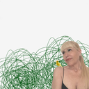
Progression of editing Martelles dps to fit into the design system of the group publication.
got rid of the purple colour and changed it to the orange and beige colours, also got rid of the green illustrations.
edited the title to be bolder and stronger visual hierarchy.
cut out some words from the quote as it was just repeat from the body text anyways. tried a layout with the quote left aligned, but tried to keep to the original, didnt want to change too much. that goes for the paragraphing too. thought about changing to the double columns but the text column became really jagged with lots of widows and orphans. decided to keep the 3 columns as theyre the same width as the double column on the second spread too.
0 notes
Photo


concept ideas for the front page
experimenting with the placement and different iterations of the title and “issue one”
0 notes
Photo


concepts for themematic intros and outro.
chose a theme of sharing stories. it was really hard to find a common theme across our four interviews so just kept it broad.
0 notes
Photo


experimenting with layout for content page and editoral intro.
wanted to make use of the hand drawn arrow from bom’s dps to bring familiarity and cohesive. all our dps have some kind of hand drawn elements so wanted to intoroduce it from the start with the contents pages
0 notes
Photo


vector illustrations and creating a header for the publication.
0 notes
Photo


changed the second double spread a lot to fit the new margings of the big publication.
feel like this layout showcases the photography nicer.
on top of feedback, incorporated graphics with text more.
edited the spacing of the question answer and new question. the line space relative to each text section. 1mm space after the question. and 3mm after the question answer.
i also feel like these wider columns fill the pages nicer
0 notes