
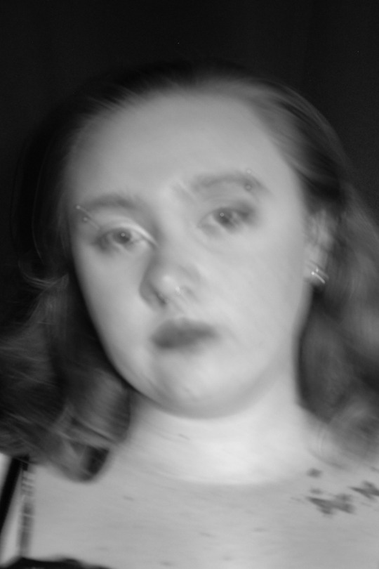
Hi, my name is Abi and I am a portrait photographer specialising in visual distortion.
Don't wanna be here? Send us removal request.
Statistics
We looked inside some of the posts by abigailmirko and here's what we found interesting.
Average Info
Notes Per Post
1
Likes Per Post
1
Reblog Per Post
0
Reply Per Post
0
Time Between Posts
4 days
Number of Posts By Type
Text
17
Last Seen Tumblr Blogs


Fun Fact
There were a total of 171.5 billion posts on Tumblr in 2019.
Text
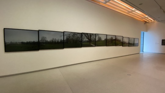
WEEK ELEVEN -> WEEK TWELVE / Development.

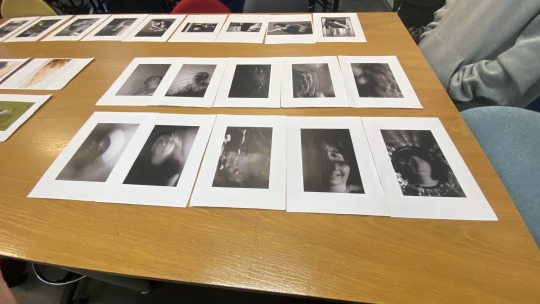

-> The photo of the left was my original sequence and layout, I had grouped them by model but during class when we were doing critiques on the sequencing and selection the class had come to an agreement to the one on the right. Natalie had mentioned as well to sequence them by different optical techniques, I cant remember why but I assume it was to create a more dynamic and visually interesting photo book.
-> I hadn't done much exploration in different sequencing between week eleven and week twelve but I had made this draft as for SDL we were required to create a presentation for final feedback before submission in week thirteen.


-> My feedback that I remember was to change my landing page to the photo of myself in the mirror and to move the ARDN631 to the back page alongside adding the names of my models. I do think that was the only feedback I had got but if there was more, I'm sorry I do have shit memory.

-> Continuing on from my week twelve feedback, I had changed the landing page image to myself and then had moved the photo of my mother with her peaking out to the first image into the series as it was like kind of welcoming the viewer in. Furthermore, I didn't like the giant gap between the next photo on the next page so I had changed the layout while also changing around the photos to see what was more effective for sequencing.

-> I had decided that the images I had wanted to keep in the same sequencing order was the landing page due to not only the class had been in agreement with the decision but also because I think it draws in the viewer through visual interest. As well as the first page and last page because I liked how the series had started by conceptually welcoming you in and engaging with the viewer through the perception concept, furthermore with how when you first are introduced to the model this is the first impression but then it starts to develop thus the end image.
-> My next consideration on this development of the photo book was one of my images (which is the one on page eleven) I feel that it is too similar to the landing page one and the only difference is the angle I am sitting at. So I think I will remove this one or find a different one to replace it with.
-> Overall, I think my next step to continuing to develop is to finalise my sequencing overall and remove the photos I think take away from the series (just that one).
0 notes
Text
WEEK 10 / Photo-Book Draft.

-> I feel confident with the development/progress working towards my submission that my photos have created a striking series subject that explores the concept of portrayal creatively.
-> At this stage, I am currently selecting photos from the past ten weeks that I think work the strongest in my series that create an effective storytelling of my concept overall.
Currently, these are the photos I have selected:

-> After selecting my photos, I started to edit them. Since I already knew and my class agreed that my B&W formative photos were stronger than my coloured I had first changed them to B&W before I had made any changes to settings like exposure, highlights, shadows, etc.
Resulted Edited Files:

-> My edits mainly consisted of creating contrast between the tones as I wanted to emphasise the idea of clarity within these portraits. So that not only am I visually communicating to the viewer my perception of my models but also engaging with them to create their own perception as this would be probably the first time they have seen these people before. I also have kept my other editing changes a little bit more subtle as I didn't want the lighting aspects to fully influence their appearance.
-> My next process in the post-production stage once I had edited my photos was drafting my photo book with different sequencing of photos. My first idea of how I would sequence my photos was by grouping my photos by the model, i.e all my photos of myself then Mia followed by my mother, Debra and then Jadyn.

(This photo was taken in week eleven as I realised when coming back to update my tumblr that I had lost my screenshot of my first draft so I am using this photo, these pages are also double sided but in the moment I forgot to take a picture of the other side.)
-> I felt that by grouping them by the model worked best originally as then it would conceptualise how these different effects worked together to portray/perceive my models. I had also kept one photo to one page as I wanted to create space between the photos with a big margin around. My intention with the design and layout was to keep it simple and not overwhelming to the eyes when the viewer was looking at the photos.
0 notes
Text
WEEK NINE / Contact Sheet.


-> I had asked one of my friends to borrow her kaleidoscope glasses as they had prisms I could easily remove (they can be put back in easily) to use for my shoot. Then I had asked my best friend, Jadyn, to come to my house where I had sat her in my brother's empty room, the day I had shot on was a Tuesday and thankfully it was sunny so I had left the blinds up as I didn't need to set up the flood light.
-> I decided to use a kaleidoscope prism as I felt that it was a really cool material that would capture my idea in a really unique way as well as to experiment with what the photos would turn out like when I would move it at different angles. Furthermore, I wasn't worried about the lighting as I liked the light reflecting on the right side of her face while there were shadows on the left and the prism hadn't watered down the lighting in a sense.
-> I am very happy with how the photos turned out and would definitely experiment more with kaleidoscope prisms in my own time to see what other photos I can capture besides portraiture. Another point that I hadn't thought about before until during the shoot was that the prism was the perfect size for my lens as it wasn't too small and wasn't too big so it fully engulfed the framing of my photos.

-> I found the result of this photo had turned out really interesting due to the sort of low angle paired with the effect of the kaleidoscope. As well that it captures this atmosphere that borderlines the clarity/focus which links back to how I am perceiving her as though we are best-friends we don't see each other much besides every now and this has always been our dynamic once we had started college as we went to seperate colleges.

-> I particularly love the framing of this photograph as it kind of captures her in the moment when the process behind this photo was intended. I also think that the lighting perfectly pairs well with the composition that was created. One thing that I would change would be the focus I had used as I think if I had focussed it more then it would create a better image.
-> I love the scale that was captured with the kaleidoscope prism as I think it creates a really intriguing contrast effect and I think that this photo had turned out a bit more different compared to the others.
-> I like this photo as I particularly like how mainly of the left side even though there is this disruption of colour you can still see the multiples of her face so it contrasts between clarity through the effect by the prism. I also like the subtly of the lighting which highlights her face.

-> I love the positioning and framing that I had created during this photo and the simplicity contrasted between the multiples of her face. I also love the subtly of colour even though these photos will be in B&W.
0 notes
Text
WEEK NINE / Self and Peer Analysis.


-> In class we had been given a worksheet to reflect on our work up to this moment and mark which level we think we are at in the categories on the sheet.
-> I had marked myself at excellent high achieving for creativity/originality as I felt the concept behind my series was well organised that had brought a unique approach to the brief for this semester, especially due to my technical techniques I have used in order to bring a creative approach. I had also marked specifications at the same level as due to my concept my outcome had really relied on aspects that fall under specification, as well as I had tried to keep my use of subject matter effective in order to create a strong striking image.
-> Composition, Concept/Content/Theme, Image Quality I had marked myself at average moderate achieving and this was because I felt that my exposure and focus/depth of field I could've worked more on during my shoots but I had become frustrated quite quickly when it came to adjusting the settings. Furthermore, I felt that my photos hadn't quite visually communicated my ideas clearly but I as I thought more about it, I think it plays into the clarity concept within my idea as well as the perception. When you interact with someone, you only know them for how they act around you but then you start to think about their own friends/family, other people who they interact with when you're not there. So you're clarity on how you seem them changes. Lastly, I had marked composition at this level because I felt that I could've explored more with the angles and framing but then I also was quite restricted in movement due to my set up on some of my techniques.
-> I do remember after filling out this sheet, we were paired with other classmates where we would discuss why we thought we were at this level and any feedback they had. I was paired with Rachel and I thought I had wrote down her feedback but I cannot find it or remember it at all unfortunately.
0 notes
Text
WEEK EIGHT / Project Direction.


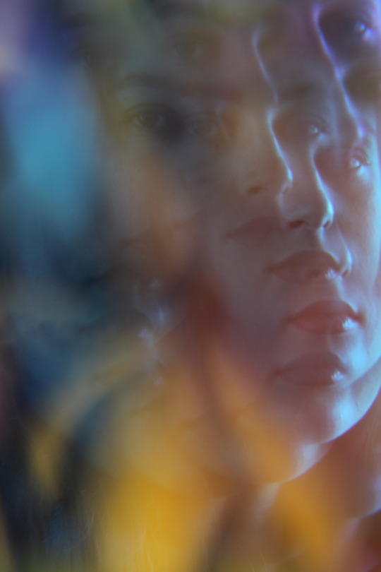
Continuing to develop my photographic series for summative submission, I will be looking more into the technical techniques that disrupt the perception of people I will be photographing. At the current moment, I have been exploring and ideating which would extend my work. The photos above are currently the direction I am looking to follow mainly technical techniques that either disrupt the full face where theres is some clarity to make out it is a person or half and half.
0 notes
Text
STUDY BREAK / Formative Feedback.
" Abigail, your series title "Luminous Disruptions" suggests the interplay between light and intervention that characterises your work—I encourage you to further explore this concept by considering how disruption can be both a technical process and a conceptual framework for challenging conventional portraiture.
Your experimental approach to studio portraiture that demonstrates a strong technical foundation and creative curiosity that will serve you well as you continue to develop your practice. The series reveals a solid comprehension of how to translate conceptual ideas into visual outcomes, particularly in your exploration of distortion, reflection, and lighting effects.
Your black and white self-portraits that experiment with movement show particular promise—especially the image with dramatic shadow play that you've identified as a favourite. The way you've engaged with the mirror as both a technical tool and conceptual device suggests a thoughtful consideration of how self-portraiture can interrogate identity through fragmentation and reflection.
I appreciate your methodical testing of different materials (glass, cling film, foil) to create various distortion effects and your careful observations about how these affected both lighting and composition. Your reflection that "the glare the glad wrap had created" and the "tunnel effect that the foil created" shows you're paying attention to how different surfaces interact with light—a crucial skill in studio photography. Your recognition that better framing would have "extended the image more" demonstrates a growing awareness of composition that you can build upon.
Your visual blog effectively catalogues your technical development through class exercises and experimentation, yet there's an opportunity to deepen your critical reflection. While you've documented what you did and what visual effects resulted, your practice would benefit from more explicit connections to broader contexts—how do your experiments with distortion and reflection relate to other photographers who have explored similar territory? The early modernist photographer André Kertész (distortion series), Francesca Woodman (mirrors/identity), or contemporary photographers like Viviane Sassen might provide valuable reference points.
As you plan your additional studio sessions, I encourage you to consider not just "what" and "how" but also "why"—what are you trying to communicate through these technical choices? How might these experimental approaches to portraiture connect to broader ideas about identity, perception, or representation? Strengthening these conceptual underpinnings will help transform technically interesting experiments into more resonant work.
Your note about "awkward family photos" suggests an intriguing direction that could be further developed. Consider how deliberate awkwardness or discomfort might function as an expressive strategy rather than something to be avoided.
Continue your promising exploration of materials and lighting, but challenge yourself to connect these technical choices more explicitly to your conceptual aims and to position your work within wider photographic traditions. Your diligent approach and willingness to experiment provide an excellent foundation for growth, and I look forward to seeing how you develop these ideas in your upcoming studio sessions. "
0 notes
Text
Week Eight / Photo book Research.


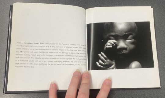
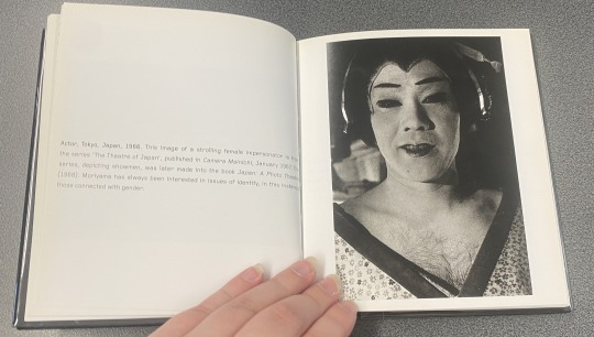


-> The first photo book I had looked at while in AUT library was "Daido Moriyama" by Kazuo Nishii which offers an introduction into the photographer, Daido Moriyama. Daido Moriyama is best known for his raw, high-contrast black and white photographs. These images capture the chaotic energy that is urban life. These are not all the photos from Daido Moriyama, I have only taken a few photos of different pages.
-> I had picked out this photo book as at first glance as I had found the cover visually interesting. Then I had opened the photo book to which I was then quickly intrigued by his B&W photography. Particularly the gritty emotion that is brought out.
-> I had originally thought that the photo book was published by the photographer himself and not someone else so I had found the sequencing interesting. As some photos would take up a bigger portion of a DPS or it would be a singular image on one page. I did find the order of images are bit random but I think this is because it was from another author and not the photographer himself.
-> I find Daido Moriyama's visual style quite interesting with the high contrast B&W as this aligns with my editing style of my photographs. But unlike having high contrast, I am going to stick to a mid/average contrast where the facial features are not washed out by the tonal range.

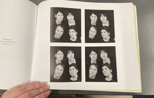


-> The second photo book I had picked up was by the photographer Barbara Probst and I found this series particularly interesting due to the camera angles and sequencing of images. She had set up cameras where the models would each be looking into the lens of a seperate camera but would still capture one another in their background. This plays around with focus, more like what we focus on first when we look at an image and the perception behind the concept.
-> This was another really cool photo book that explores the perception of people and I found the technical process into this series had really intrigued me, so much where I had looked into the method of process. Through this research of the book, I had found that she had used radio waves that had controlled the shutter release to set off multiple cameras (14 at a time).
0 notes
Text
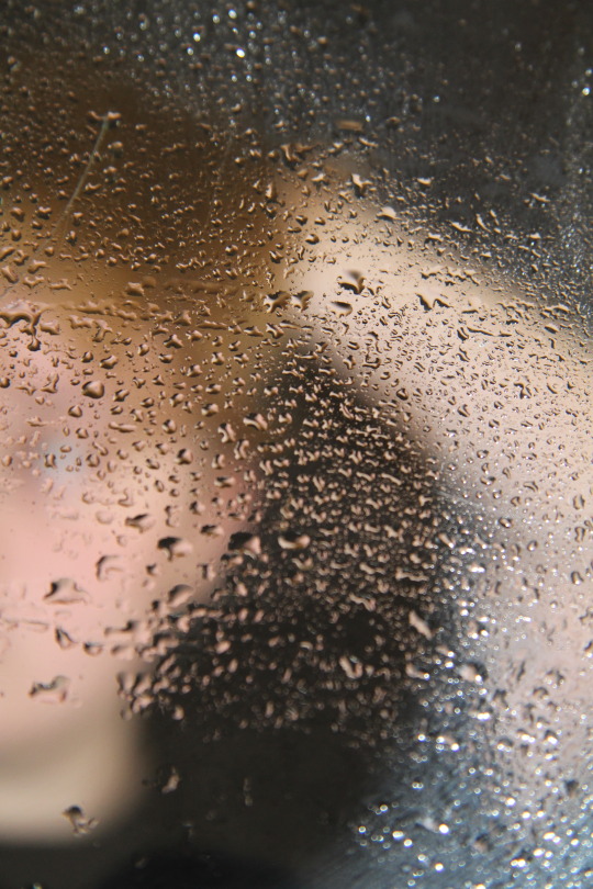
WEEK EIGHT / Contact Sheet.


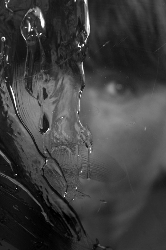
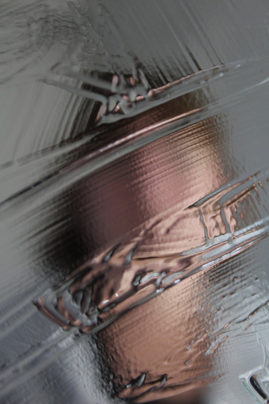
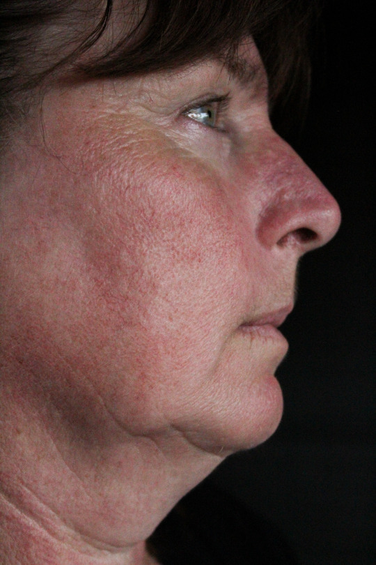
-> I used two different processes in this shoot. First, I had used a glass pane propped up against the back of two chairs to keep it in place, then smeared hair gel on the glass pane. Due to the chair height, I couldn't prop the glass higher so I had positioned the camera low so this was a set back. Another set back I had was that since I was using the dining room slider door curtain as the backdrop as well as the weather being horrible today (09.05) there was no good natural light coming through the back windows, so I had to set up a flood light. I also set up the flood light pointing away to diffuse it cause it was quite harsh and bright but the light had reflected cause the walls are white. Even still with the flood light set up I had to have a higher ISO, smaller aperture and slower shutter speed just to get a good exposure and I didn't want camera movement to affect the photo even more so my movement between shots was very limited.
-> An extension of the first process is that I decided to have my model (my mother) hold the glass pane to try and get closer with the tripod/camera so I could take photos at different angles. But the part where I had smeared the hair gel was not that big of an area so it was quite limited. Will definitely try again.
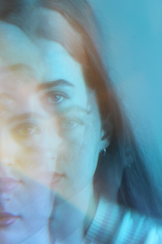
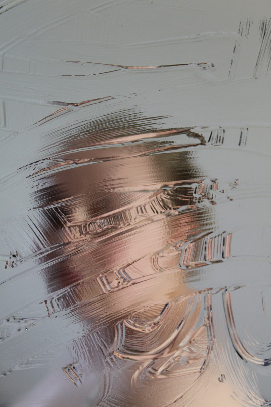
-> For the second process, I had put hair gel on a mirror to take self portraits as I think for summative, I still want to continue to explore some self portraits through the idea of distortion within portraiture. I had also taken some photos of my mum in the mirror just to experiment.
-> I am really satisfied with this photo shoot and I am definitely going to continue this idea more hopefully with different people and different settings. I also think this idea really helped me solidify the idea behind this project and brings in a new refreshing element that I think will help me extend the project from photographs to portrayal.
-> This is one my favourites out of the shoot and I'm really happy with how the photo had turned out, I like the texture that the hair gel disrupts with the photo so the only thing I would revisit is that I could clean off the hair gel that is disrupting her eyes.

-> I think the result of this photo is a little bit too hazy and you can see the reflection from the glass of the tripod so definitely need to reshoot but I the concept of this photo and will definitely play around with it more.
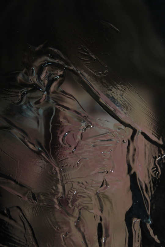
-> I like the texture that the hair gel has created in this photo and it really pairs well with the lighting I had used. To further resolve this photo I think I would be more considerate of the framing.
-> Another successful result that I am in love with, I think the shadows on the further part of my face as well as the highlights on the front side actually work really well with the effect I did. Next time maybe I would play around with what areas I am disrupting like in the photo with my mother.
0 notes
Text
WEEK EIGHT / Auckland Art Gallery.

We had visited the Auckland Art Gallery in the last hour of class to go look at Mark Adam's exhibit.

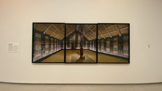


-> I found these two works of his interesting not only just how much work it took to align and layout the sequences but also due to the history and culture. Where these Whare Whakairo (carved meeting houses) had ended up in European countries and the difference in meaning.
-> The Whare Whakairo in Clandon Park, England was commissioned by Tūhourangi chief Āporo Te Wharekāniwha of Te Wairoa at Lake Tarawera, opening in 1881 and was used for customary purposes by local hapū. After the eruption in 1886, it was taken apart and reassembled like a flat pack in Clandon Park by Governor William Hillier Onslow as had bought the Whare Whakairo.
-> The Whare Whakairo in Rothenbaum was originally commissioned by a pākehā named Charles E Nelson as a tourist attraction and for performances and then was later sold to a German museum in Rothenbaum. It wasn't commissioned as an ancestral whare but more as a new opportunity for traditional cravers.
-> With the Clandon Park whare originally being commissioned for use by local hapū and named after a female ancestor compared to the Rothenbaum whare that was commissioned for touristy and performances, it is so interesting to see how these Māori whare's have been used for different purposes and have made new meanings for culture in a sense.

-> This piece of work was also really interesting as I was thinking due to the scale of the piece, it would've taken soooo much time to align the frames as they were all shot as singular images. Another interesting part of the piece was that we saw in one of the photos there was a dog but it had looked like a ghost (transparent). Natasha, Mia and I had discussed what could've happened for the dog to be capture like this and Mia had suggest a low shutter speed and high aperture which Natalie had confirmed.


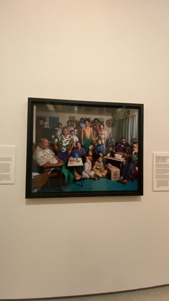
-> I had only taken one photo of his portraiture work which was this one and it was fascinating to learn how originally this traditional way of tattooing had nearly become lost but they were able to save the tradition due to Sulu’ape Paulo. He had taught many others the art as well as had been tattooing following this technique and the fact that this family had let Mark Adams capture this gathering called Umusaga. An Umusaga is a gathering after the sacred blessing given at the completion of a pe'a.

-> The last thing I had looked at before leaving the art gallery was "When the Moon Sees the Sun" by Jeremy Leatinu'u. I had videoed a part of the piece but tumblr won't let me upload it.
-> I found this piece interesting due to the imagery used as well as the quietness it had held within me and after learning that it was a art piece that was in remembrance to his passed grandfather, I found that the emotional aspect had really evoked a melancholy in me if that makes sense. It was a beautiful piece that had shown us the spiritual journey linked through Māori and Sāmoan culture.
0 notes
Text
WEEK SEVEN / Photographic Campaign.


-> The reason why I am photographing friends/family instead of strangers is because I already have an established relationship with them and exploring this idea of how visual disruption can distort/change the perception of others interests me on how I can see my friends/family in a new light/perspective (in a good way obvi). It's like exploring vulnerability through perception, if that makes sense.
0 notes
Text
RESEARCH / Helen Hetkel / David Seidner / Antonio Gutierrez Pereira

HELEN HETKEL
Hetkel, Helen. Instagram.com, 2025. https://www.instagram.com/helen.hetkel/.
As I had mentioned in my previous post, my best-friend had shown me her instagram as something that I could look into as it aligned with my project concept.
-> Helen Hetkel is a photographer based in Tallinn who has been working on her self portrait project for over a decade. She had explained in a post that she had started her project as she didn't like her appearance and wanted to feel a spark of confidence. Furthermore, her self-portraits have helped her grow and see herself in a new light. I found this quite inspiring as once we had gone over the brief in the first week, I had to come to terms with creating self portraits. Like her, I also didn't feel that confident in myself and don't like my appearance so this theme of visual disruption had stemmed from this insecurity of mine.
-> Over the past weeks, I had learned the process behind self portraits and have gone through the bad and the good photographs where I now feel more confident to share this journey. Just like her!!


-> My absolute favourites of her self portraits are these two. Particularly because of the technique she had used with the complimented lighting. Furthermore, how she creates a clarity of herself even through the visual disruption. There is a balance of focus that inspire a new perception of how I view these photos in terms with my project. The way I view and understand these photographs is that even though this sense of insecurity of visual appearance of person is shown through visual disruption techniques – there is still this balance that we can open ourselves up to improve confidence. And she is achieving this through the balance of focus between herself as the model and the visual disruption, a clarity between the two where you can visually see that she is not blurred out entirely.

-> This is another photograph that I had found visually interesting and paired with the caption "turning brokenness into beauty" had brought the subject of vulnerability that I admire. This is another visual conceptual idea that I feel aligns with my themes with self-portraiture. The key idea behind my self portraitures is exploring my self identity through visual disruption and this is like a reflection of that journey on how I had come to who I am now.
DAVID SEIDNER
Icp.org. “David Seidner | International Center of Photography,” 2025. https://www.icp.org/browse/archive/constituents/david-seidner.
Seidner, David. “Rosima.” International Center of Photography, 1985. https://www.icp.org/browse/archive/objects/rosima.
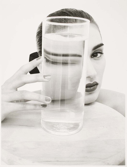
-> Through my research into technical techniques I had found this portrait 'Rosima' by David Seidner
0 notes
Text
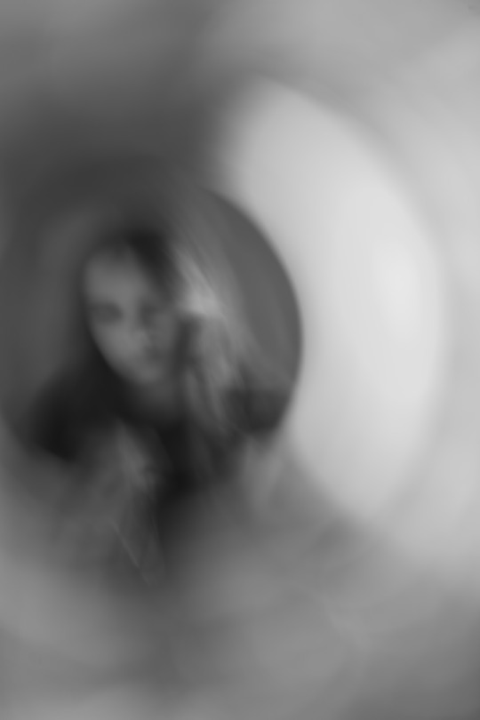
WEEK SEVEN / Contact Sheet.


-> My process for this photoshoot was using an old glass pane that was in my garage and using a spray bottle to mist the glass pane with water droplets. I then set up my camera on the tripod with a three second timer to take three photos at a time. The hard part about this process was focusing the camera as how I had set up the area was quite cramped. I had propped the glass up on two chairs and had used a closed curtain as the background, due to the lack of natural light I had positioned a light towards the wall. Thankfully due to the walls being white I was able to reflect the floodlight back onto me. The hardest part of the focusing process was that I had to use my hand as kind of like a focus point but it was quite awkward to reach around from.
-> My best-friend had recommended a photographer I could look into as some of her photographs very much aligned with my concept. Her name is Helen Hetkel and I was shown her instagram page with all of her work, she would post tutorials on how she made the effect which worked perfectly with my theme. In the tutorial I had found on her page relating to this technique was that she had used her shower glass to spray water so I aimed to do the same thing except with a glass pane instead of in the shower.
-> My personal experience overall using this method was that it was quite cool to see how it affected my subject (aka myself) but it was quite exhausting as I would be going back and forth. Especially as I wasn't always sure I had was in frame so I guess for next time I would have a marker or some sort and more room to be able freely move around. Reflecting on this shoot, I think that this came out more as a failure than I had hoped as I don't think the images turned out as I wanted and aren't that strong in terms of visual impact in a sense.
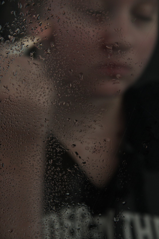
-> What I like about this image in particular is mainly how the droplets kind of fade out like a gradient and I think this works well with the idea I had in mine. My idea was to originally use a make up brush as a prop as it explores my self identity through a feminine perspective. I thought that the gradient that went from left to right had aligned with this idea perfectly as it was like a gradient of the process it takes to put on make up. Another aspect within this photograph that I like is the soft lighting as it plays into the feminine aspect (NOT TO SAY THAT ALL WOMEN ARE SOFT, POP OFF U BADDIES).
-> I think this photo out of the many was one out of two successful but not as much as the first one. The lighting is very much off, especially in the bottom right corner and I think it's unfocused too much even though some of the droplets look very clear. What I think works in this picture is maybe just the idea behind it. I was trying to mimic a masculine hairstyle but it isn't really clear.
0 notes
Text
WEEK SEVEN / Portrayal.

What and who will you portray? -> Continuing to develop my photographic project, I will portray the idea of optical disruption and how this affects how we view people through technical processes. E.g like when you look through like the bottom of the glass it creates a magnification effect so I'm using that magnification effect to personify how we can view people in a narrow minded perspective. I will continue to explore self-portrait as a sub-theme as I want to explore the side of dystrophia that I have personally experienced through gender. Furthermore, my models will be family members and friends as I want to explore and create new meaning with how I perceive people that I have already made relations with.
What might you communicate visually through the concept of portrayal? -> Ideas I might want to visually communicate is identity, perception, gender dysphoria. These all align with each other so I think it will be quite easy to all portray these ideas but for the concept of gender in my project I want to focus more on self portraiture.
How will you select and sequence your images? -> I am going to select and sequence my images in different sections in relations to either the technical process or model. They will all be in black and white as from my formative feedback, my black and white photos were more stronger.
How do we find our ‘voice’ in creative work? -> Through my creative work I will find my 'voice' by developing a style and technique that I find more interesting that expand on my perspectives.
How do we grow our skills through developing a photo habit? -> I will grow my skills through photo habits by ideating ideas (new techniques and styles, etc) and researching other photographers and then putting this into practice through shoots.
0 notes
Text
WEEK SEVEN / In Class Exercise.

In class we had looked at the magazines that came out in our birth year. I was born in 2005 and I decided to look at the issue that came out in summer as that was also the season I was born and though I do not have a subscription with Aperture I found the "Photographer's Project" interesting.

Kerry Skarbakka: Falling
I found this double page spread interesting as I was instantly captured by the movement within the compositions and how the photographer captures himself in these positions using rigging that climbers would use when climbing mountains and walls and I love it turns into this really interesting surrealist idea just from using rigging ropes to suspend himself into these positions.
I asked my friend to pick a letter which she then picked the letter C. From that I had asked her to pick a number from one – seven as there was seven photographers under the C category. From this, the photographer that she had picked was Sabiha Çimen.
Çimen is a self taught photographer focusing on women, Islamic culture, portraiture and still life. She was born in Istanbul, Turkey in 1986.

Sabiha Çimen, February 27, 2024, Photography, February 27, 2024, https://www.instagram.com/p/C30b3vaoRU7/?img_index=1.
I had looked through her instagram and this was one of the photos that was pinned to her page and I found it really interesting, especially after reading the story behind it. She had visited Ukraine in 2023 twice and she wanted to gauge how the countries cultural institutions were going in the second year of the war. She had spent time with a Ukrainian actor who originally was acting as a sniper in a movie but had become a real life sniper and so she wanted to photograph his life between reality and fiction.
I find this photograph particularly interesting as the simple impact it has on the viewer once you read the caption as well as when you see that are smiling considering the war that is going on.
Mann, Sally . 1988. At Twelve Photography. https://www.sallymann.com/new-gallery/.
-> We also looked more into photo books in class and from the links on the week seven canvas page I had selected Sally Mann's "At Twelve". This series captures girls at the age of twelve where there is an excitement and a lot of social possibilities. The age of twelve is also a time where they are caught between adulthood and childhood.
I find this photo book interesting as it seems to challenge what children become exposed to as they become twelve years old. In the photo below the twelve year old girl is posing with a male figure in front of what looks like a play house. From this photo, I believe that Mann wanted to show the viewers that though twelve years old should be a time where they are not experiencing these situations they still happen so it really becomes a thin line between childhood and adulthood.

1 note
·
View note

Text
WEEK SIX / Contact Sheet.


-> Like in the last shoot/contact sheet, I shot more in my garage but overall I am unhappy with the results of my shoots. I think the reason why I am unhappy with the results of the shoot is because I was trying to capture more motion but I started to get demotivated when the photos didn't turn as the idea I wanted it to. I also think that the results of this shoot didn't really align with my main idea within this photographic project but it was still really fun to explore. My take back from this shoot though is that I do like the flash against the garage door and I think I could continue to work on the framing.

-> I think this is the most successful photo of my shoot as I like the glowy effect that the long exposure has made, I think if I were to revisit this photo then I would try to get more motion captured within the glowy effect as then I think it would align with my idea of distortion.
0 notes
Text
WEEK SIX / Formative Presentation / Reflection.


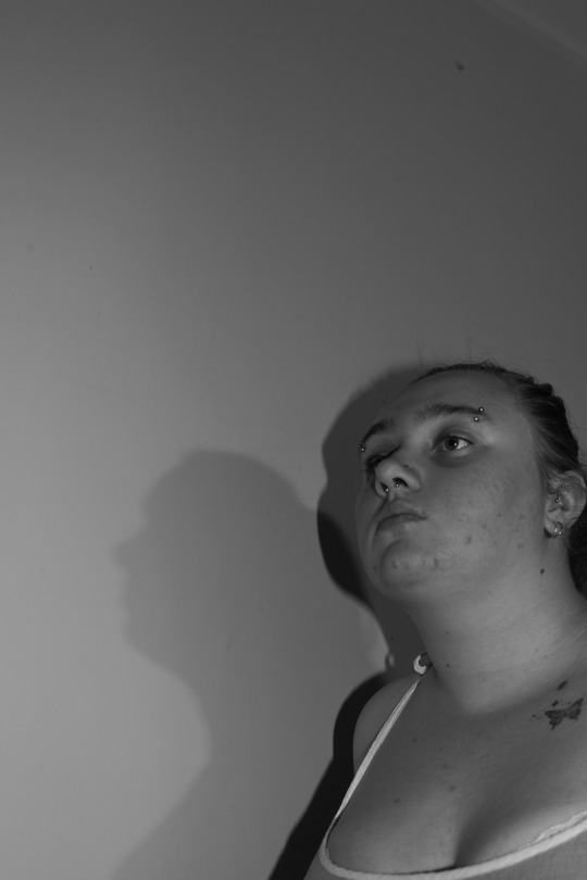

-> Looking back through all the photos that I have taken over these past five weeks, I found that I am not really happy with my overall direction that I am going in with how my images are turning out. In saying that, I do like the distortion concept that I have been exploring and I definitely want to expand over the break and next coming weeks but I can improve much more.
I am in love with how my studio photos turned out when I had used it on the 4th of April and I think I will come back to the studio either one or two more times but I want to explore more different settings that work well with the compositions I want to capture. Moving forward, I will do more research based on framing, lighting and overall composition to continue developing my concepts and refining my images.
FEEDBACK
Black and white is working best.
Movement and experimenting with the mirror.
Liked the self portrait with the shadow.
Awkward family photos.
0 notes