
Don't wanna be here? Send us removal request.
Statistics
We looked inside some of the posts by abigailshorel6 and here's what we found interesting.
Average Info
Notes Per Post
0
Likes Per Post
0
Reblog Per Post
0
Reply Per Post
0
Time Between Posts
7 hours
Number of Posts By Type
Text
17
Last Seen Tumblr Blogs


Fun Fact
130K people were victims of a chain letter scam that affected Tumblr in May 2011.
Text
Sticker for inside cover of process book

Sticker for inside cover of process book -project number in most happy variation of type. Going to add after I get process book back as my box has already been taken. It will cover the text on the inside cover already. This page printed badly and somehow ended up being marked in the printing process so I want to change this. Will be nice to add some of the mirrored effect into the process book.
0 notes
Text
Promotional Material Digital
Main - Instagram

Supporting - Website

0 notes

Text
Evaluation
LO1 Demonstrate your ability to develop a clear understanding of the relationship of research to your practice in forming a personal and critical viewpoint in the realisation, refinement and production of your Major Project.
At the project I was really stuck with what I wanted to do all I knew is that I wanted it to be typographically based. Extensive research and reflection into design allowed me to find my interests and discover problems in design that led me to my brief. I found that looking at lots of digital design projects they often feel flat, I think this over digitalisation of design and influence of AI has really impacted the skills and craftmanship we used to see in design. Through this project I wanted to highlight how human nature can be involved in design even in a digital space. The 7-38-55 Rule also really helped to push my project, understanding how much body language and facial expression impacts communication highlights how much tone is lost in digital design. I think my project helped to solve this problem. I think I did a much better job at this project in defining these problems and motivations behind my project which makes it feel more grounded and relevant in the design world outside of uni. I also did a much better job at defining my target audience and keeping them in mind throughout my project.
I took in as much typographical work as I could throughout this project to help push my work. As my project explores new concepts in design I couldn't find project that were super similar. Without having that super direct project I felt I was able to lead with my development, own judgments and critical reflection which made an innovative/unique project that I am really proud of.
My project had so much scope and there are so many more avenues of it I would love to explore. If I have time between now and the grad show I would love to add more emotions to the typeface such as anger/fear. I would also love to explore emotionally reactive advertising like me and Ciaran discussed as I think this could lead to something really interesting.
LO2 Demonstrate sustained and effective development of a practical working methodology to a topic that you have defined and which includes speculation on new and effective approaches that are at the forefront of Visual Communication practice.
I really pushed myself with learning new software with this project. Blender has become popular in modern design and pushes 3d work hugely. Learning new softwares that are at the front of design practice is important to me so I'm glad I had the chance. I spent about a week following tutorials and experimenting with settings/tools on blender to create my system. I found the tutorials online really limiting so I found creating my own system the best option, this also allowed me to really own the project and not feel like it was just someone elses system.
Development was something I really focused on throughout this project. I really struggled with finding my system and style of my typeface. I really enjoyed creates lots of different typographical experiments and being critical on myself and asking others options helped me push the project. Usually I leave designing quite leading leading me to just pick a direction and go with it but throughout this project I explored so many different methods constantly questioning them which made my outcome so much better than others.
LO3 Demonstrate an ability to authoritatively and independently project manage ideas, practice, time and work strategies in the production of a well realized body of work, reflecting the complexity of the major project and engaging effectively with academic support and resources.
I found time management difficult this project due to the amount I took on. Alongside my major project I also worked on d&ad, ISTD, penguin brief and JDO. Taking on these project helped me improve my design skills and gain a greater understanding of the design field which helped add context to my project. Due to how much I took on I found that I had to be strict with time management. My main method of this was creating to do lists each day as evidenced on my tumblr, having these soft deadlines and timeplans helped me create achievable goals and keep my project moving.
This project was the most complex I have taken on with depth of research and realisation of design. I taught myself Blender which was a lot to take on but was well worth my while. Blender allowed my typeface to be systemised and created some really interesting letterforms I don't think I would of thought of myself.
My subject matter had so much scope to it which kept me excited throughout, there were always more avenues to explore. After the hand in there is defiantly more I would like to explore with project. This project led me to create my biggest body of work yet. I have only ever created one typeface before that had 26 characters but for this one I created 468 characters. Obviously this took a lot of time but I think it was worthwhile. It made my project feel so much more impressive alongside all my different assets.
I found academic support pushed my project hugely, critical reflection in tutorials pushed me to develop my work much more than I would usually making a much better outcome. I found Ciarans feedback refreshing and super useful this term, my editorial work has completely transformed making my final outcomes look so much more refined and professional.
LO4 Demonstrate an ability to critically reflect on the process of your major project documenting its relation to both personal and wider professional contexts, practices and debates.
Throughout this project I was a lot more critical with myself as I had such a big ambition to create a project I was really proud of. Considering my secondary research and my projects relation to contemporary practice. My project is something that I felt was missing in professional design. My project feeds into the debates of digitalisation of design and the rise of AI highlighting how human nature can be present in type design. I also feel my project provides a fresh approach to communication involving tonality which is often lost in digital design. The idea of incorporating body language and facial expressions is something I would love to see explored by others and the ways this could help online communication and those with autism. I think if I had more time I could of done more in-depth secondary research as I feel some areas are lacking but I did as much as I could at the time.
0 notes
Text
Figure List
1
Inari Type (2020) Inari Typeface [online image] Available from: www.itsnicethat.com/articles/inari-type-graphic-design-220420. Accessed 16 May 2024. [Accessed 16 May 2024]
2
Théodore, L (2023) Léna Théodore: A l’an que ven lettering [online image] Available from: https://www.itsnicethat.com/articles/lena-theodore-graphic-design-discover-040923 [Accessed 16 May 2024]
3
Morten Halvorsen parkinson’s typeface
Halvorsen, M (2020) Morten Halvorsen: Write With Parkinson’s [online image] Available from: https://www.itsnicethat.com/articles/morten-halvorsen-write-with-parkinsons-graphic-design-140220 [Accessed 16 May 2024]
4
Studio Tempo® (2023) Tempo Studio: Ama [online image] Available from: https://www.itsnicethat.com/articles/studio-tempo-ama-graphic-design-product-design-project-110723 [Accessed 16 May 2024]
5
errorerror.studio® (2023) errorerror.studio®: Rajola® [online image] Available from: www.itsnicethat.com/articles/error-error-stuido-rajola-graphic-design-project-130923. [Accessed 16 May 2024.]
6
Mills, A (2021) Anna Mills: Anything Can B a B [online image] Available from: https://www.itsnicethat.com/articles/anna-mills-graphic-design-171221 [Accessed 16 May 2024.]
7
Elmehag, J (2019) [online image] Available from: https://intern-mag.com/johan-elmehag/ [Accessed 16 May 2024.]
8
Wright, H (2022) Copyright © Harry Wright, 2022 [online image] Available from: https://www.itsnicethat.com/articles/harry-wright-discover-graphic-design-illustration-081222 [Accessed 16 May 2024.]
9
Gerard, V (2020) [online image] Available from: https://intern-mag.com/victor-gerard/ [Accessed 16 May 2024.]
10
Koobas, M (2017) [online image] Available from: https://intern-mag.com/maarit-koobas/ [Accessed 16 May 2024.]
11
Sindroms (2021) [online image] Available from: https://stackmagazines.com/art-design/feeling-blue/ [Accessed 16 May 2024.]
12
Paul, J (2023) [online image] Available from: https://medium.com/@jennifer.paul12521/the-use-of-forensic-handwriting-analysis-in-criminal-investigations-to-unearth-the-truth-3591cd4b7b2f#:~:text=Handwriting%20analysis%20can%20reveal%20vital,when%20the%20document%20was%20generated. [Accessed 16 May 2024.]
13
Hook, K (2003) Emotional body language expressed by the actor. [online image] Available from: https://www.researchgate.net/figure/Emotional-body-language-expressed-by-the-actor_fig3_240838134 [Accessed 16 May 2024.]
14
FBI The Seven Universal Facial Expressions of Emotion. [online image] Available from: https://leb.fbi.gov/image-repository/truth_8.jpg/view [Accessed 16 May 2024.]
15/16
Studio Dumbar (2012) Studio Dumbar: Alzheimer Nederland [online image] Available from: https://www.itsnicethat.com/articles/alzheimer-nederland [Accessed 16 May 2024.]
17
Gavriss, A (2014) Human Emotions _ official art video [online image] Available from: https://www.youtube.com/watch?v=MTWkfpa-jJw [Accessed 16 May 2024.]
18
Beeke, A Alphabet van Anton Beeke [online image] Available from: https://fokas.nl/2016/01/05/catalogus-75-paulbooks/ [Accessed 16 May 2024.]
19
Flotner, P (1534) Peter Flötner's "Human Alphabet” [online image] Available from: https://admin.kuleuven.be/icts/services/blogwiki [Accessed 16 May 2024.]
20
(1782) The Comical Hotch Potch, or The Alphabet turn'd Posture-Master, 1782 [online image] Available from: https://www.itsnicethat.com/articles/pov-the-human-alphabet-visual-trend-graphic-design-200324 [Accessed 16 May 2024.]
21
(1789) Bourbonnoise Alphabet [online image] Available from: https://www.loc.gov/resource/ppmsca.15895/ [Accessed 16 May 2024.]
22
Zapata, C (2024) THE NEW YORK TIMES, WORD THROUGH THE TIMES : A Pop, Dip and Spin Through the History of ‘Pose,’JANUARY 2024 [online image] Available from: https://crystalzapata.com/Image [Accessed 16 May 2024.]
23
SUNNEI (2022) HELIOT EMIL SS23 ‘Primal Substance’ [online image] Available from: https://www.instagram.com/p/CmTQErCPuVE/?img_index=2 [Accessed 16 May 2024.]
24
Grevet, T (2023) Pin-Up [online image] Available from: https://twitter.com/domesticetch/status/1662292451476774912 [Accessed 16 May 2024.]
25
RCA [online image] Available from: https://www.are.na/block/7621633 [Accessed 16 May 2024.]
26
[online image] Available from: https://www.are.na/block/3014496 [Accessed 16 May 2024.]
27
Grilli Type (2018) Film Independent [online image] Available from: https://www.grillitype.com/commissions/film-independent [Accessed 16 May 2024.]
28
Grilli Type Gt Pressura [online image] Available from: https://www.gt-pressura.com/ [Accessed 16 May 2024.]
29
Nickerson, B BN Hooha [online image] Available from: https://www.bnicks.com/shop/p/hooha [Accessed 16 May 2024.]
30
KlimType Calibre [online image] Available from: https://klim.co.nz/retail-fonts/calibre/ [Accessed 16 May 2024.]
31
RaggedEdge East London Liquor Co [online image] Available from: https://raggededge.com/work/east-london-liquor-co/ [Accessed 16 May 2024.]
32
Grilli Type (2018) Film Independent [online image] Available from: https://www.grillitype.com/commissions/film-independent [Accessed 16 May 2024.]
33
Schriër, D [online image] Available from: https://www.instagram.com/schrier.xyz/?hl=en [Accessed 16 May 2024.]
34
Schriër, D [online image] Available from: https://www.instagram.com/schrier.xyz/?hl=en [Accessed 16 May 2024.]
35
PlayType rialto [online image] Available from: https://playtype.com/typefaces/rialta/ [Accessed 16 May 2024.]
36
Wiltshire, F [online image] Available from: https://www.instagram.com/fredsfonts/?hl=en [Accessed 16 May 2024.]
37, 38, 39
Sagmeister, S The Happy Show [online image] Available from: https://sagmeister.com/work/the-happy-show/ [Accessed 16 May 2024.]
40, 41, 42
Fung, J (2022) Happy Fat Font [online image] Available from: https://www.itsnicethat.com/articles/jazlyn-fung-graphic-design-120422 [Accessed 16 May 2024.]
43
Autistica [online image] Available from: https://www.autistica.org.uk/ [Accessed 16 May 2024.]
44
National Autistic Society [online image] Available from: https://www.autism.org.uk/ [Accessed 16 May 2024.]
Translate Transform
1, 2
Zheng, R (2017) Look/Hear [online image] Available from: https://www.typeroom.eu/article/ran-zheng-wants-us-feel-look-and-hear-typography-miraculous-ways [Accessed 16 May 2024.]
3, 4, 5
Zhu, R (2024) [online image] Available from: https://www.typeroom.eu/typographys-uncharted-territories-rozi-zhu-is-here-to-push-design-boundaries-forward [Accessed 16 May 2024.]
6,7
JUNO x Arctic Paper (2022) Munken Creator [online image] Available from: https://www.typeroom.eu/juno-x-arctic-paper-munken-creator-generative-typography-creative-coding-munken-sans [Accessed 16 May 2024.]
8
Reklamekollektivet (2022) Reklamekollektivet: Kulturhuset identity [online image] Available from: https://www.itsnicethat.com/news/reklamekollektivet-kulturhuset-identity-graphic-design-110322 [Accessed 16 May 2024.]
9
Hubner, P [online image] Available from: https://www.patrik-huebner.com/datadesigndictionary/creative-coding/ [Accessed 16 May 2024.]
10
Jackson, T (2022) Trevor Jackson: KH, Looking At My Pager [online image] Available from: https://www.itsnicethat.com/news/trevor-jackson-looking-at-your-pager-digital-100622 [Accessed 16 May 2024.]
11, 12
Hutton, B (2018) Rather than abstract soundscapes, the records become a visual system to understand how Bowie masterfully crafted Major Tom’s journey. [online image] Available from: https://medium.muz.li/oddityviz-a-tribute-to-david-bowie-with-data-3566d3bd6bd8 [Accessed 16 May 2024.]
13, 14
Kraning, S Pager [online image] Available from: https://sarahkraning.com/ [Accessed 16 May 2024.]
15
Brusspup Screenshots from: “Resonance experiment! (Full version- with tones)” youtube.com/brusspup [online image] Available from: https://edinburghsoundmassage.com/blog/f/cymatics-the-visual-representation-of-sound-and-vibration [Accessed 16 May 2024.]
16
[online image] Available from: https://www.google.com/search?sca_esv=1901f77a1e540082&sca_upv=1&sxsrf=ADLYWIK97VzLpnlUULSb3Ya1lkwkaLycAw:1715860768009&q=sound+waves&uds=ADvngMiwfn8uYCYg6uH33md7hfeMOSZYL97pij0RXwgYkA14a0SGYAYgheetD_dB6bWw2Pq8UxDHW4C0Ea6XdfRsJX607NalpTXxfPeF_p6NhnW-2LFGo7y_c53muEgYdLs4ynMpW0iIvS0GfJJP9RhzS96LN80wqO3vhAqu_xu8xGSmXjZmCXTGy21e76Ch7GriJFa4ekNnzjSjJ2XuwEsLAqUY6k9fBbxYwhD3elBwvYgOiPOcNs_dDWGlAs-8hS-dB6mq2Of6c6H5d6Ugg00qdAllqV6aqElyBsltTBgVyjWjqf1YjTM&udm=2&prmd=ivnmbtz&sa=X&sqi=2&ved=2ahUKEwj5lb68j5KGAxVHgf0HHWDXDmkQtKgLegQIDRAB&biw=1437&bih=720&dpr=2 [Accessed 16 May 2024.]
17
[online image] Available from: https://www.google.com/search?q=sheet+music&sca_esv=1901f77a1e540082&sca_upv=1&udm=2&biw=1437&bih=720&sxsrf=ADLYWILetrPd4pvsqnRXpccE8W2zycRCGA%3A1715860769945&ei=IfVFZoWoOeOHhbIPyKyGoAY&ved=0ahUKEwjFvLS9j5KGAxXjQ0EAHUiWAWQQ4dUDCBA&uact=5&oq=sheet+music&gs_lp=Egxnd3Mtd2l6LXNlcnAiC3NoZWV0IG11c2ljMgQQIxgnMgUQABiABDIFEAAYgAQyBRAAGIAEMgUQABiABDIFEAAYgAQyBRAAGIAEMgUQABiABDIFEAAYgAQyBRAAGIAESOkNUABYpgxwAHgAkAEBmAG3AaAB6waqAQM5LjK4AQPIAQD4AQGYAgqgAt8FwgIKEAAYgAQYQxiKBcICDRAAGIAEGLEDGEMYigXCAggQABiABBixA8ICDhAAGIAEGLEDGIMBGIoFmAMAkgcDOS4xoAeTSA&sclient=gws-wiz-serp [Accessed 16 May 2024.]
18, 19, 20
Schimautz [online image] Available from: https://juliaschimautz.com/Animation [Accessed 16 May 2024.]
0 notes
Text
Final Printed Outcomes


These are my final printed outcomes, I am so happy with how they turned out. I added a mirrored contact paper to my process book as my project is all about mirroring human emotion. It will allow the reader to see their facial expressions in the book.
0 notes
Text
Final Posters


Final posters with my visual identity applied
0 notes
Text
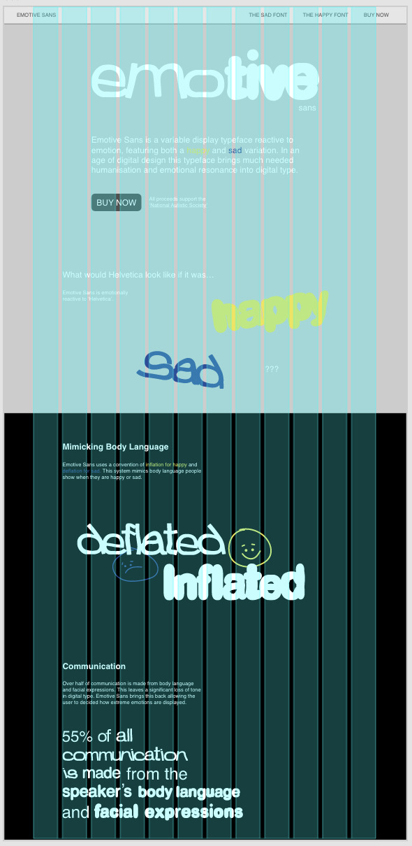
Final Website

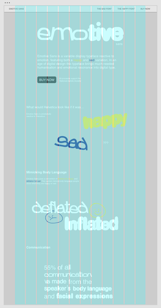
The solution I made for the home page was to add little lines around the typeface in use, this breaks the page up and draws attention to the typeface.

Happy page for the typeface highlighting the different weights

Sad page for the typeface highlighting the different weights. I ensured to add the buy now button alongside the charity connection on every page as this is what I had seen in my secondary research.

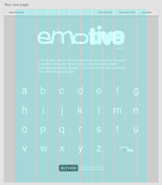
This page shows all the letterforms in the typeface and gives context to the charity and what the money will be used for.
I am really happy with the typeface as a whole, the visual identity feels consistent throughout all my assets. I think I stuck a good balance between simplicity and being informative.
0 notes
Text

Need to add some more hierarchy or find a way to break up the page - it feels too long.
Different colour???

adding lines
0 notes
Text
Website Development


Making final developments to the website. I am finding it hard to design the homepage as I want to add all the context to my project but it is starting to look too wordy.
0 notes
Text
1 in 5 autistic people have alexithymia.
People who have alexithymia may have have trouble identifying, understanding and describing emotions. They may also struggle to show or feel emotions that are seen as socially appropriate, such as happiness on a joyous occasion.

0 notes
Text
0 notes
Text
0 notes
Text
0 notes
Text
0 notes