
Last Seen Blogs
wtfnoie
caraphernelia

milly-thesims4
Millena Thayná

kyuunart
Kyun Senshi

homura89
Anime and Manga

bscrogz
Carpe Diem
Text
As the semester comes to a close, I have been thinking about how much I have learned and grown through my graphic design classes. Creating the process book really allowed me to see evidence of this growth. I think I have learned a lot of rules and techniques, but I have also increased my knowledge about other concepts useful to my design practice. I think something that has been really useful is everything I have learned about printing projects this semester. I didn’t really print anything out in my first semester because it was online, so I think that I learned a lot this past semester. In both classes I really got a lot of information about the history of graphic design, and this helped to understand my work in a historical context. Seeing the rise and fall of different trends and technology helped in creating my own style. Finally, I think I learned that I need to stick up for myself and my design choices. Although the customer has finally say, I need to be proud of my work and create compromise and new solutions that make us both happy.
0 notes
Photo
Week 12 - 4/7/22
This week I finished working on the process book. I had already set up the grid and system for the layout of the book. So right now, I am just filling in my works and blog posts. I had the correction last week of needing to lower the point size on my body copy, so I did that. That changed a lot of how my pages were set up, so I had to redo some things, but it is better now that the text is smaller. I don’t have much more to do to finalize the book, and I look forward to seeing it printed. It had definitely been interesting to go back and look at all the work I have done throughout the class.
This week we read chapter 11 in the textbook. This chapter was called “Typographic Design Process.” Although I have not had these steps specifically designed for me, I have obviously worked through them, so it was interesting to see them defined and explained. I really enjoyed the second case study of Ernest Bernhardi’s work. I found his work to be very interesting and it was cool to see the process of how he got to his final piece.
0 notes
Text
Week 11 - Chapter 10
This week’s reading was about Typographic Design Education. I think it was a very fitting chapter as we continue to work on our process books. I think this chapter was interesting because it described different exercises and then I got to see how students interpreted the assignment. Usually, they were completing the project in different ways. I really liked the assignment where students had to find a type face or letterform that corresponded to an image. I liked this exercise because I often get caught up in the distinctions between images and type, but they actually aren’t so different when you begin to see how the letter form can flow like a picture. I also found it interesting that an example assignment was the Typezine! (Even if I think our class did better than the examples in the book!)
0 notes
Photo

This week I continued working on my process book. I started exploring what the layout of the book will be, specifically how I wanted to set up the sections in the process book. I decided to set up each section as a different type of project. Then, in each project I would go chronologically through each level of class and each week I worked on the project. I think this will allow for the best readability. Although my book was very black and white or basic when I started out, I do plan on incorporating color. I will establish a color palette when I know what each project looks like in the set up of the process book. Each section will be a different color or have a different access color. I do, however, plan to keep the book very simple and clean in terms of design.
0 notes
Text
Chapter 8
This week’s reading was title Typography on Screen. I think the most interesting real-life application to typography on screen is the current ways business and individuals are marketing on social media. Although this textbook was written just a few years ago, it seems that the struggles with technology they talk about have pretty much been resolved. However, I think a new struggle is designing adequately for social media. Something that has really stood out to me recently is people designing Instagram “stories” without the proper dimensions. Additionally, I see people just uploading the design for a print flyer to the social media. This often creates weird cropping or illegibility of the text. Designing for screen is so much different than designing for print, so it is important to understand how these two mediums are similar and different. Another thing I found interesting was how the examples looked in the textbook. I found it ironic how I was viewing the textbook on a screen that was designed for print, but it had pictures of examples designed for the screen.
0 notes
Photo
3/17/22
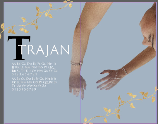
This week, I continued working on my Trajan Zine. I wasn't in class this week during the critiques, but I look forward to the next round of critiques. Something I am still working on is making the zine more cohesive. My last critique was to make more graphic elements without photos on some of the pages. I agree, and I am working on establishing a theme that includes both graphics and photography. I have also thought a lot about my AR experience. I would really want to use a video of my model and bring in the graphic elements like the gold leaves. I would also use the real-life examples of the Trajan font, like on the Trajan’s Column, movie posters, etc. I am struggling a bit to write the poem, but I think I need to stop worrying about it so much since it can be a little more silly.
0 notes
Text
Chapter 7 -- The Evolution of Typographic Technology
The chapter reading this week was about the evolution of the technology we use to create typography. I immediately knew this was going to be interesting, especially because in my German class we just discussed the creation of the printing press. It is really crazy how much changing technology like that can impact society or culture and how information is shared. The parts of this chapter that I found the most interesting was how the technology changed between manual to semi-automatic. I have learned a lot about the first examples of typographic machines, and I obviously am familiar with current digital machines, but I haven’t learned much about those transition stages before. It is cool to see how the technology has shifted to where we are today.
0 notes
Photo
This week I continued working on my font zine. I was able to complete more spreads, but I still have a bit to work on over spring break. I completed my photoshoot last weekend, and it went pretty well! I am torn between taking her out of the background of the photo because South Quad isn’t very romanesque, but I really wanted the columns so I am not sure. I got the critique during the in person review to have more pages without pictures, and I definitely agree, so that is what I am going to focus on in the next week. I am also going to further develop my ideas for the AR interactive page. I look forward to working further on this project because I think it is really fun!
0 notes
Photo
Week 7 -- Font Zine
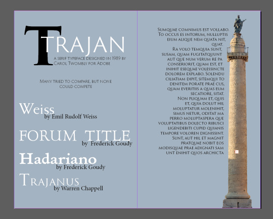
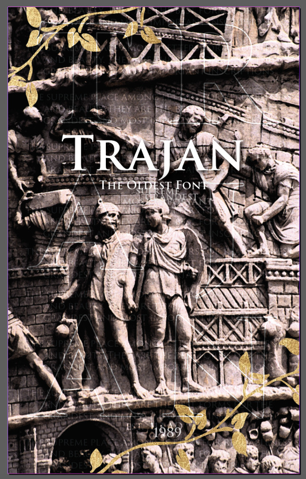
This week I started the zine for the font I chose. I decided to do the font Trajan because she is pretty tacky, but I have used her on serious projects before. I am also a big fan of small caps. When researching the font, I came across an interesting quote from Edward Johnston in his book Writing & Illuminating & Lettering from 1906. He wrote, “Roman capitals have held the supreme place among letters for readableness and beauty. They are the best forms for the grandest and most important inscriptions." I thought this quote really encapsulated the energy of a guilty pleasure typeface, and I used it to add texture to the cover of my zine. The Trajan font was designed for Adobe in 1989 based off the Trajan Column that was built to honor the Roman emperor Trajan in 113 AD. Carol Twombly (for Adobe) was not the only designer to take inspiration from Trajan’s column, there were many other fonts designed that look similar. I am considering using those in the zine, as well. I am not sure about the gold leafs on the cover, but I know I will be using gold tones as a focus in the photoshoot, so I wanted to tie it in.
Chapter 6 -- The Typographic Message
This week we read Chapter 6 of the textbook which is titled “The Typographic Message.” This chapter was about how typography can display different messages based on how it is manipulated and/or placed on the page. The chapter went over connotation and denotation of typographic design, as well as syntax and semantics. The chapter also gave a lot of examples of the way type can be adjusted to tell a story or represent an idea. While reading this chapter, I thought a lot about the shape poems we would create in elementary school. Although that is a very simplified version of the ideas of how type can portray a message, it is an easy way to see an example of what this chapter means. There were even a few examples of shape poems in the chapter.
0 notes
Text
Week 6 -- Chapter 5
This week, we read chapter five in the typography textbook, which is titled Syntax & Communication. This chapter discussed how the elements of design, like letter, word, line, column, and margin work together to create syntax through the use of typographic space, visual hierarchy, ABA form, and grid systems. I thought this chapter was interesting because I see the book transitioning into more complex ideas that allow for grater creativity. In previous chapters, the book has gone over history of typography and design or the ideas in the chapters have been pretty straightforward concepts and rules. In the examples in this chapter, rules and elements are presented, but you are able to bend and shape rules to fit the overall design. I think this is where it gets fun. Some of the concepts in the beginning about form and counter form in letters was pretty fascinating to me. I think this information can be really helpful when we are working on our next project when we are giving the typefaces character, learning how the letterforms in our font can play with other letters can help us develop the font’s personality. I think the section about hierarchy is important, and something I struggle with establishing sometimes, so I look forward to using this chapter of the textbook to further develop and help me understand those concepts.
0 notes
Text
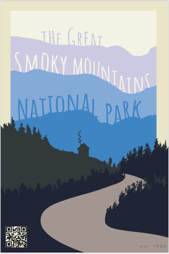
This week I finalized all of the parts for the TypeHike project. I finished the conceptual poster. I had to check on the color palette because I was using the white background, which was not part of the approved colors. I also added the QR code and worked on the AR component of the poster. Overall, I am pleased with how the poster turned out and I am glad I stuck with these ideas. I also made the edits that were suggested for my type specimen poster. I edited the alignment and stuck with the left & right justified text. I also made the postcard based off the conceptual poster, and I think it will be fun to see everybody’s finished post cards. We also talked this week about the next assignment, and I am excited to get started on that!
0 notes
Text
Week 5 - Chapter 4
This week’s chapter was all about the Typographic Grid. I found this chapter kind of interesting because it reminded me a lot of the stuff I was doing in yearbook in high school. Obviously it was not as advanced as what is in this textbook, but when everyone was first designing pages in the software, setting up grids was a tool we used. A lot of students used modular templates to create pages before they were comfortable establishing a grid themselves. However, I have never seen a grid set up with diagonal lines, so it was pretty interesting to see that. Interesting shapes and layouts can be created using diagonal lines. I had also never seen the example of “golden mean proportions,” though I recognize the common layout it created in figure 4.13. It is an interesting concept to use while design, utilizing the best page, space, and layout for the information.
0 notes
Photo
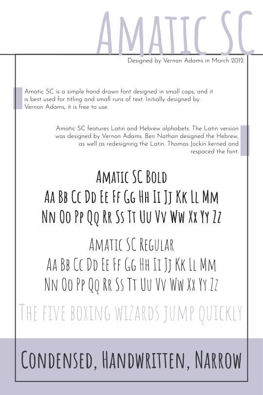
Week 5-TypeHike Specimen Poster
This week I continued working on my conceptual poster for the Great Smoky Mountains. I am still working on finalizing that design and will finish it up over the weekend. I also began my Type Specimen Poster. My font is Amatic SC, which was designed by Vernon Adams in March 2012. I found it interesting that there were multiple redesigns that have been created since 2012. I like my poster, but I got some critiques in class on Thursday, so I look forward to making those adjustments. I will extend the flags to the edge of the page. I will also look at the 4 center aligned texts at the bottom of the page. They do not match the strong right/left alignment at the top of the page.
0 notes
Text
Week 4 — Chapter 3
This week we read chapter four of the textbook, which was all about the legibility of typography. While I already knew some of this information, a lot of it was interesting and helpful to read. I think it was interesting in the beginning of the chapter how that used two pictures of a dancer and then shifted the word to read danger. Since I am a dancer, too, I thought it was kind of funny. Also in figure 3-1, the book presented a chart of an A’s top stroke increasing, making it look more and more like a “d.” I hadn't really thought of a’s and d’s like that before. A lot of the information about color pairings I already knew. That section reminded me of PowerPoints in middle school and high school, which were actually one of the reasons I got into design in the first place. Students would have ineligible text on their slides all the time, and it was annoying to try and read. Typography can definitely be experimented with, but it’s important for it to still be legible when needed. This chapter made me think of the Lassen Volcanic Park TypeHike poster we went over in class. The text in the background became background texture when it was manipulated enough to be ineligible. That is something to keep in mind as designers.
0 notes
Text

Week 4 — TypeHike
This week I continued working on the TypeHike poster. My first draft to bring to class was ok. It was mostly done in procreate. I liked the idea of it, but it definitely needed further work. The title especially looked like birthday confetti to me. I shifted my focus and moved on to fixing the title. I decided to actually take a chance with the scrapbooking look and really work on that. I bought card stock, tape, and stickers from Michaels. They even had a sticker pack all about my national park, which I thought was a fun coincidence. I was able to cut the letters out on my Cricut and place them on pieces of card stock. I used a plastic lid as the background and began placing them how I wanted. I took pictures and removed the background in photoshop. My next step is to work on tracing the image and getting it to match the color palette. However, the poster has pretty conflicting vibes right now, so I am going to work on a few different ideas before next class.
1 note
·
View note
Photo

Week 3 - Poster Sketch
This week we were assigned our next project, which is associated with the Type Hike poster and post card series. I am really excited to work on this project because it seems very interesting. When we drew parks, I was excited to get the Great Smoky Mountains National Park because I wan born in Boone, NC, so I have a bit of a personal connection to the park. I drew the font Amatic SC Regular. I wasn’t as as initially excited about the font because it is not my usual style, but I knew it would present a challenge for me. My first sketch of this project was pretty basic. I think it would have been a fine poster. However, after class on Thursday, I realized my poster needed further development. One student in my group mentioned that the font I was assigned gave “scrapbooking and patchwork vibes.” I actually really liked his statement, so I shifted my approach to the poster, focusing on more of the sentimental and hometown feel. I threw this quick sketch together and I am excited to further develop it before the next class on Tuesday.
0 notes
Text
Week 3 - Chapter 2 - The Anatomy of Typography
This week we read Chapter 2 in the textbook. This chapter explains the anatomy of typography. I had previously looked at this chapter during the first week of class to work on the classifications assignment. It was nice to reread the chapter after working through the classifications assignment because the concepts were a lot clearer. I enjoyed this chapter because it gives names for all the ideas I have been working with in typography and design. I would say I knew a fair amount about typefaces, but I was mostly self-taught, so its nice for the concepts to be explained concretely. I also liked how the typefaces were split into so many different groups. I had not realized there were so many different ways to classify a font. I didn’t know there were so many sub categories of “serif” or “sans serif.” After reading this chapter, I have been able to look at different typefaces I come across in a new way and with a better understanding of their history and classification.
0 notes