
Statistics
We looked inside some of the posts by absconder-art and here's what we found interesting.
Average Info
Notes Per Post
2M
Likes Per Post
1M
Reblog Per Post
956K
Reply Per Post
1K
Time Between Posts
2 minutes
Number of Posts By Type
Photo
13
Text
4
Last Seen Tumblr Blogs


Fun Fact
Total funding amounts to $125.3M.
Photo
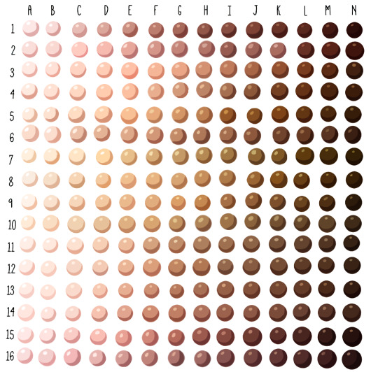
Skin tone swatches, for use as a resource.
Spudfuzz on Deviantart made the original resource, which I modified to be a bit more realistic. She gave me permission to post this.
☛These swatches, like all art resources, should be used as a “jumping off point!” All colours are relative, and change with lighting conditions. As they are now, these swatches work best for adoptables, character lineups, and other art where local colour is important. ☚
[DA]
95K notes
·
View notes
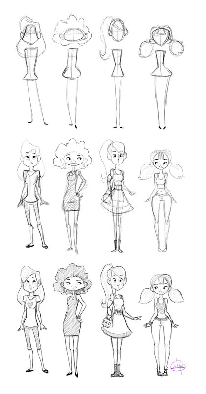
Photo
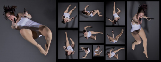
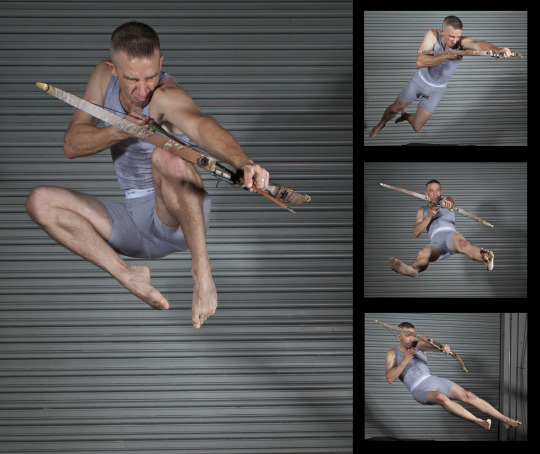
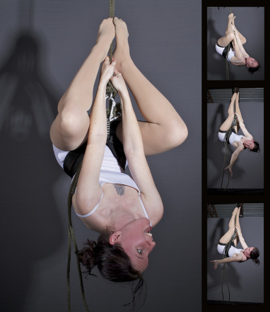
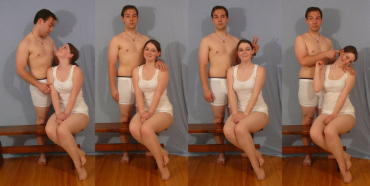
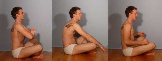
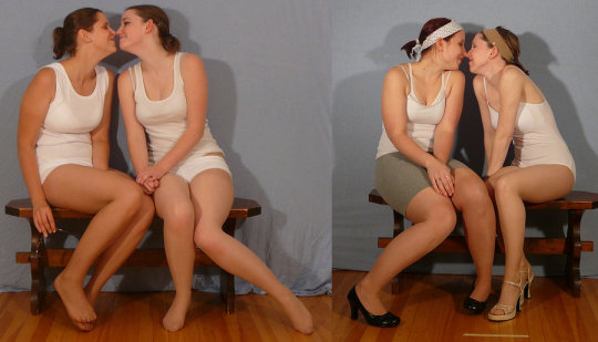
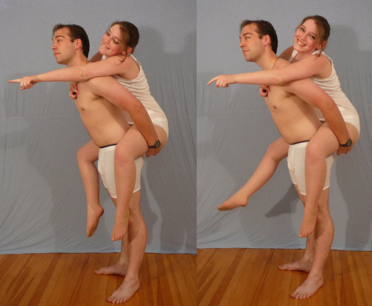
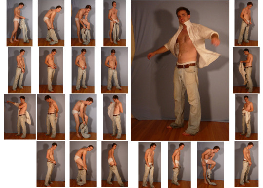
SenshiStock’s gallery consists of millions of pictures that are free to use as reference.
General Drawing Poses Sit and Kneel Dramatic and Reaching Drawing Poses Magic and Hogwarts Drawing Poses Staff Weapon Pose Reference Hammer, Axe and Bat Pose Reference Sword Weapon Drawing Reference Small Bladed Weapon Pose Reference Gun Weapon Pose Reference Bow and Arrow Archery Stock Foreshortening and Perspective Poses Dynamic Flying Falling Action Poses Deafeated or Laying Drawing Poses Magic Crystal Magical Girl Wand Weapon Transformations and Dance Cards Back Pose Reference Pin Up Inspired Poses for Drawing Performances Poses Life in General Poses Fights and Fighting Pose Reference Leaning Poses Classic Sailor Senshi Poses Wings Sailor Moon Villains Pairs Romance or Couples Pose Reference All the Male Stock Hanging Stock Drawing Reference Three or More Groups Instruments Mirrors Whip Technobabble
439K notes
·
View notes
Text
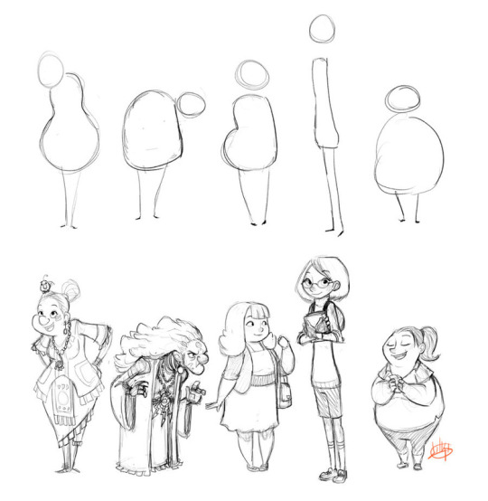
fat bodies tutorial!
ALRIGHT SO my pal @kalreyno wanted help with drawing fat characters and as a fat artist i felt like i could give a bit of helpful insight on that. there’s also been a lot of complaining about “boo hoo fat characters are hard to draw so i can’t include them in my work Ever” goin on lately so if that’s your case then this is for you too!! and also just for anyone who would like help with fat bodies in general, ofc. anyway, let’s get this show on the road!!

let’s start with some common misconceptions. these are the two main attempts at chubby bodies i run into, so i’ll focus on them.
the Anime Chubby i see everywhere, and it’s just……so wrong in many ways. first of all, there is almost no additional body fat compared to your average thin character - except for where it’s added in “attractive” places (breasts, hips, thighs). the breasts are way too perky, and don’t have the realistic shape fat would give them (though how to draw accurate breasts is another tutorial all on its own lmao). there is still a thigh gap, which usually only happens in very thin people, and bones are still visible on the surface of the skin, which also rarely happens in fat people.
the Michelin Man is better in some ways, but still not that great. it’s a slightly better attempt, but basically all that’s done there is taking a thin character and blowing them up, while giving no thought to fat distribution. the thigh gap is usually still present, and they look a lot more hard than soft - and fat is very soft and pliable.

here’s a chart on how fat usually distributes (if you can’t read my messy writing, “1. next to no fat, 2. moderate amount, 3. most of the fat distribution”). basically, the more muscle an area has, the more prone it is to develop fat, such as the abdomen, thighs, and upper arms. it’s important to note that fat sits on top of muscle, and that it does distribute in different levels, and not evenly across the body as shown in the Michelin Man.
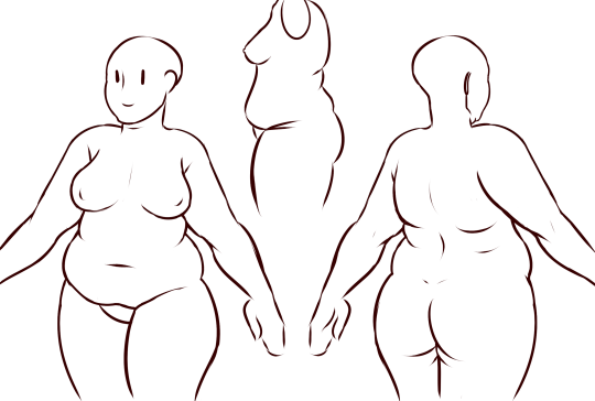
now, here’s an accurate fat body with all of that kept in mind!! notice how the fat isn’t only kept to aesthetically pleasing areas, and how it sits realistically on the character’s body. their breasts sag a lot more, which happens even in thin people with larger breasts, and the nipples are pointing more downwards than straight out. there is no thigh gap in sight, there are no bones in sight, and most importantly, they have fat rolls, which are very important in drawing a convincing fat character!! as far as i know i’ve never met a single person with no rolls at all, and everyone has them, whether thin or fat - they’re just more prominent and more consistently present in fat people. pay close attention to where they are and how they’re shaped.

here are a couple of drawings showing how fat is affected when sitting vs stretching. as seen in the first, the fat specifically on the stomach is distributed a lot more evenly and stretched out, so it becomes “flatter”. the love handles are still pretty visible, though, as well as the fat on the thighs and arms. the breasts are raised with the shoulders, and the fat on the shoulders and near the neck forms rolls as it’s being pushed together.
in the second, there is a lot less room for distribution, so the fat is all pushed together. the breasts sag and the stomach forms rolls and spills into the lap. a good analogy for the way fat works is to liken it to a water balloon, and thinking of how its shape would change when resting flat on a surface, hanging off of a ledge, held upright, etc.
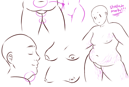
here are a few extra tips i find a lot of people miss!
first on the top is the hip/pubic region. the first circle is showing the way the bellybutton is folded in fat people, as opposed to stretched out in thinner people. the second is the stomach fat spilling over onto the pubic region and creating a separation in the two areas, which is something that’s missing in a lot of art. in addition, the pubic mound also gains fat, making it round as seen in the profile drawing i did up there (i’ve heard people refer to it as fupa?). the last in the hip region is the lack of a thigh gap. i can’t stress this enough!!!! if you’re trying to draw a convincing fat character, make sure their thighs are pretty much always touching!! for reference, mine literally don’t separate until my feet are about 2ft from each other.
the bottom right is showing the double chin, which a lot of people are afraid to draw!! fat does distribute itself here too, and there’s nothing wrong with it, so don’t feel like you shouldn’t give fat characters a double chin in your work for fear of it looking like a caricature.
in the bottom middle, it’s showing how fat affects different types of breasts with the presence of more or less breast tissue.
lastly, at the very right are stretch marks with their usual locations and directions, which i also can’t stress enough!!!!! i sometimes forget to add them honestly, but they’re so important in accurately portraying fat characters, as they literally come from the skin being stretched from fat being gained (and they’re also just rlly neat lookin like why wouldn’t you lmao). some people have less and some people have more, feel free to experiment with them!
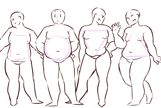
the last thing is body types!! there isn’t one single way for a person to be fat, so feel free to experiment with shapes once you’ve learned the basics!!
so there you have it, a tutorial on how to draw chubs!! now go forth and make some accurate fanart or some rad fat characters, because the world could always use more of both. hmu if you have any questions or concerns, and thanks for reading!!
EDIT: someone pointed out the bad wording in the tutorial. thank you for bringing it to my attention and sorry for offending anybody. i’ve updated the tut, so please reblog this one!
144K notes
·
View notes
Photo

Okay, this is a really long post so I put everything under the cut. Just a heads up, none of these recipes include borax, but I still wouldn’t ingest the slime. Disclaimer: None of these recipes are mine! they are all recipes I've found online, compiled into a list to save you time.
Keep reading
3K notes
·
View notes
Text
Reminder to Artists!
Add your tumblr page, product listing, or website as the content source for each work you upload. Doing so guarantees that you’ll be visibly credited even if some asshat removes your comments or you don’t feel like adding a comment.
3K notes
·
View notes
Photo
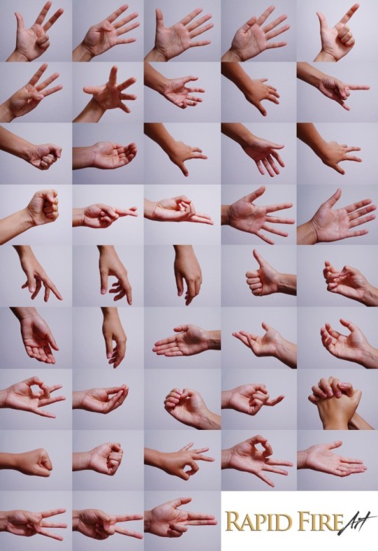
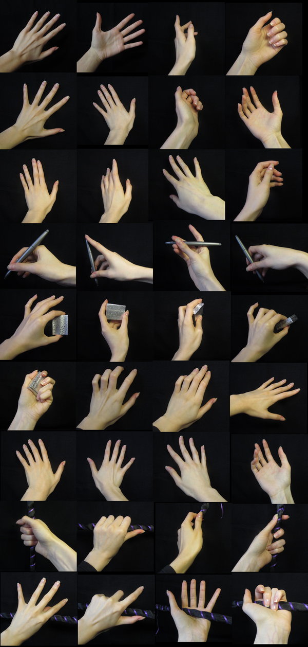
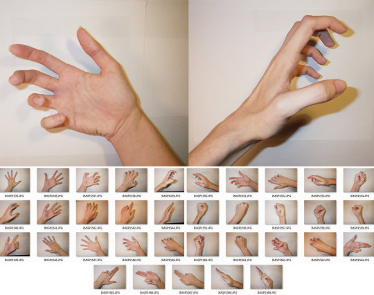
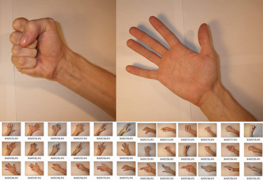
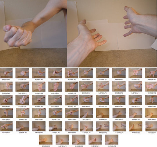
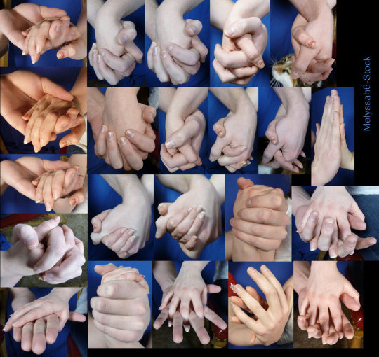
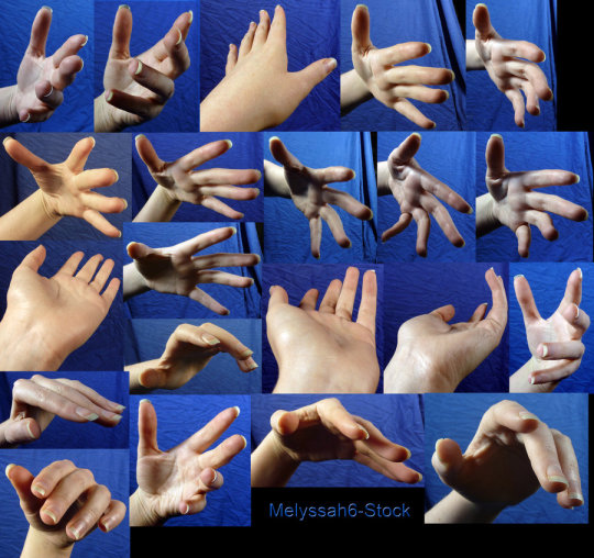
Hands Row 1 & 2 Row 3 Row 4 Row 5 & 6 Row 7
193K notes
·
View notes
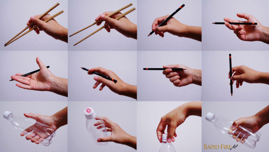
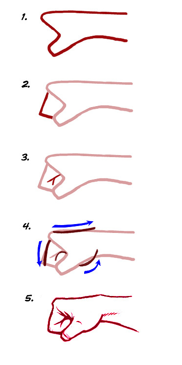
Photo


someone requested a tutorial once so Here It Is,
enjoy i hope it was at least a lil helpful
1K notes
·
View notes
Text
Tutorial: plastic keychains
I know a ton of you have been waiting for this one. Teaching you to make your own plastic keychains!
To start off, I think the biggest question everyone has is what I use to make them. I work with shrink film. You might be familiar with Shinky Dink brand shrink film as a kid. I use Grafix brand white inkjet shrink film. The inkjet kind is relatively pricey compared to the regular kind. If you’re using regular, I don’t recommend you stick it in your printer. Sharpie markers would be good for that.

Alright, now open up the file with the images that you’re working with. Make sure your images are a lot bigger than you want your finished product to be since they shrink significantly.

You’ll also want to lighten the opacity to about half. I go somewhere between 50-60%.

Now print your image out! I’ve found that it works best for me when I have it at the plain paper setting, and standard print quality.

Holepunch with a ¼" holepuncher BEFORE you shrink them. It’s so much more work to have to punch holes when your plastic is thick!

Cut out your design, leaving the amount of border you want.


Set them on a tray for convenience. An aluminum foil sheet works too, but I recommend cookie trays because they are easier and quicker to get out of the oven.

Preset heat. Your shrink film package will tell you what temperature to set it at, but I find that it isn’t always accurate for me. I generally set temperature to 350 degrees or so.

Put them in the oven. Remember to keep track of time! I leave them in for about a minute and a half.

After time is up they should be super small! Magic!

If your charms are not flat, put something heavy on it right out of the oven when they are still hot and malleable.


If you’d like to, you can seal them now. In my last two batches, I used clear topcoat nail polish. The problem with that is that I need between 3-5 coats of it, and it takes a while to dry. I’ve been experimenting with modpodge.

For lariats, you can use jump rings or lobster clasps.

Here is one that I made that wasn’t sealed. The finished texture after shrinking is a little bit rough. There’s nothing wrong with leaving them unsealed, but because they are inkjet printed, the colors wash right of without protection.

This is one that was sealed with modpodge. The colors become a little more vibrant and smooth and water resistant. Things often get stuck on when applying or drying so be careful.

These ones down here were sealed with clear nail polish. They come out shiny if you put enough coats, but the grainy texture will still be there.

Well, there ya go! Have fun making your own keychains!
195K notes
·
View notes


Text
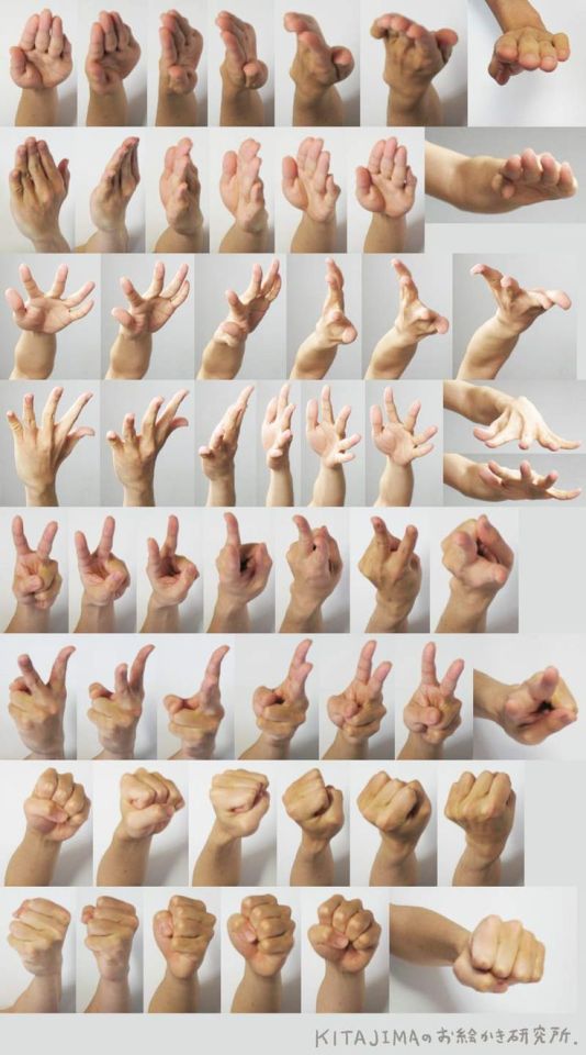
when you don’t do a warm up and go straight into lineart and your hand does the thing

158K notes
·
View notes
Photo
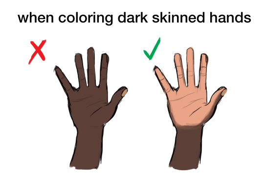
okay so I’ve seen a lot of artists,including myself, make this common mistake of coloring the palm of a hand(and the sole of a foot) as the same color as the person’s skin tone.
but in fact ,palms and soles are a different color compare to our skin
this is due to the lack of Melanin on them
hope this helps!
203K notes
·
View notes
Photo
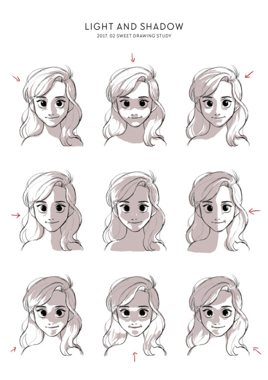
20170226
Drawing Study of February - Light and Shadow
118K notes
·
View notes
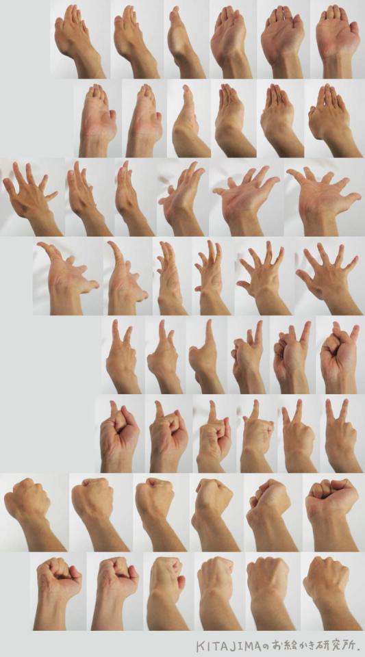
Photo
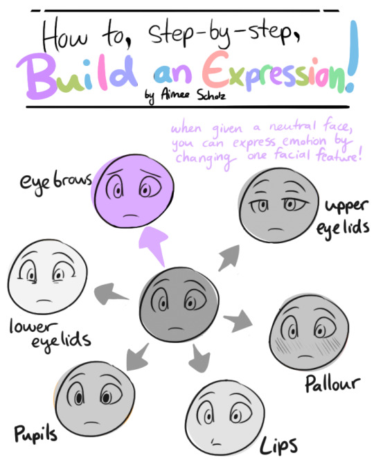
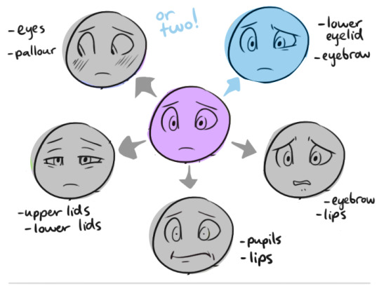
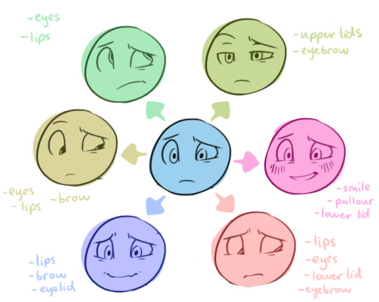
okay so my other post has gotten circled around from hell and back , but now I just want a better, cleaner version to get a chance to get around so HERE YA GO
37K notes
·
View notes


