
A place for the good, the bad, and the ugly of user experiences.
Don't wanna be here? Send us removal request.
Statistics
We looked inside some of the posts by adesignernamedcarter and here's what we found interesting.
Average Info
Notes Per Post
0
Likes Per Post
0
Reblog Per Post
0
Reply Per Post
0
Time Between Posts
3 days
Number of Posts By Type
Photo
15
Text
1
Link
1
Last Seen Tumblr Blogs


Fun Fact
Tumblr was attacked by a cross-site scripting worm deployed by the Internet troll group GNAA on Dec 3, 2012.
Photo


Good UX- While still in the process of moving, I needed to get set up for renter insurance. The Assurant site felt well thought out and easy to follow with each step. Things would automatically update while filling out the online form to show the estimated cost breakdown, with the right side staying persistent while scrolling down to further fill out information. I also appreciated the status bars at the top show my progress through the form.
https://assurantrenters.com/
0 notes
Photo

Bad UX- This was one of the most frustrating user experiences I’ve had in a while. We are in the process of moving into a new place and it lacks a fridge, so I’ve been searching for used fridges or a fridge rental service. I found this Appliance Warehouse/CSC Services site to try to get set up with a fridge rental but couldn’t find any extra detailed specs about their fridge options, and this empty window is the sum of all that. Why have a clickable link when it just shows as empty?
https://www.appliancewhse.com/
0 notes
Photo


BAD UX- This is one of my favorite examples of bad UX to find. My brother shared this website with me when I was talking about my UX design class and he immediately mentioned this site. It feels like a total mess of a site, and he was showing me a certain user journey that I later tried recreating on my own but failed to find the same link he did.
https://specialtyproduce.com/
0 notes
Photo


Good UX- This website feels straightforward but also very in depth with it’s options when searching for an RV rental. Something like this could easily be a mess design-wise but it feels like they managed it well.
https://rvshare.com/
0 notes
Photo


Good UX- The ecosia.org uses it’s earth and environmental focus to dictate it’s style and it helps users feel even more involved with the site’s mission to plant trees by showing the number of trees they potentially have helped plant through their searches.
https://www.ecosia.org/
0 notes
Photo

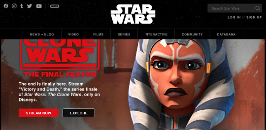
Bad UX- It honestly is a bummer to look at the starwars.com site and see a poor layout. The main thing I noticed is that the different scrolling content will always be cut off partially because of the big header/top part of the page that stays persistent.
https://www.starwars.com/
0 notes
Photo

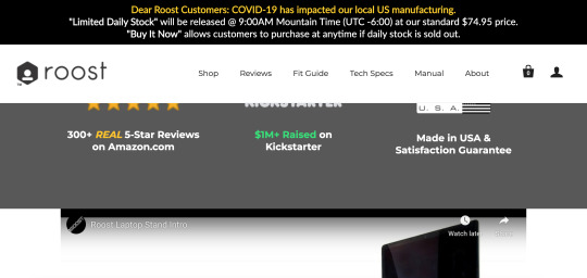
Bad UX- I was checking out this website for a laptop stand to help with my ergonomics and while I do really want to purchase their stand, their website stuck out to me as something that could be improved upon. They currently have a persistent header/banner over the normal header that already stays at the top while scrolling down, but now it takes up over a third of the screen/viewport no matter what. That makes it difficult to see full images and graphics because they’re constantly cut off.
https://www.therooststand.com/
0 notes
Text

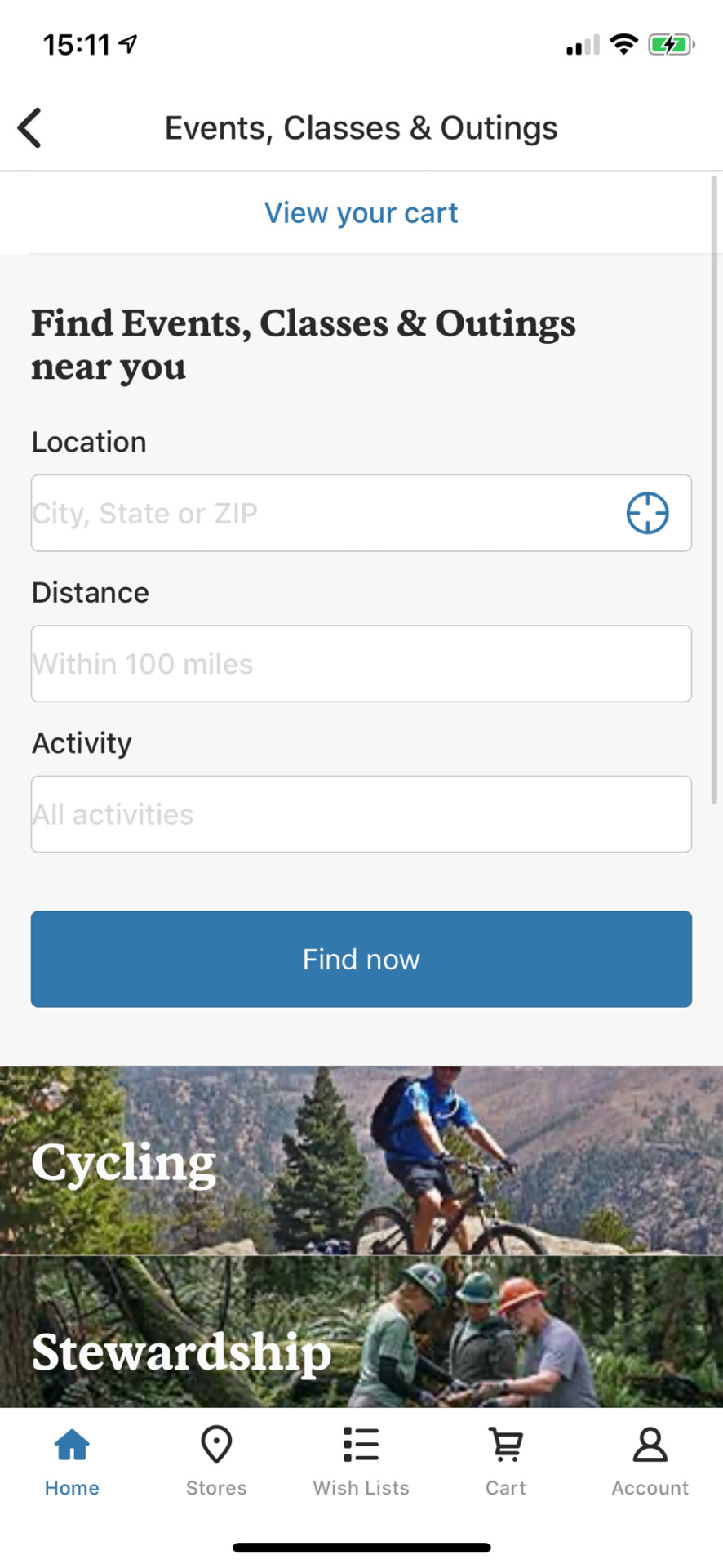
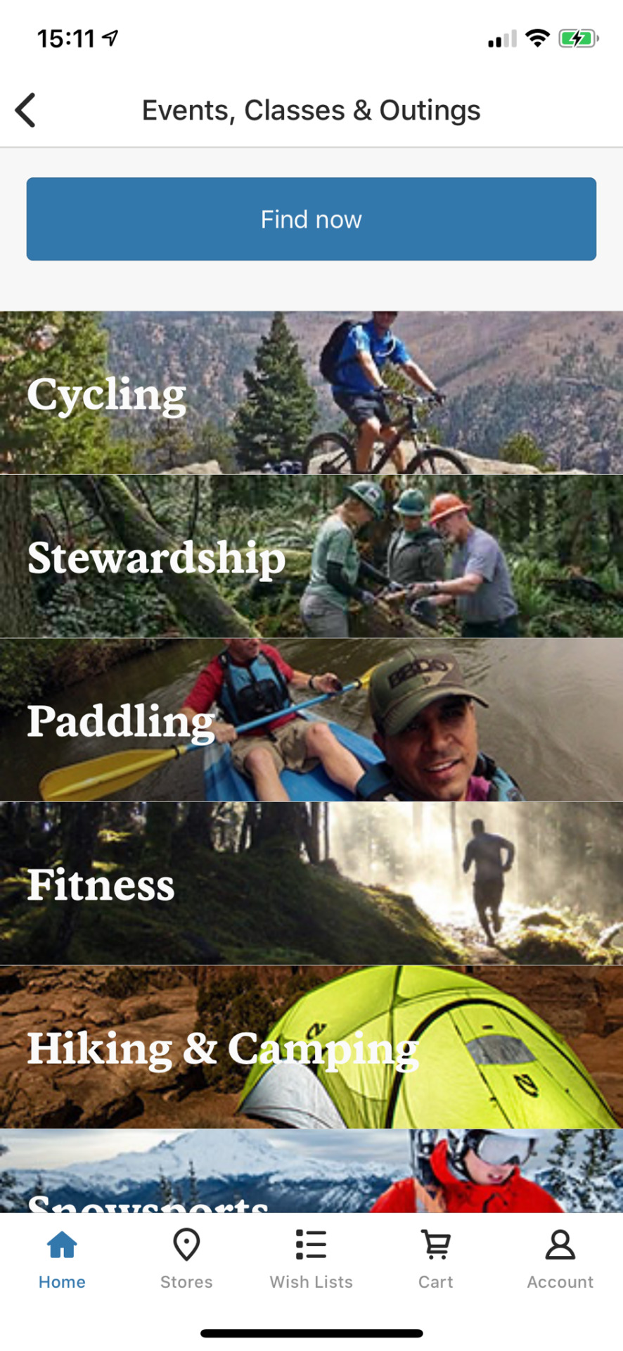
Good UX- the REI app does a pretty job with helping navigate its different store items as well as their offerings for classes. I really liked exploring their different options and their choice to use photos for the different activities instead of just using text.
0 notes
Photo


Bad UX- The LinkedIn app demands so many things before you even get to your home page if you haven’t opened it in a while. It will push for you to send messages to any emails that have come through your account to get more people to join and I had to press “skip” at least 4 times before finally getting to the main page.
0 notes
Photo


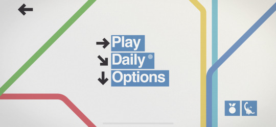
Good UX- This little game called Mini Metro stays minimalist and is able to effectively explain how to play the game through little to no instructions. Also keeps a clean aesthetic throughout the menu and the game itself.
0 notes
Photo

Good UX- for this architectural photographer Mike Kelley’s website, he kept things very minimal and clean. With one half of his homepage used for photographs to display and click through in the bottom right, his site becomes very clear with what he does.
https://www.mpkelley.com/
0 notes
Photo

Bad UX- This blog post listing all of their different company affiliates feels like it wasn’t very well thought out past just listing them in alphabetical order. It felt like I was just endlessly scrolling with no clear organization and eventually just lost interest in what this post was about.
https://packhacker.com/blog/general/small-travel-gear-brands-we-can-support/
0 notes
Photo
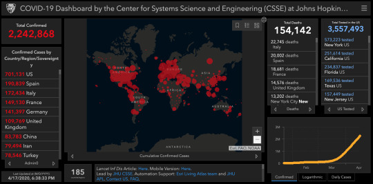
Bad UX- Given the circumstances, this should maybe get a pass out of the probably sense of urgency the developers had when making this. That being said, it still isn’t the best experience when trying to use. It’s hard to navigate the map and depending on what specific stats you’re looking for, it can be really confusing to know what is clickable or not.
https://www.covidtracker.com/
0 notes
Photo


Good UX- The Eagle Creek website lets you get a sense of scale of their travel bags with this nifty tool that let’s you pick a number of different items and see it’s size compared to the product itself. It also lets you rotate the items and change to other things.
https://www.eaglecreek.com/shop/travel-packs/global-companion-40l-ec0a3k64?variationId=168
0 notes
Photo


Good UX- This little ice machine makes getting ice an easy experience and stays overall simple. Even when it needs maintenance, it gives good feedback by indicating with and orange colored light that it needs to be cleaned.
0 notes
Photo


https://www.businessinsider.com/things-mentally-strong-people-dont-do-2015-7
THE UGLY/BAD- I came back across this old article I bookmarked a few years ago from Business Insider. Before I could even load the page, it prompted me and made to turn off my ad-blocker software to view the online article. Usually, I abide and the impact of ads is fairly minimal for the trade off. Not on this site. The page was riddled with so many ads for different things that it made the entire page hard to navigate and even just stay focused on the article itself. It was a very bad experience that feels outdated and needs to be adjusted, especially for a high profile website like Business Insider.
0 notes