Text
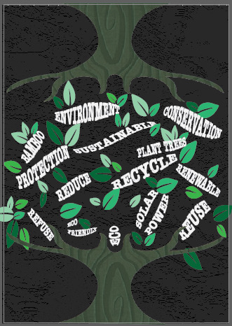
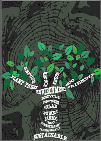
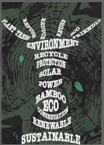
Creating a variation of poster 2 for my design to ensure it effectively communicates my message.
0 notes
Text
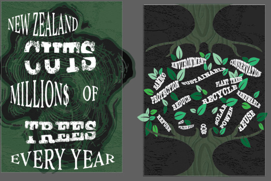
By transforming the message from a negative statement to a positive, action-oriented one. While the original poster highlights the problem of deforestation in New Zealand with the stark message "NEW ZEALAND CUTS MILLIONS OF TREES EVERY YEAR," the improved poster encourages solutions by featuring a tree graphic with eco-friendly terms like "PROTECTION," "SUSTAINABLE," "RECYCLE," and "RENEWABLE" as leaves. This visual shift from a distressed, problem-focused design to a vibrant, solution-focused one not only makes the new poster more visually appealing but also more motivational. It emphasizes environmental conservation and provides clear actions for the audience, such as recycling and reducing waste, thus encouraging proactive engagement in protecting the environment.
0 notes
Text

The changes made from the original posters from before to the updated versions primarily focus on enhancing readability and clarity. In the left poster, the distressed font for key words like "CUTS," "MILLIONS," and "TREES" was toned down, making them more legible, and the text placement was improved for better alignment and structure. The background retained the tree ring pattern, but the repetitive "HELP US!" around the edges was removed to simplify the design. For the right poster, the tree design was made more balanced and symmetrical, with environmental words arranged more consistently and legibly within the branches. Additional concepts like "PLANT TREES," "BAMBOO," "ECO FRIENDLY," and "REFUSE" were incorporated, and the overall layout was cleaned up to present a clearer and more cohesive environmental message.
0 notes
Text

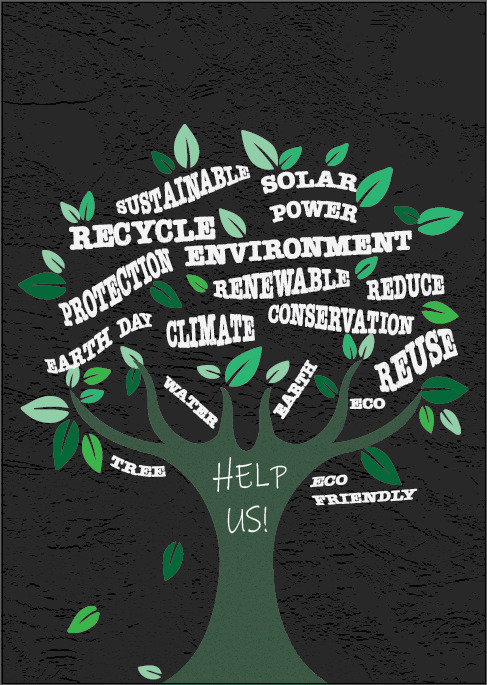
For Poster One, I have been experimenting with different shades of green and various fonts to enhance the overall design. I am also considering the balance of colors and typography to ensure the poster is visually appealing and communicates the intended message effectively. For Poster Two, I am currently focusing on refining the details to achieve a polished final look. This involves fine-tuning elements such as spacing, alignment, and graphic quality to ensure a cohesive and professional presentation.
0 notes
Text

I have utilized the feedback by making the information more specific to New Zealand, refining the second poster to focus less broadly. The first poster now highlights the problem, while the second one presents the solution. Additionally, I have adjusted the colors to enhance contrast, making the posters more visually appealing and effective in communicating their messages. These changes aim to better engage the audience and convey the intended information clearly.
0 notes
Text

Testing out Adobe After Effects on a poster offers an exciting opportunity to elevate static designs with dynamic elements. By integrating motion graphics, animations, and visual effects, a simple poster can be transformed into an engaging and interactive piece of digital art. This process not only enhances the visual appeal but also captures the audience's attention more effectively. Experimenting with various tools and features in After Effects allows designers to push creative boundaries and explore new ways of storytelling through visual media.
0 notes
Text
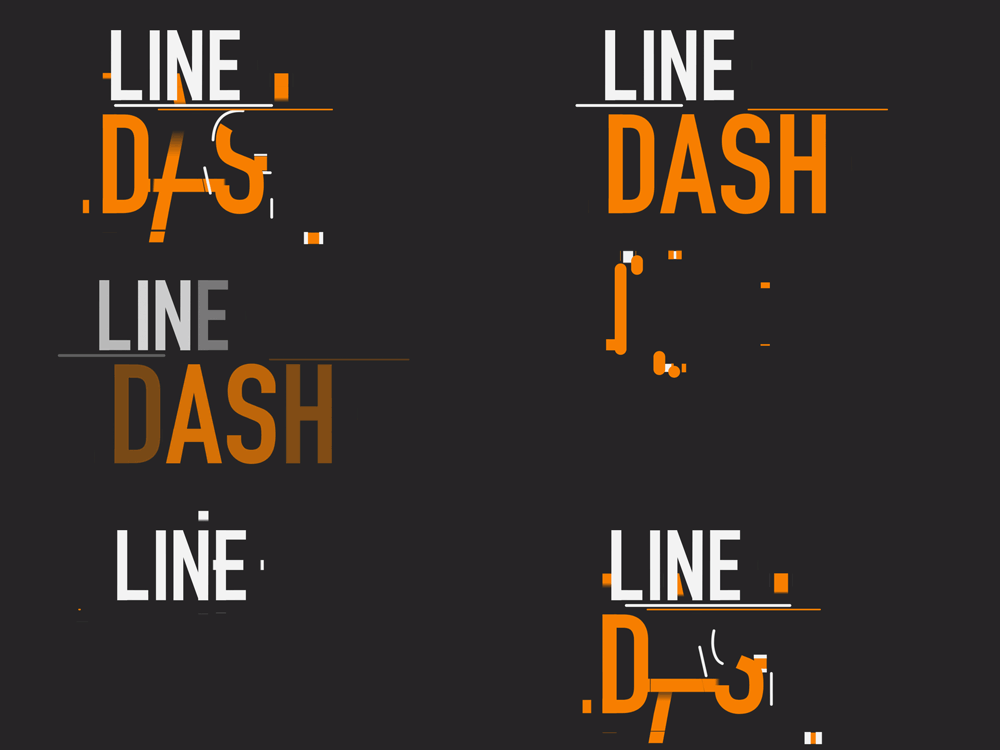
Dash typography embodies a sleek and contemporary style, presenting messages with grace and sophistication while captivating the viewer's attention effectively.
0 notes
Text

The dynamic movement of text, whether it's flowing from right to left or cascading from top to bottom, can be incredibly captivating, especially when combined with well-chosen words. In the example provided, this animated technique was employed to highlight the significance of the text and evoke a sense of surprise in the viewer. This type of animation adds a unique dimension to the presentation of words, making the message more impactful and engaging to the audience.
0 notes
Text

I find these concepts truly fascinating and innovative. They seem like they would be really exciting to experiment with. However, I'm struggling to envision how I could seamlessly integrate them into my current poster designs at the moment. While I'm keen to explore these ideas further and see their potential, I may need to rethink the structure or approach of my posters to fully incorporate these new concepts effectively. It's definitely a challenge I'm eager to tackle because I believe these concepts could elevate my work to a whole new level of creativity and engagement.
0 notes
Text

To unify both posters effectively, we can use the map as a central element connecting them. By incorporating a consistent geographic theme across both designs. This approach not only strengthens the overall visual appeal but also ensures that the connection between the posters is clear and impactful, creating a cohesive narrative that resonates with the audience.
0 notes
Text

I am exploring new ideas, variations, and placements of designs based on the feedback received.
0 notes
Text
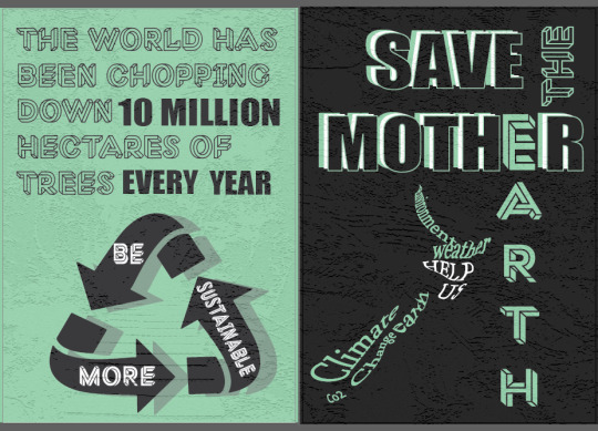
I have incorporated some of the feedback received and made several adjustments. Specifically, I've applied a visually striking paper note effect to the background featuring New Zealand's captivating natural landscapes. This creative enhancement adds depth and interest, enhancing the overall presentation with a unique and memorable aesthetic.
0 notes
Text
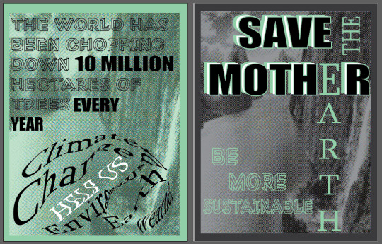
Slight changes
Using color to represent the environment can be a creative and visually engaging way to convey different aspects of nature or landscapes.
The use of colour not only to illustrate the physical features of the environment but also to evoke a mood and atmosphere, enhancing the reader's experience of the posters.
0 notes
Text
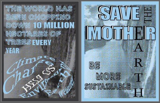
poster 3 after feedback
Using halftone effects, layering, and overlapping elements enhances your design with depth and visual interest. Halftone patterns add a vintage or artistic feel, while layering different elements creates complexity and richness. Overlapping elements adds depth and dimension, creating visually engaging compositions. Experiment with these techniques to create unique and compelling visuals that reinforce your message effectively.
Using warped text shaped like a planet can visually highlight Earth-related themes and environmental consciousness. It represents interconnectedness and sustainability, making the message of climate change stand out creatively.
Experiment with lettering in a planet-shaped design to enhances the message visually. Use creative typography to highlight key sustainability words. Adjust letter size, style, and arrangement for flow. Integrate imagery and play with color within the lettering to reinforce the nature theme. This creates a visually striking representation of interconnectedness and global awareness.
0 notes


