RMIT Communication Design Student
See My Creations
56 posts
Don't wanna be here? Send us removal request.
Last Seen Blogs
katelynnwrites
ups?

fedestiltskin
Fedestiltskin
au-uprising
Dreams, dreams
nvrsaidiwasinurcloset
Maybe You’re The Killer, ‘Cause That Cut Deep
pineapples-cant-write
Pineapples Can’t Write And Neither Can I
Text
Thank You

Designed by @adriansfolio
Wow, this semester done and Communication Design is in the books. It’s crazy how 6 months has gone so fast and I wish I did this class face to face and meeting all the students in my class. But I would like to thank Karen, Andy and Bailey for this semester, showing me all these new aspects of design. Exploring to different movements, typefaces, designers that I did not understand previously. Thank you, Andy and Karen for going out of your way and providing content for not only myself but for everyone. Andy always made the lectures funny and exciting for me and Karen I deeply appreciate insightful knowledge. I would like to say thank you to my teacher, Bailey. I knew we did not get to know each other properly, but you truly helped me a lot in this subject, getting feedback from you for my designs really helped. The fact you started class early in the morning and always willing to help and ask if we have questions shows how great a teacher you are.
For myself I learnt a lot and from now on I want to get myself out there, be proud of what I design and surrounded myself with design students friend who together embrace our creativity. Looking back yeah sometimes I was stress, felt tired, sick of working, irritated and alone but that did not make me give up. This is my dream and I will keep practicing, I will showcase my work to everyone and not be afraid to be who I am. I am still learning to appreciate myself and I will follow my passion of design through the ups and downs.
Thank You Karen, Andy and Bailey
It’s been a pleasure
✌️
24 notes
·
View notes
Text
Let’s Design: Quick Activity in Class


Here’s what I did in the quick activity Bailey made us do in class looking back now I had no idea what my brainstorm will produce. It shows we I can do in a short amount of time. Alot of people did this in their own way and it’s cool what I came up.
1 note
·
View note
Text
Let’s Design: Happy Pride Month

I knew it was Pride Month thanks to @iwishididnthavetosleep, and I wanted to design this gif that showcase the artist I listen to who support this community.
The rainbow flag designed by Gilbert Baker, which I learnt about in the recent lectures. Was another reason I designed this.
I did not realise so many artists I listen to are openly gay and it’s cool how they represent the community.
I would like to end on this quote from Frank Ocean “We All Try” which expresses how I feel about LGBTQIA community
“I believe that marriage isn’t between a man and woman but between love and love” - Frank Ocean
Link to Images:
https://bit.ly/2BLgMj5
https://bit.ly/3f2lcQV
https://bit.ly/2UoykIh
https://bit.ly/2Ydly0b
https://bit.ly/2YgFY8u
https://bit.ly/2Um4Evi
Happy Pride Month
3 notes
·
View notes
Text
OMG its another Adrian, but I like how you made the focus on your zine on type as his famous for his typography. I like to colour contrast of Black and white and just sticking with those two colours. Love it good job :)
ZINE OUTCOME!
issuu
Seeing all the interesting works done by others, I thought I would also share what I did for my zine.
“I was fortunate. Early in life, I understood that my world was a two-dimensional one. At sixteen I knew that my work would be in black and white.”
I made my zine in relation to Adrian Frutiger’s aesthetic, I didn’t put any pictures for the zine (only a picture of Mr. Frutiger himself ) to keep the focus on the typefaces. I played with page space, font size, and typography while designing this, with each page using the typeface that is being interviewed for the texts. (The Univers page would be using the Univers typeface for all texts... etc.)
Some likes and dislikes: I really like my cover page, which is inspired by the negative space typography technique. The font used for the cover page is Frutiger, I felt like it was the best option to represent him. It became challenging in the end to come up with new layout choices with the same black and white aesthetics, but I think I pulled through! Each section of the interview gives a different vibe, they aren’t repitive when it comes to arrangement but still had harmony throughout. I still wish I had more creative ways to deliver this, however.
Feedback is welcomed and please share your zines too!
15 notes
·
View notes
Text
Love how you also did someone from Bauhaus just like me.
Bauhaus Gang 😃
ASSIGNMENT (FINAL SUBMISSION)
My ‘Ask Me Anything!’ assignment was to interview the Wassily Chair, an iconic Bauhaus design by Marcel Breuer. The format I decided on for my interview was a double-sided poster, having the idea of creating an actual piece of ‘design’ out of an interview. This idea had some flaws as I found it difficult to balance out how much text I had, something my tutor Karen helped me with, suggesting to design a double-sided poster instead of one. For my overall design, I was mainly aiming to create something that I would personally hang on my wall, which made the process more fun.
I had a lot of fun designing the front side of my poster, which focuses more on the visual aspect. I kind of ended up with this ‘mess’ and really enjoyed the look. I wanted to have a lot of space leftover, representing the Wassily’s design that really prioritises the space around the physical design. I chose to use the colours blue, red and yellow to subtly include a Bauhaus feature, and to also avoid using only black and white, something I often do. I enjoy designs that have many small, elements and details, something I feel I have implemented within my poster. I was very lucky to find the image of the red Wassily with its shadow as I feel that is what inspired me with this design.

My interview side of my poster has had its fair share of makeovers and I have had my fair share of outbursts. I have never been the biggest fan of shaping text and this assignment has really challenged to learn to like it as well as to learn how to make it effective. My interview’s appearance began as a standard looking layout that is usually present in magazines, and I have always enjoyed that style. I think I find it pretty satisfying when a text that is presented with a good font is just plastered onto a page. My feedback was constantly just suggesting to make it more fun and this is what became my end result. I think I had this idea for a while now but never really executed it because I was scared of all the tedious adjustments I had to do. I think I’m also scared that whenever I look at it for more than five seconds, I’ll notice one word or letter that is just not aligned with everything else. But overall, I think I’m pretty proud and that my other ideas, like the mimicking of the blueprint design using lines, really enhanced it. I also added coloured blocks behind some words, the colours inspired by the styles of Wassily chairs you can choose from. I think my favourite part about this side are the lines joining around the big ‘W’ in the corner.

Reference List:

8 notes
·
View notes
Text
Thank you @ivanka-djo making changes and receiving feedback helped and I am glad you relate to how I talk about comparing myself to others. 💕
Breaking down my Ask me anything. Final Design. Anni Albers.

Link to the design:
https://issuu.com/aliuzzi05/docs/liuzzi_adrian_anni_albers_zine
Here is my final design, and I am proud of how it turns out. The changes I made was changing the back cover and adding yarn balls.
Honestly, this assignment was rollercoaster of emotions, I continuously brought myself down and compare myself to others for creating amazing zines. Like @chl0wang and @katiezhou, staying up all night designing and working hard. Redesigning the whole zine and I realised I just have to believe in myself and tell myself this is good!! I am happy how turn out but it’s difficult for me at first and as designers we all work hard, we all feel stressed and exhausted but it will be all worth it. I felt like doing an old-aesthetic perfectly represented my subject.
I quote this from Walter Gropius is a quote which Anni Albers stood up and prove Walter wrong.
“It is not advisable in our experience that women work in the heavy craft areas.”
Anni Albers was the perfect subject for this assignment and I am glad I covered a Bauhaus Individual who made an impact in weaving, although she hated it at first she created her own legacy and prove that she can be an artist just like the men.
Overall, I am happy with how it turned out and I hope I can print this out and show to people what I designed. Hard work pays off.
8 notes
·
View notes
Photo
Fact you took David Hockney pool piece, manipulate and change it to become your design for the zine is very creative and cool. Zooming in and using that to put your informations is very interesting. Good Job Liberty for doing an artist I have no clue of and is interested in their work.


FINISHED ZINE (Ask Me Anything!)
I was going to wait to upload these until I got all my posts up in chronological order, but I figure I may as well get this up and start fresh afterwards. I know, what a mess. Can you feel my struggle through the screen? Thank you next Miss ‘Rona, I will not miss you next semester.
Now to discuss the actual Zine…
In choosing a significant and influential figure in design, I chose none other than THE David Hockney. His contributions to art and design have always been a huge source of inspiration from me, especially his never ending curiosity into the next best thing (eg. the obsession with digital art and the use of technology in advancing art). However, I didn’t want to just interview Hockney as himself because he is still a living artist, and he can therefore speak for himself. I chose to look through some of his older work, as I was also interested in art pop. I remembered his “Portrait of an Artist (Pool with Two Figures)” from 1972 and looked into the ideas behind the portrait. Turns out, the painting is packed full with insight to a time nearing the end of Pop Art, and a commentary on the difference between his upbringing in England and the decadence of California’s lifestyle. I thought this was really poignant, and despite its fun and playful personality, left a lot unsaid within the painting itself.
I then decided I would interview the figure from the painting to add another layer to the understanding of the piece. I wanted to give the figure some of their humanity back, and explore the way Pop Art was experienced for a young person at the time. I aimed to centre the figure on a life that honours Hockney’s (such as his sexuality, his affinity for America and the mediums he used to express these things), and discuss the attraction of the figure to Pop Art through their experiences in California. The metaphor of the swimming pool being a world of luxury and experience that the figure had yet to ever ‘dive’ into was the idea behind the whole project, which I think is communicated in the interview.
Aside from taking a million days to research what the actual hell a zine *is*, I can honestly say that this might be one! I guess we’ll find out when the grades come in. This assignment was sooo fun that I think I made like three copies just to muck around before settling on this one. I’m actually really proud of this work (hell, I’m proud I even have something to hand in), I think for someone who was so confused and doubtful about this assignment its a wild success. Maybe I should refrain from using the word “success” until someone else tells me it’s successful. Oh well.
18 notes
·
View notes
Link
Wow, the progress you made is so good. I am happy how this turn out for you; the design is much clearer and it’s easy to read. Also love the yellow dog Good Job Karisma 👍
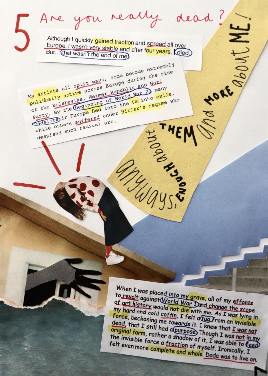
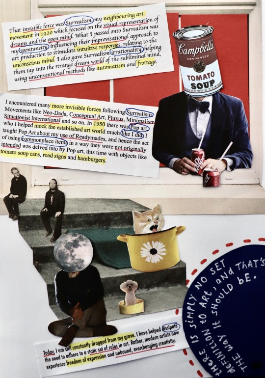
ASK ME ANYTHING REFLECTION & FINALE
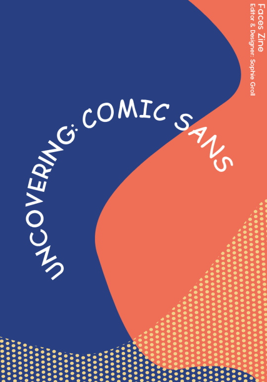
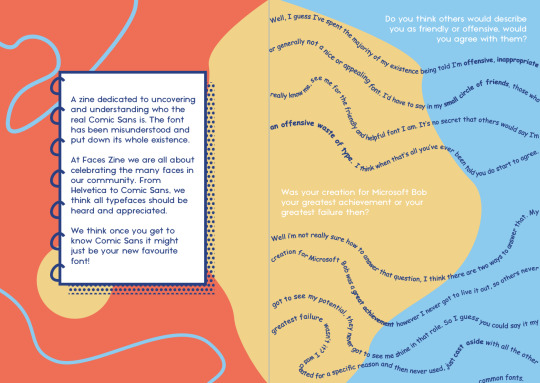
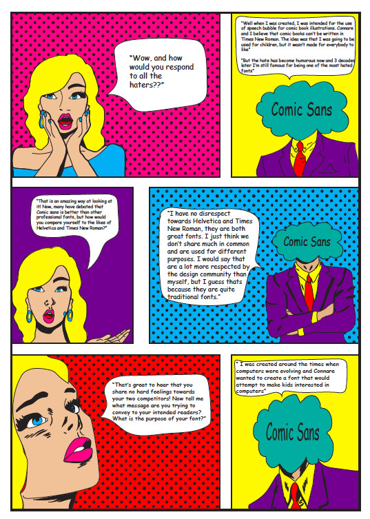
I HAVE STRUGGLED….like really struggled with this task. Working with an aesthetic so unfamiliar to me was something that I didn’t really put into consideration when choosing the infamous Comic Sans as my subject for this assessment. I have no doubt that everyone has been in some sort of design rut trying to replicate their subject’s aesthetic in their zine, but if only I could call Vincent Connare and Comic Sans and ask what do I make my zine look like?
What I’ve learnt throughout this iteration process is that there really is no exact formula and impression. Like beauty, the aesthetic is in the eye in the beholder and this is the way I chose to interpret my subject.
Working right to the crunch time, a few days out from submission has enabled me to make critical design decisions and work to a strict timeline, instead of fiddling around and trying new things.
I wouldn’t look at my zine and say WOW that is really nice, but I think that’s the point. It’s not supposed to be pretty or elegant, but I hope you can see and appreciate the design thinking applied in my iterations.
I have explored with vibrant colours, allocating a certain hue to each of my five questions and paired these with collage knick knacks and scrapbook features to enhance my ugly-childish aesthetic.
I also adopted a sarcastic and witty tone in my Comic Sans responses, in the hope of emphasising the subject as an actual person rather than just a typeface.
Despite the challenges I’ve faced with this assessment, I truly believe that I have grown as a designer and learnt to step out of my comfort zone. Not every client is going to want you to create something that matches your own style and aesthetic, so it’s important to adopt other styles in order to learn and be versatile in the industry!

I’ve really seen my grown in this assessment from the first week of iteration until now and can safely say that I have definitely learnt a few things and taken on feedback from others on this platform, as well as from my tutor!
9 notes
·
View notes
Text
I love seeing behind the scenes of people working on their assignments. It’s so cool how you did this in your shed.
“Hello, My question is...?” progression


1 note
·
View note
Photo
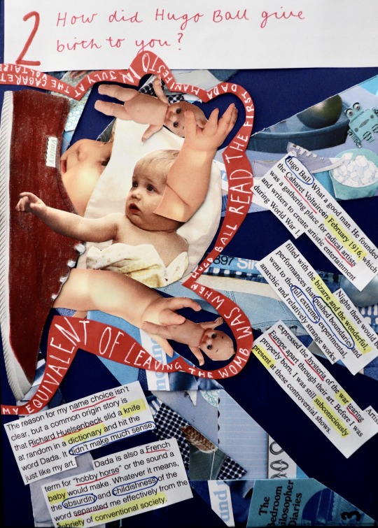
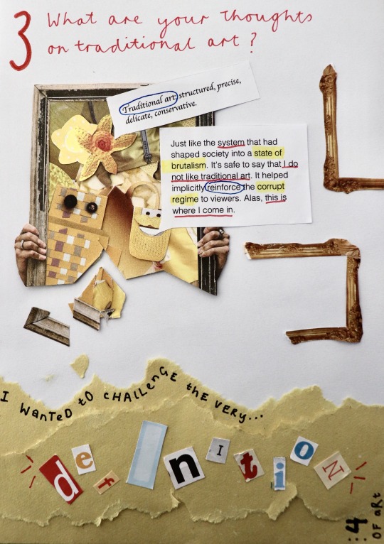
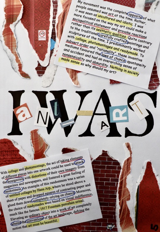
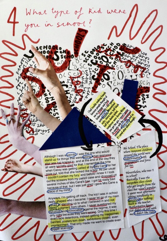
I remember you showing the first 3 pages on this zine; you were not confident about how page 3 came out and I am proud of you on your result. It must have been hard to replica dada, but you did it. My favourite page is page 2 but everything is so good. Good Job Katie. Love it
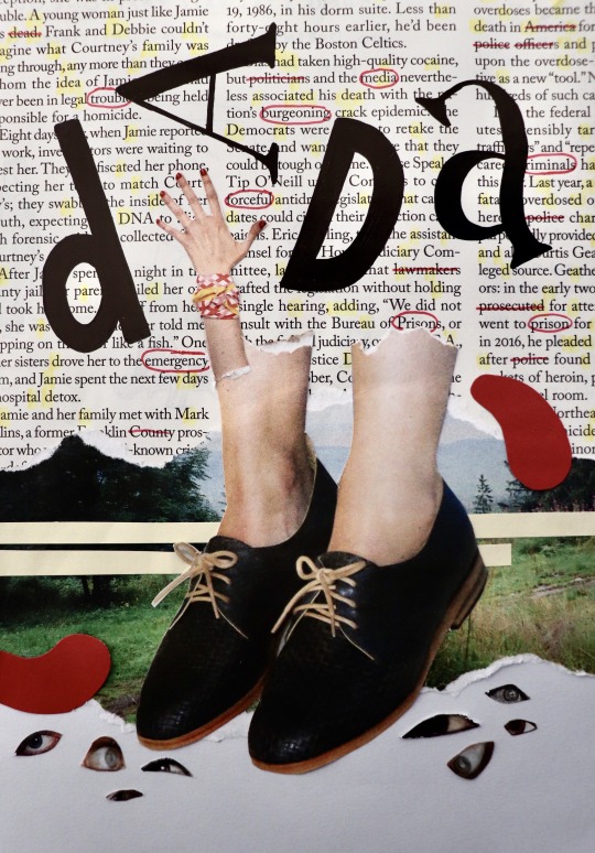
Finished Zine!!
I can’t believe I actually managed to finish! This zine, though fun, literally has consumed my life for the past few weeks, always at the back of my head. This has definitely been the most time I’ve spent on an assignment and it was the best feeling finally getting to vacuum all the tiny bits of paper on my floor and clear away my magazines haha.
There’s quite a bit I’ve changed since last time I uploaded. After receiving feedback from Bailey that my text was quite un-Dada, looking more like a magazine, I spiced it up by using random (and some ugly) alternating typefaces for each paragraph, to make them look as if they were different bits of text cut from a newspaper, a method used by many Dadaists. I also highlighted/underlined/circled important words with my primary colour scheme, giving the words more personality.
I decided to stick to a red, cursive type for my interview questions to give it more contrast from the rest of the pages with its elegant appearance, and enlarged my question numbers to give them more hierarchy.
Making the rest of my zine pages was challenging. Having to adhere to the nonsensical/humorous/weird/chaotic aesthetic of Dada, as well as relating my collages to my questions, as well as creating layouts that still had some structure and thoughtful design choices, was a lot to juggle. I had to think about each element of my designs extremely carefully. After a while, I started to stray from Dada and forgot to fully emulate its style, instead kind of just making collages with no style. I also started to lose creativity and found it hard to come up with ideas from my magazines. There were times where I spent hours doing things that would usually take 15 minutes. With all these slumps, I found that detaching myself from the zine and looking at other existing designs, whether that be Dada art, general designs, or zine designs, proved to be really beneficial in re-inspiring me with new ideas and a fresh perspective. Taking a break away from the zine and coming back to it another a day was also useful.
After learning all about the importance of colour in my colour & info class, I decided to stick to primary colours. Limiting my colour palette was a really good choice, where my pages altogether have a sense of harmony. As my pages have quite a lot going on, limiting my colours helped make them more digestible to view. It was however quite hard having to find specific things to collage with the added limitation of colour. Most of the time I overcame this by looking deep into my magazines, but other times I physically coloured in objects, like the red shoe on question two, or added in coloured paper, like the windows on the second last page.
Once I had all my draft pages ready, I spent yesterday sticking everything permanently down and fixing things I was wanting to change to the pages, such as rearranging layouts, adding more hand drawn aspects, changing my interviewer typeface, using the same yellow coloured paper etc. It was much easier to refine and improve my pages when I already had their general appearances figured out, where I found it a lot harder to start my pages from nothing, as more ideation was required.
Overall, I’m glad that I was able to push through any obstacles and make my first ever zine. It is such a completely different style to what I usually produce, and although difficult, it was really good to push myself out of my comfort zone and explore another style of design. This was also the first time I really delved into collaging and it was very interesting to both explore the endless ways to approach collaging and to have to somewhat rely on chance and spontaneity when flicking through a magazine. Some of my favourite aspects of my collages were non-intentional (e.g. accidentally dropping something on my page) and that’s why I love collaging: it has no rules. I’m really happy with how my zine turned out and I’m definitely going to do more collaging in the future!
31 notes
·
View notes
Text
Bright and colourful, I love. Seeing other people doing unique interpretations on Comic Sans is cool, and I like how you have the dog and turtle looking down to convey the feeling of shame. I agree with what you said about failure I experienced that as well and it's a common thing, we all designer good through and like you said it's important to get feedback from other peers and refine your work. Overall, excellent job :)
Ask Me Anything - Final (ish) outcome
Honestly, I have had a blast making weekly posts tumblr, but the time has come to wrap this assignment up, and post probably my second last post!
I didn’t want to finish the tumblr without showcasing and talking about my Zine, (even though there will probably be some finishing touches and refinements between now and Friday).
Below is my 8 page zine, with 6 double page spreads and a front and back cover. I have come a long way since I started the zine, even though I am still not 100% convinced it’s my best work, there are elements I really like, like the notebook back-cover from Microsoft bob help messages and some of the illustrations.

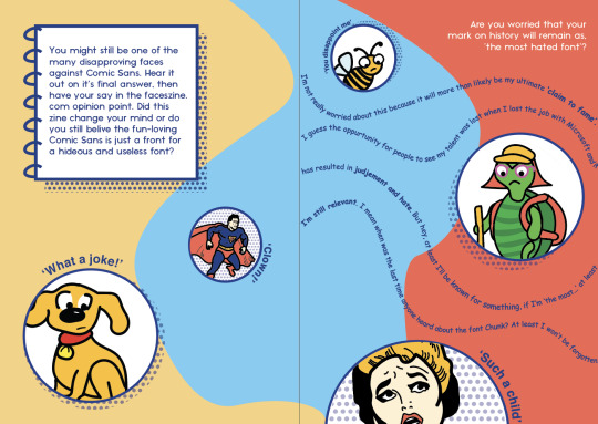
Adding small hints to the origins of comic sans, to allude to its success in fulfilling those criteria helped me add texture and more interest into the zine. The inclusion of ‘extra information’ boxes has also helped the overall feel of a publication I think (I might need to add some more historical info into those).
Through this project I have learnt not to let fear of failure get in the way of starting something. If I had begun the rough design play earlier, I would have had even more days to keep coming back to my work and refine it.
I have also learnt that it’s ok to ask for help, it’s ok to ask the tutor when I’m stuck or ask peers for feedback - It always sparks new creative ideas for me.
24 notes
·
View notes
Text
That’s beautiful Ivanka I like the mosaic effect you did it which allows colour. And the fact you use multiple colours is cool. The vector drawing of Antoni is good as well and I would have not noticed you were a beginner using Indesign. You should be proud of what you good job.
FINAL ZINE


This is my final zine!
With all the research I’ve done about Antoni Gaudí. I decided to incorporate a lot of colours into my zines, I ended up muting a lot of the colours to make it blend together better and I used a neutral colour as the background for the pages because I think Gaudí’s works have a lot of earth tones as well. I had to make a few alterations to the background on page 5 because I needed to fit the question there but I think it worked out and I quite like how the words are not arranged in a straight line. I would say I’m a beginner at using indesign because I’ve never used it before uni and I think while doing this project I managed to learn quite a lot about adobe apps so that’s nice!
16 notes
·
View notes
Photo
Love your zine this I believe represents Massimo perfectly, I like how you incorporate something that relates to how Massimo designed the New York subways. Dazzling colours being used here and very simple. Good Job Chloe


Final Zine - Ask Me Anything
After weeks of time and effort I’ve put into the zine, I finally did it! That amazing feeling of ticking it off my to-do list and close all my tabs on my laptop.
I have chosen Massimo Vignelli as my interview subject as I’ve heard about him and his work numerous times this semester. I looked him up and read about him, his concept and his works. I’m just really inspired by his style of minimalist, clean designs, the use of grids and the influence of Swiss-style graphic designs. I tried to mirror Vignelli’s previous work styles into my zine by using Helvetica and the colour of black, red and white. Yes, it seems pretty easy but it’s way harder than it sounds. There are times that I think my zine is too simple, boring, expected and basic. But the whole idea of Vignelli’s designs is the minimalist approach and timeless designs. Therefore, I constantly refer back to his previous work, do more research and get new inspirations.
The most challenging part of this project is the layout. It is hard to fit all the content and texts into a minimalist layout while being unique and creative. But I have made my way around it through adding small details and adjusting minor changes as they do make a difference!
I have learnt a lot just from this assignment through exploring, experimenting, understanding and practising. Especially the skill set that I’ve learnt by using Adobe Photoshop, Illustrator and InDesign. I believe that I could use these practices and knowledge into my future design studies. Lastly, I just want to thank everyone who gave me feedback through the process! :)
17 notes
·
View notes
Photo
Cool animation Brad, it would have also been good if the brush drew something on the notepad. Something to consider.

Thought I’d make in a rough, stop animation I played around with quickly to see the DaVinci’s brush come alive, in real life!
4 notes
·
View notes
Text
Great Job Erin I had no clue that Comic Sans was such a hated font, and it was good to read about how children used comic sans in primary school. I liked the style you went for adding like pop art feel. Overall, excellent job I enjoyed reading it.
Final For “Ask me Anything” Assignment

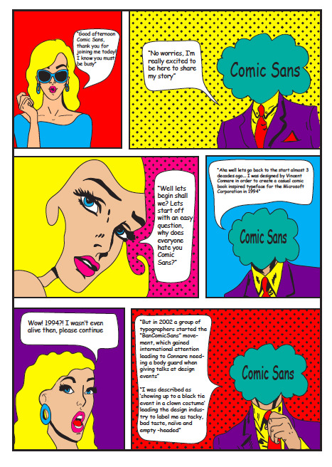

Above demonstrates my final design for the “Ask me anything” assessment which is due today. Overall i’m really pleased with how it turned out and after many hours of being frustrated drawing and figuring layouts I can say i’m proud of what i have done during this time in isolation and not being able to attend face to face classes. I think i’m most pleased with the fact that i hand drew everything myself after researching comic books and figuring out character styles and making it work with my own style, and although it’s not perfect and i still have a lot of to improve on i’m content with what i have submitted. From this assignment i think i have come away with gaining a lot more skills and illustrator abilities that i want to carry on learning in order to improve my adobe expertise. The area i found most challenging was fitting a certain amount of information into my comic book illustrations, and personally i have a habit of writing big paragraphs so for this task i had to make sure i focused on only addressing key information. Overall this had to be one of my favourite tasks out of the whole coarse as it allowed me to creatively challenge myself and step out my comfort zone which was a great experience.
5 notes
·
View notes
Photo
I was looking at Punk Movement on Tumblr then I found this and the art cover looks so similar to

Link of Photo: https://open.spotify.com/album/1dZZh7PvVgce1DDsDPzy8Z
Link of Photo: https://open.spotify.com/album/6pTMhQX8gt1xegiIwo3Ekb
It’s crazy to me how they use similar art style, both using the concepts of applying multiple eyes and using bright colours. Something that I noticed.

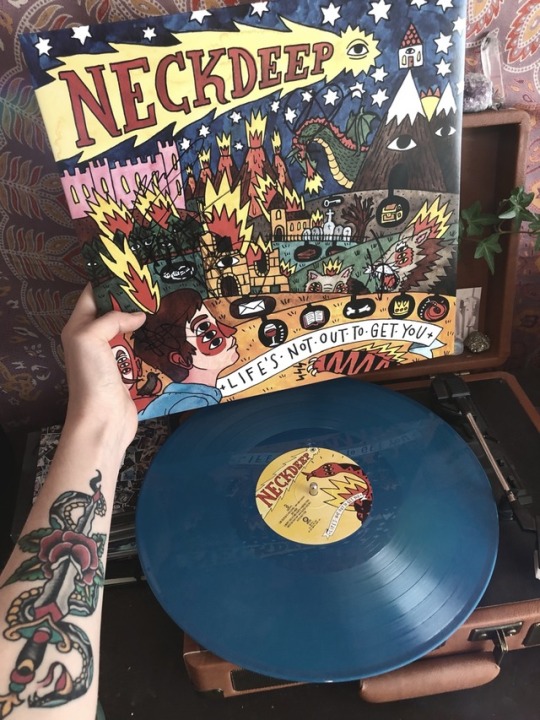
I’m so stoked on this signed copy of life’s not out to get you
Instagram: _storysofar
5K notes
·
View notes
Photo
Looking at @iwishididnthavetosleep post about how Spider-Man Into the Spider-Verse was inspiration her I wanted to show something that is inspiration to me. That’s Akira I love it the 80s aesthetic, colourful, and it’s one of the animated movies I love.
Although I just discovered this movie, this year there’s other movies like Ghost In the Shell that is also inspiration which I want to watch.


Tetsuo’s our friend! If anyone’s gonna kill him, it should be us!
AKIRA (1988) dir. Katsuhiro Otomo
17K notes
·
View notes