Don't wanna be here? Send us removal request.
Statistics
We looked inside some of the posts by adriennegad2fmp and here's what we found interesting.
Average Info
Notes Per Post
0
Likes Per Post
0
Reblog Per Post
0
Reply Per Post
0
Time Between Posts
1 day
Number of Posts By Type
Link
1
Text
16
Last Seen Tumblr Blogs


Fun Fact
Tumblr has a 66 index score for customer satisfaction in the US.
Link
0 notes
Text
Assembly of my final outcome


This project was absolutely massive for myself and yet I was still surprised about the amount of time it took to produce and assemble the actual product but the epic power it contains is prohibited by the time I have processed for this project. It took me only just took under 7 hours to put each piece of paper up on the wall adjusting it structurally to produce a wave like texture as the edges cling to the wall.
0 notes


Text
FMP Evaluation Unit 12
To get started on project I needed to identify myself a concept, for me to specifically underline and highlights myself a path that I can propose. Giving myself a steady path and expectations, highlighting exactly where I should be going each week keeping myself on track and my my final major project strong. Identification of the concept put a lot of deep digging into different definitions and ideas that could/spur from many different concepts, ideas and themes. Bringing on different inspirations immediately, as I was looking into imagery and the kind of ideas which other artists have a developed within these themes. In fact it was a bit of a struggle at this stage already because I found a lot of different concepts had ideas that I wanted to further develop, the first one was the theme of urban. Was looking into my different choices I found that there was quite a bit of imagery in urban, finding them visually enjoyable and I wanted to work from and present. I have always been inspired by the natural world surrounding me however recently I have been able to engage with the architectural forms as well which I meant I could maybe pronounce these two contrasting features together in my unit 9 project of breaking boundaries. However after digging I found it that a lot of these things crossed over and therefore I could use more than one in my project all coming back to the ideas of surroundings of myself. This idea made my project very personalized. This is an area in which I have never really taken my work before I have more focused on an audience outside of myself. I chose my concept of interior and exterior along with environment, surface and urban because I was able to make this project unique myself and truly connect with the the outcomes I was producing. I have always had the opportunity to do this however I have not actually taking it so to push myself out of the comfort zone that I have held her out this year I wanted to make my project more personalized and my audience became myself. This meant that I only needed my own approval on my final piece and I wanted to create something big. Symbolizing myself. Imagery I saw was an inspiration that I was able to produce and I wanted to look into the idea of surrounding. More specifically my own surroundings as I wanted to present them along with my own personality. Like it says in my proposal I wanted to trinity exploit this project to express myself. Leading me to the idea of interior and creating a wallpaper then further inspired me to look into different artist who's have installed these elements of my concept into this kind of design. Further more it was Joseph a Frank and that started me off in mind development of my project understanding the concepts and theme of my work I wanted at to pronounce it in a fashion of dedication and chaos. Working similarly to him he raised his colour around but still anointing his work with special factors of nature and environment.

Right at the very beginning the aria plays a massive contribution into the path and true location of where my work was to begin my practical work started immediately was local imagery at my own place of home. Powerfully linking the idea of surroundings and my own environment to my practical work, which is where I decided to go in my. It was simply the view out of my window that started to make my work worthwhile. as I grew a few pieces and it was not feeling particularly inspired by them it was the window design that I finally felt like I was doing work leaning towards my final outcome it's myself and only feeling as it was a familiarity myself. Before this design had drawn a few pieces based around other things than my own primary research and yet it was not sitting comfortably with myself because I did not have that familiarity that created a comfy base for its lay upon. Beings I have made myself the audience, I needed focused primarily on how my work was making myself feel. But I certainly did not want to limit myself and during this project I wished to explore lots of different techniques and I did this by starting off with cyanotype prints and continue to explore into other prints such as lino along with looking into an experience in the darkroom. However the similarities of what I started with an ended with are quite strong as I ended with screen printing and started with cyanotype printing and you can see a clear development and how I ended up almost back where I started.

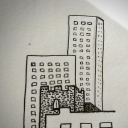
In my practical work I started off looking into the idea of my own surroundings including architecture and more of a natural element including but not limited to myself too to natural objects such as trees and leaves. You can quite clearly see my development and experimentation surrounding the natural born in my blog as I slowly start from preventing tree like a forms on canvas and then it leave me to a further produce then in oil pastels however onwards from this you can stay as i drop this idea and focus more and architectural differences. On the other hand leaning more towards the end of the project I have introduces the idea of yet another technique, eco printing. Although unfortunately eco printing not very good plan it was it yet to make a contribution into my design as the colours that I found dripped from these natural objects that were quite appealing to my own eye. It is quite unfortunate that I was not able to bring this techniques to life because it would have given me a chance to work directly with my concept. I have found that in my practical work I have discovered a passion for the idea of architecture and the true sharp lines creating a chaotic factor with the in-depth shading and Shadow creating perspective, however this is only me bringing the outside tied into my work so creating a wallpaper with the structure from outside forms I will be in turn bringing the outside in. This idea is a concept that is really quite increasable, I have witnessed installations of artwork ware people have brung natural forms in and overwhelming with them. Of course I am not intending to be as excitable as a wallpaper is meant for a home, I am really trying to express and evidence of the ivy of tranquility My final outcome has been supported by my research of Ian chambers right at the very beginning of my project. His in-depth visualizations of these architectural masterpieces that appear almost sci-fi like seen have also been presented with in my own work with the screen printed buildings I was able to capture in-depth the detail and shading in a true monochrome contrast much like in chamber does within his work. I find in arts work a lot of the beauty actually in fact comes from the contented details and intense way that it performs for the actual piece especially in the idea of monochrome which is what Ian Chambers does with his work. I was following his example with the idea of contrast and intense detail which was produced by the production through photography. Of course it was the building structural form that I was able to capture that made my final piece recognizable to it's potential. During my FMP of course I wanted to capture a lot of ambition

and still have a professional perspective keeping at my work strong and skilled. By using screen printing this technique does in fact keep it professional as a high quality of standard within all of my work, as long as I follow the simple techniques of washing the screen regularly and using tape. I found that I've made a few mistakes in my wallpaper unfortunately because I did not wash the screen regularly. This has put me back however has also taught me to be more careful. Patience has been one of the biggest factors that I have had to concentrate on because of the continuous repeat of the same tedious activity. I have had to keep calm and patient throughout. I admit it has gotten a bit boring and I have started to struggle to continue however for the outcome I needed to say confident to produce an outcome that face the idea of confidence, my wallpaper will be a statement.
Like I said above, my work really started to take off once I began taking and my primary images and photography. This is what was giving me some inspiration because it was familiar and I felt a connection to the property that I was was to display. Although I only was taking images of photographic places that sings to be iconic to me with a lot of power strength and mobility within their structural form this provided me with a lot of detail to work from and became the strength of what I was working at. However I didn't expect myself at to actually use the images straight off in my screen prints, I was trying originally to interpret them as a drawing but I wasn't quite taking off and putting the right skill and talent into my drawings to feel that they were worthy enough to produce and my final outcome. Using the photography I have developed the screen prints had a lot of power from the contrast and masses of shading. Gathering other people's opinions I came to the conclusion of actually using the photos as prince to collect as much detail as possible. Which as you can see through my blog work turned out to be the best decision of of my project because it's as I say and chaos relating back to my own personality. I expected myself to end up with princess more displaying the kind of style of the architectural drawing that I have news on my blog as inspiration with the yellow highlighter however I can see a change in development from this using my photography and it produces more into the idea of Mary Claire Smith and her idea of screen printing and going back to the idea of Ian Chambers. I suppose I really enjoyed the fiddly shades that will be introduced in the yellow highlighter so I was sir that drawn towards doing that myself though I am really happy it did not turn out because of the professional way screen-print have come out to produce my final outcome of the wallpaper.

When I finally got to the stage your actually making my wallpaper I still haven't yet decided on a specific style I would like to take on, I only knew what kind of colours I wanted to present within my work. This still gave me a base of what to work with. For a matter of fact throughout my whole project I did not think about the style of my final piece once, that is until this point in time. I feel this was a mistake because I could have developed my project somewhere else potentially along with explored other areas. The colour I knew, and I wanted a little bit of chaos, repetitive pattern let me to the idea of 70s patterns looking into all kinds of wallpaper that they displayed during this era. This was exactly what I was imagining and what I was after the kind of chaotic patterns and material that will be collided together. ThisThis gave me my biggest inspiration yet, to develop my actual paper in the way that I have. 70s brought in a lot of chaotic patterns and weighs about it especially with the bright vibrant colours which unfortunately I did not choose to use, but the way about it and how they performed as coloured interacting with each other develops a quite a hectic theme within the works, because of the situation that the wallpaper would sit within however I still wanted my personality to be developed into this so by choosing warm tranquil tones of colour and interpreting them into a 70 style I was able to start producing and my wallpaper. Within my entire project I was imagining some honeycomb and brown type shades which are warm and luxurious. Symbolizes a large concur of ambience and comfort, the type of feeling and effects I wish to present in my final outcome along with my own identity. In fact these colours call out me because of my own bodily feelings and sensations, to be more specific, I am constantly cold. Because of this I surround myself with warm sunny colours kind of symptom is also one that can be displayed if you are struggling with the mental disorder of SAD (Seasonal Affective Disorder). It is the resemblance to the sun and warmth that it provides that commits a chemical reaction in my brain and makes these colours significant myself. Being this project is for myself and I am my own audience I have found a connection with these tones and they interact with me perfectly. As for the building, I had several calendar for me to use the one resembling a parcel like form because I felt a lot of our community and historical nature about it presented a strong nature to myself elf and and I believe that was a going to create a string of potential. I really started off with a slightly smaller one, I did not feel it had the puro brutality that I wanted and intended on my work so I swapped it out for a slightly larger one that introduced heaviest shading and fit perfectly in with my wallpaper so it was presented acceptable and you can see the detail clearly when it will be presented on the wall. For a matter of fact my wallpaper had a slight bit of patterns who it was the buildings when making them and designed them so they were follow strict pattern however I will make sure the pattern doesn't correct line up and it is a bumpy and topsy turvy continuing with a chaotic theme. Throughout this project I have been having in and out doubts however I feel the final piece has gone according later plan and has created a beautiful installation especially with the way I have been able to present the wallpaper on the walls.
This project was absolutely massive for myself and yet I was still surprised about the amount of time it took to produce and assemble the actual product but the epic power it contains is prohibited by the time I have processed for this project. It took me only just took under 7 hours to put each piece of paper up on the wall adjusting it structurally to produce a wave like texture as the edges cling to the wall. The hardest technicality of this stage of assembly was the alignment of the paper the keep a structurable flow of repetition in the in patent application in print from to the paper. This was entirely necessary to create a proposal started that chants high quality of a remarkable FMP final outcome. On the other hand I clearly did not budge my work clearly shows that I did not budge my time appropriately as I have not managed to make enough paper to fine the floor as well as the walls similarly to the previous work that I have studied along this area. It is unfortunate because of the way it had the potential to create a whirling hemisphere of beauty and my own chaotic personal environment. What is the catastrophic evidence of the war paving in on the surroundings and creating a crippling effect that engulfs you when you enter. This leads me to my next factorable statement of the easiest contribution in my assembly which I was actually the fact that I didn't have to line up the buildings to create a similar pattern in fact this was the purpose of of the polka dots, to create a large area of Cycloning atmosphere, not to be recognized, meaning that nothing in the room linked up and there was a sense of continuous chaotic atmosphere that surrounds you and is lacking of an end. However to cancel app out this dramatic feeling that I have been explaining in depth is the warm emotional colours that I have introduced layering themselves on top of one another creating themselves a harmonious balance with the chaotic appearance. Without the continuous identification of this pattern the colours would bring a warm spring gentle tone to the piece of work, this allowed the the idea of harmony to take the edge off the hecticness of the wallpaper and in turn the surroundings that are created by my installation. As a layer on top of each other they they become bolder as they are more pronounced creating the ideal strength by them not bleeding into each other but making themselves more of a statement as a pile on top of one another. And then to further emphasize this idea I lay a hard stone building on top which creates the strength and nobility of the actual piece of work and identification of its power and where it draws its personality from. There was a pattern on each strip of wallpaper but I not lining up the patterned buildings I continue with the destructive cluttered way about this piece. And finally I added an additional feature to the room making it more than installation I added a wooden chair to truly highlights the colours and how they have sprung allowing the chair to be ingulfed and you can view this from the doorway. I always planned to have a chair in my installation that I did hope that over the able to bite my time in the right way and create a pillowcase to pronounce the chair as part of my installation however I'm very pleased with the appeal that the chair provide within.
0 notes


Text
First few sheets of my wallpaper a done and I was trying to get a feel for how they would look on the wall by displaying then I am a fairly confident with the way that they are beginning to pronounce themselves and I think especially together as a unit creating themselves to be chaotic factor on each surface of this room will that make for a brilliant outcome.


Each colour together layering themselves on top of each other has made at the idea of the tiger stripes on the original colour lacking of an issue because it just creates a better personality.
0 notes
Text
Presentation ideas


I managed to find these examples of installation from an interior design book, preventing this example above as wallpaper that covers every inch of the room. This is including the floors and ceilings I found this idea really quite inspirational especially for what I am doing in my project I have been talking about introducing an aspect of chaos and this right here introduces it perfectly by pouring in the original idea again and again all over the surfaces. This is exactly how I would like to display my installation further for my final outcome, creating an overwhelming fatter as it audience will struggle to process the repeated idea. The only issue is time.
0 notes
Text
Today I have started making my FMP final outcome.


I have decided to go ahead with using the warm tone reflecting upon as a healthy good natured home. Starting off with the the life peach cream coloured paint as a base creating a a line of random dots introducing the chaotic nature of myself as there is no pattern and will continue to be no pattern within in the paper when it comes to the block colour. Because there is so much to do I have been trying to do at least two sheets of the same colour each time however this idea takes up a lot of space and I will be needing space to continue at with my project to a fast-paced and that I planned upon when writing my proposal. Icea the college may not to provide such qualities as this and I will need to take my work someplace else. However for now I have found everything has been moving steadily and to a good quality the only problem I have had suggested to me is the consistency of the paint, I fear the paint is too loose and gloomy and will ruffle the paper. It has already started to create turgutreis however I am going to introduce this into my project part of the chaotic atmosphere which I'm creating within you stop and hope they become a characteristic within my outcome.
0 notes
Text
Weekly evaluation
This week started off straight away with the idea of identification and understanding, defining a purpose and a journey. Evaluating methodology and previous artists who have dabbled along these lines before. This is to give me a purpose and an understanding of where I want this week to take me as I yet again begin to understand how I want to present my installation by looking into the potential of others. This has been identified through my work by experimentation all throughout this week. Looking into screen printing primarily, I have also a being collegeing the ideas of the screens together creating more of a significant pattern, because I intend to create a strong defining realisation in my work, then bringing myself to understand the effects and power they have. Commencing this week I have also finally looked into the idea of eco printing which unfortunately did not go as planned, I believe I did not have the right materials that for the colour to bleed into as the paper I use did not capture the bleed of the petals. However I do not have time to experiment further because I do not feel it would make a contribution into my final outcome, in fact looking further into my final outcome I have identified that I want to use a element of a chaotic fashion in my work as well, by introducing a canvas displayed on the walls so I have been looking into watercolour painting of the ocean. Blue is a very calming colour and and well-known for it's a tranquility however I felt like although this became a beautiful experiment it was not what I wanted to achieve. After screen printing I found the print that I have created below the paper I was originally printing on and made it for sweet little gems and I used a weaving technique to place that onto a canvas. The black and White Trudy observing the idea of chaos.
This week has been one of the most important weeks so far in my FMP, all about identification my potential and the best way I can achieve the most powerful effect in my final outcome. I mean actual style of the wallpaper has been selected ( inspired by the 1970s period of mad times and patterns that style and shape everything). This in turn introduced the colour and specific times that the paper will have, creating the right level of comfort and home within my work. How about a fact that is just as important and large in my project is a presentation. Me perspective and the way it will will allow the audience to interact with my installation is important because it is going to reflect the idea of a house, it will be an environment and surrounding. Unfortunately though I don't feel I have found the right way of exhibiting my work yet this will continue into next week.
The main purpose of next week is to start planning on how I intend to present my final outcome and actually start to make it. I will be making as many sheets of wallpaper as I possibly can measuring the walls and trying to fill as many as I can looking at what kind of artists have clearly displayed their work as an installation.
0 notes
Text


This was an impulse piece of word that I did because of a quick idea I had. After printing this morning I noticed the paper underneath had court little glimpses of the Prince and collage them together in a jumbled way of contrast I found this idea and concept intriguing and I wanted to do something with it however I didn't know what until I came up with the idea of leaving the design together. Using the guillotine I cut it into little strips and jumbled them up so they did not connect or create a picture looking into at the idea of the chaos theory I wanted a little bit of disruption into the design of my fireplace and this could create a messy factor. I glued and taped these pieces together and produce them onto a canvas and now I hope to use at this canvas in the room once I finally put up my wallpaper installation. I plan for it to stick out like a sore thumb and being incredibly noticeable however not recognisable creating a puzzle. How I got the ironic sense of this is that the buildings that surround it in the room are the missing pieces.
0 notes


Text


Eco printing
I realised that I haven't yet looks into my projects and I might want to introduce into my final outcome so with what little time I have left I have decided to introduce this idea and play around to see if my expectations of this kind of technique would be true. however unfortunately I believe I did not have the rights and materials for such because the colour of the vegetation did bleed but the paper did not catch it just leaving unprofessional it is not what I was going with this.
0 notes
Text


During today session I have been experimenting with the way that I can produce my final outcome using the technique of screen printing, developing my technique and do or don't to do with this practice understanding the best way for me to to produce my outcome using this technique. It has also been about the visual expectation that I have for my design as today has been away for me too see my designs in this format so I can understand and produce the right design for my FMP final outcome. I must say creating the block colour has come out extremely professional which is the kind of expectation I would like to drive into my outcome layering each part of the colours upon each other creating and exercising the stress that I would like to produce in colour and the emotion. Introducing the buildings on top of this kind of design create an effects of passion and warmth within the idea of isolation, producing the buildings onto my shapes to better understand the tone that they have been able to produce. Raffle quite clearly this session has been for me about analysing the way of production that I will need to intend in my final outcome. I have discovered from today's lesson the warm yellow and pinkish toes fit quite gracefully in the emotional balance that I intended to produce within my final outcome, away of sanctuary if it were and a warm genital appearance introducing itself as slight. It is these times that pronounced the buildings in the way that I expected and I will be using this in my final outcome.
0 notes
Text
70s wallpaper designs


I feel like the pattern and shape of the wallpapers that were advertised in the 1970s related strongly to the shapes that I have been inviting into my final outcome. If I was doing bombard and overwhelm my wallpaper with bright and vibrant shapes there would be a huge similar advantage to my design and the 70s style. I have managed to find this article about the best qualities of 70s wallpaper I found it was a good read, and some of the installations that were provided as imagery were a good display and inspiration to myself on how I could invite my audience to see the true potential of my design.
https://www.retrotogo.com/2019/11/10-of-the-best-1970s-style-wallpaper.html
0 notes
Text
Primary research of wallpaper designs


Here I have presented some wallpaper designs that I managed to find from local decor and innovation design shops I have used them for inspiration of what kind of colour palette I need to be referring to and what kind of imagery should be presented along with the idea of repetition and composition. I have been using these as inspiration throughout my project and need to have seen the professional outcome and ability that my final piece needs to obtain.
0 notes
Text


When it coming to my final piece I am aware i've had to endure the process of experimenting with colour because it's great importance to my work and the emotional balance that will have and the effect my audience. As we know and have already explored colors expresses different emotions within a person and can spark new emotions to a piece of work. Mister finds colour as a remarkably design element. The purpose of today was too express the right colour in my final piece and discover what kind of imagery I wish to create. I will be added in emotional connections to my work by applying the right tones and colours in addition to adding an accent to the wall.
What I have noticed was the way that the bright sunny warm tones, particularly the yellow and the browns what working almost independently producing a warn luxurious emphasis on the idea of homely. They were creating soft tones especially when I would additionally add them as pastel colours, as I have recently discovered pastel colours present a sensitive and kind gentle touch in their home delicate and nursing in their identities. Live kind of emotional balance is one that I have been searching to achieve during today’s session and I feel the pastel colours particularly at the way to go especially looking into these warm honeycomb yellow and and mixing them with different tones. In fact I found it was the 2-Tone different yellows that worked best together. The overlapping proceed of colour created a a beautiful gentle touch that tumi displayed me ambiance of a warm summer evening. This kind of warm bright turnage I am going to exploit and see if I can introduce one of the the pastel pinks to this idea of the summer contrasting yellows and that relate to a sunset. rsf and warmth that was echoing off of these shadowy colours created a sense of joy particularly because of the yellow so as we all know it is the symbolising colour for this emotion. This design idea as what you can probably already see is my favourite, which is clear by my passion for it.
The reasoning behind the shapes though is because I wanted a block colour and simplicity within the colour. Are tears the triangles because of the the beauty they have in the idea symmetry however I found them to be unfortunately to shop for the idea that I wanted to portray the curvature of the circle however was it perfect. Gentle and soft edges to perfectly cut up the idea of innocence within my work. So I have decided that I will be using the honeycomb yellow, spring, delightful colours, along with the circle representing a sunny glow in my final piece, creation an accent in the form of block colours. And this will be my next step after seeing what the appearance of these designs are with my screen print of buildings I will like to be producing these circular prints onto my wallpaper.
0 notes
Text


This is examples of one wallpaper design being expressed and presented in different circumstances to allow and the viewer to understand and see potential within it. This relates to my concept because at this stage that I am in, I now need to start figuring out and problem solving my presentation skills in which I need to show flair in to represent potential and extravagance in my design.
0 notes