
Statistics
We looked inside some of the posts by agentochangestudio and here's what we found interesting.
Average Info
Notes Per Post
1
Likes Per Post
1
Reblog Per Post
0
Reply Per Post
0
Time Between Posts
8 minutes
Number of Posts By Type
Text
17
Last Seen Tumblr Blogs


Fun Fact
The “We are the 99%” Tumblr blog became the slogan for the Occupy Wall Street movement.
Text
Reflection on "Agents Of Change"
Over the course of this semester, I feel I have learnt quite a bit about fashion and more specifically, fast fashion. Before this semester I had somewhat of a good idea of what fast fashion was and how I could avoid it. However, after this semester I feel more confident in my choice to only buy sustainable or second hand-clothing. Learning about how so many aspects of the fast fashion industry are not only horrible but considerably unethical has given me the motivation I needed to stand firmly against fast fashion. I find that I ask myself more and more questions about the ethics behind my purchases. Not only did I learn about fast fashion, but I also developed my sewing skills and campaign orientated design skills.
Designing for products is very different from designing for a non-tangible message. Products usually have specific features, sometimes ingredients, materials, uses and more to promote and sell. The goal of this is also very different to a campaign. The goal of designing for a product is to usually just sell that product, however, the goal of designing for a campaign can be to engage people, inform them, prompt them to contribute to the cause and more.
When designing for prominently a message, communication really is key. As designers, we know what we are designing for and the meaning/concepts behind those designs. It’s easy to assume audiences will understand and see what we see, but really spelling it out to audiences’ members is what good communication of a message is. I’ve known that as a designer, clearly communicating is vital, this studio has made me even more aware of this and prompted me to try and analyse my work from a different perspective.
Part of refining your communication of a message is feedback. Many studios will run through a whole semester without really pushing you to get feedback outside of the classroom. The time dedicated to feedback in this studio was very helpful and reiterated the importance of audience feedback. With the use of feedback, I was able to improve my colour palettes, construction of garments, messaging and more.
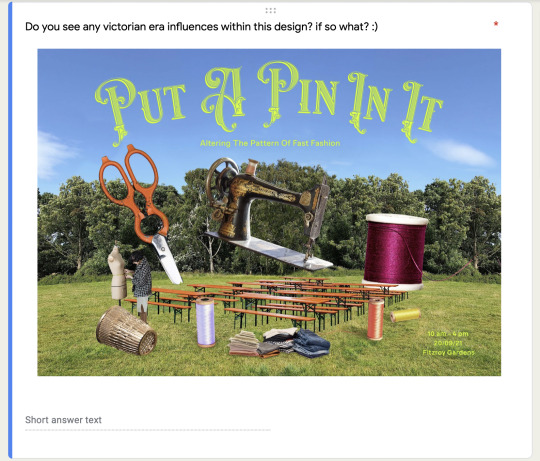
I feel that I have improved throughout this class because of my passionate interest in garment construction and fashion design mixed with graphic design. Having little knowledge about professional sewing and more of a grasp on the very basics of sewing and clothing alteration, I was able to try and delve into the sewing world and learn as much as I could. I enjoyed mixing my sewing skills with my graphic design skills immensely. Having come up with quite a happy and positive campaign focusing on healthy and balanced activism, I'm pleased with the overall design and concept for my “Put A Pin In It” campaign.

1 note
·
View note
Text


These are some of my final "disappointed posts
You'll notice that the colour palette has been inverted fr more of a dreary and gloomy appearance.
Each post you see above is in sets of two. The photo title will be posted and audiences can swipe to the right and see the post next to it. if tried to also include tips and tricks to not get too disappointed and sad.
0 notes
Text


These are some of my final "Optimisitic" posts
Each post you see above is in sets of two. The photo title will be posted and audiences can swipe to the right and see the post next to it.
I'm very happy with the effect that the soft yellow has on the overall mood of the campaign. I feel that this colour perfectly represents the happy side due yellows cheerful connotations.
0 notes
Text
Week 14


Fast Fashion Fasts & diagram
Here are some fact tiles about fast fashion. Although my campaign is about healthy activism through finding a nice balance of enjoying life and being driven in activism pursuits, I felt it was important to include these facts in order to really inform the audience about how bad fast fashion really.
I feel that these tiles need tweaking. A mild drop shadow needs to be applied to the typography in order to create contrast from the background.
You'll also see a little diagram of how I've finished the edges of my garments.
0 notes
Text
Week 14


Optimistic Side
The soft pastel yellow against the bright green grass creates an exuberant and cheerful aesthetic. While the bolder typography contrasts against the images more, the smaller weights of typography will need to be increased in weight for legibility.
0 notes
Text
Week 14


Victorian illustrations!
these are some Instagram tiles with victorian illustrations. Including illustrations from the victorian era will reinforce the victorian influence in this campaign.
I have research slang from this time period and found some great sayings. I also included little "translations" into what that sentence would be like now. I included these descriptions to that audiences did not feel alienated if they did not understand the slang terms.
0 notes
Text
Week 14


Disappointed Side
These are some of the Instagram tiles I have designed for the disappointed side of these garments.
The soft pastel yellow typography is more legible than the bright lime green type I had before. While the yellow is easy to read when on top of dark colours, it becomes less legible when onto of lighter colours, like this cream brick wall.
I feel that I will need to increase the contrast between the type and cream wall by darkening the cream brick wall to more of a dull brown.
also in the first photo the weight of the body copy is too light and gets lost in the background, I'll need to increase the weight.
0 notes
Text
Week 13

These are some feedback notes I took after presentation my work on Friday.
They are a bit all over the place but essentially they are about using the photos of the "disappointed" side for promoting activism, and using the "optimistic" side for promoting the "Put A Pin In It" event.
0 notes
Text
Week 13


On Tuesday my friend Bridget and I had a photoshoot with the garments I made!
Bridget did an amazing job taking the photos, I’m stoked with the results. The photos emulated my two themes and concept perfectly.
While taking photos of the optimistic side I tried to look happy and like I was having fun (which I was). We also shot those photos in a grass field and bush area. We took photos in this nice park to convey where the “Put A Pin In It” event could be/look like.
When taking photos for the disappointed side I tried to look more serious and quite literally disappointed. We shot these photos in an area of a park that has old industrial buildings and pipes. This matched the disappointed theme quite well because of the location’s dreary appearance. It also had some interesting graffiti which was a great backdrop.
Im super happy with the results!
(also that's my cat Mandy)
0 notes
Text
Week 12


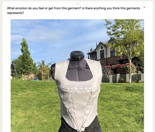
This week I finished sewing my corset!!
I was unfortunately ill and couldn’t attend this class however I did manage to finish my corset before I became ill. Above are pictures of my sewing process. I enjoyed this thoroughly and feel that my garments turned out well considering I’ve never made a corset before.
In response to the feedback about the disappointed side of the corset looking more natural and calm, I decided to experiment with rubbish bags. I aimed to create lines from the rubbish bag that looked like cracks in the corset. The result looked more like an odd palm tree. That was okay though because I came up with another idea…

I researched about Victorian era bags and saw that they slightly resembled the shape of a tiny rubbish bag. I decided to make a drawstring bag from rubbish bag material. The bag not only mimicked Victorian era bags but also had the appearance of a tiny rubbish bag!
0 notes
Text
Week 11 SURVEY


This is my google forms survey!
The survey was quite helpful! One piece of helpful feedback that I got was about the “disappointed” side of the garments. This side looked very neutral and calm instead of disappointed. I could fix this by adding some interesting materials, such as rubbish bags or plastic. That could convey that we are disappointed in the waste that the fast fashion industry creates.
Another piece of helpful feedback was the suggestion of adding more Victorian era related imagery. I think that I definitely need to push the Victorian era angle a lot more.
Another suggestion was to change the green colour of the campaign, which I completely agree with. I plan to have a photography with lots of grass in it so using green typography will be very ineffective.
0 notes
Text
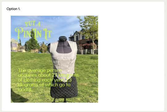
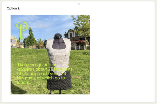
Week 11


Here are my corsets cut and pinned onto my dress form. I used these in my survey to convey what my finished garments will look like.
I had some bright colour lace that I had originally planned to use, however the lace made the corset look more like a costume and very busy. I decided to exclude the lace, so it did not distract from the pattern clashing on the optimistic side.
0 notes
Text
week 10
This week we got into group and came up with questions to ask our targets audiences.
These are the questions I came ups with:
What emotion do you feel or get from this garment?
What emotion would you say this garment portray?
Who do you think would like this campaign?
How much do you dislike fast fashion from a scale of 1 - 10?
How much to you know about fast fashion from a scale of 1 - 10
How much do you dislike fast fashion from a scale of 1 - 10?
How much to you know about fast fashion from a scale of 1 – 10?
Do you see any Victorian era themes in this project?
What do each side of the garments represent?
Do you feel you know how you can make a difference in regards to fast fashion?
Do you feel like you want to buy less clothes and make good use of the ones you already have?
Do you feel like you can identity fast fashion now?
Do you feel like you have a good understanding of what fast fashion is?
Do you feel you would attend this event?
Do you feel confident that you could make a new garment at this event? (With the help of a seamstress?)
I was concerned that I would not have my corsets sewn by next class but we discussed cutting out pieces of my fabrics and pining them onto my dress form. I could then take photos off that to show everyone.
I could then lay the type and logo over it to give a sense of the overall aesthetic.
0 notes
Text
Week 9
PUBLIC HOLIDAY*

This weeks there was no class due to a public holiday. I focused on cutting out my fabric using my pattern pieces.
I used weights to weight down the patterns so that they didn't move. I also tried to keep the patterns aligned in the same grain orientation. However, some pieces were not aligned to the grain of the fabric so that I did not waste large sections of that fabric.
Overall the results were a little rough but I think it turned out well :)
0 notes
Text
Week 8
Revisiting the feedback from week 7 project proposals
Liked the healthy activism side of the “put a pin in it campaign”
Use “Disappointed” side for activism, but also use “Optimistic” side for activism
Allow for more than one week of designing Instagram tiles with photographs of reversible garments
Add sayings from the Victorian era
Reference back to this opulence of that era.
Reference queen Victoria
Make sure to use text to communicate the disappointment side & optimistic side.
Use text to express that the materials are second hand
I will try and address all of this feedback in m designs :)
0 notes
Text
Week 8


This week were got feedback on our SKO’s. We spoke about including dead ends in our projects and making sure to document our process.
In the photos above you can see the beginning of the draping process. I have never draped this many pieces of fabric on my dress form before, but I think it went pretty well for a first try. I made sure to spend a lot of time on this, so that the patterns I cut out of my fabric were precise and worked together nicely.
(I loved this process of draping!)
0 notes
Text
Week 7
Project Proposal
This week was very eye opening. I absolutely loved learning about my peers projects and the issues they will be tackling. I especially admired Laura’s project about period culture. There was a really great discussion about how even medical professionals avoid periods. I find myself very excited to see what my peers produce.
I presentation my “Put A Pin In It” campaign to the class and felt that the presentation went quite well! Some helpful feedback I received was that the idea of healthy activism within my project is interesting. I also had suggestions such as using both sides of my garments for activism which is a great idea because we can be “optimistic” while protesting and not just angry and disappointed.
Also allowing for more than a week to work with the photography of my garments to produce Instagram tiles.


0 notes