Undergraduate Graphic Comuunication student, Illustration enthusiast, design devotee
Don't wanna be here? Send us removal request.
Statistics
We looked inside some of the posts by agraphicdesignernamedjessie-blog and here's what we found interesting.
Average Info
Notes Per Post
1
Likes Per Post
1
Reblog Per Post
0
Reply Per Post
0
Time Between Posts
7 minutes
Number of Posts By Type
Text
1
Video
5
Photo
11
Last Seen Tumblr Blogs


Fun Fact
Forty percent of Tumblr users are between the ages of 18 to 25.
Text
Evaluation
Day one of module 5 turned out to be quite a significant day for my progression of visual ideas relating to my festival. Renowned stage designer and innovative creative director Steve Gallagher talked to us about his agency bloq 9. Steve stressed how vital it is to have a narrative thread engrained within any design that you make. He also emphasised that his most successful and popular work stemmed from a creative concept, built into a story book-like narrative.
From the ‘get go’ I knew that I wanted a small scale intimate festival that was set in the forest. My initial creative thoughts were expressed through doodling and sketching possible visual staging/mapping outcomes of my festival. During the first day of our brief, I actually managed to have a long discussion about stage design, generating ideas with Steve which really helped me progress.
I began to draw visual inspiration from two main festivals, ‘Shambala’ and ‘The Secret Garden Party’. Both set in the outdoors, they had similar values encouraging: friendship, being at one with nature and the advocation of original musical material. However, the design inspiration that I drew from each of these festivals contrasted vividly. This was helpful to me as it allowed me to think about varied aspects of design
The Secret Garden Party mainly inspired ideas relating to aesthetic and theme. Its ‘secret’ location gave it a magical, other worldly feel as each of the ‘festival goers’ would venture into an ‘unknown, dreamlike land’. Lighting, staging and other eye catching large-scale stage designs further encapsulate this sense of a positively fairy tale like augmentation of reality.
Shambala fest educated me on the importance of having a strong set of principles, technically acting as a manifesto pledging to its audience. Tambala’s branding has a solid, illustrative, Aztec theme that focuses on repetitive symbolic designs.
Soon after this, we were encouraged to start to formalize direction and ideas for our festivals, by researching and documenting festival experiences from many different genres. This is when I started to conceptualize how I could create a festival that would appeal to my own musical interests (and that of others) and would also standing out from other festivals.
I decided to name my festival ‘Acoustic Roots’. I thought this name was fitting as the word ‘Roots’ is a homograph (a word with two or more different meanings). Roots could be referring to the roots of music, the roots surrounding the forest area or the roots within us all (where you came from and what you are influenced by). I also thought that the word roots has a lot of appropriate, natural imagery associated with it which would be a good platform for visuals.
Once my festival name and logo were decided, I needed to create a specific brand collateral, that would extend across a range of media and materials. I also wanted my visual language to be heavily influenced by a range of illustrative hand-crafted techniques and styles. My festival is home grown, and I wanted all of my visual outcomes to have a home grown handmade aesthetic.
Most of my Visual outcomes were created across various programmes on my iPad pro. I decided to push a hand drawn aesthetic to the maximum as I thought this would appeal to a wide range of consumers. I thought that the family demographic would be interested by this as it has a story book illustrative feel to it. Also, any of the consumers aged 16+ would be intrigued by illustrative style as it differs from that of many other visual festival campaigns.
Later on in the module, I had expressed to Johnny that I wanted people to experience my brand visually and physically within VR. I had planned how I wanted my festival to look through sketchbook work and thought that creating some form of mapping or way finding work would allow me to further enhance my illustrative style and atmosphere.
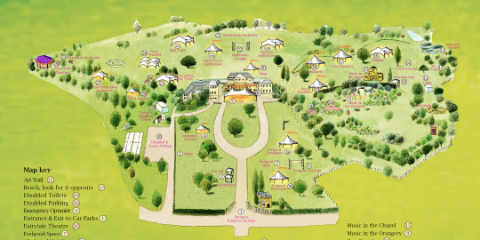
I initially had a two-hour session outside of class time hours and during that time I managed to design a main stage. This is the main focal point of my festival and once I could see this with my own eyes, I could further picture other places and landmarks within this space. With a second session in VR, I managed to entirely create a 3D, hand drawn festival map. Once this was created I really felt like my vision had come to life.
Acoustic Roots is a small scale ‘day fest’ situated in and around Delamere Forest “a shady oasis in the midst of the agricultural landscape of the Cheshire Plain.” I would expect a capacity of no more than 400 people and it would take place on the 31st of July 2018.
The objective of my festival is to create a naturalistic, imaginative version of society that encourages the participants to be at one with their natural surroundings and enjoy stripped back, raw, original music. Acoustic Roots involves the encouragement of local, up and coming singer/songwriters to showcase their material alongside their successors and idols. This would all be visually enhanced by the dream like forest setting.
The target audience for my festival would include:
· Families and friends that are interested in attending a festival nearby in a safe and enclosed environment. People that may not have had the time to have 3 days camping but still want to experience a festival with some of their favourite artists.
· People aged 16 and over that are singers, songwriters or musicians themselves that want to have a day long experience of listening to raw, acoustic and original music.
· A local audience would also be encouraged to attend as the majority of acts are homegrown singer songwriters and local upcoming bands.
· Those that enjoy being in a natural outdoor setting. The festival is designed around nature. It’s all about following natural instinct and staying true to your roots.
The Principles of my festival would include the celebration of talent and individuality. It aims to promote such talent within a magical forest setting. This allows the festivals participants to be surrounded by like-minded individuals and for them to encourage each other’s and their own creativity.
There are very few acoustic day fests that take place in and around the UK. The Acoustic Festival of Britain takes place across 3 days and doesn’t technically solely focus on primarily acoustic music, as they have blues events. ‘Off the tracks festival’ actually is a day fest that pops up around 3 different locations in the UK each year. It was voted as a top ‘small is beautiful’ festival by the Sunday Times. It is larger in scale than that of my own and some of the material performed is not original.
I am very happy with my final outcome and believe that I have managed to communicate my ideas effectively through many different visual mediums. I’m glad that I approached many of the design hurdles we had to face with a different illustrative perspective. If we had an extended brief, I am sure that there are things that I would and could tweak with time but overall, I am pleased and proud of all of my final outcomes.
0 notes
Video
tumblr
This is my stage design that I created in Virtual reality using the programme ‘Tilt Brush’.
Later on in the module, I had expressed to Johnny that I wanted people to experience my brand visually and physically within VR. I had planned how I wanted my festival to look through sketchbook work and thought that creating some form of mapping or way finding work would allow me to further enhance my illustrative style and atmosphere.
I initially had a two-hour session outside of class time hours and during that time I managed to design a main stage. This is the main focal point of my festival and once I could see this with my own eyes I could further picture other places and landmarks within this space. With a second session in VR I managed to entirely create a 3d, hand drawn festival map. Once this was created I really felt like my vision had come to life.
0 notes
Photo
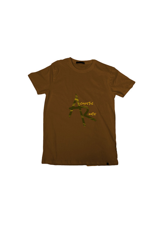
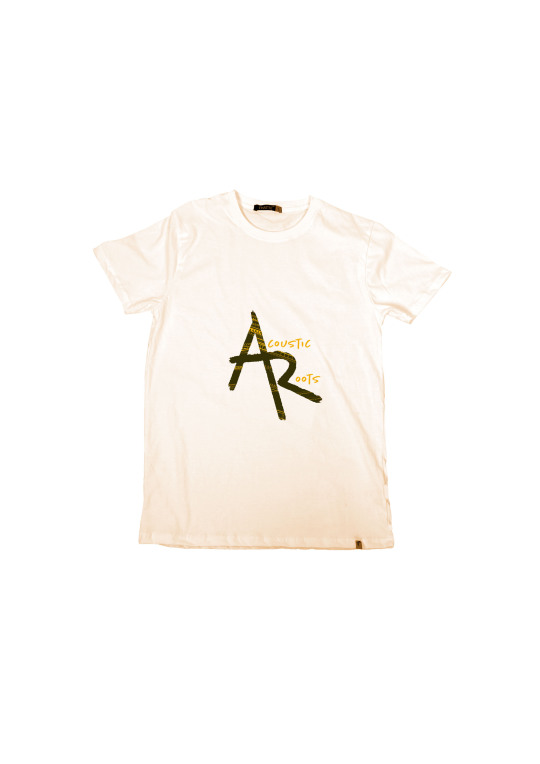
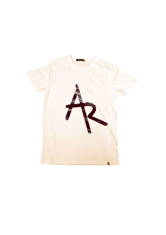
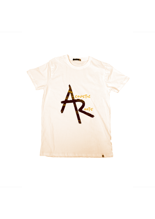
Some simple T-shirt Design I did on Photoshop.
I transferred my different logo iterations onto some T-shirt images
0 notes
Photo
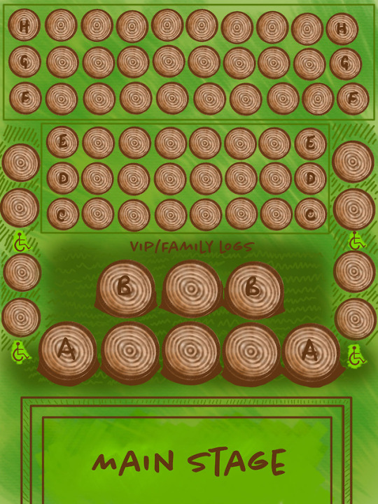
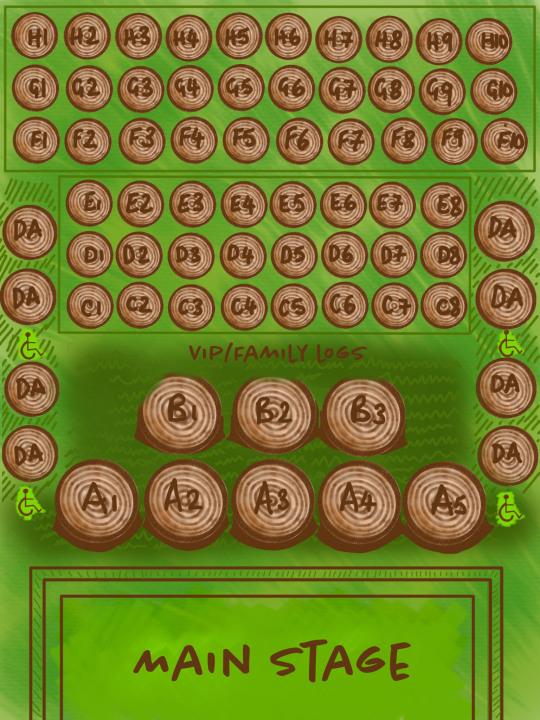
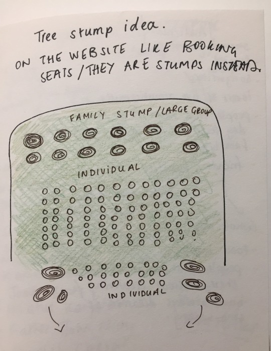
I had the idea that all of the festival goers would be able to book a seat on a website and pre book logs. This would be a similar process to booking theatre or cinema tickets online but with a fun, imaginative twist
0 notes
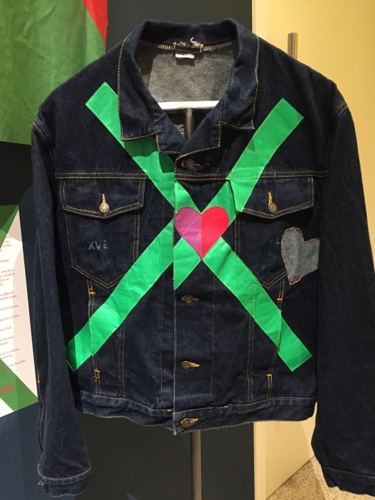
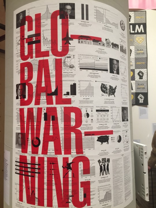
Photo
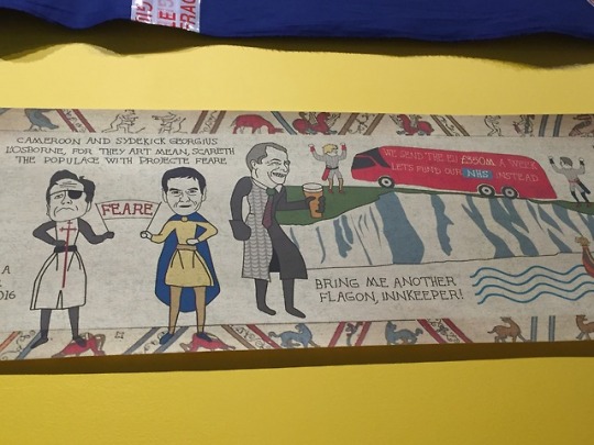
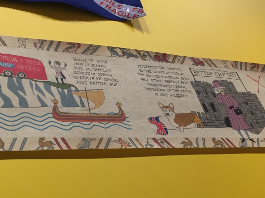
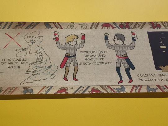
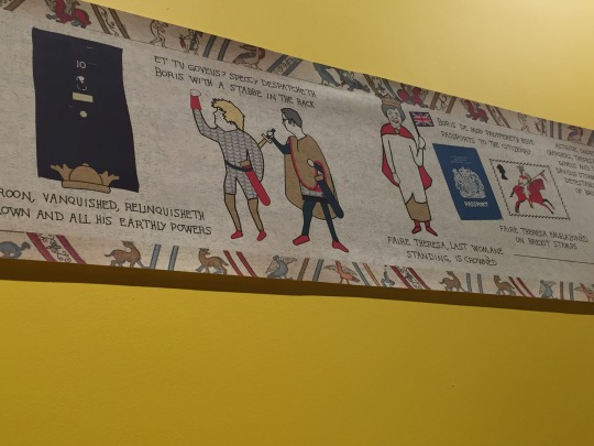
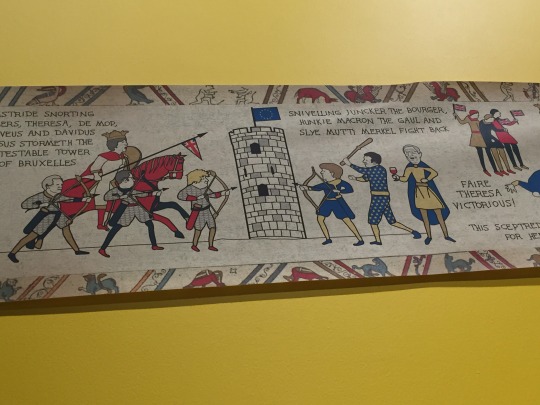
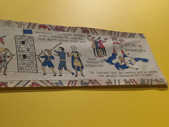
A modern tapestry of our current political situation - Hope to Nope
0 notes
Photo
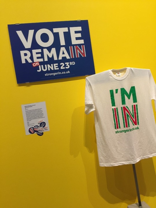
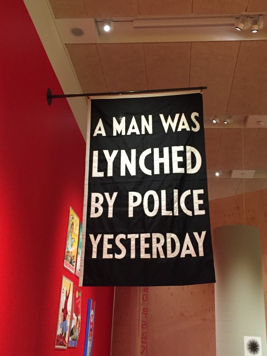

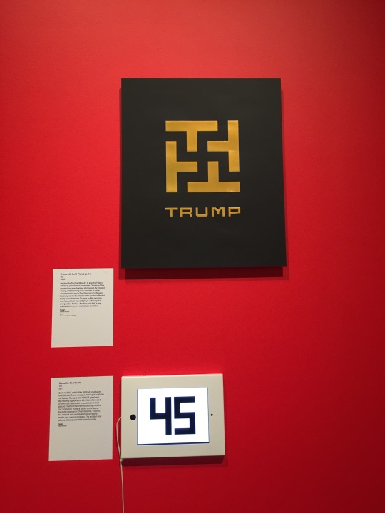
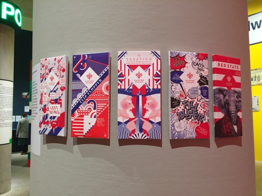
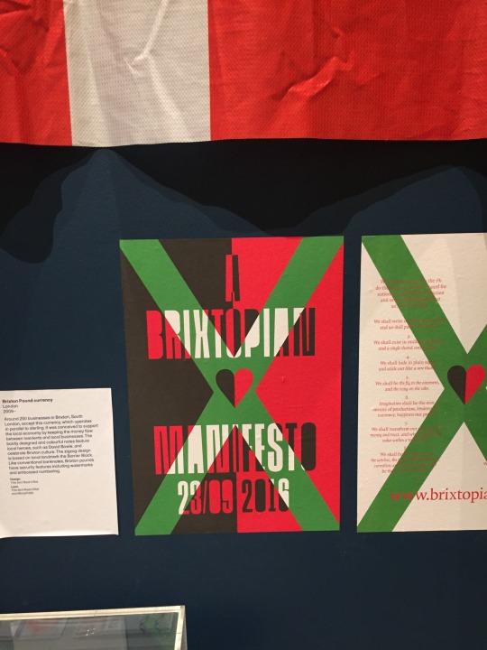
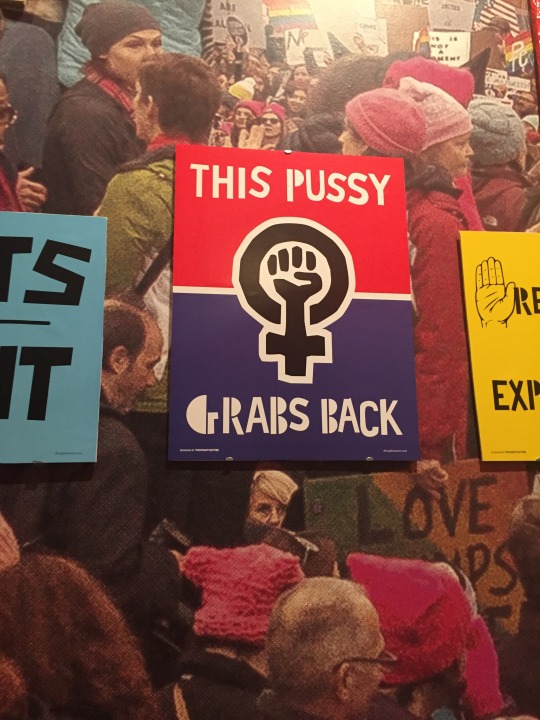
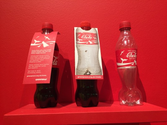
LDN BOUND
our l4 group visited London together to go and see the ‘Hope to Nope’ exhibition in the Design Museum.
‘Public engagement with politics has changed dramatically since 2008. Discover how graphic design and technology have played a pivotal role in dictating and reacting to the major political moments of our times.’
0 notes
Photo
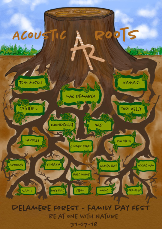
In the end, I decided on this for my final poster. I added text and a date and location. I also decided to add the words “acoustic roots” so that my brand came across clearly
0 notes
Video
tumblr
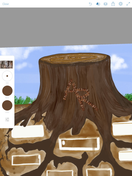
This is a time-lapse of the illustration side to my poster
0 notes
Photo
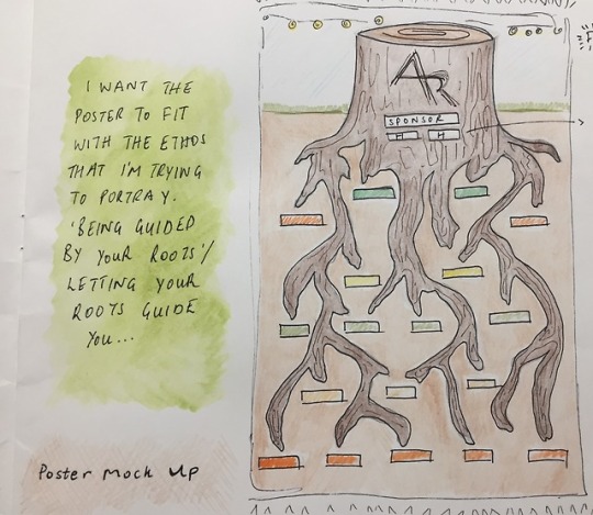
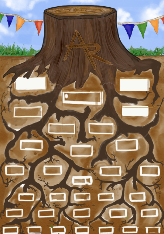
Here are some of the initial ideas that I had with regards to my line up poster. I wanted to play on the idea of roots so decided for each artists name to be placed by root.
0 notes
Photo
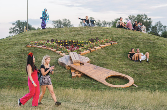
Here is some way finding and map imagery that has inspired me to create a mapping system of my own
0 notes
Video
tumblr
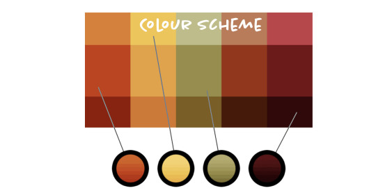
The sorts of colours that I decided to use are based around earthy like shades. The top video is a time lapse of my experimenting with possible colour ideas on Adobe Sketch.
0 notes
Photo
After I decided on the placement of my text and image I then made my logo into a GIF. I used photoshop to do this
0 notes
Photo
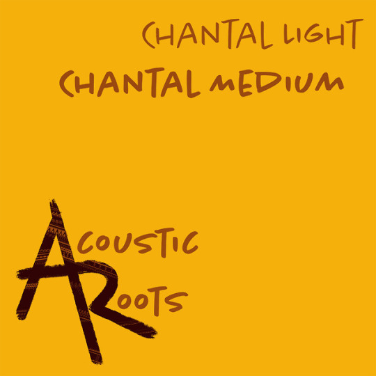
I tried and tested a number of fonts with my logo but in the end decided on a hand written style. I thought that this matched the aesthetic of my AR design well. The font is called Chantal. I downloaded a light weight and medium weight.
0 notes
Photo
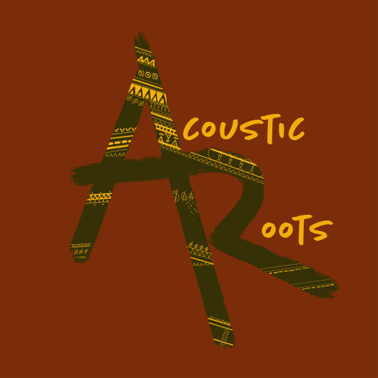
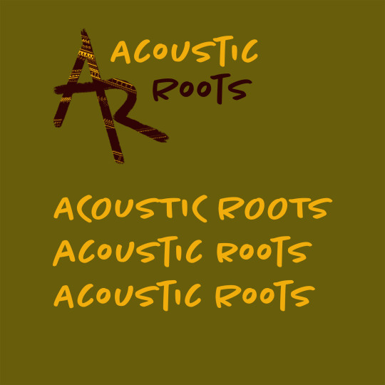
I decided to add some text to further communicate the brand name.
I’m glad that I did this as now I have a variation of my logo with and without text
0 notes
Video
tumblr
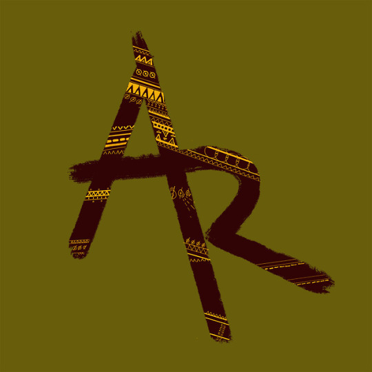
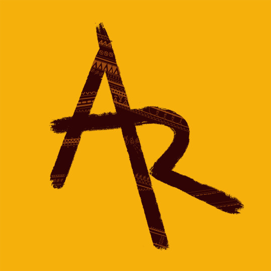
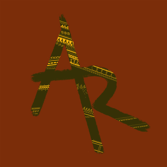
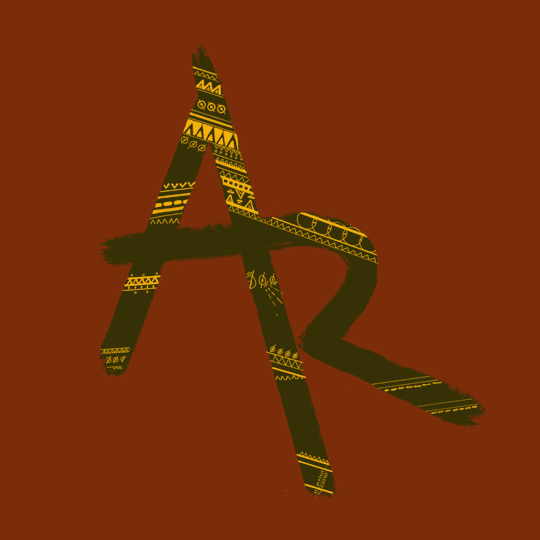
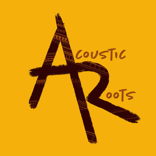
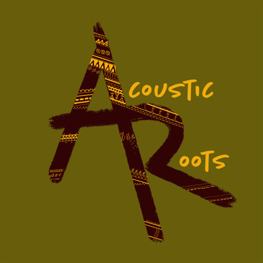
This is the finished Logo that I designed on my iPad.
I wanted to create an inky brush stroke and include a tribal like pattern on top of this. Some of my tribal patterns are inspired by the way finding lanaguage from Lost Village Festival.
Even though my logo was designed in black and white, I can already imagine what it will look like with colour and text added
1 note
·
View note