
Statistics
We looked inside some of the posts by agreyarea and here's what we found interesting.
Average Info
Notes Per Post
1
Likes Per Post
1
Reblog Per Post
0
Reply Per Post
0
Time Between Posts
2 days
Number of Posts By Type
Text
17
Last Seen Tumblr Blogs


Fun Fact
In February 2021, Tumblr had 518.6 million blog accounts.
Text
Photobook (Case Continuation)
Day 3
After the box dried I began to cut out the black book cloth to cover the box.


However, a few problems happened. The typeset was not working properly to emboss over the cloth. So I had to remove the spine and start over. Then I made a new spine and stuck that first onto the book cloth and embossed it. I then began to stick it on the rest of the parts of the bookcase.


After this, all I had left was embossing the front of the case. Again a few problems came up because the book was not passing through the press machine and then I had to use another machine which did not work properly. In the end, I had to hold each font and hammer them to create an emboss. I was not happy with this result.


Overall I am both happy and not happy with the box. As I feel I could have done better if I had more time. But somewhere I am also happy because I was able to create what I envisioned even if it is not perfect
0 notes
Text
Table of Content
(As only 10 links are allowed per post the table of contents section is split into 4 different posts. And to make it more accessible I have split them into sections)
Final Reflection
Photobook
Exhibition | Kunstmatrix
0 notes
Text
Table of Content
(Continuation)
Part 1 - Smile Please?
Part 2 - Through the glass, clearly?
Part 3 - ഇത് തന്നെ ആണ് ഞാന് | THIS IS ME
0 notes
Text
Table of Content
(Continuation)
Concept | Artist Inspiration | Theories | Techniques
Initial Ideas
0 notes
Text
Table of Content
(Continuation)
Lighting Trials
Workshops | Creative Sessions | Skills
0 notes
Text
Photobook (Book Layout + Printing + Case Making)
While searching for a suitable printing service for my photobooks, I was recommended to check out Blurp, an online printing store that specializes in creating high-quality photo books.


Three kinds of books:
Layflat
Hardcover
Softcover
Five different kinds of paper:
LUXURIOUS Mohawk Superfine Eggshell
LUXURIOUS Mohawk ProPhoto Pearll
PREMIUM Lustre
PREMIUM Matte
Standard
Sizing decided - Standard Landscape
After looking at their options I decided to go with:
Hardcover book with PREMIUM Matte paper for Part 1 and Part 3 of the photo book. The premium matte paper would provide a high-quality finish to the images and elevate the overall look and feel of the book.
For Part 2 of the photobook, I decided to go with a softcover book with PREMIUM Matte paper. The soft cover would allow for easier flipping of pages, which was crucial for the flipbook section, and the premium matte paper would ensure consistency in the look and feel of the book.
Template/Layout Design
Initially, I started designing my photobook template on Indesign. However, once I opted to use Blurp for printing my books, I found that their software was a better option. It provided clear instructions and was more user-friendly, which reduced the risk of making errors in the design process, and once you create the book it directly uploads the work onto their website and makes it easier to send for printing. While Blurp did offer plugins for Indesign, I felt more confident using their software for creating the layout.

To maintain consistency among the three photobooks, I opted for a black cover with white writing for each book's cover page. With writing in the first page and last page of each book
Additionally, I added a QR code to the back of each book, which scans my Linktree profile. Although I initially had not included any information on the back cover, I received advice to do so, and later on, I realized the importance of providing additional information about my work to potential readers.
PART 1 + PART 3
Both these books have the same layout
Part 1


Part 3
There are only two distinctions between the books:
The first difference is that the book cover for Part 3 has the title in my mother tongue, Malayalam, on the front, and in English on the back. This is a significant aspect of the project.
The second difference is that the pages of this book are black, so the color contrast is more pronounced and consistent with the theme of this part.


Part 2


Cover Sheet
I designed a cover sheet to go along with the book, which includes a brief description of the whole project and each part. It also contains instructions on how to use the flipbook, so that readers can fully engage.
Photobook (Book Case)
I decided to create a bookcase for my photobooks, which proved to be a time-sensitive task since I could only begin constructing it once my books had arrived. Additionally, I had to coordinate with the technician who could assist me in the process. While this was a challenging experience, I was excited to learn new skills that were useful for the project.
I drew inspiration from various book sets that typically accompany books with multiple parts and wanted to incorporate a similar idea for my photobooks.
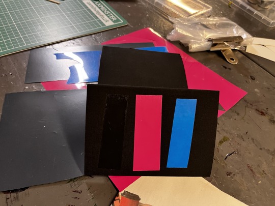
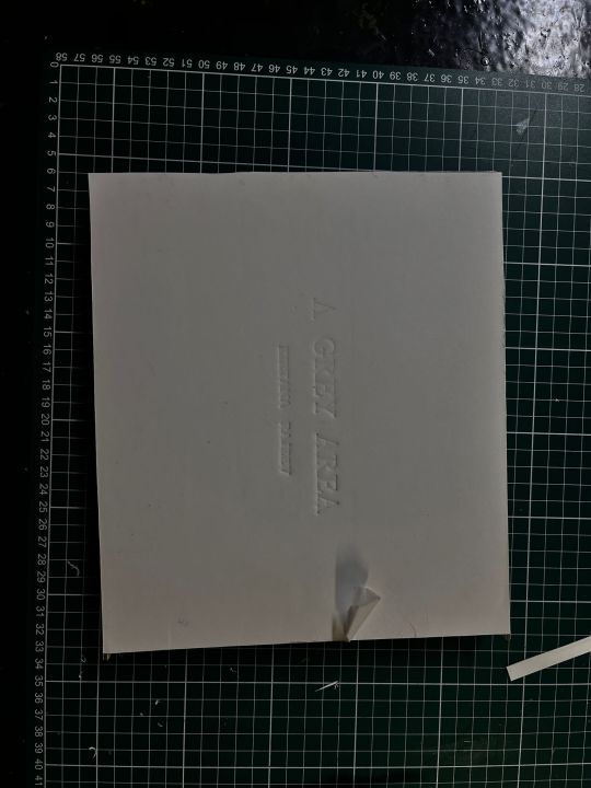
I wanted the bookcase to be black and embossed in front and on the spine of the book.
Day 1
To create the book cover, I began by measuring the photobooks and then cutting the board and paper to the appropriate size, leaving a few millimeters of extra space.
Next, I glued the paper onto the board, applying two different kinds of paper on each side of the board. One of the papers was very thin, while the other was slightly thicker. I had to wait for the glue to dry before proceeding further.
Day 2
And then glueing the paper onto the board each side of the board was glued on with two different kinds of paper. One very thin and one a little thicker. This had to be left to dry.
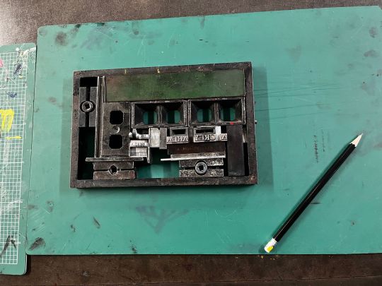
At first, I had intended to laser cut the writing and then emboss it onto the bookcase. Unfortunately, the writing turned out to be too small for laser cutting. As a result, the option of using vinyl was suggested, but I decided against it because I wanted the text to be embossed onto the bookcase.
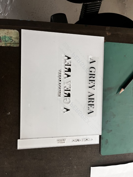
The only option left to achieve my desired outcome was to use the traditional typesetting method. Though it was a fun process, it was also frustrating at times.
First, I had to find the right serif font to maintain consistency with the typeface used in the books. Finding the correct size for each font and letter was time-consuming since there were so many options (not organized)
Making the typesets was like constructing a puzzle or building a car part. It required precision and attention to detail to ensure that everything was correctly placed and remained tight.
Testing the typesets to see if they were positioned correctly or if they were aligned or not
Finally, I embossed the typesets onto the book cover panels, which was a bit scary since there was no time to remake them if anything went wrong. I had to ensure that they were aligned perfectly with my vision.
Typeset for the front
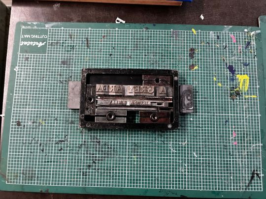
Typeset for the spine
Creating this was much harder as the size of the fonts got smaller it was harder to keep them straight and prevent them from falling.
(Triall embossing to check alignment)
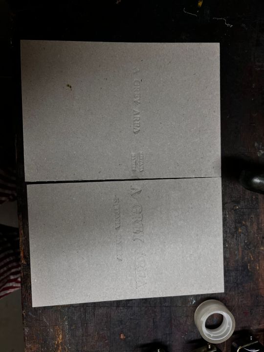
Final Embossed Version
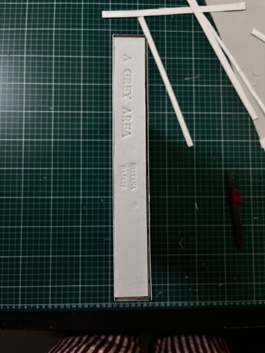
After embossing the panels I started to stick the pieces together. It was a little hard as the panels kept coming off, therefore I had to apply pressure and hold onto one panel for a while before moving to the next.
Left the box to dry before the next step
0 notes
Text
Photobook (Flipbook for Part 2)
How can I represent the video?
Throughout my project, I knew it was crucial to find a way to represent the video aspect in the photobook. It was not sufficient to merely include a few stills from the video; I wanted to capture the essence of the video as a book.
That's when I came up with the idea of presenting the video as a flipbook. I began by selecting various continuous stills from the video, choosing around 50 frames to ensure smooth movement. Before sending the book for printing, I created a miniature flipbook to test the flow and make sure it captured the movement of the video.

After experimenting with the miniature flipbook, I was pleased with how it turned out, and I decided to proceed with using the selected stills in the final photobook. However, during the testing process, I noticed that the book required more space to hold while flipping the pages to make it easier for the reader to engage with the flipbook.
0 notes
Text
Photobook (Initial Ideation)
Ideation:
A book in a book
8 page zine (part 1 + 3) and small flipbook
8 page zine with a Turkish fold on the inside and small flipbook
3 Landscape books with book cover
I've been considering multiple ideas for my photobook, all with the aim of creating a physical representation of my vision that would speak to the person holding the book. I wanted to ensure that my photographs and videos would be presented in a way that does justice to their detail and meaning.
One of the ideas that I had was to create a book within a book. Although it seemed possible, I felt that this approach might not fully capture the essence of my work. As the book progressed from one part to the next, the photographs would become smaller, like a Russian doll, potentially losing the impact of the images. Moreover, I wanted the first and third parts to be similar to keep the exhibition's theme in mind.
Then I considered the 8-page zine. I envisioned each page featuring a single image, opening out into a collage of the 50 images, like a poster. However, I ran into an issue with the slit that would need to run through the collage.
The plan for this style of photobook was so that the singular images would come on each page and open out into the collage of the 50 images like a poster. But there was one problem the slit that would run through the collage.
The second plan with this style was instead of having it open out the center of the book would have an extra page attached as a Turkish fold.

In the end, I decided to go with my final idea. I wanted to ensure that my photobook was a good representation of my work, and I felt that this approach would allow for a better finish that would truly capture the essence of my vision.
0 notes
Text
Journey through theory for my FMP
I remember feeling lost at the beginning of my creative journey. I had a clear idea in my head, but I struggled to articulate it in a way that made sense to others. I had no solid foundation or purpose, except for my deep desire to create honest work and collaborate with people. It became clear to me that I needed to start researching to develop my practice.
However, the sheer amount of information out there made it overwhelming to know where to start. I delved into topics such as subaltern studies, postcolonial feminism, and autoethnography, but none of them seemed to align with the work I wanted to create or the vision I had in mind. That's when I stumbled upon theories on selfhood and social identity.
As my research progressed, I realized that I needed to bring in philosophical theories that fit my personal exploration. It was through this process of trial and error that I was able to establish a strong foundation for my creative practice.
Through my research, which drew on various academic sources such as pragmatic anthropology, social identity, dialogical self-theory, and Buddhist philosophy, I was able to explore the topics of personal practice and the connection between literature and art. This comprehensive exploration laid a solid foundation for my personal practice, which allowed me to create work with intention and purpose.
To deepen my understanding of how personal practice is undertaken by visual artists, I also examined the works of various photographers. Through this process, I aimed to bridge a connection between literature and art and gain further insight into the practical aspects of visual art.
By conducting this research and incorporating its findings into my personal practice, I was able to create work with a clear goal in mind. This approach not only helped me to develop my skills as a visual artist but also allowed me to establish a deeper connection with my work and its intended audience.
0 notes
Text
Part 2 (Editing)
Editing a video for the first time was a learning experience for me. There were several aspects that I needed to understand and apply to achieve my desired outcome. After reviewing multiple footages, I finally settled on one that I was pleased with.
To begin, I trimmed the clip to the desired length. Since I wanted the subject to be the only colored element in the video, I had to use masking techniques to achieve this effect. This proved to be a challenging task as I had to figure out the correct techniques. However, after some trial and error, I was able to successfully mask the subject.
One of the major issues I encountered during the editing process was when people crossed through the subject. This posed a challenge as it affected the mask and required further adjustments.


Although I was satisfied with the overall outcome of the video, I felt that it lacked a certain quality. Specifically, I wanted to incorporate a motion blur effect to enhance the surreal nature of the footage.
To achieve this, I decided to overlay the same clip twice and adjust the opacity to create a dragging motion effect. This technique allowed me to produce the desired surreal effect that I had envisioned. After applying this effect, I felt that the video was now complete and captured the unique quality that I had been striving for.


Despite this setback, I persevered and was ultimately able to produce the video I had envisioned.
0 notes
Text
Kuntsmatrix (Online Exhibtion)
Designing the virtual exhibition using Kuntsmatrix proved to be a challenging and frustrating experience for me. The main difficulty I faced was the size of the rooms, as they were quite large and didn't allow for any changes in the arrangement of placeholders. Additionally, I had to be mindful of the space I used, as I had a videography work that needed to be prominently displayed.
To ensure that the videography work was visible, I had to carefully consider the placement of each exhibit and avoid choosing a room with windows, which could have caused visibility issues. Despite these challenges, I persisted in creating the virtual exhibition and was able to successfully showcase my work through the Kuntsmatrix platform.

After going through multiple different rooms and figuring out the placements for my work, I was finally able to pick a room and create an exhibition I am okay with.
The main problem I felt while using this software was how it was very restricting but at the same time I feel that is a very valuable platform for creators


0 notes
Text
Exhibition (Prints + Note)
Initially, I had planned to print the images for Part 1 and Part 3 separately and then stick them together as a collage. However, I realized that I wanted the collage to have a seamless look, with black running smoothly through the images. As a result, I decided to abandon this idea.
I began to explore various paper options for printing. Initially, I preferred a matte finish, but I learned that it wouldn't be able to achieve the deep black tones that I wanted in many of my images. Only gloss or semi-gloss finishes would be able to deliver the desired result.
After looking at multiple paper options, I narrowed it down to three:
Epsom Premium Lustre/Semigloss 250gsm
Colourbyte Smooth Gloss Photo paper 260gsm
Colourbyte Pro Photo Lustre/satin 260gsm
I then looked at samples of each paper to help me make my final decision. After reviewing the samples, I ultimately decided to print my images on the Colourbyte Pro Photo Lustre/satin 260gsm paper. The paper had a beautiful satin-like texture and wasn't too glossy, allowing for rich deep black tones that complemented the feel of the images.
I selected the A1 print size to ensure that the high quality of the medium format images was accurately represented. With 50 images in each series, it was important that each individual photograph was displayed clearly and in great detail. I felt that a larger print size would allow the viewers to fully appreciate the quality of the images and the attention to detail in each image.


Exhibition Note
Writing the exhibition note and work notes have been difficult to do. As I have so much to say about each project it was hard for me to make them into clear paragraphs. But finally I was able too
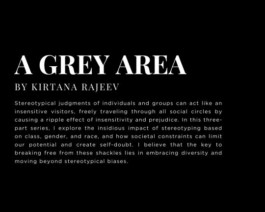
"A Grey Area"
Stereotypical judgments of individuals and groups can act like an insensitive visitors, freely traveling through all social circles by causing a ripple effect of insensitivity and prejudice. In this three-part series, I explore the insidious impact of stereotyping based on class, gender, and race, and how societal constraints can limit our potential and create self-doubt. I believe that the key to breaking free from these shackles lies in embracing diversity and moving beyond stereotypical biases.
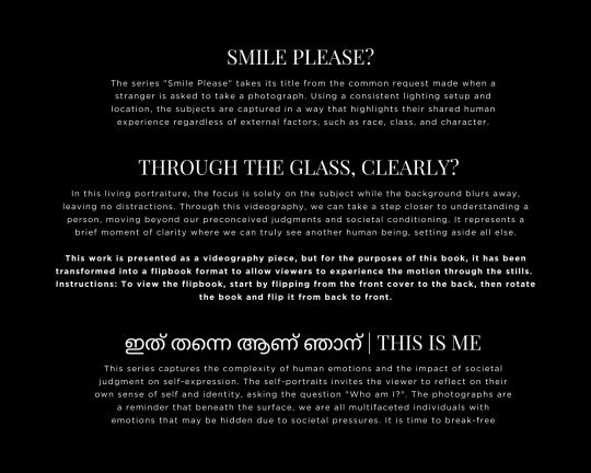
"Smile Please?" (2022-23)
The series "Smile Please" takes its title from the common request made when a stranger is asked to take a photograph. Using a consistent lighting setup and location, the subjects are captured in a way that highlights their shared human experience regardless of external factors, such as race, class, and character.
THROUGH THE GLASS, CLEARLY?
In this living portraiture, the focus is solely on the subject while the background blurs away, leaving no distractions. Through this videography, we can take a step closer to understanding a person, moving beyond our preconceived judgments and societal conditioning. It represents a brief moment of clarity where we can truly see another human being, setting aside all else.
ഇത് തന്നെ ആണ് ഞാന് | THIS IS ME
This series captures the complexity of human emotions and the impact of societal judgment on self-expression. The self-portraits invites the viewer to reflect on their own sense of self and identity, asking the question "Who am I?". The photographs are a reminder that beneath the surface, we are all multifaceted individuals with emotions that may be hidden due to societal pressures. It is time to break-free
0 notes
Text
Project 1 - Smile Please (Continuation)
After doing the trials, I was able to fix on the light and all the other details I would be keeping consistent throughout the series. As all the images had to look alike in terms of light, setting etc. Only difference would be in the subjects
All the portrait's will be taken in the same setting and lit up similarly
Shot in a blackout studio
Using 40-50 different participants including me I will create a collage

Equipment Pentax 645Z + 55m Prime Lens (I loved the output of the images, there was this clarity and smoothness to skin and light that I loved and it worked perfectly in line with my vision) Studio Camera Stand Black Background Bowens 500 Flash Light + Big Octagon Soft-box Camera Settings Aperture: f/5.6 (I wanted a low depth of field only capturing the subject) Shutter: 1/125 ISO: 100 Focal Length: 55mm
The biggest challenge while doing this project was trying to find models, I knew very few people in High Wycombe and I needed to scout as many to hit the mark.
I first had a few shoots here & there, using my contacts and their friends. After that I hit a slump I couldn't get in contact with anyone, I knew no-one and I was lost.
So I created a poster and put it up everywhere and got in touch with the student union as well.

March 29th I was able to wrap up this project and start working on the final part. Editing.....

I shot all the images at the distance because I knew the final Images had to be cropped and equal dimensions.

As for the edit I created a preset which I applied to all the images and according to that made the other changes

After cropping and editing images I started placing them together to see various different layouts.

After placing them one by one I realized that I wanted the images to have a gradient look to it. Placed the images according to the color of clothing they had worn (greyscale).
The deliberate arrangement of the portraits in a gradient based on the tone of the subject's clothing aimed to shift the viewer's focus from external appearances to the unique personalities and characteristics of each individual. This arrangement aimed to promote a sense of unity and diversity, challenging the viewer's preconceived notions about people based on their appearance.

I am thrilled with the final result and how all the images complement each other, creating a sense of unity and coherence that aligns with the aesthetic I was aiming for.
1 note
·
View note
Text
Part 2 (continuation)
I find Chinatown to be a captivating location because of the diverse range of people who visit it. Often, I like to simply sit and observe people, and invariably, I end up capturing some of my favorite moments there.


Focal Length: 50 mm (the focal length at which we see people) Shutter Speed: 1/8 (capture the motion blur) Aperture: f/22 (high depth of field needed) ISO: 800 (the usual ISO for videography)
0 notes
Text
Part 2 - Through the glass, clearly?
From Part 1, we zoom in on one particular individual from the series of images - myself. The subject is placed in the center of a bustling crowd and is in sharp focus while the crowd is intentionally blurred and out of focus. The time-lapse video technique is used to capture the fast-paced movement of everything around the subject, further adding to the busy atmosphere of the scene. Additionally, the subject is highlighted in color while everything else is presented in black and white, drawing attention to the person amidst the chaos of the surroundings.

I was highly inspired by the us of this technique in Chungking Express a film by Wong Kar-wai shot by Christopher Doyle, Andrew Lau. Both cinematographers use the slow-but-fast-motion effect. They use two techniques to achieve this. Step printing and under-cranking, two related techniques, are responsible for the effect. Step printing determines how many frames we see, and under-cranking influences how blurry the motion is.
When I took on this project, I knew that it would be a challenging and unfamiliar experience for me, yet also intriguing. The challenge came from stepping outside my comfort zone and standing amidst a bustling crowd, all while being aware that I was being recorded but needing to act as if nothing out of the ordinary was happening. Additionally, I was testing new equipment and attempting to create a time-lapse video for the first time, which added to the unfamiliarity of the situation.
Equipment:
Sony A7 - 24-70mm Lens + Manfrotto Tripod
I made sure to bring an ND filter along with me, just in case I needed it. However, every day that I went out to shoot, the weather was overcast, providing even lighting throughout the day without any variation in cloud cover. This fortunate circumstance eliminated the need for me to use the ND filter. However, due to the overcast the dynamic range was also less.
When it came to selecting a location for the project, I wanted to choose a place that I was intimately familiar with and where I felt most at ease and content. For me, that place was Chinatown - a location that I frequent often and one that holds a special meaning to me. Despite the crowds of people who visit the area, I am able to find a sense of serenity amidst the chaos, which is why I decided to feature it in the project.


To test the optimal shutter speed, aperture, and ISO for the project, I captured still images of various parts of Chinatown. Through this process, I was able to re,view and determine which frames I wanted to include in the final product.
0 notes
Text
Exhibition Layout
From the beginning, I had a vision that all three parts of my project could be displayed together as an exhibition that tells a story. However, I struggled to effectively convey this idea to others.
I knew that I needed to clarify the purpose behind each part of my project to create a strong narrative. I began to ask myself questions such as: What is the overarching concept? What do I want my work to communicate? How do the different parts relate to each other?
Part 2 played a critical role in connecting Part 1 and Part 3, and I wanted to highlight this in my exhibition. Part 1 consisted of 50 to 52 images, while Part 3 also needed to have a similar quantity to show how every individual has their own unique story and cannot be judged in the same way.
It was during this process that I realized Part 3 needed 50 to 52 self-portraits to mirror the quantity of Part 1. Part 2 would act as the bridge between strangers, challenging preconceived judgments, and allowing individuals to connect and get to know each other on a deeper level. Through this approach, I was able to create a compelling narrative that linked all three parts of my work together.

One of my biggest struggles has been to get the same proportion for all the images for P1 and P3. But finally, I have been able to do it, so it is systematic.
Exhibition Space Planning


0 notes