
Last Seen Blogs

shutterfox5555
ShutterVonFoxen

mindless-unicorns-blog
Mindless Unicorns

perilouswaif
Rudeo Clown

fyshmelkyrecruitment
FYSH AND MELKY RECRUITMENT
Text
Antagelser om 50-åringen…
Notater fra dagens runde (7. april) : Antagelser om 50-åringen
Alle innspill klippet rett ut av chaten. Gruppert for enkelhets skyld.
Husk dette er ikke fakta, men antagelser som dere må ut og kartlegge/undersøke.
Livssituasjon
Barn som flyttat ut - mer tid
Mer tid og penger enn tidligere,
Stabil livssituasjon
Sosiale bånd oppstår gjerne gjennom barnas aktiviteter, skole e.l. - blir kjent med de andre foreldrene
Holdninger og væremåte
Født på 70/60 tallet
ikke så vandt til treningssenter
Kanskje litt trege på nye ting.
De vil gjerne ha øvelser som er kjente
Tidligere liv – forskjellige forutsetninger
Jeg ble spurt om legg på polet i forrige uke:-) 50 is the new 40!
50-årskris - inser att man borde börja träna om man inte gjort det tidigare
Skal være bedre enn naboen - konkurranseinnstinkt
Vill göra något extremt som de kan skryta över på Facebook, typ löpa maraton
FB er viktig og brukes mye. Tar kontakt igjen og følger med på gamle venner.
Sosiale medier(være vellykket)
Liker facebook
Marton med artose :))
dritgod:)
Teknologisk kompetanse
Gjennomsnittlig teknlogi
Teknologiske ferdigheter
Ganske god kontroll på teknologi
Ganske god kontroll på teknologi
lett for og lære seg teknologi men vil kanskje ha det så lett so mulig
Teknologisk kompetanse: avansert teknologi ikke uoverkommelig, men jo enklere jo bedre
Teknologisk forståelse er alt fra veldig bra til veldig dårlig.
Fysiologiske forutsetninger
Avgjørende tidspunkt - Etter 50 mister du 15 % muskelmasse, kolesterol nivået stiger
Fler skador från ett långt arbetsliv
stive og ryggproblemer
Utfordringer med syn
Om man har f eks ryggplager så kan man vara rädd för att träna/bevege sig
Mange kan ha behov for å styrke benmuskulatur for å kunne ha en god opplevelse av f.eks å gå på tur
Artrose i knær
hverdagen blir gradvis tyngre enn før
Overgangsalderen
overgangsalderen
:glad i friluft
De setter pris på trening i form av sport/friluft aktiviteter
0 notes
Photo
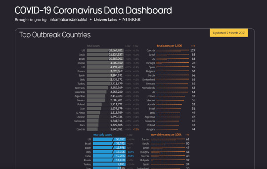
https://informationisbeautiful.net/visualizations/covid-19-coronavirus-infographic-datapack/?fbclid=IwAR31Yt6rahsFq7DOm54oLLcwI1srCqacg4-z4KfKeg1atMH-N8WCNJ_HBJM
0 notes
Video
vimeo
"The Map" (Work & Co x Gary Hustwit, 2020) is a short documentary about a revolutionary redesign of New York City's iconic subway map. Filmmaker Gary Hustwit documents the process as digital agency Work & Co creates a new "live map" — one that updates in real-time — to help New Yorkers and tourists better plan their journeys. The film examines the evolution of wayfinding and user interfaces, and shows how good design and the latest digital technology can simplify one of the world's most complex transit systems. Featuring Felipe Memoria, Rachel Haot, Sarah Meyer, Joshua Gee, Marcela Abbade, Karina Sirqueira, Robert Penner, and Mohan Ramaswamy.
A Film First production in conjunction with Work & Co
Director: Gary Hustwit
Producers: Gary Hustwit & TJ Kearney
Executive Producer for Film First: Jessica Edwards
Director of Photography: Ben Wolf
Editor: Isabel Ponte
Original Score: Danz CM
work.co
hustwit.com
map.mta.info
0 notes
Photo
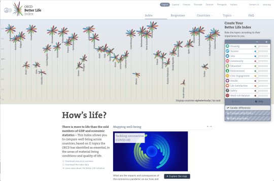
How's life?
There is more to life than the cold numbers of GDP and economic statistics – This Index allows you to compare well-being across countries, based on 11 topics the OECD has identified as essential, in the areas of material living conditions and quality of life.
http://www.oecdbetterlifeindex.org/#/11111111111
0 notes
Photo

Even though all letters seem to be the exact same height, the round shapes are actually slightly bigger. The intersection of the O, for example, with the baseline and cap height is just a single point. While the intersection of the letter E, for example, touches those lines with its full surface. Because both letters are technically the same size, they will seem disproportional. We need to overshoot the O a little in order to make them visually equal.
https://99designs.no/blog/tips/typography-design/
1 note
·
View note
Photo

The secret to any good design lies in the way its visual elements are organized and positioned in relation to each other. This is exactly what layout design is all about.
https://visme.co/blog/layout-design/
0 notes
Photo
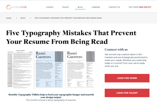
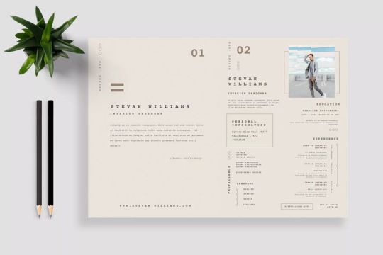
Let your design elements work with each other. For example, if you use dashed lines or rules to separate content blocks, use them sparingly and consistently. Then use squares for bullet points. And other right angled elements to add a little more detail. You can separate your resume from the generic-looking documents with these consistent touches.How your resume is presented is just as important as the content. Design considerations can actually make or break your chance to move towards an interview but don’t let the aspiration to get super creative get in the way in your career path. Keep in mind: balance.
https://www.creativecircle.com/blog/five-resume-typography-mistakes/
1 note
·
View note
Photo

http://www.dear-data.com/theproject
Each week, and for a year, we collected and measured a particular type of data about our lives, used this data to make a drawing on a postcard-sized sheet of paper, and then dropped the postcard in an English “postbox” (Stefanie) or an American “mailbox” (Giorgia)!
0 notes
Video
youtube
Blue Note captured the refined sophistication of jazz during the early 60s, giving it its signature look in the process. Follow Vox Earworm on Facebook for more: http://www.facebook.com/VoxEarworm When asked to visualize what jazz looks like, you might picture bold typography, two tone photography, and minimal graphic design. If you did, you’re recalling the work of a jazz label that single-handedly defined the “look” of jazz music in the 1950s and1960s: Blue Note. Inspired by the ever present Swiss lettering style that defined 20th century graphic design (think Paul Rand), Blue Note captured the refined sophistication of jazz during the early 60s, particularly during the hard bop era, and gave it a definitive visual identity through album covers. Some songs don't just stick in your head, they change the music world forever. Join Estelle Caswell on a musical journey to discover the stories behind your favorite songs. Check out the entire Vox Earworm playlist here: http://bit.ly/2QCwhMH
2 notes
·
View notes
Video
vimeo
Innovasjonspris for universell utforming 2020: Kategorivinner grafisk design
Oslo kommune består av mange virksomheter og tjenester som kommuniserer med mange målgrupper. Med mer enn 250 kommunale logoer var det et behov for å skape én samlende identitet som gjorde kommunikasjonen med innbyggerne lettere. Løsningen er blitt en universelt utformet visuell identitet der Oslo kommune fremstår som én tydelig avsender.
0 notes
Video
youtube
WILLIAM KEMPTON
This project is a part of an ongoing research project at the Oslo School of Architecture and Design. It is also my first attempt at making a gingerbread house. As opposed to making it the traditional way, with a rolling pin and pre-cooked sheets, I decided to to create a custom process with desktop 3D printing tools. Im sure any expert gingerbread house artist will agree that his crafting of gingerbread houses is a skillful art. This tool sets out to complement that great tradition. Thanks to Alexandre Chappell for helping me make this video and the custom extruder hot-end. Pictures and background information available here: https://medium.com/@boneskempton/a-3d... 3D files available here: http://www.thingiverse.com/thing:1961594
0 notes
Photo
https://www.grafill.no/visuelt/vinnere/2020/digital-design/installasjoner-og-spill/interaktiv-installasjon-speisa?fbclid=IwAR0W6knC4u8db8ROdcXANv-lIHb5HVGWryrQWNLrBBl2HjWS-cqM5zyOFRo
0 notes
Video
vimeo
Apropos brukertester
Most phones come with flimsy manuals with complicated language and jargon. These books, which can live on a bookshelf actually contain the phone.
Each page reveals the elements of the phone in the right order, helping the user to set up the sim card, the battery and even slide the case onto the phone.
The second book is the main manual – the phone actually slots into this and becomes the center of attention.
Arrows point to the exact locations the user should press, avoiding confusion and eliminating the feeling of being lost in a menu.
Check out our other work here: special-projects-studio.com/out-of-the-box/
Video: Ninian Doff, niniandoff.com
Music: Plink, Plank, Plunk by Leroy Anderson
0 notes
Link
Norge Rundt, en klassiker tilgjengeliggjort på denne nettsiden. Kan lett forsvinne noen timer her:-)
For turprosjektet er dette et par fine klipp:
https://tv.nrk.no/serie/norge-rundt/PRHO04002506#t=10m02s
https://tv.nrk.no/serie/norge-rundt/FREP41000188#t=08m55s
0 notes
Video
vimeo
HOW TO DESIGN A BOTTLE
When Mothercare approached Daniel Weil for help with a new feeding range, he proposed an unusual solution. In a category dominated by engineering advances, Weil began the project with a study of parenting across the last four decades to find a human context. His research led to discovery, invention and ultimately a new baby bottle design.
Directed by Christian Carlsson
0 notes