
Statistics
We looked inside some of the posts by aisyahscottage and here's what we found interesting.
Average Info
Notes Per Post
0
Likes Per Post
0
Reblog Per Post
0
Reply Per Post
0
Time Between Posts
17 minutes
Number of Posts By Type
Text
17
Last Seen Tumblr Blogs


Fun Fact
The “We are the 99%” Tumblr blog became the slogan for the Occupy Wall Street movement.
Text


Process book printing and binding done ! Thank god all done on time ! :)
Feel kinda sad 😢 that meaning the semester is over..
Thanks to Mark and Jazeey for helping and guide me to make a nice project! 🤩💕
0 notes
Text
Final presentation!

I got a feedback to make it a bit smaller because the object is too big, and i also need to put some descriptions!
0 notes
Text
Some sketch i made for the asset branding

And here is some of the digitalize version


0 notes
Text
This is the final logo i made, i change the name into TranquliTea, the name is come from Tranqulity+Tea. With the meaning a place where you can drink a cup of tea in the tranquility place, having a tranquility time, by yourself or with your loved ones.
I named it TranquliTea instead TranquiliTea for the pronunciation.

0 notes
Text
I tried to digitize some of the sketch and here is the results

Actually I'm planning to use this one logo but in the studio day i got feed back that pot is actually meaning weed 😀 I didn't now that LOL, so yeah i need to change the name.

And also for the logo the most suitable one is this one. But yeah this got refrences from teapot and leaf but i need to make it more clear so i change the shape into cup
0 notes
Text
I made some sketches for the logo. As for the visual I took it from key visual I made.

0 notes
Text
Moodboard/refrences

Narrative
In busy city life, where people is exthaused with their works life, where people need to charges themselves by talking and having a heart warming chat with each other, where people need to take care of themselves, their mental health, they inner peace, where people need to get away with all their busy life. a green space, where people can meet each other, feel themselves, and embrace the nature, this is a brand that offer that kind of services. a brand that have an outdoor traditional tea spot where people can sit on the warm and comfy cushion, surrounded by nature, and some pond with relaxing sounds of flowing water.
Why Nature and Tea?
as from research human and nature share 97% atoms in common, and share a lot of simliarity with nature (example : human body elements contain hydrogen, oxygen, carbon, nitrogent, and water.) that’s why when we’re in nature we could feel some connection and we could feel like we are embracing the universe. and nature is an antidote for stress. it can lower blood pressure and stress hormon levels, reduce nervous and system function, increase self esteem, reduce anxiety, and improve mood. as for tea, tea contain the amino acid L theanine which promote relaxation. it’s promote sense of mindfull alertness and can lowers levels of stress hormone. and more than that, every tea has their own function. for example herbal tea can reduce stress and anxiety. also you can come and have a good time with your fams, friends and have a chit chat or come alone and embracing nature!
Why Traditional Vibes?
so you can forget all the modern busy city life, and focus with your people, your self, and the nature

0 notes
Text
The 3rd project is 15 Minutes City. We need to make a brand with the services or product within 15 min city. I did some research and brainstorming for my idea.
Proposition : a place where people can
meet, relax, and have a ‘me time’
brainstorm :
age from 24-55, male, female, all welcome, economy low to
middle, single to big and small fams, workers in busy city, all
citienship.

USP : Outdoor traditional tea spot where you can
meet people, feel yourself, and relax in nature.
Key Words/Personality : Togetherness, self love, Relax.
Target audiences :
Demographics : age from 21-23 male, female, all welcome, economy low to
middle, single to big and small fams, workers in busy city, all
citienship.
Psychographic: Extroverts, introverts all welcome, stressfull feeling from works,
inferiority, anxiety, mixed feeling, nature lovers, tea lovers, prefers
healthy drinks.
Geographics : busy city with limited green space
key visual :

0 notes

Text
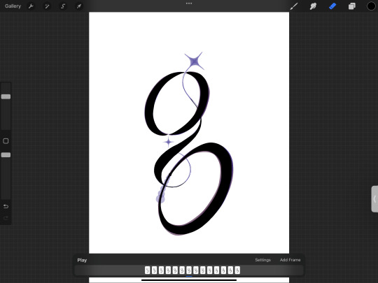
For the student letter I got assigned to make letter g, and here’s the sketch


I tried digitise my font

I made the gift on the Procreate

0 notes
Text
Here are my poster and instagram asset revision I didn’t change much on poster, and as for the instagram asset a change quite a lot.
It was two carousel with 4 slides each, I change it to one carousel with 6 slides. That’s also because I realised that I’m too focus looking for image that will likely make my slides look nice but it’s make the focus point change to the image instead of my font. So I tried to not use any image and try to be more creative.


0 notes
Text
After some feedback, revision, and development!! Here is my final font! ✨ Glints Serif ✨

This one is for the beautiful/glyphs version

This last one is the lowercase

0 notes

Text
This the behind the scene of S.. I tried to flip it, rotate it, to analyze the anatomy of S.
I tried to make the S several times and.. it's so frustrating 😂 itssss soooo harddddd but it is fun. I love this project :)
But thank God after trial and error 😂 i made it nicely and I'm satisfied with the results!

This is the development of the S and the final

0 notes
Text
Today is presentation day!
Here are my works so far.. to be honest i didn't like them : D i like the poster and the fonts because i tried my best so i like to appreciate myself hehe.. but for the Instagram asset.. I don't really like em since i kinda rushed and like .. don't really try my all on em.. so yeah i don't like them.

This one ks the outline, so you can really see their anatomy.. Thi it's really are messy.

Poster & Instagram asset..


My font name is Glints Serif ✨ because i want it to shine the brands or the typography people made. And yeah of course because of their sparkling accents.

I made the poster in black and white so my fonts will looks contrast and look more shining 🌟. And for the corner i put the highlight/the unique parts of my font! So when people take a look at the poster they'll notice the unique parts first then will get interested (hopefully) with the font. I also use a little purple because purple is represented as elegant.
As for the first Instagram asset, i tried to show some of the DNA for Glints serif (that's also count as USP) and also show the type and the type in ghlyps mode/beautiful version.
As for the second asset i tried to show them in all different way of use. Like for the branding, in the gradient, and even for the food with contrast color.
Here are the feedback for my fonts ✨
For the poster it seems that the elegance is true but the stylist and attractive is subjective and it is! :D... And the sparkles on the poster (the one that not the parts of my fonts) is distracting so gonna throw em.
For the fonts Q and J have the same serif's DNA, it looks nice on Q but not on J so gonna revise the J.
The S corner is nice so better try to make that as the serif's DNA like for C and G.
The i dots its too far. The lowa cas it's not working! Better to just use the uppercase.
For the Instagram asset
Don't need to make them all have beautiful version. Just some of it is perfectly fine.
Dont need to make the caption for it (like regular versions/ghlyps version)
Be more playful with the in action, try different way to use em.
For the gradient one it's too much, better to try to use the color in the picture.
For the fashion one, don't make it like copying Vogue, try different way to use it.
The sushi one is.. it's typo 😂 joke aside, the image is too much that they'll focused more to the image rather than the font. Don't use the image too big. And yeah for the food, the lower case is work.
Also i need to be more careful for the display. Don't export it as pixel bc it's look a bit blurry. And be careful with the printing bc i printed them with the wrong size.. my bad.. also for the cutting.. there's still white paper left, be careful and be more beat next time !
0 notes
Text
Today is the studio day! This are my one night revision.. i put all nighter because i want to ask a lottt of feedback for my font and make improvements! And anyway, i did some research for type anatomy from this one poster!

I also did an analyze with Times New Roman and Bodoni because i think they're the nost famous and kinda similar w my font. I analyze how their DNA works and what fonts share the exact same DNA. Also analyzing them for the anatomy like the cap height, ascender high, etc. and from that i learn that A, C, R,Q,V,U, S and all other fonts that have basic shape like triangle and circle have a different cap height. But i wonder why.. can't we like make it with the same height..??
Anyways! This is my one night revision so far..

Here is the DNA of A since lotta other Fonts DNA using A's DNA

I'm glad Fred said it's improved a lot. He even keeps asking me am i sure I'm not copying it somewhere.. well such an insulting compliment! (Just kidding i know he means no harm)
I got several feedback such as; make the J simpler. Because it seems that I'm doing too much on the J. He likes how the M it's connected and advice me to be playful with that like trying to make the connection for the H and A too.
Also for the G, C, D i need to make the body more curved.
I ask him about the cap height difference for some of the fonts. He said that is because when the rectangle, triangle, and circle are made with the same cap height size it will make the circle and triangle smaller. So as for our eyes look at them with the same size, we need to make them slightly bigger.
I also ask him how to make S since it's really hard for me.
And he said i can try to make a 50:50 of the S then try to unite them together and adjust a bit to make nice S. Let's try! Hopes that's work.

0 notes
Text
Today we have a pin up and presentation for our fonts. I have some feedback and revision.
As for i prefer "the more the merrier" more than "less is more" i got like too many decorations or meaningless accents on most of my fonts.
Like for the snail one i got feedback that the circle is distracting so better to throw em away. And as for the tangerine they said they like it, and even the "m" if it rotated 45° to the right it will make an "g". Because i use the same DNA it's easier to make other fonts with just all the font's DNA i have.
I got lotta feedback for the serif because it seems that i need to explore and make it as my project.
The diamond makes an uncomfortable repetition, will be much better if just some of em have the diamond. Like for the dot on I or the corner in fonts (like corner of T). I could try to make the diamond as their serif.
I need to be more playful with the serif and like try some experiments.
Be careful with the fonts anatomy such as they're high cross and low cross like the line for AGHFERP etc.
And yeahhh i got some other feedback but mostly i have write the crucial one.

0 notes