
Don't wanna be here? Send us removal request.
Statistics
We looked inside some of the posts by alannahwendt and here's what we found interesting.
Average Info
Notes Per Post
10K
Likes Per Post
7K
Reblog Per Post
3K
Reply Per Post
7
Time Between Posts
3 minutes
Number of Posts By Type
Text
12
Photo
5
Last Seen Tumblr Blogs


Fun Fact
Tumblr Inc. is using 66 technologies for its website.
Text
Final reflection
I’ve really enjoyed my first semester of communication design studies. I think that out of all my classes, the assignments and activities in this course have been the most interesting and engaging. I didn’t really know what to expect from my courses when it came to the workload and activities, so I was pleasantly surprised that most of the assignments were creative.
What I’ve enjoyed most:
I’ve really enjoyed the freedom that this course has given us. Compared to high school, it’s a lot more freeing in what we can create. I love how we are given broad options with the mediums we can work in. I know that my strong points are hand drawing, so it’s awesome that I can still create my assignments based around my skill sets.
What I’ve learned to improve on for next semester:
I will definitely admit I have not been organised at all this semester. I slightly feel like I’ve let myself down, and looking back at some of my work I really wish I put a bit more time and effort into some aspects. It’s been really challenging studying from home, and I’ve been feeling very unmotivated to do anything. Next semester I’ll be planning my time and assessments better, researching deeper into lecture topics and involving myself more in class activities.
With all that said, this semester has been really exciting despite everything that is happening in the world around us. I can’t wait to organise myself better and look forward to learning even more about design next semester.


I thought I’d also throw in a few cute photos of my new puppy, Blue! He has really helped cheer me up in these lonely times! I hope you enjoy his cuteness as much as I do.
Bye for now! :)
8 notes
·
View notes
Text
Five ordinary questions for Banksy
Ask me anything final assessment


‘Five ordinary questions for Banksy’
I chose this title because it fit in with my overall idea of Banksy being interviewed by a boring, average interviewer. This is also why I chose to use the basic font of Arial regular for the questions, title and blurb, as Arial isn’t really anything unique or exciting compared to Banksy’s typefaces. Banksy’s answers on the other hand show how creative and versatile he is.
Overall, I’m very happy with my final zine. I think that the colour theme of red, black and white really compliments Banksy’s style, along with the recreations of his artworks and typography. The only thing I’m a bit unhappy with is the small white border that cut off some parts of the artwork. I did try to remove the border, but because the artwork was cut off in some places, especially where the rat is holding the sign saying “rats”, it looks really odd because it wouldn’t line up. So I decided to leave the white borders on all the pages, because it actually fits in with the design and adds a bit of space to the pages.
0 notes
Text
Loving these poster designs. I haven’t seen many people’s image & identity work so I think it’s great that this was posted here! The imagery and colours are eye-catching, and the words are short but have great impact. This was a great topic choice to convey such an important message.
Image & Identity Project: Racism
Because of the current events that is happening in the world right now, I would like to share my work in Image & Identity as I chose my topic issue to be Racism in Australia. I know that this is not only happening in Australia but for project-purposes, it was best to be specific with my audience.
We were to do a profile of our chosen issue and create a design artefact of some sort for it, and I did a series of posters advertising a campaign called #StopRacism to increase awareness that it’s still happening which is affecting TOO many lives.


#BlackLivesMatter. Enough is enough. Let’s all help and change the world. Educate yourselves, educate someone. The internet is filled with resources, donate, sign a petition. We can make a change, little or big, one at a time.
5 notes
·
View notes
Text
Zine development
I’ve decided to hand draw around 95% of my zine, as it’s the easiest way to illustrate the images and typography in Bansky’s style. The 5% that I haven’t illustrated will be the questions themselves, part of the front cover and the blurb, which I am planning to add in indesign after I’ve scanned in the final pages. I’m quite happy with how it has progressed, as it’s starting to get the handmade aesthetic I was going for. All the imagery I have chosen also relates to Banksy work, and the typography I chose to use has been used in various Banksy works. The only problem I’ve really had is that the posca paint markers have made the black paper ball up, but I’m hoping I can fix this in photoshop if needed.


I really like the look of my zine as it is now, and I’m really wishing we were still handing in hard copies so I could hand it in as it is! Anyway, I’ll be putting all these drawings into indesign once I get them scanned. I’m hoping that converting it all to digital format won’t take away from the hand-made aesthetic that it has right now.
0 notes
Photo
A few of Banksy’s recent works during this current pandemic!


Banksy, the mysterious street artist known for his worldwide public art exhibits, is working from his bathroom during the COVID-19 pandemic. He published these photos to Instagram on April 15 with the caption, ‘My wife hates when I work from home.’
follow @nowthisnews for daily news videos & more
626 notes
·
View notes
Photo
I love the aesthetic of this zine and the way everything has been cut out and scanned into one image! This could be a good idea for my Banksy zine.


A queerzine about the Dutch ballroom scene - available to buy from British zine distro, Pen Fight.
17 notes
·
View notes
Text
https://thispersondoesnotexist.com/


In this weeks lecture we were briefly introduced to “thispersondoesnotexist.com”, where a photograph of a person is generated using artificial intelligence. The people in these photographs don’t actually exist! I found this really unsettling for some reason, maybe it’s because of the way the people are looking at the camera and the thought of them not being actual people kinda freaks me out. Also let’s ignore the creepy squashed face in the third photo because once I saw that I had to get off the website!!!
Creepiness aside - this website really shows how much technology has progressed, and how what you see can still be deceiving no matter how real it looks. This is the same with deep fakes, where artificial intelligence is used to replace faces and audio in videos, and can lead towards the spreading of fake news, having reallydetrimental effects.
0 notes
Text
Finalising ‘Ask me anything!’ Questions...

My final five questions to Banksy:
How would you define ‘art’?
Are you an individual or a collective?
What is your message?
What is your favourite animal and why?
Where do you see yourself 10 years from now?
I’m happy with these five final questions, as they leave room to explore various aspects of Banksy’s work. I will most likely keep them in this order throughout the zine too, as it flows from an opening question to an ending question.
0 notes
Text
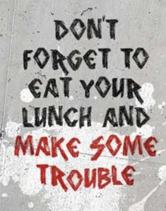
I found this really inspiring :) It’s been really difficult for me studying from home and it’s always good to be calm and not feel overwhelmed. I love this short little list, and relate to quite a number of points.
Made a wallpaper for my everyday reminder. Words are from “Peter Fischli and David Weiss: How to Work Better” that was discussed in this week’s lecture.

Image source: https://pin.it/6YS746n
7 notes
·
View notes
Photo
This is so awesome! I wish I had magazines to chop up but I just moved houses and own zero magazines or catalogues :( I really love the black and white image of David Bowie, and how the colours in everything else pops out against the image.

Week 9 Tutorial Collage (or week 10 I’ve lost track after the mid-sem break split 2 weeks into one)
I thought I would post all the images that are my own in one post, and summarise some research and class notes in another post, to try and avoid making so many mammoth posts
So, as a quick overview of the activity, we were asked to make a collage, either digital or physical, in reference to collage art & Détournement (which I will explain more in the next post)
I began by cutting out images that I just thought were quirky and fun, without thinking about it too much, then separated my images across my desk in ‘groups’ like people, body parks, skeletons etc before quickly deciding a layout.

I decided to segment David Bowie’s head and place inside some colourful and weird faces and body parts, emulating what I think is Bowie’s weird and obscure persona. I like how I unintentionally created a nice colour harmony with black and white images and then warmer pink and yellow tones.
After class I quickly made another little reflection collage with some leftover images (I didn’t get a scissor dint in my thumb to not use all the images I cut out!)

* Images used taken from 4 issues of ‘Zen’ Magazine *
I really enjoyed this activity, and I think I might try creating a digital collage, or even a digital version of my physical collage.
15 notes
·
View notes
Text
Pruitt igoe doco

Today I watched the Pruitt igoe documentary as I had a bit of spare time. The front image of the documentary really intrigued me, as I’ve always been really into abandoned buildings for some reason, and I always want to know what failed. I was also unsure how this documentary related to design, so I wanted to know more.
After watching the documentary, it was clear that the negligence of the government contributed to the downfall of Pruitt-igoe less than 20 years after it was constructed. The area became known for its high crime rate, drugs, prostitution and daily shootings.
Designed by Minoru Yamasaki and George Hellmuth in 1951, Pruitt-igoe was a mini city, housing 10,000 people in its 33 buildings. It was a racially segregated, middle-class complex, which deteriorated year after year due to a lack of maintenance and funding.
Image source: https://www.atlasobscura.com/articles/pruitt-igoe
1 note
·
View note
Text
Zine research
‘Astigmatism and other forms of disfunction’
I really love the aesthetic of this zine and the blocky colours that they’ve used. It really reminds me of when I learned to screen print, and print with Lino in Art. I would love to try printing my zine with lino and inks, but after researching the prices of some of the inks, I don’t think I’d be able to :( I might use a combination of posca pens, markers and paints in my final zine to give it a nice handmade feel.


(Source: https://www.behance.net/gallery/80822409/Astigmatism-and-Other-Forms-of-Disfunction)
Unknown title:
I really like the aesthetic of these pages. Some of them give off a real Banksy vibe with the phrases and imagery. Unfortunately I could find the name or source as I just found it on Pinterest and the link leads to a website full of photos. I’d like to experiment with similar layouts of images and type in my own zine.

https://bureauborsche.com/
0 notes
Text
Zine idea generation
Even though we are digitally creating our zines, I’m aiming to create the feel of a good ol’ handmade zine. A zine that has smudges, cut-outs, slight tears and crinkles. I’m hoping to do this through drawing most, if not all of my imagery by hand with inks, markers and paints and then scanning it in. I want it to almost feel like Banksy crafted the zine, and I just asked the questions.
How I am envisioning my zine:
Lots of hand drawn imagery mimicking the style of Banksy’s artwork, along with handwriting in the various styles of Banksy’s works.
Dreary colours. The theme for my zine is “dismal”. Many of Banksy’s works are black and white stencilling on drab buildings - so I would like to replicate this theme throughout my zine.
I’d like to somehow connect the front page to the back, so that when the zine is flattened out it becomes one image.

I’ve also been watching a few videos/documentaries on Banksy’s “Dismaland bemusement park”, which was a pop-up exhibition Banksy created in England in 2015. Even though it looks super depressing, I’ve found this exhibition super interesting to look into. Each attraction/artwork at the park is dismal and hides a darker meaning. As someone who grew up watching countless Disney movies, I find this really creative and intriguing. Researching into this exhibition has definitely helped set the tone to what I want my Banksy zine to feel like.
Image source: https://youtu.be/_nY9nWHP5Bs
1 note
·
View note
Photo
I really like all the colours used in this and the way the letters have been formed with triangles. I think the U really stands out, as it has a really nice sense of balance.
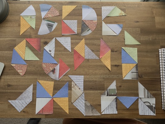
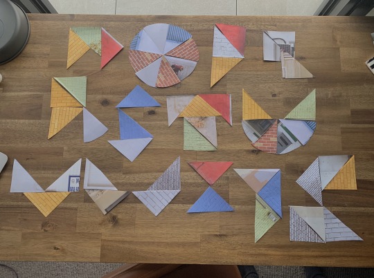
SHAPESHIFTERS ACTIVITY
I decided to do one of the workshop activities today during my image and identity tutorial class. I’ve found that doing a semi-mindless jobs while my teachers are talking in online class helps me to stay sane, it can get a bit tedious if I am just sat at my desk doing nothing.
I couldn’t find any coloured paper so I used pages out of an old scrapbook style notebook, but I think it came out pretty good, i even unintentionally stuck to bauhaus inspired colours.
I tried constructing the alphabet from the triangles and slices, I was more successful with some letters and kinda failed with others. I found it hard to try and stick to the bauhaus inspired style, like for example the letter R and F are too pointed and unreadable in my opinion. I think I, K, O and U resemble the Bauhaus aesthetic because 1) they are readable and 2) they have a good balance of pointed and curved edges.
I really liked doing this exercise and am gonna try complete some of the older workshops in the coming weeks. It took me back to the start of the course when we made the alphabet from everyday objects in one of the first tutorial classes.
9 notes
·
View notes
Text
‘Ask me anything’ one on one
I briefly pitched my five ideas to Bailey in our one on one session and told her that I’m really leaning towards Banksy as my ‘ask me anything’ topic. We briefly discussed Banksy’s historical significance as he is still alive and still creating. She did agree and said that Banksy had been a topic of discussion between the tutors and it was hard to decide on, but that he has had a significant impact. Another student had also given me the idea of focussing my topic on London street art instead of Banksy specifically. I did a bit more research into this and found a few other significant artists in London, but I was really stuck on Banksy and decided to continue my exploration into his work and style.
Banksy
Further research into my chosen “Ask me anything!” subject
The image below is one of Banksy’s most recent artworks, depicting a child playing with a toy nurse - depicting her as a heroic figure. Banksy often creates his works around important and controversial topics that are occurring in the world, and this COVID-19 themed image is a clear example of that.
Image source: https://www.bbc.com/news/entertainment-arts-52556544

The various typefaces of Banksy:


I want to include a variety of typefaces throughout my zine which will all connect back to Banksy’s artworks. The images above are just a small sample of some of the styles of type he has used - from New York style, to stenciling. Each typeface helps convey a different feeling, and I’m hoping to use a number of them throughout my zine to compliment each of his answers.
All images sourced from: https://www.canvasartrocks.com/blogs/posts/70529347-121-amazing-banksy-graffiti-artworks-with-locations
0 notes
Text
“Ask me anything!” brainstorming
After some quick brainstorming and research, I narrowed down my options to my top five possible subjects for brief 2:
Conceptual art
Pop art
Montserrat typeface
Comic sans typeface
Banksy
I’m leaning more towards Banksy, but I’m confident in my list and will keep the other ideas as back up just in case I get stuck with Banksy.

A picture of my very plain, useless brainstorm (I just wanted to play around in procreate). Once I thought of Banksy I knew I wanted to focus on his work as I’ve always been interested in his style and would love to explore it some more.
0 notes
Photo
Linking to this weeks lecture (week 7) - I love these little illustrations depicting the Bauhaus school of design. The images are exactly what I’d image the classrooms of bauhaus to look like.
Bauhaus had great influence towards modernism and still greatly influences many aspects of design to this day.
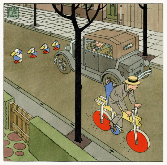
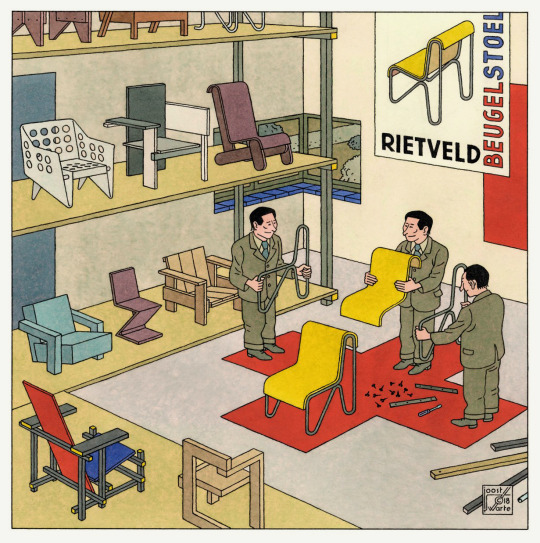
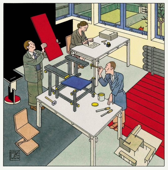
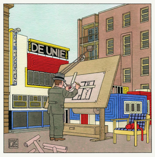

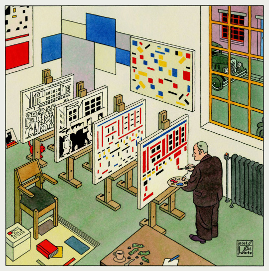

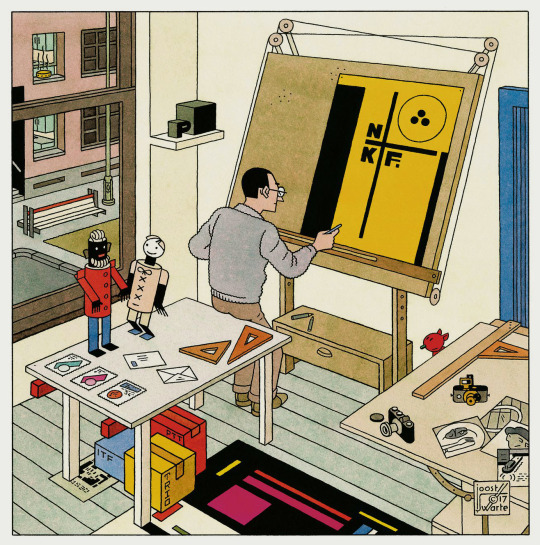
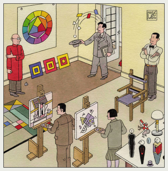
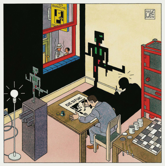
Joost Swarte - De Stijl art movement
9K notes
·
View notes