
At NWK college studying Motion graphics and animation.
Don't wanna be here? Send us removal request.
Statistics
We looked inside some of the posts by alexridgleymga-blog and here's what we found interesting.
Average Info
Notes Per Post
3K
Likes Per Post
1K
Reblog Per Post
1K
Reply Per Post
3
Time Between Posts
11 days
Number of Posts By Type
Photo
4
Text
7
Video
1
Link
5
Last Seen Tumblr Blogs


Fun Fact
The “We are the 99%” Tumblr blog became the slogan for the Occupy Wall Street movement.
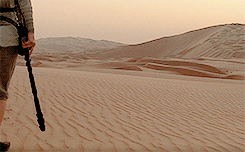
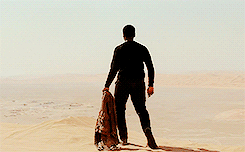
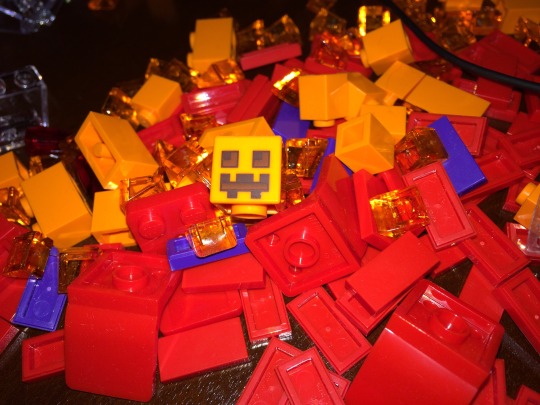
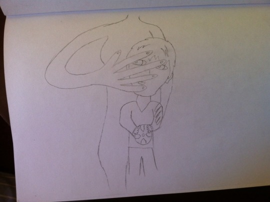
Photo
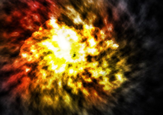
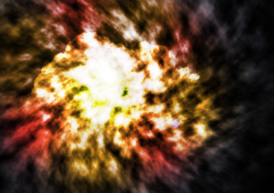
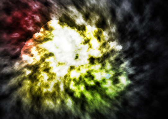
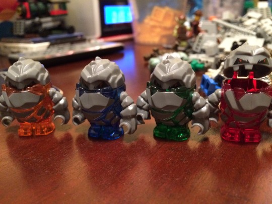
Just 3 ideas of what the Galaxy will look like for Iron trills, the 2d-3d anime series.
#star wars#Space#Stars#Colour#Colours#Red#Yellow#Green#Orange#Grey#Cloud#Dark#Glow#Detail#Wonderful#Lenze#Lenze flare#SciFi#Story#narative#Plot#Characters#Home#Sky#Background#Conflict#Battle#Strange#Mystery#Photo
3 notes
·
View notes
Text
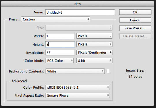
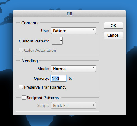
MGA Tutorial: Creating a monitor scan-line effect in photoshop
Making a convincing screen display can sometimes need more than simply applying a texture onto a screen. In some cases you may need to apply a scan-line effect to a texture to imitate certain computer screens, mostly older ones where this effect was more noticeable.

To begin, create a new photoshop file with a width of 1 pixel and a height of whatever you want, the height will determine how big the lines will appear. Since this is a very large image I will be using a height of 8 pixels.
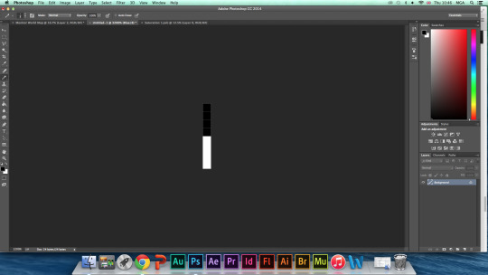
Next you need to use the pencil tool to colour half of the pixels black.
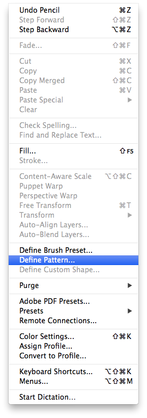
From here you now go to the “Edit” dropdown menu at the top left. Select Define Pattern.
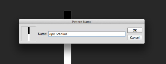
Name the pattern and press OK.
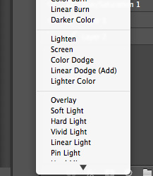
Now return to the image you want to add the effect to and open the fill dialogue box and use these settings. (From here you can change blending mode from normal to overlay to save time.)
If you haven’t already, change the blending option from normal to overlay.
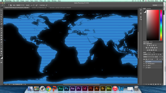
And it’s done. You may not notice it in this image due to its size but the effect is quite useful.
575 notes
·
View notes
Photo
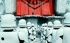


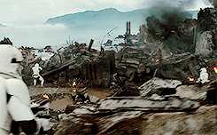
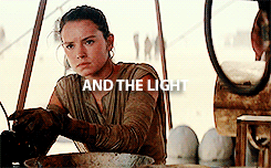

There has been an awakening… have you felt it? The dark side and the light.
2K notes
·
View notes
Photo
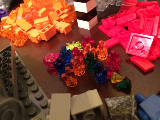
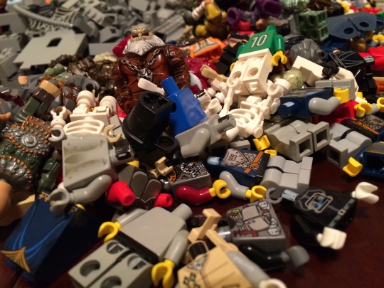
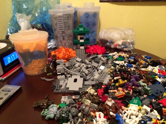
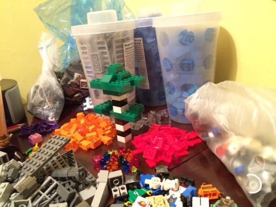
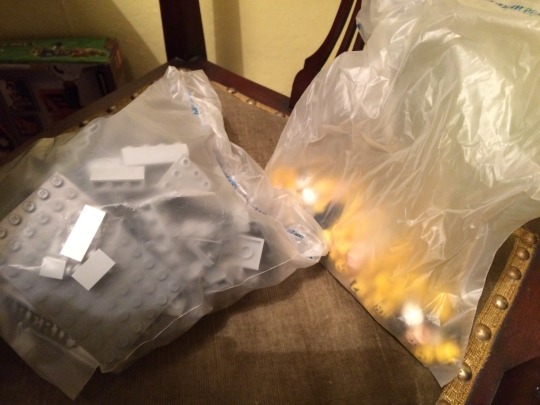
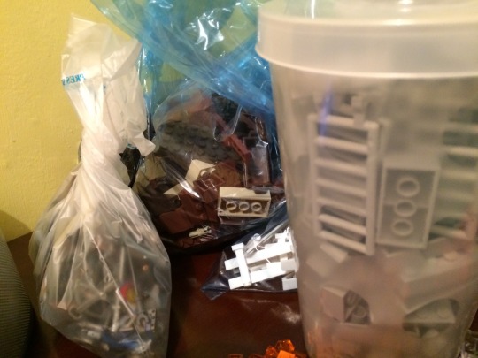
You would think I was ready for my stop motion project. But this is only half of what I need.
#lego#legosets#building#built#blocks#colour#color#colorful#sets#stopmotion#2d animation#3d animation#media#film#tv
0 notes
Video
tumblr
Things that went well.
I feel that I picked up flash a lot quicker than I expected to, after having not used it for three months.
The movement of the subject(s) seem to be close enough that they seem fluent.
The colour change on the plant worked better than I expected.
Things that could have gone better.
I could have left one or two frames in-between the drawings so they were a bit slower.
I regret not using my time a little better so I could have added more to the actual opening of the flower.
I increased the thickness of the brush a little late and it made the stem look rather unrealistic for it’s length.
0 notes
Photo
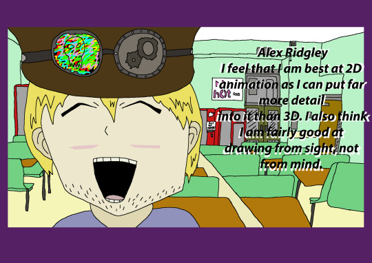
Self portrait for the end of year with a short description of me.
1 note
·
View note
Link
After a lot of editing and mind changing, my portfolio site is finally done. I believe that it kept to the original design fairly well and has reached all my expectations, if not surpassed them.
0 notes
Text
Frame rate in UK and other countries
The UK uses pal which is 25 frames per second. America has a different frame rate of 24, this is because America developed HD capabilities before the UK did, and chose 24 frames as their industry standard. When the UK finally developed HD they used there TV frame rate as their industry standard.
0 notes
Text
Production log 03/06/2015 Website/portfolio
Today, as I previously said I would, I added all the necessary text to each page, additionally I made sure each link worked on the pages and, finally, created a “contact me” page so that possible clients can contact me not just from the social media links but also from my email address.
0 notes
Link
My first published version of my site, still a work in progress.
0 notes
Text
End of lesson 1 re-cap (02/06/2015)
The first two images are the home page. I have added an 8 bit logo and two videos, showing off the two most resent animations.
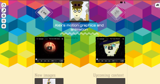
The bottom half now has an up-datable section for the most resent image, be it a hand drawn image or a computer drawn one. I have also changed the colour of the page navigation section, not just for this page, but for all of them. I had originally wanted to have my email in the “Want to say hi” section, but have now decided to use a comment section instead, as I may miss a message while going through my email, however it will be more noticeable when I visit the page if the message is there waiting for me.
I also changed the colour from the purple background that the template gave to me to a navy blue one for the “About” page, using the change background option on the right click menu.
I wanted to have a bit of variety in my pages, but not so much that it would change the theme or feel jarring. So for the 2D and 3D animation pages I went for a dark green to match the nature gallery theme I was going for.
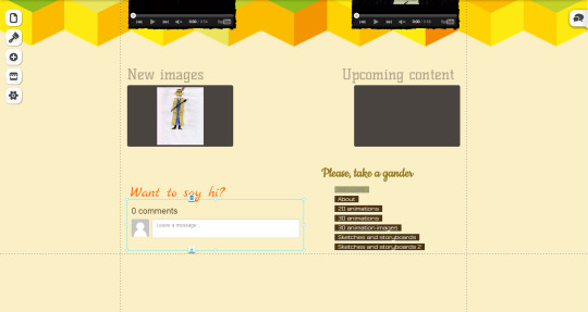
For the last three pages I simply added the re-edited hand drawn images from yesterdays work and added the edited page directories and comment section.
Conclusion: There are still a lot of written sections to be done. And not all of the video slots can be filled yet as I only have 3 or 4 videos available, so it is something that I will add to later.
0 notes
Text
02/06/2015
Today I am hopefully going to be finish my written segments for my web site for every page. Also refine any of the page layouts I am not so happy with.
0 notes
Text
Final production log for 2D animation.
Today I finished off task 6 which was the evaluation and audience feedback. Instead of doing them as separate sections, I decided to merge them all together so the whole piece flows better.
0 notes
Text
Task 6
Animation evaluation and audience feedback.
Out of all the projects we have done, this is the one I have been the most worried about. The main reason being not the shear amount of shots I had to do, but the shear amount of character drawings I had to do. If there is one thing that I struggle with the most, it is character drawings.
This is backed up by the feedback that I got from my target audience:
Matt Paul said- ‘Tis okay. The narration seems a bit rushed but you might just be going for a fast pace thing. The only real fault is, I think you need to work or your proportions with people. 0:35 his body seems a bit weird’. I have always struggled with proportions, I know I can not avoid to do a character drawing at some point so I will focus on getting proportions right before I attempt another project like this.
Sticking with what Matt said with the narration, I feel like the shot times were worked out rather poorly. During the pre-production I was told to make the animation shorter, so I took out shots and shortened some down, however I was also mindful of this while doing the narration and I think I may have said the lines too fast. So much so that when I was piecing the animation together I found I had an awful lot of excess footage that was originally planned to only have 1 second excess, but turned out to have a lot more.
Another bit of feedback from Luke mentioned the narration too: The narration is nicely read out but It seemed quiet .I did turn up the audio levels in after effects, however this was simply a problem with me not turn up the audio input level while recording the narration.
Another point brought up was the lack of music: George- This is very well done i would have to say you should have some music that adds dramatic suspense.
Though I see the benefits of having music, I did not want to risk copy right issues if I used already existing music and I have tried composing music in the past and it has not turned out very well.
Even though I feel 50/50 on the overall outcome of this project, there were some good parts. I feel that some of the image traces I did turned out really well, chief among them being the city shot and the Tudor bedroom.

Overall everyone I showed the animation seemed to liked it, however there are still major parts I would want to improve on and change should I do a project like this again. Chief among them being my time keeping, I spent far too long on one of the shots and when I had finally completed it, half my time had gone, also for some bazaar reason I had decided to include a lot of shots that had character drawings, I knew how bad I was at these before and should have planned an animation that did not rely on them so heavily.
Over all conclusion
It is by no means my favourite outcome of this year and I really wish I had changed my idea around a bit, if not have completely gone with a new one.
0 notes
Link
Just reposting the animation from youtube so there is more than one way to find it.
3 notes
·
View notes