
Don't wanna be here? Send us removal request.
Statistics
We looked inside some of the posts by alexsalterfmpyr2 and here's what we found interesting.
Average Info
Notes Per Post
20
Likes Per Post
5
Reblog Per Post
15
Reply Per Post
0
Time Between Posts
3 hours
Number of Posts By Type
Text
17
Last Seen Tumblr Blogs


Fun Fact
Tumblr’s reach among the 26-to-35-year-olds in the US is 11%.
Text
Setting up the show

Setting up the show ended up having a couple of issues. During painting the final outcome, I presumed that I would print it in A3 and frame. Somehow it didnt coma across to me that there may not be any frames. The only ones being A2. Firstly the printers only printed in A3 meaning I would have to print in two parts, which may have caused it to be a little scruffy. I am also not all that confident in my work, so having my work on a massive A2 frame would send a shiver down my spine. When I printed out the piece in A3, a lot of the gorgeous colours had been lost due to the printer not being fully calibrated. I think a lot of what carried the piece is its use of colour, so taking that away was not particularly something that I wanted to do. For the show I ended up presenting my work through a looping show reel of screenshots of progress. This allowed it to be a lot more interesting to look at rather than simply one image, but also utilised the computer screen a lot better, keeping the colours in tact.��
5 notes
·
View notes
Text
Post processing the piece
youtube
One of my favorite youtubers is someone called sinix design. This person has helped me out tonnes with learning how to do draw character anatomy so I can trust him to give me a lot of tips on learning new things. I didnt actually know that he covered this aspect of artwork, so after googling on how to finish or touch up a piece i found this video.

This is my final outcome officialy. After post processing it by following each part to finishing my art pieces. I used all of the tutorials except the forbidden gradient mapping that I still cannot properly get my head around. I also didnt use chromatic aboration as it looked a little silly and didnt fit my painting at all, although I could find some uses for it on another piece at another time. The one that I think was the most beneficial to me was the high pass filter. This one really made the piece feel a lot sharper and polished it. Gaussian blur i also used but have had trouble with before so I didnt use it too harshly. I also didnt apply it to the character so that it would make her stand out. Finally, the effect that I think really brought the piece to life and is also something that rossdraws uses a lot and that is colour dodge! This again I used fairly sparcely as I didnt want to add too much light to it, but I think this really made the character stand out. I mostly used it on the arms of the character. Overally This was a great tutorial. Before using this tutorial I was not overly confident in the work that I had produced, so this gave me a boost of confidence in the final outcome.
1 note
·
View note
Text
Polishing the piece

Here are the two final images of my outcome. I put both on here with and without the coyote as more to compare as I am still unsure whether to keep it in or not when I present my final work.
I still felt that the piece needed a bit of polishing as felt a little scruffy or rough, so I tried cleaning up the rougher or messier areas. Mostly around the character. I also finished the rock by adding a bit more detail to it and altering the colour of it slightly to look more grey. The spear was something that I decided to leave till last so I could get the colours right. Although I dont think it looks fantastic was something I did put off doing a little.

1 note
·
View note
Text
Another attempt at the wolf

Here I started outlining the body of the character, mapping out where I want certain areas I want to go such the eyes. I still wanted to use the same colours that I had previously if adapted a little. I do think that before they were a little too saturated and brought away a lot of the attention from the main character. This is not something that I want to do, so I feel that making the character a lot whiter may help with this.

I started using the same technique that I had done for the first attempt in terms of scribbles. I liked this as it replicated fur and also allowed me to place colour down easily. I also added the leg which I wanted to poke out of the rock a little.

I then started focusing more on the back of the coyote. I wanted to get this right so then i could buyild upon and compare the face to. I didnt want to face to be too desaturated.

I then decided to add the sky back so I could start to blend the surroundings into the character. I wanted a lot more softer effect in the fur so using the surrounding colours did a good job in this aspect.

I then started work on the face of the character. I think honestly this is what ruined the character a bit as I feel it is too human like and almost breches the uncanny valley.

1 note
·
View note
Text
Coyote fix

Here you can see me trying to fix or alter the previous coyote drawing however I couldnt get it it to look quite like a coyote. I still liked the colour selection however. You can see the direction that I am trying to take it, and trying to simply build up layers and lines

With criticism I altered the shape to try and match that of an existing coyote. I think that I made it far too stylised and that it just wasnt identifiable. I tried make it a lot less slender and with a lot more fur around the neck or head of the animal. Here you can me really start to build up the layers. Adding a lot more detail and lines to the areas that needed more focus. A lot of the animal wouldnt actually be seen as it would be behind the main character so I didnt bother adding much detail in these areas as there was no point.

I then started adding more shading to the drawing, with an amphasis on the left side as this was the side for the darker clouds. I felt that it still didnt sit quite right in the piece and stood out, more so than the character which then takes away a lot of the point of putting her directly in the center.

In a last ditched effort, I tried to salvage the drawing by blending it more into the background by using its surrounding colours and applying blending modes with clipping masks. I do think that I did a good job in this aspect but the drawing was too poor. I think one of the main issues was that the anatomy of the creature perhaps wasnt all that accurate and although I think I fixed the initial problem in the sense that it didnt look like a coyote or wolf, it now just feels out of place.
1 note
·
View note
Text
Re-painting the sky (again)

I started completely from scracth this time. I wanted it to be a white canvas so that I had a lot more freedom rather that trying to use the same colours as I had previously. I wanted a lot more richer colours and recently I took a photo of yet another sunset. This time the colours were a lot brighter and saturated which was prefect for what I needed. I still wanted to keep the themes of having a darker side on the left and a lighter on the left I want to tone it down a little and not have too much of a difference in values. I also wanted to have the body of the clouds a lot fatter or larger as before it was essentially a series of extremely thin clouds and not really any sky. It didnt necessarily look like a sky as such. In this screenshot above I tried to map where I wanted things and to simply place down the colours and position of where roughly I wanted things although I had a vague idea in my head of what I wanted.
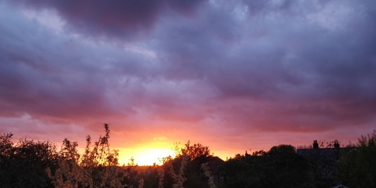

Here you can see me start to flesh out the original starting points that I had placed. At least on the left side which I wanted to focus on mainly. You can see the inspiration taken from the photo and how I used it as reference. Although I didnt specifically want a sun in the image, I did acknowledge that I already have a lighting scheme on the character so that changing it would ruin what I already have. Meaning that I would have to roughly follow the lighting from the character and use that almost as reference as to where the darker elements can go. I wanted to start with the darker elements for this reason.

The main idea was that I would have two main clouds. This is the best way that I can show that there is two sides, a lighter and a darker rather than simply using that with only colour. I wanted to keep this idea consistent, so I thought why not have simply two main clouds that are almost fighting each other.

I also wanted to make the darker cloud closer. this is because the character is closest to the screen and is in a combat pose. I wanted to infer that she is fighting the darker side/ the Europeans, so making the darker cloud closer would show that she is close to them. As you can see I was trying to make it so the lighter cloud was a lot further back. I also didnt want the screen to be only two clouds and no sky which was a mistake in the previous background. I tried doing this by making the part below only sky. I am exteremely happy with the colour choices although technically I cheated by grabbing colours from not only the original image, but also from a website that gave me direct contrasting colours.
https://www.sessions.edu/color-calculator/
This website allowed me to key in the colour code number and it would find direct contrasting colours for me. This ended up being extremely useful as it found me the rich orange that you can see here. I really like this colour as it not only works really well with the skin tones, it ‘feels’ native american and allows people to perhaps deduct that the cloud represents the native american people fighting off the invaders of purple. I discovered the saturated blue from this website as well. I really like this colour as it brings the piece together. It not only allows the character to stand out a little, but feels like a pleasant sky to look at. It is something that is inviting which is good for my target audience as my audience enjoys environments that are a lot more bubbly and bold which I think the colour choices reflect well.

Here you can now see hopefully what I envisioned. I think I did a good job in applying the change perspective that I was aiming to achieve. I decided to add the area next to the lighter cloud a lot lighter blue to not only allow the cloud to stand out a bit but to emphasise the perspective a bit, just to be on the safe side to make abundantly clear that this is further back than the darker cloud. I also did this to distinguish the cloud from the actual sky and to add some blue to illustrate that this is indeed the sky. I understand that at this point i am repeating myself but i was constantly worrying that i was making the same mistake that I had done previously so i really tried to avoid that. I think the colour choices was a lot better this time round however so I dont think I had to worry as much as I think this is what carried the background. As you can see there are still aome thinner clouds that I wanted to keep as they looked nice and allowed me to fade the clouds outwards, not making it just a puffball. This is something that the painter turner did and I thought was particularly effective.

Finally to finish off the sky I added some white clouds. Before on the previous background I had a white on the bottom to de-saturated it and have it fade out to a much more saturated top half. This time I wanted to keep that theme but ultimately decided to add some clouds instead. This I think not only looked better but inferred that the character is quite high up. To do this I simply googled for cloud png and changed the setting to search for ones at hiogh resolution so that it would not pixelate. I downloaded the image directly from the website rather than copy and pasting it as therte would be a black background and wouldnt have the same effect as there is often a little bit of black outline when I remove it. I also adjusted the opacity and altered the shape of the clouds so that it didnt stand out too much and curved around the rock.
2 notes
·
View notes
Text
Adding to the top half of the body


Here I started to add some detail into the clothing on her chest. I tried to use the same colours as used previously for her skirt. I also wanted to add depth and curvature into it, I did this by having it a lot darker towards her back and gradually growing in value towards the edge in which I added a harsh white edge to make the character pop. I did this previously on the face as well so I plan to keep it consistent.

Something that I had been wanting to change for while was the elbow as was annoying me a little. It didnt necessarily look like an elbow so when fixing it I wanted to really define the actual elbow bone. I added a harsh white highlight which I think really brought it to life. I also added a crease in the body of the arm underneath the elbow that gave it more of a bend. I also added some detail into the gauntlet/ arm bracelets. Again adding some depth to it however I do like the long line of darker and then fading out into a slight bit of light.

I then started work on the hands. Typically hands have been something that I am not too great on, so I made sure that I had them down from the original line drawing so that painting them could make my life a lot easier. I think throughout painting this piece my skills have improved, so that now I think I am a lot more comfortable in painting hands like this. I do not think that the hand is perfect but I know fully well that hands are not my strong point so I am pleased with how the hands turned out. This took me a while to get right however, but I think the hands are an important part of the piece as it hangs out from the body, so stands out from the background.

On the other arm I tried my best to mirror what I had from the opposite side. This mostly included colour, but I wanted to define the elbow again as I had done previously. I decided to make the nails a lot white than they typically would be as I wanted them to somewhat stand out, and they helped define the fingers. From a distance they looked normal, and although at close they look particularly white, the piece when fully zoomed out is what will be viewed so was fine to me. I do not think that this arm has the same quality as the other, but perhaps that is because I tried to mirror waht I had done previously which I am not all that great at. One weakness of mine is symmetry or to replicate something which is why I had the character off to the side so that I wouldnt have to get the eyes etc exactly the same.
1 note
·
View note
Text
Finishing legs

I started by making the top a lot thinner and adjusting the size of the knee cap. I also made the thigh area a but more visible and darker. I wanted it to be quite saturated in colour so that it didnt get lost. Although there is a clear improvement it still wasnt quite right. I think the issue was that the leg almost bent or curved. Another issue was that it was too long. I know that I tried to get an exaggerated perspective but illustrate that to an audience the leg was too long and it ended up making the foot appear massive and not close.

I started by bringing the foot upwards a little. It was minor but helped a tonne in bringing the perspective to a sense of realism. I also moved the leg up a bit showing a lot less thigh. This made the top part of the leg feel a lot bigger without increasing the size, but also wasnt too large that it ruined the perspective.

Finally all that was left was to blend the colours together. I wanted to add a bit of depth to the leg so I added a long line of ‘shine’ or lighter colour to represent the bone and also to make the leg seem more rounded. I also added a colour over the top adjusting the blending option to overlay. I wanted the skin tones to match closer to the body of the character while also toning down the difference in values a little. The legs had proven to be the trickiest part of the entire piece and this took a lot of time and work to get right. It was mostly trial and error, experimenting to see what worked and didnt. I am at a point where it is satisfactory. It may not be perfect but I think i fixed it at least. I didnt want to spent any longer on the legs as I do actually want to get the piece done and the legs took a large chunk of my time. They do perhaps need a little bit of polish as does the rest of the painting, but its at a point that I am happy with.
1 note
·
View note
Text
Fixing the Legs

Before something that had bothered me for a while was the fact that the lighting on the left leg was the wrong way round. I cant believe I hadnt noticed it when painting it but it has consistently annoyed me ever since. So i made it my task today to fix that. I took the same colours that I had previously and layered it to the correct lighting scheme.

Here I started to blend the colours in with the correct colours. However there is something I feel wrong with the legs. Like it doesnt completely look right. I decided to get rid of the clothing and rework that as well, as I feel the main line drawing wasnt very accurate in perspective for the bottom half of clothing.

Here I took away the original clothing and added some skin colour to replace. I also filled in the large gap in the leg where the original clothing flowed over. I did like the idea of the clothing flowing in the wind but I simply couldnt make it work or look right.

Here I added the base for the replacement clothing. I think this looks a lot better - if a little more skimpy. I dont want to oversexualise the character but at the same time I do need to think about a sense of realism. The native americans wouldnt wear a lot of clothing and the majority would wear loincloths. This is an issue because the game is rated 12+, so I cant have clothing like that as is too revealing. So the skirt was the best option, but is important that I didnt make too ‘sexy’ or short.

I then started adding more detail and shading to it. I also fixed the shape of it a little bit as was quite rough. I wanted to add some visible stitching as well simply to add a little bit of variety into the clothing.

Another issue was the legs. I felt that they were too chunky at the top and the ankle was too skinny. I couldnt get the perspective right which was completely my fault from the beginning when I decided to challenge myself with a tricky over the top perspective. I am always up for a challenge however so although the leg can be frustrating I will try my best to fix it.
1 note
·
View note
Text
Painting the Coyote

Here I decided to not bother starting with a line drawing and wanted to experiment a little. I decided to simply place the colours straight on until I formed something that resembled a coyote. Obviously this is a lot more reliable but one issue I have is that I often have to make the line drawing as perfect as possible. I dont personally like a messy line drawing even if I am only using it as a guideline. I added a bit more detail in the face of the coyote to get a better feel of what direction in terms of style I want to take it in. The main character isnt neccesarily drawn to a sense of realism and has a more stylistic approach, so i need to keep continuity in the piece with the other character.

Here i started adding more detail in the face of the coyote. I want add a bit of artistic flair to the character but I do feel that it is heading away from looking like a coyote or wolf.

Here I took the existing colours that I originally had and altered them in value and saturation slightly. What I did was take these colours and draw small scribbles in various places. This ended up looking quite effective as simulated fur to some degree. I also tried to make the top a lot lighter in value and vice versa for the bottom of the character. I do still think that I need to tweak it to make it look more like a coyote as it looks more like a cat. I also need to add more detail to it as although it does look like fur, it is essentially just a series of scribbles and doesnt have the same level of detail as the character.
1 note
·
View note
Text
Repainting the background

Here is the first background. I also drew a quick coyote/wolf. this was mostly to figure out where I want to put him. I am unsure if I want him directly behind the character or slightly off to the center. This is something I do plan on changing. I also added some detail and colour to the rock that she is standinf on. I felt this was neccesary to do so that I can use colours that dont look out place and that flow with the character and rock. To create the rock I again blended a lot of the colours together with a soft airbrush and the colour mixer tool. I also used some colour dodge of=ver the top to create a harsh lighting on the edge of the rock.

Here you can see all the colours that I wanted to use in the sky. The plan was to have one side more of a darker and the opposite as a lighter. I wanted to do this to infer that there is an evil source or darker ‘light’ that the opposite side would have to defeat. I dont plan on drawing the Europeans in this piece as I have on clue where I would put them, so this is a good way of showing that there is a dark force in the environment . I tried to use a style similar to turner did. I think I did this to some degree of sucess. To create this I used the texture brush provided by ross draws. I often changed the opacity of the brush and picked colours next the part I was drawing to sort of blend the clouds.

I often took colours from the previous background. I really liked the use of yellows and orange in the lighter part of the sky as I feel it help the audience recognise a native american theme. It often is associated with plains so I liked this choice in colour. I tried to make the line almost clash as if the clouds were fighting each other. Purple vs yellow. I wanted to almost tell a story within the clouds and tried to add movement or direction in the clouds similar to how van Gogh did.

I felt that the bottom half was too dark or saturated so I added a white gradient and changed the blending mode. I then painted white elements over the top so it looked a lot less saturated. Overall I think that it looks ok. I tried to do it in the style of Turner and I think i did to some degree of sucess, but overall I just dont think the choice in colours were all that great. Or at least all that visually pleasing. Yes I feel it infers a native american vibe, but ultimately doesnt feel that visually pleasing. I also think that there is too much detail and that I went a little over board. I feel that there is not enough sky and too much cloud. In fact there is only cloud. Perhaps I made the clouds to thin as there isnt much body to the clouds.
1 note
·
View note
Text
Artist: Van gogh

Vincent van Gogh is an iconic dutch painter from mid 1800s. I also saw his artwork shown at the MOMA gallery in new york. I think what makes this artists painting so special is the brush strokes. They are clearly identifyable and show the flow or direction. I think this is especially effective for starry night as it shows the movement of the wind in the clouds. I think this is really effective, as there is a lack of detail but not enough to not identify what is going on. The brush strokes show the direction and guide the eye to follow the movement which is really effective. I also really like the contrast between the blues and yellows.

0 notes
Text
Artist: William Turner

William turner is a famous painter during the 1800s. This artist I think does one thing particularly well to what makes him stand out. I really like his style of skies and clouds. The artist has a specific source in which the light or clouds radiate from. This is generaly slightly off to the center and is often depicted as a sunset. This creates atmopshere in which the lighting and colour pallete is mostly made of yellows reflecting the sun setting and the time of day.

0 notes
Text
Torso

In the society that I am trying to portray, clothing is sparce and I think one issue I had previously in the clothing was that it didnt reflect this nor necessarily made her look like a warrior. The character is meant to be fighting so would prioritize combat over looks. To make the character wear a baggy shirt wouldnt make sense. I decided to change this to match the skin tones of the arms and face. Here you can see me simply replacing the colours of the shirt with skin tones, simply applying it over the top and figuring out shadow and lighting.

Here are starting fleshing out it, quite literally. You can start to see it forming and i am understanding where I want the darker areas. A lot of the colours are simply copied from the arms above. I didnt bother adding the rust texture technique as it simply wasnt worth it. I also added a lot darker lines simply to know where to put darker areas. The lines arent intended to be this harsh or dark.

As you can see here I really started beldning the colours together. I also used a lot smaller brushes for the area in the centre of the back. I wanted to get the shading right which with a larger brush couldnt do. I think now it has a lot more continuity with the top half of the body. I still need to work on the clothing aspect but I think that the actual chest is pretty good.
1 note
·
View note
Text
Face 2.0

Something that I previously didnt like was the shape of the face and the position of the different facial features. I decided to change this by using the liquify filter. This allows me to alter what the shape by moving certain areas. However when I did it the eyes would change shape into something weird and simply didnt look right. So I decided to take them out so I could change the shape of the face.

Here is what it looked like after, however I really wasnt too happy with it. I think the eyes were too long and the character seemed really angry. This expression is fine, but firstly in a majority of the league splahes the character is happy. This ties in with my target audience of being 12+ years. I want it to be inviting which is why I should make my character friendly or happy.

This is the final face. I decided to use the liquify tool again, however I also changed the shape and positions of the eyes and brows. I made them a lot smaller and moved the brows closer. I still wanted to keep the lrg eyebrows from my character design, however I think they were far too large. I also tried to put more of a focus on the cheekbones that are privalent in native american people. Previously I had more of a line, this was ok but I wanted to make the cheekbones more rounded and defined. I also fixed the nose. The issue that I had with the nose was that the nostrils were too large and open and there seemed to be no bulb to the nose which ended up making it too wide and with no structure. I also added a small white highlight on the tip which I learnt from the ross draws tutorial. I am really happy with the face now as before it didnt quite look right. I think I did a good job in showing the character is native american, while also looking aesthetically pleasing. I didnt make the character too attractive while also making sure that she looks female.
1 note
·
View note
Text
Face

The face I think is the most important part of the piece as is the first thing that humans are naturally to look at. It is important to get this right for this reason. I wanted to get a good balance between cartoonish/stylised and realistic as is done in the league splashes. As seen previously, I had done some work on the eyes although would ened to work on later as they were only basic. I started on the nose as is the best way of understanding the perspective and angle of the face. I nearly always start with the nose as it allows me to then work around it and get an idea of what size and shape the mouth to be. I think that the colours I chose was really good and amhappy with the nose considering the initial drawing was quite vague for facial features.

I then progressed onto the lips. I wanted to make sure people understood that she is native american. The lips is a good place to start in this aspect as they are often quite puckered or fuller. I really like the colours that I chose as I wanted to incoporate a bit of red, to emphasise her gender. I didnt want to make them too red as would make it seem like she is wearing lipstick which wouldnt be realistic. I also finished off the nose. I wanted to paint the red face paint directly over rather than painting with skin tones then adding the red and using a blending mode. Although this way is way is a bit more risky, it takes a lot less time and I find blending options to sometimes be unreliable. I also reworked the eyes a bit. I didnt add too much, mostly a white line on the eyeball, however id was very effective and added a lot more depth to it

Something that I had noticed was that the chin was far too large. To work around this, I simply made the neck a little longer, or by adding red over some of the chin. This was also good because the neck was too short so was a win/win. I also added a lot more detail in the lips. I had added the base before, so started to blend the colours out and then using a smaller brush adding more lighting detail. The thin lines were very effective and I really like how the lips turned out. I do still think that the face needs a little bit of work as the shape doesnt quite feel right but it is a good start and am pleased with the progress that I have made.
1 note
·
View note
Text
Reworking the skin colour
youtube
Something that I didnt particularly like was the colours on the skin. The skin seemed too pale or caucasian. It also didnt really reflect the colour scheme of warm colours that I am aiming to get. To fix this, I found this video that helped me a lot.

The first step in this tutorial was to use textures or existing photographs. One that would have a broad range of colours. For this I googled ‘rust texture’ and changed the settings to look for ones with a high resolution. This is the one that I thought was best as I liked the vairiety of colours, but also thought that the colours were very saturated and aesthetically pleasing. The yellows and oranges suited the scheme I was after and the purples and blues also gave a nice contrast and would suit the skin tones - or at least the darker tones. I applied this to the base layer as a clipping mask so that it didnt spread around the rest of the canvas.


I then took a lot of the colours ans started painting them wherever really. I mostly however put the purples and blues on the more shaded and darker areas and yellows for the lighter.

I then started blending these colours together. To do this I used the colour mixer brush and selcted an area that I wanted to mix with. This brush picks up the paint that you select and blends it together. I dont like to use it all the time as it can be a little unreliable, however I felt it helped here a lot. Although, I wasnt too keen on the direction that this was heading however.

I started adding a lot more of the reds and pinks that came from the texture image. and blended together untuil I got to what I have now which I really like. It is exactly waht I was after as it not only uses a lot of warm colours but I feel that the character is a lot more native american in skin tone and a lot less caucasian which originally was a key problem.

I also repeated the same on the legs.
1 note
·
View note