
Don't wanna be here? Send us removal request.
Statistics
We looked inside some of the posts by aliciaansellfreakyorunique and here's what we found interesting.
Average Info
Notes Per Post
0
Likes Per Post
0
Reblog Per Post
0
Reply Per Post
0
Time Between Posts
1 day
Number of Posts By Type
Text
9
Photo
8
Last Seen Tumblr Blogs


Fun Fact
Average visit duration of Tumblr.com is 10 mins and 25 secs.
Text
mediacollege.com

These are the different shots you could use in a video
0 notes
Text
Adobe Interface

The left side is the unedited version. Bellow this is the source where all the other shots are kept. They are kept there until you need them, when you need them you can drag them above to cut shorter if you like. The right side is the timeline where you can add sound or take it away. You can also speed up the time or make it slower. The Right side is the edited version . This is just so you can view both so you can tell the difference.
0 notes
Text
Video production Evaluation
For our Freak or unique project we were asked to make an advert advertising our item or something we believe in such as healthy eating.
I think we had some good shots especially the last one taken above the table when the chocolate was falling from the sky. I also liked how we took very quick shots because it was easier and faster to edit afterwards. I also liked working in a group because I could be in it whilst someone holds the camera, this made it easier to take different shots from different angles.
I learnt how to use some tools in Adobe Premier Pro CC such as making shots faster and slower. I learned some new words such as the interface which is the whole screen and the timeline which is where you can cut, add sound or get rid of sound. I also learned about how to do an skeleton edit, which is usually the first edit you do. This is when you cut things down by the second you want, to make it shorter and cleaner.
I like to be in front of the camera so i really enjoyed getting to be in the advert. I also love to edit videos so i liked the video production side of it.
If i had some more time I would have used more effects in my advert. For example I would have made it black and white so it was more of an old fashioned advert and just try loads of different effects. It would be interesting to see what the advert would be like if it was serious, funny or sad. I think I also would be more serious in the advert because in one shot i was trying not to laugh so I would retake that shot again. So I will work on my acting skills.

0 notes

Photo

This is my advert on a street on a billboard sign. I think this is really cool because it looks like it is actually apart of the picture, its like its an actual advert in a city. To do this i copied i pressed control A to select my advert and then control c to cop and then control v to paste. Then i pressed Ctrl T to adjust the picture into place.
0 notes
Text
Example advert designs
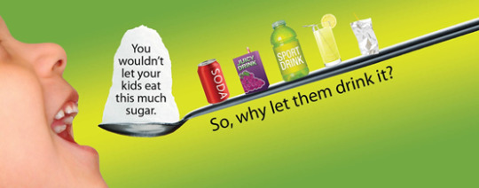
The text on this advert is a dark color just like the spoon. The text is underneath the spoon in the same position as the spoon, which is going down, compliments the graphics. Also because the words are going down and the drinks it looks like the child is about to drink it all. It really puts the point across.

This advert uses little graphics however this also make the advert effective because its a simple advert giving a simple message. I like how the text "give us a smile" is in the middle of the page because it really stands out. Also its good how they put the health facts in the bottoms corner next to the banana. Because the facts are about bananas.

This advert uses different bright colors for each letter in the shape of different fruit or vegetables. I believe this is because its for children and children like bright colors because it makes them want to read the text. The girl holding a chocolate bar and a apple in different hands shows she has to two options, healthy eating or unhealthy eating.

This advert has the text on the floor and the "more potassium" on the floor just like the Potatoes. This is very pleasing to look at. Also these words are created from potato peels. This makes them stand out which really tells us the aim of the advert. For people to have more potassium.
0 notes


Photo

Photographic evaluation
This assignment was about creating a freaky or unique print advert. We had to take our own phonographs, using our own props, then chose two photographs that you liked the most and edit them on Photoshop to turn them into a freaky or unique advert.For my research i looked up depression on google images. This is because i was going to do an advert to spread awareness for men who have depression but unfortunately my model did not show up so i had to change to another idea which was healthy eating. Previously I found a photograph off a mans face pressed against a window that had water drops all over it. The water drops reminded me of tear drops, which made me think of depression and sadness. I thought this would be a dramatic print advert. I also found another picture of a man’s back that had hand prints all over him but from the inside, like he was harming himself from the inside by hating himself. I also liked that idea for a print advert.
For my healthy eating advert that i ended up doing instead, i found a picture of a fruit cut open, by some kind of opener, and there was a plain background and some text. I liked that advert barbecue it was simple but effective and thats what i wanted in my print advert.I changed my original idea of having an unhealthy food such as chocolate in my advert, that i explained in my proposal, because i did not have one on the day due to having to change ideas. I had to improvise by using what i did have on me, which was a lot of fruit.I used a tripod,a hot light and a plain white sheet for the background.
The first challenge was to successfully find the right angles and height to take the picture from. The second challenge was to make sure the camera was in focus. However i soon was able to do this.
In Photoshop i used the quick select tool to select my previous apple and spray bottle from another file so i could insert it into a new Photoshop file so i could join the two images together. Another Photoshop tools i used was the spot healing brush tool. I used this because when i pasted a second picture of a bagel, which had been mostly eaten so i could put in inside of the apple where there was a bite mark. I needed to clean it up so that all of the bagel would fit inside the apples bite mark to make it look tidy. I also used the paint tool to put spots onto one of the apples to make the apple look poorly. Also i used the text tool to put the header at the top and the facts at the bottom.
I learned how to set up a hot light and how to put the bulbs in. I also learned how to put the camera on the tripod safely without the camera falling off as well ans it boosting my Photoshop skills. For the next photography assignment i would try different angles instead of just taking the picture in the same position every time.
Comments
Peter.L I think the issue Alicia is pushing is brilliant. But i also think the writing in the bottom left is hard to see.
Caitlin W-B - I like what Alicia has done for her advert. It adds some comedy to a serious topic. It shows that Alicia’s photoshopping skills have some great potential.
Daniel.F - i like what Alicia has done with her advert. i like the pun on the advert as well saying ‘clean up your diet!’. the advert has very good composition as well
Cameron H. - I find the poster that Alicia has created very humorous although I think that the placement of her images and text seem a little bit out of place. Her use of rule of thirds worked well though placing the text in the middle of the screen makes the work look rough and incomplete.
Cameron M. -i like how there is a contrast between the two apples and the blatant difference between the good apple and the off apple. i like how the text changes color half way through.
0 notes
Text


I used the healing brush tool to get rid of the text and then i used the text tool to write a new message. I found this easy.
0 notes
Photo


These are our group shots based on the newspaper we used to recreate certain images. The other groups had to guess which picture,from the newspaper, we were trying to recreate.
0 notes
Photo

This is what i have done to my advert so far in graphics and interactive. I have added in the original apple and the Photoshop apple to compare a good apple to a bad one. This is to show the difference between a good diet and a bad one and the effects it will have on your body. I have also added text around the apple and text coming out the spray bottle to emphasis the fact they need to “clean up” their diet.
0 notes
Photo


I opened up a landscape document and added guidelines by going to edit then to preferences and went to guides. I changed the grid-lines to 100 percent with a subdivision of 3.
Next i snipped it and went to save as a rule of thirds. View-show-grid then i went to edit-preferences-rules and chose cm. Next i tapped control and R to add a ruler at the top. After that i went to view-new guides then setup 2x vertical 1cm+20cm and a 2x horizontal 1cm+28.7cm.
0 notes
Photo

This is my blended phonograph/advert that i have made this lesson.
I started out with the picture of an apple that had been bitten. Then i added in a part of a bagel that had been mostly eaten, and added it into the picture. Next i expanded it to make it bigger and then i put it on top of where the apple had been bitten to make it look rotten in the inside as well as looking like bread. Also i added in a spray bottle to fit in with the slogan i made at the end.
0 notes
Text
Photography: Items i brought in from home to photograph
Oranges
apples
Bagels
spray bottle
0 notes
Photo


These are the images i used to create my freaky or unique advert. My advert was made to try and convince people to become more healthy by eating more healthy foods such as apples.
0 notes

