
Don't wanna be here? Send us removal request.
Statistics
We looked inside some of the posts by alindell007 and here's what we found interesting.
Average Info
Notes Per Post
0
Likes Per Post
0
Reblog Per Post
0
Reply Per Post
0
Time Between Posts
3 days
Number of Posts By Type
Photo
13
Link
1
Text
3
Last Seen Tumblr Blogs


Fun Fact
In 2020, 27% of US Tumblr users had an annual household income of over $100,000.
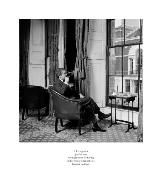
Photo


“Commuting Alone in London”
By: Alexandra Lindell
My final photo series
0 notes
Text
COVID-19 Photo Documentary Assignment
Imagine you were given a documentary assignment to create 3 photos on the theme “My life in the time of Covid19”.


When I returned from London I was under a two week self quarantine which not only limited where I could go but also how I could interact with people. The first photo in my series is of my grandmother. This photo is impactful to me on two levels, the first is that I haven’t been able to hug or kiss her since I have returned due to my quarantine; the second is that while she isn’t quarantined everyone is asked to remain at home and she is isolated from her normal activities. This photo of her reading in bed is how she is spending her days. I was able to take this photo by zooming in so that I didn’t get too close to her, she wasn’t aware that I was even there taking it. I liked the way the light behind her put her in shadow which seems appropriate with the isolation she is going through. My second and third photos were taken at the park next to my home. While I am quarantined I was still able to drive my car as long as I didn’t get out so I decided to see how my city looked during this time. These photos are impactful to me because this is an area where I go to the beach, for walks and also have picnics with my friends and now there is a giant sign telling me to stay six feet apart from others and a place that has always been about relaxation and fun has been converted into a COVID-19 testing location. During this pandemic so much has changed in my day to day life and I felt that these photos captured the feeling of isolation and fear that not only my family and I are facing but that is affecting everyone.
0 notes
Text
Week 10 Blog Activity 2 “Masculinities, Liberation Through Photography at the Barbican”
Choose one series of photos and explain why and for whom you think these photos were taken.
https://karenknorr.com/photography/gentlemen/ Gentlemen 1981-1983 By: Karen Knorr
I think these photos were taken to illustrate that while women are considered equal to men there is still an inequality that exists in positions of power. I believe these photos were taken to highlight to men how women are aware that men in power continue to endorse a patriarchal relationship against women. Not until the last photo in this series do we see a woman. This last photo is interesting in that it is a recreation of the portrait in the background of the photo, the only difference being that one of the men from the portrait is now being represented by a woman in the photo. I think this is symbolic of a small change happening but still representing that power still lies in the good old boy club, that is represented by the Gentlemen’s clubs not allowing women members.
What, overall, can you understand about masculine identity from this exhibit?
The masculine identity portrayed in this exhibit is one of traditional elegance, power and control. The men pictured are all very put together and expressionless while exhibiting their power through their wardrobe, poses and environment. These images reflect an upper class masculinity that is associated with good breeding and an appearance of a civilised environment; meaning emotions aren’t shown and everything is very clean and sterile.
Is there anything about the works you have seen by following these links that you find problematic or that you think is worthy of praise, or both? What makes it so – style, subject matter, a combination of both, other?
The photos in these links can be praised in that they attempted to cover many different aspects of the new masculinities that emerged from the 1960s to the 2000s. When you look across the different series the works capture masculinity across age groups, nationalities, economics, sexual identity and race. The works also used different forms of composition to get their messages across. Mikhael Subotzky’s series captured the race conflict as seen through South African prisoners both in and out of jail in a documentary type format. Both Larry Sultan and Richard Billingham’s series both focus on masculinity in their families, their works while differing in style both use their families as models in their posed photos. Sultan’s photos of family explore the difference in masculinity from father to son in a conservative middle class home environment. While Billingham’s photos focus more on a poorer lower income home environment and the relationship of the man and woman in the household. When looking at Wolfgang Tillman’s photos the audience sees the similarities in masculinity across politics and nations through the photos of young soldiers. Race was addressed as I mentioned, by Subotzky’s photos but also by Hank Willis Thomas’s photos. Thomas chose to portray race utilising advertisements to depict how race is being commercialised to sell products.
Now looking 3 different photos (3 different artists):
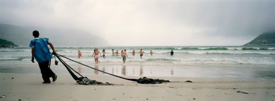
“Ex-prisoner Marc cleans Hout Bay Beach. Cape Town, South Africa. 2005.” Mikael Subotzky
Analyse closely how the subjects are depicted. How does this influence the way you understand the message of the photo?
The subject of this photo is the ex-prisoner, he is depicted on the left side of the image walking towards the edge as if he will be out of the frame soon. While he is depicted as the largest image in the photo he is isolated and not part of the activities the other people are participating in. The photo symbolises the divide in South Africa between the black man and white society by depicting the white people enjoying a day at the beach while the black man cleans it for them. This photo was taken from straight on, the subject is more in focus than the background with the people in the water. The beach goers are more brightly illuminated against the overcast and fogginess scene in the background, this provides the viewer with a sense of the emotion the subject is experiencing as he watches the people in the waves.
What is the relationship between the photographer and the subject(s) in these photos?
The subject in this photo is unaware of the photographer and doesn’t look like they know that they have had their photo taken, the photo does not appear to be staged. The photographer seems to have kept a decent distance between himself and the subject enforcing this thought that the subject is unaware of the photographer and being photographed.
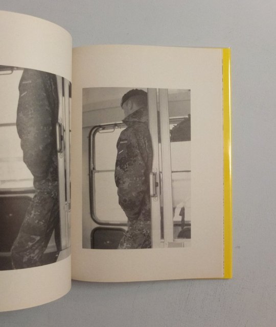
“Untitled” in Soldiers – The Nineties“ by Wolfgang Tillmans. 2000.
Analyse closely how the subjects are depicted. How does this influence the way you understand the message of the photo?
The subject is depicted in black and white, centered within the frame of the photo. The subject is photographed straight on from behind, we don’t see his face which lets the audience see this as a soldier from any country or service or as someone they may know. The subject is depicted in dark clothing in contrast to the rest of the photo which is either white or bright. This contrast pulls the audience's eye to the subject.
What is the relationship between the photographer and the subject(s) in these photos?
The relationship between the photographer and the subject in this photo is it appears he is unaware of the photographer and that he is taking his photo. The way that the photo was taken, from behind emphasises that the subject may not have known the photographer or even that he was there.
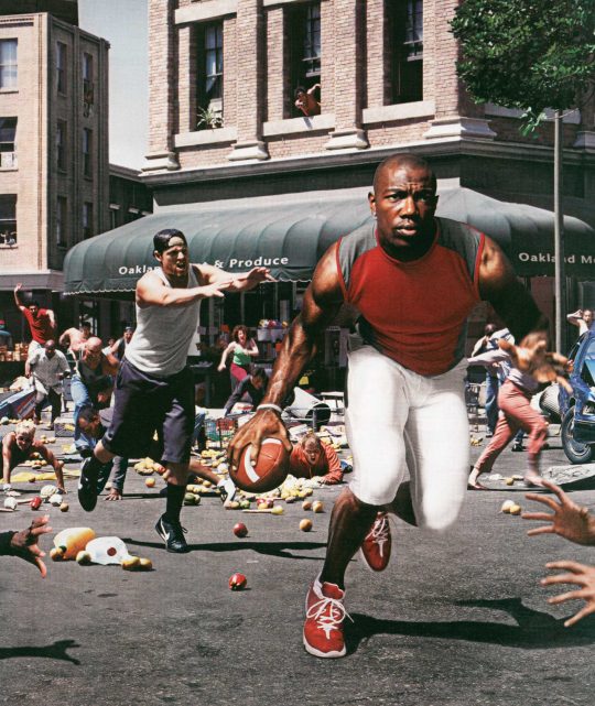
“Untitled” in Unbranded: Reflections in Black by Corporate America 1968-2008 By: Hank Willis Thomas
Analyse closely how the subjects are depicted. How does this influence the way you understand the message of the photo?
The subject of this photo appears to be photographed with a slight upward angle making him look extremely large compared to other aspects of the photo. The lighting on the subject keeps him in focus and much brighter than the other people in the image which are blurred or out of focus for the most part. The subject is framed by three sets of hands that appear to be trying to stop him or grab his football. While the other people and content of the photo are in various states of falling down or a mess, the main subject is neat and composed compared to them. These elements help us understand the message of the photo by depicting the black athlete as efficient, put together, and focused with no one being able to keep up with him. If this is an ad it implies that either his workout routine, clothing, or his shoes give him the edge to be a superstar.
What is the relationship between the photographer and the subject(s) in these photos?
The relationship between the photographer and the subject in this photo is that the subject is unaware of this photographer because this photo is composed of images from magazine ads and manipulated into this final image. The subject may have been aware of the photographer in the original image during the shoot for the advertisement.
0 notes
Text
Week 10 Blog Activity 1
“Horn of Africa famine: Somalia, Ethiopia and Kenya suffer worst drought in 60 years” -Article Photos

Dagahaley aden
What aspect of the article does the image illustrate? That is to say, does the image help you visualise one particular part of the text? Which one?
This image helps illustrate the malnutrition that the children are suffering. We also can visualise the lack of water both by the empty cracked basin the child is sitting in, as well as the dust from the dry ground around him.
In what light does the image present that aspect of the article that it illustrate? That is to say, what comment does the image make about that aspect of the written text?
The comment this image makes is that the children are helpless and isolated in their suffering.
How does the image help you engage with the written text? That is to say, in what ways does your chosen image influence how you understand the text?
This image influenced how I understood the text because it not only showed the malnutrition described but it also showed the lack of supplies, even if there was water to bathe in the basin is cracked making it impossible to bathe.

Dagahaley goats
What aspect of the article does the image illustrate? That is to say, does the image help you visualise one particular part of the text? Which one?
This image illustrates the refugees traveling through the scrubland from Somalia to Kenya with their livestock trying to save what they have left. It also illustrates the drought conditions as you see the dust being kicked up as the people and goats walk through the land.
In what light does the image present that aspect of the article that it illustrate? That is to say, what comment does the image make about that aspect of the written text?
The comment the image makes about the drought is the dust we see not only around the people but all the way into the horizon. The horizon being brighter than the rest of the picture provides an image of hope that the people are walking towards.
How does the image help you engage with the written text? That is to say, in what ways does your chosen image influence how you understand the text?
The image engages with the written text by not only showing the people walking through the dry lands caused by the drought, but also showing the livestock mentioned in the article that the people are trying to save from the drought. The image also shows the people walking and we can assume they are walking towards an aid camp.

Dagahaley treated
What aspect of the article does the image illustrate? That is to say, does the image help you visualise one particular part of the text? Which one?
This image illustrates the child refugees being treated at an aid camp for malnutrition and dehydration.
In what light does the image present that aspect of the article that it illustrate? That is to say, what comment does the image make about that aspect of the written text?
The comment that this image makes is that the children are suffering and the aid workers are doing their best to help them.
How does the image help you engage with the written text? That is to say, in what ways does your chosen image influence how you understand the text?
The image helps you engage with the written text by focusing on one childs look of despair, while we see others in the background waiting to be helped. It gives the impression that there aren’t enough aid workers to help everyone.

mogadishu old man
What aspect of the article does the image illustrate? That is to say, does the image help you visualise one particular part of the text? Which one?
This image illustrates the refugees traveling to escape the drought in Somalia. The image also illustrates the impact to the elderly and the young. The man in this photo is clearly ill and struggling.
In what light does the image present that aspect of the article that it illustrate? That is to say, what comment does the image make about that aspect of the written text?
The comment that this image makes is that the drought has affected people across all ages and families with young and old members have travelled even while suffering to try to survive.
How does the image help you engage with the written text? That is to say, in what ways does your chosen image influence how you understand the text?
This image influences how I understand the text by providing a person to relate to. This man while having a vacant look in his eyes continues forward with the children. It gives the audience the perspective that the man is trying to lead the children to aid, in order to save them.
Leader image
mogadishu old man
I selected this photo as my leader image because it spoke to me on the will to survive. The old man is struggling to walk, we see him using walking sticks to help him but he appears to move forward to help the children get to a place with aid and hopefully water. The image while showing the extent of the malnutrition and the drought on the man also provides an image of hope. We see this in the children's faces as well as the symbolism of the cross at the top of the building over the man’s head.
0 notes
Photo


Week 9- My Photo
Three possible captions for the original photo:
“Deep in Thought”, “Companions”, or “The Protector”
Before cropping:
My choice for this photo is because I feel the bond between my grandma and my dog is very strong representing the connection between humans and their pets. The full image was taken from the vantage point of my dog as she watches my grandma watch her nightly tv shows. Having the dog out of focus and occupying the foreground represents how the dog is protective over the other subject. Taking this photo from the upward angle and the body position of my grandma makes her seem very powerful and strong over everything else and the audience. My captions represent different emotions and states of my subjects' relationship to each other. “Deep in Thought” represents how they are together but looking in different directions and we don’t know if they are actually seeing something or just thinking. “Companions” represent their bond and how they don’t have to interact, but just be present with each other. “The Protector” represents the perspective of the dog appearing larger in the foreground giving her power and the appearance of protecting the other subject.
After Cropping:
I chose to crop my image this way because I wanted to highlight the powerful energy that this 90 year old woman is naturally displaying by her body language. The cropped version is about strength versus relationship. I wanted the audience to see strength that comes with age versus the fragility that comes with age. The cropping enhances the angle that this photo was taken from amplifying her size making her appear larger and therefore increasing her power over the audience which is how the message has been changed by the cropping I have done.
0 notes
Photo


Week 9- Exhibition Responses
Mohamed Bourouissa: “Free Trade”
What is the main message of this artist’s work
He wanted to give people a glimpse into where he came from and the resilience of society and give a view into their identity across generations.
How is this conveyed? (What techniques is s/he using?)
He used photography like an Act by engaging with both people he knows and strangers. He engages with them to collaborate on the images he will portray.
Anton Kusters: “The Blue Skies Project”
What is the main message of this artist’s work?
That even while jailed in concentration camps everyone was under the same blue sky. That while separated they were all still together. This work inspired by his grandfather is about human rights and the trauma that came from genocide during World War 2.
How is this conveyed? (What techniques is s/he using?)
He conveyed this by using a polaroid camera and photographing upward from the ground to the sky making the sky look like a circle/ representative of a globe. He also brought in facts of location via GPS coordinates as well as the number of victims in each camp. He also made the exhibit interactive by including an audio tone to represent the victims voices.
Mark Neville: “Parade”
What is the main message of this artist’s work?
The message of this work was the sense of community in Brittany, France as the UK announced it’s departure from the EU. He focused on the relationship between humans and their animals in this French community with British roots.
How is this conveyed? (What techniques is s/he using?)
He blended both staged photographs with unstaged candids to capture the dynamic between human and animal.
Clare Strand: “The Discrete Channel with Noise”
What is the main message of this artist’s work?
How communication isn’t perfect and the transmitting of information even with the best plans doesn’t always result in the same message being received.
How is this conveyed? (What techniques is s/he using?)
She utilised her husband as the transmitter to send her coded grid segments of her photos and she reassembled them on her end by painting the sections in tones of grey. The expectation was that she would have representative shaded images of the original photographs.
Which artist should win the competition
I believe that Anton Kusters “The Blue Skies Project” should win the competition. The visual he presented with the polaroids of the 1078 images he took from the sites he visited provided the viewer with the magnitude of how many camps there were. The coordinates and victim numbers ground the viewer in the impact and reach on the ground while we are looking at the sky. This grounding effect in opposition with the hopefulness of the sky images is very impactful. This exhibit blends art and history in a very unique perspective that brings beauty to a very ugly time and place.
Choose one photo by each artist:
Mohamed Bourouissa Le Hall, 2007 From the series Périphérique © Mohamed Bourouissa, Kamel Mennour, Paris & London and Blum & Poe, Los Angeles
This photo follows the rule of thirds, splitting the photograph between the solitary man, the view of the lake and the two men interacting. The use of light and shadow provides the viewer with a highlighted image of the graffiti and the man leaning against the wall while placing the two men on the right in shadow, obscuring one of them completely. The image of the water and background are blurred with the feeling of a painting, making the photo more about the people than the landscape.
The relationship between the photo and its message is clear that it is about a poorer segment of society on the edge of what appears to be a nicer environment. The title of the photo doesn’t help understand it but the name of the series which means outlying or peripheral does. While the exhibition text was helpful to understanding the photographer's inspiration, it wasn’t necessary to understand the meaning of the photo it is clear that this image captures people that are standing on the sidelines in a society. This photo reminds me of other inner city types of photos.
Anton Kusters Danzig (Schulemann) | 0000025 | 54.349522, 18.641100 (AP) from The Blue Skies Project © Anton Kusters
The message you see in this photo is a small piece of the larger work representing the fact that everyone was under the same sky while they were separated in the different concentration camps. The contrast between the black border and the blue and white aspects of the sky project the image of the globe, not just a piece of sky from a single location. The use of shadow enhances this feeling by having the left side be darker almost representing night and the right side brighter representing day. The addition of the GPS coordinates and the number of victims to the photo provides context to the viewer. For this photographic series the title isn’t helpful and you don’t fully understand the message or intent without the exhibition text. The photo reminds me of a view through a telescope.
Mark Neville Parade #39, 2019 © Mark Neville
The message in this photo is of a hard life that is shared between a human and a farm animal and how they exist together. This photo was taken looking straight on at the subject. The photographer’s use of light illuminates the foreground of the photo making the woman and the piglet draw your eye in while leaving the background in dark shadow. The title of this photo does not help to understand it, but reading the exhibition text provided clarity from the photographer's point of view of depicting a sense of community that translates not only between people but people and their animals. The style of this photo doesn’t remind me of anything I have seen before.
Clare Strand The Discrete Channel with Noise : Algorithmic Painting;Destination #2 and The Discrete Channel with Noise : Information Source #9
I have included both the transmitted coded photo image as well as the received painted image. You are able to see the artist’s message that communication can be complicated and you don’t always interpret messages exactly as they are meant. You can see in destination #2 that while you know it's a replication of the photo it is distorted. I needed the exhibition text to understand the photographers intention, it was not clear from the title or series name. The resulting image reminds me of an Etch A Sketch drawing. The photographer used paint as her medium to translate her photos using the coded grids transmitted to her to equal different shades of grey in her recreation. The different shades of grey resulted in a blurry version of the original image.
0 notes
Photo


Week 9- Activity 2
Some of the different things you notice in each image, and what these might signify.
Image 1: no adults near the kids, bright red of the car in contrast to everything else.
Image 2: Pops of red (notebook, plane, and binocular lenses), many different people wearing the same lanyards, majority of the crowd is all men.
Image 3: The room is long and narrow, pops of red (his shoes, clothes, and bottom of washing machines), different socks hanging, and the subject's reflection in the washing machine door.
Image 4: The decaying of the brick walls, the broken stained glass window and British flag, and the awkwardness of the two subjects.
Then choose two and write 4 different captions for each of these:
Image 1 captions:
“Day at the Shore”- This caption affects the meaning of the image because it brings to mind an innocent time of just having fun.
“Sweet Treat”- This caption affects the meaning of the image because for a kid there is nothing better than having and enjoying an ice cream cone.
“Summer Heat”- This caption affects the meaning of the image because it makes you wonder if the heat is so intense that you can’t even enjoy an ice cream cone.
“Time to Go”- This caption affects the meaning of the image because it makes you question if their day at the beach has ended or if they need to leave because of how messy they are.
Image 3 captions:
“Patience”- This captions affects the meaning of the image because it makes the viewer think you have no control and you have to wait for the machines to be done.
“Daydreaming”- This caption affects the meaning of the image because it brings your focus to the subject and makes you wonder what he is thinking about while he is waiting there.
“Solitude”- This caption affects the meaning of the image because there is no one else in the laundry room, it is a place to get away and have some quiet time.
“The Lost Ones”- This caption affects the meaning of the image because it makes you wonder how things can become easily lost like the socks or the subject dealing with things in his life.
0 notes
Photo


Week 9- ACTIVITY 1
BEFORE CROPPING:
This photo is of an old couple eating, while sitting on a public bench in a semi enclosed area, a baby eating ice cream and a group of women standing on a sidewalk.
The photo is about litter and how people interact with it or completely ignore it. You see an older couple sitting surrounded by garbage but looking around the litter at something out of the frame. In contrast you see the woman outside of the enclosure with her back to the mess while facing a neat and orderly scene of women and cars. The photo represents how people are desensitised to litter even when it’s literally at their feet.
AFTER CROPPING:
The cropped photo is primarily of three people out in public. The cropped photo is about people enjoying a nice day out. We see this by the older couple enjoying some food on a nice bench and the group of women in the parking lot appearing to go on an outing.
0 notes
Photo


Series: Sogno #5 “Untitled” By: Lorenzo Castore
Week 8 Assignment
The composition of this photo is assorted paperback books in a disorganised pile almost as if they are being thrown away. There are also other writing papers mixed in with them for a feeling of someone’s academic work. Predominantly neutral coloured with some bright red books being highlighted. The center of the photograph is brighter making it the focal point, since the main source of light is coming from the top of the image creating shadows. The mood of the photo is of chaos and abandonment. The photo is of new and old editions of books and other reading material that have been left in a big messy pile. Some of these books look like their covers were torn off or had pages torn out of them.
This photo is about destruction and disarray, the viewer knows something happened but isn't sure if it is due to vandalism or just general messiness. This photo is reflective of the disorder and chaos that may have existed in the psychiatric hospital. It gives the viewer a feeling of confusion that could be indicative of a troubled mind.
My process to recreate the photo was to find mostly old books and take them from an orderly bookcase and transform them into a random pile. Because the original photo seemed to have pops of red I made sure to pull books that also had red in them. I didn’t have old writing papers but I attempted to bring in some town crumpled pages into my photo. In my recreation and my inspiration photo I tied them together by having both the book and the album for West Side Story as a focal point in both photos.
What I learned in the process of recreating this image is that it can be hard to recreate someone else's work for multiple reasons. First you probably are not in the same mindset or scenario that the original artist was in when they created their piece, you also don’t know why they chose to have the light highlighting certain books more than others in this photo. Second you can go down different ways of recreating the artwork, making it an exact recreation with every little detail the same or a recreation like mine with the same theme but using different subjects in this case different books and crumpled papers. My response to this photo could also be considered a recreation of this chosen photo using it as inspiration for mine. I was inspired by the chaoticness of the books which I decided to relay to a subject that interests me which is music. I had old albums that had been given to me by my grandma which I thought would make a good response which was meaningful to me for this photo.
Progress since Brainstorming 1:
Since the brainstorming session I narrowed my photographic series ideas down to two: Cigarettes, Commuting. I have taken some photos for both of these topics but have been able to mostly take photos for Commuting. Now that I have had to come back home there aren’t as many opportunities for cigarette photos so I plan to focus on the commuting theme. But I am currently quarantined for 14 days before I can go back into public spaces, limiting me on what I can take photos of. The next steps to develop my series would be to go through the photos I have already taken from my time in London of my commuting theme and find the best looking ones, also possibly taking more photos from where I live in the US of people commuting once I am out of quarantine.
0 notes
Photo


“Heavens Vault Villa Farnese, Caprarola, 2014”
This is the 2nd photo in the series and continues the ongoing theme of having an animal focal point against the feminine feel of the villa. The muted pink toned colors in the background allow the vibrant colors of the peacock to stand out. The photo is balanced with the Peacock in the center of the frame using a low to mid angle which kept the peacock in proportion to its surroundings. Knorr uses vertical lines with repetitive patterns of shapes that draw the viewer into the back of the photo and makes you wonder where the hallway leads. These lines also soften the structural elements making it pleasing to the eye. Shadow and light are used to draw the eye in. The photo was shot with the foreground on the left in a dark shadow while the right side is brighter with the light coming from an opening on the left. The viewer can’t see this opening but knows it is there. Your eye is initially drawn to the Peacock but then you notice and move around the photo from right to left following the light which leads you back to the peacock. The photos layout and subjects bring together the feeling of old and new and the romantic and the mystical. Initially it looked like the peacock was facing toward the light exploring but after looking at this photo multiple times I noticed that the peacock was actually looking into a dark doorway which gives the photo a more sinister feeling.
Minerva’s Owl, Palagonia, 2015
This is the 4th photo in the series and it continues the ongoing theme of having an animal focal point against the femine feel of the villa. The muted bluish colors in the background blend in with the white of the owl making the owl feel like a part of the room. The photo is balanced with the Owl in the center of the frame using a mid angle shot. Knorr uses vertical lines with repetitive patterns to frame the owl. In this photo there is very little shadow with very little contrast giving the feeling of no movement. Your eye is drawn to the Owl and the fact that it is captured and can be closed in the cupboard. The photos layout and subject are monotone and feel very sad.
About Author
Karen Knorr is a contemporary photographer who has lived and worked from Puerto Rico to multiple cities in Europe as well as having exhibits in the United States and India. She has her work on display in galleries throughout Europe. The Danziger Gallery explains that Knorr blends her analogue and digital photos to create collages that present like a painting. She incorporates animals into her work as a contrast to the architectural and historical locations she is photographing (DanzigerGallery.com, no date). According to KarenKnorr.com Knorr uses the animals to symbolically challenge authority and power throughout heritage sights in Europe and India (KarenKnorr.com, no date).
First Impressions
The photo assigned to me in the group project is “Heavens Vault Villa Farnese, Caprarola, 2014”. My first impression of this photograph was that it looked more like a painting than a photograph. It was pleasing to the eye and it evoked femininity, culture and history.
What is the artist trying to do / show / say with their work?
Knorr is trying to show that there is beauty in both man made structures and in nature and that they can be blended together. It seems like she is promoting inclusion, that man made architecturally significant buildings should be able to be shared with all and that there is beauty in the combining of animals into the buildings hidden interior beauty. But she is also highlighting that the blending doesn’t always end up as expected.
What techniques is she using to convey his or her message
Knorr has blended the vibrant colors of the peacock so that it stands out against the more femine softer colors of the frescoes painted in the hallway that the peacock is standing in. She balances the focal point of her photo the Peacock in the center of the frame, but has it facing away from the viewer facing toward the light as if it is exploring its surroundings. The angle of the photograph seems to be a low to mid angle keeping the proportion of the peacock natural to its surroundings but definitely making it stand out. Knorr also uses vertical lines that have repetitive patterns of shapes that draw the viewer into the back of the photo, which leaves you wondering where the hallway leads. The lines of the arches, doorways and frescos utilize geometric shapes and offer a repetitive pattern that soften the structural elements making it pleasing to the eye. The natural light highlights the bottom of the walls making them brighter while the upper walls and ceilings become increasingly more shadowed. The colors of the walls are muted/ romantic in contrast to the vibrant colors of the peacock reinforcing the blending of old and new, the romantic and the mystical. The photo was shot with the foreground on the left in a dark shadow while the right side is highlighted in the light coming from an opening on the left the viewer can’t see but knows is there, based on the light becoming brighter in the right background. Your eye is initially drawn to the Peacock but then you notice and move around the photo following the light from the right foreground to the background and then back on the left side to the left foreground and centered peacock. After looking at this photo multiple times I finally noticed that while I thought the peacock was looking toward the light it seems to be looking into a dark doorway which gives the photo a more sinister feeling.
Themes
Blending of old world architecture with an exotic animal, in this photograph the peacock which has a mystical or fantasy feel about it. The photo has a femine feel coming from the colors and lighting used which softens the hard feeling of the stone architecture. Seeing the curving hallway seems to move around the corner in a circular direction invites exploration further into the building. The theme of blending history with the mystical stands out in this photograph. While my photo was of a peacock the peacock theme was carried throughout most of the photos either in painted form on the walls or even in one photo of a white peacock with the doves.
Title
The title Heaven's Vault Villa Farnese and Minerva’s Owl, Palagonia evokes a biblical image of classical art but the photos with the animals seems to bring in elements that don’t belong in the traditional feeling of the title.
Sequencing and do these work together as a series?
These photos in this series work well together and their sequencing takes you on a journey. The photos are tied together in the elements they show the viewer. The fresco paintings and architectural elements on the walls are a theme that is carried forward in each photo. An exotic animal is centered in each photo extending the classical with the mystical feeling. The color palette is kept muted and soft across most of the photos using greens, golds pinks, blues in different ways to highlight each photo's story. Towards the middle of the sequence the colors become more vibrant and once we get to the last photo all of the colors are represented in a rainbow assortment drawing the viewer’s eye to the top third of the photo. When you look at this series from the beginning to the end it reflects a journey from exploration to capture to domination. The first photos show the animals having access to the outside and exploring (the leopard and peacock photos), as you get to the middle of the sequence the animals seem more captured (the owl in the cabinet) and searching/confusion trying to get out, they can see the outside light (the doves and single giraffe) and ultimately at the end they are trapped in the interior of the building (the bear in the middle of the room and the two giraffes).
What is the effect of seeing a lot of her images together (as a series)?
While looking at my photo alone it is able to tell a story, seeing the images together turns that one chapter into a book and allows you to see the ugly hidden in the beauty. The elements of each photo appear appealing and beautiful to the eye almost whimsical. When looked at as a series they develop into a story that seems to bring out the ugly that is hidden in the beauty of the architecture, which entices and captures these free and exotic animals and keeps them hostage inside its walls.
Do you consider these “good” Photographs? Why or why not what is your criteria
I consider these good photographs because they not only are pleasing to the viewer but they encourage thought and examination beyond one photograph. In order to fully understand the viewer needs all pieces of information in order to fully understand what they are looking at.
Do they convey the artist's intended message? (how does your answer to this question relate to your answer to the previous question?)
Yes they convey the artists message that cultures blend and sometimes it isn’t always as expected.
How does the written information change your understanding of the photo?
The written information about Karen Knorr and the Metamorphoses series of photos doesn’t change my understanding of the photos as a viewer, but it does add context. That Knorr is making a statement about power and cultural heritage. Based on the written information we understand that Knorr is trying to show a blending of things that aren’t normally together, like the exotic animals and the European religious and historical buildings. This is symbolic to the blending of people into Europe from other cultures and religious belief systems. The photo and the series is about more than beauty meeting beauty, it is about blending and change.
Last Impression and Self Assessment
In the end the photo and it’s series seem to flow through various elements: beauty and fantasy, exotic and traditional. But it also gives a sense of the unknown and of curiosity, fear, and control.
References
Projects - Danziger Gallery (2020). Danzigergallery.com. Available from https://www.danzigergallery.com/projects [Accessed 22 February 2020].
Metamorphoses | Karen Knorr (2020). Karenknorr.com. Available from https://karenknorr.com/photography/metamorphoses/ [Accessed 22 February 2020].
Link to Presentation:
https://docs.google.com/presentation/d/1HLr8AGaH302GX111EkjLwy-aZJXyLqjZuB0H9thS6ow/edit?usp=sharing
0 notes
Photo


Beautiful pictures of something ugly
My series is a reflection on a journey on the London underground arriving at an industrial looking skate park. I feel that while these photos are of areas that are in many cases dirty or not polished the views I took give the viewer a perspective of a hidden beauty. The first part of the journey is waiting for the tube to arrive and standing on the platform. We see symmetry with the lines of the platform and the wires on the far wall. The Yellow line on the platform and the red circle on the sign on the far wall add interest to the photo. This photo also implies motion with the lines of both the platform planks and the wires. The second photo is of the tube tunnel and the perspective that it is taken in gives the tunnel a prism effect that goes from the red of the wall to the brightness of the ceiling to the pink on the far wall. The people in the distance add interest and indicate movement as well. The third photo is the arrival at the destination. While this appears to be a deserted industrial site it has been transformed into an area of interest with graffiti adding color and detail. The angle of the photo draws the viewer eye to the one center column with the other columns in the background and the rail in front framing the photo. The pink wall to the right adds another dimension to the photo much like the red wall in the earlier photo. This last photo gives the appearance of a bright amusement park not an abandoned industrial area. These photos together provide the viewer with a journey that shows movement, going from dark and monochromatic to increasingly brighter and more colorful.
0 notes
Photo


David Goldblatt 1930-2018Particulars 1975Week 5/ Photography in London PHOTOGRAPHIC EXHIBITION ANALYSIS SHEET
From American Surfaces 1972-73, printed 2005-2014
Stephen Shore 1947
The artist is trying to show the audience how different the US is in regards to its social and geographical landscape when you travel to many different urban scenes across it. He shows that the economic condition of the times which is illustrated by the empty refrigerator, the bland looking market, the young boy wearing and apron making us assuming he has to work, and then the image of a bar with an enticing sign that offers escape. The message is that people are struggling financially to support themselves and businesses are without customers. The techniques that he is using to convey this message would be having different and random subjects of his photos to truly showcase the social and geographical landscape of the US. He shows an open empty refrigerator and a store looking empty alluding to people not having money to shop or feed themselves. The young boy centered in the frame of the photo looks lonely and a result of the poor economy, by having to work.
I consider these to be “good” photos because, they have a focus on a certain subject/object that allows you to see a glimpse into the environment he was and a part of the story of what was going on there. I believe that these photos convey the artist’s intended message that people are struggling financially to support themselves. The viewer is able to see the harsh reality of what the artist saw and his use of color helps in providing that glimpse into the locations we are able to feel the emptiness and poverty based on what we are seeing.
The effect of seeing a lot of his images together as a series was very overwhelming but it definitely pushed you right into the scenery and the places that he went to. Since there were so many photos you were able to see how some were very similar but others contrasted those a bit. The written information didn’t change my understanding of the photos too much because just by looking at them as a whole I could tell it was about a journey or seeing a difference/similarity between places he went to visit. It felt like we were able to see his journey and relate to his subjects by seeing what their reality was like during this time period.
Particulars 1975
David Goldblatt 1930-2018
The artist is trying to show with his work that these people have a hard life filled with pain and difficulties. The techniques that he is using to convey this message was zooming in on aspects of the people versus the whole person. He shows the people in positions of appearing to be holding onto themselves. The photos show the subjects with their hands being clenched/ clasped, their legs twisted around themselves, or their hands holding onto something important like a handbag, a head or a blanket for warmth. The use of dark and light highlights and frames the images drawing our eyes to the center of the frame.
I consider these to be “good” photos because, they have a focus on a certain subject/object that allows you to see a glimpse into the environment he was and a part of the story of what was going on there. These photographs are successful in portraying struggle and worry, we feel that these subjects are suffering but we don’t know from what only that life appears hard for them.
I think they do convey the artist's message, his goal is to show the uglier side of society and he does that with these photos. We see a lot on the ground; we don’t know if he is hurt, sleeping or drunk but we know it is wrong. We also see people holding themselves in position of what appears to be pain - we don’t know if it is physical or emotional. The photos of the woman holding her stomach and the hand with the blank imply that they are cold and lacking comfort.
The effect is that while we see a couple sitting on a park bench which could be a nice leisure activity they are turned away from the front and it leads into the other images which progressively seem to become more concerning. The people seem to be in positions of wanting and struggling and viewing them together gives a better feeling what it is really like there, that what we are seeing is common.
It helped me to understand that the artist wanted to share the sadness of South Africa leading up to Apartheid and allow the viewer to feel the fear that may have been there as well. It didn’t really change my understanding of the photographs. The photographs did a good job on their own to convey sadness, fear and desperation.
0 notes
Photo


“The World’s Edge- The Atlantic Basin Project”
By: Thomas Joshua Cooper
Week 5 / Photography in London Reading a photographic series
FIRST IMPRESSION
My first impression of the photographic series I chose was very mysterious looking with a nice balance of lights/whites and darks/blacks. The photos really caught my attention to try and figure out what each photo actually was and a great contrast to most of the other series in the book because they were all bright and in colour and these are dark and B/W. The use of light in these photographs gives them a mystical quality along with giving the rocks and cliffs a very defined look against the mist and water elements. The lighting gives the rocks dimension; the dark elements sides of them appear light and reflective.
THEMES
This is a series because the photos are tied together with the theme of land and sea taken from the perspective of being on the shore looking out onto the ocean and horizon. They all provide the viewer with a sense of looking towards something and show an escalation of emotions as you go through a journey. The first photo implies something good is out there with the light, the second is like being lost in a fog searching, the third allows you to get your bearings, the fourth is going back into the fog of uncertainty, the fifth is almost like you have hit bottom and aren’t getting where you need to be, the sixth is like a struggle with the waves crashes onto the shores and between the rocks with a dark horizon, and the final 7th photo you end up with the light back, the fog leaving and the water calm looking at the ocean from an elevated position of success.
TITLE
“The World’s Edge- The Atlantic Basin Project”
By: Thomas Joshua Cooper
This title frames the series in making the viewer see the photos as looking out at the unknown. It influences my reading of the images because I started from the perspective of a journey into the unknown.
SEQUENCING
I think that the artist has chosen a temporal, spatial and thematic arrangement for the photographic series. Temporal because the photos bring the viewer into looking out into the world, the beyond, as if reaching for something. Spatial because the photos use the rocks and their relationship to the water levels and forces to frame the photos. And thematic because the photos are exclusively the ocean and the rocks on shore from different perspectives. This influences the reading of the photos because it allows the viewer to feel engaged with the changing elements and feel like they are part of a journey.
LAST IMPRESSIONS and SELF-ASSESSMENT
My first impressions have changed as a result of considerations on overall thematic and sequencing of these images because the more I looked at the photos the more I felt intrigued. At first glance they appear to just be random views of water and shore but as you look at them collectively you can paint a story from one to another there is a feeling of a start and end. The light in the beginning photo seems to announce the start of the journey and the calm in the last frame seems to portray the arrival while all the photos in the middle represent the journeys challenges.
0 notes
Photo


Week 4 Personal photo assignment
These two photos that interested me were the first of the woman who was behind the glass and mirrors. The multiple images of the woman refracted in the multiple parts of the glass and mirror seem to portray drama. The focal point being the darker image of the woman appearing to look at herself in another part of the glass like a mirror adds dimension to the photo. The positioning of the subject and the multiple images of her give the audience a sense of mystery and drama the audience feels like there is something troubling her. While the focus is on the troubled image we also see other more comfortable images of the woman in the panes of glass, which adds dimension to the subject. The second photo that interested me was the fourth one of the young woman in the corner between the dolls. The photo being mostly dark with the subject's white face being the contrast to the other darker elements brings the audience into the subjects gaze. The Photo carries this contrast to the dolls faces too. the subject is framed in between the dolls almost like she is one of them. This photo has a sense of mystery and drama, who is this young woman, why is she hiding in the corner and who is she looking at?
In my portrait photos I wanted to capture the feeling of mystery and drama that I saw in these photos. The darkness and shadowing in my photos that is created by the lighter illuminates the subject. The lighting provides the audience with a glimpse of the subjects face in what appears to be deep thought. The almost complete darkness emphasizes the subjects aloneness with her thoughts. The lighting captures the hand and cigarette as focal points that draw the audiences eye in. These light elements balance the almost complete darkness of the rest of the photo providing contrast that reinforces the subjects intense expression. The lightness of the cigarette, lighter and hand balance the darkness of the face giving it a sense of contemplation and mystery. The audience wonders what the subject is struggling with. I decided to use two photos instead of one because I thought that both compliment each other, showing two different stages of her emotion and having them both in B/W emphasized all of these characteristics and the emotion of the photo.
0 notes
Photo


Week 4 Photographic Exhibition Analysis:
Winning photo we chose:
The Hubbucks
By: Garrod Kirkwood
We chose this photo as our winner based on our three judging criteria of, light, focus, and colour. Thinking about light, we thought that this photo had a lot of light in it with very few shadows so you were able to see most of the objects and features within it. The focus of the photo is the car itself with the actions of the subjects in it, having the car be in the bottom 3rd of the photo with the balance of the blank sky in the rest of it allows you to really concentrate and see the subject’s characteristics. The colours of the photo are all very similar being in the blue green family with pops of pinks and reds having this balance of similar colours also allows your eyes to not be overwhelmed with too many bright colors so you notice more details of these objects and subjects. Overall based on o0ur judging criteria this photo was appealing and interesting based on its use of light, focus and colour.
In the exhibition: 2 photos with analysis
Photo 1:
Untitled
By: Alex Llopis Cardona
The artist conveys a sense of the person’s character in this photo Untitled By: Alex Llopis Cardona, through the use of colour between the subjects hair and the shirt but also the background and sunglasses are slightly similar in color too. Making it seem like her persona is everywhere with this orange colouring. The point of view along with the subjects body position makes the subject come across as powerful and stronger than the artist and the audience looking at the photo.
Photo 2:
Wayfinding in Cold Light
By: Amy Friend
The artist conveys a sense of the person’s character in this photo Wayfinding in Cold Light By: Amy Friend, through the use of lighting and composition. Having the subject placed just off centered with the light streak down the middle almost creating two seperate images. This makes me feel like the subject feels lost or alone because he is looking down instead of straight ahead. Having this photo be almost empty other than the subject, the light streak and the ocean I think allows the audience to be brought in deeper to what the subject is feeling and thinking about in the moment forming a connection with the subject.
0 notes
Photo

Week 4 Class Activity:
I would say this photo is a portrait because it is showing the viewer who this person is by revealing their likeness and a part of their character. The subject is very contrasted compared to everything else in the photo. The subject is also centrally positioned which makes your eye go almost directly to them.
The light has both natural and other light being used; coming from the left is the natural looking light and from the front looks like the artificial light. This is eliminating as many shadows on the subject’s face as possible. With the photo having the subject in all dark coloured clothing it really makes them stand out in the photo against the bright wall, the bed and the two pink pillows framing the subject. The focus in this photo was used by having the color of the subjects clothes draw your attention right to them and the look on their face.
The pose of the subject in this kneeling position, makes me feel like they are trying to stand up to someone or something/ showing they are not lesser or small in comparison. But they haven’t quite made it to their total power yet and that's why they are still kneeling. In the background we have a plain wall with a mirror in the corner, middle-distance/ foreground we see the subject, pillows and the bed that the subject is kneeling on. The mood seems to be serious because of the face and body position the subject is making.
0 notes