
Statistics
We looked inside some of the posts by alishavisualdiary and here's what we found interesting.
Average Info
Notes Per Post
9
Likes Per Post
9
Reblog Per Post
0
Reply Per Post
0
Time Between Posts
2 days
Number of Posts By Type
Text
9
Last Seen Tumblr Blogs


Fun Fact
Celebrities use Tumblr as well.
Text
Visual Diary 4 Post 2: IHS Meal Service

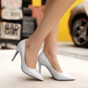
Post 2: For my second visual diary post, the example that came to mind is one of my local homeless shelters. The shelter, called the Institute for Human Services (IHS), offers a meal service/distribution to its residents and to other homeless individuals in the surrounding community. The unique thing about the meal service is that IHS allows its residents to volunteer as servers. While distributing free meals to a homeless community would often fall into the helping category, in this situation, I think there is more of an equal relationship, which makes it a service instead. The homeless individuals are given the equal opportunity to give back to their community, just as their community (through IHS) is helping them. It makes them less of a "helpless" party, and in inviting the homeless residents to serve food alongside the IHS staff, IHS is treating them as equals. I am inspired by the way that IHS conducts its meal distribution to be inclusive of their residents, and I think it would be great if other homeless shelters used a similar approach. (Image retrieved from IHS website).
0 notes
Text
Visual Diary 4 Post 1: Community Work Day

For my first visual diary post, I am reflecting on a service experience that I've previously participated in. During college, I participated in a community work day on a local farm. While volunteering my time in this way would typically fall into the category of helping, I believe this experience was instead an example of service. As we learned in our reading, serving is a mutual experience where both parties equally benefit, and there is no "debt" for the receiver. These community work days were uniquely designed so that the volunteers gained a lot from the experience as well. While volunteering, we got to learn more about Hawaiian farming practices and were taught many new skills on how to care for the land. At the end of the day, we even got to enjoy a free meal as a group, which was intentionally prepared using produce from the farm, in order to show us the full cycle of what the land that we worked on produced. In this experience, a mutual service is taking place since the farm benefitted from the extra hands and support, and the volunteers benefitted from the knowledge gained and the meal. In this serving relationship, the power and resources reside with both the helper (volunteers) and the receivers (the farm). A major pro of this service design was that by taking the time to share so much knowledge and skills with us, all of us volunteers were then better equipped to continue volunteering in the future. Overall, I think it was a richer experience for both parties. The image above shows what the work days look like (retrieved from the organization's website. which also has more information about the program). In the image, the program leader is taking a moment to teach the participants.
0 notes
Text
Visual Diary 3 Post 2: Slip-On Shoes
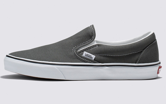
My second example of a human-centered product is slip-on shoes. Pictured above are slip-on Vans (just one example of many slip-on shoes on the market), which I personally really enjoy wearing.
There are countless ways that a shoe could be made more innovative, visually or technically, with new materials or unique silhouettes. Slip-on shoes, on the other hand, focus less on flashy innovation and instead are a simple, understated product that meets a lot of otherwise unmet human shoe needs. I think it's a great example of empathic design, as it appeals to human needs, of course, but also to human constraints and practices. Slip-on shoes offer convenience to busy people who must rush out the door. Slip-on shoes make independence possible for those who perhaps have mobility issues that make tying shoelaces a challenge. It is a simple product that helps people achieve these human needs of convenience and independence.
1 note
·
View note
Text
Visual Diary 3 Post 1: Adjustable Kid's Jeans
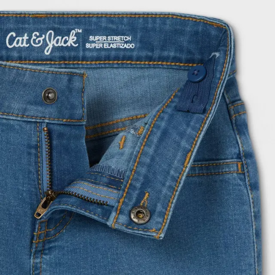
My first example of a human-centered design product is adjustable kid's jeans. As shown in this image, there is an adjustable elastic waistband that can be tightened or loosened using a button. The design is so intentionally and appropriately aimed towards growing children. I learned about these jeans in December when Angel Tree shopping vlogs were trending on TikTok. I saw a comment on one of the videos saying that adjustable kid's jeans are a perfect Angel Tree gift because they allow wiggle room for a child's size, AND allows the child to grow into jeans even a while after they were received.
I found this product to be very inspiring. Children grow so fast, and I can imagine that, as parents, it must be hard to keep up with buying new clothes so constantly. Therefore, flexible-sized jeans become a desideratum — especially in instances such as Angle Tree gifting when you are shopping for children who may not be able to afford many clothes and need these jeans to fit for as long as possible. Sizing is a human need that varies so much between different humans, and this product goes above and beyond other jeans to meet this need so well.
#Desideratum#Intentionality#Design Leadership#Jeans#Kid's Jeans#Adjustable Jeans#Human-Centered Design
1 note
·
View note
Text
Visual Diary 2 Post 2: Ticketmaster Dynamic Pricing

My second example of a wicked design problem is Ticketmaster's dynamic pricing. This is a feature that Ticketmaster has which allowes prices to fluctuate depending on demand, and it has been known to cause ticket prices to skyrocket into the hundreds or even thousands. I personally encountered this issue when trying to buy Taylor Swift concert tickets last year. There was a presale with thousands of people shopping at once, and as a result, tickets that had once been advertised as $100-$200 were going for $500 and up. It was crazy. I think this is a really cruel design on Ticketmaster's end because it takes advantage of their customers. The artists are partly to blame as well since I believe they need to choose whether or not to opt into the dynamic pricing, but I think the blame ultimately falls on Ticketmaster since they really should not have designed such a feature to begin with. This makes shows and entertainment less accessible to people and creates a very negative experience for users. I think this is the exact opposite of empathic design, as it completely ignores users' constraints and needs. Furthermore, I feel like this feature was created with the very intention of getting higher profits from customers who will have no choice but to settle for the ticket prices since a lot of shows only sell tickets via Ticketmaster.
#Empathic Design#Intention#Ticketmaster#Dynamic Pricing#Concerts#Tickets#Design Leadership#Wicked Design Problem
1 note
·
View note
Text
Visual Diary 2 Post 1: Apple Mouse Charging


My first wicked design problem is the way that Apple designs their mouse so that the charging port is on the bottom of the mouse. Pictured here is my mouse, and as you can see, it is completely unusable while charging. Just the other day, I was in a deep flow with my work but had to take an unplanned break when my mouse died and I had to let it charge. Another time, I was very close to a deadline and working on an email to submit my project, but the mouse died and I had to let it charge for a bit, which cost me some valuable time. This is a problem that annoys Apple users everywhere, and while it is a generally harmless problem, it is definitely irritating. Since Apple mouses are so fantastic (in terms of their function), if Apple could just find a unique way to improve the charging design, I think they could be design leaders in the mouse space. My gripes with this design are definitely subjective critique, as they are fully grounded in my personal experiences using this mouse.
1 note
·
View note
Text
Module 1 Post 3: Compostable Straw

This is a compostable straw — not the annoying paper straws that get soggy halfway through drinking a beverage, but a straw that feels almost like plastic but is miraculously compostable. Where I live, there is a ban against plastic straws. For a while, coffee shops and boba tea shops in my state were struggling because they couldn't give out straws for their drinks. They started giving paper straws, but customers complained so much due to how fragile the straws were. Sturdy, compostable straws became a desideratum in my state — eventually, these straws were created and changed the straw game. I don't even quite understand the technology that goes into creating this straw (how is it compostable even though it feels so sturdy and plastic-like?). However, I do know that the inventors must have thought boldly and pushed the bounds of their thinking to be able to come up with this straw when for so long, paper straws had been the only solution anyone else could come up with. This is why I believe this simple, human-centered design product is an example of design leadership. In the grand scheme of things, a straw is very small. However, I know that this invention had a huge impact on my state's local businesses and essentially revolutionized disposable straws in my state — now, these are everywhere, and it is widely considered the straw norm. Sometimes the smallest things carry such a great impact!
3 notes
·
View notes
Text
Module 1 Post 2: Spotify Music Streaming
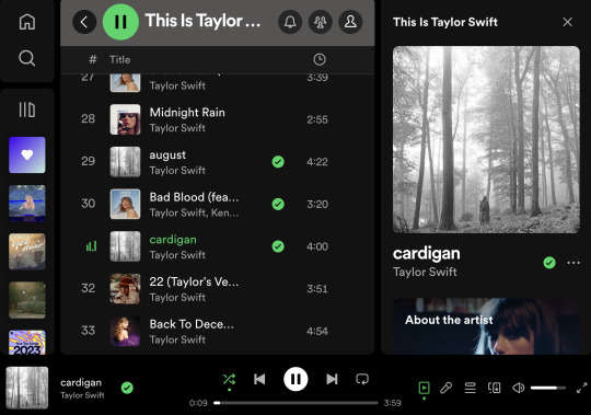
For my second example of design leadership, I wanted to think of something that I personally use often in my daily life. Going through my daily routine and considering what things I interact with most, something that stood out to me was Spotify for my music streaming. This is a screenshot from my own Spotify that I was quite literally listening to right before I started working on my blog posts. Spotify revolutionized music streaming. In an age where streaming was still conducted via individual song and album purchases, Spotify made the bold choice of offering a subscription-based streaming service and using a freemium business model. I think this was a design intervention on Spotify's end — they certainly created new opportunities for consumers and shifted the norm in the music streaming industry. Spotify's revolutionary music streaming design was very closely catered to the needs of music listeners (I think the offering of a freemium plan is quite reflective of this), which also leads me to think this is an example of empathic design. I certainly could not get through even one day without Spotify!
1 note
·
View note
Text
Module 1 Post 1: Loʻi Kalo

Living in Hawaii, one example that I consider design leadership is the Loʻi Kalo that exist on our islands. Loʻi Kalo are traditional Native Hawaiian irrigation systems that grow kalo (taro). My college campus (University of Hawaii) actually housed a beautiful Loʻi Kalo, which is where I first learned about these systems. Using nothing but the earth and a lot of creative problem-solving, Native Hawaiian people developed these genius irrigation systems that retained and channeled water from rivers and streams into the kalo patches. I think this is design leadership because they used what they had and the parameters given but thought outside of the box to create a design that really transformed the way that food was (and is still) grown in their culture. This was vernacular design, as it was born out of using the land and created by the community. I think there was a lot of intentionality in this design as well, as each component of the Loʻi Kalo has a very specific and important purpose in the overall design.
#Vernacular Design#Intentionality#Kalo#Loʻi Kalo#Native Hawaiian#agriculture#farming#design leadership
1 note
·
View note