
Statistics
We looked inside some of the posts by alisonnnnc-blog and here's what we found interesting.
Average Info
Notes Per Post
0
Likes Per Post
0
Reblog Per Post
0
Reply Per Post
0
Time Between Posts
2 months
Number of Posts By Type
Text
12
Last Seen Tumblr Blogs


Fun Fact
Tumblr was the first site to host the blog for President Barack Obama in 2011.
Text
Pub 231 Journals
Week 1: “What does Design means to you?” (How do you see/ use design in daily life?)
Before taking any SIAT course, “design”, this word just tied with aesthetics, and how we can make something aesthetic and appeal to our eyes.
Now, I believe that design is a process of problem-solving for specific purpose. Other than aesthetic, design combines with functionality and meaning to be a sustainable and effective solution serving for its purpose. Having a core purpose (like what the clients want), designer will do research, brainstorm ideas, select ideas, iterates again and again while reminding the match between product and purpose and creates prototype to test the product. Design is like a journey to create something needed in the world.
Design is a kind of communication to me as well. Our choice of font, colour, composition, text and image are crucial to how well and effective we tell the story, information. How it can attract and be understood is something we have to think about when designing with purpose and target audience. It is like telling a story in other medium indirectly. Therefore, design is like a communication to me and it is designer job to form the most effective communication required by clients.
Week 2: Print Production
Varieties of Paper:
1. Uncoated paper
for business cards, brochures, invitations, books...
have surface textures: wove/smooth, linen, laid...
2. Coated Paper
for magazines, brochures, annual reports, advertisements
(not always glossy/ reflective)
variety of finishes: gloss [shiny finish] , satin [good for img], matte [flat finish, ink just lays on top]
More info: http://designingforprint.com/3-things-to-know-before-you-specify-paper-a-shortcut/
Week 3: Who is a Typographer? (Create a list of typographers, collect an example of work for each: when the piece was done...)
Typographer [Definition]: a person who specializes in the design, choice, and arrangement of type matter (according to Merriam)
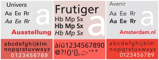
1. Adrian Frutiger (Swiss): An important san-serifs typefaces designer
Univers (1957)
Category: Neo-Grotesque
Similar to Helvetica as both are based on Akzidenz Grotesk
Has variety of weights and widths (flexible!!)
Similar Font: Nimbus Sans, Aktiv Grotesk
Font Pairing: Univers+Glypha
Frutiger (1976)
Avenir (1988)
Category: Geometric
Slightly humanist features: e.g. tail on t; o -->not perfect circle
Similar Font: Neuzeit, Sailec
Font Pairing: Avenir + Century Schoolbook
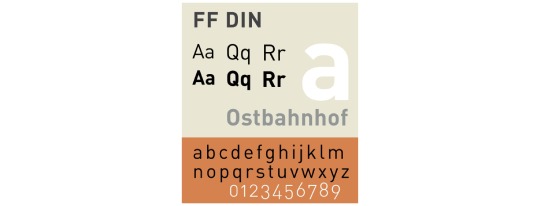
2. Albert-Jan Pool (Dutch): san-serifs
DIN (original version in 1931 for use in engineering and technical applications such as traffic signs)
Linear (1994)
Imperial (1994)
FF DIN (1995)
FF DIN ARABIC (1995)
FF OCR (1995)
FF DIN ROUND (2010)
Similar Font: Interstate, Nudista
Font Pairing: DIN + Aachen
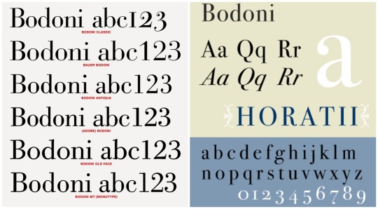
3. Giambattista Bodoni (Italian): serifs --- admirer of Baskerville
Bodoni (1798):
Category: Transitional—>Modern
Extreme contrast between thick&thin strokes ==> more suitable for display face than a text face
Similar Font: Didot, Modern 216
Font Pairing: Bodoni+Futura
Week 4: What are cool books about design?
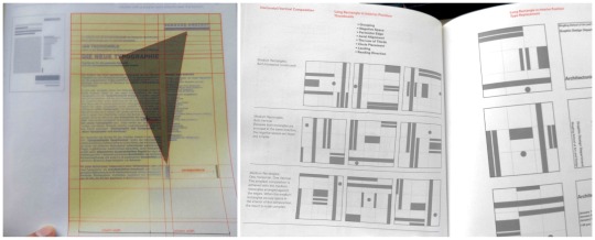
1. Grid Systems: Principles of Organizing Type by Kimberly Elam (2004)
This book mentions what to pay attention when we are designing the layout: proportion of elements, negative spaces, grouping, etc. that affects the overall visual hierarchy. It also provides many ideas on different composition like Horizontal, Vertical and Diagonal Compositions.
One cool thing about this book is that there are pages with grids and instructions that we can see through these pages and analyze the layout on the next page. This is quite helpful.
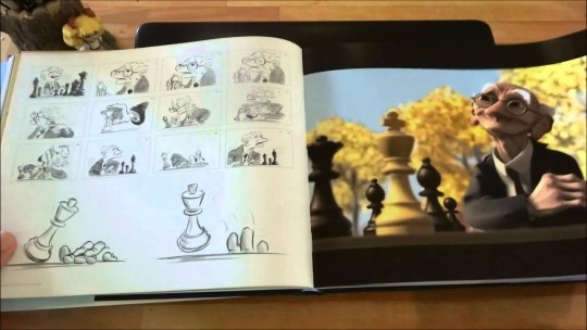
2. The Art of PIXAR Short Films by Amid Amidi (2009)
The book includes characters and storytelling design process of many Pixar short films. From the initial character design: sketches on the facial expressions, motion, modeling, character wireframe in software…to the storyboard of the short film, we can take a peak of the details of these successful animations.
The layout of the book is simple and organized. As it assembled many short animations, it goes in the same flow:
Initial sketches of the character
Notes to pay attention to
Character development (motion and emotion)
Digital visualization (finished work)
storyboard in sketches
Final digitalized scene
The photos are in full bleed and there is a yellow colour page to indicate the start of another short film. It has a dark blue hardcover with the stamped signature of Pixar — Lamp
Week 5: (Type)
Pay attention to:
Remove double spaces
Set italics
Replace hyphens with em or en dashes where appropriate
Remove widows and orphans
Do not break any proper nouns (names)
Do not break with less than 3 characters(what-ever=ok, whatev-er=no)
Do not stack more than 2 broken lines
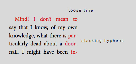
Check that quotation marks(”) and apostrophes(’) are not primes(")
Adjust loose and tight lines
Set small caps and text figures where neccessary
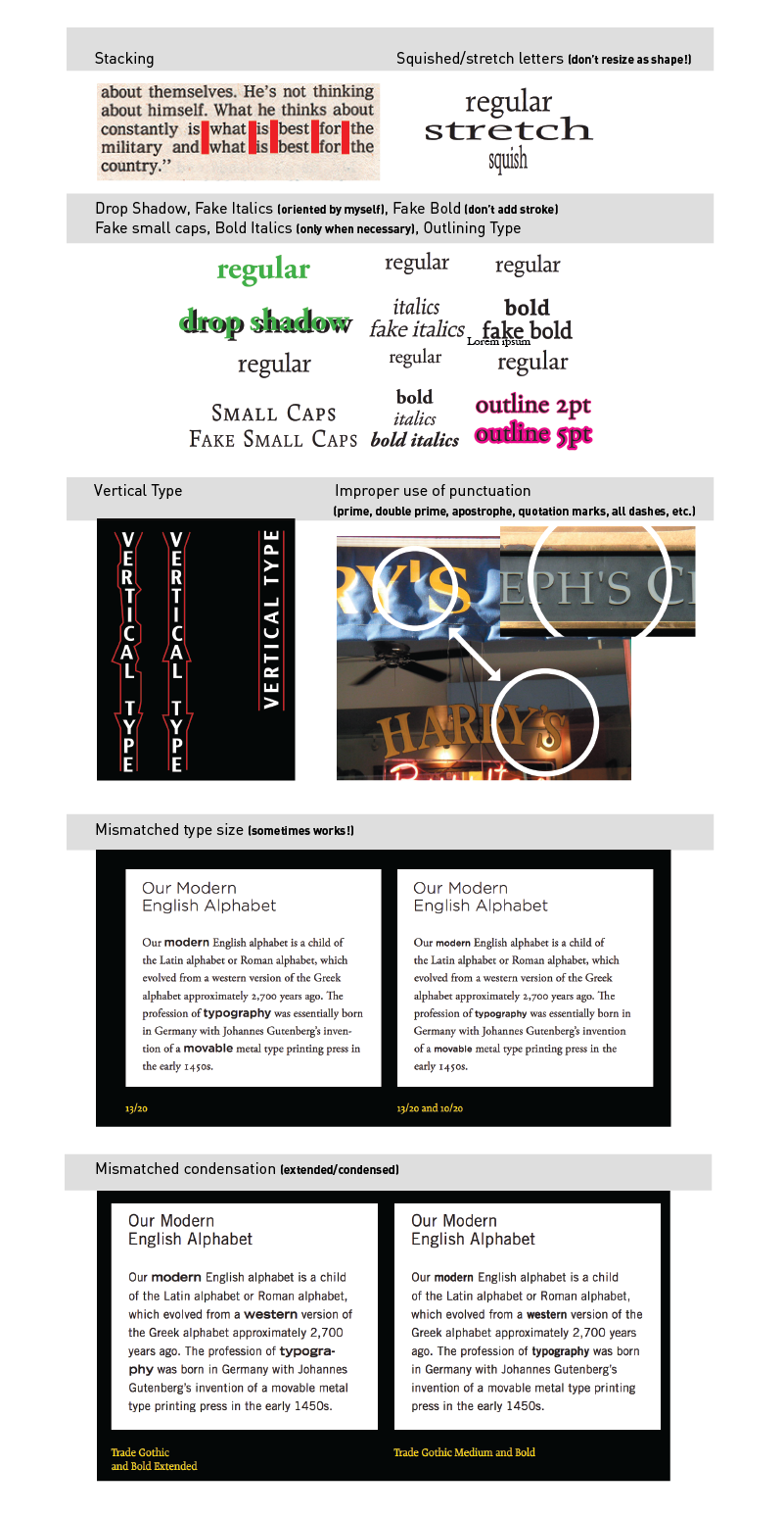
Type Crimes: (ones that I mostly will forget)
Orphan & Widow, terrible rag, double spaces, Improper hyphen break
NOT using appropriate ligature or dot-less i
Negative leading collision
Small caps with lining figures
Full caps with old style figures
Terrible contrast
Text only in all caps (sometimes works!)
Overly tight kerning/ tracking
Overly loose kerning/ tracking
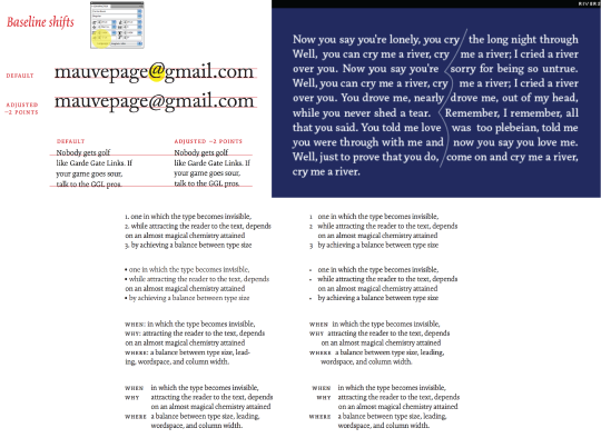
Baseline shift not adjusted (character or line of text)
Use of virgules rather than solidus for fractions
Too many typefaces (be careful of context and execution, sometimes in can work)
Rivers
NOT using hanging punctuation (numbers, bullets, indents, quotation marks)
Baseline shift not adjusted (character or line of text)
Week 6: Think about colour.
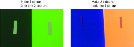
(What were some of your findings from playing with this mixing colour papers?)
For option 1: To find colour from achromatic.
For option 2: Have to match value of two different colours? To choose colours that has close values so it will look the same colour.
Week 7: What are interesting magazine about design?
(Find a design article that intrigued you and write about the most interesting and useful point of the article; take note of when the article was written)
Book Cover Design: (March 25,2019)
https://www.designweek.co.uk/issues/25-31-march-2019/book-covers-that-never-made-it-rejected-designs-revealed-in-new-book/
The article is about a new book called No No No No Yes, which includes 4 versions of book cover that did not make it (4 NOs) and the final used book cover (YES). The article mentions suggestions and reasons why the covers might have won the writers’, publishers’, and other production teams’ heart and why some nice covers got rejected. It is an interesting collection of covers that allows other designers to observe and analyze what clients may be looking for when designing. It is not only about the aesthetic, it is also about the communication of message. Here’s the takeaways:
For printed book:
“But a “direct” and “simple” message and good use of “colour” is often the key to finding a design that works, he adds.”
For electric book:
“so something bold often draws the eye over something restrained”.
Week 8: Publication design principles
Balance
Proportion
Sequence
Unity
Contrast
Things/Terms that I will probably forget:
Week 9: Find a really good and really bad book or magazine cover; analyze why they are good & bad.
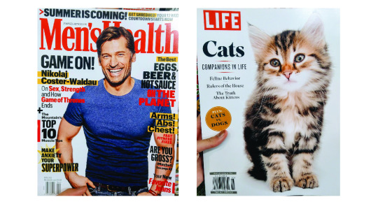
Left Cover (Bad):
Unclear Hierarchy: too much colours, the use of many shapes (star, bars), too many bolded/ highlighted/ drop shadowed word: which is hard to know what is more important as everything seems screaming out
No whitespace, everything is compact: for eyes, this might be too much, tired to read before actually start reading
The only success is probably the use of handsome guy to attract potential customers.
Right Cover: (Good)
Image matching heading “Companions in Life”: Correct image choice as I cannot agree more when looking at its eyes. (using empathy to attract readers)
Simple and clear: The hierarchy, theme is clear. It does not list all the potentially interesting feature articles title on cover. It only puts shape and use different font (probably bolded) typeface to create the contrast, which is simple and on point.
* Both covers interestingly used RED as main heading/theme, which is really popping out and readers can know the theme of the mag immediately.
Week 10-11: AUDIENCE, CONCEPTS & SEMIOTICS
1. Signifier: SFU
2. Signified: education, mountain, expensive
3. Icon: (it resembles the signs or the idea) e.g. F ~ facebook?
4. Index: (direct link between the sign and object; a reference; an indicator) e.g. toilet signs (the cartoon)
5. Symbol: (abstract sign; no logical connection between the sign and what it means; culturally learnt) e.g. country flag
6. Paradigm and Syntagm :
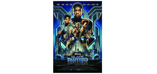
Paradigm: a chain or collection of signs which invoke each other because they are culturally, paradigmatically
Black Panther: power, authority
Syntagm: the structural relation that combines signs in code-specific ways.
Color: blue, gold, silver= wealth, high-technology, weapons, royalty
Size of characters: like the order of importance to the narrative; who got most of the power and who is threatening the power
Hierarchy: top-down, from big to small to title
Symmetrical balance: fight to be a stable, steady country?
The pointing “N” in title to sub-heading: metaphor the use of weapons/ metals, fights for the power
0 notes
Text
WEEK 8-9
week 9:
Visual interpretation:
The World as Flatland’s “ World Filter” (leave visual trace with IP)
Digg Labs ( stories, topics, other web content and rate by users)
0 notes
Text
WEEK 8-9
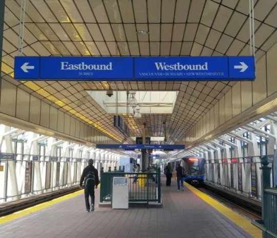
Spatial transportation contexts, e.g. waiting and loading areas, transit lounges, vehicle interiors and displays
week 8: (think in time and see things in sequence!!)
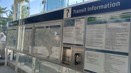
Environmental and Interactive Wayfinding:
Planning: tools for people to plan a trip (with different travel modes)
Moving: tools for people to make decisions along the way ( orientation, direction, identification information>> landmarks, focal points, decision points, rest areas) like google map
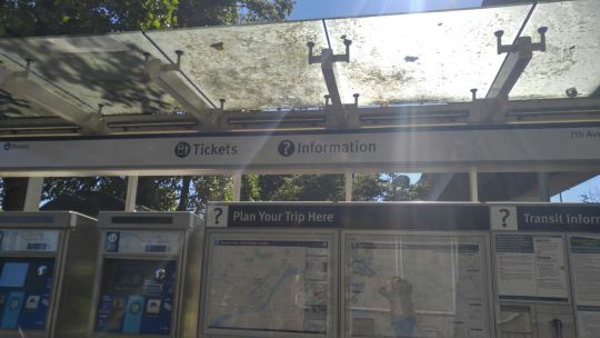
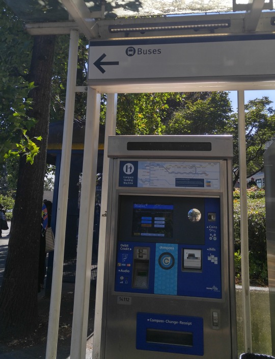
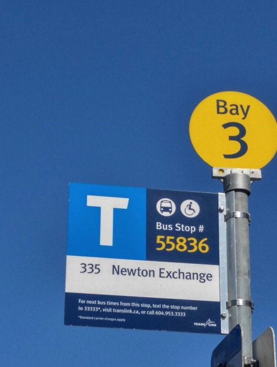
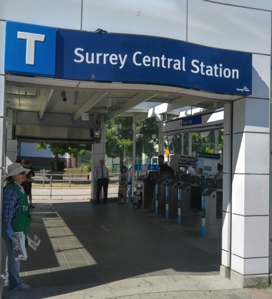
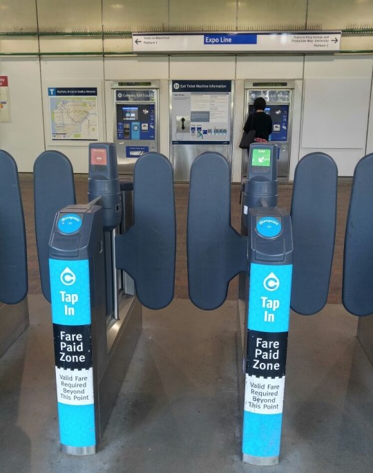
Changing: tools for people to make decision about the journey when changing from one transport to another (like train to bus) **interchanges: subway stations and bus stops. ( the boards outside the station that allows people to check where they are,where their destination is and how to get there with bus table next to it.
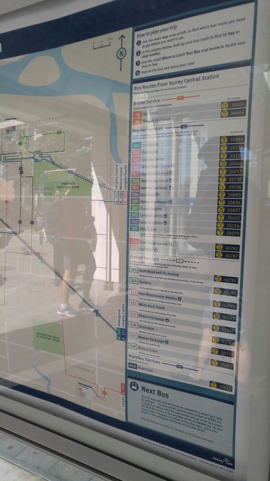
Name + symbol: memorable and engaging, instantly recognizable, iconic (like the bus symbol and “T” for transit, and different symbols around the station)
street signage system
personal tools: what the system should embrace-- digital tools to support navigation
Guiding principles:
unified language
data organized + updated in same centralized database>> same standard
Planning signage...
- KEY
the sequence in which the viewer will encounter the information
street level to platform area
- a lively color palette
Here’s Canada public transit (skytrain and bus) in color theme yellow and blue, which can create contrast and it is easily recognized by the public as these two colors represent the transports and stations in Vancouver.
0 notes
Text
Week 6-7
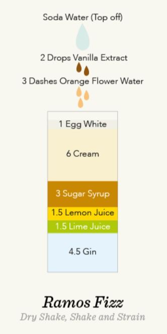
http://www.informationisbeautiful.net/visualizations/cocktails-interactive/
- Not only this is an interesting idea in showing the ingredients in the drink, but also it is impressive that the order of ingredients is based on the amount in the drink, in ascending order from top. It represents the portion of each ingredients as well.
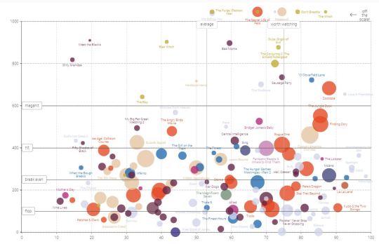
http://www.informationisbeautiful.net/visualizations/the-hollywood-insider/
- Even though there are many overlapping, it is good that there are still responses and extra information pops up when mouse hover
- Since there are some off the scale, it is better to update the graph/ change it to keep all the information inside
- It did not state what the color represents, that’s why, as the user, the graph may be a little confusing as we do not understand the color choice and reasons why the movie is represented with that particular color.
0 notes
Text
Week 6-7
Examples: http://www.informationisbeautiful.net/
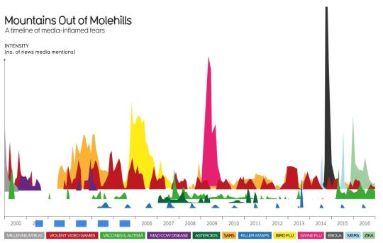
http://www.informationisbeautiful.net/visualizations/mountains-out-of-molehills/- use color to represent different headlines (use strong color)
- show the data mountain in different colors,especially in different layers >>> show data clearly without too much overlapping
-keeping distance in each year column >>> can see the small or huge changes within a year >> data can be compared within a year,or years.
- show the information and connect all like a mind map.
- use different line weight to represent the amount
- add a little icon with the information for better understanding
X: hard to get the color use (For example,what does light blue represents comparing to the darker blue that is much more legible?)
GOOD EXAMPLE (legible and appropriate)
0 notes
Text
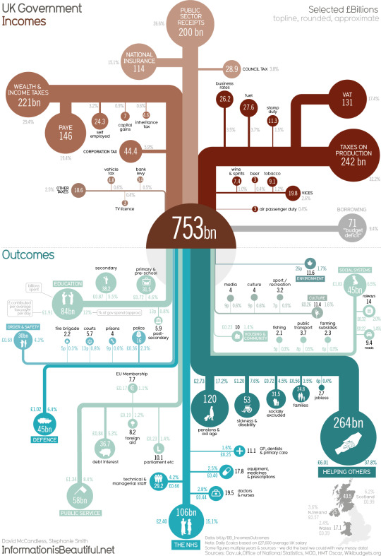
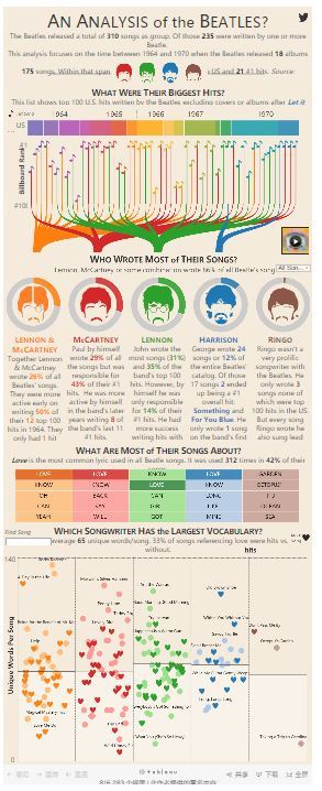
Week 6-7
Good example of online infographic “AN ANALYSIS of the BEATLES? “
http://duelingdata.blogspot.ca/2016/01/the-beatles.html
Ways to organize+visualize information + user interaction (based on BEATLES):
1. It uses 4 colors to represent the 4 members,which also links to the songs they wrote alone or together and the unique words loved by many in the songs. >>> To categorize the information with color.
2. The color graph also connects to the year color bar as well. With Billboard ranking using the music note. >>> Use simple symbol to represent points on the graph.
3. Use pie chart to show percentage...>>> The one on webpage is nice and clear on who wrote the songs. Perhaps the five pie charts can combine into one so it is more obvious when comparing.
4. (In the common lyrics table) Highlight the same data in the table so user can easily know whether there are common words among the songs and who uses the word most.
5.
Good:
use heart symbol to represent the word “LOVE” in the song and show the unique word distributing in graph based on the word usage per song.
Show extra information when mouse hover.
Bad:
It takes some time to understand the graph completely. It is hard to know it actually shows the number of an unique word in each beetles song.
It is hard to get why it uses circle in the graph as well since it did not state the meaning of the circle like what heart means on the top right corner of the graph. >>> should add the meaning of circle as well.
0 notes
Text
Week5
Choosing appropriate media to deliver data:
columns for small screen :7-10 words per line,50-70 characters per line
digital devices (brightness, contrast, colour depth ,resolution)
Design for majority, get users to content as quickly as possible(simple)
Responsive and consistent interface
For iPad:
“Skim and dip”
Swap pages
scrolling carousel navigation system- use thumbnail images
tap stories on home screen and appear instantly in reading pane
For mobile phones:
Consider restrictions like portrait, landscape orientations, screen size, gestural interaction
Navigation: simple and universal
Consistency and simplicity is important. I do not know whether this applies to the same web on different platforms, like the same social media app on computer and on smartphone.
For example, soundcloud (https://soundcloud.com) has different interface on computer and on smartphone. There is an inconsistency between these two. The mobile app has less buttons and functions comparing with web, but isn’t this supposed to be the same? As a user, I found this a little confusing and inconvenient as mobile app is simple but does not include all functions, which limits my usage on mobile app. For example, profile setting can only be change in computer version but not in mobile app.

Fig 1. Soundcloud interface on computer
Fig 2. Soundcloud interface on mobile app
0 notes
Text
Week4
Legibility, Readability,Contrast:
Font: spaces, x-height
Weight,size and size
Color, tint and tone:
Hue, shade(added black), tint(added white), tone(added black & white/ grey)
Colour-coding ( attach a specific colour to a category or group of content >>instantly recognizable) [eg. MTR,subway system]
like Fig 1. Red=most important,urgent...and each page represent by different nameable colors
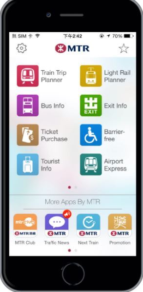
Fig 1. MTR app Main Page http://www.mtr.com.hk/en/customer/services/mtr_mobile.html
Body content:
Avoid using condensed or extended faces
do not set to all capital letters
Usually 8-14 points in size
Use nameable colour ( with right combination)>>more memorable
Typographic elements:
typeface(have personalities)
Kerning (too close—cause confusion) [space between letter]
tracking[space between letter in a whole word]
leading [space between lines in a paragraph/block]
paragraph (indent of 12 points if it is 12-point text + be careful on widows & orphans)
Graphic elements:
rules (lines to divide, frame and emphasize elements within a design)
dots/bullet points >> clarify information
lines (curved lines can use to create form)
arrows (eg. Diagrams >> direct attention)
Imagery:
Illustration- able to add colour, suggest personality, mood and tone
Photography- crop, scale
Pictographs ,icons, symbols
Diagrams- plans, sketches, drawings, instructions, visual aids
In fig 2, photographs are used as the added information to support text,so viewers can know what they are looking for by recognizing the photo.
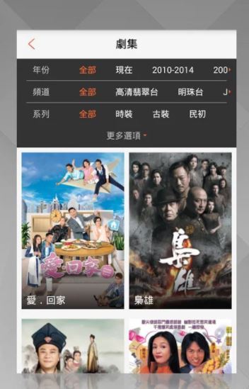
Fig 2. TVB app search drama page
0 notes
Text
Week4
Design Toolkit (Key Principles of good design) Workbook
Color - easily scan and isolate elements like subheadings and bullets
Type Styling - differentiate types of information,gives a sense of hierarchy
Weight and Scale - prioritize information (works with color and type styling to clarify complex hierarchies)
Structure - make use of grid and white space
Grouping information - hierarchies of importance(use color,weight,scale)
Graphic Elements - (use lines, rules, bullets to attract eyes),can give direction
Imagery - use an intriguing image as reader may attract by the photo rather than reading every text
Sound and Motion - can leave a memorable impression(playful site navigation)
My refined webpage of https://www.ultimate-guitar.com/
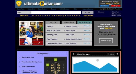
Fig 1. My refined web of a crappy web
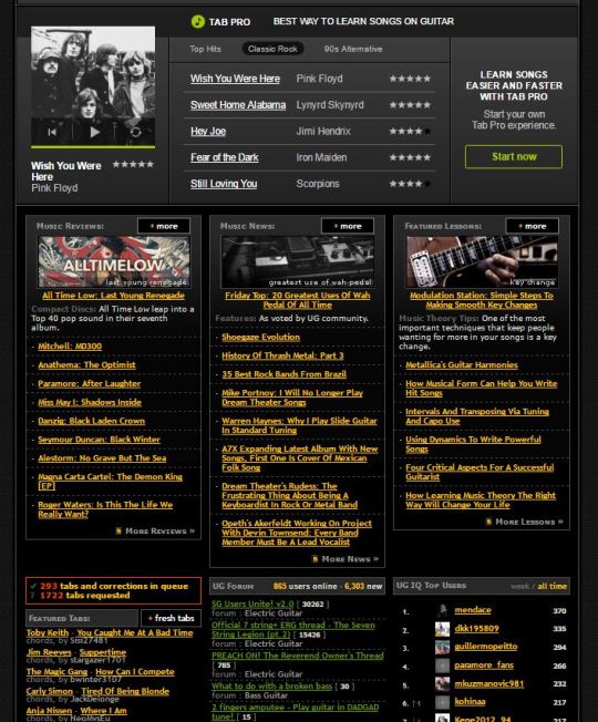
Fig 2. The original webpage
Although the original website is changed from time to time (the current one is not the original one I saw before designing the one on Fig.1), I tried to keep most of the elements in the original web. There are three main principles I used/should use to design this web, make it more legible and memorable.
COLOR :
I tried to turn the whole page color theme similar to the logo color to look more united. As color can help reader do quick scan,find the important button,functions, I also put the search tool into yellow to help viewers locate these main tools quickly. Beside, interaction are added with color change to white when mouse hover.
GRID:
In Fig.1, the web is clearly divided into 3 main area in main content. This is better than all packed together in Fig 2 as this is also a hierarchy of importance. In Fig 2, not other all sessions packed closely together, all the links are also in sharp yellow color. This is not only distracting, but also unable to know which one is more crucial within this crowded bottom area. Therefore I put into 2 main bottom session, which the one on right can go to other session like music news,lessons,etc by clicking the arrow.
My only concern for this one is that viewer might not know they can change the content by clicking the arrows until the mouse hover to that area.
SOUND AND MOTION:
This is an interesting area as for this kind of music page, sound is a crucial element, like a snippet of song is played when the photo slideshow is on, or a guitar chord is played when mouse clicked the guitar lesson area. This can give great impression to viewers and show how practical this web is to the target viewers, like beginners.
0 notes
Text
WEEK 1-2
04 Type and Interface
Wireframe: represents the skeletal structure of a website or application. From the chapter, what I can understand is that before we start to design and put the information into the web, we can have a low-fidelity wireframe to think, organize, allocate the text box, button or image box.[We can also use symbols to simply identify the interaction elements in the page] Therefore, we can have a clear picture of what we are going to create. Simple graphics and tilted lines can be used to represent the interaction in the page.
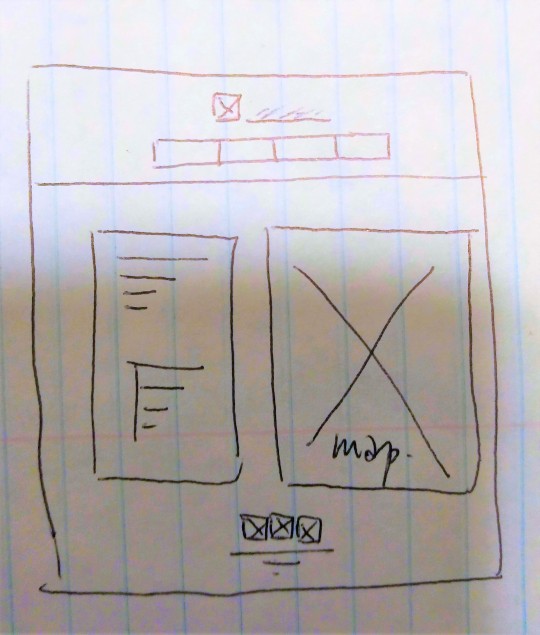
Fig 1. My wireframe/graft of store page in HeiLison
Good Pies:
Emphasize the name rather than the number
Change it to a ring so we can put some text inside and outside the ring rather than putting the text in a column next to it.
Highlight the text when mouse over a section of the pie(interactive), rather than use arrows pointing everywhere.

Fig 2. Sample of bad pie chart (should follow the above 2)
Table:
Good:
line: only on header line, row lines
shades: on header and row lines
color bar on key information
Bad: (uneven and might overemphasize some data)
tight line spacing
narrow row height
uneven cell dimension
cell width are fixed on the longest line of text
0 notes
Text
WEEK 1-2
WB CH2
Wrangling Audience & Content:
What I learn is that we firstly have to identify and prioritize possible users first. For example, in Hong Kong government website, it separates into 3 main tabs Residents, Business&Trade and Non-Residents, which are the 3 reasons people staying in HK. This can help user identify themselves and find what they want clicking the right category. || Although this is not useful in restaurant website design, it reminds me to think and consider who are the audience/ possible viewers and the target customers of the restaurant=> kids, teens and families.
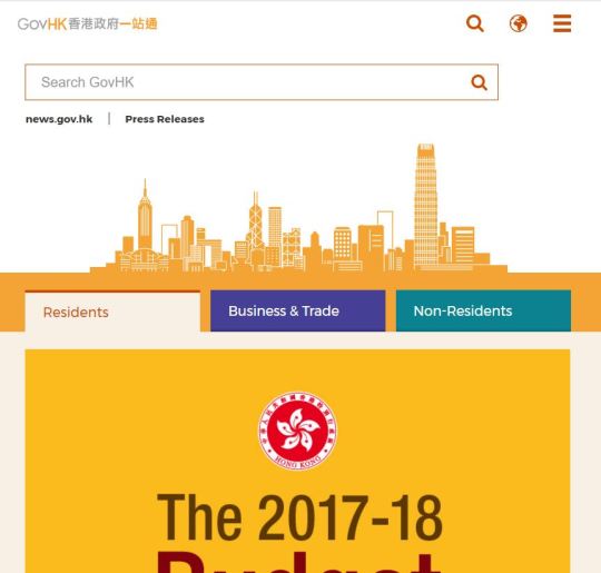
Fig 1. HK Government Website www.gov.hk
Secondly, understand the requirement needed to be included in the website. Gov website has included all the social aspects with a little symbol next to each of the page. These mini infographics allow to those who do not understand the language get the meaning of the page. I thought of doing the same in the navigation, but considering that this is not going to be used world-widely anyway, instead I put the logo of donuts a little bigger, so whoever visits the page will know what the restaurant is famous for when they open it.
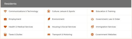
Fig 2. HK Gov under Residents’ Tab
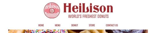
Fig 3. The header and navigation of my designed restaurant HeiLison
From the reading, it also mentioned the label in alphanumeric system. Arrange the pages in alphanumeric system not only can make the website looks well-organised, but also helps the viewers find what they are looking for as it is the intuition when we are checking from the top. I agree that this is useful all the time, but in my opinion, in website with less pages it is better to list from most important to less important, from what most people will look for to least. Therefore I changed it to the one shown in Fig 3.
Besides, it stated that we can highlight the keywords so viewers can find what they want rapidly. Rather highlight keywords, it gave me the idea to change the color of the navigation whenever the mouse is over one of the title like “HOME” and “MENU”. This can be one of the interaction elements in the website, which allows viewers to know what they can click into and read, a little guiding in the website.
0 notes
Text
WEEK 1-2
From Introduction:
Infographics: visual displays in graphics like illustrations, symbols, maps and diagrams ==> mostly use to explain complex information and tell stories
[Examples: scientific illustrations of human body, brains, subway map...]
Putting each station in the Hong Kong map in shade,which makes the location of each train station in Hong Kong easier to understand and imagine the distance.
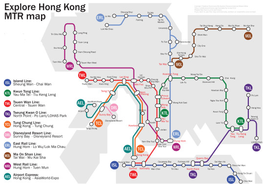
Fig.1 Hong Kong MTR Map
Information Design: use to inform people, like general government website, informative and infographic is one of the possible outputs.
https://www.gov.hk/tc/residents/
Data Visualization: the visual representation of different information together to allow the viewer understand the ideas,patterns,structures or relationships effectively.
2 structures of information visualization: hierarchical and textual.
Hierarchical: usually arrange in directional relationship to one-another vertically, horizonally or centrally.
Textual: Typography is one of the ways to visualize this. Mostly on website like government website that are more text-based. The problem is that sometimes it might be hard to differentiate which word is important as the length, color and weight can make viewers confuse. However, it is still necessary to show the information accurately.
0 notes