
Statistics
We looked inside some of the posts by alkond-art and here's what we found interesting.
Average Info
Notes Per Post
44K
Likes Per Post
32K
Reblog Per Post
12K
Reply Per Post
44
Time Between Posts
5 days
Number of Posts By Type
Photo
5
Text
6
Note
6
Last Seen Tumblr Blogs


Fun Fact
Tumblr Inc. is funded by 13 investors.
Text

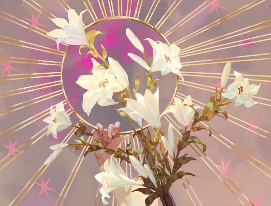
It is literally me and my 2nd personality when people act we don't like🖖🏿🤡🗿 (tap the pic 4 better quality)
#illustration#art#design#digital art#character art#aesthetic#anime art#sketch#digital sketch#bodyart#comics#funnymemes#funny jokes#funart#peopleart#portrait#art commisions#digital fanart#digital commisions
2 notes
·
View notes
Text


Omg on the 1st pic there is a boy I like, thanks to the world he doesn't sit here
#illustration#art#design#digital art#character art#aesthetic#anime art#sketch#digital sketch#muscle art#peopleart#portrait#tennisart#nacked#bodyart
7 notes
·
View notes
Text

Half of my tennis team 🤩🤩🤩🥰🤌🚬🗿
#art#illustration#design#digital art#character art#aesthetic#anime art#sketch#digital sketch#tennisart#muscle art#bodyart#peopleart#portrait#digital fanart
8 notes
·
View notes
Text


Omg just look at the palette
#illustration#art#design#digital art#character art#aesthetic#anime art#sketch#character design#own character#digital sketch
3 notes
·
View notes
Text


2 notes
·
View notes
Text

2 notes
·
View notes
Note
Hi Awanqi! Your art is beyond exceptional! I'm in love with the way you control colors; it gives a dream like quality to your pieces. How is it you went about learning to place colors as you do? Studies? Another artist? (I saw you like Leyendecker ;D) I read back a little and you seemed to opt for more vibrant colors over realistic ones (referencing the ask directly) But I feel as if you still largely maintain a strong grasp of realism, and it fucks me up on so many levels.
Thank you so much <3
There were so many places where I learned color, but I hope I can recall the most important ones
Noah Bradley’s youtube channel has helpful videos on doing studies. Robotpencil does too, and I remember how his tips on value helped me a lot. Leyendecker, yes, him too :) and Alphonse Mucha has good colors. James Gurney’s book on color theory was also a tremendous help.
Learning the fundamentals and practicing them allows you to maintain that strong grasp of the basics while also doing other stuff like stylistic ventures, etc. I always say that I have to know how to draw well in order to paint well. Drawing, like with lines, is the most basic and important of art techniques for me.
Fundamentals (for me): anatomy, value, color, composition, drawing, realism (in terms of anatomy, and maybe the other stuff too)
As for placing colors, I’m always trying to find a good color palette. Keep switching it up to see what you can come up with. Color theory comes into play here the most. Some colors look good together, others just don’t. Test out the intensity/saturation as well, and values too, of course.
449 notes
·
View notes
Note
aaa hello! can u please share me your secret on how to draw such beautiful skies ?? ive been struggling with them lately ;( is it a matter of using references?
Yes, definitely use references. If you’re ever struggling with drawing/painting something, it’s always a good idea to reference an image, that way you can see how it works and learn how to draw it as well. General tips for skies: paint with a gradient of color/value/both. Add elements that relate to skies to make it interesting, could be anything ie skylines, birds, clouds, indication of wind, stars/moon, etc. but mainly just know what color the sky will be, look up what it looks like in both photographs and paintingsHope that helps!
66 notes
·
View notes
Note
Do you have any advice for getting from line drawing and cell shading to painting? I can draw just fine but whenever I try to paint I fail a lot, I just can't get it right. I've always preferred more 'flat' cell shading, but I thought that if I want to become a professional I should learn how to paint as well, but I am really, really struggling. It always looks so weird and pale and weirdly 'amateurish' and I have no idea how to handle this? Please help me, you paint like a god haha
I’ll try to answer this based on what you’re telling me, … So, it seems that your painting efforts aren’t going so well, the first thing I would check up on is your value. I think I can visualize what you’re getting at when you say “weird and pale…” that happened to me a lot when I was just starting out painting digitally. Your colors/values are perhaps looking muddy, almost too soft, little distinction, etc. I’d recommend shading in blocks. Force your hand to make a definitive edge when you’re painting shadows and lights, look at master paintings or other paintings which you think have good value and would like to emulate. A tip I have is to turn a reference painting/image to greyscale and carefully observe the differences in value. I made a similar post in the past, here where I touched on my method of painting. Hope this helps somewhat! I think I also recall several other asks that I’ve answered that talked about painting.. it might be down there somewhere in my ‘asks/tips’ tab.
224 notes
·
View notes
Note
I have a question I've always been wanting to ask, how do you pick your colours? Especially the skin tones... I often find cool and slightly saturated cyans and green in them and I think they look really nice! Keep up the stunning work! ^_^
I like a combination of analogous, complementary, and chromatic neutrals in my pieces. One or the other is typically the light and shadow, so for example if my overall palette is warm, the skin would be some warm color and the shadow would be either the complementary of that (desaturated) or the chromatic neutral. I believe it can be interchangeable at times.
Generally, if I have orange light, I will have a desaturated orange or a very desat. blue, the complementary, as the shadow. You can switch it up with the analogous colors of either dichotomy, so orange light + desat. purple/desat. blue/desat. green for shadows, and vice versa, etc.
One more example, blue light + warm shadow, i.e. desat. orange/yellow.
Dividing lights and shadows into warm and cool, or cool and warm, is a good starting point for me.
And just as important to keep in mind is value. A good placement of value and color makes all the difference!
Hope this was informative!
:)
436 notes
·
View notes
Note
Hello! firstly i wanted to let you know you are one of my greatest inspirations when it comes to art! your use of color and composition is phenomenal <3 secondly, i was wondering if you had any tips when it comes to A) sketching B) cleaning up and rendering sketches. thank you!
Sure, I got some tips for you :)
Читать дальше
379 notes
·
View notes
Note
Thoughts on the asaro head?
For those who are unfamiliar,

This is the asaro head! It’s a great starting off point, but it doesn’t look like it shows all parts of the skull, but I suppose that’s the result when you’re simplifying something complex, as the head is. I think it’s very good for showing how the head is shaped in a way that is easier to grasp, but I also wouldn’t rely on it solely for learning the head, since it doesn’t detail everything. I believe there are other kinds of plane heads, some more specific than the Asaro head, or less, and it might be good to check those out too, if interested!
(Such as this one, it’s more specific in that you can more clearly make out the form of the skull and it’s landmarks, but at the same time not every human head looks like this; there are advantages and disadvantages with these, but that’s to be expected)

For a more detailed approach I’d recommend studying the skull along with the more surface stuff like muscles and skin. Knowing what lies underneath can only help you better understand what you’re actually drawing :) anyway, that’s just my thoughts. Thanks for asking for my thoughts! I hope you could get something out of my ramblings 👍
1K notes
·
View notes


Photo

taken from April 2018 tutorial reward.
Full version (up to 18steps) + Step by Step videos (‘Drawing and Painting Shelves’ total duration: 11min 54sec )
Tutorial is already available here: https://gumroad.com/kawacy
4K notes
·
View notes
Photo


Oda Nobunaga with her younger brother Oda Nobukatsu and *cough* her future girlfriend Okita Souji from Fate/Grand Order.
as kids from the Sengoku period of Japan.
5K notes
·
View notes