
Statistics
We looked inside some of the posts by almondoll and here's what we found interesting.
Average Info
Notes Per Post
2
Likes Per Post
2
Reblog Per Post
0
Reply Per Post
0
Time Between Posts
47 seconds
Number of Posts By Type
Text
17
Last Seen Tumblr Blogs


Fun Fact
Tumblr.com is the 103rd most visited website in the world.
Text
The Final Evaluation
In recent years, in a society where the Internet has become mainstream, the low awareness of sex discrimination in Japan just before the Olympic Games would be held, has become conspicuous. Therefore, I was investigating discrimination against women in Japan in my first research, but as I researched more, I knew the fact that even countries that are aware of sexism have not completely solved the problem. With these as an opportunity, my concept was not to "inform / make people aware of sex discrimination in Japan" but to changed to "a movement to create a world where women can live and act more comfortably". This means that I tended to focus on negative articles when dealing with the former topic, but the latter one had a lot of very positive and fascinating articles (such as the references I included in my research). In short, this research made me realize that I had a negative feeling about the word "female" without my knowledge. Instead of spreading the negative image, I wanted to convey the positive image of women to people. My concept, which was born in this way, changed to "encourage and support women."
The last unit took more effort to input and output ideas than ever before. I was trapped in creating an object and was spinning at the stage of preliminary research. Thanks to the great tutorial, I've noticed my mistakes many times. It took me a while to discover the connection between the final concept and the output, but I think it was done within the time I expected.
As mentioned above, I had a headache every time I had a tutorial. As I was idle for a long time, I was doing research and output at the same time. However, the tutors who would be patient listened to my presentation. I made a note of the advice I received at that time, understood it in my own way, and used most of it in my work.
I wish I could increase the layout repertoire of the process book a little more. Throughout all the units, I was conscious of improving visual design, including editorial design, so I thought I should know more accurately how to use InDesign efficiently and how to shortcut.
Through this unit, I learned how to create 3D illustrations with InDesign and kinematic typography with Adobe effects. I was also surprised that they are simple and can be combined to create more complex works. I realized that it was important to understand simple tasks, not to know the difficult things from the beginning.
I have some things that I finally understood through all the units so far. Especially when thinking about the concept, I thought that works that were complicated and took a long time to understand were beautiful, but visual communicators are not. The last some sentences will be in my process book.
2 notes
·
View notes


Text
0 notes


Text
Trials of Animation
No.1

Too blinking
——————————
No.2

Good movements but think the timing
——————————
No.3

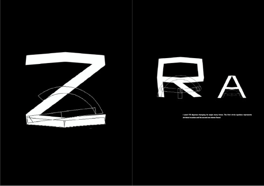
It’s a bit far from the concept - ‘flexibility’
0 notes


Text


The Interesting article - Femme Type
I knew there are many typefaces which were inspired by something around us. I choose some of them and analyzed how it work and why did designer decided to make those typeface (https://femme-type.com).
.
.
Stéphanie Brusick
: On Elegant Font Design & Serifs Inspired By Fashion
https://femme-type.com/stephanie-brusick-on-elegant-font-design-serifs-inspired-by-fashion/


The elegant typeface was inspired by fashion. The smooth line reminds me soft and elegant texture. I felt this typefaces is matched with serif as the line is thin and smooth like silk. The most interesting part is this designer has not tried to design typeface because she is a visual designer and director, but she is an expert of visual design, so she has a lot of knowledge about fashion styles. This means many inspirations come from everywhere which is sometimes not related to a topic directly.
.
.
Mournblade
: By Morganne Borowczyk


According to Morganne Borowczyk’s interview, this typeface represents that ‘ancient mythologies of monsters and magic with a contemporary eye.’ Because she has loved fantastic story since she was a girl, the typeface tells a story. I can understand what kind of the story from the typeface.
0 notes


