
Don't wanna be here? Send us removal request.
Statistics
We looked inside some of the posts by alternatecontrolsij and here's what we found interesting.
Average Info
Notes Per Post
0
Likes Per Post
0
Reblog Per Post
0
Reply Per Post
0
Time Between Posts
2 days
Number of Posts By Type
Text
17
Last Seen Tumblr Blogs


Fun Fact
The Tumblr app for Google Glass was released on May 16, 2013.
Text
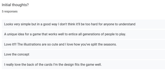
Progress - Feedback
Now that I am happy with the characters I have designed, I wanted to get some feedback to ensure I was on the right path. This has reassured me that I picked the right design decisions!


0 notes
Text
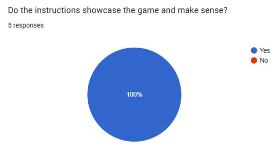
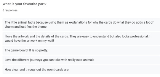
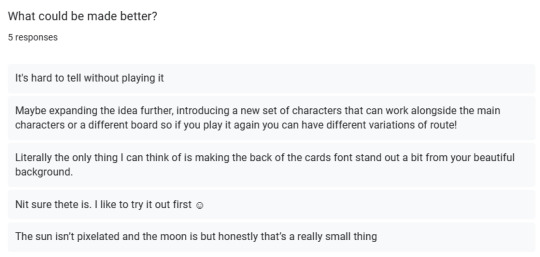
Final Product - Feedback
As I now have the final product of what my game involves, it is important that I reflect on this and showcased my work to people who haven't seen to get some unbiased opinions. This always help to think how I could do better for the next project.
0 notes
Text
Card Design - Final Outcome

To give a good example of how this game could look physically, I decided to print off a few of the movement cards just to see whether they were how I envisioned them. Unfortunately, my home printer is not reliable (hence why I haven't printed it all off) so they are not perfect but I believe this showcases how this game would come to life. The colour scheme works well together and I think that the whole game would look vey visually appealing all together.


0 notes
Text
Card Design - Final Cards
This is the link to the entire document of cards, pieces and board! I am vey happy with how it came out and worked hard to make individual cards that are understandable and cohesive. If I were to print it out, I would need to do it without border and do it double sided from the longest side of a piece of paper!
0 notes
Text
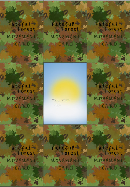
Card Design - Day/Night

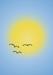
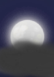
Another of the element of the game that I have added is the day/night card. This card will be flipped every round of turns and will give different bonuses and change the gameplay for each animal. I wanted to create something really clear to represent this. I started off with a more complicated approach of using the different trees in a lighter and darker background but I didn't like it at all. So instead, I though of what showcase day and night the most obviously which is the sun and moon. I used a smooth low opacity brush to build up the colours for both and added the detail of the birds for day and the cloud for night to make it even clearer. I think this look exactly as I wanted them!
0 notes
Text
Board Design - Counters
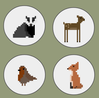
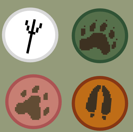
So that can players can go around the board I needed to make some counters that depict the four different animals. At first I thought about using the same animal design and just scaling them down but I think I have used these images enough for the cards so I decided to challenge myself to create something new. It has to be cohesive with the design and link to the animals clearly so I decided to do their footprints. I researched good reference images and went ahead and did the different designs. I also wanted to added a thicker border and this gave me the opportunity to figure out colours too. I decided to go with the overall colours for the animals representative seasons as this meshes well. White for the winter robin, green for the summer badger, pink for the spring fox and orange for the autumn deer!
0 notes
Text
Board Design - Spaces

This may have been the part of this project that I struggled with the most. I was very much overthinking and overcomplicating the design as in mind I had an elaborate board with different paths. This isn't the route I needed to go down as I just want some simple gameplay to show off the cards! So ultimately, I decided on a path that has an equal amount of spaces in each season and explores the forest in it's entirety!
0 notes
Text
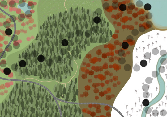
Board Design - Big Progress

I have really been enjoying the process of designing this board as I am using skills I haven't used before. My visualisation of my idea in mind is a board that shows the seasons of the year through the landscape. The animals will have different bonuses for the seasons and certain parts of the board like deer stopping on roads and badgers not moving on water as this adds a level of detail and contextualisation.

I started off with separating the board into four and adding roads and water to decided where I wanted them. The summer (second) trees were simple as I have done these before and the winter (fourth along) were pretty basic so I didn't have any problems with them. But when I tried to the spring (first) and autumn (third) trees I struggled with the entire design. I begun with these blobs of colour thinking that it could pass as trees but they didn't look good at all. So I tried to overcome this and took some time to ask around and search for better ways. I eventually found that drawing a tree in a separate file, turning it to black and white and making it into a pre-set brush to use and turn into different colours worked really well. This meant I could go in and do a few trees in there respective colours and then copy and paste them to fill the board out. I will definitely use this approach for future projects. I am really happy with how it turned out!

0 notes
Text
Board Design - Sorting Problems

As I am beginning the design on the board for my game, I am ensuring that I am considering the most effective ways of doing things. I wanted to draw a bunch of trees and then go in and copy and paste them, flipping them every now and then to add variation. However, when I tried to select a certain amount and pasted them, lots of them weren't picked I which I assume is because they are fairly close in colour. I did some research into why this was happening and also asked the people around me to discover it is to do with tolerance. I have never changed this before! I lowered it down to 5, a big difference from the 32 default, and now when I select some trees none of them are cut off.


0 notes
Text
Card Design - Printing Layout
If I were to print out this card game, this is how the first few cards would be set out! My next target is to make instructions and character cards for the players so they can understand the rules.
0 notes
Text
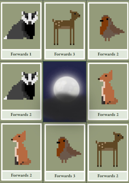
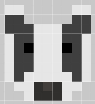
Final Characters - Polishing
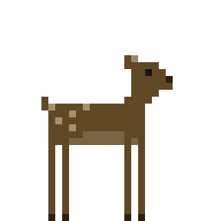
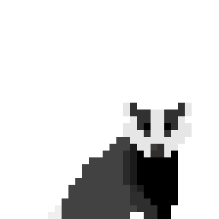
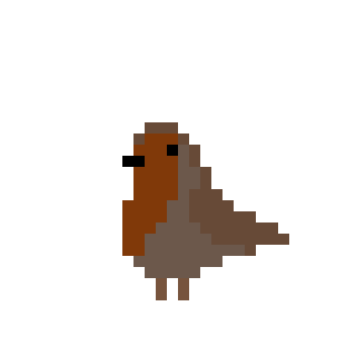
I am very happy with these animals overall! I spent a lot time deciding on how to make them cohesive and fit together well. I believe they all work together and are all unique from each other. This will allow me to base the game around their distinctive elements. Whilst picking the animal I made sure to consider the realistics of the animals which helped me to decide.
0 notes
Text
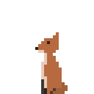
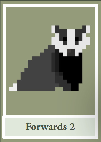
Design Process - Badger
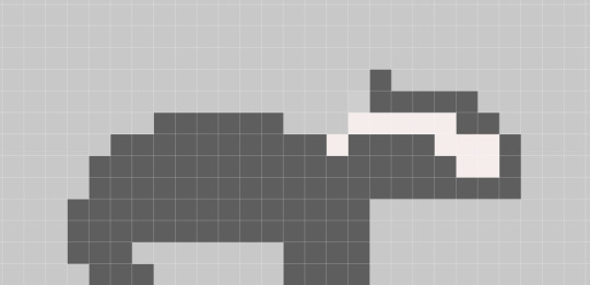

I have chosen to replace the other animal with a badger. This is mostly because it is British woodland animal that is commonly depicted with the other character such as in Beatrix Potter. Also, it has distinguishable features that make it easier to add detail into like the black and white striped faced and shape, It took me a while to figure out how to start so I made sure to take my time and try lots of different options until I was happy with it.

0 notes
Text
Card Design - Layout

I am making a lot of progress with my cards! I have made a design for the backs of them using my own brush which I learnt from doing the board! I wanted to add the footprints again to really pull the designs together and I think they look really cute against the different coloured leaves. I have set out the layout for both the movement and event cards now, I want to have a lot of these to show the variation of the game. My idea process for the events is thinking of things that happen in British forests to, once again, keep it cohesive.

0 notes
Text
Media Research - The Wind in the Willows


This book and film have been helpful to look into as there are lots of different version of the woodland animals and environments to be inspired by. This has helped me figure out that I could replace the bear with a badger as it another animal that has distinctive markings like the fox. Other animals like a rat or mole, like in this, or a weasel, otter and other key British animals are harder to differentiate as they have similar elements. I love the characterization of them as they are anthropomorphic, despite not doing this for this project, the facial features are important as it really makes a character. This has also shown what the board could include like navigating weather.
youtube
0 notes
Text
Media Research - The Animals of Farthing Wood
youtube
To really support me in the development of this project, I have researched into this show as it has the exact theme I would like of British woodland animals adventuring through a forest. This had made me think more about the animals I am using, the deer, frog and fox go well together but it would make sense to change the bear as it doesn't fit in the concept. This is important as it shows how I can make my ideas cohesive. I would like to take inspiration from the environments into the board I create as the lakes and dense tree areas are something I could replicate and could cause certain events in the game.

0 notes
Text
Primary Research - Dixit and Chocobo's Crystal Hunt


On the left is the game Dixit which I have been shown because of it's clever layout. The game involves a voting system where a player says a clue and the other players have to decode which card it is based on, as this all picture based and the board also only uses numbers, this is very accessible for a wide target audience. This is the main feature I will take away but I also love the simple board and the voting piece as it is effectively individualised. Chocobo's Crystal Hunt is similar in the way the cards have no words so it is also accessible but has a totally different style of game play which shows how varied cards can be. Something I especially like about these cards is the visual cues in the corner of the cards that explain what they do to jog your memory, they aren't inoffensive and fir the theme of the card which is clever!
0 notes