
Don't wanna be here? Send us removal request.
Statistics
We looked inside some of the posts by amberveilleux and here's what we found interesting.
Average Info
Notes Per Post
48K
Likes Per Post
30K
Reblog Per Post
18K
Reply Per Post
61
Time Between Posts
3 days
Number of Posts By Type
Text
8
Last Seen Tumblr Blogs


Fun Fact
In 2020, 44% of users from Denmark used Tumblr daily.
Text
BLOG #7
“Arizona Dream” by Emir Kusturica
The film “Arizona Dream” by Emir Kusturica is centered around the fascination of dreams and how they may interact with each other the way humans do. The main character Axel (played by Johnny Depp) dreams of fish and Eskimos in Alaska. He works for a fishing company in New York City until he is persuaded by his friend Paul (played by Vincent Gallo) to go to Arizona for Axel’s Uncle Leo’s wedding. Eventually, Axel is roped into staying in Arizona to help his uncle sell Cadillacs, Cadillacs are all that Uncle Leo dreams of. In Arizona, they meet Eliane (played by Faye Dunaway) and Grace (played by Lili Taylor) a stepmom and stepdaughter duo. Eliane dreams of building her own flying machine, which Axel has devoted himself to helping her build after he gets the lovebug. Grace dreams of turtles and suicide. Everybody’s unique, and somewhat crazy dreams begin to intertwine with each other playing out as chaos in the real world.
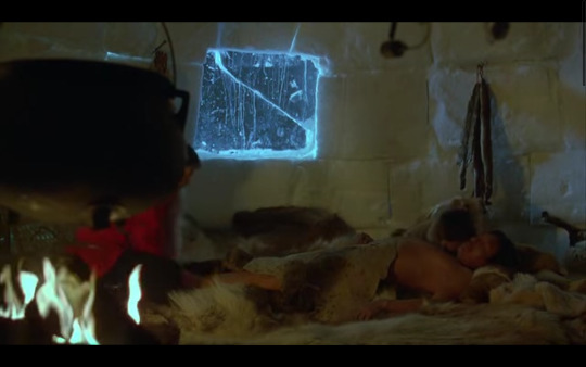
In this blog, I will break down the opening scene of “Arizona Dream” which happens to be Axel’s dream of Eskimos.
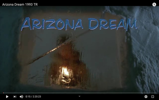
The movie first begins with the title scene, showing a figure of a young boy looking through the glass ice window of his igloo home. He is holding a candle/lantern and is out of focus to add suspense. The lighting comes from two sources- the candle/lantern the boy is holding and an outside light source that is a cooler blue tone compared to the warmth of the candle/lantern. This gives the effect of safety and warmth from inside the igloo compared to the harsh winter conditions faced outside.
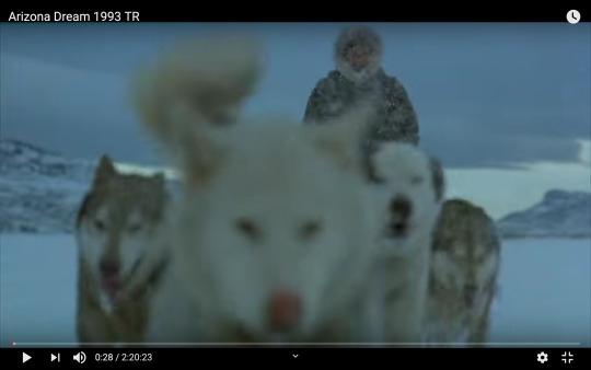
The next shot features a dog sled trudging through the intense snow blizzard. A wide-angle lens was probably used for this shot as you can see the surrounding mountains and landscape on the edges of the image. The focus is directed on the man controlling the dog sled, leaving the foreground of the picture (the dogs) blurry.
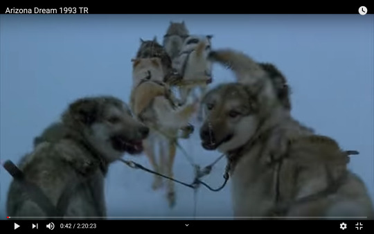
That shot is then followed by a first-person POV (point of view) shot of the dogs looking back at the man controlling the sled- which is the eye’s the audience is looking through.
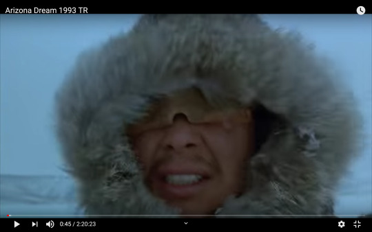
The audience is taken back to the man on the sled fighting through the winter storm. This is a close up of the mysterious man, we can see and (almost) feel his struggle against the powerful wind.
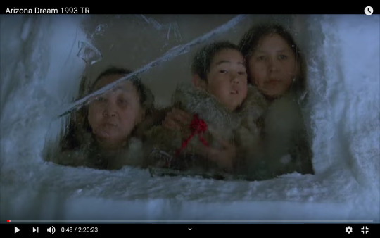
The shot goes back to the origin open shot setting of the igloo window. This time the young boy is joined by two other women, they all seem to be looking out the window in expectance of someone- perhaps the man on the sled? The camera angle this time though is lower as it is slightly tilted up to reveal the characters’ expressions rather than a straight-on shot. The characters are also in focus this time, uncovering more and more of the story. The sequence of the previous shots is paired with quick transitions and eerie music adding tension to the scene. As of now, the audience is probably curious as to the relationship of all these people and the mission of the man in the storm.
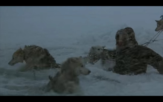
As the man and his dogs are traveling they come across a body of water covered by (not so thick) ice and fall through. The dogs fall first and struggle to get out of the cold water, the man jumps in to help. This is a medium shot, it captures the dogs stranded in the water and the man’s action of trying to rescue them.

Once the dogs are successfully rescued we cut to a scene of the man sitting by a fire leaning against a tree trying to warm up. The depth of field here is quite far although as you can see the horizon line in the background, although not much is visible as the snow and wind make it difficult to see.
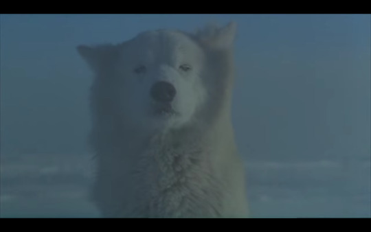
The shot turns to a wild wolf or another dog sitting and staring at the man. This shot is supposed to be from the man’s perspective as it is eye-level with the wolf/ dog.
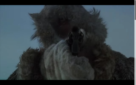
At first, the man is quite threatened, pulls his gun out, and points it at the animal. The angle is slightly lower than the chest-level and looks up toward the man with the gun in focus. This gives off an intimidating stance.

But suddenly the man falls over before any fatal action is taken. The cause of his fall could be due to hypothermia or fear, we may never know. Luckily, the wolf/dog is compassionate and drags the unconscious man over to the sled.

As this happens the shot pans to what seems to be a dead fish on the sled. The lighting throughout the scene is pretty dark and gloomy, symbolizing the trouble that the man and his family went through just to get food.
The scene cuts to the man covered in wool blankets near the fireplace inside of the igloo. Although this time instead of looking from the outside in through the window, the audience can finally see inside the igloo. A woman and the young boy try to warm up the unconscious man.

Finally, the man is awake and everybody celebrates that he is alive. Here the family seems to be skinning the ginormous fish shown previously. The lighting seems to be coming from outside of the window behind the three people. This makes the people seem almost like silhouettes as the lighting isn’t directly focused on their faces.
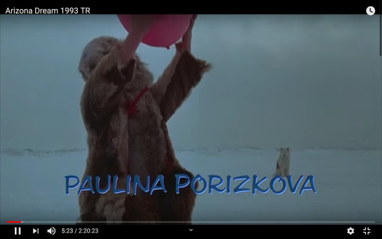
Finally, the scene ends with the young boy tossing a balloon in the air. A wide-angle lens was used to capture this shot because you can see a wide area of white snow and cloudy sky in the background. As well as the wolf/dog that saved the man earlier in the scene.
0 notes
Text
BLOG #6
TIME Magazine’s “Best Photojournalism of 2019”: A Holistic Analysis
1.

PERSONAL: This photo was taken on March 4th by Bryan Anslem in Beauregard, Alabama after a tornado ran through the area, killing 23 people. Here you can see insulation form a house that became a victim of the natural occurrence. The pink insulation gives the photo texture and interest as it hangs from fallen tree limbs, the trees also add linear interest. On the ground, you can tons of personal items destroyed by the tornado, and in the background is a pretty beaten up house.
HISTORICAL: This piece is evidence of digital photography.
TECHNICAL: A wide-angle lens was probably used to capture this image to fully encapsulate the amount of damage the tornado brought. The depth of field is pretty deep as you can see the green pine trees in the background (look at the open area to the let of the house). The lighting is natural and from the overhead sun, this adds highlights to the scattered insulation and shadows to the piles of items on the ground to the right and left of the photo. There also seems to be an outside light source focused on the insulation and pile of objects towards the bottom right area (maybe a camera flash?)
ETHICAL: This image is ethical because it is able to capture the unfortunate damage of the tornado without preying on the victims of the tragedy.
CULTURAL: Photographer as a photojournalist.
2.

PERSONAL: Here a little girl, Nora is photographed by Nanna Heitmann with her Barbie dolls laying on a knitted blanket on October 7th in Taucha, Germany. The colors of the blanket are saturated and simple, Nora is surrounded by her dolls giving this photo a child-like innocence. Although Nora’s sad eyes and deep look off into space gives the photo a curious juxtaposition. Is she sad because of family issues? Is she sad because she, like so many other young girls wants to look and live exactly like Barbie? Or maybe she isn’t sad at all and is just in deep thought.
HISTORICAL: This piece is evidence of digital photography.
TECHNICAL: The picture was probably taken with a normal lens. The depth of field is shallow. The soft lighting coming from the left side also adds to the child-like innocence this photo exerts. This gives makes Nora’s face perfectly contrasted as there are highlights on the left side of her face and shadows on the right. The image has high quality because you can see, and almost feels the soft texture of a knitted blanket.
ETHICAL: This photo is ethical because it does no harm to the subject or audience.
CULTURAL: Photographer as a photojournalist.
3.

PERSONAL: This photo features Christina Munce’s writing pad, a waitress at the Broad Street Diner in Philadelphia, and a picture of her daughter inside (taken by Sasha Arutyunova). Along with some very key ingredients that help reveal that this is a diner- a couple of egg omelets on a plate, tin containers of jam and butter, and on Munce’s pad is an order for waffles and bacon (among many other breakfast items). The stainless steel countertops and brown tile flooring is a common sight in many kitchens. Along with the tin containers, holding the jam and butter- which both are also commonly found in many restaurants and diners. The school picture of Munce’s daughter gives the picture a personal feeling. This reminds the viewer that although this diner’s kitchen looks like many across the country the individuals and people associated with it are one of a kind, emphasizing the importance of human connection. Munce’s bright purple writing pad also adds interest, its bold color draws the audience’s eye to the focal point of the image.
HISTORICAL: This piece is evidence of digital photography.
TECHNICAL: A normal angle lens was probably used to take this photo. The depth of field is shallow. The lighting is intense and bright, as it is in most kitchens. The reflection of the light off of the stainless steel countertop is also to blame for the brightness. This makes for great contrast as the light shines on the exposed countertop and creates shadows under the plates and tin containers. As mentioned before color plays a creative, eye-catching roll as the purple writing pad draws attention, and the orange in the jam packets and egg omelet add for settle interest.
ETHICAL: This photo is ethical because it does no harm to the subject or audience.
CULTURAL: Photographer as a photojournalist.
4.

PERSONAL: Here, is a photograph of the Dalai Lama (the religious leader of Buddhists) taken in February by Ruven Afanador. The breathtaking scenery of the distance mountaintops and green trees in the foreground gives this photo a peaceful feeling. Similar to the last photo, the deep red garments and shoes the Dalai Lama is wearing have the same effect as Christina Munce’s purple writing pad- it draws attention. The horizontal and vertical poles that make up the railing contrast the jagged mountain top.
HISTORICAL: This piece is evidence of digital photography.
TECHNICAL: A wide-angle lens was used for this photo as you can see all of the Dalai Lama’s surroundings. There is also a deep depth of field as the faraway mountain tops can be seen through the foggy overhead. As stated before the striking red stands out apart from Mother Nature’s color palette. The lighting is natural, it seems as if the sun is trying to peek through from behind the clouds. The quality of the image is evidently high because you can make out most of the individual leaves on the tree branches and the rough terrain on the mountainside.
ETHICAL: This photo is ethical because it does no harm to the subject or audience.
CULTURAL: Photographer as a photojournalist.
5.

PERSONAL: This photo features an anti-government protester in Kowloon, Hong Kong arrested right near Tsim Shua Tsui police station on August 11th, taken by Adam Ferguson. The choice of black and white for this photo is quite beneficial as it adds a ton of great grey shades and definition to the image. The lines of the cleverly designed rock wall are dark and bold symbolizing the rigidness and intensity of the Chinese government. The visual cues of the black boots, baton, and knee-pads indicate that the two pairs of leg surrounding the protesters belong to law enforcement. The expression of the anti-government protester seems somber and deep in thought about the consequences he might face.
HISTORICAL: This piece is evidence of digital photography.
TECHNICAL: A normal angle lens was used to take this picture, and the depth of field is shallow. All three figures in the image are dressed in dark clothing, which allows them to stand out against the lighter grey rock wall. The lighting is natural and the image is of high quality as the lines and texture are sharp and distinct.
ETHICAL: This photo may be unethical as it reveals the face of an antigovernment protester, although the name is not given away.
CULTURAL: Photographer as a photojournalist.
References
Lester, P. M. (2014). VIsual Communication: Images with Messages. Boston, Massachusetts:
Wadsworth Cengage Learning.
TIME’s Best Photojournalism of 2019. (2019, December 24). Retrieved from
https://time.com/longform/best-photojournalism-2019/
0 notes
Text
BLOG #5
Infographics
For this blog post, I have decided to create a slideshow presentation (of a topic of my choice) using infographics as aids to help convey my message. Here, I will be breaking down the usage of the infographics in relation to my slideshow on systemic racism in the United States.
INFOGRAPHIC #1 (Slide 4): This bar chart displays the median income of four different race groups (White, Black, Asian, Hispanic) in the United States for the year 2016. It is significant because it shows the ever-increasing wealth gap between the different races through the means of annual income. This is important because it further proves the ongoing racism in the United States, which is further perpetuated through the capitalistic society. The chart is a statistical infographic, specifically a bar graph. It can be defended as an ethical example of an infographic because it is easy to read, objectively displays the numbers, and covers a wide range of people (those that make money in the 10th, median, and 90th percentile from White, Black, Asian, and Hispanic races). The symbolism of using different shades of green to identify the different races is genius because green is also related to money or the economy.
INFOGRAPHIC #2 (Slide 5): The infographic shows the percentage of workers from different races (Black, Hispanic, Asian, and all other) in low-level paying jobs in 2018 in America. This visual is useful because it breaks down how often ethnic minority members usually occupy low paying jobs compared to other races. Similar to the last infographic, this one is a statistical one and is also a bar graph. Although this time each bar is separated into four categories representing each race by respective percentages. It passes the ethical test because the x-axis begins at 0, it is easy to read and projects the reality of the workers in a variety of low paying jobs.
INFOGRAPHIC #3 (Slide 6): The chart used in this slide depicts the amount of black and white people that own their homes in the United States during the years of 2013-2017. Percentages were used to measure homeowners from both groups and separated into categories of education, income, metropolitan status, marital status, and age. The chart effectively proves the systemic racism in the U.S. through the area of housing, black people well significantly less likely to own their home in every category covered. This visual is a statistical graph and passes the ethical test as well. The x-axis begins at 0, the chart is readable and represents a large number of individuals.
INFOGRAPHIC #4 (Slide 7): Here, we have a graphic that simply states facts about the quality of education pertaining to race- around 50% of students of color go to high-poverty schools whereas, less than 10% whites attend these same type of schools. The diagram was originally apart of a whole series of diagrams that illustrate racial disparities in America. This message is conveyed through a few simple sentences rather than any visual depictions. This is an example of a non-statistical image, it is best compared to a fact box type of graphic. It is ethical because it is readable, but it does lack some important qualities such as the year this data was composed of. It does incorporate a winding path that ultimately connects all of the pieces of the graphic series into one cohesive, connected message.
INFOGRAPHIC #5 (Slide 9): This graphic states the consequences of being a black woman in the health care context in 2017. Black women are more likely to have health issues or even die due to the poor quality of health care serviced to them, realities that are not lived by their white women counterparts. This proves the racial bias embedded in our healthcare system, either conscious or unconsciously health care professionals often don’t give enough attention or care to their African American patients. The visual is a statistical graph, circles grow in size according to the respective percentages they represent, which is described in an accompanying paragraph. It is simple and easy to read, the use of only the colors white and grey allows the spotlight to solely shine on the content of the graphic.
INFOGRAPHIC #6 (Slide 10): This final graphic is a timeline revealing the relationship of American history and the prison complex through the years of 1860-1960s. It confirms the corruption of the entire system and is the reasoning that the prison population is mostly composed of African Americans. This is an example of a non-statistical infographic because it is a timeline. It is somewhat ethical because the visual objectively indicate times in history and its relation to racism, although the print is quite small.
Link to slideshow: https://docs.google.com/presentation/d/19kXzizIe9SDfv3iLj3vJZhxwe5o6NK6l-aALpDgjhnk/edit?usp=sharing
0 notes
Text
BLOG #4
Socio-Political Art With A Holistic Analysis
Similar to my last blog I will be analyzing visual images that use graphic design, typography, and graffiti. I will be specifically focusing on socio-political art by three artists- Banksy, Emory Douglas, and Diego Rivera.
1.

This first piece is by the anonymous artist Banksy, known for his politically bold, stencil-like graffiti work. This mural borrows elements from Jean-Michel Basquiat’s Boy and Dog in a Johhnypump (1982). The differing artistic styles are quite evident to the eyes- the boy and dog are works of Basquiat’s and the police officers are works of Banksy.
PERSONAL: First let’s digest Basquiat’s work of art, the boy and the dog are both painted in black with hints of yellow, orange, and red outlining their figure. Both seem to retain animalistic/ savage characteristics. The boy’s feet and hands are unusually large and his hair is quite chaotic. Their eyes, mouth, and skeleton are created with simple white lines that do not give much detail, but outlines their body parts. In contrast, the police officers are stenciled using black, white, and grey with a heaving emphasis on the shadows to add detail and definition. The officers seem to be inspecting the boy and searching him. Noticing that the only colors present are the yellow, orange, and red that outline the boy and the dog’s bodies. It can be subjectively interpreted that these colors stand for the overwhelming creativity an artist inhibits, especially a street/ graffiti artist and their struggle against laws of vandalism. Or the pain and fear felt by African Americans against the police force due to years of systematic violence, their skin color being the target of hate.
HISTORICAL: The history of typography and graphic design can be defined into five periods: pre-Gutenberg, Gutenberg, industrial, artistic, and digital (Lester, 2014, p. 185). This mural falls under the artistic time period.
TECHNICAL: The two different art styles of Basquiat and Banksy creates within the image itself. The use of color on the boy and dog also creates contrast and tension in comparison to their colorless counterparts. The entire mural is large to ensure that it can be seen across the street, for all passerbyers to see. Because the two police officers are surrounding the boy, the viewer’s attention is drawn to him making him the center of attention. Although this mural contains two different works and artistic styles Banksy did a great job in making it one united image. The little details such as the orange from the dog’s outline spilling onto the woman police officer’s pant leg or places where the police officers’ bodies block the entire view of the boy’s body due to the direct onlook of the image.
ETHICAL: Banksy’s work is an example of the hedonism philosophy as it is designed to express a personal statement, the one of creative, rebellious street artists. Or one of suffering and injustice of black people in America, if interpreted that way.
CULTURAL: There are seven various free form types of art including art nouveau, dada, art deco, pop art, punk, new wave, and hip-hop. Basquiat’s part of this piece fits under the punk culture of art, respectively Banksy’s art fits under hip-hop art culture.
CRITICAL: Acceptance and support of any form of art relies on the audience. For me personally I enjoy this mural by Banksy in collaboration with Basquiat’s work. The stark contrast in each artist’s style adds interest to the piece. Banksy’s twist gives Basquiat’s painting a new meaning, proving that art is subjected to evolution and personal interpretation.
2.

This graphic is by artist Emory Douglas, a graphic designer and was formerly the Minister of Culture for the Black Panther Party. Douglas played a prominent role in the party as he directed, designed, and illustrated the Black Panther Party’s newspaper. This image reveals the money hungry, capitalistic society of the United States of America.
PERSONAL: Gerald Ford the 38th President of the United States, rather (according to this depiction) the 38th puppet of the United States is pictured here. The text bubble states, “I Gerald Ford am the 38th Puppet of the United States.” Attached to him are dotted lines to resemble strings, connected to a hand that hovers above him filled with large corporations. Some of the brands featured are Ford, Allstate, Gulf, New York Life, and Bank of America. The background of this image is the New York Stock Exchange Transactions, emphasizing American society’s monetary and materialistic ideals. This graphic has a thin black outline and is bordered by green on the top and bottom. The lack of color of this image ensures the focus on the corrupt values of capitalism.
HISTORICAL: This graphic piece by Douglas is evidence of the digital age.
TECHNICAL: Because the background is of a newspaper showing the New York Stock the typeface used is the roman typeface and is shown in columns. The title is the only legible element of the newspaper, unless one uses magnification to reveal the rest although this is not necessary. Just showing the title affects the image’s message. The puppet master hand and company brands are strategically located so that the title can be seen. The hand itself is large and overwhelming, signifying the power corporations or the wealthy hold over politicians and the government. The choice of using dotted lines as string instead of bold lines is interesting. Maybe it is used to separate from the black border of the image or the bold, black lines of the hand, or maybe it is used simply to add texture to the image. The speech bubble coming out of Ford’s mouth is filled with the cream color of the newspaper rather than being transparent so it is easier to read the message. The message is in typewriter font and the size is relatively small compared to the puppet controlling brand names.
ETHICAL: This graphic image is ethical and fulfills the golden mean philosophy. Meaning this image meets the requirements of the utilitarianism and hedonism philosophies- it is readable and useful as well as it shocks the viewer/ expresses a personal statement.
CULTURAL: Emory Douglas’s graphic is an example of hip-hop art culture.
CRITICAL: This image was made for the Black Panther Party’s newspaper, it exposes the systemic injustice the US government revolves around. It states that American politicians worry more about financial status than the basic equal rights of all people, the basic rights black people have been robbed of by corrupt politicians.
3.

This painting is by Diego Rivera, a well-known muralist that evoked political thought in his works and among his audience. He was also the husband of famous artist Frida Khalo, both of them held strong ties to Mexico and Mexican culture which evident in their artwork.
PERSONAL: This is one of Rivera’s first works and is quite abstract, therefore it is crucial to understand the background and timeframe of this painting to fully encapsulate its message. During the time of this painting the Mexican Revolution was underway, meanwhile Rivera was studying the cubist artistic style in Europe (Gotthardt, 2019). Against a landscape background fragments of rifles, sombreros, and Mexican craft can be found in the jumble of abstract mess. Rivera uses these symbols to identify with Mexico during the revolution despite being away.
HISTORICAL: This piece is best identified under the artistic time period as that lasted from 1891-1983 (Lester, 2014, p. 190), and the painting was creating in 1915.
TECHNICAL: The main focus of the painting is the abstract blob of fragments of Mexican culture, which takes up most of the image. Within this area there are sombreros, rifles, and serapes ranging from colors of red, yellow, green, pink, orange, and blue. In the center of the blob are two wooden pieces. Many patterns can be found throughout the ethnic clothing depicted, including the broccoli top looking images that hold spaces on the top outsides of the blob. Within the abstract piece are tons of white space, one specifically worth of noting is the rifle. The entire rifle is shown and stands up vertically, with white space filling the left and a miniscule portion of the bottom fragment. It almost seems as if Rivera cut this picture out of a magazine and pasted it on his painting. The background of the painting is an undisturbed landscape of mountains and water.
ETHICAL: The hedonism philosophy would apply here because this painting is a personal statement from Rivera, pledging his loyalty to the freedom of Mexicans.
CULTURAL: As mentioned before this painting has a lot of cubist ties to it, but using the seven different free form art styles the painting is a work of dada art culture. The time period and political ties justifies this determination.
CRITICAL: Because this work was made to show Rivera’s solidarity to the Mexican Revolution his audience was probably people that fought/ supported the revolution. The abstractness of the piece allows for their own interpretation while the individual fragments of Mexican culture can aid as a sense of familiarity.
References
Emory Douglas: “Power to the People...” . (2016, January 3). Retrieved from
https://sheldonartmuseum.org/exhibitions/emory-douglas-power-to-the-people-%E2%80%A6
Gotthardt, A. (2019, December 24). 5 Iconic Works By Diego Rivera . Retrieved from
https://www.artsy.net/article/artsy-editorial-5-iconic-works-diego-rivera
Indrisek, S. (2019, September 6). The 6 Most Iconic Works By Banksy. Retrieved from
https://www.artsy.net/article/artsy-editorial-6-iconic-works-banksy
Lester, P. M. (2014). VIsual Communication: Images with Messages. Boston, Massachusetts:
Wadsworth Cengage Learning.
0 notes
Text
#Blackout for Minneapolis. For Louisville. For Toronto. For Brooklyn. #Blackout for Us All.

To the #Blackout Community and Tumblr at large,
We know you must have a lot of questions or are feeling distressed about the news. The world has been dealing with a lot this year, and it is an especially harrowing time for Black Americans and Black folks abroad. We know your biggest question right now could be summed up by a quote from Toni Morrison:
“What can I do where I am?”
Here at #TheBlackout, we have decided to help you start finding an answer to that question - we feel that we need each other. We need unity, organization, a clear sense of direction, but more importantly, a space where you can be yourself without judgement or fear.
So, in addition to boosting your art and businesses, our highest priority right now is to provide you all with resources to help you start from where you are.
This is a masterpost of places you can donate, find mental health + spaces for radical self-care, and just do something fun. We will be adding on as things change.
Donate/Boost/Sign:
Minneapolis Freedom Bail Fund & Louisville Community Bail Fund
Reclaim the Block
Black Visions Collective
The Official GoFundMe of George Floyd’s Family
Official Petition for Breonna Taylor
Justice for Regis Official Fund
Tony McDade’s Memorial Fund
Black Lives Matter Network
Mental Health Resources:
Ethel’s Club - Black-owned and operated social club offering access to Black therapists and a multitude of creative events for People of Color.
Crisis Text Line - A different approach to crisis intervention, Crisis Text Line offers you help when you text 741-741. You’ll be able to chat with someone who is willing to listen and provide you with additional resources.
Shine Text. – Black-owned! Sign up to receive cheerful texts and tips every day.
Therapy For Black Girls - A Black-owned a directory to help you find Black therapists in your area.
Tips for Organizing/Protesting:
Knowing your rights - ACLU
How To Prepare for a Protest. (Remember to wear a mask in or to protect yourself!)
A Twitter thread of suggested readings
Fun Online Communities and Things to Do:
Some of our favorite online communities.
Nerd Culture: @blacknerdproblems, @superheroesincolor
Poetry and Literary Spaces: Cave Canem Literary Balms program for Black poets, Nuyorician Online Open Mic Events, Well-Read Black Girl
Podcasts: Therapy For Black Girls, Strong Black Legends by Netflix’s Strong Black Lead, The Read with Crissle and Kid Fury.
Hobbies: #BlackBirdersWeek by BlackAFinSTEM (5/31 - 6/8), Wellness Week by Black Girl Gamers.
Join us for the 5/31 Emergency #Blackout/#BlackoutDay here on Tumblr and Twitter.
48K notes
·
View notes
Text
BLOG #3
Typography and Graphic Design
Typography and graphic design go hand and hand in portraying the message of any visual communication means. Typography is the study of the use of words to communicate messages, combinations of factors such as the font type, size, color, and space all determine the effect and attitude of a message. “Graphic design is the art and craft of bringing organized structure to a group of diverse elements, both verbal and visual,” (Lester, 2014, p. 185). Ultimately the power of visual messages is ruled by the response of an audience. In this blog, I will analyze three different examples of the use of typography and graphic design in visual images through the personal, historical, technical, ethical, and cultural perspectives.
1.

This first image has been plastered over social media recently for the means of achieving justice for George Floyd (this particular image was taken from a Facebook post posted by Zero Hour). George Floyd was an African American man that was brutally murdered by four former Minneapolis police in broad daylight; bystanders witnessed and filmed the horrific event making it available to be viewed by anyone with Internet access.
PERSONAL: The image’s focal point is an animation of George Floyd with his eyes closed alluding to the idea that he is at peace. A circle of flowers surrounds him consisting of yellow, green, pink, orange, and blue. Thin, half-cursive, half-print letters spell out, “Justice for George” in the top fourth section of the image and are written in a darker shade of blue. The text, flowers, and the figure of George contrast the light blue background. The compatible color pallet and simplistic design style give the image a peaceful look, which is starkly opposite from the heinous, violent way George Floyd died.
HISTORICAL: Both the history of typography and graphic design can be categorized into five periods: pre-Gutenberg, Gutenberg, industrial, artistic, and digital (Lester, 2014, p. 185). The time period for this medium can be identified as the digital age. The graphic was probably created on a computer, laptop, or smartphone via creative programs such as Adobe Illustrator. Spreading this image also relies on the use of digital technology.
TECHNICAL: The typeface used for “Justice for George” can be labeled as a sans serif typeface due to the lack of serifs on the letters. The text size is reasonably large enough to be seen and compliments the image but is small enough not to overwhelm the visual, it takes up about the top fourth of the image running horizontally. The kerning of the letters varies due to the use of both cursive and print. For example, the word “justice” is separated into three segments, the beginning “J”, “us” connected by cursive, and another cursive segment “tice”. The darker colors used for George and his sweatshirt contrast the lighter colors used in the flowers, text, and background. The flower circle is balanced, although not asymmetrical, and is a noticeable pattern of a full flower followed by leaves, stems, and smaller flowers (repeated four times). The rhythm of the image is quite simple as the eye is drawn to the animation of George, the surrounding flowers, and then the lettering at the top. Overall the image holds a harmonious unity with floral elements, dainty text, and a peaceful George.
ETHICAL: This graphic passes the ethical standards as its intent is to spread the word of the horrific act with the goal of bringing justice to George’s merciless death. It satisfies the requirements of utilitarianism by bringing light to the issue of police brutality and racism, and is readable.
CULTURAL: Free form types of art include art nouveau, dada, art deco, pop art, punk, new wave, and hip-hop. This particular image fits under the pop art category because it ties back to the artistic style’s history in political movements concerning civil rights in combination with hippie culture (Lester, 2014, p. 203).
2.
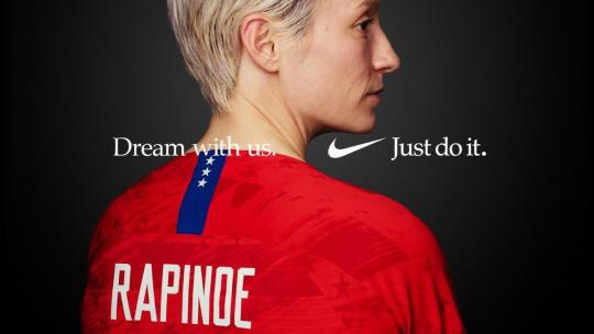
This next example is a poster of a collaboration with the company Nike and USA Women’s Soccer team, specifically featured in this poster is Megan Rapinoe. The USA Women’s Soccer team has recently rallied for equal pay among them and their USA Men’s Soccer team counterpart, fighting not only for their own rights but the rights of all women. Megan Rapinoe is currently a part-time captain of the team and an advocate for women and LGBTQ+ rights. These two powerhouses collaborated to advocate for equal pay among all genders, although the effect of Nike supporting such movements will increase sales from consumers who also support the cause.
PERSONAL: Megan Rapinoe grabs the viewer’s attention with her red jersey and lighter complexion in contrast to the black background. There seems to be a light source focused on Rapinoe’s head as the background in that area is more of a grey shade than the darker black borders of the image. Just above the word “Rapinoe” on the back of the jersey is the text that invites the audience to, “Dream with us” followed by a space and ends with Nike’s distinguished logo and the slogan “Just do it”.
HISTORICAL: This piece of work is evidence of the digital age. The picture was probably taken on a professional camera, as this is an ad for the multi-billion dollar company Nike. It was then most likely edited on a software program and text was added on top.
TECHNICAL: There are two different types of text used in this image- the text displayed on Rapinoe’s jersey and the text encouraging the viewers to come “Dream with us”. Text on the jersey can be classified as miscellaneous text whereas the other text is in the Roman typeface family, most likely (if not exactly) the Times New Roman typeface. The space between the phrase “Dream with us” and Nike’s logo/ slogan adds tension to the message. The font size is quite minuscule compared to Rapinoe’s jersey lettering and the overall image. Although because the text is centered and Nike’s symbol holds such widespread popularity this enables the brand to be minimalistic in its advertising.
ETHICAL: Nike and the USA Women’s Soccer Team ad falls under the golden mean philosophy. That means it is a mix of the utilitarianism and hedonism philosophies, satisfying a unique and legible look while advocating for commercial purposes. Even though Nike does sell athletic products such as clothing, shoes, and equipment this specific ad does not promote any form of product, rather it promotes the idea of gender equality.
CULTURAL: Similar to the piece “Justice for George” this ad is a part of pop art culture.
3.

Pictured is a billboard advertisement for the Geico insurance company, starring their memorable mascot a gecko (supposedly named Martin from the company Martin Agency that helped create ads for Geico). In their popular and rather humorous commercials/ads ends with their slogan “15 minutes could save you 15% or more on car insurance.” Although this billboard shows a shorter version of the famous slogan it still gets the point across.
PERSONAL: Geico’s billboard ad displays their well known mascot and slogan, keeping it simple so drivers (and passengers) in bypassing cars can easily read the ad in a short amount of time. The letting for the slogan is written in a shade of blue and contrasts the white background. Next to it on the left is the Geico’s famous gecko, bold in green showing his chest and above. Underneath this, taking up the bottom fourth of the billboard in a strip of blue and on the right side is “Geico” written in white. The minimal color scheme, basic layout, and big lettering seems to be the best combination for billboard advertisements.
HISTORICAL: Similar to the other examples this ad is evidence of the digital age. It was probably made with a computer or laptop using software such as Adobe Photoshop or Illustrator.
TECHNICAL: The typeface used for both the slogan and Geico name is sans serif due to the lack of serif on the ends of the letters. It is clever to use this type of front because it is easy to read, especially for people passing by. Which is the same reason why the front size is so big as well as the leading (the space in between the lines of text). The use of the gecko is also quite notable in this ad. Imagine if he was absent from the ad and only the slogan filled the billboard, it would lack interest and blend in with other surrounding billboards. The bold green of the gecko and the friendly face of a familiar commercial star adds as an eyecatcher for this ad.
ETHICAL: This ad falls under the utilitarianism approach because the design is useful and legible.
CULTURAL: Just like the previous two examples this Geico billboard ad is a piece of work from pop art culture.
References
Assault, C. (2017, September 30). Geico TV Commercial- “Ricky Berwick’s New Stong”.
Retrieved from https://www.youtube.com/watch?v=TyF8rVRtLzs
Acquavella, K. (2019, May 12). WATCH: Nike Reveals 2019 Women’s World Cup Commercial, featuring Mallory Pugh and Other Star Athletes . Retrieved from https://www.cbssports.com/soccer/news/watch-nike-unveils-2019-womens-world-cup-commercial-featuring-mallory-pugh-and-other-star-athletes/
Lester, P. M. (2014). VIsual Communication: Images with Messages. Boston, Massachusetts:
Wadsworth Cengage Learning.
Hour, Z. (2020, May 27). Justice for George. Retrieved from
https://www.facebook.com/photo/?fbid=2568809283367919&set=a.2006740799574773
0 notes
Text
BLOG #2
Stereotypes in the Media
Stereotypes are defined as, “something conforming to a fixed or general pattern, especially: a standardized mental picture that is held in common by members of a group and that represents an oversimplified opinion, prejudice attitude, or uncritical judgment” (Meriam-Webster). These preconceived notions can be applied to any marginalized group of people based on ethnicity, gender, sexuality, physical ability, socioeconomic status, and so on. For example, the assumption that all people of Arab descent are terrorists would be a stereotype. Stereotypes can be supported by visual media, which in hand strengthens the harmful effect of these thoughts, and the repetition of an image/ moving still only reinforces the power the stereotype has over others. In this blog I will identify four different social stereotypes found in images and television ads that promote various products.
https://www.youtube.com/watch?v=ecLMTgAWsqs
This commercial ad for Liberty Mutual features a young adult, Anglo male actor standing in front of what seems to be a green screen projection of the Statue of Liberty. Through physical characteristics of a chiseled jawline, smoldering eyes, and freshly cut hair the actor can be categorized as attractive. The Statue of Liberty was a gift from France in 1886 located in New York Harbor, New York. It represents alliance with the French and freedom to the people, an ideology the company Liberty Mutual (the company advertised in the commercial) seems to represent. The actor attempts to deliver lines that convince the audience to purchase custom car insurance from Liberty Mutual, claiming that you “only pay for what you need”. He goes through many takes and in each one he messes up the catchphrase or turns the opposite way of the statue. As entertaining as it may seem to hear the struggling actor spit out “Miberty Lutual” or “Liberty Buetchemel” a deeper look into this commercial reveals some disturbing stereotypes. The stereotype of beautiful people being known for their looks rather than intelligence has been running around Hollywood since the beginning of time. The Liberty Mutual insurance ad is a contemporary example of this. The male actor is implicitly portrayed as young, attractive, and dumb through his “blooper” trailer of an ad.
2. https://youtu.be/hWZHxDlctqk?t=218
A commercial for Airheads candy displays two preteen/ teenage boys eating an Airhead, excited to see the radical, crazy effects it has on them. After a bite of the delicious candy one of the boy’s head blows up into a balloon, more frankly an airhead. The other boy runs towards the fence confused why the boy with the airhead didn’t blast off and exclaimed he did it wrong. Suddenly the airhead pops, spraying multicolor paint all of the other boy and the fence. The boy covered in paint is stunned with awe and excitement over the paint explosion. This commercial is backed on the stereotype that all adolescent boys are reckless and “out of control” as the Airhead’s catchphrase implies and is evident by the boys’ attitude towards the conspiring effects of the Airhead.

3. This Mr. Clean ad depicts a mother and daughter cleaning the window with a Mr. Clean product. Tagged with the caption “This Mother’s Day, get back to the job that really matters,” indicting that women’s true calling and purpose is to clean and take care of the children. The image plays on the outdated gender roles of men and women; the idea that men are meant to financially provide and do the heavy lifting in the family while women are thought to cook, clean, and care for the children. Not only is this ad harmful to the progression of women, but it also supports the ideologies that have been oppressing women that have rung throughout history.

4. This ad for Protein World features a young, fit, and attractive female model wearing a yellow bikini that matches the yellow background. With the caption “Are you beach body ready?” emphasizes the narrowly constructed stereotype of the physical bounds of beauty- only skinny, fit individuals are considered enticing and ‘beach body ready’. In hand, this ad inadvertently body shames other body types that don’t fit into society’s predetermined idea of beauty.
References
Bad Job (Extended Cut)- Liberty Mutual Insurance Commerical. (2020, January 8). Retrieved
from https://www.youtube.com/watch?v=ecLMTgAWsqs
Carr, S. (2019, August 10). The Top Eight Most Recent Controversial Ads. Retrieved from
https://ppcprotect.com/top-controversial-ads/
Late 200s/ early 2010s Nostalgia Ads. (2019, August 8). Retrieved from
https://www.youtube.com/watch?v=hWZHxDlctqk&feature=youtu.be&t=218
Mertes, A. (2020, May 12). 12 Offensive Advertisements Your Business Can Learn From.
Retrieved from https://www.qualitylogoproducts.com/blog/12-offensive-advertisements/
Stereotype. (n.d.). Retrieved from
https://www.merriam-webster.com/dictionary/stereotype
0 notes
Text
BLOG #1
The Work of Barbara Kruger
Barbara Kruger is a renowned artist known for her graphic images that critique the established social norms of society, invoking themes of feminism, power, and consumerism. Her use of black and white photographs contrasted with bold text (often with the use of a red background) can be traced from the influences in her early art career. Kruger attended Syracuse University and Parson School of Design in her student years and also worked under Diane Arbus and Marvin Israel, who both encouraged and helped cultivate her passion for the craft. Barbara Kruger’s work pushes the bounds of ‘social acceptance’ forcing her audience to reflect and analyze the world around them in hopes of bringing change for all.
Mass communicators identify two different perceptual theories to help understand visual perception, those being semiotics and cognitive theory. Cognitive theory is based on nine mental elements that impact visual perception (cited by Carolyn Bloomer): memory, expectation, habituation, projection, salience, selectivity, words, dissonance, and culture (Lester, 2014, p. 63).
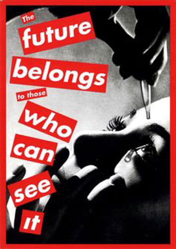
This graphic by Barbara Krguer incorporates equally visual segments of words and images, both parts depend on each other to fully convey its message.
Using the cognitive theory to breakdown the photo, two elements can be identified- the use of memory and words. Eye drops are commonly used to prevent dry eyes or wash a piece of dust (or perhaps an eyelash) out one's eye. After application the illusion of seeing more
clearly is apparent once the minimal inconvenient pain is washed away. The phrase “The future belongs to those who can see it” gives verbal meaning to the use of eyedrops in the black and white image, while helping the viewer comprehend the theme in an easier manner. It can be intuitively assumed that the female subject is constrained by the social norms placed on women in society. The subject is seen to be putting eyedrops in her eyes anticipating to be able to see the future more clearly, to break free from the confines of gender roles/norms. The simplicity of the image’s color, format, and composition adds to its complex message of feminism.
References
Lester, P. M. (2014). Chapter 3: Visual Theories. In Visual Communication: Images with
Messages (pp. 63–70). Boston, Massachusetts: Wadsworth Cengage Learning.
The Future Belongs to Those Who Can See It- Barbara Kruger. (2016, May 5). Retrieved from
https://worldofthewoman.com/future-belongs-can-see-barbara-kruger/
1 note
·
View note