
Don't wanna be here? Send us removal request.
Statistics
We looked inside some of the posts by amutucarts245-03 and here's what we found interesting.
Average Info
Notes Per Post
1
Likes Per Post
1
Reblog Per Post
0
Reply Per Post
0
Time Between Posts
9 days
Number of Posts By Type
Text
11
Last Seen Tumblr Blogs


Fun Fact
The total number of visits Tumblr.com received during January 2021 is 327 million.
Text
245 Final Blog
Overall, this class has been a great experience. It's been very valuable for me as someone who is considering graphic design in my future, and it's absolutely been worth my time. I've enjoyed most of the projects we had, though I can definitely say the digital ones were more fun compared to the craft-heavy ones from the beginning of the semester. I liked how the projects in this class required a variety of programs—it was great practice for the Adobe apps as well as the first time I've used an exacto knife so extensively. I also like when projects have final products that seem "real/professional" to me; I'm definitely putting these in my portfolio. I think the structure was fine, incremental deadlines really help me since I'm a procrastinator and getting used to workflows for these projects is definitely something new for me. Though, I can say there were points where I was a bit swamped since I had ARTS 265, the illustration class, at the same time and a lot of times projects ran concurrently. I look forward for future design classes and hope to continue creating fun things!


some faves
0 notes
Text
Indiana Fever R&D
For project 5, my team was assigned the Indiana Fever to redesign. Based in Indianapolis, the Fever is a WNBA team that started in 2000 and are well known for iconic players like Tamika Catchings and Caitlin Clark.
In terms of branding for the team, I think they could have a stronger, more focused direction. First off, the name "Fever" is a bit vague. It's supposed to represent the hype and craze surrounding basketball in Indiana, but this leads to them not having very easy imagery for logos and mascots. I'd want to try to tie in the state's history with racing (both horse and automobile), like with the name of their NBA counterpart the Pacers—I'm thinking of Mares or Motors. I like the retro look of their logo as well as the color scheme, though I'm thinking of putting a bigger emphasis on the red and less of the navy blue, which is already seen with the Pacers and the Colts (NFL team). Returning to that retro look on the uniforms would help focus the direction of the brand as well, like keeping the same font from the logo on the uniforms.

0 notes
Text
Blog Post 8


This week's reading was very interesting, covering specific details about type that I would consider not well known. For example, it explains em dashes, en dashes, and hyphens, which all have different use cases that I never realized, such as how number ranges should only be written with en dashes. These little details are things that us as designers should definitely pay attention to as we progress with our skills. This also applies to the section on proofreading, which I personally didn't know that there were commonly understood marks that people use to indicate different things about the text they're checking.
This project for me has been very fun and I am very happy with the result! As I mentioned last blog, it heavily reminds me of the process journal for ARTS 102 but I feel like we had more freedom in terms of experimenting with the typesetting and grid for this current one. If I were to change anything if I did this again, I might would think of stronger, more stylized aesthetics for the overall spread designs as I enjoy trying to mess around with the different elements in InDesign.
0 notes
Text
Blog Post 7


Top: Letterform file with all the experimentation Bottom: Spread sketches
This week's reading reminded me a lot about the final project we had in ARTS 102 where we created a process book. Hierarchy is something that is something I'm happy to have more practice with especially with this current project; it's definitely something that is so common that we usually don't think about but is so important. I found the part about paragraphs especially interesting due to how designers try to create newer, unique ways of separating compared to the standard line break and indentation.
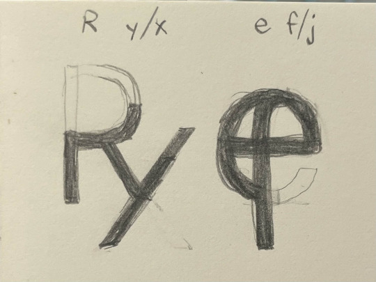
As for the project process, I had fun creating the final vectorized characters, though I was super indecisive for the serif one (see the picture with the other designs). I'm still thinking of their names and I plan to have the original letters be present in them. For the layout I definitely want to have a strong hierarchy in both, with a more traditional style for the serif and something more modern and experimental for the sans serif. Once I start the actual spreads in InDesign I'll try experimenting with different graphics and shapes to make the layouts more interesting.
0 notes
Text
Blog Post 6

Image from the book; these notes are very helpful in having me think about the individual pieces of the characters that I could mix and match for the current project
This week's section was very interesting to me; I enjoyed delving deeper into the details of type and letterforms. Since we've been working with type for a bit now, it's nice learning about a lot of terms that I'm already somewhat familiar with due to seeing them in Photoshop or Illustrator. Like with last week's reading, I find it interesting how the different aspects affect one another, such as how different x-heights affect the apparent "size" of text, even if they all have the same point size. The type family section was fairly similar to what we had learned in class from lectures, but I still enjoyed how the book broke down the different font variations and also included "crimes" where styles like italic or bold could be "faked" instead of using the designer's intended version. The smaller details about the different proportions in letterforms have me thinking about what new characters I could create for the current project, especially for the serif ones since there is a variety in weight.
0 notes
Text
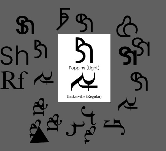
Project 4 WIP


For this project I'm using the typefaces Poppins (sans serif) and Baskerville (serif). I wanted the color scheme to match the vibes of each typeface, so I went with neutral browns for Baskerville to give a nice classy vibe and brighter blues for Poppins for a cool modern look. I'm still thinking of looking through Pinterest for more layouts that inspire me for that section of the project.
As for the actual letters themselves, I starting first with the sans serif since I think it'll be simpler. If anything this project reminds me of one from ARTS 102 where we combined different letterforms to create an abstract design, so I'm trying to work in a similar way by taking the more interesting letters. When I move on to the sans serif, I think it will be more complicated but also more fun since there is a big variety of shapes with the serifs; I am definitely using the Baskerville uppercase Q in some of them!
0 notes
Text
Blog Post 5

I was unsure if we were supposed to keep the loose (positive) tracking and only kern or if we were supposed to track the letters back together as well
This week's reading introduced many basic aspects of type, many of which I'm familiar with but were still interesting to dive deeper on. It's really interesting to me how many of these aspects work together as a whole to make reading a comfortable (or intentionally uncomfortable) experience. The reading mentions how higher leading will break up the solid "gray tone" of text into individual lines, which reminded me of the previous project in which we used bodies of text to create "blocks". I also enjoyed all the examples of "crimes" under each section that clearly showed an ineffective use of each aspect.
Of course, the sections on kerning and tracking relate directly to this current project. As of writing this post, I have not started working on the project itself yet, however I do have a plan of action. After seeing the example shown in class, some of my confusion for the project has been cleared such as whether to track the spaced-out words in addition to the required kerning. I hope to apply the concepts in both the reading and the supplemental videos to help with the kerning of the letters.
0 notes
Text
Blog Post 4


The grids that I used: column, modular/asymmetrical, experimental
This week's reading directly related to the gray reading project, covering the other aspect that last week's did not cover: the text itself. The discussion of the importance of the negative space between characters was interesting as it reminded me of the variety of text we had to use. The overall "color" of text blocks we used for the project depended on so many aspects: background color, text color, spacing between lines, spacing between characters, typeface and font, etc. I believe that our use of text as literal blocks of color in the project will help us down the line with formatting things on the grid; reading the chapter I found it more noticeable how the text was sectioned of in a main body block, most evident on the pages with text that broke off from the main block, creating visual interest. Moving forward, I am also interested in learning more about the smaller, more technical details of type such as kerning, which was mentioned near the end of the reading.
0 notes
Text
Blog Post 3


1-3: Some found type I had in my room 4: Example of modular grid from the textbook that I particularly liked
This week's reading was very helpful in reinforcing what we had learned from the grid lecture. It was interesting to see how the different layouts emerged and evolved from one another, like how adding rows to a column layout will lead to a modular grid. Speaking on the different types, I was thinking for this project to do one column, one modular, and one experimental/another modular layout. I'm particularly reminded of the ARTS 102 final process journal because looking back, I had a lot of fun playing around with the modular grid, and I want to gain a better understanding of it. On another note, I actually recently watched a video about the Golden Ratio, and I found it a little funny how the reading discussed how using a golden section can feel arbitrary.
0 notes
Text
Blog Post 2


Left: 8/9 Squares Right: Dollar Print
Finishing up the 9 Square Project, I'd say I'm pretty comfortable where I'm at. I have only one square left to do, #6, and I had the idea of using dollar bills as the texture; I scanned some dollars onto the paper that will be cut. As for the mounting process, I'm reminded of the reading for this week obviously due to the connection of using the grid. As with last week's section, it was very interesting how grids as a concept evolved as the technology evolved, from representing the blocks used to print letters to the pixels on modern screens. The idea of "Swiss design" and the rise of modular sections within the grid to house text and images is something I never thought about, even though it appears everywhere nowadays. It also reminds me of the way our mounting is supposed to be: three columns and three rows, defined spaces in between, and margins around the outside. I hope to be able to experiment more with different aspects of grids as we move forward in the class.
0 notes
Text
Blog Post 1


Top: squares 2 and 3 Bottom: squares 5 and 4
This beginning section of "Letter" in the textbook focused on the origin of the Latin Alphabet, more specifically how typefaces that we use today originated and evolved. I found it quite interesting how the different times shifted the trends found in the typefaces, especially how new technologies allowed for new innovations in how letters were portrayed. With all the different varieties in fonts, at the end of the day, the letters themselves still have the innate quality of representing spoken sounds.
This intersection between form and function is similar to our exploration in Project 1. All nine squares have a connection to the original image portrayed in square 1, but they all go about different ways, similar to how typefaces emphasize different qualities about the same Latin letters. With this in mind, I tried striking a balance in square 3 with what was colored black and what was left white; I wanted the face to stay readable while also not necessary connecting lines that you might would when doing a line drawing (such as square 2). I'm happy with the result and how it looks with the colors in squares 4 and 5 (though 5's color may look odd on some screens), and I'm still thinking about what kind of textures to experiment with for square 6.
1 note
·
View note