
Don't wanna be here? Send us removal request.
Statistics
We looked inside some of the posts by amy5365034 and here's what we found interesting.
Average Info
Notes Per Post
112
Likes Per Post
52
Reblog Per Post
0
Reply Per Post
60
Time Between Posts
6 days
Number of Posts By Type
Text
11
Last Seen Tumblr Blogs


Fun Fact
Women make up for the other 50% of Tumblr’s audience.
Text
Week 10 Final Reflection

iThrough this course, I have learn a variety of model making techniques and methods, both physical and digital, and I was very happy to see that towards the end, I was beginning to critically assess the strengths and weakness of each. Like how foam models were a good alternative lens to form exploration instead of just sketching, but can also be inaccurate in small details which can go unseen and need to be pinned down in later stages. I pieced together a clearer idea about when it would be suitable to use which type of modeling technique, and experienced it through a design process for the Olay moisturizer bottle. This allowed me evaluate my past projects; and now I have this new understanding and basic skillset to implement new methods in the future.
I saw great improvement in my sketching and drawing skills, and was happy to see that I applied what we learnt for orthographic drawings in my project for Studio 1B. I had difficulty working with digital sketching and modeling, however I can now say that I am much more comfortable working digitally, with a wider range of tools that I am able to use. To my surprise, the process of learning about digital model making was also more enjoyable than anticipated. I was always so excited to see how the my new learnt skills allowed me to make things that I honestly did see myself capable of making when I first got the tasks. Through this I also learnt about how to cope with the stress of learning new things, and to implement different working approaches, like breaking down the task and having longer sessions of concentration when working on challenging tasks.
I made many mistakes along the course, stumbling not only in building new skills, but in practicing old ones. Through the mistakes I made in hand sketching, I learnt new method and tools, from using circle templates and set squares, to just the simple act of wiping down rulers to prevent smudges. But small discoveries and experiences like these build up, and eventually lead me to become better at sketching and drawing. When making the physical model, I became more familiar with tools, and from the irreversible nature of foam modeling - understood the merits in planning the order of steps before acting upon something. When doing digital work, I learnt how important in was to organize the workspace even if its digital - as I panicked and searched through my unnamed layers. I also learnt to be less restricted in exploring in general, and to not be held back in making the strangest shapes as they might just be the spark to inspiration or discovery. Every challenge went to prove to me that, I really shouldn’t worry when a new challenge presents itself, because it will just be another adventurous journey that leads to my own personal growth as a designer. So if I were to do this again, I would take a second to think and plan before each task, to not let my emotions get in the way.
After writing Tumblr posts every week, I now think it is absolutely essential to reflect on a regular basis. The overall process was just a great way of getting new information, insights to be considered on a deeper level, and to be recorded. Not only does this keep a record of growth to look back on, the process itself allowed me to retain a lot more knowledge, discoveries, and insights to be able to draw from in the future.
Huge thanks to Rob, Gonz, and Tom for making this course so enjoyable, honestly enjoyed every class we've had, and I hope to see you guys again in future classes!
12 notes
·
View notes
Text
Week 9 CAD Modeling of Bottle
Taking experience from last week, I began this week’s CAD modeling by decluttering the digital space, also changing the color of the models - just to maximize my positive engagement with the activity.
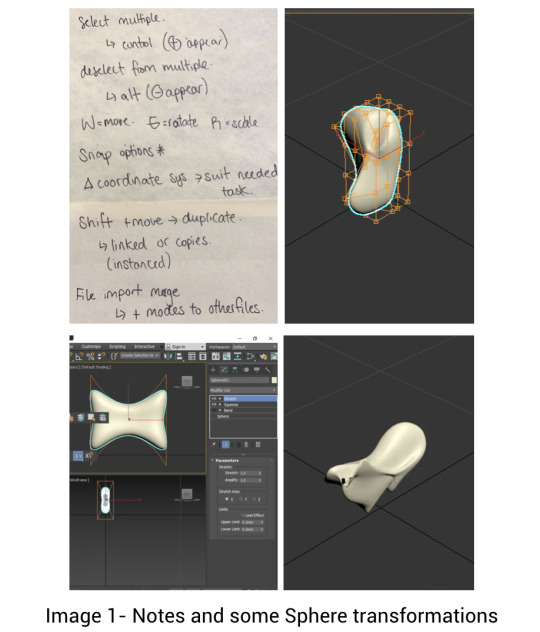
I had a few ideas in mind about how to construct my model, and given that it is not too complicated, I did not apply the photos to the model and went freehand. Originally I used the “taper” modifier, but it affected the overall dimension in places I did not want. I ended up using swift loops and scaling the faces to get the overall shape (image 1). After the chamfer(image 2), I also learnt that the order in which modeling steps are done also changes how easy it is to do something.
Then I accidentally discovered the all-mighty hotkey to turn off everything. I had to dig through to retrieve my previous views, and thanks to that I learnt roughly about what everything and the tools are. This showed me that sometimes silly accidents lead to more knowledge ;)

So instead of doing the horizontal chamfers first, I made the flat surface first the second time I tried. My new favorite tool from this week is the “cut” function that I found when doing research. It was great for sculptural changes without the constraints of other modifiers(image 3&4). If I were to do this again I would also make sure to name my layers, and organize my workspace better.
As I compared my models, I realized my foam model has a curve at the bottom of my flat surface, and the CAD model made it more apparent for me to fix (Image 5). The advantages of different modeling techniques was brought to my attention; the foam model is less accurate but good for form exploration, and the CAD models forces you to face difficult details to imagine and make them exact. This gives me more understanding about when to use which in future design processes.


One of my biggest findings this week was also just about my personal work flow. Unlike what I usually hear, about short work sessions with breaks in between, I realized actually work better in extensive periods of concentration. I finished most of my model in one sitting spanning across 2+hrs, and I found that this was great for not having to repeated try and defeat the emotional stress of getting back to a difficult CAD software. I will be keeping this in mind in the future, and I am glad that I took the time and found out.
9 notes
·
View notes
Text
Week 8 CAD Modeling
When trying to do the CAD actives this week I felt very worried about the new software, but fortunately, my worries were proven quite unnecessary as I worked through, and it was an exciting journey.
Going through the online tutorials, I found the software not too hard to follow, maybe it’s because I found some similar features that existed in Fusion360 which I was familiar with. I realized in the past, tutorials weren’t as helpful since I’d forget the overload of functions being introduced. So this time round I made a note of all the things I found useful (image 1) .
I learnt how essential it is to declutter my workspace - since following the in class tutorial instructions to hide unneeded functions made the interface less intimidating instantly. I especially liked the modifier features of this software, the range and control made manipulating the model very intuitive. I did however have to mess around with the parameters in each one, sometimes getting unreasonable results, but ultimately it lead to more understanding. As I experimented, I realized how careful I was sometimes with the model, which is not a good sign for a designer, since designers should not be afraid to test and explore different things. So in the next parts I wanted to encourage myself to create random objects that were inspired by any shapes I come across (Image 1).
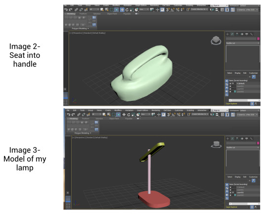
When following the next Autodesk tutorials, I built onto the models I was instructed to make based on my own understanding of how to use the application. The seat reminded me of the handle of a household product, so I transformed it into the handle of a window cleaner I saw. I also tried to model my own lamp from scratch, just when I felt more confident, the bevel produced an error. It took me 30min before I realized the chamfer was set to a value larger than the width can allow, so I fixed it and became more aware of the constraints some tools can have.
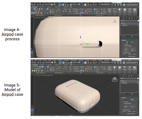
I then also moved on to making my airpod case, and found myself branching out to use more tools, but also using more suitable modifiers to efficiently create the shape needed (not using editable poly if its not needed yet).
My main takeaways this week:
I need to be more courageous and creative to become a good designer
Although cliche and obvious, practice makes perfect! It’s only been 1 week and I’ve grown a lot more comfortable with the application, and getting used to the UI.
Some tools have constraints, look out for them.
Get a PC soon to stop using myAccess ;( each change takes a 20second lag to appear and its too inefficient!
11 notes
·
View notes
Text
Week 7 Physical Modelling
This week’s activity was very fun and exciting. I had been bad with foam models before, but this time I was ready to properly tackle the task with better tools.

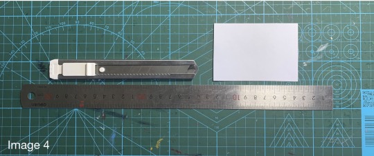
aI got a saw to cut through the foam, and having worked with saws a lot in the past for woodwork, I thought it was going to be easy. It turned out to be difficult to control and stop tapering since foam is a lot softer, and I no longer had access to proper stands and workshop tables (image 2).
When doing the rough shaping, I found the orthographic views extremely helpful. Being able to stick the views on top made sure that I was cutting the right shapes, but I got too excited and cut it too close to the edge of the template (image 3). I also originally going back and forth with the file, which chipped off material instead of abrading it off. These issues did not impose a big problem, I would definitely leave more space in future models, because it is irreversible.

The center line was very helpful too (image 5), since I noticed I did have the tendency to shave too much off of one side. This connects with what I thought about guidelines in previous weeks, I think they are very useful tools to easily implicate and get much better and cleaner results in design exploration.

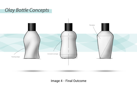
The process of sculpting made me realize I had mis-interpreted my bottle shape before, and this helped to show me what it would actually look like. When drawing the top view, I put the flat surface flat without an angle to the body of the bottle, when in reality, to achieve that feature I imaged, it would have to be on an angle (image 7 left). I had also changed the fillet on the edges, since the process of sculpting led me be believe that it would look better (image 7&8). This goes to show how essential physical modeling is in design, and that they should accompany sketches to clarify and further test out ideas.

In general, a few points I picked up for modeling techniques were:
Choice of tool matters in achieving different surfaces, and speed at which material is removed
Shape of tools help to achieve different shapes on the model, a wider sanding block worked better to make the flat surface (image 6) than the file which left markers from the edges.
Plan out which stages are rough or detailed sculpting, saves time and increase precision. I was too careful in some initial stages, which made the process too long, and in some precise parts, too much material was taken/chipped off because I had not switched tools for precision. And the finest sandpaper creates a satisfying result!
11 notes
·
View notes
Text
Week 6 Digital Sketching
I was extra nervous this week, because I had close to zero experience in sketching in Photoshop. But I soon realized that maybe it was not as difficult as I thought, and it turned out to be a very fun exercise that had taught me a lot of useful skills for the future.
I first found some ideas on pinterest, to learn from the kinds of sketches produced by experienced professionals, and hopefully draw inspiration from them to apply in my own work
Sources:
https://www.pinterest.co.uk/pin/211174954293618/
https://www.pinterest.co.uk/pin/366480488437802048/
https://www.pinterest.co.uk/pin/519532506987464934/

After setting up the layers and paths, I became more comfortable with the interface. I found the method of using a mask to sculpt away at the box a very useful methods, it allowed me to quickly create accurate shapes that I had in mind. I took advantage of this and experimented with new ideas. In the past, I used to create digital sketches purely by adding geometries together, and it had its merits of being very accurate but it was time-consuming (image 3 - right). I think the method of painting in the masked layer is a fast and low risk method of experimenting - with more freedom for shapes, and the color fill helps me to visualize better, so I think I will be using this in the future for other projects!
It took a while to master the pen (I’m using the trackpad because I don’t own a mouse) and I eventually realized that my Mac settings were not ideal for Photoshop - my computer curser was larger, causing the pen radius to be different (image 1). In case anyone else had the same issue, it can be fixed by changing the curser size to normal in settings - accessibilities
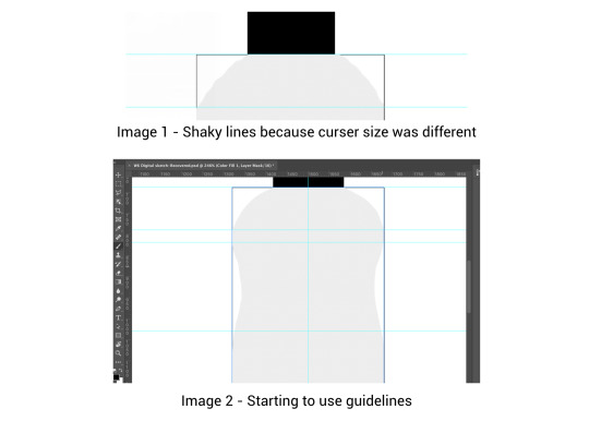
As I sketched, I began to experiment with guidelines (image 2), and they were the most useful tool I found in this activity. I was able to have a more confidence in my strokes and make more accurate shapes using it.
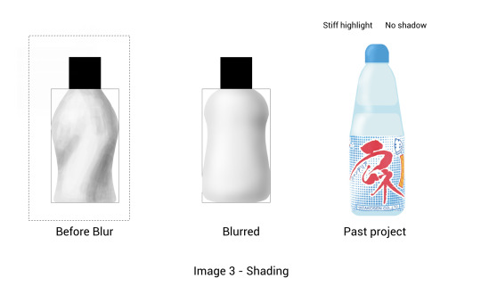
I was particularly surprised by the blurring function for shading and highlighting. I used to shade and highlight using a pen with 0 hardness (Image 3 - right), but the effect was not nearly as good as the new method, so I am happy that I had learnt this new skill.
I made the contour lines a lighter gray according to my conclusions from last week; I think they look less jarring, especially next to the thicker outline and I am happy with the way they turned out. When roughing up the outline, I was initially skeptical about how it would turn out. But soon changed my mind and realized the value of communicating the “in progress” nature of the concepts and realized this trait on a lot of sketches I found online. (image 4)
Having never done digital presentation sketches, creating drop shadows and backgrounds felt very foreign. But it was perhaps one of the most exciting parts, seeing that I could also create something similar to the sketches I admired online by other designers. I tried to think about the emotion and appeal I wanted to create - like we recently did for another class, and I think it marked a good start to my journey in digital sketching.
8 notes
·
View notes
Text
Week 5 Drawing
This week’s exercise was perhaps the most fun, but also frustrating. Sitting in the tutorial at 8am, I felt like a failure as I compared my work with the works of the tutors 🤣 That had emphasized how much harder I had to work, to be able to draw like them.
During the warm up exercise (image 1), I saw my hand getter more steady, I had done these exercises sometimes, but not always, and I was reminded of essential and extremely helpful it is. I will definitely be continuing to do this every time I draw.
I tried using different pens to test out what I like. My favorite is the Uniball fine line pens, since they had more grip on the page allowing for more control, but they were more sensitive to pressure changes. I tried using other pens like Zebra sarasa and Unibal signo pens, although they where smoother, but they were too slippery on the page, and I do not have enough control at the moment to use them. So at the moment I will be using uniball’s fine line pens for future drawings.

As I began the orthographic thumbnails, I saw the tutors using pen and instantly sketching out perfect drawings. Upon trying to draw with pen straight away, I soon realized my lines lacked confidence and went back to pencil for practice. The first few drawings weren’t symmetrical, so I began using guidelines to help. After I while I had more precision, so this shows that with enough practice, I will also one day be able to sketch with confidence like the tutors did. Next time I have similar exercises, I will try to use pen and overcome the fear of making mistakes. The contour lines were too thick sometimes, and I addressed this issue in the next drawing.
I experimented with different ways to shade, first doing hatching lines in pen, then adding more shading in pencil and marker. I was not very familiar markers, and I had to watch many more tutorials. I was really thankful that I did not start straight away, since when choosing colors I realized some markers were drying out and unable to make “even quick strokes” as many videos instructed. During the process, I became very anxious and thought that I shaded it too dark, but learnt that it just needed to dry. Overall, I’m not mad at it as a first try, but I could definitely use more practice in making the gradients smoother (image 2)

I warmed up again for the perspective drawing , since I took a break. And this definitely helped the lines look smoother and more confident (Image 4 and 5). I saw how important it was to check if the drawing looked “right” - I flipped page around as one of the video resources suggested and fixed anything that looked off. I chose a thinner pen for contour lines this time, since some of the ones in the orthographic looked like they were distracting. Unfortunately, not much progress was seen in the marker shading, I guess it just takes more practice!

7 notes
·
View notes
Text
Week 4 Perspective Drawing
This week we did perspective drawings. I had done perspective drawings from design class and art class in middle and high school, but never really utilizing measurements and more exact methods, so this was an exciting approach for me.
When I first started setting out the page, I did not know how far apart the PP, HL, and BL should be, and upon asking during the tutorial, I decided upon something that I thought was reasonable and set the page out. It turned out that I had made the SP too far from the PP, so the LVP fell off of the page in my first trial. I added an additional piece of paper to account for that (image 3), but I kept this in mind and successfully avoided the issue for the next 2 parts. When doing the top view, I lost one of the corners (I still don’t quite know why I made that mistake), so I became really confused when trying to connect projected line intersections with the VPs (image 1 has 2 PP lines, one from the wrong trial). This however lead me to think more about what the object should look like, and analyze how the perspective drawing works, and with the aid of the model made - I was able to identify and correct my mistake to successfully complete the first drawing (image 3).

In the second drawing, my main take away was that some times the intersections of the lines can be hard to pin point, and being slightly off on each one would lead to an inaccurate drawing - since lines are constructed in reference of other lines. When the intersections are made at a small angle, it looks as if the intersecting point is elongated, and this caused me to construct new lines that were slightly off (image 5). I soon realized this, and decided to use additional things and points as reference, also double checking in my mind to ask myself if it looks correct in terms of other parts of the drawing.

Finally when doing the ellipses, I found myself making the basic set up and drawing the cube a lot faster than I did in the previous two drawings. I think I have improved on my ability to utilize this method of drawing 2-point perspectives, and got better at estimating/deciding where each point and element should go. I did find the ellipse very hard to draw, because I realized I’ve been drawing them wrong all along! In high-school I originally assumed that the major and minor axis were projected lines from the mid point, but that is not the case. When drawing the ellipse, I found myself gravitating towards the wrong positioning of the shape just like I did before, but the guidelines helped me to correct them. My ellipses were very “hairy” as of now, due to the lack of certainty in my pencil marks (image 9), but I was able to still make out some what of an ellipse in pen later on (image 8&10). I think this was definitely a very helpful exercise, and with more practice, I wish to finally get better at being precise with it.
The exercise overall was very helpful as a practice, and I definitely feel more comfortable drawing in perspective now. I will need to practice a lot more to slowly lose the page set up and do it free hand, but it feels like an exciting challenge. I also tried to do the projection lines lighter this time, but perhaps too light that they become invisible on the scans (image 2, 6, 10), so for the purpose of showing the process, I have enlarged to actual photo of the drawing.
A question that was left in my mind is: How do you find the major and minor axis for the top face of a shape in 2 point perspective? There are no “opposite sides” to connect with the vanishing points, so I was not sure. If anyone could help answer that I would greatly appreciate it!
4 notes
·
View notes
Text
Week 3 Engineering drawing
This week we practiced drawing auxiliary and section views in orthographic drawings. I first tried to understand the shape from the isometric drawing. When doing the rough sketch I was confused and realized that I oversimplified the shape in my head. I assumed that the bottom of the shape would be level, and that the slanted surface was a rectangle, but upon recording down the dimensions I corrected my understanding of the shape.
I planned out roughly how the dimensions and views would fit on the page (image 1), and when doing the auxiliary view, I realized that it does not fit as it would create a weird spacing between the views. From that I knew that I needed to remove it and reference it using titles based on my understandings from the lecture, video, and readings.

When choosing the right page size and planning the layout, I struggled a lot. First I tried to see what 1:1 scale would look like on a3 but realized it doesn’t fit. I assumed that it would fit on the a2, so I had set the an a2 page up for the drawing. After some calculation and trials (image 3), I realized that at a scale of 1:1 it doesn’t leave enough space between views, and at 1:2 the drawings look oddly small on the page (image 2). When I went back to setting up an a3 page I remembered the box from last week, and realized it was more useful than I thought, since I’m still at a stage were imagining the rough size of the drawing is difficult. I decided to cut a slip of paper that represents the front view at a scale of 2:1 and used that to aid my layout planning (image 4). I decided that the size was suitable, and thought it would be useful for me to practice drawing at a different scale (1:2), so I began my final drawing. My approach to layout this week was very frustrating because I had gotten it wrong so many times, but I think it was all good practice, and the mistakes that I have to make a couple times before to improve.

Drawing each view and adding dimensions was easier and faster than last week. Although I had only practiced once, I think I was able to remember and utilize the standards better. I had everything planned out in my initial rough sketch with more accuracy than last week, so this process went a lot better than before. From last week, I wasn’t happy with the line thickness of my writing, so this week I used a thinner pen to account for my tense grip. I also made sure to align the dimensions this time, to make it look neater and more unified. (image 5&6)


If I were to do this task again, I would definitely make the box/slip of paper first, because I am still at a level where I cannot instinctively decide the best paper size and scale. In the end, I accidentally almost forgot to label and hatch the section view, so I would make a checklist next time, and do that until I no longer need the reminders. Also - although a minor point - I would erase the pencil markers with more caution, since this time I accidentally scrunched up the paper when erasing, which is a bad mistake to make after the drawing is done. Hopefully next time, I will be more skillful overall, and be more efficient.
22 notes
·
View notes
Text
Week 2 Engineering Drawing
For this week’s engineering drawing, I was a little more anxious than I was with the last task. From the reading and lecture slides, the drawings looked a lot more professional and accurate than the orthographic drawings I did before. I was afraid of being inaccurate or imprecise, so I was more hesitant to do the task. However, I know that things can only be identified and fixed if I have something down on paper, so I pushed myself at multiple points to continue.
The first parts where simpler, making the box around the highlighter (my chosen object) was not very difficult (image 1), but proved to be very helpful in visualizing and laying out where to put the different views from the third angle projection onto the page.

When I made the rough sketch to note down dimensions (image 2), I was not pleased with the imperfect outlines. However, I found the rough sketch helpful in noting down all the dimensions for later use, also in thinking about where the dimensions should be put to achieve visual clarity. So I learnt to love and cherish my first sketches like an ugly child just as Bruce Mau said in his guest speaking lecture earlier in the week. There was also multiple small curve in the product that was hard to measure, so I found an alternative way and used a mathematical equation to figure out the radius based on the sagitta and chord length of the arc.

In doing the final drawing, I first laid out the page with boarders and the title box. Then I calculated the correct placement of the views. I found construction lines very helpful when drawing the highlighter in differently views, it was more accurate and faster, since the lines would extend and the parts would be outlined in all the views together. I saw myself getting better at using tools like the circle template than last week, and was happy to see development in my skills.

I wrote the dimensions down in pencil, considering their placement based on experience of attempts in the rough sketch, and it looked a lot neater (image 5).However at this point, I suddenly realized I had forgotten about the standard spacing and writing size from the reading, so I had to go back and double check. From this I learned that I need to read and take notes on the future readings with more caution.

I readjusted the spacing and writing size of the dimensions, and outlined it in a fine liner with 0.25mm thickness. However, I found that I press down really hard when writing so the writing is thicker (image 6) - next time I will use a thinner pen to account for this

It was very rewarding to see a precise and accurate drawing to emerge from my efforts, I definitely feel more equipped to communicate information about designs and more knowledgeable about orthographic drawings having applied the information in my own drawing. My main take-aways are to not be afraid to start something, and also to find better ways to retain the new information from readings!
5 notes
·
View notes
Text
Week 1 Tutorial exercise
In part 1, I originally did not find the task challenging, but as I worked on it some more, I was humbled by the emerging considerations for layout, construction lines, and deciding which instruments to use in each section. I ended up redoing the drawings 4 times before I was satisfied. I originally used a protractor to construct any lines at an angle, but it was very time consuming (image1). I then used the T-square and the set squares (image2), which where more convenient, but due to my lack of experience, I had to double check each line with the protractor in the very beginning. When I traced the first shape, I passed the point where the line was supposed to end because the construction lines continued. I learned to tidy up any misleading construction lines the second time, and had a more accurate result (image3). I found using the circle template most challenging; it was hard to position it correctly and account for the thickness of the pencil meeting the template. However, with more practice I was able to use it with more ease and accuracy.
In part 2, I saw myself getting better at using the set squares, and having to check less often with the protractor. Approaching the shape, I originally wanted to draw it by adding together the smaller individual equilateral triangles within the shape. But then I decided that the shape could be made from a more subtractive method, by taking away smaller triangles from the corner of a larger triangle with the base length of 12cm. This sped up my process and increased precision (Image4&5). When piecing the shape together, I did find 2 shapes that were slightly accuracy, but it was easily adjusted by trimming the edge that was 1˚ off of the intended angle. I pieced it together but the natural curvature of the paper affected the overall effect (image6), so I used removable tape and glued them onto a piece of black card for contrast, and it yielded a more satisfying result (image7&8).


13 notes
·
View notes
Text
Introduction
Hi guys, I'm Amy!
I've been interested in design ever since my first woodwork design class in grade 7, and continued to pursue it in the IB diploma program. Upon visiting Sydney 4 years ago, I fell in love with the city and that led me here today, studying Industrial Design in UNSW.
I've loved singing, drawing, and crafts ever since I was a kid. I'm also very passionate about learning languages, I speak English, Chinese, and Korean. But recently I have been learning French!
10 notes
·
View notes