
Don't wanna be here? Send us removal request.
Statistics
We looked inside some of the posts by anasanchez12345 and here's what we found interesting.
Average Info
Notes Per Post
0
Likes Per Post
0
Reblog Per Post
0
Reply Per Post
0
Time Between Posts
8 days
Number of Posts By Type
Text
12
Last Seen Tumblr Blogs


Fun Fact
Tumblr has 411 employees.
Text
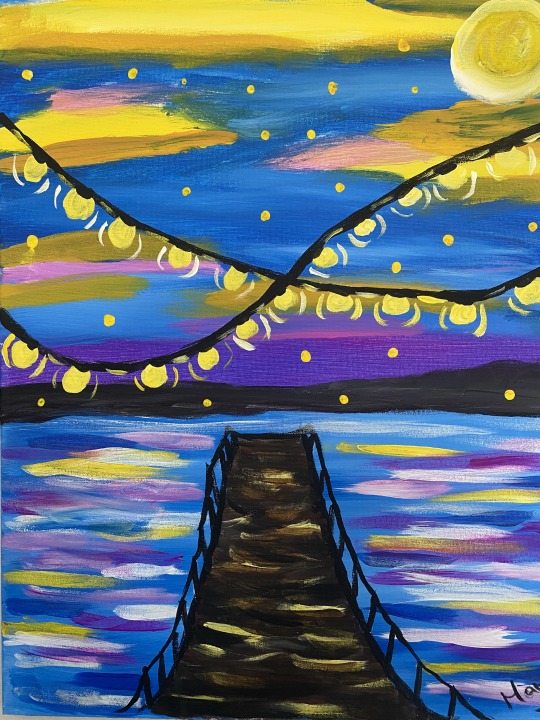
I had 16-inch by 24-inch canvases and utilized a photograph as a model. I also used pastel paint, so my objective was to create my painting mostly with primary colors (blue, red, and yellow), as well as black and white.
I painted the sky using brown, yellow, blue, white, and red to get the pink tint, followed by the lights and bridge in black and yellow.
I used brown, yellow, and white to create the sun, then I painted the mountains in the distance entirely in black.
For the horizon, I used some red and blue to produce the purple paint, and for the lake, I was attempting to get a mirror image, so I used blue as well, Yellow, white, and a little red.
0 notes
Text
How did Jackson Pollock go from studying with Thomas Hart Benton and using abstract imagery in his paintings to removing all imagery in his famous “drip” paintings?
Early Influences and Training: Pollock trained under Thomas Hart Benton, a renowned artist recognized for his regionalist style and murals. Benton's influence may be observed in Pollock's early works, which had more figurative and representational elements. During this time, Pollock learnt about the effect of large-scale paintings and absorbed Benton's theories on picture space1.
Pollock's shift towards abstraction began in the early 1940s, as he abandoned specific figures and shapes. He completely covered his paintings with markings, ultimately shifting to a more abstract style. His painting technique became known as "action painting," which was distinguished by spontaneous, vigorous brushwork and an emphasis on the physical process of making art.
In his Drip Paintings, Pollock deviated from standard equipment including brushes, palettes, and easels, leading to his breakthrough. Instead, he used a flat canvas and let his imagination flow in the moment. This is when he created his well-known "drip" paintings. Pollock would stand over a horizontally positioned canvas and drip or spatter paint over it. The results were dynamic, chaotic, and devoid of any identifiable imagery. Pollock reinvented radical abstract expressionism by deleting all representational aspects. His groundbreaking method separated line and color, fundamentally redefining the definitions of drawing and painting. These paintings were famous, ushering in a new way of thinking about and seeing art.
In summary, Jackson Pollock's path from studying under Thomas Hart Benton to developing his drip paintings was a gradual movement from realism to abstraction, ending in a pioneering creative style that continues to captivate audiences today.
0 notes
Text
THE MEETING OF ABRAHAM AND MELCHIZEDEK
Sir Peter Paul Rubens
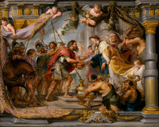
Around 1625, Peter Paul Rubens received an important commission from the Infanta Isabel Clara Eugenia, Governess of the Southern Netherlands (1566–1633) to design a tapestry series of The Triumph of the Eucharist for the royal convent of the Poor Clare’s in Madrid. The tapestries were to be hung during the feast days of Good Friday and Corpus Christi, which celebrate Christ’s presence in the Eucharist. The subject had profound meaning for the Poor Clare’s, who were particularly devoted to the Eucharist—the bread and wine of the Mass that Catholics believe miraculously transubstantiates into the body and blood of Christ when consecrated by a priest. Rubens focused on Old Testament prefiguration’s of the Eucharist and allegorical subjects symbolizing triumph of the Catholic Church over the forces of evil and heresy.
The Meeting of Abraham and Melchizedek is a highly finished morello, or sketch, for one of the Old Testament prefiguration’s of the Eucharist. This story from Genesis tells of the gifts of bread and wine that Abraham received from the Priest-King of Salem, Melchizedek, after returning from a victorious battle (Gen. 14: 17-20). Catholic theologians viewed Melchizedek’s offering of bread and wine as a prefiguration of the Last Supper, and even saw Melchizedek, whose name means “king of Justice,” as a prefiguration of Christ. In Rubens’s vivid portrayal, the scene unfolds on an illusionistically painted tapestry held aloft by putti before an architectural framework. Abraham, in armor standing at the head of his band of soldiers, appears in the center, gratefully receiving loaves of bread from Melchizedek. As the two men lean toward one another, they lock eyes as though they have a premonition, unshared by the others, that the bread and wine have significance beyond bodily sustenance.
Rubens reinforced the momentousness of the encounter not only through compositional devices, but also through his exuberant style. His vivid colors, rich textures, and expressive brush imbue the scene with a feeling of grandeur. In this way Rubens both signals the importance of the prefigured Eucharist in the Old Testament and suggests its continued centrality to the Catholic Faith in his own time.
Society Composition and Dimensions:
The picture is an oil on panel from 1626. Its overall dimensions are around 65.5 x 82.4 cm (25 13/16 x 32 7/16 inches), and when framed, it measures about 96.8 x 113.4 cm (38 1/8 x 44 5/8 inches). The image depicts a scenario from Genesis 14:17-20. Abraham, the biblical patriarch, has emerged triumphant from the battlefield. He meets Melchizedek, the Priest-King of Salem, who offers him bread and drink. According to Catholic theology, Melchizedek's contribution foreshadowed the Last Supper and even linked him to Christ. The painting takes place before an illusionistic ally designed tapestry held aloft by putti (cherubic figures).
Abraham, clothed in armor, stands at the head of his warriors, centered. He joyfully accepts loaves of bread from Melchizedek, who stands opposite him. Their gazes meet, implying that the bread and wine are more than just food. The architectural structure offers depth and context. Rubens uses a vibrant color pallet to convey grandeur and importance. The rich textures and expressive brushwork add to the scene's vitality. The warm tones emphasize the spiritual link between the figures. The composition is well-balanced, with Abraham and Melchizedek creating a prominent axis. The tapestry, carried by putti, conveys a feeling of height and movement. Architectural components ensure stability and symmetry.
Rubens accomplishes unity by arranging individuals and objects in a harmonic pattern.
Emphasis and Variety:
The interchange of bread and wine represents the Eucharist. The focus is directed to Abraham's thankful look and Melchizedek's royal gesture. Textures, hues, and emotions vary, which adds to visual interest. In conclusion, The Meeting of Abraham and Melchizedek expertly depicts a watershed period in biblical history, combining religious symbolism with Rubens' vibrant style.
How does the work make you feel?
The paint impact me because it refers of a Bible passage that I have read these verses in Genesis when Abraham met Melchizedek who is considered a prefiguration of Jesus in the last supper, and Abraham was blessed by Melchizedek (Priest king of Salem) who is considered a pre-configuration of Jesus.
How or why does it evoke these feelings?
Because I am Christhian, and this is one of my favorite’s chapters in the Bible.
What movement is the artwork associated with?
Is associated with the traditions of the Italian renaissance to produce a powerful style. It was commission by Infanta Isabel Clara Eugenia Governess of the Southern Netherlands (1566–1633).
This is not a portrait; the author tries to make this paint look like a tapestry.
What does the artwork say about the artist that made it?
The author was a profound Christian Catholic who was devoted to paint this kind of themes.
Can you tell what the artist was trying to say?
The artist was trying to describe the passage of Melchizedek and Abraham in the book of Genesis.
How clearly does the artist get their message across?
It is very graphic and clear showing the soldiers, (according to the Passage Abraham just came back from the Battlefield), bread, wine that are described in this Bible passage.

I pick this paint because I think is very important to know that everything in this art it is so real for me in my Christian life, and also that is part of the Bible that is the book that guide my Christian faith, the meeting of Melchizedek and Abraham it is fundamental for us, Christians, Abraham is well known as “The father of the faith” and this is one of the acts that prove it.
0 notes
Text
1. JOURNALING:
Unity and variety:
The concept of unity relates to a design's sense of harmony. It's about building harmony by making sure that all aspects function together successfully. Variety, on the other hand, brings diversity and interest. It avoids monotony by using opposing components. Example: Consider a well-organized bookcase, with books of all sizes and colors organized well. The general structure creates unity, while the different book covers provide variation.
Balance:
Balance is about distributing visual weight uniformly throughout a composition. It may be symmetrical (equal weight on both sides) or asymmetrical (unequal but visually balanced). For example, two kids of different sizes change their positions to maintain equilibrium on a playground seesaw.
Emphasis and Subordination:
Emphasis draws the viewer's attention to a particular focal area. It's like emphasizing the star of the performance. Subordination keeps less significant parts from overpowering the major theme. In an image of a flowering flower, the vivid petals (emphasis) contrast with the calm the background (subordination).
Directional forces:
Directional forces direct the viewer's eye throughout a composition. They may be literal lines or inferred motions. Arrows on road signs, leading lines in architectural photographs, and the flow of a dancer's movement are all examples of directional forces.
Repetition and rhythm:
Repetition refers to use of the same visual elements (such as forms, colors, or patterns) to achieve consistency. Rhythm refers to the visual flow that results from repeating features at regular intervals.
For example, musical notes in a song follow a rhythmic pattern, much as repeated design elements in wallpaper or fabric produce rhythm.
Scale and Proportion:
Scale describes the relative size of pieces in a composition. It can express significance or make a visual effect. Proportion ensures proper connections between pieces of an artwork. Example: In architecture, the vast grandeur of a cathedral's entryway highlights its importance. Similarly, a little bonsai tree in a large garden demonstrates proportion.
Let's examine an artist's work that demonstrates one of these ideas.
Artist Piet Mondrian
Principle: balance Theme: "Composition with Red, Blue, and Yellow" Mondrian's abstract artwork achieves equilibrium by utilizing a grid of basic colors (red, blue, and yellow) and black lines.
Even though the arrangement is simple, it feels connected. The equal distribution of color and form produces a feeling of balance.
2. CONNECTING ART TO YOUR WORLD:
I traveled to Nassau (Bahamas) with my family earlier this year. During a journey to the Atlantic Ocean, I was intrigued by the deep blue of the sea. The color of the sea changed from deep blue along the coast to a lighter turquoise as it approached the sandy shoreline. The blue color shifted with the position of the sun, providing a captivating dance of light and shadow. As I looked out over that ever-changing vastness, I felt both tranquility and astonishment.
The landscape's beautiful sunrises and sunsets enhanced the color saturation. The contrast with the Cerulean Sea was startling.
My ideal color palette would be a beautiful combination of warm oceanic tones. Imagine the richness of the deep blue sky, the many shades of gold and orange at sunset, and the calming presence of deep forest green. These hues represent stability, development, and a connection with nature. They remind me to enjoy life's basic joys and to see beauty in the ordinary.
So, my life's hues would be earthy red a rose that represents perfection, beauty, and the strength of life.
3. ART PROJECT
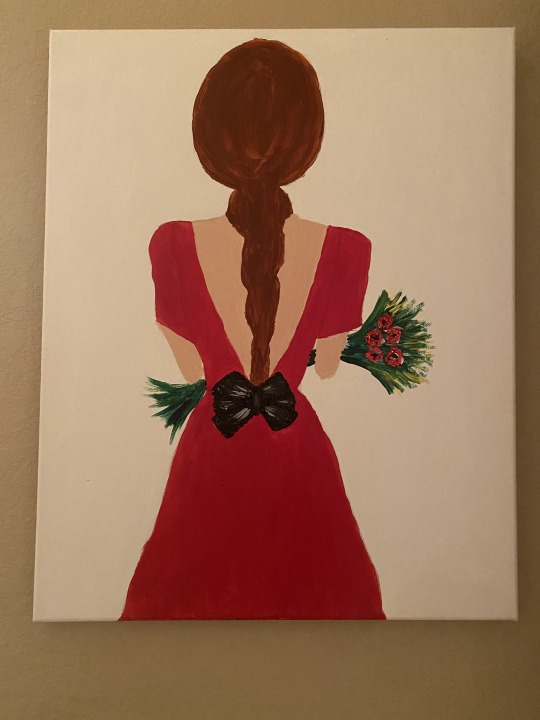
This painting means a lot to me because it represents how always a woman has to be treated as special and beautiful, and my dad, when I was a little girl, always said to me that a woman is delicate, has to be treated with love, and has never been touched, even with a petal of a rose. The meaning of that phrase is that men never hurt women; they have to tread on them very gently. I made this painting a couple years ago.
4. DISCUSSION:
Group 2
Bad Layout Design

Good Layout Design

What makes this a good design?
This is a good sign because it is very clear about the message that it is trying to show and say, and it is also simple and colorful.
What is the design's intention?
The intention of this sign is to show that we need to eat healthy if we want to have a longer, healthier life.
Does the design fulfill its purpose?
Yes, I think the sign fulfilled its purpose because it taught the healthy way that we have to eat to take care of ourselves and also guided us to have better health.
0 notes
Text
Light is this amazing elixir,” James Turrell explains. “We drink light through the skin as Vitamin D … so we are literally light eaters. It’s part of our diet.” It makes sense then that Turrell’s light spaces—immersive installations realized through combinations of natural, artificial, and colored light—are best understood through experience, and are not easily captured through photographs or words.
The new prints, as well as the process behind their creation is on view in Pace Prints’ new fall exhibition, “James Turrell: Prints and Process.” In addition to the three editions—each realized in gradations green, blue, and red, respectively—the show includes six proofs and six blocks utilized in their creation. The mystifying motif in each—a dark ground encapsulating a graduating series of ellipses—draws the eye into the center, then outwards, from bright white to deep saturated color, serving as a visual, reverberating reminder of the original.
When I see this paint, I see oval circles, but I can also imagine being in another world.
0 notes


Text
What perspective are you bringing along when you look at art?
The perspective that I have when I look at art is beauty, perfectionism, admiration, balance, and color.
How old are you?
I am 51 years old.
What is the gender you primarily align with?
Female.
Where are you from?
I am from Colombia.
What is your ethnicity?
Hispanic.
What do you do for fun?
Dance, going to the movies, going out for Dinner.
Are you a member of any organized group?
yes, I am a member of Bayside Community Church.
Where do you work?
I work at Sarasota County Schools.
What makes you uniquely you?
I am Colombian daughter of God.
0 notes
Text
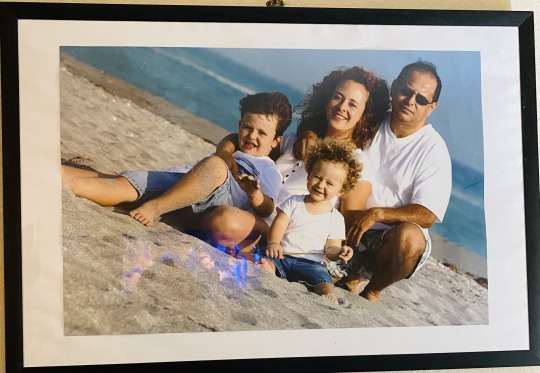
What media were used to create it?
The media were used to create this artwork was a camera, which was taken years ago by a professional photographer.
What use does it serve?
The picture is meant to create memories, decorate my house, and show my family and the people that I love the most. I also remember when my kids were little.
That life is too short, and we have to enjoy every single moment with our children because they are growing too fast, and when you see, they are adults, and they started their own lives.
Do you think it is beautiful?
Yes, I think this picture is beautiful because it shows my beautiful family and was taken at the beach! with the ocean behind during the summer.
0 notes
Text
Hello class, my name is Ana Sanchez and one fact about me was, when I was in third grade, I won the first prize for the best coloring picture.
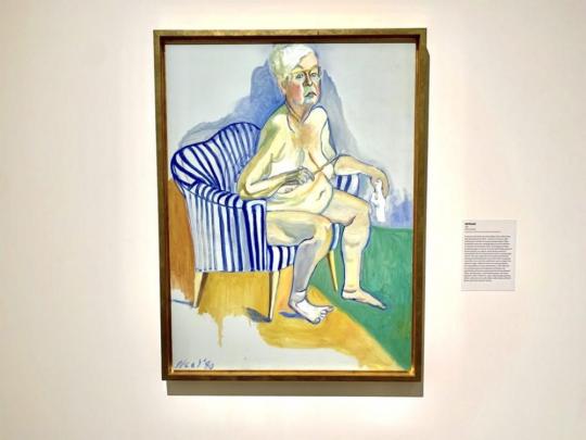
Facts about Alice Neel 1980 Self-Portrait. Oil on canvas; 54” x 40”.
. Alice Neel "hurls shafts that hit the mark but do not sting," pinpointing the penetrating yet compassionate quality in the figure studies for which she is best known.
. Neel adhered to portraiture in the midst of the Abstract Expressionist movement and was consequently ignored by the art world until shortly before two retrospective exhibitions held during the early 1970s.
. Life begins at seventy!" she said of her career’s newfound transformation.
. In 1975, Neel began this shocking, endearing, and utterly unconventional self-portrait, one of only two she ever made.
. She took five years to complete the work and later, recalling the process, said, "The reason my cheeks got so pink was that it was so hard for me to paint that I almost killed myself painting it."
. A striking challenge to the centuries-old convention of idealized femininity, Neel’s only painted self-portrait is openly accepting of her aging body.
Reflective Paragraph
When I first saw Alice Neel's 1980 self-portrait, I was surprised and embarrassed to see an old lady naked, but after I read why she made this painting, it totally touched my heart because a lot of women don't like their own bodies, and sometimes they don't want to get old and see and accept their imperfections and their bodies, and I love the way that Alice Neel loved and accepted her own body until the end of her life.
I think this is an amazing example for all the women, young and old, that we have to love ourselves for who we are.
0 notes