
Don't wanna be here? Send us removal request.
Statistics
We looked inside some of the posts by andrefavrondesign-blog and here's what we found interesting.
Average Info
Notes Per Post
2
Likes Per Post
2
Reblog Per Post
0
Reply Per Post
0
Time Between Posts
7 days
Number of Posts By Type
Photo
12
Last Seen Tumblr Blogs


Fun Fact
70% of Tumblr users say the Dashboard is their favorite place to spend time online.
Photo
Experiment #12- Whatever you want
For my final experiment, I wanted to try both the creature theme and combining vector and raster illustration again. I felt that my last attempt was weak. This one I felt much better with. It was partially inspired by the artist Carapace777 https://twitter.com/Carapace777/status/1197543868914225152. I sketched out the creature in a raster program and then image traced it. I brought it back into Sketchbook for the foreground and the clouds/mist.
0 notes
Photo

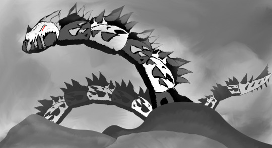
Experiment #11 - Otherworldly Creatures
For my experiment, I used both Illustrator and Sketchbook. I built up the creature in Illustrator, restricting myself to mostly blocks. I then textured it in Sketchbook. I added some “tearing” parts to represent that it isn't suppose to be here, as reality is pulling on it.
0 notes
Photo

Experiment #10 - Size and Scale For this experiment I was inspired by a bunch of fantasy art that includes creatures or structures larger than mountains. I ducked out of doing a lot of detail for this illustration. I made the swords with ink on paper, and then image traced them in Illustrator.
0 notes
Photo
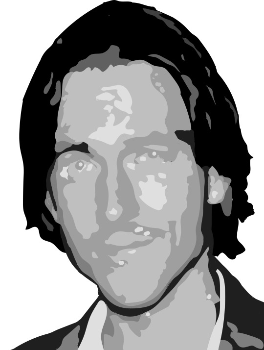
Experiment #9 - Celebrity Portrait
I used an image of Mat Mercer for my portrait, a voice actor and face of “Critical Role”. I wanted to try an approach similar to that of a project I did last year where I made a portrait with grey cutouts. I used a black and white image to get the basic tones which I then used to build his face one tone at a time. I’m happy with the end result, but I feel that I should have had a few more tones.
0 notes
Photo

Experiment #8 - Landscape I’ve never really done landscape and didn’t really feel like I was ready to tackle anything realistic. So, I took a very paintlike, abstract approach to the experiment using Photoshop. I incorporated a little bit of shadow- the sheltered cove is darker than the rest of the landscape- but I really played with texture, adding multiple colours and smudging them together. I based it on a picture I took while on Hornby Island visiting my grandfather. Overall I’m very happy with the abstract look.
0 notes
Photo

Experiment #7 - Raster For this week I wanted to work with material I knew. I often drew machines in my sketchbook and approached the same subject matter. Those drawings are sketches, though- I’ve never been strong with color or shadow with these things. That ended up being a real challenge.
0 notes
Photo

Experiment #6- Ink
For this experiment, I decided that I didn’t had the necessary skill to create the whole illustration on paper. I did a bunch of strokes, fills, and dots with ink on paper, and then brought them into Photoshop as elements to build my illustration. As I tend to do with the experiments, I didn’t have a goal in mind as I worked, until I realized that the strokes together looked a bit like antlers. I then worked to develop this “demonic” deer skull, somewhat also inspired by Halloween coming up. I found the process of using the scanned pieces to create an illustration quite rewarding and fun. I think I would do it again.
0 notes
Photo

Experiment 5- Texture
Texture is something I’m really, really weak with. I tried a few things but they didn’t really work. I decided to really delegate the texture to shading, and this was the best of those experiments. I tried to keep monotone so the texture is more obvious.
0 notes
Photo

Experiment #4- Vector
This week I was to work in vector once again, and once again I was stuck for what to do. I found my inspiration buried within my hard drive- some drawings I made in MSpaint when I was a teen. Taking the challenge to remake them, I took the design, redrew it, and modified it, giving it curves and overall improving the design. The original design had a lot of issues so I mostly had to start from scratch. I kept to the same colour scheme, and Live Paint was my friend once again, as well as the reflect tool.
0 notes
Photo

Experiment 3- People Doing Things
When I started this experiment, I didn’t really have a good place to start. Theres so many things I could do, and it was additionally daunting as I felt I lacked the ability to design a detailed person. So my challenge was getting around that weakness. I started with just building a skeleton of a person in Illustrator, still a bit iffy with what I was actually going for. After playing around with poses I hit the enlightenment I needed and went forward with the superman flight idea. I decided to elaborate the skeleton a bit, keeping the basic form but giving it interest in the triangular shapes. Adding the cape and accessories, I was then overcome by the issue of adding fill. In previous projects I’ve painted it in manually. But I discovered the Live Paint tool, which changed my life and this work. It was probably the biggest thing I got out of this experiment. Overall I think I like how the design came out, although the entire thing isn’t as big of a push as previous experiments. I do really enjoy the logo/mascot feel of the design, though.
1 note
·
View note
Photo

This experiment was all about colour. I though that probably one of the easiest ways to play with colour would be to use acrylic paint, which would allow me to mix colours on the fly. I sketched out a simple tree shape to start with, but really all of the colours were on a whim. I mixed multiple colours and layered them for the texture and the design. Overall it was a fun experiment, but I am in no way a good painter and so the lines are quite rough and a lot of the colour ended up muted.
0 notes
Photo

Experiment #1- Finger House (Autodesk Sketchbook)
My two words were finger and house. Originally I was just going to make a finger with each segment being a traditional house, but I ended up scrapping that. I did want to make sure I kept that finger shape, like when you rest your index finger. I decided to go with a bunch of buildings that together make a finger shape- with the large majority of them being houses or homes of some sort (besides the pyramid- I just thought it fit). Overall I’m happy with what I did with a few hours of labor. I do think I had problems with the shadows; they seem quite sloppy. I had big issues with keeping everything look like it all fit together since everything was at different angles. I kept it monochrome as I felt that it would work a lot better without possibly clashing colours.
1 note
·
View note