
anigeosm
Geo S-M
George S-M Animation Blog! Hi! Use the 'Pages' in the top right to navigate between pages!
52 posts
Don't wanna be here? Send us removal request.
Last Seen Blogs

weareawakeatthree
Badhand
angeloflife
angel in the flesh

moulinrougequiz
Moulin Rouge! Pub Quiz for BCEFA

wnsqktem
Untitled

twentyonephandomsjksuperluv-blog
Untitled
Text
Media Roles Project- The Design of Hilda

Showing consistency of style between early, non-Hilda related drawing, the comics and the final show. Specifically the tones and visual themes of showy mountains, tiny red house and giants.

Iteration of design for both Hilda and Twig, breakdown of shapes, proportions and posing as well as style. Style close to original and not pushed was chosen, so the story would be the focus- not the medium.

Other humanoid characters. Luke Pearson made sure the Mara (centre) weren't any kind of reconsiable marginalised group as the story surrounding them is that Hilda thinks they are weird and investigates, finding they are monsters. The initial 'weirdness' isn't meant to be about them being socially different from Hilda in any way. Progressive storytelling!

Little look at some of the inspirations behind episodes and characters. I actually bought the Craigie book and was mislead by its meaning of 'Illustrated'... a lot more reading and a lot less pictures than expected-still good. Looked into Nisse and Brownies and other Scandinavian folklore creatures.

Few more creatures. Wanted to focus on some vaguer stuff other than just Elves and Trolls. The Barghest is interesting as it originates in Northern England, where both me and Luke Pearson are from. Interesting to see the way the designers took the description of the lindworm from the Craigie book and chose aspects that worked with Hilda's style of storytelling.

Comparison of the colour pallets used in Hilda to give it a very recognisable visual style.
0 notes
Text
Walk Cycle Development
First attempt at translating shapes of character:
I focused on translating the shapes. I knew I wanted the character to have good posture and a fairly loose, but not overly exaggerated gait so I’ve keep it fairly simple and realistic. This was my first rough pass on twos.

Adding more character:
I repeated the cycle again from scratch to push the key frames a little more. I like the long limbs and short body, and pulled out the shoulder. I worked on giving his gait a looser feel, especially in his head and hands, as well as adding more bounce. In retrospect, I should have pushed the extremes further than this and used the in-betweens to accommodate it. I definitely could have been braver with the walk cycle over all but as a first go at one, its a solid start.

Adding in-betweens:
I tidied up a little from there, adding in-betweens. I worked for quite a while on the path of his shoulder, to add more swagger (if that's the correct word.) The spacing and timing isn’t amazing and I should definitely have spent more time at this stage making them super smooth and neat, especially where the lines don’t move much like the easing of the arms as they swing back. The timing is a little inconsistent and frustratingly, I think this retracts from the loose, easy going character element, especially on the forward swing of the arm. It’s a bit too fast and could use another in between. I may attempt to add it in, even so late on.

Basic clothing shapes and secondary action:
Definitely need to look at the hat again and the detailing of the trousers. I’m happy with the shoes, especially given how long they took!

Colouring:
I neatened up the hat and added a basic plan for colours. I wanted to keep them fairly neutral but still bold, like with the pink and green. Stil need to go back and look at the cape and spacing of some of the limbs.

1 note
·
View note
Text
Walk Cycles!
My very first walk cycle done in class with Dan R. I was super pleased with how it came out, and that I had time to make a slightly cleaner version during the lecture!


I tried to make a stomping, angry version by pushing the shapes a bit. It went okay! Needs further work but thought it was worth including.

0 notes
Text
Development and Research for Cowboy Character


Working on silhouette. Pushing the proportions and considering the consistency of shape. I chose a trapezium shape because it combines a triangle and a square. My hope is that I can keep the associations with both- squares being solid and stocky and triangles being more evil looking. This was my translation of the initial sketch I did in my sketchbook of the suspicious rancher character, who is cool when you get to know him. I hope the trapezium shapes would keep the visual association of the two shapes while remaining consistent within the design itself in a similar sense to how Kelby explained cartoon characters are designed around one major shape.

I explored pushing the face, making it more angular and exaggerating the features. I lengthened the nose and played around with hair- bearing animation in mind. However, considering the design includes a poncho- I found the exaggerated features registered as native American or indigenous and I wanted to avoid engaging in stereotype and the ‘Cowboy vs Indian’ trope could be perceived as culturally insensitive which I’m adamant to avoid. I resorted back to the original design and focused more on balancing curves and straights and avoiding parallels as best as possible.
Below are the clothing options I looked at. My plan is to keep my options open so I can change up the coat/poncho depending on my ability to animate flowing fabric.

0 notes
Text
Caricature Lecture.
Translating shapes and reference photos into characters. Took this guy and made him more tired. I imagine him as an overworked single dad and focused on his head shape, nose and wrinkles to make somewhat of a likeness.


Prompt by Dan K, to draw your character from an existing pose reference. The likeness is poor for sure, and I relied a little heavily on the clothing to cover up the body shape. This was done before a lot of my gesture drawing practice.

For comparison, this is what I’m currently working on for my D&D character. The initial sketch of the pose was built upon on the lower layers of the detailed sketch so it isn’t there for comparison, but I’m pleased with how I’ve built upon the techniques we learn in lectures.

0 notes
Text
Character Design: Experimental Sketches

Experimenting with single shapes and exaggerated characature, building character from initial shapes. Ideas for cowardly sheriff and bruiser mayor.

Notes on above drawing: “loner by occupation, no one knows his job, rancher???, suspected bounty hunter/bandit- just a really cool guy. maybe a Shepard??? looking after someone wanted- lawless guy but chill about it. intimidating but friendly. Gambler, slow to anger, charitable.”


Using shapes in all aspects of the drawings, points and squares for different affect. Old west stereotypes ‘the sheriff, the doctor, the aristocrat, the gunslinger...”
Working to develop a visual, illustrative style and make the drawings look consistent. Third and fourth drawing show development from first two. I concluded I can’t develop a unified style while my style is still unformed and in flux. I’m working to break away from the idea of ‘a style’ after our talks with working, freelance illustrator during the conference week. She explained a ‘style’ is something put up by designers only for their portfolio or social media and is not an accurate reflection of the breadth of their work. That was good to hear.
0 notes
Text
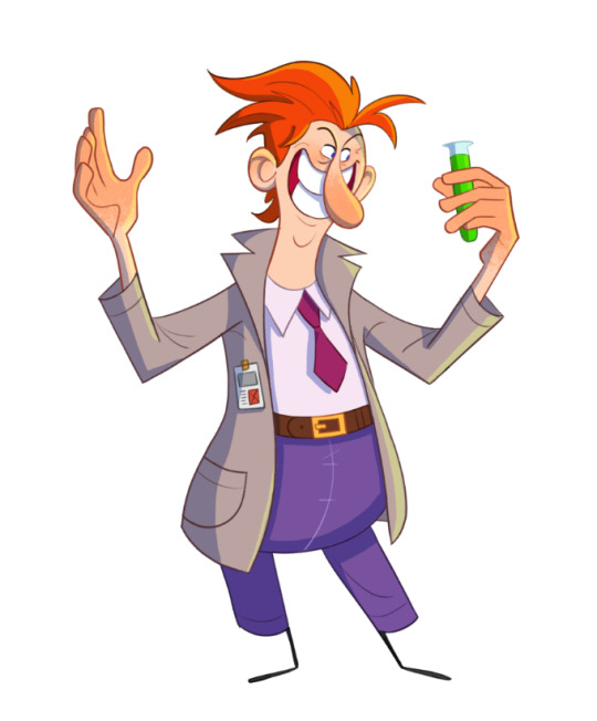
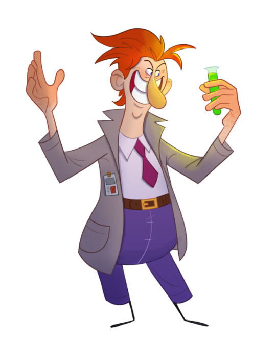
Colour with Dan Kelby.
This was the second lecture we did with Dan on colour where he talked to us about lighting and shade using photoshop and let me tell you- A LIFE SAVER. I’ve been baffled for so long about this on Photoshop as the majority of modern 2D illustrators use Procreate- as much as it’s the same basic set of principles, its difficult to apply in a very different software.
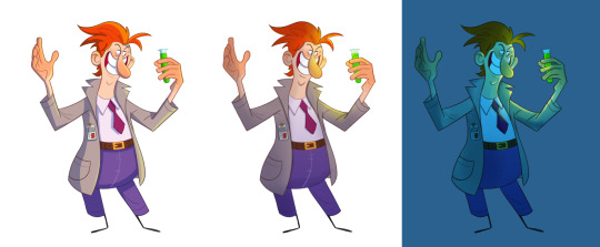
The first example, (I apologise for the quality, I’m not totally sure why its so grainy) used a very graphic style of shadows and highlights that was my standard technique. Its a very methodical and precise style of shading and highlighting which is successful, especially for application in animation as its easier to keep consistent, but a little 2 dimensional.
The second used a gradient from bottom to top and then several multiply layer of different opacity for highlights. I love this approach and it looks very technical despite actually being very very simple. It used the lasso tool to highlight sections you want to colour and a large airbrush to fill and take away using clipping masks. It’s a much more organic way to shade and highlight as you have to do it by eye of what looks right rather than worry about balance and neatness as with the above technique. It’s slightly more complex but with practice is just as applicable and very successful visually.
THIS however blew my mind. I’ve never attempted this kind of thing, as I know it typically requires a lot of colour theory. I’ve seen a lot of people setting their background a certain colour and using it as a basis for the colour pallet of a drawing which can be very basic but still look super dynamic and coordinated. This is slightly different and is just a case of a blue layer! Crazy. I love how much it changed the mood and with the above technique applied it’s so much more dynamic and dramatic to look at! I had a lot of fun with this as you can get away with much more bold highlights and utilise some of the other layer types available. For this I used soft light and colour fry.
0 notes
Text
Gesture drawing practice.
A small collection of some of the gesture drawings practice done both independently and with Dan Kelby in classes. Practice really does make perfect and I certainly don’t practice enough. I really miss in-person life drawing, it was a great way to socialise and develop skills. Watching Dan draw is really helpful and I’ve noticed an improvement in finding the line of action and creating shapes with straights and curves, as advised. In some of the commission work I’ve done, this has come very handy, applying the poses to different body types using the basic shapes and some anatomical references.
I especially find the visual library on Character Design References he recommended us helpful for my extra-curricular work.
https://characterdesignreferences.com/visual-library (see below)

20 sec to 1 minute sketches.
references all from New Master’s Academy YouTube channel: https://www.youtube.com/user/NewMastersAcademy


Dan Kelby Workshop.
Pushing the pose is way more difficult than I imagined and when doing so I can really start to feel the benefit of the gestural language we began to develop with Will Tether in the previous term and practicing gesture and shape with Dan K.
The pose in red before I cleaned up the line is much more dynamic and I feel the clothing made it a little clunky, as the harsh straight likes didn't compliment the curves I drew for the pose itself in the way I had hoped. I do like how I translated her hair into a more complimentary way that made the pose more interesting by focusing on the negative space of the pose.

I was pleased with how this came out. The original pose is very stationary and square but following feedback from Dan regarding finding the line of action and pushing it (see arrows) to make the poses dynamic- I think it came out really well and looks much more active than the original, which is very posed.

0 notes
Text
Week 16: Head turn animations.
Tonko House (2020) Animation: Toshi Nakamura's Character Head Turn - Tonko School (#057) [online] Available at: https://www.youtube.com/watch?v=lJrXJUZNYBM
I used this video as research for the simplicity of the shapes and the characters facial features. The main action involved was the head turn and a blink in the breakdown frame. It also had slight secondary action in the ears which wasn’t relevant to the task, but shows how small details can add a lot of character to a very simple design. The breakdown is very subtle on squash and stretch and didn’t include smearing or doubles as the characters movement is fairly absent minded. The example isn’t incredibly emotive but definitely breaks down the process and shows how it can be applied to different face shapes and types of characters.

The process of making in-betweens was very methodical and true to what we learnt in the lecture. It was helpful to see that the same method is applied in industry rather than just as the basics. It makes working on these techniques, and finding my own habits and shortcuts within the tried and tested, more rewarding.

The tip about the nose arc was really interesting and I imagine the same can be applied for a lot of moving pieces. From research, arcs are one of the major aspects of organic movement and allowed this animator to go back and make adjustments that were only made visible using the guideline. Its a helpful tip and I’ll make sure not to be shy when using guide layers in future.

AnimatorIslandTV (2019) Blueprint for good animation / Anticipation & Breakdown in a Headturn - How to animate 2D [#005] [online] Available at: https://www.youtube.com/watch?v=KeKFk8iOePo
This video broke down the steps of conceiving a head turn from scratch. I didn’t do this in my initial head turns in lecture, but I’m certain it would have made the movement more dynamic. I was reluctant to reference this video as it didn’t seem to use many of the practices we are taught, but its definitely given me some tips to use in the future.

For the breakdown, the animator showed several examples that were discussed in our lecture such as moving the head further up or down in

Experiments using elongated in-betweens.
These were fun to do- they only took about 5 minutes each. I copied the Animator’s survival guide p.96 for the top one. The breakdown examples are slightly offset which I like. I love the wonky, squishy appearance of the 1930′s style animations like this, and the elongated frame is clearly applicable to a lot of movement. These and doubles are really really interesting. I researched rotoscoping before I joined the course as I had just played Bendy and the Ink Machine and saw a lot of parallels to Fleischer with the much darker style of animation. Rotoscoping, based on Fleischer’s work should be squashy and stretchy too, using the video references as guidelines- much like gesture drawing but a lot of animation I see online now that is rotoscoped is just frame by frame copies of videos. It shows a lot of commitment to do that, given the frame rate of an average camera but it loses that wonky feeling. The offset framing, smears, elongations and doubles trick the eye into seeing what the animator wants more effectively than true to life animation.

Work from lecture with John:
Blink, Eyeroll and Smear.
I was definitely happy with the consistency I managed with the facial features and how I managed the timing. The blink may be a little slow or it may just be how I prefer the less realistic 2D style. I’m especially happy with the smear head turn and how the facial features blur into it. I could definitely have spent more time on a proper tie down as this is definitely too sketchy and wobbly.

0 notes
Text
Week 15: ‘Workout’

Task 1: Touch your toes!
This took a couple tries. Initially I added squash to the body as the character folds to make them seem a little chubby and squishy. The first attempt at this I moved the bottom line of their body up and added a crease to their body as rhey folded to make it seem like their chub was folding and pushing back from the view as they folded. This was very successful in making it look like they were wearing a t-shirt that bounced up and followed through with the action, but that's not what I was going for sadly. For the second attempt, I added more squash without moving the bottom line... that made it look like the body itself was crushing down, like the spine was getting shorter, even when I emphasised the eyes dropping as the head turned downwards to signal the bending motion. Way worse. Horrifying. Looked very weird! For the final go, seen above, I simply had the head hide the rest of the body that stayed static throughout the movement. This worked to simplify the action and balance better with the exaggerated arm movements that coil back in anticipation before shooting down quickly and looks believable when you look at the way the eyes turn downwards. Its possible I’ve been looking at it for way too long but something still isn't quite right. I might have added too much anticipation and didn't leave myself enough frames to hold the toe touch and exaggerate that moment of tension so its very energetic but I suppose it is a workout! The eyes could probably be pushed further and some other features like hair or a nose could be added to contextualise the head tilting forward so it looks like... bobby? Highly technical terminology on this blog... Overall, as a simple action and a first attempt at character animation? Very pleased with myself. Go Geo!
Task 2: Star jump!
Once I had drawn out the keyframes and added the betweens I noticed it was very static and dull. I first tackled the upper arms as the movement of a star jump is much harder to exaggerate than reaching down to touch your toes- I found it a little difficult to add character but knew I wanted the character to be soft and bouncy. With the arms, I focused on making them seem loose like in task 1. This mainly involved making them bend up and down in a realistically jointed way that didn't look like they have noodles or strings of arms but avoiding it looking to angular or mechanical. Next I focused on the legs which were even more static and difficult to exaggerate than the arms. I experimented with bending their legs in anticipation of each jump but due to the forward facing angle it just looked like the legs were breaking! I added some shake to the legs but with too many frames it didn't look like a star jump and with too few it looked like I had a shaky hand when drawing those frames. I instead added a very slight bit of squash and stretch, shortening the legs when they squash down to mimic the knees bending. I think this was very effective in solving the issue of the legs looking too static as well as the making the action more dynamic overall and adding the soft and bouncy character aspect I wanted. Then it was just a case of adding a little smear to the eyes and voila! Star jump! If I was to develop this further I would look at fiddling with the frames on the second jump when the arms fall down. It looks as if it has much more weight and seems a lot quicker than the first jump and breaks up the fluidity of the action overall. This could be solved by adding another frame to the top of the jump when their arms are above their head and by removing one of the frames just before the loop restarts. The latter could effect the anticipation but its definitely something that needs balancing to keep the action consistent throughout.
Task 3: Bedtime.
Even with such a simple character I found myself coming up with a little personality for them. I had this idea of them being very reluctant and lazy and I was making them do exercise which really entertained me.. sort of Coco the Clown 4th wall break style.... or those ‘Animator vs Animation’ videos. They were great. I imagined them sighing at me as I animated them excersing and them having to do it again and again as I watched the frames over and over as I refined the lines until they were exhausted. A little sadistic now that I think aout it... Once I had finished the two tasks with this idea in mind as I did, I imagined them just collapsing and refusing to do a third exercise task which I found far too entertaining. So I obliged the little fella and let him conk out. Figuring out the path of the fall and tracking the frames to the previous ones was surprisingly difficult and I overestimated how many frames it would take from them to hit the deck at a realistic speed which, combined with some issues in movement and spacing between frames, initially looked more like a jump up and a flop down...which was funny, but not what I was going for. I played around a lot with the arms and legs, making them drag and flop in a way that was realistic but exaggerated (like in task 2!) I tried to add ‘ z z z’ for them snoring but that looked too clunky and it worked out that I had the same amount of frames as their head moved down as are in the word ‘tired’ so I added that in and I really like how it looks. It would have been great if I had given myself more frames for the other few tasks so the character could flop and just lay there for a while and then possibly add the snoring.
0 notes
Text
Week 14 B1aB ‘Arcs’
Task 1: Static Bouncing Ball

The challenge in this task was to make the ball look like it was bouncing along with the camera tracking it as if its on a dolly or something similar. I quickly realised that the ball would just move up and down if the camera was completely in time with the balls movement so I opted for a slightly ovular path to make the action more recognisable and dynamic. This was a great task to do, especially when Dan pointed out its application to feet or heads in walk cycles. Its such a nice feeling when you see what the exercises are leading up to when it comes together. Its easy to feel like what you’re doing is pointless in this learning environment. I was really pleased with how this came out and how quickly I was able to spot and refine the issues with my initial sketch. I’m especially pleased with the squash and stretch and how it reacts to the ground. My ONLY issue is it could have done with one more frame just before the loop resets, or its possible I accidentally extended the last frame by one. It’s irritating me now I’ve seen it... gosh dangit.
Task 2: Heavy Pendulum

This was just a 2D replication of the pendulum swing tasks from the After Effects projects so it was nice to be back in familiar territory. Dan suggested we add some kind of multiple or smearing to the lowest point of the swing to convey the weight and speed of the pendulum. I opted for some subtle smearing as I thought the multiples looked a bit messy and didn’t translate with the keyframe marks I had made that I was happy with. It’s definitely nothing special as an action so I coloured it in (: If I was to repeat the task I’d probably add a frame or two extra at the high points as it looks a little clunky and could do with more easing.
Task 3: Light Pendulum

This was much more interesting and shows how much more fluid hand drawn animation can be in comparison to things like After Effects (which is precisely why I prefer it.) This was a much lighter weight on the end of a pendulum which meant the string would lead the downswing, creating a really nice arc. It was difficult to keep the strings length consistent as it ignores the guidelines when it bends upwards. I’m quite happy with the little flick when the weight shifts on the downswings and the consistency is good. I think the looping and easing is pretty on the nose actually. I experimented with multiples and smearing again, even though its a much slower swing but found the multiples looked a bit clunky and the smearing very difficult to make flow believably from one frame to the next because of the inconsistent path. I think if I was to repeat the task I would do something about that difficulty because it looks a little uninteresting on the bottom part of the swing. I’m not sure it would look right even if I did it bang on but its always worth experimenting.
Task 4: Pendulum with a joint.

Again, so much fun to see it come together as something recognisable and applicable to walk cycles. Its also great to see how complicated things can be simplified when they’re broken down. I’m really excited to see how all the little exercises we do over the course will come together later and inform my work when I start working more on self-guided tasks. I think I didn’t get the length of the lower pendulum quite right and its much longer by the time it swings back which I didn't notice when making sure the starting and end point were the same, resulting in quite an obvious shortening just before the loop restarts. I think if I had done the whole drawing slightly smaller I would have had more space as I think the few frames that were out of the shot did influence the back swing and the consistency. On the plus side, I think the pacing is good and the general action is very believable, its just a case of refining my drawing more so its more consistent.
0 notes
Text
Week 13: ‘Overshoot, Anticipation, Perspective and Multiples’

In the first task we looked at anticipation and overshoot. I found this task tricky to follow initially and spent a lot of time fiddling with the spaces of my keyframe marking. There was a lot happening at once and lots to take into consideration when including squash and stretch, anticipation and overshoot all together, so I often cleared the frames and restarted the sequence from scratch rather than fiddle with the frames, as there were so many within such close proximity when the onion skinning was on and and it was difficult to maintain consistency of the volume without them. This is a habit I want to get out of later on as I probably had some perfectly fine keyframes and struggled mostly to diagnose the problem. When I had keys I was happy with, I added a few betweens to exaggerate the anticipation as well as remove some frames from the faster parts of the path as well as dial down the amount of squash and stretch I had used. It was a difficult balancing act finding a way to make all the different aspects balance but I’m pleased with how they came out.
In the second task, we had to move an object away from the viewer in relation to the perspective given as well as add either smearing or multiples to the closest frames. I really like how the multiples look and most of my experimentation with this task was the sizing and spacing of the frames to create a realistic path. I found it a lot easier than the previous task as a result of some messing around in animate I did in my free time in week 11 which is a nice lesson in how invaluable experimentation out of the boundaries of the set tasks can be to our overall progression
The third task was self directed and we were simply told to move an object from the top left to the bottom right of the frame. I ended up just doing what I am more comfortable with in order to manage my time so I did a bouncing ball. It was fun working with something I was familiar with but within constraints of a start and end point. It meant I had to do a much higher, closer bounce than previously and balance the loss of momentum of the ball with the lack space I had to work with. I fiddled with the amount of squash and stretch especially to find a density of ball that was both interesting to look at and heavy enough to stop bouncing that quickly. I ended up using something dense but bouncy, like a basketball or a netball. If I was to experiment with it further, I would focus on slowing the last couple bounces down. I would add maybe one or two more frames to ensure the ball still eases at the peak of the bounce without making it lose the overall velocity of the action.
0 notes
Text
Week 12: Walk Cycle Analysis
Cycle A:

This character (and their dog) has long feet with a long stride. Their feet drag bet behind the driving force of each step, which is the knee, and the toes drag behind the feet. Their walks are bouncy and both their noses and hair bounces in the same way. For the dog, its tail bounces in a circular loop which is mirrored in the owner beret and coat. The dog’s fur on the back legs smear behind it as the legs move forward and the fur on the front leg bounces up and down. The owner has a swinging brief case to add that same dragging visual. These characters have a very loose gait and their shoulders bounce in a figure of 8 shape.
Cycle B:

I couldn’t figure out a way to crop the GIF’s without them remaining stationary when attached to this post... so enjoy trying to read the tiny notes (I’m very sorry!)
These characters have much smaller feet and a tiny stride by comparison so their feet move in a much smaller space. Their spines are much straighter and they have a more rigid posture so the shoulders only move backwards and forwards. As a result, the main focus of their movement in in the hips, which wiggle quite exaggeratedly for both the dog and the owner. Comparatively, there is very little secondary action as they're much more stuck up and uptight as made clear by their noses both pointing to the sky. The pieces of the owners coat that are facing away from the viewer appear briefly when her hips wiggle as a very subtle form of follow through as well as a visual queue that her hips are turning so the movement doesn't look too static. There is also some movement in the form of the pugs head bobbing which is mirrored by the owners hair bobbing too. She also holds a small bag or book which moves in a very tight up and down motion as well as a slight bounce in her chest.
Cycle C:

Like I said... very tiny notes.
This one is interesting as the dog has much more action than the owner. Previously it was fairly balance but in this case, there is significantly more secondary action on the dog. Both have fairly small strides, though much bigger than Cycle B, and keep quite close the the ground, unlike Cycle A. The shoulder of the owner has a greater range of movement and drops down much further than the other owners and the bum bounces more to represent an exaggerated twist in the chest and hips of the character. The brim of her coat and hat are large and bounce and bob to either side to mirror the fur around the dogs neck and on its head with the small bow dragging after it. The brim of her dress mimics the fur around the dogs legs, but doesn't move nearly as much with the dogs fur smearing, squashing and stretching as it moves. Both of their noses are raised, with the dogs bouncing, the dogs tail loops in a fairly large circle and the owners palm moves backwards and forwards in a very small and. uniform arc
0 notes
Text
Week 11 BA1b. Adobe Animate tasks.
Task 1: Easing in and Out.

Without adding any kind of stretch, its difficult to see the full effect of the easing in and out, especially with so few frames. However, I was happy with how I was able to keep a consistent shape and of the ball having never used Animate at the time. I think the easing out and in task looks the most effective as it is slower, which makes me think more frames with smearing would be more effective maintain the same speed while emphasising the easing. Similarly, I suspect adding squash and stretch as the ball moves would make the velocity have a more believable or realistic influence on the ball.
Task 2: Basic bouncing ball

As a first attempt at hand animating a 2D action, I was really pleased with this. The squash and stretch is more subtle than I would do if I was to repeat the task now, but its still effective and the changes in shape of the ball throughout is consistent and smooth which i. However, the movement across is quite mechanical which I think I could have prevented by paying closer attention to the easing. Watching it as a loop makes it obvious that the ball moves at a very consistent rate in the second bounce which is due to the timeline markings being regular without any easing or hang in the air. This is what makes it seem mechanical and less realistic as it suddenly ignores gravity half way through the cycle.
Task 3: More bouncing ball

I actually lost track of these files over Christmas and didn't manage to analyse and blog about these until week 16. Its really interesting seeing the mistakes I made. In this task the squash and stretch lessens quite suddenly after the third bounce which I did to make it more realistic. Looking back, I’ve definitely learnt that realism is significantly less important than what looks right to the viewer. Adding more squash and stretch to the later bounces would have been unrealistic but would have rationalised the bounce more and adding consistency to the very exaggerated squash and stretch early on. I also made the bounces more peaked rather than round which is a more realistic bounce pattern and I think it works here- but only just. I probably should have made it a slightly more rounded path to match the exaggerated squash and stretch. Sadly, I made the same mistake with the easing here as I did with the second task. Despite having definitely reflected on this MUCH sooner, its nice to know a little improvement happens just through iteration, even without analysis.
0 notes
Text
Ratched (2020) Ryan Murphy, Evan Romansky
Ratched itself is a reimagining of ‘One Flew Over the Cuckoos Nest’ with a focus on the life of the main antagonist, Nurse Ratched. The show makes a point of making the character, who is fundamentally horrible in the book and film adaptation of OFOTCN, one of light and shade, good and evil in ‘Ratched.’ The cinematography of Ratched takes a great deal of inspiration from the film adaptation of OFOTCN, which itself uses many of the spatial tropes, shot compositions and camera movements as Stanley Kubrick. Simon Dennis, head cinematographer for ‘Ratched’ states in an interview on the Get Creative Show podcast that Kubrick was a direct inspiration for Ratched. His example was that, unlike other films in the horror genre, ‘The Shining’ (1980) uses large and well lit sets filmed with wide shots. A particular motif in Kubrick’s cinematography is a tight shot of an object or character with a slow zoom out. The sets for Ratched, especially the infamous Oregon State Hospital, were 360 degrees, allowing the cameras to move freely throughout the space in long continuous shots- creating an inescapable feel to the space. Both Kubrick and Dennis subvert the dark and claustrophobic feeling and themes of their films by capturing them in bright, large spaces which are unsettling to the audience who are used to the trope and are subconsciously made to feel slightly off, while being able to enjoy a visually diverse and pleasing set of shots.
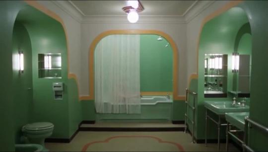
(above) The Shining (1980) Stanley Kubrick (below) Ratched (2020) Ryan Murphy, Evan Romansky

Another very key aspect to ‘Ratched’ was colour theory. Throughout the show, Mildred Ratched wears many monochromatic outfits with bold colours that the Director’s explain correspond with her mood or intentions in each scene. Similarly all of the sets were incredibly boldly coloured, in line with Ryan Murphy’s signature style, which meant a very high resolution camera was needed (RED helium 7k resolution) to increase the colour space to accommodate the set colour and ensure no official post-production enhancement would be needed.

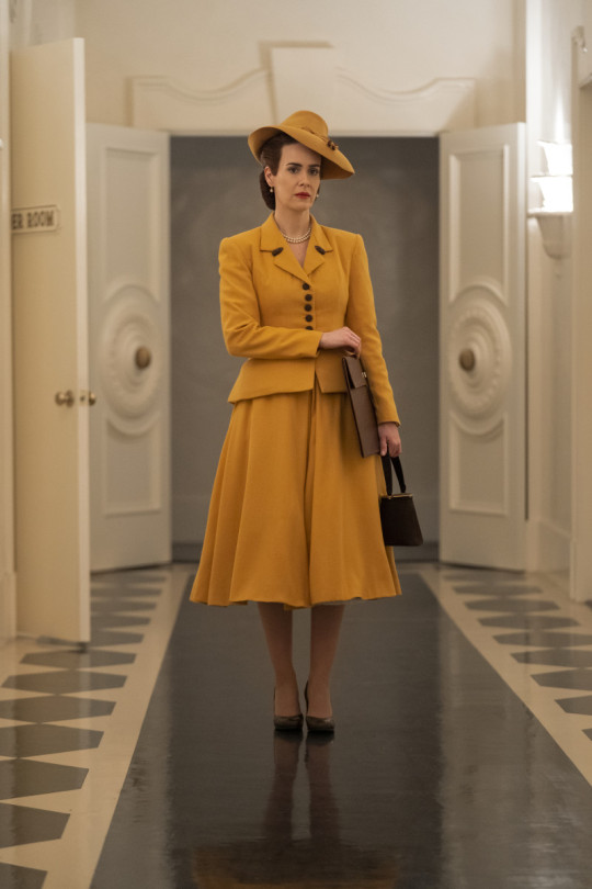

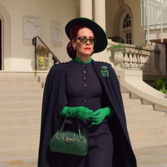
Additionally, high intensity colour filters are used periodically to convey specific instances of intense emotion. Green is used to show scenes of a sexual nature or when a character is feeling lust greed while red is used to show a when a character is losing control.

(above) The Doctor consumes sedative gas as a means of coping with stress. (below) Nurse Ratched discovers two of the nurses having sex in the break room.
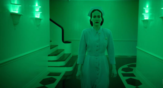
Cinematographer Simon Dennis explains that these scenes were especially difficult to film as using bold colours affects the depth of the shots for example, with red the camera is losing 2 stops of range as a primary colour. To combat this, incredibly bright LED’s had to cover all of the sets and be edited out in post production to maintain the depth and detail.
0 notes
Text
The Truman Show (1998) Peter Weir.
The strength of The Truman Show comes from its use of both diegetic and non-diegetic cinematography and the way the camera movement and framing is used to both literally and figuratively represent Truman’s experiences. Throughout the film, the camera is shot from unconventional angles such as through mirrors, (both two-way and reflected) the corners of rooms and most regularly, behind his car radio. Several shots such as the car radio are repeated to represent the drudgery and repetitive life Truman leads.

These camera angles are examples of diegetic cameras and make The Truman Show incredibly unique. The combination of diegetic and non-diegetic shots is best represented in the opening sequence, where we see hidden camera shots of Truman, behind-the-scenes documentary style interviews with cast members, and non-diegetic footage of fans holding merchandise and watching the show. This is used to very quickly set up the world that the Truman show exists within. This is then contrasted with several non-diegetic shots throughout the film in moments where Truman begins to question his reality for example, when the stage light falls into the road and he looks at the sky. The breaks in convention are used throughout very effectively and realistically in relation to his revelation.

The camera movement generally moves along one axis at a time, as per how the hidden cameras would move. In one sequence, Truman and his love interest, Sylvia, are evading the cameras in hidden spots and moving between cameras and we see the cameras panning back and forth and zooming in as they search for them. This sets up the cameras as a non-human villain and gives them a sentience that is unsettling when detached from the camera crew of the show. As Truman becomes more and more aware of his reality, the product placement and strange behaviour of the cast becomes more and more obvious to him. This is represented to the audience using dramatic and tight zooming in as well as a much clearer shot than the hidden camera sequences the audience is more familiar with.

Similarly, the framing of the shots in a scene where Truman wants to travel shows the lengths the production team are willing to go to. Large posters of plane crashes and warnings about travelling occupy the majority of the shots as a representation of how obvious and attention-grabbing they are and are meant to be.

1 note
·
View note
Text
Parasite (2019) Bong Joon-Ho
Throughout Parasite, all aspects of the cinematography lead the audience to understand we are the viewers of something. This is done most often with generally wide shots through an anamorphic lens with a deep depth of field and a wide focal length that is more like the human perspective. This creates a similar level of clarity of the background to the foreground and makes the background seem closer and the spaces more oppressive.

Background action is differentiated from focal action using lighting and framing which makes the action more realistic to life, with many things happening at once and less focus on the main characters.

This creates an effect like Brecht’s ‘alienation effect’ where the familiar is made to feel strange and make the audience is aware of their separation from the story as viewers. Parasite does this by pulling focus from the main action/ characters and simulating the human perspective (as mentioned above) which is familiar, but by doing so, subverts our expectation of cinema (where suspension of disbelief in prioritised) which is thus unsettling and strange to an audience, even on a subconscious level. This alienation also allows the audience to maintain objectivity. Uses practical lighting carefully to create. This theatre style separation is enhanced by the composition. Throughout the film a front on perspective with symmetrical framing is used, often with use of scenery such as picture frames, windows and doorways to emphasise the symmetry and create a boarder similar to a proscenium arch theatre. This is occasionally contrasted with some overhead shots such as the scene of the flood for impact. The movement on the camera is very slight, with very slow if not stationary pans with several tracking shots down corridors or along rounds which creates a doll house effect and a strong focus, serving to alienate the audience.

The composition is also used to represent class division visually. In the opening shot we see a window with a low angle of the road using very little fill light to create contrast in both tone and action.

Throughout the Kim family are captured with medium shots which include them all, this is used to show that they are a strong family unit and when they’re in their house, to emulate the small, cramped space they live in: both the shot and their room is full.


In contrast, the Park family is captured with wide shots that emulates their lack of unity as a family and the large, expensive space they live in.

0 notes