
Seeking Expert Digital Product Designers? Let's Connect! | Clutch Award Recipient 2024 🏅 | UpWork Top 3% Talent 🚀 | Clutch 5/5 Ratings ⭐
Don't wanna be here? Send us removal request.
Statistics
We looked inside some of the posts by ankitparmar09 and here's what we found interesting.
Average Info
Notes Per Post
4
Likes Per Post
4
Reblog Per Post
0
Reply Per Post
0
Time Between Posts
3 days
Number of Posts By Type
Text
17
Last Seen Tumblr Blogs


Fun Fact
Women make up for the other 50% of Tumblr’s audience.
Text
You have traffic but NO SALES? That’s not a marketing problem. It’s UX.
youtube
If your site makes users think too much... They LEAVE. And guess what? They’re buying from your competitor instead. A confusing website = frustrated visitors. If they don’t find what they need in 3 seconds, they’re GONE. Every extra second they spend searching? That’s money you’re losing. I learned this the hard way. Poor UX was killing my conversions. Once I fixed it, everything changed. Here’s the FIX: Menu Simplicity ❌ Too many choices overwhelm users. ✅ Keep it to 3-5 clear categories MAX. Obvious Call-to-Action ❌ Hidden buttons frustrate visitors. ✅ Make your ‘Buy Now’ button stand out. Cut the Clutter ❌ Pop-ups and distractions annoy users. ✅ Ensure a smooth, clean UX. Fixing your UX isn’t optional. It’s the key to conversions. Revenue. Growth. Want a free UX review of your site? DM me. Let’s turn traffic into results.
0 notes
Text
175+ CXOs. One Roof. Countless AI Possibilities.

Last week, I had the privilege of attending the AIMED: Ahmedabad IT Management Executive Delegation Annual Event and the AI Mastery for Leaders by Ritesh Vajariya! The powerful speaker at the event shared invaluable insights into the future of AI—providing a roadmap for leaders to drive transformation, adoption, and responsible innovation. Congratulations to the organizing team Gurupritsingh Saini, Rajan Rawal, Bhavik Shah, and Vishal Rajpurohit for curating such a powerful platform and delivering a high-impact experience. Congratulations to the newly elected admin committee! Wishing you a successful, impactful, and inspiring term as you lead with vision and purpose. Grateful and Honored to Be Part of the AIMED: Ahmedabad IT Management Executive Delegation Community.
#AIMED#AILeadership#CXOs#AIMastery#ArtificialIntelligence#DigitalTransformation#LeadershipSummit#Congratulations#AIinIndia
0 notes
Text
Would YOU buy from a sketchy website? Neither would your customers.
If your site lacks trust, people won’t buy. Here’s how to build trust and boost sales. A bad design screams: ‘This might be a scam!’ And users RUN. No reviews? No trust badges? No clear contact info? HUGE red flags! Here’s how to fix it: ✔ Add real customer reviews. ✔ Use security badges (SSL, payment logos). ✔ Display clear refund & contact info. The easier you make it to trust you, the faster they buy! Here are key lessons: ↳ Build trust to boost sales. ↳ Fix design flaws to gain trust. ↳ Add customer reviews. ↳ Use security badges. ↳ Display clear contact info. ↳ Make it easy to trust you. Want a website trust audit? Let’s chat! ♻️ Repost to help your network!
youtube
0 notes
Text
Struggling with AI adoption in your product?
Here’s what you’re missing ↓ AI can revolutionize user experience, but poor UX can kill adoption rates. Let's fix that. Many companies face low user engagement with AI features, leading to wasted resources. This guide will help you overcome these challenges efficiently. Step 1: Neglecting User Education ↳ Users need to understand how AI benefits them. Step 2: Ignoring Contextual Guidance ↳ Provide real-time tips and explanations within the interface. Step 3: Overlooking Error Handling ↳ Design graceful recovery from AI mistakes. Step 4: Disregarding User Feedback ↳ Continuously iterate based on user interactions and suggestions. Step 5: Forgetting Accessibility ↳ Ensure AI features are usable by everyone, including those with disabilities. Want to go the extra mile? • Tip 1: A/B test different UX approaches to see what resonates best with your audience. • Tip 2: Offer personalized onboarding experiences for AI features. By following these steps, you’ll be able to boost AI adoption and user satisfaction. Remember, user-centric design is key to successful AI integration. Which of these mistakes have you seen most often? ♻️ Share this guide if you found it helpful! Follow me for more insights on UX and AI.

0 notes
Text
Want users to stay on your site longer?
Here’s how to get it right ↓ A boring site equals disengaged visitors. No engagement means no conversions. But there’s a fix! Many sites struggle with keeping visitors engaged, leading to high bounce rates and low sales. Here’s how to turn that around: Step 1: Add Hover Effects ↳ Make buttons and images respond when hovered over. Step 2: Implement Subtle Animations ↳ Use small movements to guide the eye. Step 3: Use Progress Bars ↳ Show users how far they are in a process. Small animations make a BIG difference. Microinteractions can significantly boost user engagement. Want to add microinteractions to your site? DM me now to discuss how small tweaks can make a BIG impact! Which microinteraction do you find most effective? Found this helpful? Repost to help your connections. For more UX tips, make sure to follow me on my YouTube channel!
youtube
0 notes
Text
Getting traffic, but NO ONE is clicking?
You don’t know how to optimize your CTAs. But there are only 3 ways: → Make Buttons Stand Out ☑ Use bold colors and high contrast. ☑ It grabs attention and guides the user. ☑ Overdoing it can look spammy. Make your button unmissable! → Use Action Words ☑ Use phrases like ‘Get My Free Guide’. ☑ It tells users exactly what they'll get. ☑ Generic words like "Submit" are weak. Be clear and direct! → Create Urgency ☑ Try ‘Claim Your Discount Now!’ ☑ It motivates immediate action. ☑ False urgency can erode trust. Make it irresistible! We used to: . Say ‘Submit’. . Say ‘Click Here’. . Use dull colors. But now, action-oriented CTAs are the way. If you want to optimize your CTAs, DM me now! ♻️ Share this to help others boost their clicks! For more UX tips, make sure to follow me on my YouTube channel!
youtube
1 note
·
View note
Text

Struggling to keep your SaaS customers around? Here’s what you’ve been missing ↓ Churn is the silent killer of SaaS businesses. Many focus on flashy onboarding, but that’s just the first date. What about the long-term relationship? Here’s the secret formula to reduce churn beyond just onboarding: Step 1: Deep Dive into Data ↳ Analyze usage patterns to identify at-risk users. Step 2: Personalized Engagement ↳ Reach out with tailored support and resources. Step 3: Continuous Value Delivery ↳ Regularly update features and content based on user feedback. Step 4: Build a Community ↳ Foster connections among users to increase product stickiness. Step 5: Feedback Loops ↳ Actively solicit and implement user suggestions. Want to go the extra mile? • Tip 1: Implement a customer success program. • Tip 2: Offer advanced training and certification. By focusing on the entire customer journey, you’ll be able to transform users into loyal advocates. Remember, a retained customer is more valuable than a new one. Which of these steps do you find most challenging to implement? Who in your network needs this? Tag them below. Follow me for more insights on SaaS growth.
0 notes
Text
They built fast. Launched faster. And lost $25000.
Ever skipped user research? Paid for it later? I once read about an Indian edtech startup. HikeLMS (name changed for privacy reason). Launched a sleek learning platform. Aimed at college students. They had everything on paper: ✅ Modern UI ✅ Gamified features ✅ AI-based learning paths But what they didn’t have? User research. “No time to talk to students.” “We already know what they want.” 📉 Within 2 months of launch: – Students dropped off after sign-up – Most never finished a single course – Support team was flooded with messages Here’s the kicker: They built 80% of the features. Students didn’t care about them. And missed the one thing needed: Simplified offline access. 💡 Lessons they learned: ☑️ Don’t assume you’re the user. ☑️ Talk to real people. ☑️ Good UX starts early. When they paused and interviewed students. The insights were mind-blowing. They trimmed features. Improved flow. Made offline learning a core priority. Within 6 months, engagement doubled. Ever had a surprising moment? "User said WHAT?!" Drop it in the comments. Real stories help real founders. ♻️ Share with your network!

0 notes
Text
Trusting blindly? (It cost me dearly.) Ever made a business decision you regretted? I learned a hard lesson in 2018. It was a turning point in my career. I lost a major deal and key projects. This was due to trusting people's words without verification. I failed to check their capabilities. It was a costly mistake. Blind trust can lead to significant setbacks. Verifying information and skills is crucial. Due diligence is not just a formality. It’s a necessity. My experience taught me: → Always verify claims and promises. → Assess capabilities independently. → Trust, but always verify. → Protect your business interests. This experience reshaped my approach to business. It made me more cautious and thorough. It also made me more resilient. What steps do you take to ensure due diligence? ♻️ Repost to help your network!

0 notes
Text
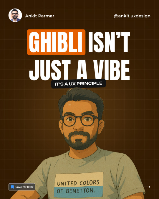
Ghibli Isn’t Just a Vibe—It’s a UX Principle
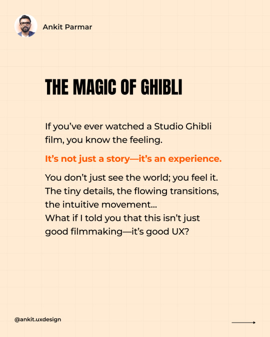
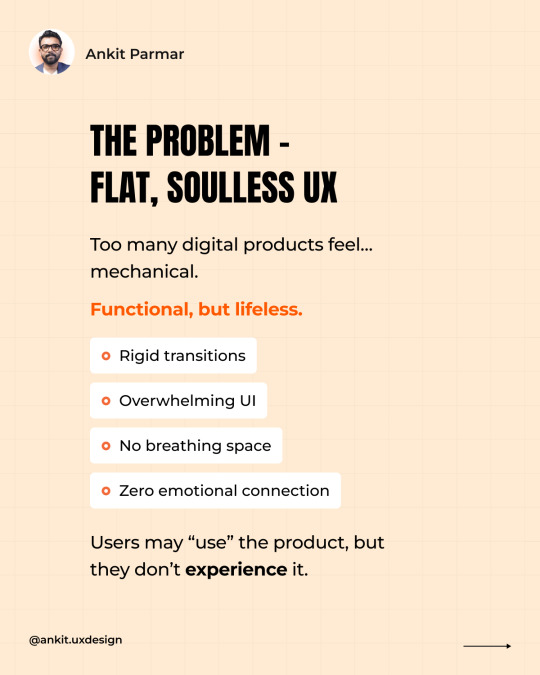
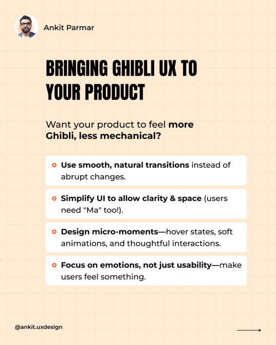
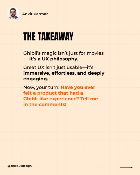
Ever watched a Studio Ghibli film and felt completely immersed? It’s not just the art—it’s the way the world moves, breathes, and flows. Now, imagine if your product’s UX felt the same way. Too many digital experiences feel... mechanical. They work, but they don’t feel. 🛑 Rigid transitions 🛑 Overloaded UIs 🛑 No breathing space 🛑 Zero emotional connection Users use them, but they don’t experience them. Ghibli teaches us a better way: ✅ Microinteractions – Subtle, natural movements that make UX feel alive. ✅ "Ma" (Negative Space) – The power of pauses, clarity, and letting designs breathe. ✅ Seamless Flow – Effortless navigation, like a perfectly told story. ✅ Emotional Connection – Because great UX isn’t just functional—it feels right. Want your product to feel more Ghibli, less robotic? ��� Use smooth, natural transitions instead of jarring shifts. 🔹 Let UI breathe—simplicity beats clutter. 🔹 Design for micro-moments—hover states, animations, thoughtful interactions. 🔹 Make users feel something, not just complete tasks. Because UX isn’t just about usability—it’s about experience. Have you ever used a product that felt like a Ghibli-level experience? Drop your thoughts below! ⬇️

2 notes
·
View notes
Text
Struggling to streamline your UX workflow?
You're not alone if you're juggling multiple tools and frameworks. Here are three ways to supercharge your UX process: → Design Thinking Workshops ☑️ Kick off projects with collaborative workshops to align stakeholders. ☑️ It fosters empathy and generates innovative ideas. ☑️ Challenge: Requires strong facilitation skills. Example: Use virtual whiteboards to brainstorm user needs and pain points. → Agile UX Sprints ☑️ Integrate UX research and design into agile development cycles. ☑️ Enables iterative improvements based on user feedback. ☑️ Challenge: Demands close collaboration between UX and development teams. Example: Conduct weekly usability tests to validate design decisions. → User Journey Mapping ☑️ Visualize the end-to-end user experience to identify pain points and opportunities. ☑️ Provides a holistic view of the user's interaction with your product. ☑️ Challenge: Can be time-consuming for complex products. Example: Create a visual map highlighting key touchpoints and emotions. We used to rely on: . Miro and FigJam for UX Research . Figma for design & Prototype . Google Analytics, Hotjar, and Maze for User Behaviour Tracking. . Monday, Trello, or Basecamp for project management. Now, Figma offers an all-in-one collaborative design platform. Ready to transform your UX workflow? Explore these tools and frameworks to create seamless user experiences. Share your favourite UX tools in the comments!

0 notes
Text
Is Your Homepage Converting Enough?
Follow this proven structure ↓ Your homepage is often the first interaction potential customers have with your brand. It needs to make a killer first impression. Many homepages fail to clearly communicate their value, leading to lost opportunities. This guide will help you transform your homepage into a high-converting machine. Step 1: Clear Messaging ↳ Answer these questions immediately: What do you offer? Who is it for? Why should they care? Step 2: Strong CTAs ↳ Make the next step obvious with a primary CTA like "Free Trial" and a secondary CTA like "Book a Demo." Step 3: Social Proof ↳ Build trust by displaying customer logos, showcasing testimonials, and highlighting user numbers. Step 4: Product Visuals ↳ Show, don’t tell. Use a short video, GIFs, or interactive demos to showcase your product in action. Step 5: Benefits Over Features ↳ Focus on solutions, not just features. For example, "Save 10 hours a week with AI-powered automation." Step 6: Integrations & FAQs ↳ Highlight key integrations and answer common objections near your CTA. I tested this framework on a struggling SaaS product and saw 3X more signups in weeks. Your homepage isn’t just a website—it’s your best salesperson. What’s the #1 homepage mistake you’ve seen? Drop your thoughts in the comments! 👇 Want to optimize your SaaS homepage? Save this post & share it with your team!


1 note
·
View note
Text
Why Your Design and Dev Teams Miss The Mark (And How To Fix It!)
Let’s dive into effective communication strategies. It’s the key to successful product development. Many teams struggle with miscommunication, which leads to project delays. This guide will help you bridge that gap efficiently. Step 1: Establish clear goals ↳ Align both teams on project objectives from the start. Step 2: Utilize collaborative tools ↳ Platforms like Slack, Trello, or Figma streamline communication. Step 3: Schedule regular check-ins ↳ Consistent meetings foster open dialogue. Step 4: Encourage a culture of feedback ↳ Both teams should feel comfortable sharing ideas and constructive criticism. Want to go the extra mile? • Tip 1: Implement a shared vocabulary to ensure everyone understands technical terms. • Tip 2: Use visual aids like diagrams to clarify complex concepts. By following these steps, you’ll be able to create successful products. Remember, effective communication bridges the gap between design and development. Which of these steps do you find most useful? Share below. Help your network by sharing this post today. Follow me for more insights on team collaboration.
0 notes
Text
Happy Holi🎉💥

Let’s celebrate Holi with enthusiasm, positivity, and lots of colors! Wishing you a vibrant and joyful Holi. 🎉🌿
.
.
.
#rpuxcollab #happyholi #holi #celebration #colors #joy #positivity #festival #happiness
0 notes
Text
I quit
The Day Everything Changed. I still remember the moment that changed everything. Sitting at my desk, staring at yet another UI project, I felt… stuck. Not because I didn’t love design—I did. But because I knew I could do more. More than just executing tasks, more than just following briefs. I wanted to create, strategize, and truly help businesses grow through UX. But there was one problem—I was an employee. And as long as I worked for someone else, my vision would always have limits. So, after years of designing for businesses, I took the leap. I left my comfortable job, said goodbye to a steady paycheck, and stepped into the unknown. Was I scared? Absolutely. The Harsh Reality of Starting From Scratch The first few months were brutal. No guaranteed income. No big clients. Just me, my laptop, and an idea. I quickly realized that being a great designer wasn’t enough. Running a design agency required skills no one had ever taught me: ❌ How to sell my services ❌ How to price my work ❌ How to build trust with clients I thought businesses would come knocking because of my experience. Instead, I faced rejection after rejection. One potential client told me, “Your work looks great, but we need someone with a proven track record.” I wanted to say, How do I build a track record if no one gives me a chance? But I bit my tongue and kept going. The Turning Point: Learning to Sell UX, Not Just Design The game changed when I stopped selling design and started selling business results. I stopped saying: ❌ “I’ll create a great UI for you.” And started saying: ✅ “I’ll help you reduce churn and increase conversions with better UX.” That’s when clients started listening. I focused on their pain points—drop-offs, low retention, poor user engagement—and showed them how UX could solve those problems. One of my first breakthrough projects was for a SaaS startup struggling with onboarding. Users were signing up but abandoning the product within minutes. By redesigning their onboarding experience, I increased activation rates by 35% in just 3 months. That success opened doors. 🚀 Startups and Businesses began trusting me. 🏆 RP UXCollab was recognized as a top UX agency in 2025 by Clutch. Starting a design agency isn’t just about design—it’s about solving business problems. Here’s what I learned along the way: ✅ You’re not just a designer; you’re a business owner. ✅ If you can’t sell your work, no one will buy it. ✅ Rejections don’t define you; how you respond does. What About You? Have you ever thought about starting your own agency? What’s holding you back? Thinking of making the jump? Take the leap—but be ready to sell, lead, and solve real problems.

0 notes
Text
5 Reasons You Shouldn’t Hire Us (Yes, We’re Serious!)
Wait... a design agency telling you NOT to work with them? Sounds crazy, right? But hear me out. We’ve had prospects approach us, excited about getting a new website. But sometimes, after digging into their expectations, we realize—we're just not the right fit. And that’s okay. Because not every agency is for everyone. So before you reach out, here are 5 reasons you should NOT hire us: → If You Just Want a Pretty Website ☑ If your goal is just aesthetics and not business growth, we’re not your team. ☑ We design for conversions, engagement, and user experience—not just eye candy. ☑ A pretty website that doesn’t convert is like a beautiful car with no engine. → If You’re Looking for the Cheapest Option ☑ We don’t compete on price. ☑ We compete on value. ☑ If you’re looking for a low-cost website, there are plenty of freelancers and DIY platforms. → If You Don’t Care About User Experience ☑ A website without great UX is just a digital brochure. ☑ If you’re not thinking about reducing bounce rates, improving retention, and driving conversions, our approach might not align with yours. ☑ Great UX turns visitors into customers. → If You Want a Website Without Strategy ☑ We don’t just “build websites.” ☑ We craft digital experiences that are backed by strategy, research, and real business goals. ☑ If you don’t want to discuss those, we’re not a fit. → If You Want a Website Overnight ☑ Quality takes time. ☑ If you need a website “by next week”, we probably can’t help. ☑ We focus on doing it right, not just fast. We used to see websites as just online brochures. . Static pages with basic info. . Limited interaction. . No real strategy behind them. But now, we see websites as dynamic tools for business growth. Still Here? Then We Might Be a Fit 🚀 If you’re looking for a website that actually helps your business grow, let’s talk. 📩 Drop a comment or DM me, and let’s discuss how we can help!

0 notes
Text
What If 𝐘𝐨𝐮𝐫 𝐏𝐫𝐨𝐝𝐮𝐜𝐭 Could Be the 𝐍𝐞𝐱𝐭 𝐁𝐢𝐠 𝐓𝐡𝐢𝐧𝐠 𝐢𝐧 𝐔𝐗?

Ever heard of a product that seemed average at first but suddenly became a game-changer? Think about 𝐒𝐥𝐚𝐜𝐤, 𝐅𝐢𝐠𝐦𝐚, 𝐍𝐨𝐭𝐢𝐨𝐧—they weren’t the first in their category, but they redefined the experience. So, what’s stopping your product from doing the same? Most products have great features but still struggle with: ❌ 𝐋𝐨𝐰 𝐚𝐝𝐨𝐩𝐭𝐢𝐨𝐧 𝐫𝐚𝐭𝐞𝐬 ❌ 𝐇𝐢𝐠𝐡 𝐜𝐡𝐮𝐫𝐧 ❌ 𝐂𝐨𝐧𝐟𝐮𝐬𝐞𝐝 𝐮𝐬𝐞𝐫𝐬 Why? Because people don’t buy features. They buy experiences. If your UX isn't solving real pain points seamlessly, users will drop off—no matter how powerful the product is. How to Make Your Product the Next Big Thing in UX 🔹 Solve frustrations, not just add features 🔹 Less friction = higher adoption 🔹 Empty states, microcopy, onboarding flow—these shape the experience 🔹 A well-designed product isn’t just easy to use; it’s impossible to ignore The best UX doesn’t just retain users. It turns them into evangelists. I worked with a 𝐒𝐚𝐚𝐒 𝐬𝐭𝐚𝐫𝐭𝐮𝐩 that struggled with activation. Users signed up, but 𝟕𝟎% 𝐝��𝐨𝐩𝐩𝐞𝐝 𝐨𝐟𝐟 within the first session. We redesigned the 𝐨𝐧𝐛𝐨𝐚𝐫𝐝𝐢𝐧𝐠 𝐞𝐱𝐩𝐞𝐫𝐢𝐞𝐧𝐜𝐞 to focus on quick wins instead of overwhelming features. The result? A 𝟑𝟓% 𝐢𝐧𝐜𝐫𝐞𝐚𝐬𝐞 𝐢𝐧 𝐚𝐜𝐭𝐢𝐯𝐚𝐭𝐢𝐨𝐧—just by improving guidance and usability. What’s one product whose UX completely won you over? Drop it in the comments! If you’re building a product and want it to stand out with UX, let’s connect. Your product could be the next big thing—but only if users love using it.
0 notes