Don't wanna be here? Send us removal request.
Statistics
We looked inside some of the posts by annaccole-blog and here's what we found interesting.
Average Info
Notes Per Post
0
Likes Per Post
0
Reblog Per Post
0
Reply Per Post
0
Time Between Posts
7 days
Number of Posts By Type
Text
17
Last Seen Tumblr Blogs


Fun Fact
Tumblr Inc. is funded by 13 investors.
Text
Subject
Aims objectives concept
Title- for my project I deceived not to create a title as a felt it didn’t need one to explain what it was representing I also felt that no title would fully represent the work
0 notes
Text
Presenting options


When thinking of ways to present my work I arranged my photographs in multiple ways overal these were my three favourites.
After asking different opinions but ultimately focusing on my own I chose to have the third option

Final display
0 notes
Text
Personal project evaluation
For my final outcome I decided to to use two images from each specific colour with two varying poses. Instead of one image using the model and one using the flower. I decided this as I felt the photographs were more coheriant and represented fashion and pop art much better. Even though I was originally combining both portraiture and still life. I felt best just sticking to one.
Red photograph evaluation- I am very pleased with both outcomes for these images as they were mounted nicely with no issues. The colours through both match well and are consistent. I also very much like the poses and facial expressions that the model is giving as it looks very natural. The flower used is clearly secondary instead of the main focus which is what I was aiming for. The clothing choice was also very well matched. The only issue I can notice is that there is a one but of dust on the bottom right corner.
Yellow photograph evaluation- overall I am veg pleased with both images the yellows math very closely even though the jumper is darker than the backdrop it works very well. As yellow is such a pale colour if it was too similar I think it wouldn’t look right. Even though the images are both different they arnt as different as the first models poses. The model also doesn’t look as relaxed as when in the digital images. If I had more time I would go back and re- shoot this maybe practiceing more diverse poses.
Green photograph evaluation- overall the green went very well. The clothing matched superbly and the model took direction very easily. Both the poses are very different and also look very natural and relaxed. The flower is front and centre but also still secondary. If I was to redo the mounting I noticed there is slight white line at the bottom. The only issue with this if I was to cut it off I’d cut too much othe image and potentially ruin it.
Pink photograph evaluation- overall the photograph came out vey well and there were no issues printing. The only issues I noticed were that in the backdrop there are still showing on the side. I like the shadows for the image as an individual but as all the other photos don’t have them it creates a slight inconsistency. The poses are also slightly similar. If I was to reshoot I would correct this issues.
Overall if I was to redo the project I would like to use more colours maybe eight or nine different ones. I would also like to experiment switching the colours around. I would also use a variety of models using males aswell. I would also make the scenes more complex now that I have more experience in the studio and with the camera. I would also leave more time for errors and trying out different ideas. I would also try as different paper as I typically use gloss as I like the shiny finish it gives but I think matte paper would also work well.

0 notes
Text
Mounting
For the mounting process after I had the induction I decided to go for the cold press instead of the hot press. Even though the outcome was the same I reaslised less people were using it and thought it would be more efficient use of my time to use the cold press. There were more steps to pay attention to. This when it came to it I had partially forgotten and needed to be shown again. As I didn’t want to risk ruining my materials or pictures. Even if I did unintentionally ruin my photos from mounting I made sure I had copies of each just in case.
I decided to use foam instead of card as in my opinion it looked more professional as it is thicker than card. I also hadn’t worked with it before and wanted to try something knew. When mounting before I had ago I watched others and observed how they did it learning techniques they used. This was very useful as watching over and over again allowed me to remember the process much better. I mounted half of my images first and half the day after. I did this because I had worked hard both days and didn’t want to risk ruining any images. Overall the process didn’t take me too long but I didn’t rush especially when trimming my images as I wanted to make sure I cut exactly along the line with cutting and colour off. As I decided on eight images instead of six I had to purchase another board this meant I had room for error if it went wrong. Thankfully it didn’t so I now have spare card if I need to use in the future. Overall the mounting process was very successful as no flaws occurred. I also much prefer having mounted images instead of just sheets of paper.
0 notes
Text
Printing


When I began printing I decided to do one colour at a time. I started with green as I felt it would be the most challenging to get correct. The first photo are a few photos I developed to see what poses I wanted to focus on and as for my final piece. Even though I liked them much there was small things I wanted to change about each image. The first two I very liked the pose but wasn’t keen on the facial expression. The Bottom two liked the facial exspression but not the placement of the flower as on the first it created too much of a shadow and on the last it covered too much of the body.
The second image above are the eight stages that it took to get the correct green and skin tone. The final one being correct before doing a larger print. As this was my first print out of eight it gave me a good indication to how long it can take to get an image technically correct. This gave me a lot of motivation to make sure printed all my images with plenty of time.

I struggled less on the second green image. Instead of finding the background tough I found the skin tone difficult as it was too dark towards the end so I had to continuously change small things to finally get the correct skin tone.

After finishing the green images I decided to move onto red. I found this less challenging as it took me less attempts to get a technically correct photo. I was able to detect and adjust my setting much more easily also asking for more guidance If stuck.

My second red image took me even less time only four attempts instead of five. This is because the settings were very similar as I took the photo with the same set tings and solar lighting.

With the first yellow one I found the first few images were coming out much too orange. After fixing this I had to adjust the image as there was a slight magenta cast on the jeans and on the face. I found balancing the skin tone against the yellow backdrop very tough as slight adjustments made a big difference. But after guidance I was able to get the correct image.

The second yellow took a lot less time as the photos were very similar naturally. The only issue I encounted was making sure the images closely matched in colour. Making sure they weren’t too light or dark.

The pink I found surprising easy and didn’t take me too long to get a final image. The first one was very much over exposed but his was corrected quickly. Apart from that I found no other issues other than making sure it was too light.

My last image was the final pink one. Even though it was my final I still wanted to put the same amount of effort into it as the others. Instead of the first image being too over exposed it was underexposed and much darker than it needed to be. This also didn’t take too long to correct and was able to get a technically correct photo.
Evaluation of printing
Overall printing coloured film was successful but also much more time consuming and stressful than I first anticipated. With developing each image I learnt more and applied it to each new print. As I went on I made sure to split my paper into three this meant I went through less paper as I realised I was going through it much quicker than I wanted. Luckily finishing before I ran out. I also used the dust cleaner much more often as I kept noticing dust went on my prints. I was also determined each time to get the same room as it meant the setting were the same and could pick up from the same place that I left the day before. Now that I’ve had practise using the equipment if I was to do another project using coloured film I would feel much more confident.
0 notes
Text
Second shoot


For my second shoot I focused only on flowers I started of by first matching the coloured flower to the correct backdrop. Using the same lighting as I did for the models. I used a brown stool to place the vase on and used a single flower to keep it simplistic. I only did two practise shots as I had kept my notes from the first shoot so I knew what I had to change according to the different colours. Even though I had one set up that I wanted to keep the flowers in the same position I still divided up the shots equally to make sure I multiple options just in case something was to go wrong.


After I had finished with matching the colour to the backdrop I switched the flowers and backdrops around to try and give a different effect. Being even similar to the pop art I had researched. This is very much liked as it gave a great contrasting effect. I worked out some flowers went better with certain backdrops. Being able to see this on my digital before shooting on film was key to not wasting shots.
0 notes
Text
First shoot
For my first shoot I decided to use four different models. One for each of the different colours. Before the shoot I asked each model what colour they would prefer to be as I wanted them to feel comfortable. I also arranged each outfit prior so everything was to my liking on the day of the shoot. I also wanted to check the tones of the colours so that they were a good match. I also wanted each model to wear something different, so each image wasn’t too similar. I set up about thirty minutes before the first model was to arrive as I wanted to make sure all the lighting was correct. As even though this is for a university project I wanted it to be as professional as possible. I was nervous to begin with when setting up the equipment as I usually have help or someone with me. To combat this I took it slowly to make sure everything was set up securely and safely and that there was no risk of breaking anything. I wanted the image to be very bright with limited shadowing and limited shadowing on the backdrop.
I also decided to make sure the models didn’t come all at once as I didn’t want them to have to wait around especially if they had other things to do. As they were doing this as a favour as I wasn’t paying them. I also had asked them to pre plan some poses they felt comfortable doing. I also had positions in mind for each shot as I wanted them to all look different. As a class we had the option to choose whether we would shoot on medium format or 35mm I decided to shoot on 35mm. This is because I havnt had a lot of experience with film cameras in the past. Except when we had the black and white film project where I also used a 35mm camera. I wanted to develop my skills and and also use a camera that I had some experience with.
To check my lighting I didn’t go straight to using a film camera once I had finished setting up. I decided to also take some photos on my DSLR. This helped give me perspective to where I should put my camera and also how the lighting was coming out on the photographs. This had to be adjusted slightly for each colour as the lighting effected each one differently.


Each shoot went very smoothly and was very pleased with each set up. there were no technical issues. As when shooting with my digital camera occasionally the flash didn’t go off. I was pleased this didn’t happen when using my SLR. I also made sure I split the number of shots per model equally to make I had lots of options from each one. Each time spent with the model wasn’t too long as I had preplsnned the majority of everything. This meant I spent a bit of time waiting around for each girl to arrive as I had over anticipated how long each one would take.
0 notes
Text
Colour printing


My first time ever doing colour film printing was during our class workshop. This I found to be more challenging than I expected as to be able to get all colours neutral without a coloured shein or tint to the image takes a lot of skill and practise. Even once I had gotten very close to getting all colours neutral I still had to change a few of the settings as others could tell there was a slight colour inconsistency that I couldn’t notice. But after many attempts I managed to get a neutral image. Even though I found the process challenging I very much enjoyed all the different steps.

After I had achieved a neutral image our next task was to follow instructions that would mean each image would come out with a different coloured tint. This meant I got to practise the process more and also practise boarding which I knew would be essential for our project.
0 notes
Text
Continued research


Dior exhibition - favourite inspired clothing


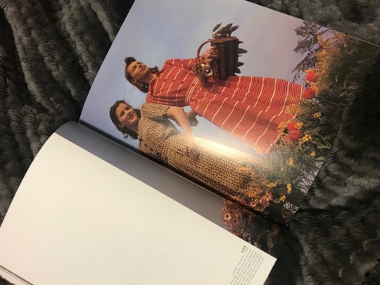
As I had not began shooting my project yet I took a lot of inspiration from other things other than looking just online. I managed to attend the dior event at the victoria and Albert muesum. Which displayed many beautiful clothing. This helped me think what clothing I would want to use in my shoots. I especially liked the bold coloured clothing the best the red being my favourite. I also looked in many books such as Richard Learoyd. The book consisted mostly of different portraits this being my favourite as it was inspiration for my own project. I looked at many older portraiture when looking around different galleries such as national art gallery and the V&A. The painting I chose and found most inspiring I couldn’t find a name for. I once again liked the bold striking red dress, but also the positioning of the model and the props around her.
Lastly I looked at some more photography but displayed in a different way not online or in books but framed in real life as an actual print. This made a huge difference. As I was able to obvsrve in a different way. The photograph was taken my Nickolas Murray and is titled “lady in headscarf” 1938. It was taken for a poplar woman’s magazine which started many celebrities. I very much liked the two separate colours which loosely linked to pop art. Underneath is the final cover using that image.


I also took a lot of inspiration from this collection of Polaroid’s in a display in urban outfitters. Especially the middle red photo that combines both the model and a flower. I also liked the rainbow effect the overall Polaroid’s reflected. I wanted to recreate this but with my own creative input.
0 notes
Text
Portraiture research

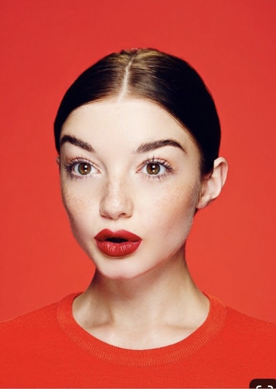

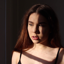
When extending my research on portraiture I began looking at photos that included very bright colours. Then onto photographs where the backdrop matched the clothing of the model. I noticed this was mainly for fashion purposes or campaigns and wanted to focus my work around fashion. I looked at a range of work but specifically liked the photos above as they are very brightly lit up with very few colours being different to the assigned colour. Such as the first photograph having tinted blue sunglasses with the main colour being yellow. I very much liked the expressions as they were very simple. With the main focus being the clothes. I also very much liked the added detail of the middle picture with the red lip.

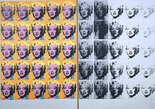
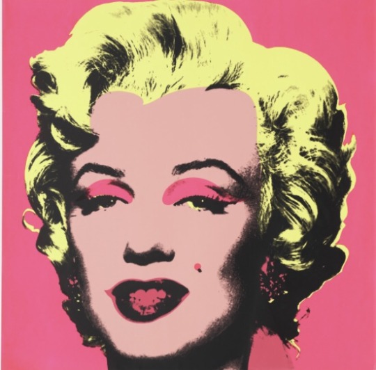
I also took a lot of inspiration from pop art and artists such as Andy Warhol and Roy Lichtenstein. The first painting is by Roy Lichtenstein is called “girl with hair ribbon”. Completed in 1965. This Is a very iconic piece of art work and represents what many people view as pop art. I very much liked the block colours of the yellow hair and red backdrop. The second image is a very famous piece by Andy Warhol called Marilyn diptych completed in 1962. It is her face over and over again both in colour and in black and white. I very much liked the repetition of her face and the effect it created. Lastly the final image was also created by Andy Warhol in 1967 and is titled Marilyn Monroe. This image is also very iconic with it capturing the very essence of pop art with it being bold and bright.


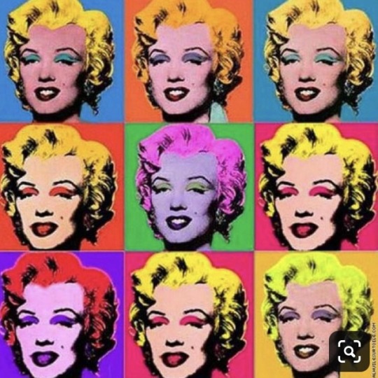
I also looked at less famous pop art done by lesser known artists. Where they recreate and adapte the work done by famous artists such as as Warhol. Each of the images above are all repetitions of a famous faces or body parts. They each use bold colours and switch around each colour so no image has the same colours. This is done differently in each image giving me inspiration for my own work.
0 notes
Text
Personal project - the constructed photograph
For my personal project I wanted to look at all three options still life, tableau and portraiture. By exploring and researching all options I made sure I didn’t rule any out.
Tableau


Out of all the options This was my least favourite as I was unsure how to construct 5-9 images in this style and make them coheriant. It also not my personal style of photography. Even though I very much like these images I knew early on it wasn’t the right choice. I also felt that in our group project we produced an image similar in this style and wanted to make this project different.
Still life


For still life I started off by looking at traditional still life and famous painters for inspiration. Such as Juan sánchez Cotán. I very much liked the simplicity of each of his still life images I looked at especially the middle one being my favourite. As even though it is simple each object stands out. The flowers on the other hand are very elaborate and detailed. This is something I would like to simplify and make more modern. I also very much like the bright red in the apples as they stand out very vividly from the dark backdrop.
Modern still life


As I had looked at very traditional still life I also wanted to look at modern still life. The two styles are very different. Traditional still life had very natural colours using very natural objects. Displaying them in a very gracious and astestically pleasing manner. Whereas when reasearching modern still life I found the colours to be very bright and not natural at all. The first and last photograph was shot by Stephanie gonot. Gonot is a LA based photographer who focuses on using colourful and interesting objects. To create still life’s that resemble in the style of pop art. The majority of her work such as the first image is very colourful and have very coordinating colours. The bright pop of orange is my favourite aspect of the image. As a viewer it is what sticks in your memory not necessarily the objects. The last image even though it isn’t very bright compared to most of her work I like how she took very typical fast food potentionally McDonald’s. Which is widely known for its bright yellow and red. By making it completely white it gives a very different feel to the image which I’m very fond of. The middle image was taken by katya havok. Her image is very simple but very effective with her colour choice. I like how the toast and the backdrop coordinates with the links being very similar. The turquoise makes the pink pop even more.
Portraiture

My favourite choice out of all three was portraiture. As I felt I could be the most creative with this choice. I very much liked the work of David lazar as he is a photographer I had being looking at for a long time. I like his use of bright colour against darker skin tones and dull backdrops. The first image is my favourite as more of the model is shown compared to the others where they are fairly close up. Which I felt left out a lot of detail. Especially in the middle. Even though I like the image this is something I would like to avoid. I very much like how natural the models look and how genuine their expressions are. I also like how the images a very well lit without there being much shadow. This is something I would like to follow on with.
0 notes
Text
Final group shoot
This was our final shoot as we were very clear on what we wanted to change and what we wanted our outcome to be. Our setup didn’t take long as we had mapped out very specifically where everything was. We made sure that the lighting looked as if it was coming from their devices. This I believed was achieved very well. We also decided to use ourselves as models as we felt we knew how we wanted to pose for the best outcome making us more effective to use. We also changed the positioning of the mankind to look less put together by twisting them more. We also made the second model lye on a smaller sofa as it looked more natural than sitting on the floor. We made the light more blue to give a better effect of moodlight to make the image creepier


Final image
Overall I am very pleased with our final outcome as the picture developed drastically throughout each shoot. We were able to be very creative and work well as a team.
If we were to do it again I would like to start slightly earlier and possibly explore more ideas such as my own. This way our work will be more diverse.
0 notes
Text
Second group shoot
For our second shoot we found it much easier to set up and work out where to place our lighting as we had already had a bit practise with our last shoot. We decided to try make the changes we felt the picture needed to be improved. Such as the lighting and composition. We also decided to use other models instead of those in our group to test whether it worked better. We also decided to add manikin bodies to the set to add an abstract element.


With the models we made sure they were wearing casual clothing and that the spacing was better suited so that the image was better filled. By using other models each person in our group was able to visually see and make any changes they felt necessary. We also changed up our idea so instead of the person in the backdrop to be stalking the other model we wanted both models to be engrossed in their technology . That they are so consumed with what is in their phones or laptop that they dont communicate. The manikin bodies are there to respresent those who have been taken by social media and those too far invested. That even though their are many “bodies” there they are still all alone in reality. The lighting improved by being broader and not solely focusing on the models. This meant more details were picked up instead of the lighting being too direct.

With this shoot we also encountered some lighting problems that we had to overcome as sometimes the flash wasn’t firing equally meaning sometimes only part of the image was lit.
Overall we very much liked this shoot but when reviewed we noticed more elements we wanted to change we wanted to make the lighting come from the devices eg laptops and phones. We also wanted to change the positioning of the manikins as we felt that they were too staged. This was because many of them are facing the camera. Lastly the relationship between the two models was too confusing as it is unclear is they are colleagues of friends as there is a big age difference between them both.
0 notes
Text
First group shoot
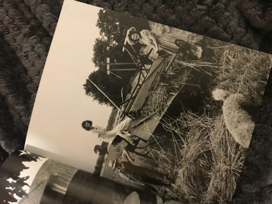
Once we had had a meeting and pitched our ideas to each other. We had all come up with very different views on what we wanted the final outcome to be. I very much liked each idea but some included too much difficulty that wasn’t suitable for our group project. Even though we wanted to push ourselves to try new things we felt that the complications involved were too high. Eventually after discussing with our teacher and as a group we combined an idea. Creating our base. Even though it wasn’t my idea I wasn’t disappointed as I was excited to see how our new idea would develop. As I was apart of combining the ideas adding to the development. I also thought it was very interesting as it was so different from what I originally pictured.


It was based on two movies but prodomiantly ‘Get Out” - the last image. The image is much darker both visually and contextually. Than my ideas as mine were very bright and gave off a warming feeling. This idea is very juxtaposing Giving off a cold and dark feeling. This image only has one perosn in it which I considered a good point as it meant we could creatively come up with how could fit another person in it, potentially more. As even though I wanted a good starting point for an idea I didn’t want our group to copy to much as then it becomes a recreation rather than a new creation. To be able to add more people in we would we would have to change the placement of the camera as the movie still is very close up. This is something we ideally wanted to change and we wanted to add more details else where without making it look too cluttered. The man is clearly frightened with the very powerful look on his face. And tense body language. We liked how the main focus was on the man and the backdrop came secondary. Well analysing the image we tried to work out where the lighting was coming from to help ourselves when setting up our own shoot. We also liked his clothing as it was very natural and casual.

Once we had settled on an idea I decided to research other horror movie stills to see if their were other similarities. I mainly focused on the different lighting. As each of these movie stills all have very different lighting with the top being very funky lit, the middle being very dull and the last one being very light. My favourite is the first one as it seems the most natural and spooky. The lighting is also dry mysterious which is something I would like to capture in our group project. What all three images have in common is their powerful facial expressions. That respresent their emotions. This adds to the narrative of the image very strongly and is something else I would like to capture.
We didn’t want our set up this photograph in a studio setting as we needed it to look like a home/ hotel environment. If we were to do it in a studio we would have to bring in multiple props and build a set. This wasn’t doable as the set was too elaborate to build. Instead we looked around places on campus that had homey furniture. We ruled our halls as even though they could be made to look like someone’s home the space was too small to include multiple lights and people. We went to the social room above reception this was a good space as it had nice furniture and the surroundings could be made to look homey. We next had a look at the undercroft we liked the look of it but the practicality of using it wasn’t suitable as there would constantly be people around working and socialising. We then found the loft which is a section above the undercroft this was a large space that wasn’t used very often it had lots of furniture in and multiple props we could use. This location was also much closer to the media store where we would collect our equipment from as there was a lot to carry this made it easier to set up as we had to walk less


Before we started setting up we discussed the positioning of the models more so we could set up lights accordingly. For our idea we decided to have one model on the sofa closest to the camera and the second model further back in the foreground. staring at the other person without them knowing as if the person was being stalked. We wanted it to look like it was taken at night with one light highlighting the model at the front. With the light acting as television light. The model in the back would be lit by moonlight. With the light being covered by a blue gel to give a better effect.
On our first shoot we took a while to set up as we were unfamiliar with the equipment and were overly cautious as we didn’t want to break anything. This is where having a group really was helpful as we were able to help each other work out the equipment with our knowledge combined. We placed the lights in various positions as we wanted the light to be on the two models. We took many shots adjusting each time to better fit what we needed.


Here are a few of my favourite shots from our first shoot. The middle one is my favourite as the lighting is very even for both models and the position of the model in the foreground is much more natural.
Even though as a group we did like the middle image we knew it was too simplistic to be our final image. We also wanted to change the positioning of the first model as we felt she wasn’t facing enough from the one in the backdrop. We also wanted to add a deeper meaning to the image relating to social media. We lastly wanted to correct lighting on the model behind as we felt the blue gel wasn’t vibrant enough.
0 notes
Text
Group project ‘staging the scene’ initial ideas
For this project when it was first given out to our class I was very determined to find a team that would be as dedicated to the project as I would be. I knew that the more effort that was put in by each memeber the more creative the final photograph would come out. To achieve this I made sure to find my group very soon and we formed within the next few days. I feared that if I left it too long I would have to be placed into a group rather than having choice.
My group consisted of all woman me, Elsa, Nadia and Lucretsia. As we had become a group early on in the project we had a lot of time to come up with different ideas of what our project may turn out to be. We decided not to rush anything so we had time to research various ideas and allow for our different ideas to develop. This spanned over around two weeks until we had a final group meeting to decide on our starting idea. As even though we had plenty of time we knew that we would need time to set up multiple shoots that as a group we could all be present to.
Also allowing for any mistakes that may occur to recorrect them as our main aim of a group was to make sure our final image captured everything we wanted with us not regretting that we didn’t have enough time to correct certain elements. As we had all never worked on a project like this , using new equipment, working with new people and using location lighting. We were eager to start and not feel pressured to finish.
My research
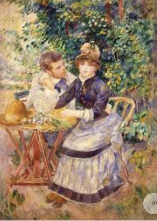
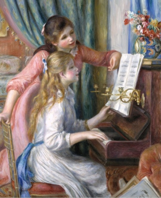
When researching for the group project I became fascinated with famous painters both in this era and in the past. Many that I looked at were not suitable as many displayed strong religious themes and unrealistic backdrops. until I came across Pierre Auguste Renoir. Renoir was a French painter. His art consisted in many different styles throughout the years including realism, modern art, post Impressionism and he was also a leading artist in the development of Impressionism. Renoir has done many pieces of art but out of them all I chose my favourite three that I thought would work well if we were to use them in our group project. I very much liked the composition of each of the photographs as even though they are all different the main focus in each is the two people with the backdrop adding comtext. It was also vital in our project that we used to people as taht was part of the criteara and these paintings gave very good examples, I also only wanted to choose images that I felt were achievable within the time span we had. I also took into account the criteria that the image “communicates and interrogates an issue of concept through staging, lighting and narrative”. Also taking into considerate the type of image such as what it could be used for eg, editorial, fashion, tableaux, portraiture or fine art/gallery, I felt these three images would be used as fine art/gallery. I also looked at what else to consider when choosing an image such as staging, styling, lighting, narrative and technicality.
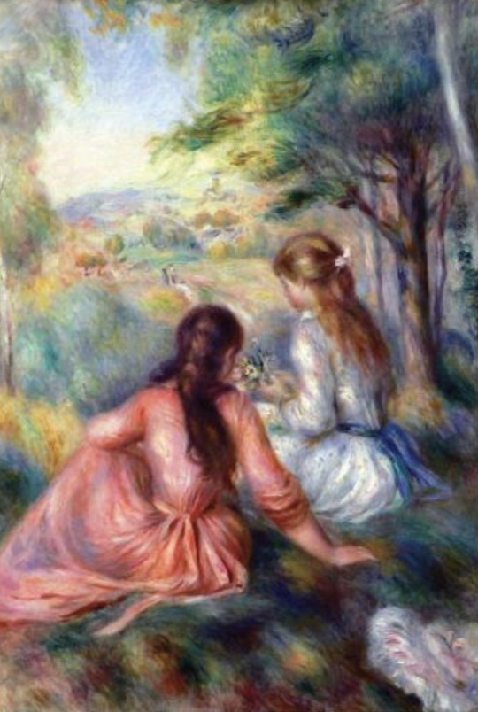
The first image is titled “In the garden” I very much liked this image as it is composed very well the space is filled but not cluttered with the paining being very brightly lit. The picture is very warm with the light being prodomiantly sunshine. As the paining is very vibrant it hilights what appears to be a couple due to their body language and them holding hands this creates a relation between the two of them. This creates a narrative that is clear. Many viewers would see a couple relaxing together in a garden enjoying the weather. Even though this is probably the most common outlook of the painting the narrative is still open to interpretation with many other scenarios. The clothing fits the era in which the painting was done (1885) making the image very formal as it is very different to modern clothing. If we are to use this image for our group project I would like to use a similar backdrop to the one in the painting as it is very delicate also hope with a dainty table and chairs. The location would most likely be outside meaning our group would have to use location lighting I very much like the positioning of the people but I would like to change up the relationship instead of it being a heterosexual relationship I would change it to a homosexual relationship. To show how times have progressed this would also give the image a new narritive. For the clothing I would change to being smart casual instead of formal. And add some more modern props to the image to make it seem more natural.
The second image is titled “girls at the piano”. This is a very direct title and is very clear. The painting once again is very formal showing that the girls are most likely from an upper class family. This you can tell from their formal clothing and fancy decor and possessions as a lower class family is unlikely to own such a nice piano. The narrative of the photo is likely that the girls are either sister or friends or possible the one standing could be a piano teacher. The blonde girl practising on the piano while she is being helped by the other girl. The lighting is once again very bright with the whole image being very bright and clear the colours re also very soft creating a calm effect. The painting looks very natural with the girls minding their own business working through the music sheets they both look fairly serious and engaged showing that are interested in what they are doing. If we were to base our final image of this image I would like to see two brothers either the backdrop being less formal with a less impressive piano to also make the surroundings darker. This would give the picture a different narrative and different emotions.
The last painting is called “in the meadow” it appears to use the same girls as the painting “girls at the piano” except they are out and about relaxing in the outdoors. The relationship still isn’t 100% clear if the girls are sisters or friends as they don’t have that many similar features but I have now ruled out that the girl in pink is a piano teacher. The clothing is still very formal still representing their status. The staging looks very natural as they both look very relaxed, but as their heads are turned the viewer is unable to see their facial expressions. The lighting is mostly sunlight as they are outside making it very bright and cheery showing that it is a Fun time as the girl is also picking flowers. If we are to use this image for our group project I would find a rural setting with a lot of countryside to match the painting to use maybe twins as models to show a clearly famiky connection I would also turn the models more to the camera so their facial expressions can be seen more clearly.
I also decided to look at more modern versions of photography that I felt were similar to Renoir. I very much enjoy how relaxed and natural all the models are.
0 notes
Text
Project title
I decided to call the project “darkness within the light” this is because I wanted to use my title as a play on words as even though I focussed on the light aspect of the project title “time, space and light” the hidden meaning behind all the images in fact can be very harmful and very dark. I also think the title will make people question why I have names it that and want to dig deeper into my work.
(How did this develop from your working title and what was involved in the decision making process?)
Subject
(Reflect on the subject matter of your project and the background research on this project).
I believe I stuck to my subject matter very well as I focused heavily on neon lights. My background research also heavily reflects this as it focuses solely on neon lights.
Aims, objective, concept
(How and to what extent have you achieved the aims and objectives of your project? Describe the main driving concept of your project.
Form, medium, presentation
(What is the final form and method of presentation of your work and why did you make these decisions).
I decided to present my work in a grid format using nine images. I decided to leave the boarders around my image as because my images were very dark, the white border made my images stand out even more vividly. I also very much liked how the boarders were thicker than I’d usually do. This also suited the layout and fitted well with the grid.
Research methods
(What research methods did you use to research this work and how did this research inform your project)
I used mostly the internet and social media for my research for this project. I did try to vary my resources but found nothing of use within books or magazines.
0 notes
