
annedaviesartblog
Jessica Anne.
Foundation Year Development.
111 posts
Don't wanna be here? Send us removal request.
Last Seen Blogs

asombradopassado
A Sombra do Passado

anythinggoestoday
Untitled

mdle
M DL E

hakaieve
mr showtime!

entre-nos-5
Entre nós 5
Text
These are some of the thoughts that had been going round my head for a while...

Putting bonds web onto the badges.


The heat, from the iron has turned the fabric pen blue, and the bonda web has not stuck down properly. The idea of the final result still stands and should look like this..

Only with the text.
0 notes
Text
I sewed into the badges by hand doing a slip stitch inside to keep the fabric sturdy and bent the bias binding ever the edge and used an invisible hemming stitch all the way around, to leave a red or blue edge.

By using bonda web the badges on there will be no sewing line and it will look a lot neater in my opinion.
This also makes for easy placement to check where I want to place the badges before I commit to it.


The final outcome is unexpected, especially with the thinking bubbles looking different to my design. The fact that I had to change my initial outcome idea due to technical difficulties was frustrating and a challenge, but it lead to me being able to practice, when it comes to hand stitching, and become more skilled on an area I knew but found tricky, I feel glad that I have gained a little more experience in hand sewing.
0 notes
Text
The pillow case when looking at it and comparing it to the skirt, I noticed it was very delicate and decided to not add any black, to keep its sort of innocent look.

I really, really like this pillow case and will be displaying it as a cushion for one of my final peices, to show the artist inspiration and to show that this style can be put on more than clothing.
0 notes
Text
Some black ended up in the zip so I used a wet paint bush to try and clear it off..


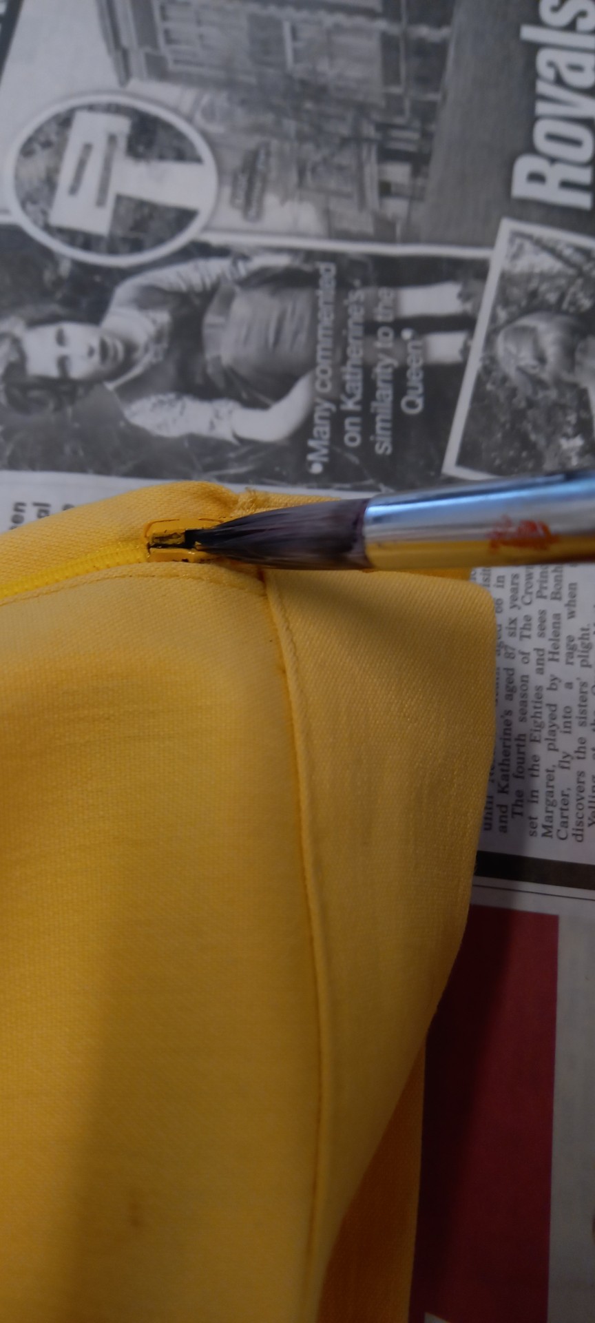
0 notes
Text
The final design of the back, I had trouble with the zip area, but managed to fill in the gaps and neaten up the lines a little.
If I was to do this again, I would probably place the lettering closer together so that it would have missed the zip.

0 notes
Text
The BACK..


The paint didn't print properly onto the fabric so I had to carefully paint over the empty spaces with a paintbrush.
0 notes
Text
Looking at the skirt I have noticed that there is many layers and therefore showing all of the different effects just from a peice of fabric.
Skirt, fabric patches inspired by people that are against gener specific clothing, the printed negative words written by annoyed people that disagree. And the badges that lie on the top the fabric that show battles with mental health, that can be caused by social media.
0 notes
Text
Painting over the duller patches.


It, worked a little but still shows the patches through the paint.
0 notes
Text
The final print onto the front of the skirt..
I placed a peice of paper on the inside of the skirt to stop any transferring onto the other side.


Once I printed onto the fabric and let it dry I noticed some imperfections on the outline and between the letters.

I am frustrated, but also the ridges remind me of the pinking sheers cuts and the edginess of the patches and what they were trying to convey.
I also noticed that in using multiple different fabrics the paint showed up more clearer on some and a little fainter on others.

Once the fabric is dry I will attempt to go in with a paint brush and see if that makes a difference.
0 notes
Text
Printing onto the skirt.


Here I was trying to find the best possible fit for both of the screens, but decided to place one on the back, due to how much empty space there was.


Originally I had planned to not put anything on the back of the skirt but actually, I like the idea of utilising the space to show off the whole skirt not just the front.

This is the print I want on the back !
0 notes
Text
Badges with pinned bias binding..


In the blue and red colours for lichtenstein inspo.
I will sew a single line stitch in them to hold them down in place to look like little speech bubble badges.
0 notes
Text
I like the bias bonding but it had cut off the curves around the badge and doesnt give the look I initially wanted...

Im going to change the shape of the badges to make them easier to sew.


The thread isn't working well with the fabric...
...
The sewing machine isn't working.
Im going to have to use the bias binding with a single stitch around the whole badge.
0 notes
Text
Due to the sudden change of plan, with the badges, I want able to get black bias binding and therefore decided on red and blue colours to match the pop art style of Roy Lichtensteins work.

0 notes
Text
The badges are going to be fabric and sewn on one I like the placement...
Making the badges:
I cut out little bubbles from white fabric and used black cotton to sew around the edges, with fabric pens I wrote in the classic comic book style.


The thread wasn't working well with creating the curves around the fabric, so I have decided to look at using bias binding to create the edge instead.
0 notes
Text
The lighter coloured paints didn't show up well on the photocopies, on paper so I think the dark green and black might be the best option to work with on fabric.


0 notes
Text
I used pinking sheers to create these little rugged edes on the fabric patches that made me think of Westwood, and her edge that she gives her work in general and I really enjoyed this look.


Although I liked the idea of the jagged edge at the bottom of the skirt, I couldn't get the botton straight and secured to hem it instead.


1 note
·
View note

