
A documentation of the research carried out to inform the final outcome of (BA) Hons Fashion Marketing and Branding & (BA) Hons Fashion Design's collaborative project.
Don't wanna be here? Send us removal request.
Statistics
We looked inside some of the posts by annietaylorfmb-blog and here's what we found interesting.
Average Info
Notes Per Post
0
Likes Per Post
0
Reblog Per Post
0
Reply Per Post
0
Time Between Posts
3 days
Number of Posts By Type
Text
17
Last Seen Tumblr Blogs


Fun Fact
Tumblr has 411 employees.
Text
Finally finished!
I have finally finished my brand launch pack! It’s amazing how it’s call come together considering how stuck I was on the project at the beginning. I remember Adele saying that it does feel uncomfortable at first (which I can confirm it definitely did) but now I have actually created an outcome i’m really happy with it. I haven’t actually collected it yet because I want it to be hard bound but I’m hoping it’ll all look good when its bound together! The queue was so long, but it meant I actually had a chance to edit a couple things on my laptop during my three hour wait...
So, I decided to get a couple of pages printed on acetate paper because I thought it would be really fitting for the virtual/’there but not there’ concept that both Anna and I have used within the design/branding work we have produced. I am really happy with how its turned out and so glad that I had the thought process before I actually got the document printed because I think it really adds a multi-dimensional element to it if that makes sense.
The pages I chose to be printed onto acetate are the ones whereby I am talking about the virtual offerings of the brand. I actually used the original photograph and image traced them on illustrator to make them look as though they are virtual versions of clothing as opposed to actual images. This is how they turned out:


These were the original images:


I am actually looking forward to picking my work up tomorrow - its been a really tight turnaround because the print shop have been so busy, so the work that is only meant to take 24hrs has extended to 48hrs. Im just hoping everything is all okay when I pick it up.
I guess this is my last blog post now as the deadline will be over by 12pm tomorrow - second year has gone so fast! I feel as though this project has really built on my creative skillset and I actually feel this module will be beneficial for next year when we have to develop our own business concept. In a way I am glad that all the decisions will be down to us next year though as I feel as though working with Fashion Design students was quite hard - I know that it will be a similar situation when working in industry so I guess its something I will just have to deal with. Nonetheless, Anna was really helpful after her deadline finished and gave me everything I asked for! Her clothing looked amazing at the show which is also evidenced in the above pictures that she did for her photoshoot - I’d be really proud if I was her. It has been really fun creating a brand based on her clothing inspirations so I hope I have done her designs justice.
Anyways, Cya x
0 notes
Text
Pricing architecture
I need to work out the pricing for each of the garments I have proposed for E_WEAR’s collection. To do this I have used the methods that Rachael Hobbs showed us within the range planning and pricing architecture session she had with us shown below:

Given the nature of the brand I am proposing, I have decided for E_WEAR to take the new selling route - an online brand that sells directly to the consumer. This means that I can cut out the wholesale price, however it could be a more risky route to take. Nonetheless, I don’t feel as though it would be right for the brand to be sold in physical retail stores nor department stores, therefore this is the decision I am going to stick with.
These are the calculations I have worked out. I have based the RRP’s on the competitors I have identified and also what Anna has already told me about her brand (this is for the physical garments). The price point is slightly lower than what you would expect from Off White, Gucci and Balenciaga etc as I feel as though these are established and reputable luxury fashion brands. As a start-up brand, I think it is important that the prices of some of the garments fall into the affordable luxury segment, as pricing the clothing at the exact same prices as the brands competitors could result in no sales being made.
Coat
RRP £1,350 - (divided by 340% =) Production £397
Blazer
RRP £750 (divided by 340% =) Production £221
RRP £815 (divided by 340%=) Production £239
Trousers
RRP £650 (divided by 340% =) Production £191
RRP £600 (divided by 340% =) Production £176
Tops
RRP £420 (divided by 340% =) Production £124
RRP £400 (divided by 340% =) Production £118
RRP £350 (divided by 340% =) Production £103
Dresses
RRP £510 (divided by 340% =) Production £150
Skirts
RRP £315 (divided by 340% =) Production £93
Dungarees:
RRP £400 (divided by 340% =) Production £118
Whilst the price points are relatively high for a millennial consumer, I feel as though it is justifiable in the sense that these items will be one off products that they do not buy often. Furthermore, digital versions of these products will be marked as a lot lower given that no materials will be used. However, assuming that the consumers do buy the physical products, E_WEAR can afford to sell it at a lower price point because the try before you buy scheme will give a good indication of how big the demand for the products are and therefore the production waste costs should hopefully be cut down so that there are no excess materials.
0 notes
Text
Range planning
I have been working on the range development/planning of E_WEAR but first I think it is important to understand the current range before projecting anything for the future of the brand. Looking at Anna’s line up, I have come to the decision that E_WEAR’s first collection ‘Distortion to Reality’ will constitute of a coat, 2 pairs of trousers, a dress, a skirt, three tops, dungarees and a blazer. I came to this decision based on the session we had with Rachael Hobbs, who recommended 8-12 pieces within a collection. Here is Anna’s line up:

I came to this decision using the following method:
Brand: E_WEAR
Persona of target audience: Young (teen to young adult), bold, fashion-conscious but possesses individual style, willing to pay premium price
Values of brand: innovation, self-expression, empowerment
Styles in the range: AW20 – coat, 2 pairs of trousers, a dress, a skirt, three tops, dungarees and a blazer
Sizes offered: 6-14
Breakdown of sizes: mainly 8s and 10s
Following this, I have used the 4P’s model to understand fully what E_WEAR’s offering is, as Rachael said within her session that in order to plan a range it is important to consider what is unique about your brand? / how can you be different? / why will your customers shop with you? / what do your competitors do that you won’t do? / what can you do better? and what will you do the same?

Now that I have answered the above questions, I can consider the future for the brand. Focusing on the product development section of the Ansoff Matrix, these are some of the opportunities I propose for E_WEAR in the future:

The above model is quite a rough version of what the development for E_WEAR could be as it is something which is a bit hard to dictate. Ultimately it depends on whether the virtual side of the offering takes off or not. I will have to have a further think about what else the brand could do but for now I have chosen what I want E_WEAR’s current range to consist of which should be launched in time for AW20.
0 notes
Text
Fashion Show
We had the fashion show event today and it was so nice to see it all coming together. Our hard work really did pay off in the end - especially in regards to the event programme that we created. Seeing them all laid out on seats was really rewarding (so much so that I even took one home to keep!). It has been a stressful month or so building up to the fashion show and wasn't even sure it was all going to come together but I feel as though everyone pulled their weight on the night of the show which meant that it all went to plan. It’s a shame that its over really, but I’ve definitely learned that communication is key throughout the whole process. Every team had to rely on another team for something else so it was so integral that we all played an active role in the event prep! Overall, it was a really good turnout and we managed to sell all our tickets yay! And after all of the stress, there were still happy faces at the end...

However, I thought it would be a good idea to keep track of who has been doing what for the fashion show. As a group leader, it has been quite difficult to ensure that everyone is participating equally (and to be honest I don’t feel as though this is the case unfortunately). However, here is a list of things that were carried out and by who.
Event poster mock ups - Myself, Rose Tovell, Dominique Yearby, Shaan Sohal and Tafadzwa Mukura
Event poster final - Myself, Rose Tovell and Dominique Yearby
Putting posters up - Olivia Hayward, Uchenna Douglas, Eleana Forson - unsure as to whether these were distributed properly as I did not see any in Newton or the SU but none were given back to me.
Event programme - Myself, Rose Tovell and Dominique Yearby
Communicating with NTU radio - Jordan Rennie - unsure if this was completed
Going out to local businesses asking for sponsorships/gifting - Helena Evison
Design of physical tickets - Myself
Selling of tickets - I believe everyone bar Jordan completed this task? Unsure if she turned up as her name was on the register but I did not see her
Attended the show - everyone
Security on the friday - Shaan Sohal and Sarah Mercedes, Olivia Hayward and Uchenna Douglas, Jordan Rennie - unsure as to whether everyone turned up but no one told me otherwise so I am assuming it was all fine
0 notes
Text
Event Programme
We finally finished the event programme today!! I am honestly SO happy with the way it has turned out and I really have Rose to thank for that as she has helped me extensively with the whole thing. Having someone to work with on this kind of task is really useful because they will have an eye for detail that you don’t see yourself and trying to do this whole project on my own would have been a disaster. This is what it looks like:

We decided to keep the front page as the poster design that has been circulating around uni and on the fashion show social platforms because we thought it was important that the programme was consistent with all the other material, but also thought that it was generally quite a visually engaging front cover. It’s funny because the front cover has come a long way from when Dom initially designed it – I have SO many different versions of it on my laptop from colour changes to text changes to additional QR codes and logos – it’s been a bit of a nightmare and my desktop is so cluttered it is unreal, I honestly can’t wait to clear it! But if you look at them side by side its really interesting to see the development of them both as the above is what it looks like now but this is what it looked like originally:

On the inside page we decided to sum the event details up, which had been informed by my own writing in combination with the information written for the press release and Max’s mini manifesto for the inspiration of the show.

I also have Dom and Rose to thank for the next couple of pages as Dom came up with the idea of presenting the fashion designer’s names in a similar format to a festival line up and I feel as though it really worked, especially when relabelling them as the creatives as it really fit in with the theme. They both spent forever transferring the designer’s names into little boxes and making sure it all aligned, and I felt so bad by the end but I really do think it was worth the time and effort spent on it.

To make the show evident it was a collaboration I spoke to Nicole and she suggested doing the same thing for everyone on the FMB course, which is a task that I took on myself as I felt Rose and Dom had done enough and whilst I could have asked another team member to do this for me I am unsure as to whether it would have got done and trying to share one Indesign file between three was confusing as it was. It didn’t take too long as the basis of the boxes had already been done by Rose and Dom so I just filled the names of everyone who was taking part in the module into the boxes and changed the colours so that they were different from the blue and pink that surrounded the designers names.

The next page is full of key information in regards to the show e.g. raffle tickets/prizes, the exhibition but also some thank you’s. While I feel that every team leader deserved a thank you within the programme, it was too much to include so we chose the people who we thought really did deserve a praise which includes Nicole Ng – to think I actually applied for the Event Manager role is insane. I cannot image how stressed she must have felt during the lead up to the event, so she must be so proud of herself! Hence we credited her. We also credited Alex as he was alongside her the whole way so it only felt right to do that too. Finally we credited both Adele and Katie as I know that Adele especially was staying until late every night at one point to ensure the event was going to plan so it was only right that they both received a thank you from the FMB year group as well.

The next two pages are dedicated to thanking all the local businesses that supported the event – again Vicky did an amazing job of this and it’s so nice to see that we had so many people on board supporting the fund set up for Becky and Philippa.


It really is such a tragic loss and although I didn’t know them both personally, I really do hope we did them and their families proud and I cannot wait to see how much we raised! Therefore, last but not least, it was crucial that we dedicated a page to Becky and Philippa, explaining a bit about the fund so that the audience knew what they were raising money for.

As I say, I am really proud of the way the programme has panned out and I can’t wait to see how it looks once its printed!
0 notes
Text
A3 Boards Critique
I received my feedback from today’s critique session which again I was quite happy with. It was interesting to see everyone’s take on the task as it was fairly open to interpretation, but for mine specifically my feedback was quite similar to my presentation. Whilst I visualised things differently, I still found relabelling things such as essence etc quite difficult and as I re-did all of my boards last minute it wasn’t really something I had prioritised. However I know that before Thursday these all need to be changed so I am going to focus some time solely dedicated to that as I feel like it’s something the tutors are definitely pushing for.
Again, I was advised that my text was perhaps too long and that I should make it shorter/more visually engaging to entice the viewer. Linking to this, the text that I had written on the boards didn’t really reflect my tone of voice as much as it probably should have so again this something I need to work on before Thursday! These are minor changes which I’m hoping won’t take too long.
One thing that Adele did like was the ‘we are for the human’ / ‘we are for the avatar’ section on my second board. This is the board which I have incorporated my ‘call to action’ element, as upon scanning the QR code it should take the audience to a mini personality test that dictates whether they are human or avatar and thus advise them whether they should purchase the digital or physical version of the brand’s clothing. Unfortunately it wasn’t live when I presented the board for the critique but gathering from Adele and Katie’s response I think they quite liked the idea of this so this is something I am going to keep going forward, I just need to make it live!
Overall this touchpoint was really useful because although only minor changes need to be made I feel as though they will really make a difference. Furthermore, I have learned from this session that I need to be more aware of what colours are available for printing and what are not because although the neon green colour projected within the Dropbox version works well, upon printing it for the critique session, the colour has changed into a dark green as the neon ink is not available in the print shop. This is something which I somehow need to find a solution to.
Update -
My final boards turned out as follows which I am really happy with as I have taken all the tutors criticism on board and have attempted to respond to each of the points they made within the critique session.


0 notes
Text
A3 Boards
I have finished my A3 boards just in time for the critique session today (literally doing last minute touches on the commute back to uni lol). I am yet to see Anna’s final garments so I found this task quite difficult to be honest, especially in regards to finding images to make my boards ‘visually engaging’. I knew I wanted to convey the essence of my brand within the theme of the boards, so I decided to utilise the cloud as a design device across all three of them. These were how the first bunch ended up...


Horrific right? The green was far too bright and I’m sure someone else would back me up when I say they’re not what you would call ‘visually engaging’. But like always, I came to a blank – I didn’t know how to correct them and sat for ages feeling sorry for myself. Paradoxically, I was really happy after I received my indicative grade for the presentation I created on E_WEAR, so it felt like it was going downhill after my first attempt at these boards.
I persevered and decided to start the board that I hadn’t actually finished to begin with. I knew that for my communication board it would be easier to use images as I always envisaged collaborating the brand with a CGI influencer, and what better person (if you can call her that) than Lil Miquela! I decided which image of her I wanted to use, and then things just started to flow. I find that always happens though – when you’re looking for design inspiration it takes ages to find what works and then it just clicks. I split the page up with black lines to divide the page and used the green as more of an accent colour (which is what it was actually supposed to be in the first place) and these were what I came out with (they’re a bit crinkled).


I kept the cloud device throughout as I plan to fill the middle of them with cotton wool. I know that I will have to print two of each board though just in case it doesn’t look as good as I hope lol. I originally wanted to buy some cloud shaped hangers too and hang the A3 boards from that but considering they have to be on foam boards and stuck onto Velcro, I wasn’t sure how practical it would be (and they were £10...).
I’m hoping I receive satisfactory feedback from today’s session because the turn-around is quite quick if you take into consideration printing time. And of course, the fashion show is also keeping me on my toes – it’s been a hectic weekend to be honest, from designing and then re-designing my boards, while also have to start from scratch designing physical tickets for the show. It’s going to be a stressful week as the event is on Thursday!
It’s weird because although I know placement people probably have it harder in the sense they have to work 9-5 and then do a report, this module for me feels like new territory and I am SO bad at multitasking so trying to balance four things at once has been so challenging. I’ll be pretty glad when it’s over haha but I definitely feel more prepared for next year after learning we have to create our own brands/business concepts next year too.
0 notes
Text
The Market
Whilst I have identified a gap in the market, I still feel that it is important to carry out an external SWOT on the UK fashion industry. This is to understand what E_WEAR will need to be aware of going forward in terms of issues and challenges but also where it can use its competitive advantage also.
Strengths
Creativity of UK design - UK design retains a unique “edgy” feel, which sets it apart from other leaders in the world of fashion
Innovation of UK retailers - UK retailers have become increasingly cut- ting-edge in terms of their use of market research, supply chain management and brand promotion. Driving forces include the fierce nature of competition on the high street and the dynamic demand cycle of the UK industry where designer fashion drives trend-led product at retail.
Weaknesses
Issue of sustainability – has attracted increasing levels of political attention in recent years. There is now a demand to decrease the UK fashion industry’s carbon footprint on the world and consumers are moving away from fast fashion
Higher Education System - In clothing, textiles and footwear courses, there is little emphasis in the fashion chain jobs, such as garment technologist, pattern cutter, grader and logistics specialist, while the role of the designer is centre-stage.
Opportunities
Growing importance of online sales - with internet penetration rates growing immensely over the past decade, online retailing has become increasingly important as a source of growth across most industries, including fashion
Digital clothing – many industries are becoming digitised, including fashion, however not to its full extent. Given the unsustainable nature of the industry, there is room for a solution or at least ways in which can help the industry become more sustainable
Threats
Rise of alternative fashion weeks – Recently a range of countries are creating their own fashion weeks in an effort to compete with traditional market-leaders (New York, London, Milan and Paris). Of the major fashion capitals, London is probably the most vulnerable due to the predominance of small businesses and the small number of global brands.
Public funding pressures - impending sharp cuts to university funding would lead to a further exodus of top UK teaching talent, preventing creativity of new UK designers
No-deal Brexit - with no certainty around what is happening with Brexit, fashion designers (particularly in the case of luxury brands) may find it difficult to source fabrics from external countries with tariff prices put in place
From carrying out this SWOT I believe the key takeaways for E_WEAR include:
There is definitely room for virtual offerings given the unsustainable nature of the fashion industry
Public funding pressures means that competition for E_WEAR could be limited, working as an advantage for the brand
The Higher Education System only being designer-focused is a threat to E_WEAR because such brand will need more creative engineers to assist the process
UK design retains an ‘edgy’ feel which is exactly what E_WEAR aims to convey
Alternative fashion week’s means E_WEAR needs to find new ways to gain brand awareness / connect with their target audience
0 notes
Text
Logo development
I feel as though this blog could just be a short and sweet one, simply because there wasn't much development required for E_WEAR’s logo. Until I was sat in Anthony’s first visual workshop, I hadn’t even thought about what I wanted it to look like. But I do feel as though every luxury logo looks the same nowadays - I remember seeing a post on LinkedIn about how so many brands are resulting to just a black sans serif written word as their logo and thereby it is really hard to distinguish one from another in terms of creativity or what the brand stands for.
Update - I actually found the picture that was in the post so i’ll insert it here.

I know that this is definitely not something that I want to apply to E_WEAR as the brand is supposed to convey a personality that is bold and disruptive, so what use would a one word sans serif logo be?! So again linking to the essence of the brand, I chose to incorporate the graphic element of the Cloud. Ultimately, I believe that a brands logo is the primary interface that a consumer has with it, and therefore I think it is important that it conveys the right message about who the brand is and what it stands for. The Cloud does just that for E_WEAR, so the first mock up of the logo looked as follows:

And to be honest, all that has changed since speaking to Anthony is that I’ve added a little bit of colour to it (which is what he recommended) and I have adapted it to suit different backgrounds too.

To ensure this logo would resonate with consumers of a an age so I put an Instagram poll on my story to see which logo they preferred and the above image is what received the most votes (62 votes in comparison to 40 votes for the bottom option).

However, I still thought that using the second logo would be beneficial so I decided that In the case where the height is restricted, a fixed word would be better - however this should ONLY be used in the event of the primary logo not fitting properly. Here are two possible colourways of it:

Okay so the blog was a little longer than I thought, but overall I am happy with the logo that I have developed for E_WEAR as I believe it to have meaning which I think is the outcome every brand should desire.
0 notes
Text
Primary Research
I decided that it was probably about time I carried out primary research for the concept of my start-up brand and it’s a good job I did because I have had to adjust my brand to suit the needs of consumers as a result. The aim of the questions asked within my survey were to pre-dominantly find out about consumers perceptions towards the concept of virtual clothing, but also to analyse consumer behaviour towards social media and their photo-uploading habits.


Although only 48 people have answered so far, the results have been interesting to see and have actually informed a change of direction for my brand. In particular, I was intrigued by the responses to question no. 8 as hardly anyone said that they would be satisfied from only receiving a digital version of clothing which completely put a spanner in the works in terms of the what the brand I was proposing stood for. Some of the reasons included:
“because I am not very active online, so there is no point to me to buy something just for an online presence. Also I think it could promote further anxiety and self-esteem issues for people who think they need validation from others over the internet.”
“No because I would still be cautious of fit etc. And if I liked the comfort of the outfit”
“I think it’s a great start but I would also like to try it on myself to see how the fabrics and garments sit on me. It might look good on the virtual but completely different when you try it on.”
“No because you can’t show it others in an everyday sense”
“Yes, try before you buy but visually”
The last response, in combination with the inspiration from Adele, is what has actually informed the decision to change what E_WEAR offers. It is evident from the above that the vast majority of respondents would not be satisfied by a digital only brand offering despite 60% of respondents saying that they would in fact be interested in the concept of virtual clothing.
Therefore, to create an equilibrium between the two, I have decided that E_WEAR should offer a try before you buy scheme but virtually. And then from that, consumers can choose whether they then go ahead and purchase the product virtually or instead buy the product physically. I suspect the majority of people would choose the latter but I think it is important that the option is there for when the industry does evolve in offering more virtual clothing, whereby these consumers perceptions will probably change.
From carrying out this survey, I have learned that not everything will always go the way you intend it to and therefore it is important that as a Brand and Marketing Consultant, you have to be willing to change your offering otherwise your brand may fail within the market.
0 notes
Text
Brand Identity Update
After having the session with Stuart today on brand development and communication strategies, I decided that it was probably best that I revisited some models again as my brand has definitely changed over the course of the last three months. Using the brand pyramid he showed us, I have put together an updated brand identity for E_WEAR, showcasing its attributes, functional benefits, emotional benefits, personality, and brand essence of the brand now:

After I did this, I actually realised that not much has changed since the first time I did similar models, as the principles of the brand still remain the same despite evolving the offering of the brand. However I have updated the following Aaker model to include visual elements since this has been accounted for now.
Brand as a product – high quality fabrics, unique, adaptable silhouettes, futuristic, distorted patterns, accent colours, statement pieces, premium, virtual/physical offering
Brand as an organisation – visionary, creative, eccentric, innovative, contemporary, niche
Brand as a person – bold, real, daring, edgy, disruptive, maximalist, creative, avant-garde, loud, self-expressionist, innovative, funky, young, rebellious, different, female
Brand as a symbol - The Cloud, aesthetically pleasing
Brand as an experience – Fresh, contemporary, vibrant, edgy, sensory, maximalist, intrusive
Another thing that I would like to add to the branding process is what I believe E_WEAR to be in terms of Jung’s archetypes.
The most applicable archetypes to E_WEAR include:
The Rebel - possessing characteristics such as leadership, risk taking, individuality, bravery and honesty
The Creator - possessing characteristics such as nonconformity, imagination, sense of aesthetics
The Explorer - possessing characteristics such as independence, testing limits, bravery, nonconformity
And thus, I believe the brand to be an amalgamation of all three, equally split.
I feel as though I now know what my brand really stands for and therefore this will help when putting together my communication strategies later on within the project.
0 notes
Text
Presentation Feedback
Despite not being overly happy with the outcome of my presentation when I uploaded it, I am actually quite happy with the feedback I received. Overall, Adele and Parminder agreed that it was a strong presentation and one thing in particular that I was praised upon was how I had visually experimented with most of the models within my presentation. I genuinely thought that this was more of a requirement than a choice to be honest but at least it paid off! I also used the graphic device of loading bars to assist my mission/vision statements which is one thing that I will definitely carry forward when developing the brand further as I feel as though it really links well with the overall concept and again was seen as a positive aspect from both tutors.
Another thing that Adele picked up on was my essence. Originally I chose the phrase Clothing in the Cloud to link with the digital Cloud and virtual memory, however it was actually her response that sparked a different interpretation of what my essence could mean (probably without her even knowing it). Adele said that my essence alone made her feel as though she was on Cloud 9, which for me has been a key takeaway from the feedback session as it has made me think of the brand as multi-dimensional. For example, the aim of E_WEAR is to maximise self-expression (as explained in my proposition) so I feel as though the brand could do this to the point where consumers feel as though they are on Cloud 9 as well as offering clothing in the digital Cloud too.
Offering an alternative interpretation of what the Cloud could mean has made me wonder whether it would be better to offer digital and physical clothing simultaneously rather than being a digital only brand. The latter can be confusing for some people, evident when Parminder asked me if digital clothing brands were actually a thing (in her defence it’s still very new to the market). But all in all, I am kind of glad she did ask that because it has definitely made me realise that I need to have more clarity when explaining this in the future.
Moving onto the things I need to work on following this touchpoint include going the extra mile and changing titles to reflect E_WEAR’s tone of voice as a futuristic brand (something which I did think about but really struggled with). Also, I need to take ownership of my brand in the sense that I need to talk as them rather than about them within my launch pack. Finally, I need to work on my USP, something which if I’m honest I just threw together last minute as I wasn’t entirely sure what the unique selling point actually was as there are already digital only fashion brands within the market.
Overall though I am happy with the way the session went as I feel as though I have had balanced feedback and have learned what I need to do to improve going forward.
0 notes
Text
Creating advertising content
I met with the advertising and promotion team today to start designing the printed materials needed for the upcoming fashion show. Myself, Dom, Rose, Shaan and Tafadzwa spent the day in Dryden and luckily, as Max was in university at the time, he joined us for a short while too. We discussed the Design team’s vision for the show which gave us insight into what we should be including within our posters/flyers to fit in line with the theme. This included what sort of colours they wanted to use within the design of the actual show, which pre-dominantly centered around black and gold alongside other primary colours to act as accent colours. We wanted to reflect this within the design of the content, so we have taken these design decisions on board for the outcomes produced today.
We then proceeded to look at design inspiration from the group Pinterest board and discussed which ones we liked the best and of which fit in with the theme of a museum. Max was able to inform us which ones were his favourite too which helped us begin to brainstorm different potential ideas. As a team, we decided that it would be best to each design a possible poster for the fashion show so that the Design team has a choice of what they like best and can then choose their favourite one/s to be printed based upon this. We also felt that because Indesign is quite hard to work on as a group, doing them separately would give each member an equal part within the design process regardless of if they get chosen or not.
However, one thing we decided to change for the posters was the title of the fashion show as we felt that ‘The Fashion Show’ was too generic and vague and that in fact, the other option, ‘The Blank Canvas’ was suited a lot more to the museum-like theme. We felt this because it allowed more room for self-expression, which is key to the designers work being produced for the event. This is obviously subject to change upon meeting with Max, Nicole and Alex on Monday. These are the first drafts that were produced today, therefore some of the information is incorrect but can be changed easily.
Mine:

Rose’s:

Dom’s:

Shaan’s:

All of the designs produced have a QR code printed onto them, which we actually generated as a team. Upon scanning, it takes users straight to the fashion show Instagram page that is being monitored by the social media team. We chose to do this in the hope to build the following of the page but also so that the social media team can provide key information about the event as we did not want to bombard our posters with information and take away from the minimalistic approach we have tried to convey throughout. Overall, I am really happy with the outcome as I feel they all align with one another and that the Design team will have a strong choice of materials to choose from when showing them on Monday!
0 notes
Text
E-wear competitors
Looking at where E-wear would position itself in the market I have decided to carry out a traditional perceptual map analysis using the axis digital/physical and high-fashion/mass-market. By doing so, I am hoping that I will be able to identify a gap in the market for Anna’s brand so that it can bring something fresh to the industry. However, I do feel as though from the map there may not necessarily be a clear-cut gap as such because the extent of which a brand can be fully digital and fully physical can be varied. Thus, I am going to summarise a little bit about each of the key competitors that I feel align with e-wear first as this will hopefully aid in grasping more specifically where the gap lies for the brand.
I.AM.GIA: https://iamgia.com
Story: I.AM.GIA is a fashion label which was created solely around the concept of a fictional character named Gia. The brand is based loosely on the film Gia, whose character rose to fame very quickly and therefore, the brand wanted to do the same thing for the clothing label – which it was successful in doing (growing 60% month on month since its launch). It produces collections based on what GIA is doing within her life and thus they’re released monthly as opposed to four capsules a year.
Positioning: I.AM.GIA’s character is the ‘it girl’ of social media and thus, the brand uses social platforms to create an ultra-elusive and luxury like label, but for the masses. It has a turn-around of six weeks, which is mega in the fast-fashion industry.
Aesthetic: GIA has introduced a masculine aesthetic to womenswear which enables women to dress the pieces with a high-heel or combat boot depending on their style.
Wearing the brand: Emily Ratajkowski, Bella Hadid, Jordyn Woods
Signature piece: Pixie coat
Off-white: https://www.off---white.com/en/GB
Story: Off-white is a hybrid brand which fuses high-fashion with streetwear. The brand reaches common ground between the two by giving a classic silhouette a fresh direction that appeals to the millennial generation; aiming to give the young generation freedom to style themselves instead of dictating who should be wearing the brand. It allows them to mix and match apparels as they want without adhering to any rules.
Positioning: It is a premium brand based on the combination of style and quality.
Aesthetic: An American aesthetic – priding itself on quality with a modern approach.
Wearing the brand: Kendall Jenner, Bella Hadid, Gigi Hadid.
Signature piece: Yellow and black belt.
Gucci: https://www.gucci.com
Story: Gucci is an Italian fashion house that is reinventing luxury fashion by giving it a modern and contemporary feel that remains desirable. The brand is crafted upon quality and attention to detail.
Positioning: Gucci belongs to the Kering Group, which is a global Luxury group that manages the development of a series of renowned Houses in Fashion, Leather Goods, Jewelry and Watches.
Aesthetic: Eclectic, contemporary and romantic.
Wearing the brand:
Signature piece: GG belt.
Balenciaga: https://www.balenciaga.com/gb
Story: Balenciaga is an haute-couture fashion house renowned for exquisite craftsmanship and innovative designs– especially regarding shape. Modern Balenciaga, however, embraces logos and streetwear looks like hoodies, while still experimenting with textures and silhouettes in futuristic or glamourous styles – appealing to the millennial consumer.
Positioning: Balenciaga belongs to the Kering Group, which is a global Luxury group that manages the development of a series of renowned Houses in Fashion, Leather Goods, Jewelry and Watches.
Aesthetic: Oversized, contemporary
Wearing the brand:
Signature piece: Chunky trainers
The Fabricant: https://www.thefabricant.com
Story: The Fabricant is a digital-only fashion house which exists to present fashion beyond the current concepts of catwalks, photographers, studios and sample sizes. The brand specializes in photo-real 3D fashion design and animation, developing digital fashion editorials, digital clothing and occasional collections.
Positioning: Free digital downloads of digital clothing
Aesthetic: Futuristic, innovative, new
Wearing the brand: N/A
Signature piece: DEEP collection
Carlings: https://digitalcollection.carlings.com
Story: Carlings is a multibrand-chain that offers a wide selection of housebrands, mixed with well-known international brands. The concept is rooted in denim and music, made for urban-minded youth whom are energetic and somewhat rebellious. The brand is not afraid to challenge the norm in a way that is socially responsible – minimizing the negative impact they have on the environment. It has released a digital clothing to support this premise.
Positioning: Norwegian mass-market brand, offering digital collection ranging from 20-30 euros (currently delivering to Norway, Sweden and Finland) that can be e-fitted to users’ photos for a small cost.
Aesthetic: Tech aesthetic - metallic tracksuits and streaks of lightning, slogans that nod to the digital realm such as ‘Artificial Excellence and ‘I’m Not A Robot’
Wearing the brand: modelled’ by CGI influencers like Perl
Signature piece: N/A
Atacac:
Story: Atacac is a Swedish based fashion studio that digitally designs three-dimensional garments so that these garments can be presented before being produced. It is used for many things such as developing new designs, replacing physical prototypes, replacing product images in stores, or for communication purposes.
Positioning: Premium brand which sells digital basics clothing with an average price of 200 euros. Content is created within four weeks therefore by reducing the time and resources that would usually be associated with physical production, Atacac is able to sell its pieces at lower price points than traditionally designed pieces.
Aesthetic: Clean, contemporary
Wearing the brand: N/A
Signature piece: N/A
This is not an exhausted list of E-wear’s competitors as there are independent designers etc. that do the same jobs also. However, I believe that these are key players within the market (hence why I relabelled the title that within my presentation) and thus, ones of which E-wear need to bare in mind. As I mentioned earlier, I have used this information to now produce a perpetual map of these competitors shown below:

The gap identified above is where Anna’s brand would sit within the market. After doing using this model, I decided to visualise the data differently so that it tied in with the rest of my presentation, which can be evidenced here:

0 notes
Text
Development of presentation
Unfortunately, the communication between Anna and I hasn't been great and therefore she hasn’t sent me the designs I asked her for. Having to adapt to this quite quickly I have instead had to use a generic picture of CGI influencer Lil Miquela to convey the brand story within my presentation as evidenced below:

Nonetheless I still feel as though it works and ties in with the green colour that I have conveyed throughout the presentation. Developing what I had done before, I have chosen to utilise the loading bar again but in a different context to convey E_WEAR’s brand personality and values (similar to the Instagram settings when you upload a picture)


Other key aspects which I have included are trend cartograms, and a positioning map which can be found in my previous blog posts. However one of the elements of the presentation which I want to focus on within this blog post are the consumers that I have proposed.
I chose for the first consumer depicted to be presented as a face made out of emoji’s (to convey their digitally obsessed nature) in combination with a VSCO presets image (a photo editing app) to showcase how they value their online self, perhaps more than their real life selves.

This is someone who, like it says in the presentation, is follower-focused, style driven, filtered and bold. I tried to think of a different way to visualise and depict these words and the above slide is what I came up with! I think it works well as again, the emoji inspired face is that of Lil Miquela which again ties in with the virtual offerings of the brand.
The secondary consumer group is someone who is belief-driven, passionate but simultaneously a rebel. I wanted to present this in a visually engaging way that was similar to the first consumer. So, I found an image on Pinterest which combined a human face with flowers, and decided to overlay it with the selling page of Depop (a buy and sell app similar to eBay). I chose these things in order to convey the sustainable stance that the consumer has - believing that she is an advocate for change for the fashion industry.

Whilst not the most experimental way to present the consumers for my brand, I am overall satisfied with what I have proposed. I felt overall quite stressed about the presentation as i’m still not 100% sure I am heading in the right direction especially after emailing Adele and asking whether it was ok to do a digital only brand to which she ensured I must provide justification as to why I want to do this. It was a bit late by that point though as I had already uploaded it to the Dropbox. Oh well I’m sure i’ll find out soon!
0 notes
Text
Design inspo for Fashion Show
I decided to create a Pinterest board today with the aim of collating design inspiration for the fashion show. I have tried to pin content which I feel fits in line with the theme of a museum by adding things which are relatable, such as tickets and exhibition boards that are usually put outside. These are some of the pictures, which I have also shared with the rest of the group who are helping create the printed materials for the show, the Social Media team leader Sophie and the Design team leader Max.


After speaking to Max, he came back with the pins he liked the best - aiming for a clean, bold yet funky look which I aim to share with the rest of the group when we’re back from Easter. These are as follows:


0 notes
Text
The Dislocated World
The second macro trend I have analysed and of which I believe to be synonymous with Anna’s distortion to reality innovation project is The Dislocated World - one of which I discovered on LS:N again (an invaluable source!). We are essentially living in a world which is dominated by distrust, disenfranchisement and disconnection; terrorism, racial segregation and climate change are dominating news headlines and therefore people have lost public trust in government, financial sectors and brands as an entirety. Therefore, what Anna’s brand needs to do is somewhat attempt to solve these issues, restoring these factors within society and putting consumer’s mind at ease.
Using the same cartogram model as before, I have looked at who the trend innovators are, the trend drivers, the trend impact, the trend consequences and trend futures The Distorted World has had and will continue to have which can be evidenced below:
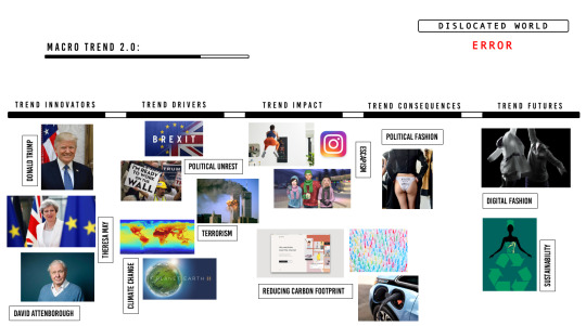
Cartogram explained:
Trend innovators:
The key trend innovators of a dislocated world include:
Donald Trump becoming the American president - inflicting his racist, misogynistic and homophobic views on the country
Theresa May - the British prime minister who is attempting to negotiate a Brexit deal and KEEPS receiving a no confidence vote...
David Attenborough, a natural historian who creates documentaries that enlighten the world of the damaging effects humans are having on the earth
Trend drivers:
Trump attempting to build a wall that stops immigrants getting into the US illegally
As mentioned earlier, the UK’s decision to leave the European Union
Documentaries such as planet earth which are highlighting key issues surrounding climate change/global warming
The numerous terrorist attacks carried out by ISIS
Trend impact:
The impact that the dislocated world trend has had has been colossal. People are constantly looking for ways to escape from the unrest that occupies the world; they are living in a climate of fear and need help breaking free from it. Gaming, for example, is an industry which has allowed people to escape from the world for years - documentaries such as second life 2.0 on Netflix demonstrates how far people blur the boundaries between their real lives and online lives (seriously, its the weirdest thing I have watched). Fitness is also beginning to utilise the AR and VR industries by presenting instructors in a virtual form - one of the biggest activities people do to relieve stress/mental health. Finally, so many industries are trying to reduce their carbon footprint within the world including the car industry - turning to electric cars as opposed to fuelled cars, brands and restaurants turning to paper straws instead of plastic straws and even the fashion industry to an extent with the likes of wardrobe optimising apps shown within the immaterialism cartogram.
Trend consequences:
The trend consequences for a dislocated world are very similar to the impact it has had, although one way in which it has impacted fashion in particular is that political fashion has entered the runway with models parading in underwear with the slogan ‘f*ck your wall’ and also high end brands such as Burberry supporting the LGBT movement.
Trend futures:
I believe that the trend future for the dislocated world will, again, be digital fashion. Having digital clothing will allow people to express themselves creatively and seamlessly depending on the event they’re going to. Our online selves will increasingly become more important as a means of detaching ourselves from the real world and the pressures behind it. In terms of Maslow’s hierarchy of needs, I feel as though digital fashion will actually be the type of product, albeit virtual, that will grant consumers with the answer to their esteem and/or self-actualisation needs. Digital clothing will give consumers a heightened confidence boost within the online world by aiding consumers to express themselves freely; likes and comments will ultimately evoke a sense of achievement for the consumers buying Anna’s brand and therefore I would argue that there is a need for more premium fashion brands to enter the digital marketplace.

0 notes