
Statistics
We looked inside some of the posts by anranren-designresearch and here's what we found interesting.
Average Info
Notes Per Post
1
Likes Per Post
1
Reblog Per Post
0
Reply Per Post
0
Time Between Posts
13 minutes
Number of Posts By Type
Text
17
Last Seen Tumblr Blogs


Fun Fact
Tumblr has 4 main sources of revenue.
Text
Final Postercard Set


I refine the references of the postcards and hightlight the keywords of each postcard.
0 notes


Text
Draft Methods Paragraph 2
Another important method of mastering minimalist publication design is the choice and use of colour. Colour plays a very important role in publication design. The properties of colour and the various ways in which it is expressed can impact on the visual senses of the audience, and give them a different visual experience. When designing publications through the use of minimalist principles, monochrome and simple colour swatches are often used, because simple, contrasting colours are highly recognisable and more likely to make a lasting impression. The stereotype of minimalist design is usually that it is all about black and white. In fact, the use of pure black and white is indeed an expression of minimalism, which can be ethereal or heavy on its own, and in combination provides a strong sense of contrast. But given the demands of publication design, the use of two or three colours in addition to black and white is also very compelling. In my artwork “Labyrinth” , I have used only white, pink and blue-green to present the story. I tried to make these three colours become flexible enough to be used throughout the rest of the design seamlessly. The limited colours make the illustration of all the objects into colours that do not correspond to reality, but this method also gives the image a stronger visual impact as well as convincingness. Therefore I suggest that the combination of fewer colours with minimalist shapes and lines contributes to the efficacy of the minimalist principle and highlights the ideas being expressed.
0 notes
Text
Color Design Workbook: A Real World Guide to Using Color in Graphic Design
Since color is such a important part of graphic design, designers need the most up to date as well as the most fundamental, information on the subject to have the tools needed to use color effectively. From the meanings behind colors to working with color in presentations, this book provides readers with the vital information needed to apply color creatively and effectively to their design work. Readers also receive guidance on talking with clients about color and selling color ideas. The science behind color theory is also explained in easily understood language, and case studies are included to show the effects some color choices had on both their clients and consumers.
Stone, T. L., Adams, S., & Morioka, N. (2008). Color design workbook: A real world guide to using color in graphic design. Rockport Pub.
0 notes
Text
Draft Methods Paragraph
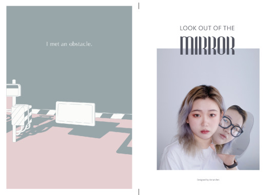
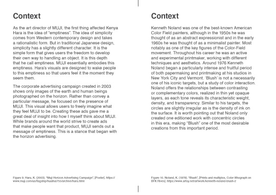
When applying the principles of minimalism to the design of publications, the concept of minimalism creates some of the characteristics of this type of design. As a publication designer, it is crucial to master the methods of these characteristics. A key feature of minimalist publication design is white space, which is also known as "negative space”. It generally has the appearance of leaving a lot of blank space in addition to text and images, or of blurring the background in order to highlight the main subject in the design. Using white space gives the design elements space to breathe and to interacts with other elements. The use of white space not only focuses the audience's attention and creates a spatial hierarchy in the layout, thus emphasising the subject matter conveyed, but also leaves space for the audience to imagine and think. In my publication project "Look out of the mirror”, I tried to use the suitable amount of white space and to adjust its structure and hierarchy in relation to the text and the images. I have carefully considered and tested the shape, size and position of the white space on each page of this booklet. With the whole in mind, I balanced the proportion of white space on each page to make it more consistent, regular and harmonious when flipping through. Moreover, the particularity of this method for publication design is that it is always important to consider how the white space will look when printed out. I am still learning to master the use of white space in order to present the subject of the design more clearly and to make it more aesthetically pleasing.
0 notes
Text
Comparison and Convergence of the Blank Space in Chinese and Japanese Graphic Design-Focusing on the Expression of Blank Space in Poster Design
Comparison and Convergence of the Blank Space in Chinese and Japanese Graphic Design This study discusses the philosophical foundation in Chinese and Japanese aesthetics. Most of the contemporary graphic designs in China lack influence or individual philosophy on aesthetics. In analyzing and comparing the use of blank-leaving in graphic design works showed that the traditional artistic sense of the blanks can enrich the cultural connotations of design and raise the artistic creation of the works. This paper used "convergence" to create a new approach on Chinese contemporary graphic design, especially on poster design. The application of blank-leaving in the graphic design has positive impact in the creation of excellent graphic design works that provide references and inspiration to develop a new blank on my own design.
Xie, W., & Kim, W. S. (2017). Comparison and Convergence of the Blank Space in Chinese and Japanese Graphic Design-Focusing on the Expression of Blank Space in Poster Design. Journal of the Korea Convergence Society, 8(6), 153-162.
0 notes
Text
Application of Design Geometry in Minimalist Style Product Design
From the historical overview of design geometry, this paper briefly introduces the current popular style of product design---minimalist design. The emphasis is laid on the analysis and research of design geometry in the minimalist style product design, leading to the contemporary designer's concern and thinking about design geometry. Thus, this paper establishes the importance of design geometry in minimalist style product appearance design.
Zhang, X., & Xue, Y. (2019, July). Application of Design Geometry in Minimalist Style Product Design. In IOP Conference Series: Materials Science and Engineering (Vol. 573, No. 1, p. 012100). IOP Publishing.
0 notes


Text
Study on Aesthetic Images of Chinese Calligraphy Elements in Minimalist Design
Chinese calligraphy is an ancient traditional art, which embodies the transcendent spirit of "Taoism, nature" and "harmony between man and nature" between black and white. With the embellishment of bright red seals, the deep Zen space is formed, which embodies Zhuangzi's aesthetic thought of "simplicity and beauty cannot be contended with in the world". The minimalist design style advocates the removal of the non-essential elements of the design object. In the purest style, restoring its most basic and original state is also an aesthetic idea. This paper studies the application of the aesthetic elements of Chinese calligraphy in minimalist design.
Bo, W. (2019). Study on Aesthetic Images of Chinese Calligraphy Elements in Minimalist Design.
0 notes
Text
Analysis on the Trend of Contemporary Book Design from the Minimalism
As a kind of design thought, contracted concept is aimed at using as little as possible elements to reveal the connotation of things. Books of contracted concept pursue the vision's conciseness on the design and abundance in the emotion. This is important to protect environment and save energy. On the basis of the interpretation about contracted concept, this paper analyzes the problems the contemporary books design form esists, puts forward the feasibility of the Minimalism's application in book design.
Zheng, H. (2012). Analysis on the Trend of Contemporary Book Design from the Minimalism. Art and Design, 10.
0 notes

Text
Keywords of Critical Commentary
Minimalist
Publication Design
Visual Impact
Visual Communication
1 note
·
View note
Text
Research
PDW, Publication Design Workbook: A Real-world Design Guide--magazines, Newspapers, Catalogs, Annual Reports, Newsletters, Literature, Systems, and Everything in Between

This latest volume in Rockport's Workbook series, Publication Design Workbook is packed with information regarding the ins and outs of publication design. The media featured includes magazines, literature systems, newsletters, exhibition catalogs, annual reports, newspapers, and retail catalogs. Both current and historical approaches are provided to give readers a complete background on design style, application, and techniques involved in creating effective publications.
Readers will develop a clear understanding of publication design through a comprehensive and accessible workshop-style format. Fundamentals of form and content are included, along with diagrams to further textual understanding. This is the most complete book for designers on applied publication design principles combined with an awe-inspiring collection of the best work from around the world.
Samara, T. (2005). PDW, Publication Design Workbook: A Real-world Design Guide--magazines, Newspapers, Catalogs, Annual Reports, Newsletters, Literature, Systems, and Everything in Between. Rockport Pub.
0 notes
Text
Chosen Title
By James’ suggestion, I decided my final title:
How to enhance communication in publication design through the use of minimalist principles

0 notes